The Exorcist (1973) isn’t just a horror movie; it’s a piece of cinema that feels like a dirty, grainy artifact. It exists outside of modern trends. When I analyze this film, I’m not just seeing a scary story; I’m seeing a specific, gritty visual texture that defined the 1970s and set a standard that digital filmmaking is still trying to reverse-engineer.
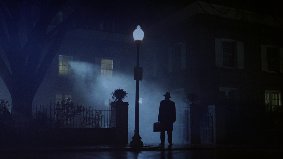
I first watched The Exorcist years ago, but revisiting it now with a trained eye, the thing that hits me isn’t the shock value it’s the discipline. It doesn’t rely on the “horror look” we see today, which is often crushed blacks and overly stylized teal-and-orange grades. Instead, it relies on a relentless, creeping normalcy. From the harsh, desaturated sun of the Iraq sequence to the cold, clinical silhouette of Father Merrin arriving at the MacNeil house, the film builds a visual language that feels terrifyingly grounded.
About the Cinematographer
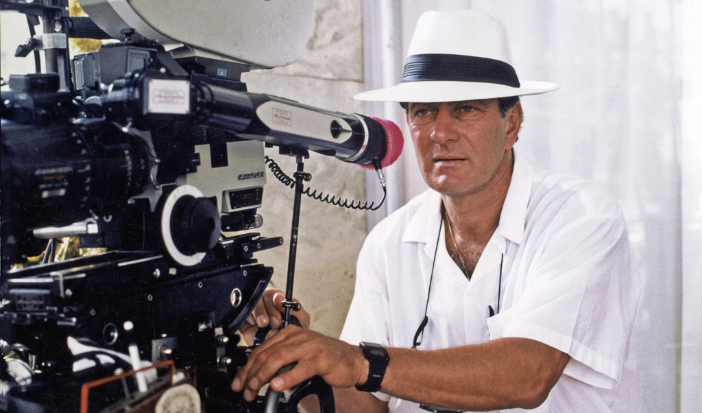
The man behind the lens was Owen Roizman, a DP who hated “movie lighting.” I admire Roizman because he didn’t approach this as a fantasy film; he shot it like a documentary. Coming off The French Connection, he and Friedkin had already developed a shorthand for grit. Roizman wasn’t interested in making things look pretty; he wanted them to look true.
For The Exorcist, this approach was vital. Friedkin needed someone who could strip away the cinematic gloss. Roizman understood that if you light a demonic possession too dramatically, it becomes a cartoon. Instead, he lit scenes to feel disturbingly plausible like you just walked into a room you weren’t supposed to be in. He captured a reality that feels raw and unpolished, which is exactly why it works.
Inspiration Behind the Cinematography
Friedkin’s directive was simple but difficult: “documentary realism.” He didn’t want a gothic creature feature. He wanted to depict evil as something invasive in a modern, boring setting. This meant avoiding the safety net of shadows in the early acts.
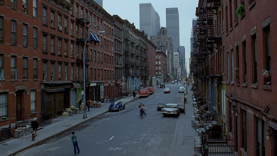
The visual inspiration stems from the mandate to make the impossible feel factual. The film was largely shot with hard light and handheld cameras, avoiding the smooth, floating feeling of a studio picture. When you look at the mundane scenes the hospital tests, the party they are lit with bright, unforgiving lights. This makes the transition into the supernatural much more jarring. It’s about grounding the extraordinary in the ordinary. The horror here isn’t a monster in a castle; it’s physical trauma in a Georgetown bedroom.
Camera Movements
The camera work in The Exorcist is deceptively simple. It doesn’t draw attention to itself until it has to. The pacing is methodical, mirroring the slow burn of the narrative.
In the beginning, we get smooth, controlled dollying. It feels safe. But as the possession takes hold, the camera starts to break loose. Roizman utilized the Arriflex 35 IIC for handheld work, and you can feel the weight of that camera in the movement. It’s not the weightless float of a modern gimbal; it has a human struggle behind it. During the medical procedures, the camera maintains a cold, observational distance, which makes the graphic imagery harder to watch. In the climax, the movement becomes claustrophobic, boxing us in with the priests. It’s a physical, aggressive style of operating that adds to the atmospheric pressure.
Compositional Choices
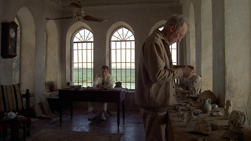
Roizman’s framing is all about isolation. He uses the 1.78:1 aspect ratio to create pockets of dead space that feel heavy. In the opening Iraq sequence, he utilizes extreme wide shots to dwarf Father Merrin against the landscape, emphasizing his insignificance against ancient forces.
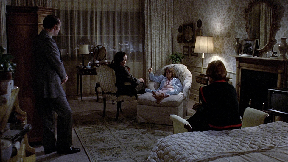
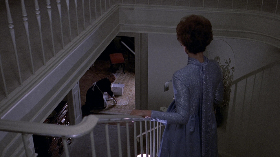
Inside the MacNeil house, the composition tightens. There is a specific “left-heavy” weight to many shots, keeping the characters off-balance. We all know the iconic frames the silhouette in the window, the bed shaking—but look at the quiet shots. The way Chris MacNeil is framed alone in that large house creates a sense of vulnerability long before the demon shows up. Roizman wasn’t afraid to hold on a static shot, forcing the audience to stare at something uncomfortable. It’s a lesson in restraint: let the frame do the work.
Lighting Style
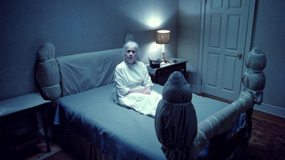
Lighting is where this film separates itself from modern horror. Roizman didn’t rely on “moonlight” blue gels; he used motivated, practical sources. The lighting is predominantly hard light, which creates sharp, definitive shadows rather than soft, pleasing rolloffs.
The most famous lighting choice, of course, was the refrigerated set. They dropped the temperature below zero to capture the actors’ breath. That’s not a visual effect you can fake in post the way the light catches the condensation adds a layer of tactile coldness to the image. Even in the dark bedroom scenes, Roizman kept detail in the shadows. He used a technique of “underexposing and printing up” or pushing the negative to get a grainy, thick texture in the blacks. It feels murky and suffocating, exactly as intended.
Lensing and Blocking
Technically, Roizman relied heavily on Panavision Standard Primes. For the Iraq sequence, he utilized telephoto lenses to flatten the space and create that heat-haze effect, contrasting sharply with the wider, more intimate focal lengths used in Georgetown.
The blocking was dictated by the practical effects. Because they were dealing with mechanical rigs for the levitation and bed-shaking, the actors had to hit precise marks. Yet, it never feels staged. The “spider-walk” scene is a prime example the camera had to be positioned perfectly to hide the wires while maintaining the horror of the movement. Friedkin’s directing style was famously aggressive (firing guns on set, slapping actors), and while controversial, it resulted in a physical tension in the actors’ bodies that translates through the lens. They look exhausted and terrified because they were.
Color Grading Approach
From my perspective as a colorist, The Exorcist is a masterclass in density. It was color timed by Terry Haggar, and the look is defined by the Eastman 100T 5247 film stock.
The palette is split. The Iraq sequence is warm and desaturated a dusty, oppressive heat. Once we get to Georgetown, the warmth vanishes. The film leans into cool, muted tones, but not in a stylized way. It looks like a gloomy winter day. The skin tones are natural but stripped of vitality.
What I love about this grade is the contrast management. The shadows on the 5247 stock are thick and noisy. In a modern grading suite, the temptation would be to “clean up” that grain or crush the blacks to make it look slick. But the horror lives in that texture. The “pea soup” green is another specific choice it’s a sickly, bile yellow-green that pops vividly against the otherwise somber palette. It’s a grade that prioritizes mood over aesthetics.
Technical Aspects & Tools
The Exorcist – Technical Specifications
| Genre | Drama, Horror, Occult, Thriller |
| Director | William Friedkin |
| Cinematographer | Owen Roizman |
| Production Designer | Bill Malley |
| Costume Designer | Joe Fretwell |
| Editor | Norman Gay, Evan A. Lottman |
| Colorist | Terry Haggar |
| Time Period | 1970s |
| Color | Warm, Desaturated |
| Aspect Ratio | 1.78 – Spherical |
| Format | Film – 35mm |
| Lighting | Hard light |
| Lighting Type | Daylight |
| Story Location | Asia > Iraq |
| Filming Location | Asia > Iraq |
| Camera | Arriflex 35 IIC |
| Lens | Panavision | Standard Primes |
| Film Stock / Resolution | Eastman 100T 5247 |
This film is a beast of the 1970s workflow. It was shot on 35mm film using the Eastman 100T 5247 negative. This was a tungsten-balanced stock that Roizman manipulated beautifully for both interior and exterior work. The camera package centered around the Arriflex 35 IIC, a workhorse camera that allowed for the gritty handheld shots, paired with Panavision glass.
The lack of CGI is the film’s greatest technical asset. The “effects” were physical. The rig that thrashed Regan around, the harness for the levitation these were heavy mechanical devices. When you see the bed shaking, it has mass. When you see the breath in the cold room, it’s real physics. This reliance on practical solutions forced the cinematography to be reactive. They couldn’t “fix it in post.” They had to capture the physical reality of the event on the negative, and that commitment to the physical world is why the visual effects still hold up 50 years later.
- Also read: THE HELP (2011) – CINEMATOGRAPHY ANALYSIS
- Also read: WARRIOR (2011) – CINEMATOGRAPHY ANALYSIS
Browse Our Cinematography Analysis Glossary
Explore directors, cinematographers, cameras, lenses, lighting styles, genres, and the visual techniques that shape iconic films.
Explore Glossary →