Alright, let’s talk about The Elephant Man. For a lot of people, this film is just a classic drama, but for me, this movie is a cheat code. It’s David Lynch’s second feature, dropped in 1980, but it looks like it was dug up from a time capsule buried in 1945. As a colorist, I have a complicated relationship with black and white. Clients think it’s “easy” because there’s no color balancing involved, but honestly? It’s terrifying. There’s nowhere to hide. You can’t fix a lighting mistake with a secondary key. That’s why watching this film is such a fascinating exercise it’s pure tonal storytelling, stripped naked.
When I re-watched The Elephant Man recently, the first thing that hit me wasn’t just the story of John Merrick; it was the texture. You can almost feel the grit of Victorian London on your teeth. It doesn’t feel like a polished Hollywood set; it feels like a nightmare captured on celluloid. The film is over 40 years old, yet it feels sharper and more modern than half the digital content shot on Alexa today. It dares you to look at a character that is visually repulsive, but it uses that repulsion to pull you in. It’s not just “cinematic”; it’s aggressive. It forces you to look beyond the surface which is ironic, considering the whole movie is about how society refuses to do exactly that.
About the Cinematographer
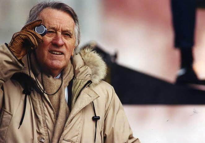
The guy responsible for this look is Freddie Francis, and he is a legend. Before this, he was shooting Hammer Horror films you know, those gritty, high-contrast British horror flicks. He wasn’t just a “lighting cameraman”; the guy knew how to create atmosphere on a budget.
Francis understood that lighting isn’t just about exposure; it’s about psychology. He shot Sons and Lovers and The Innocents, so he knew his way around monochrome. When Lynch hired him, it was the perfect clash of styles. You had Lynch, the surrealist coming off Eraserhead, and Francis, the classical technician who knew how to execute that vision. Francis brought a discipline to Lynch’s madness. He grounded the surrealism in a physical reality that made the dream sequences hit harder because the “real” world felt so tangibly heavy.
Inspiration Behind the Cinematography
Shooting this in black and white wasn’t just an “artsy” choice; it was a survival tactic. Let’s be real: John Hurt’s makeup was incredible, but in 1980s color stock? It probably would have looked like rubber. The monochrome hides the seams. It blends the prosthetics into the shadows, making Merrick look like an organic tragedy rather than an actor in a suit. It distances us just enough from the shock value to let us focus on Hurt’s eyes.
Beyond the makeup, Lynch was obsessed with what he calls “industrial aesthetics.” If you’ve seen his other work, you know the vibe: grinding gears, smoke, steam, metal hitting metal. The B&W stock (Kodak Plus-X 5231) eats that stuff up. The high contrast turns the factories into these gaping mouths of hell. It’s not just set dressing; the environment feels like a machine designed to crush Merrick. The cinematography reinforces this with hard lines and metallic textures. It’s cold, unfeeling, and completely brilliant.
Camera Movements
Camera movement in this film is surprisingly restrained. In modern cinema, we’re used to gimbals and drones flying everywhere, but here, the camera usually only moves when it needs to. It mimics the way Merrick moves slow, labored, hesitant.
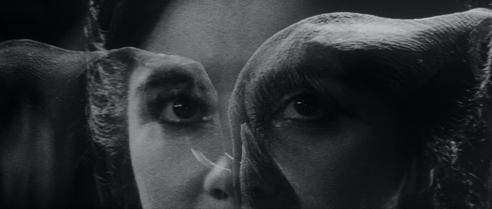
There are these long tracking shots down dark corridors that feel suffocating. The camera follows Dr. Treves (Anthony Hopkins) into the unknown, and because the lens is tight and the depth of field is shallow, we feel that claustrophobia. But the real standout is the subjective camera work. There’s that shot where the camera essentially goes inside the eye socket of Merrick’s hood. It’s uncomfortable. It forces you into his headspace. It’s not just a POV shot; it’s an invasion of privacy that flips the script suddenly, we are inside looking out.
Even in the chaotic scenes, like the chase at the train station, the camera work syncs with the panic. The steam engine smoke wipes the frame, the motion blur kicks in it’s visceral. The camera stops observing and starts panicking along with him.
Compositional Choices
If you pause the film at random, you’ll notice how often Merrick is framed by “cages.” Not just the literal bars of the freak show, but doorframes, bed posts, narrow alleyways. Lynch and Francis are constantly using framing to trap him.
They also make great use of negative space. In the hospital wide shots, Merrick is this tiny, vulnerable blob of darkness against massive, clinical white walls. It emphasizes just how small he is in the system. And then there’s the silhouette work. When we first see him, he’s just a shadow. It’s a classic horror trope used for empathy we project our own fears onto that silhouette before we even see his face.
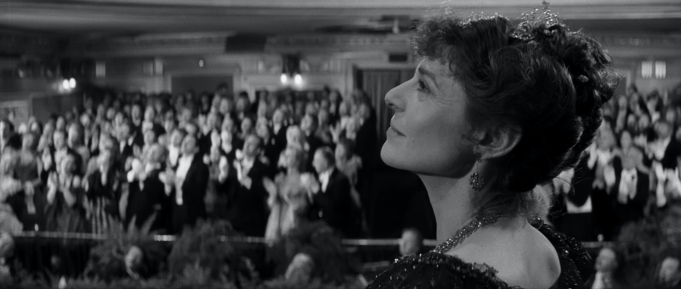
I also love the low-angle work. When the mob is chasing him, the camera drops low, making the attackers look like giants. But when he’s with Mrs. Kendal, the camera levels out. They share the frame. The composition tells you everything about the power dynamic without a single line of dialogue.
Lighting Style
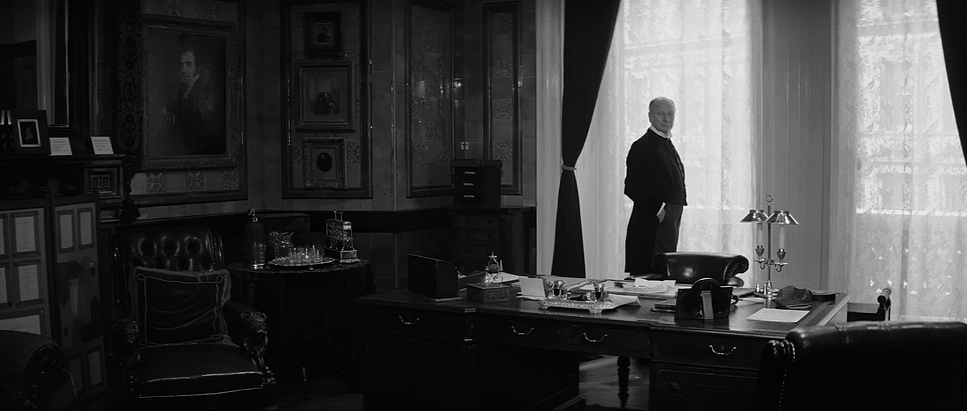
This is where Freddie Francis really shows off. The lighting is the main character. It’s classic chiaroscuro high contrast, deep blacks, hot whites.
The film lives in the shadows. But what’s interesting is how Francis uses “motivated” sources. You see gas lamps, bare bulbs, and industrial fires in the frame, and the lighting mimics that harsh, flickering quality. It’s not the soft, flattering beauty light we use in commercials today. It’s hard light. It casts long, distorted shadows that stretch across the walls like ghosts.
The highlights are precise, though. Even with that heavy hood, Francis always manages to catch a “eye light” or catchlight in John Hurt’s eyes. That tiny pinprick of light is what gives him a soul. Without it, he’s just a monster mask. It’s a subtle technical trick, but it carries the entire emotional weight of the performance.
Lensing and Blocking
The lens choices here dictate how we feel about the space. For the industrial shots and the hospital corridors, they likely used wider focal lengths (maybe a 24mm or 35mm equivalent), which exaggerates the distance. It makes the hallways look endless and daunting.
But when people are staring at Merrick, Francis often switches to a longer lens. This compresses the background and isolates Merrick, but it also creates a sense of voyeurism like we’re watching him through a telescope or a sniper scope. It’s detached.
The blocking (where the actors stand) evolves with the story. Early on, Merrick is always in the corner of the frame, or short-sided (looking off the edge of the screen). It feels unbalanced. As he gains confidence and acceptance, he moves to the center. By the time he’s building his cathedral model, he’s framed centrally, balanced, bathed in a softer light. The visual language grants him dignity before the script even does.
Color Grading Approach
Okay, putting my colorist hat on. If I were grading this today in DaVinci Resolve, I wouldn’t just desaturate the footage and call it a day. That’s the rookie mistake. Real black and white is about tonal separation.
In color, if you have a red apple on a green table, they separate naturally. In B&W, if their luminance values are the same, they blend into gray mush. Freddie Francis was essentially “grading” on set. He knew that if he put a red filter on the lens, the skin tones would brighten up and the blue sky would go black. He was manipulating the gray scale chemically.
If I were working on a restoration of this, I’d be obsessing over the “toe” of the curve the point where the shadows roll off into pure black. You want that filmic density where the blacks are rich but not crushed; you still want to see the texture in the brick walls. I’d probably use a DCTL to emulate the specific density of the print stock. I’d also be careful with the highlights. Digital clipping looks awful in B&W. You need that soft, creamy roll-off that halation gives you that subtle glow around the gas lamps. That’s what makes it feel organic and not like a crisp, sterile digital file. It’s about managing the contrast ratios so the image feels thick and tactile.
Technical Aspects & Tools
The Elephant Man
Technical Specifications| Genre | Drama, History, Biopic |
| Director | David Lynch |
| Cinematographer | Freddie Francis |
| Production Designer | Stuart Craig |
| Costume Designer | Patricia Norris |
| Editor | Anne V. Coates |
| Time Period | 1800s |
| Color | Desaturated, Black and White |
| Aspect Ratio | 2.35 – Anamorphic |
| Format | Film – 35mm |
| Lighting | High contrast |
| Lighting Type | Artificial light |
| Story Location | … United Kingdom > London |
| Filming Location | … England > London |
| Camera | Panavision Cameras |
| Lens | Panavision Lenses |
| Film Stock / Resolution | Plus X 5231 |
We know they shot this on 35mm, specifically using Kodak Plus-X 5231. This is a legendary stock known for its fine grain and punchy contrast, which explains why the blacks in this movie look so deep. They likely used Panavision cameras, the workhorses of that era.
The real secret sauce here was filtration. As I mentioned, B&W cinematographers carry a wallet full of colored filters. A yellow filter creates that nice separation in the clouds; a red filter turns a blue sky into a dramatic, stormy black. Francis would have been swapping these constantly to control the contrast before the light even hit the film.
And let’s not forget the lab work. In 1980, you couldn’t just Power Window a face to brighten it up. You had to do it with “dodging and burning” in the print process, or just get it right in camera. The consistency of the look across the whole film is a testament to the discipline of the lab technicians and the DP.
- Also read: FOR A FEW DOLLARS MORE (1965) – CINEMATOGRAPHY ANALYSIS
- Also read: THE STING (1973) – CINEMATOGRAPHY ANALYSIS
Browse Our Cinematography Analysis Glossary
Explore directors, cinematographers, cameras, lenses, lighting styles, genres, and the visual techniques that shape iconic films.
Explore Glossary →