The Deer Hunter (1978) directed by Michael Cimino’s epic is exactly that a brutal, beautiful, and exhausting experience. It’s a masterclass in how visual language can carry the emotional weight of a story when dialogue just isn’t enough.
It’s a massive film nearly three hours which feels like a lifetime in today’s TikTok attention span economy, but Cimino uses that runtime to let you live with these characters. What fascinates me most isn’t just the raw performances from De Niro, Walken, and Streep; it’s how the image itself evolves. The cinematography here doesn’t just document the events; it shifts and breaks alongside the characters. It moves from the warmth of home to the cold, grainy chaos of war, and that visual journey is what makes the film stick with you decades later.
About the Cinematographer
The visual architect behind The Deer Hunter was the late, great Vilmos Zsigmond. In the color grading world, Zsigmond is a bit of a god. He understood that “cinematic” doesn’t mean clean; it means atmospheric. Before this, he had already proven he could sculpt light in Close Encounters of the Third Kind, but The Deer Hunter required something different. He wasn’t painting cosmic wonder here; he was sculpting grit.
Zsigmond’s approach was rooted in a style of “dirty realism.” He wasn’t afraid of underexposure or letting shadows fall into complete blackness if the emotion called for it. This isn’t the polished, high-dynamic-range digital cinematography we see today. It’s subtle and immersive. He bridged the gap between the painterly, romanticized interiors of the Pennsylvania steel town and the handheld, documentary-style nightmare of Vietnam. It was a partnership with Cimino that prioritized the emotional core of the frame over technical safety.
Inspiration Behind the Cinematography
The cinematography is driven entirely by the film’s unique three-act structure. It’s not really a war movie; it’s a movie about the interruption of life. Cimino and Zsigmond needed the first act in the steel town to feel lived-in and authentic. They wanted the audience to practically smell the beer and the cigarette smoke in the bar. This required a visual language that felt warm, dense, and deeply personal.
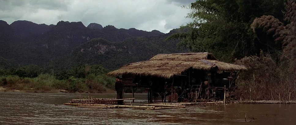
Then comes the shift to Vietnam. The visual language had to shatter. It needed to be raw, chaotic, and devoid of that earlier comfort. The goal was to portray the brutal reality without the Hollywood gloss no hero lighting, just the stark, unvarnished truth of suffering. Finally, the post-war phase demanded a visual style that conveyed the “ghost in the room” feeling the psychological trauma and the inability to readjust. The contrast is deliberate: moving from a vibrant, almost romantic realism to a harsh, desaturated nightmare, and finally to a muted, somber resolve.
Camera Movements
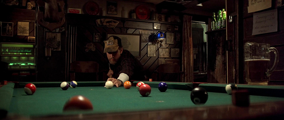
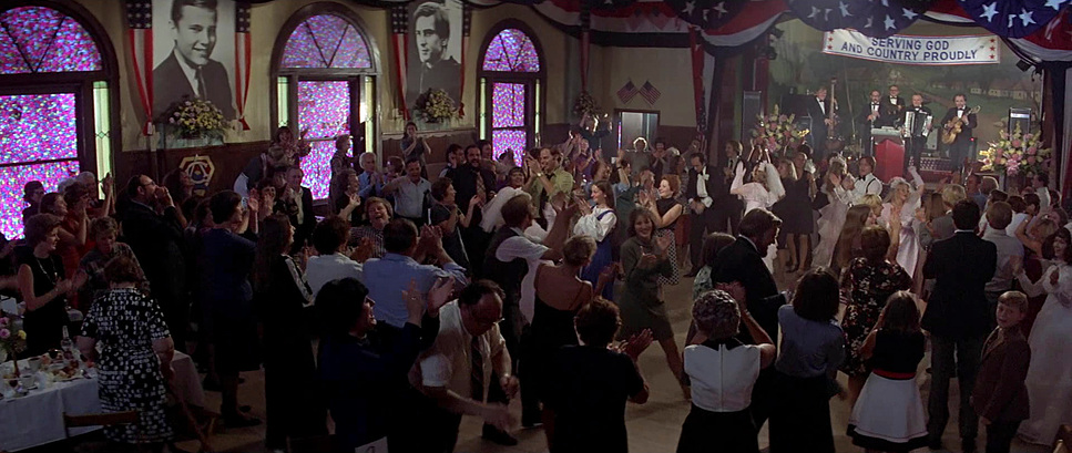
When I watch The Deer Hunter, the camera feels like a character in the room. In the Pennsylvania scenes, Zsigmond uses these long, fluid tracking shots. Think of the wedding sequence: the camera floats through the dance floor, drifting past the chaos and the joy. It’s observational, letting us sit in the pocket of their lives without forcing the pacing.
Once we hit Vietnam, the tripod is gone. The movement becomes sharp, urgent, and reactive. In the Russian Roulette scenes, the camera is uncomfortably close, operating handheld with a frantic energy that mirrors the panic of the prisoners. It creates a claustrophobic intimacy. The framing becomes tighter, cutting off the environment to trap us in the headspace of the characters. It’s a deliberate choice to disorient the viewer. Then, when Michael returns home, the camera settles down again, but it’s heavier. The movements are static or slow, reflecting the internal paralysis of a town that doesn’t know how to move forward.
Compositional Choices
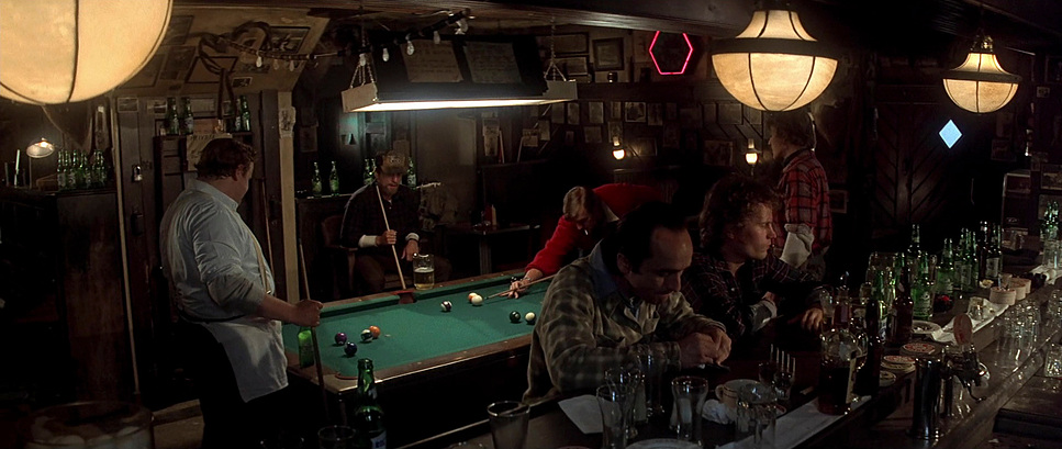
Zsigmond’s framing tells you everything you need to know about the characters’ relationships. In the opening act, he relies on wide shots and medium two-shots (or three, or four-shots). He packs the frame with people. The steel mill, the bar, the wedding the frame is always full of community. It creates a subconscious sense of safety and belonging.
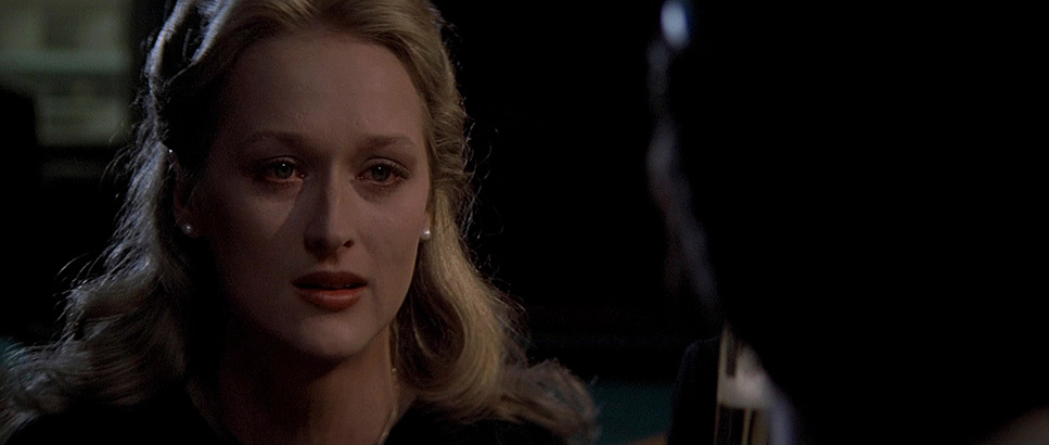
But in Vietnam, the composition isolates them. The Russian Roulette scenes are shot in extreme close-ups you are counting beads of sweat and seeing the terror in their eyes. The wide shots in Vietnam don’t offer community; they emphasize vulnerability, dwarfing the characters against a hostile landscape. The most haunting compositional choices happen post-war. We often see De Niro framed in isolation, separated from others by doorframes or negative space, even when he’s in the same room as them. It’s a visual representation of his survivor’s guilt physically present, but psychologically miles away.
Lighting Style
The lighting is a lesson in motivated sources. In the pre-war sequences, particularly the wedding and the bar scenes, Zsigmond leaned into warmth. He likely pushed the tungsten sources to glow a bit, creating that “golden hour” nostalgia even indoors. It feels safe. The bar isn’t just a set; it’s a refuge, bathed in soft, inviting light.
When the story moves to Vietnam, that softness evaporates. The lighting becomes hard, high-contrast, and often top-down to create deep eye sockets and harsh shadows. The Russian Roulette sequence is lit to look “hot and sweaty.” Zsigmond used practical bulbs and harsh sources to create specular highlights on the skin, making the actors look grimy and desperate. It’s high-key in the sense of exposure, but low-key in terms of mood—interrogative and unflinching. Post-war, the light seems to drain out of the film. We get overcast exteriors and dim interiors, lacking that earlier golden punch, visually underlining the sorrow that hangs over the town.
Lensing and Blocking
Zsigmond’s choice of glass works hand-in-hand with Cimino’s blocking. In the first act, they used anamorphic wides (likely Panavision C-Series) to capture the breadth of the group. The blocking is communal De Niro, Walken, and Savage are constantly physically touching or occupying the same depth plane. It lets you exist in their world.
In Vietnam, the lens choices start to compress the space. Telephoto lenses flatten the background in the jungle, making the danger feel like it’s right on top of them. The blocking in the POW camp specifically the water cages is a nightmare of confinement. It’s not just the set design; it’s how the actors are blocked into corners, submerged, with the camera cutting off their escape routes. Back home, the blocking becomes stiff. Characters stand apart. The distance between them in the frame represents the things they can’t say to each other.
Color Grading Approach
As a colorist, this is where I geek out. If I were grading this project today, knowing the emotional arc, I wouldn’t just slap a teal-and-orange LUT on it. I’d be looking at density.
For the Pennsylvania act, I’d build a look based on a warm print film emulation something like a Kodak 2383 target but with the white point warmed up. I’d want the blacks to be thick and the highlights to roll off gently. I’d emphasize the skin tones, pushing them toward a healthy, blood-rich hue. The goal is to make the image feel “thicker,” evoking that nostalgic, working-class warmth.
For Vietnam, I would strip that density away. I’d lean into a “bleach bypass” look desaturating the image while crunching the contrast. I’d pull the greens toward a sickly yellow-olive and desaturate the blues until they felt like gray slate. The key here would be separation or the lack of it. I’d let the shadows crush a bit to make the jungle feel impenetrable. Skin tones would be pushed toward sallow, sweaty yellows and magentas to sell the heat and the sickness.
Returning home, the grade would need to be cold. I’d introduce cooler tones into the shadows steely blues and cyans but keep the contrast more linear than the Vietnam section. It shouldn’t look “cool” or stylish; it should look lonely. A gray, overcast palette where the colors feel tired, just like the characters.
Technical Aspects & Tools
| The Deer Hunter — Technical Specifications | |
|---|---|
| Genre | Drama, War, Military, Vietnam War, History |
| Director | Michael Cimino |
| Cinematographer | Vilmos Zsigmond |
| Production Designer | Ron Hobbs, Kim Swados |
| Costume Designer | Eric Seelig |
| Editor | Peter Zinner |
| Time Period | 1960s |
| Color | Desaturated |
| Aspect Ratio | 2.35 – Anamorphic |
| Format | Film – 35mm |
| Lighting | Soft light, Low contrast |
| Lighting Type | Overcast |
| Story Location | … Pennsylvania > Clairton |
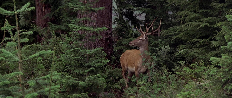
| Filming Location | … Mount Baker > Heather Meadows |
| Camera | Panavision Panaflex |
| Lens | Panavision C series |
| Film Stock / Resolution | 5248/7248 EXR 100T |
To achieve this, Cimino and Zsigmond relied on the workhorse tools of the 70s. The film was shot on 35mm, specifically Kodak 5247 (100T). This is a crucial detail 5247 was the stock of that era. It had a specific grain structure and a way of handling mixed lighting that is hard to replicate digitally. It wasn’t the high-speed stock we have now, meaning they needed a lot of light, which contributed to the sweating and the practical intensity of the interior scenes.
They shot with Panavision Panaflex cameras and Panavision C-Series anamorphic lenses. These lenses are famous for their unique flares and the way they render out-of-focus areas (bokeh), giving the film its cinematic squeeze (2.35:1 aspect ratio). That wide canvas was essential for capturing the scale of the mountains during the hunt, but also for isolating a single face in the negative space of a wide frame. It proves that it’s not about having 8K resolution; it’s about how the glass and the film stock interpret the light.
- Also read: HOTEL RWANDA (2004) – CINEMATOGRAPHY ANALYSIS
- Also read: SOUL (2020) – CINEMATOGRAPHY ANALYSIS
Browse Our Cinematography Analysis Glossary
Explore directors, cinematographers, cameras, lenses, lighting styles, genres, and the visual techniques that shape iconic films.
Explore Glossary →