Introduction
Stepping into the world of The Chaos Class feels like finding a beloved, slightly faded photograph of a bygone era. At my studio, Color Culture, I spend my days staring at high-resolution monitors and tweaking curves, so I find a specific kind of magic in peeling back the layers of this vintage visual storytelling. This isn’t about dissecting a masterpiece of “high art,” but rather appreciating the effective, heartfelt work that captured the public imagination. It’s about the tangible decisions made with cameras, lights, and lenses. From the first frame, you feel the specific energy of 1970s Turkish cinema—a distinct flavor that speaks to local sensibilities while tapping into universal themes of youth and rebellion. It’s an honest, unpretentious form of filmmaking, and that honesty is reflected vividly in its cinematography.
About the Cinematographer

The visual architect behind The Chaos Class was Hüseyin Özşahin. His approach was typical of the working cinematographers of that period: it wasn’t about overt stylistic flourishes designed to boost the DP’s ego. It was about serving the narrative. In an era where production resources were often stretched thin, the cinematographer’s role was one of ingenious problem-solving. Özşahin’s work here exemplifies a pragmatic artistry. He wasn’t just pointing a camera; he was framing a cultural moment and setting a visual rhythm that allowed the film’s unique humor to flourish. It’s a reminder that compelling cinematography isn’t always about the grand gesture, but often about consistent, intelligent choices that let the story breathe.
Inspiration Behind the Cinematography
The primary inspiration for the look of The Chaos Class clearly stems from its genre: a raucous ensemble comedy set inside a boarding school. The film needs to feel alive, dynamic, and chaotic. The composer, Melih Kibar, has been described as a legend whose music evokes “sadness when played slowly and joy when played fast.” That duality perfectly mirrors the film’s visual rhythm.
Özşahin’s choices are driven by the need to facilitate rapid-fire gags and physical comedy. The camera often acts as a neutral observer, allowing the ensemble to play out their antics within a relatively stable frame. There is a directness to the imagery—an almost journalistic approach to capturing spontaneity—which is crucial for comedy. You don’t want stylized camerawork distracting from the punchline. Instead, the visual language immerses the viewer directly into the school’s unruly environment, making us feel like just another student in the back of the class observing the hilarity.
Camera Movements
When I look at the camera movements here, I recognize the practical language of 1970s narrative filmmaking. This isn’t a film defined by elaborate dolly shots or complex crane work. Instead, the movements are utilitarian, designed to follow action and reveal character.
We see a lot of subtle pans and tilts guiding our gaze across the bustling classroom. These aren’t flashy moves; they are smooth, purposeful shifts. A pan might follow a mischievous student sneaking out, or a tilt might reveal a teacher’s exasperated reaction.
There are likely some simple tracking shots—side-to-side moves to accompany characters walking or to broaden the scope of a group scene—but they remain modest. This reinforces the film’s grounded reality. The camera moves when the story demands it, not just for the sake of movement. This unassuming confidence in the blocking is a hallmark of good comedic cinematography; it lets the audience engage without feeling manipulated by a restless lens. It serves the chaotic energy without becoming chaotic itself.
Compositional Choices
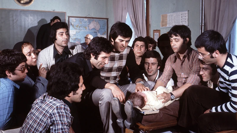
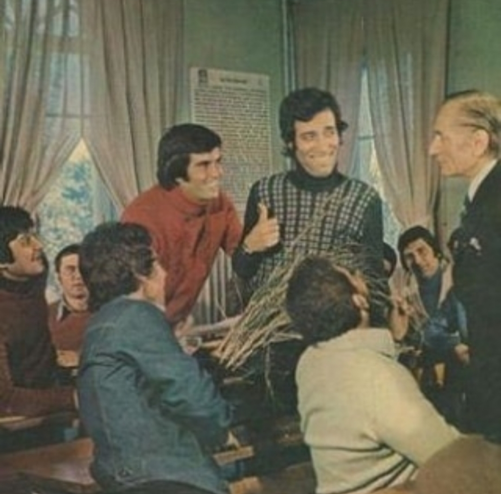
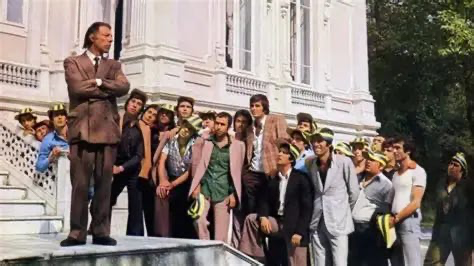
The compositional philosophy in The Chaos Class is rooted in clarity and depth cues—both essential for managing a large ensemble. Özşahin often utilizes wider compositions within the classroom, which allows multiple characters to populate the frame simultaneously. This isn’t just about fitting everyone in; it’s about showcasing the group dynamic and allowing reactions to unfold organically in the background.
I notice a preference for layered blocking, where students are arranged at different distances from the camera. This creates a sense of spatial depth. A character in the foreground might be reacting to something in the mid-ground, while another student further back is plotting a prank. This depth ensures the frame feels lived-in.
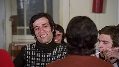
Close-ups are reserved for punchlines or moments of exaggerated emotion. This scarcity makes their impact more pronounced. When the frame tightens, it is a deliberate choice to focus our attention. The compositions are never abstract; they are functional and direct, a lesson in compositional discipline that prioritizes the delivery of visual information.
Lighting Style
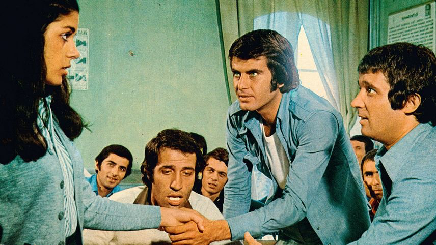
The lighting leans heavily into a naturalistic, practical approach. You don’t see heavy, dramatic chiaroscuro here. Instead, the lighting aims for visibility, which is paramount for comedy.
Much of the film feels lit by motivated sources—sunlight streaming through windows or practical lamps. It is skillfully crafted to appear uncrafted. The light is soft and even, minimizing harsh shadows that could obscure facial expressions. This results in a flatter, more uniform look that some might call “functional,” but for a 1975 comedy, it is exactly right.
As a colorist, I immediately notice how the light shapes the faces. While the overall look is gentle, there is still attention paid to separation—perhaps a subtle kicker to delineate a character from the background, or fill to lift shadows under the eyes. It maintains a cheerful, accessible aesthetic that never feels heavy, aligning perfectly with the lighthearted tone.
Lensing and Blocking
The lensing and blocking are fundamental to the film’s DNA. Given the ensemble nature, I see the use of wider to standard prime lenses—likely 28mm or 35mm for group interactions. This allows a broad field of view without introducing excessive distortion, ensuring everyone remains legible during group gags.
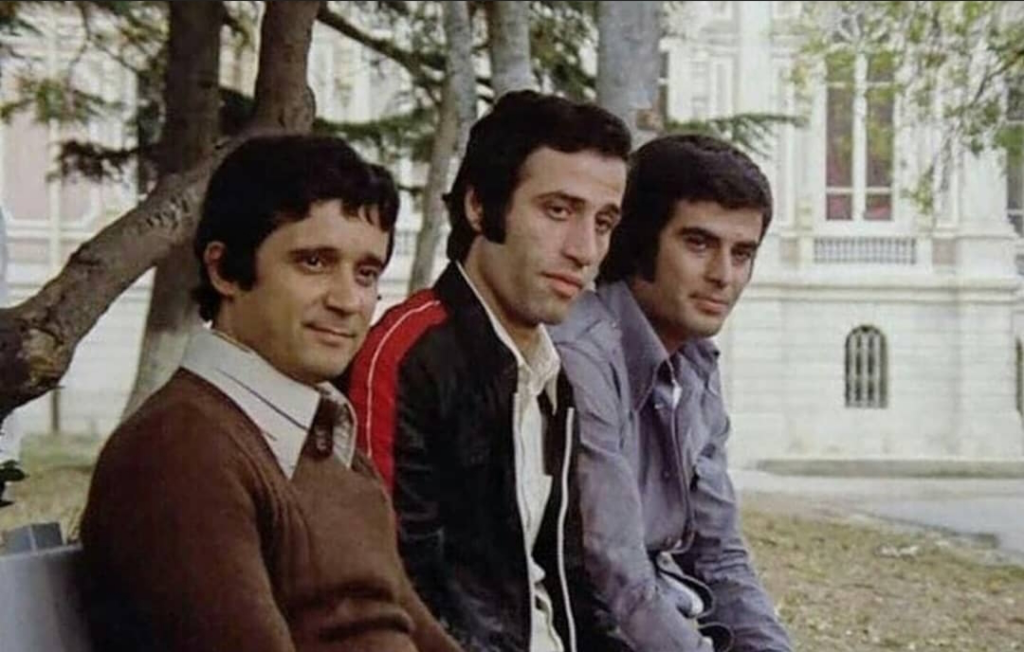
Blocking is where the film truly excels. Özşahin, likely in collaboration with the director, employs sophisticated blocking to manage the cast. Characters are layered to create visual interest; a student might deliver a line in the mid-ground while a reaction plays out in the foreground. This isn’t accidental; it’s a meticulously choreographed dance that allows the viewer to discover new details within a single shot.
For intimate moments, a 50mm lens might be used to bring the audience closer to individual characters. This interplay between lens choice and character placement allows the film to shift dynamically between the broad sweep of the ensemble and nuanced individual performances.
Color Grading Approach
Ah, the color grading. This is where my professional instincts kick in. Back in 1975, digital “color grading” didn’t exist. It was all about “timing” the print in the lab—adjusting exposure and filters during printing to achieve the desired look on celluloid.
For The Chaos Class, the original prints likely had the characteristic warmth and slightly desaturated quality of mid-70s Eastman stock. The highlights would have a gentle roll-off, never clipping harshly, while shadows would lean toward a rich, warm tone rather than neutral black. The grain inherent to the stock adds a tangible sense of realism.
If I were approaching a restoration or grading this today, my goal would be to honor that print-film sensibility. I would sculpt the tonal values to ensure separation between uniforms and classroom walls without making it look clinical or modern. Hue separation would be crucial—keeping the reds distinct from the blues in an organic way. I’d aim for contrast shaping that preserves the nostalgic feel, rather than pushing for the deep, crushed blacks we often see today. It’s about respectful preservation, ensuring the film’s visual character shines through.
Technical Aspects & Tools
Since The Chaos Class was made in 1975, the toolkit was firmly rooted in the analogue world. I’d bet on the film being shot on a workhorse camera like an Arriflex 35BL, renowned for its reliability and quiet operation. These cameras were the backbone of cinematic storytelling.
The film stock was almost certainly an Eastman Kodak negative, likely 5247. The characteristics of this stock—its grain structure and latitude—defined the initial look. Lighting fixtures would have been primarily tungsten-based: open-face lights for fills and fresnels for key lights. These units are heavy and generate heat, requiring meticulous placement to achieve a natural look.
Sound recording would have been synchronous, likely using Nagra recorders, and editing was a physical process on a Steenbeck or Moviola. This tactile workflow imposed constraints that fostered a highly collaborative environment. Every decision carried weight, creating a completely different experience from today’s digital workflows.
A Lasting Image
Reflecting on The Chaos Class, what strikes me isn’t just the technical competence, but the warmth woven into its visual fabric. It embodies the spirit of its time—a period when cinema was more tactile and less polished, yet rich with character. The choices made by Hüseyin Özşahin coalesce to create a visual experience that is both immediate and enduring.
- Also read: THE INTOUCHABLES (2011) – CINEMATOGRAPHY ANALYSIS
- Also read: THE USUAL SUSPECTS (1995) – CINEMATOGRAPHY ANALYSIS
Browse Our Cinematography Analysis Glossary
Explore directors, cinematographers, cameras, lenses, lighting styles, genres, and the visual techniques that shape iconic films.
Explore Glossary →