When The Big Short dropped in 2015, it didn’t just explain the 2008 financial crisis; it weaponized it. Adam McKay took a dry, infuriating subject and turned it into a cinematic live wire. At Color Culture, I often talk about visual grammar, and McKay’s grammar here is purely confrontational. He pivoted from his comedic roots to a style that feels like a documentary on a caffeine overdose. This isn’t about pretty pictures; it’s about a visual engine that forces you to engage with collateralized debt obligations whether you want to or not. It’s urgent, it’s ugly, and it’s brilliant.
About the Cinematographer
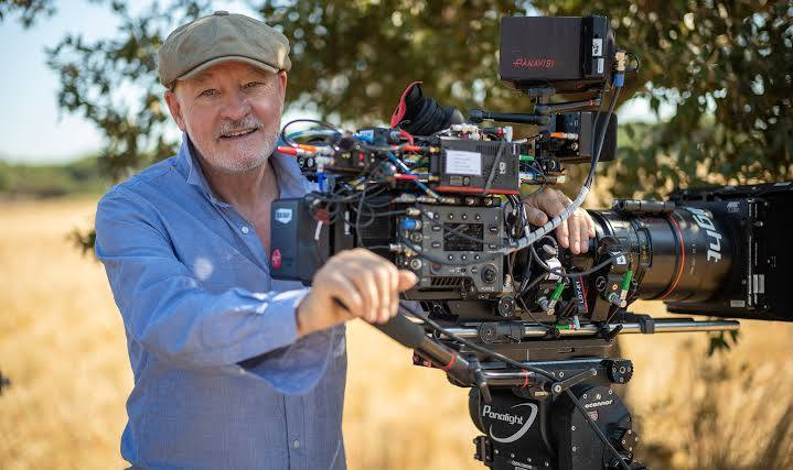
To pull this off, McKay hired Barry Ackroyd. If you know Ackroyd’s work on The Hurt Locker or the Bourne films, you know his signature: a gritty, immersive realism that feels like you’re watching a war zone. Ackroyd doesn’t do “polly-dolly” moves or sterile crane shots. He’s a master of the handheld aesthetic, favoring a reactive, journalistic approach. He treats the camera not as an observer, but as an embedded reporter in the middle of a collapsing economy. By choosing a DP who thrives on imperfection, McKay ensured the film would feel organic and unvarnished the exact opposite of a polished “studio” production.
Technical Aspects & Tools
The Big Short (2015) — Technical Specifications
| Genre | Comedy, Drama, Finance, History, Biopic, Political, Business, Docudrama |
| Director | Adam McKay |
| Cinematographer | Barry Ackroyd |
| Production Designer | Clayton Hartley |
| Costume Designer | Susan Matheson |
| Editor | Brent White |
| Colorist | Stephen Nakamura |
| Time Period | 1980s |
| Aspect Ratio | 2.39 – Spherical, Super 35 |
| Format | Film – 35mm |
| Lighting | Soft light, Hard light, Side light |
| Lighting Type | Daylight, Artificial light |
| Camera | Arricam LT |
| Lens | Angenieux Optimo Zooms, Panavision Primo Primes |
| Film Stock / Resolution | 5219/7219 Vision 3 500T, 5207/7207 Vision 3 250D, 5213/7213 Vision 3 200T |
This is where the “documentary” feel gets interesting from a technical standpoint. While many modern DPs would have reached for an ARRI Alexa for a shoot this frantic, Ackroyd stayed loyal to the texture of celluloid, shooting on the Arricam LT (35mm film).
This choice is critical. Using Kodak Vision3 500T (5219) for those dingy, artificial-light office interiors provides a specific grain structure and highlight roll-off that digital sensors still struggle to emulate. The agility of the Arricam LT allowed the crew to maintain that “run-and-gun” energy without sacrificing the rich, organic feel that only 35mm stock can deliver.
Lensing and Blocking
The “look” of the film relies heavily on a specific glass choice: the Angenieux Optimo Zooms and Panavision Primo Primes. Those aggressive “crash zooms” that pull you into Steve Carell’s frustrated face? That’s the Optimo at work. In a documentary-style shoot, a zoom lens is a storytelling tool, allowing the operator to react to a character’s emotion in real-time rather than waiting for a lens change.
The blocking follows suit. It’s a reactive dance. The actors have the freedom to move naturally, and the camera has to keep up. It’s a high-wire act that makes the scenes feel alive and unscripted, perfectly mirroring the unpredictable nature of the housing bubble.
Camera Movements
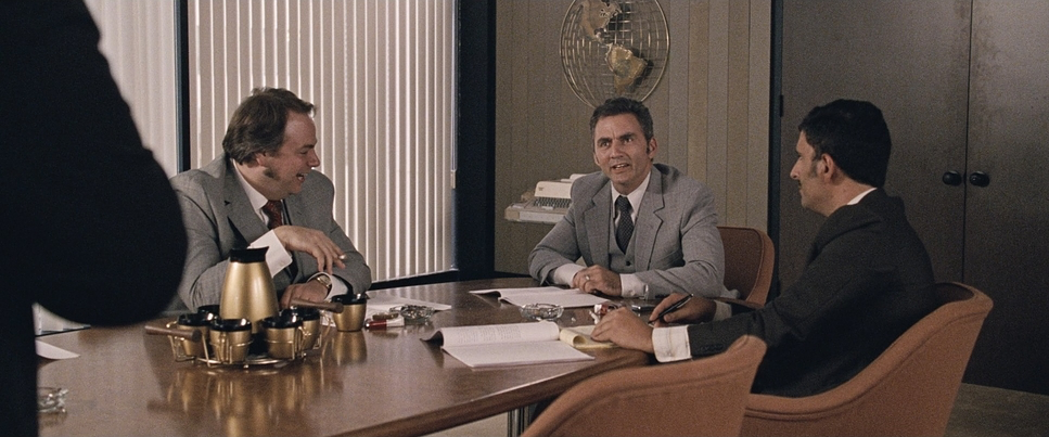
The handheld work in The Big Short is a narrative imperative. We are constantly jostled through trading floors and suburban cul-de-sacs. This isn’t just “shaky cam” for the sake of it; it’s designed to keep the audience on edge. The use of jump-cuts mid-sentence and the deliberate deconstruction of traditional flow reflect the fragmented information the characters are drowning in. It’s as if the camera itself is struggling to comprehend the financial jargon, mirroring our own confusion as viewers.
Compositional Choices
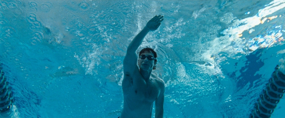
In line with the verité aesthetic, the compositions are loose. You’ll see characters slightly off-center or frames that are subtly canted to create unease. One of the most “human” touches is the use of out-of-focus actors. In a traditional film, that’s a mistake; here, it’s a choice. It emphasizes the fleeting, spontaneous nature of the moment.
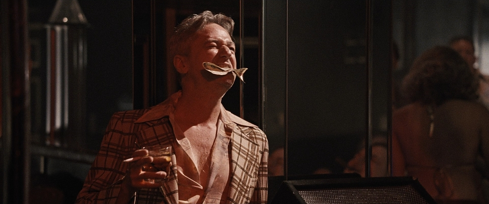
Then there are the fourth-wall breaks. When Jared Vennett (Ryan Gosling) addresses the camera, the composition shifts to a direct, intimate eye-line. It turns the audience into a confidante, pulling us into a morally ambiguous world where we are no longer just passive observers.
Lighting Style
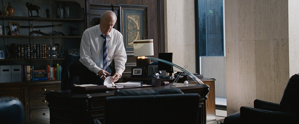
The lighting here is the antithesis of The Wolf of Wall Street. There is no “glamour” or corporate sheen. Ackroyd uses a naturalistic, verité approach mostly motivated by practical lamps or ambient daylight.
Whether it’s the sterile, depressing glow of an office or the harsh, artificial light of a Las Vegas convention, the lighting feels grounded. It strips away the allure of the “high life” and highlights the bleak reality of the impending crisis. This “grim black comedy” aesthetic is reinforced by allowing shadows to fall where they may, rather than sculpting every frame to perfection.
Color Grading Approach

Now, let’s talk about the grade. Stephen Nakamura (a powerhouse at Company 3) handled the DI, and his work here is a lesson in restraint. Given the 35mm source, the goal wasn’t to “clean up” the image, but to lean into its honesty.
As a colorist, I admire how Nakamura handled the contrast shaping. He didn’t go for the “commercial” look with crushed, deep blacks. Instead, he kept the black points slightly lifted, giving the shadows a dusty, “milky” quality that feels like a vintage film print. The hue separation is equally disciplined; the skin tones stay neutral and believable, while the environments are often desaturated cool blues for offices and muted greens for the Florida suburbs. It’s a grade that communicates gravity without resorting to visual melodrama. It’s a “print-film” sensibility that values texture over digital perfection.
Inspiration Behind the Cinematography
The core mission was to de-glamorize Wall Street. McKay wanted to reject the slick aesthetic of Oliver Stone’s Wall Street and instead create something that felt like “Scorsese on steroids.” The “purposefully crappy” camerawork is a stroke of genius. By presenting the world through a lens that is always searching and sometimes out of focus, McKay and Ackroyd mirror the central theme: the financial world was unhinged, and only a few “misfits” could see the truth through the blur.
- Also read: BIG HERO 6 (2014) – CINEMATOGRAPHY ANALYSIS
- Also read: LITTLE MISS SUNSHINE (2006) – CINEMATOGRAPHY ANALYSIS
Browse Our Cinematography Analysis Glossary
Explore directors, cinematographers, cameras, lenses, lighting styles, genres, and the visual techniques that shape iconic films.
Explore Glossary →