The Best Years of Our Lives (1946), a film like this a genuine post-World War II masterpiece doesn’t just tell a story; it shows it with an honesty that still resonates decades later. For me, that honesty comes right down to the lens, the light, and the way every frame is sculpted. This isn’t just a “classic” it’s a masterclass in how visual language can elevate human drama, even (and perhaps especially) in black and white.
When I look at The Best Years of Our Lives, I don’t see an antique from 1946. I see a blueprint. It has that raw, almost documentary-like feel, yet it’s polished with an invisible craftsmanship that we rarely see anymore. It makes you feel. It makes you understand. That’s the magic of the craft.
About the Cinematographer
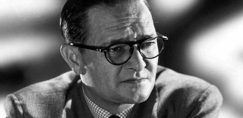
The man behind the camera, responsible for crafting this visual tapestry, was the legendary Gregg Toland. When William Wyler set out to capture the raw mood of a nation after the Second World War, he needed a partner who prioritized truth over “glamour.” Toland was precisely that a visionary who was constantly breaking the tools to see what they could actually do.
Toland wasn’t just a technician; he was an artist who understood that light and shadow could speak louder than dialogue. Coming off his iconic collaboration on Citizen Kane, he used this film to solidify his reputation for innovative deep-focus cinematography. He wasn’t interested in “pretty” pictures for their own sake. He was interested in creating a window into the souls of these men. He embedded meaning into the very grain of the image.
Inspiration Behind the Cinematography
The core inspiration here stems from Wyler’s obsession with realism. The film isn’t about glorifying war; it’s about the brutal, often mundane, reality of coming home. Wyler understood what drives people, what tortures them, and what heals them, and he wanted that shown in a frank, unvarnished way.
This directorial ethos demanded a visual approach that was similarly “naked.” Wyler even had the actors buy their clothes off the rack. Think about that no custom tailoring, no studio artifice. The cinematography had to follow suit by stripping away the “Hollywood glow.” It wasn’t about making things look “cinematic” in a showy way; it was about making them look real.
This commitment extended to the casting of Harold Russell, a non-professional actor and actual amputee. His portrayal of Homer, a veteran who lost his hands, forced the camera to be a sympathetic observer rather than a detached spectator. We aren’t watching a performance; we are experiencing a day-to-day routine.
Camera Movements
The camera work here is a masterclass in “less is more.” You won’t find flashy handheld work or gratuitous crane shots. Instead, Wyler and Toland employ a restrained elegance.
I was watching a breakdown recently that pointed out the subtle back-and-forth dollying shots moving in and out from the actors almost imperceptibly. It’s not movement for movement’s sake; it’s a breath. It’s a gentle ebb and flow that mimics how we actually observe people in a room. When the camera moves, it feels organic, like a silent participant shifting its gaze to follow the emotional temperature of a scene. These shots often serve as a quiet embrace pushing in as a character grapples with a revelation, or pulling back to show their isolation. It’s invisible craftsmanship. That’s something I always strive for in my own work: let the emotion guide the lens, not the other way around.
Compositional Choices
This is where Toland’s genius and his use of deep focus really shines. The compositions here were revolutionary. Instead of relying on shallow depth of field to “cheat” the audience’s attention to a specific character, Toland keeps multiple planes of action in sharp focus.
This isn’t just a technical flex; it’s a narrative choice. By keeping the background as sharp as the foreground, Toland creates a visual density that mirrors the complex lives of these veterans. We see a character in the mid-ground, but we’re simultaneously observing a crucial detail in the deep background. It forces you to actively scan the frame, emphasizing that these men aren’t isolated; their struggles are part of a massive, shared societal experience.
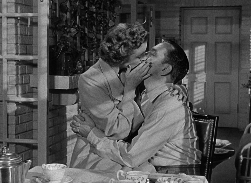
Take the famed “powder room full of mirrors” scene. You think you’re looking at them straight on, but you’re actually seeing their reflection in a vanity. It’s a sophisticated use of depth cues that suggests the internal reflection of the characters themselves. The fact that they pulled off these “one-take” shots without ever catching the camera in the glass is a testament to the meticulous staging. It’s “simply complicated” framing that invites you into the moment without ever pulling you out of it.
Lighting Style
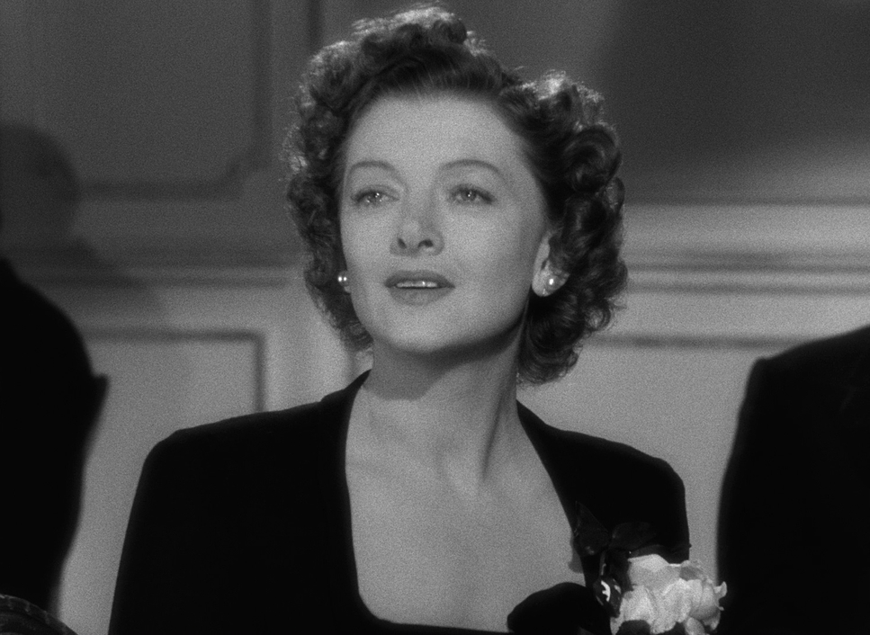
The lighting is a masterclass in motivated realism. In B&W, light is your color palette; it dictates texture and emotional weight. Toland’s approach wasn’t about making the stars look beautiful; it was about sculpting form.
You’ll see deep, rich shadows contrasting with carefully shaped highlights. These shadows often envelope the characters, hinting at PTSD or the uncertainty of their new lives. When Fred Derry is struggling, the lighting reflects that density. It’s not about even illumination; it’s about pockets of light that guide the eye.
The key lights are usually soft but directional, suggesting practical sources like a window or a desk lamp. This makes the interiors feel lived-in and the exteriors like that famous airport tarmac shot feel grounded. As a colorist, I love how Toland managed the dynamic range here. The blacks have true depth, and the whites “breathe” without blowing out. He’s creating three-dimensionality without the help of a single hue.
Lensing and Blocking
Lensing and blocking are the “secret sauce” of this film. Toland’s preference for wide-angle lenses was the only way to achieve that deep-focus aesthetic. But doing this in 1946 was a nightmare it required massive amounts of light and stopping the lens down to its smallest aperture (f/11 or f/16) just to keep the background sharp.
Because of these wide lenses, Wyler could block actors in complex, multi-layered arrangements. Instead of the standard “ping-pong” editing of close-ups, he’d place characters at different distances. You see one person reacting in the background while a conversation happens in the foreground. It lets the scenes play out naturally, just like they do in real life. It’s a courageous way to direct because it puts immense trust in the actors and the power of the unbroken moment.
Color Grading Approach (Monochromatic Tonal Sculpting)
If I were grading this today on a modern DaVinci Resolve setup, I wouldn’t call it “color grading” I’d call it “tonal sculpting.” My goal would be to honor Toland’s original intent while leveraging the precision of digital tools.
- Contrast Shaping: I’d be looking at how contrast creates separation. I’d manipulate the curves to ensure the deep shadows retain texture (no “crushed” blacks) and that the highlight roll-off is buttery smooth. That “roll-off” is everything it’s the difference between a digital look and a filmic look.
- Tonal Density: Each shade of gray needs a job. I’d focus on ensuring skin tones, fabrics, and backgrounds sit in distinct luminance ranges. For example, Homer’s hooks should have a specific metallic reflectivity a “ping” in the highlights that separates them visually from the matte fabric of his suit.
- Film Grain & Texture: Modern digital captures are often too “clean.” To keep the soul of the 1940s, I’d likely reintroduce a subtle film grain emulation. It’s about making the digital representation feel true to its celluloid origins.
Technical Aspects & Tools
The Best Years of Our Lives (1946) — Technical Specs
| Genre | Drama, Romance, War |
| Director | William Wyler |
| Cinematographer | Gregg Toland |
| Production Designer | Perry Ferguson, George Jenkins |
| Costume Designer | Irene Sharaff |
| Editor | Daniel Mandell |
| Time Period | 1940s |
| Color | Desaturated, Black and White |
| Aspect Ratio | 1.37 – Spherical |
| Lighting | Hard light, Top light |
| Lighting Type | Daylight, Sunny |
| Story Location | North America > United States of America |
| Filming Location | Long Beach > Long Beach Airport |
It’s easy to forget how “analog” this all was. What they achieved with 1946 technology is honestly staggering.
- Cameras & Glass: They were likely using Mitchell BNCs heavy, studio workhorses. The lenses were custom-ground, high-speed glass for the time.
- The Light Problem: Because Toland was stopping down his aperture so far to get that deep focus, he needed an insane amount of light. We’re talking massive, hot arc lamps and incandescent fixtures that would make a modern set feel like an oven.
- Film Stock: They were likely on Kodak Double-X or a similar medium-speed stock. These didn’t have the “low light” capabilities we take for granted today. Every shadow you see was a deliberate, hard-fought choice in exposure and lab processing.
- Also read: FREE SOLO (2018) – CINEMATOGRAPHY ANALYSIS
- Also read: THE GENERAL (1926) – CINEMATOGRAPHY ANALYSIS
Browse Our Cinematography Analysis Glossary
Explore directors, cinematographers, cameras, lenses, lighting styles, genres, and the visual techniques that shape iconic films.
Explore Glossary →