When I first heard another Batman movie was coming out, I rolled my eyes. We’ve seen the origin story, the gadgets, and the cape so many times that it felt like there was nowhere left to go. But then I actually sat down and watched it and then I watched it again. As someone who spends my life staring at scopes and tweaking curves, The Batman (2022) didn’t just grab me, it completely shifted my perspective on what you can actually do with a superhero “blockbuster.”
This isn’t your typical mass-produced, visually sterile comic book movie. It’s a moody, visceral piece of filmmaking that feels like it belongs in a different era. Even Roger Deakins a man whose work on Blade Runner 2049 is basically my personal textbook called the cinematography some of the best in recent years. And in our industry, when Deakins gives a nod like that, you pay attention. You get the point.
About the Cinematographer

The look of this film is the work of Greig Fraser. If you’re a DP or a colorist, his filmography is basically a wish list: Lion, Zero Dark Thirty, Rogue One, and Dune. Fraser has this incredible knack for building visual worlds that feel lived-in and textured, even when he’s working inside a massive franchise.
What I love about Fraser’s work here is that he isn’t just trying to make “pretty pictures.” He’s building a visual language. He understands that cinematography is about more than just exposure; it’s about guiding the viewer’s eye and forcing them to feel the grit of the environment. His collaboration with director Matt Reeves feels totally symbiotic. You can tell they weren’t interested in playing it safe; they wanted to push the format and make something that feels truly cinematic in the classical sense.
Inspiration Behind the Cinematography
Matt Reeves was pretty open about his influences, and Fraser clearly ran with them. The goal was a detective story rooted in the “film noir” tradition, mixed with the meticulous, unsettling vibe of David Fincher movies like Seven.
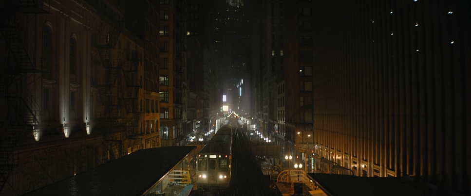
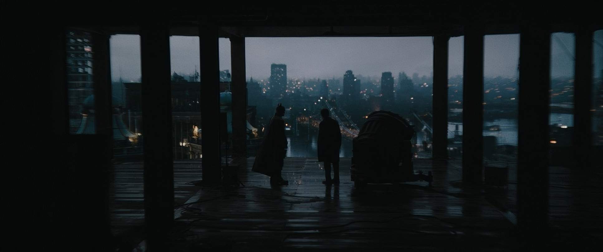
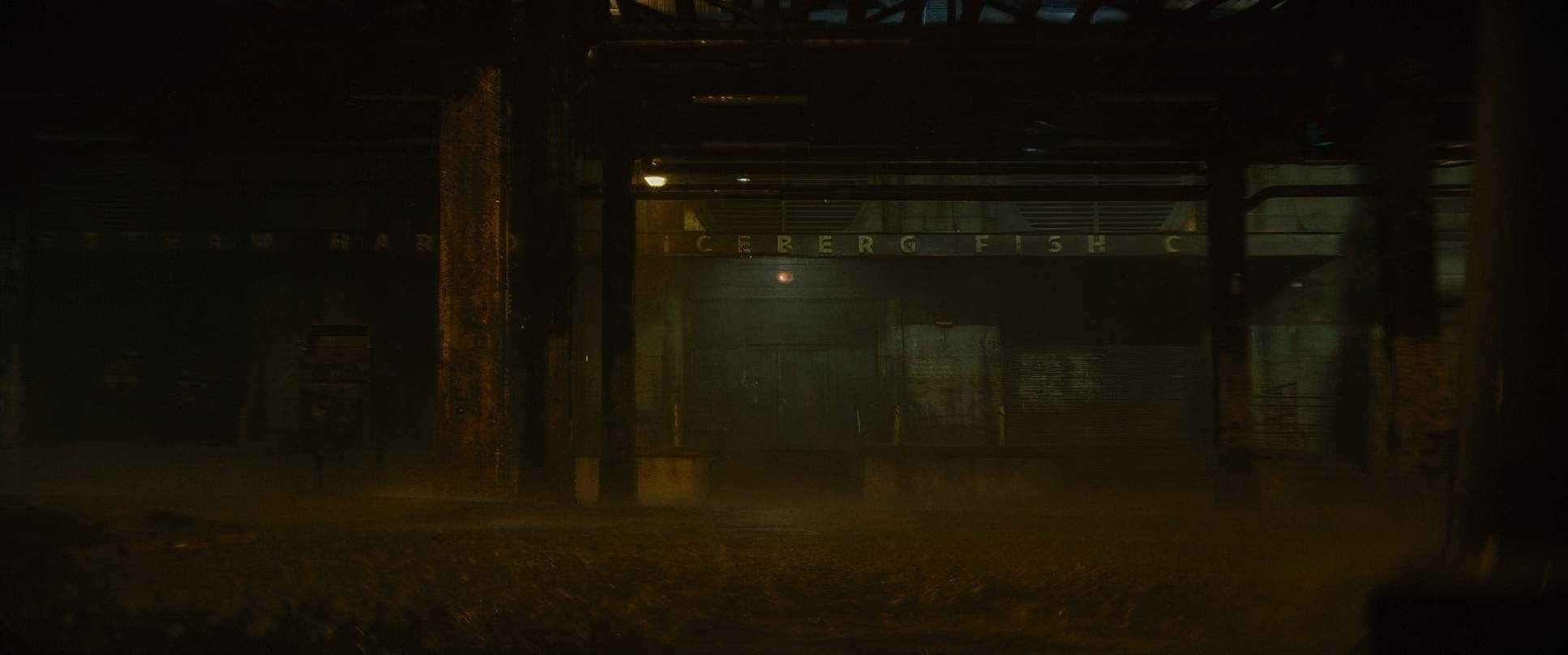
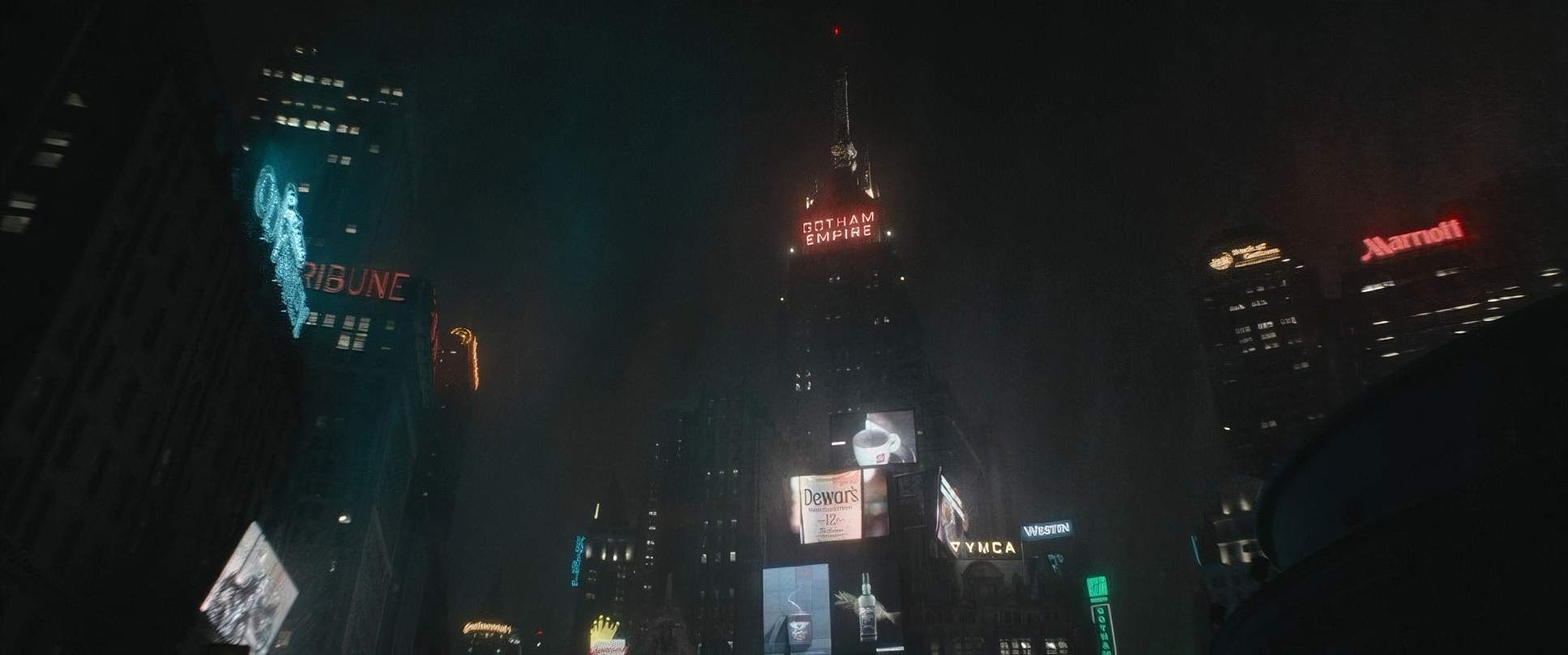
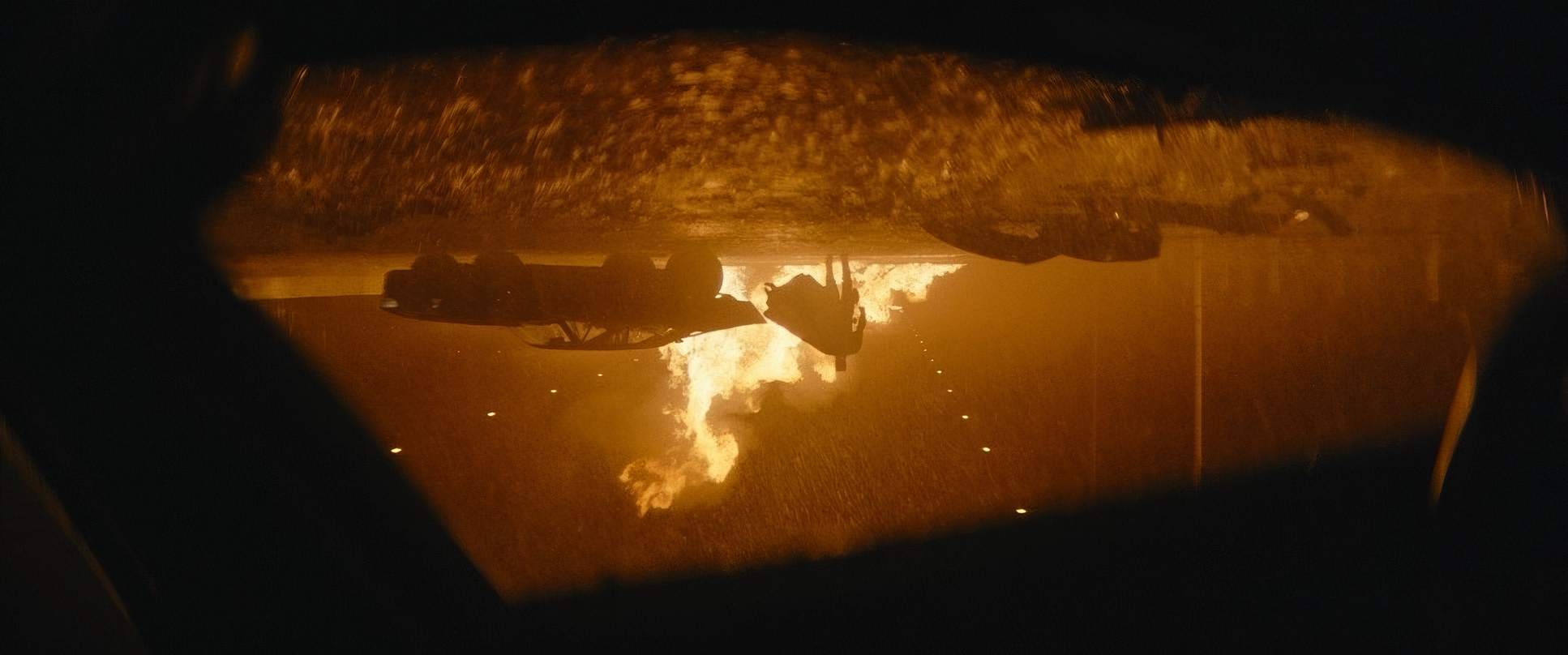
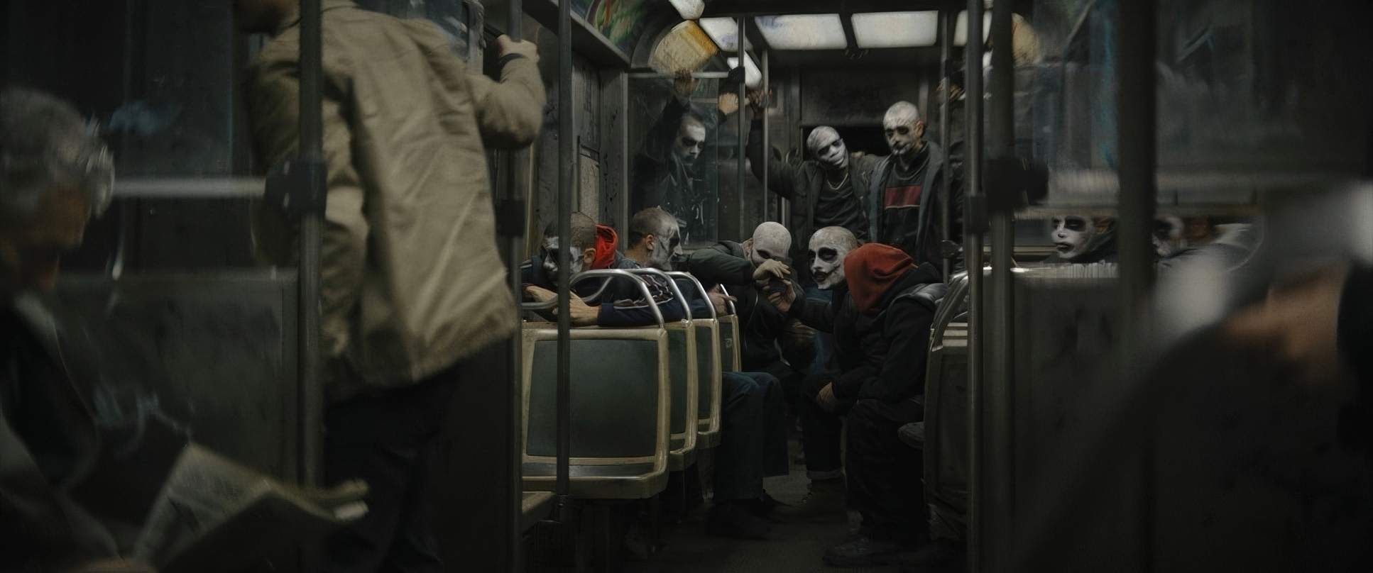
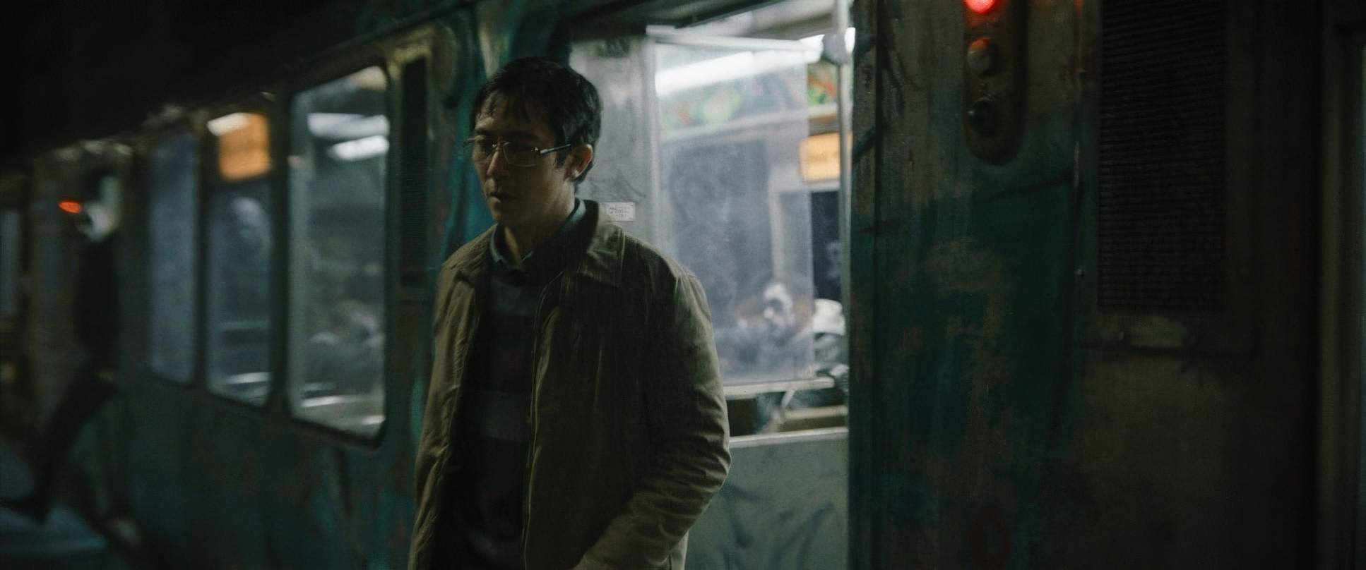
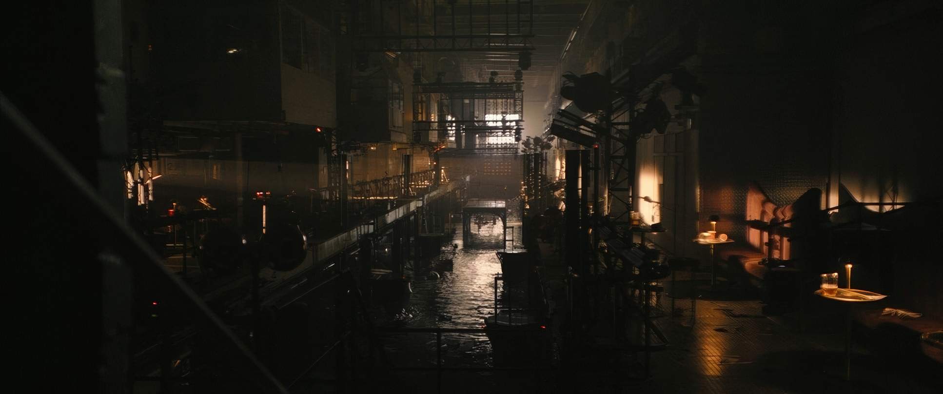
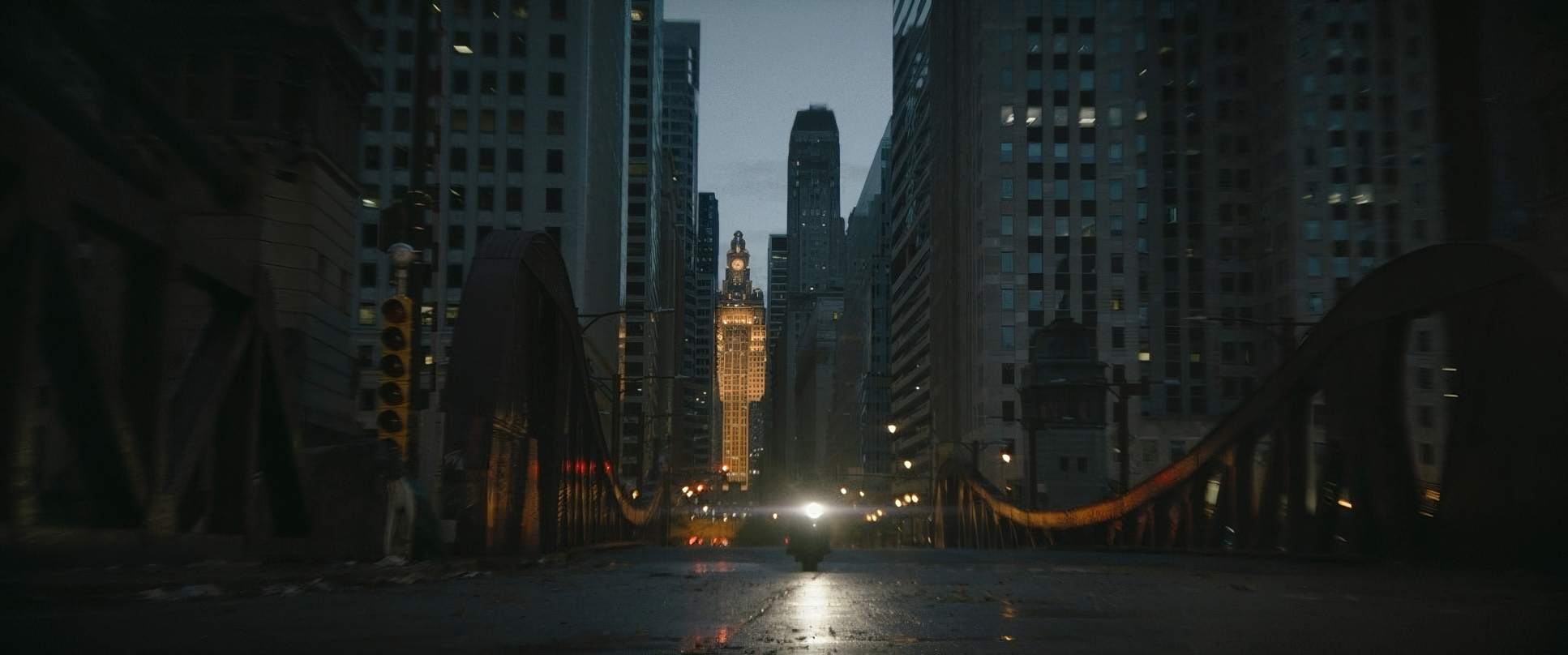
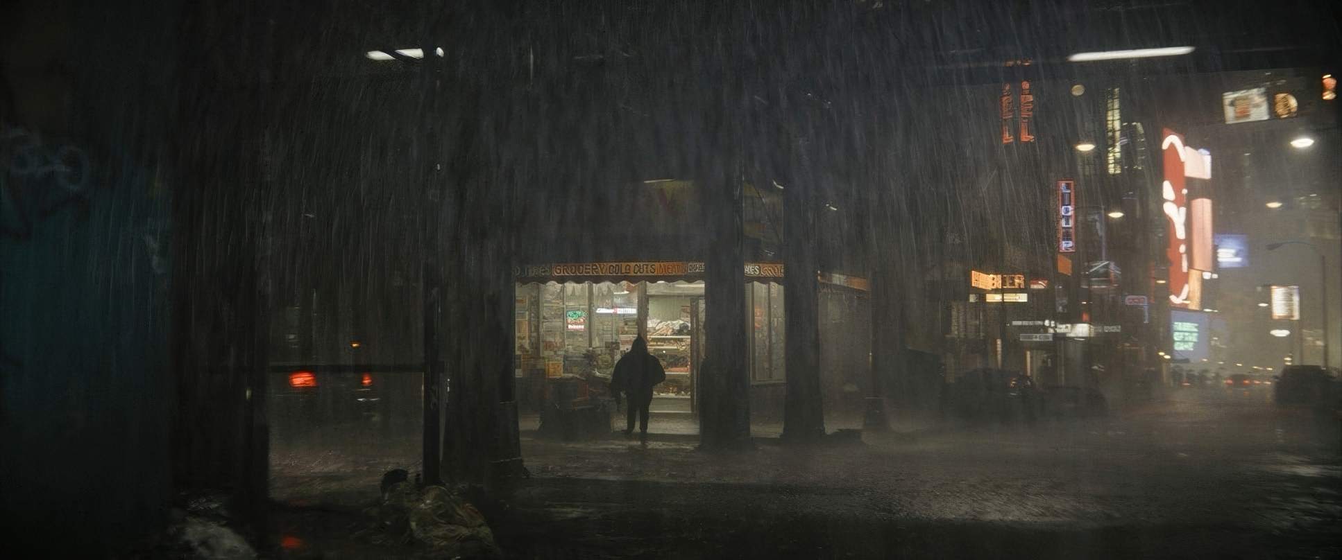
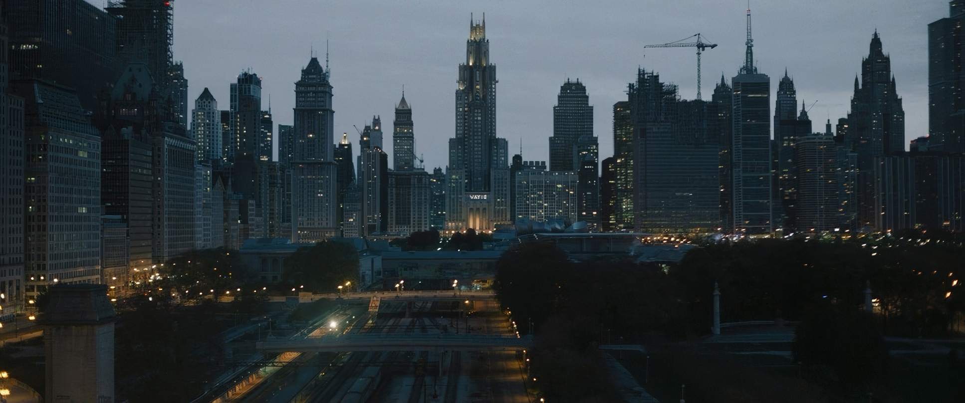
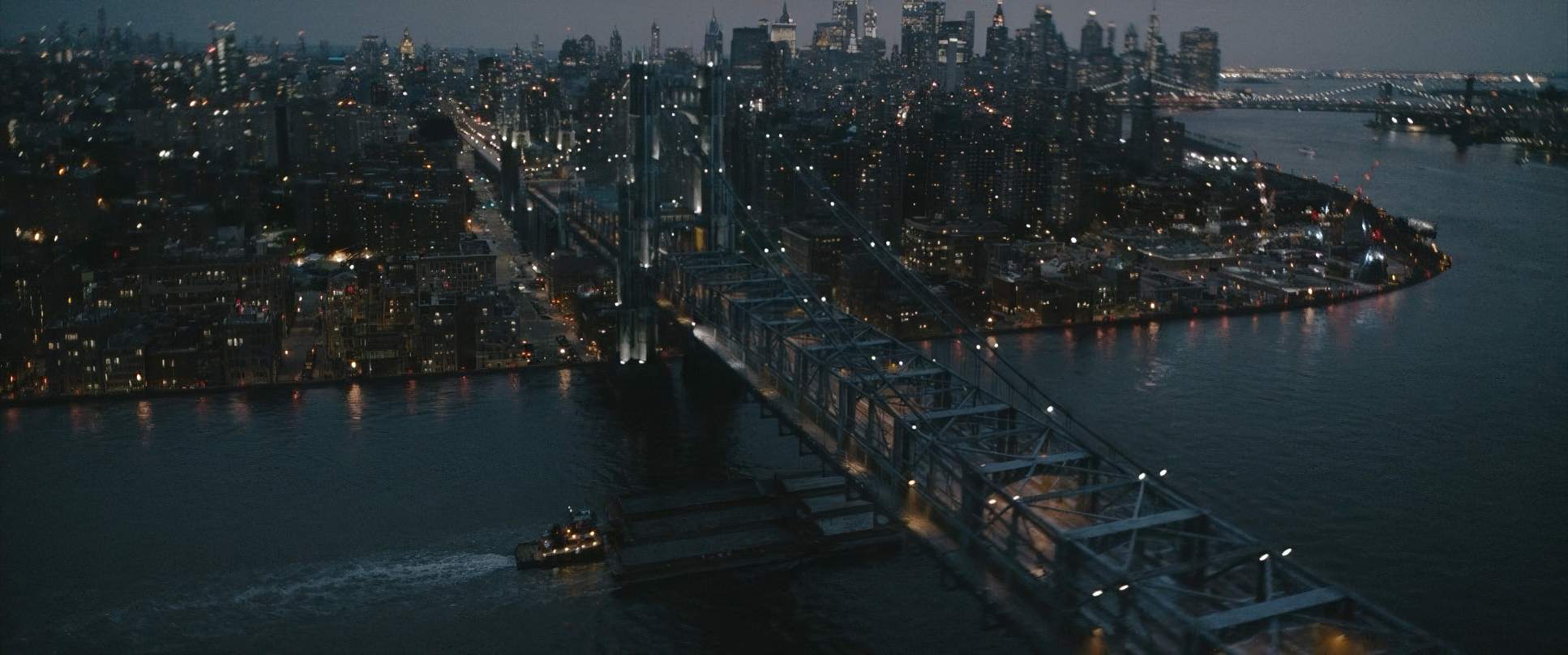
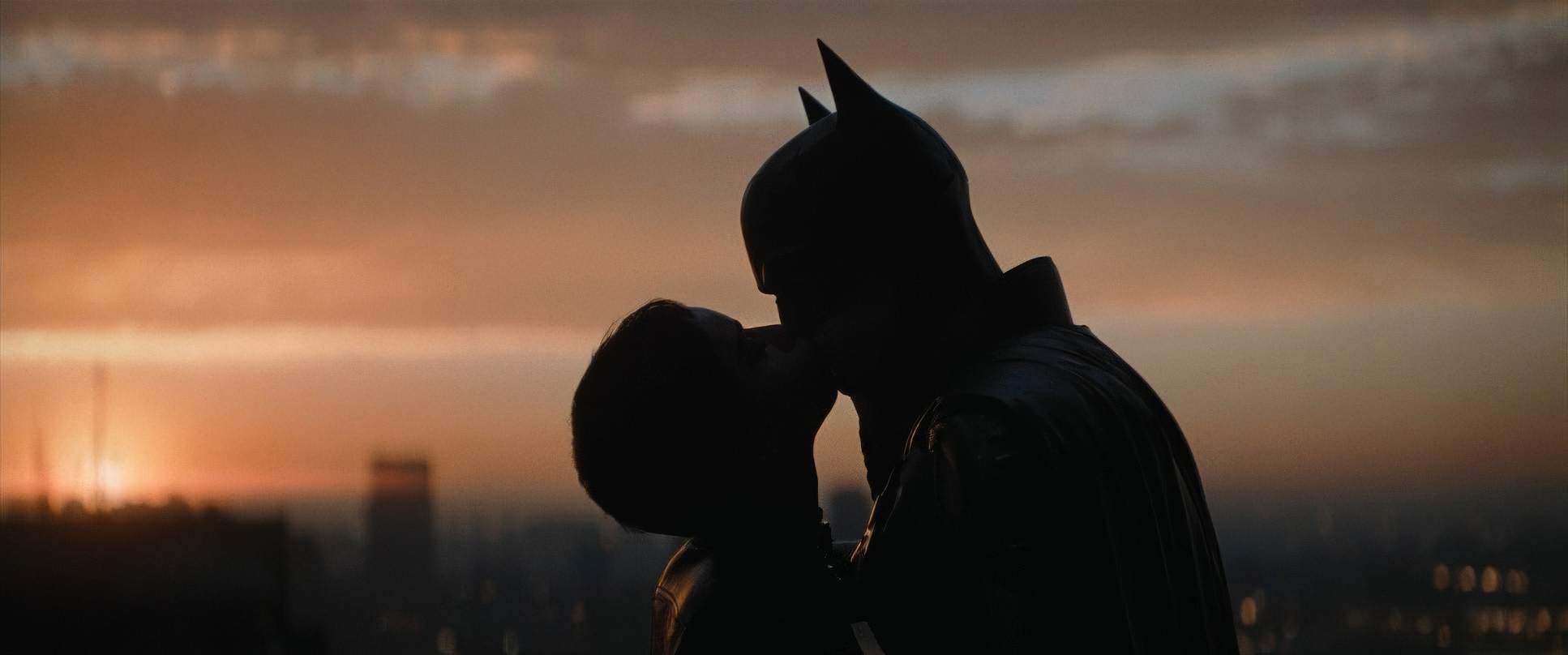
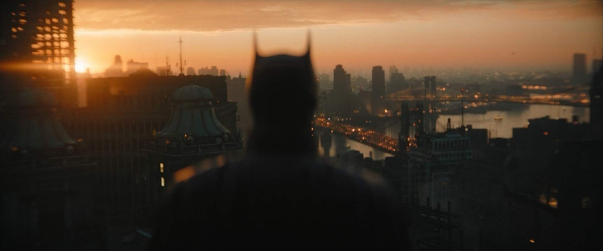
But noir is more than just turning the lights off. It’s a psychological state fractured light, heavy shadows, and a sense of dread. Their version of Gotham isn’t the shiny, generic city we usually see. It feels like 1970s New York mixed with the neon pulse of London or Tokyo. It’s a city that’s “eating itself.” You see the rain-slicked towers in the distance and the decaying ruins of the city’s “renewal” projects in the foreground. That visual weight makes Batman’s presence feel like a desperate necessity rather than a choice. It’s a world where justice is a faint whisper against a constant roar of despair.
Lighting Style

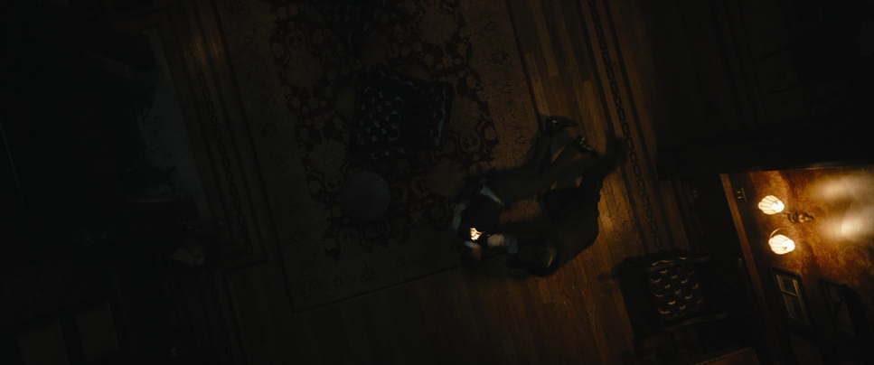
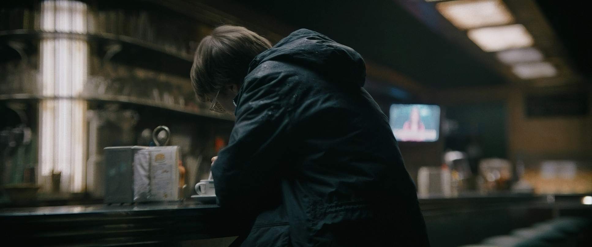
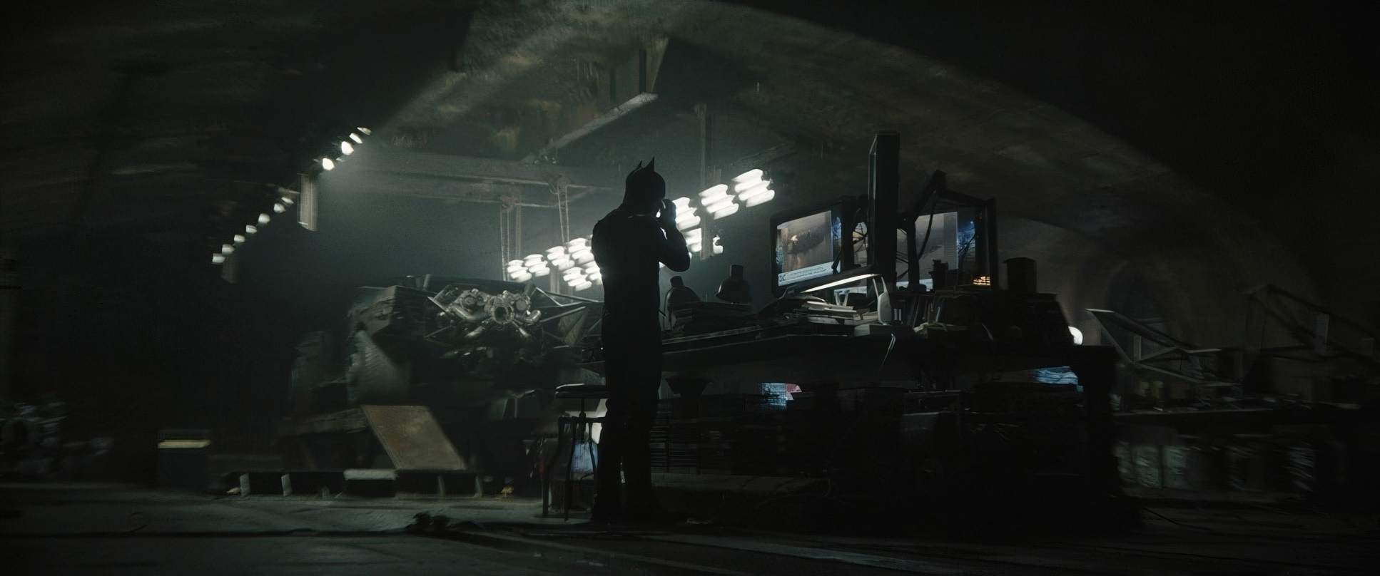
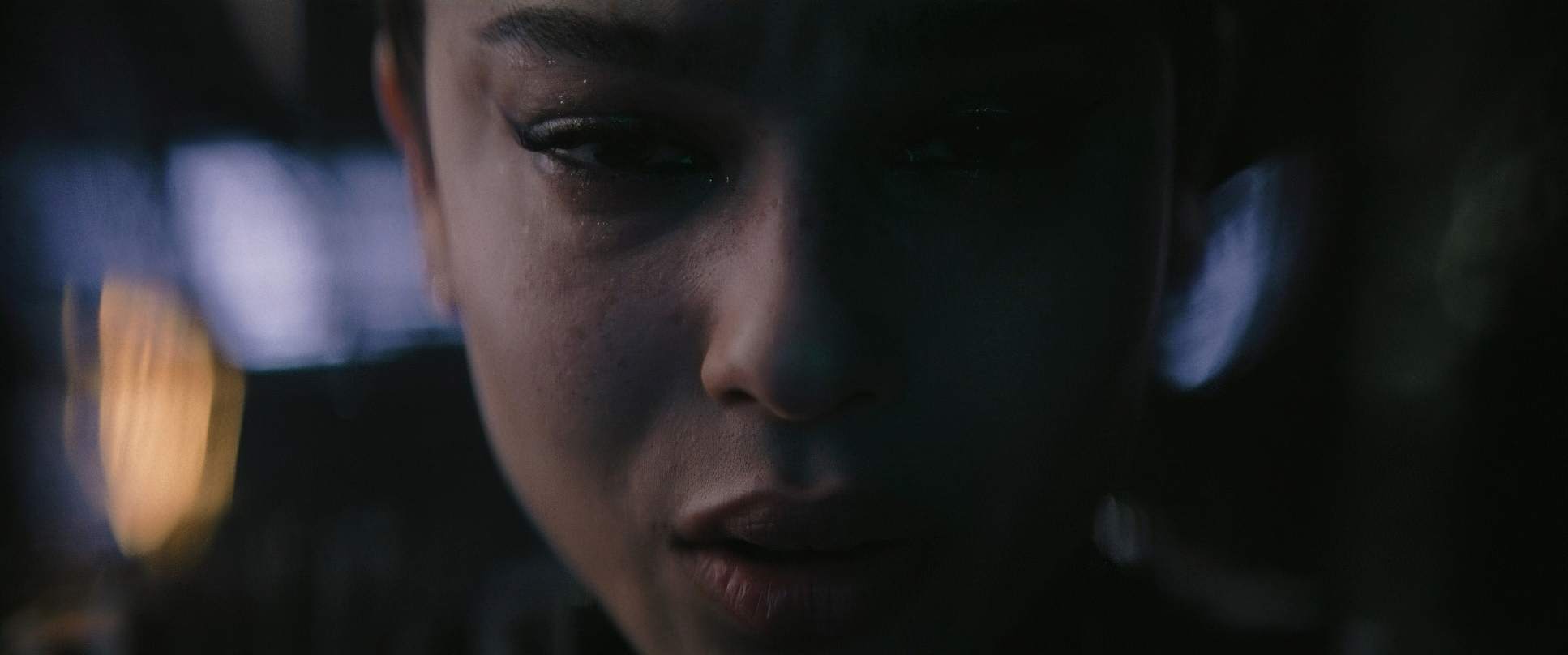
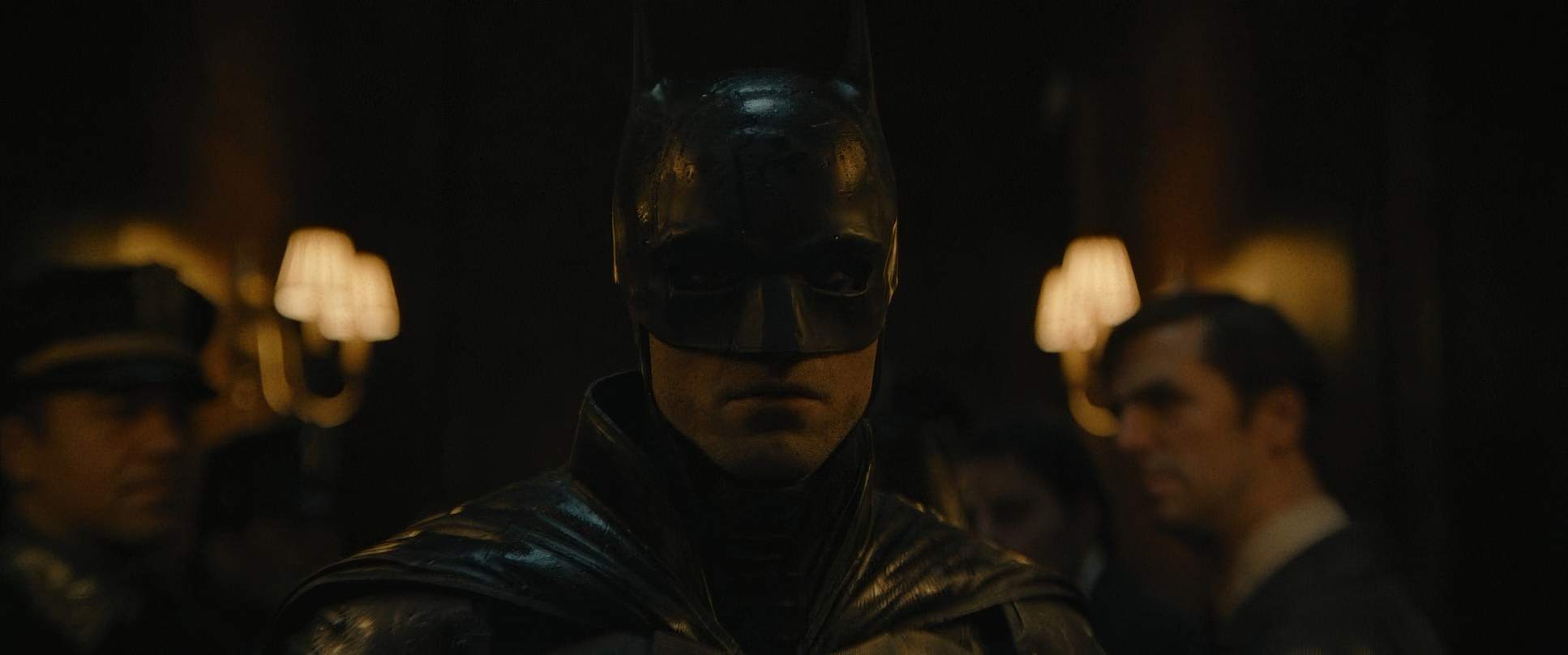
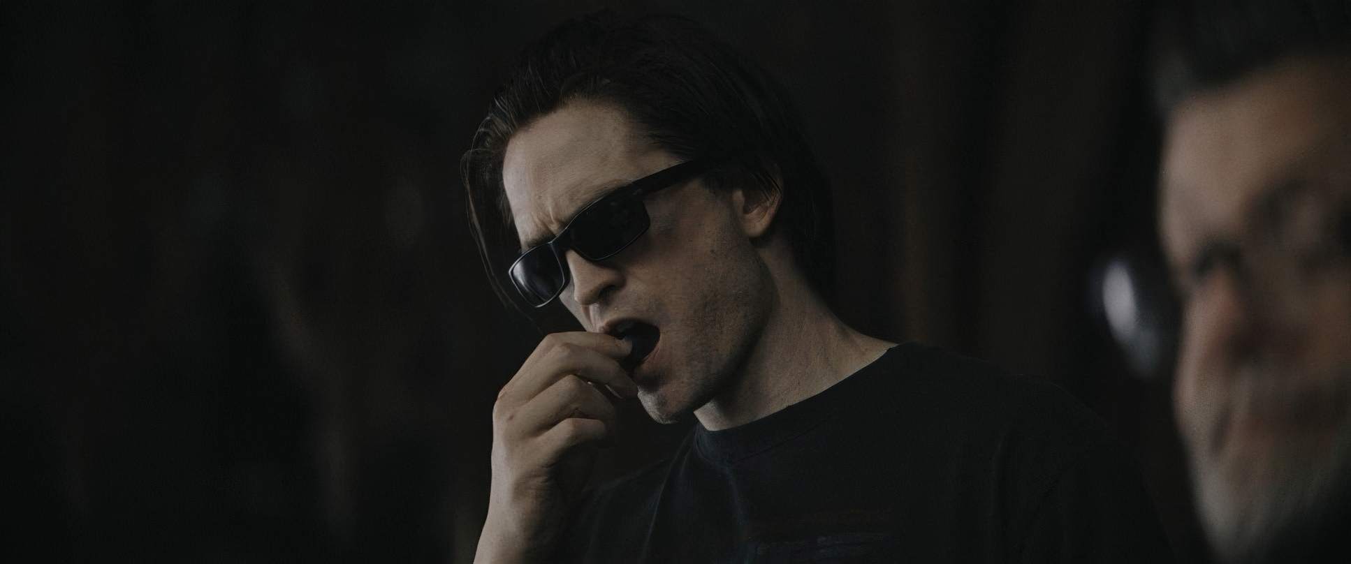
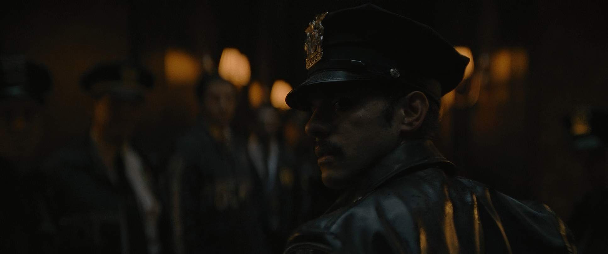
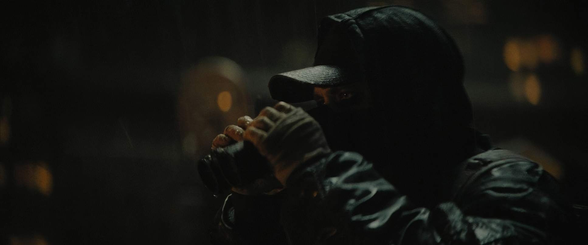
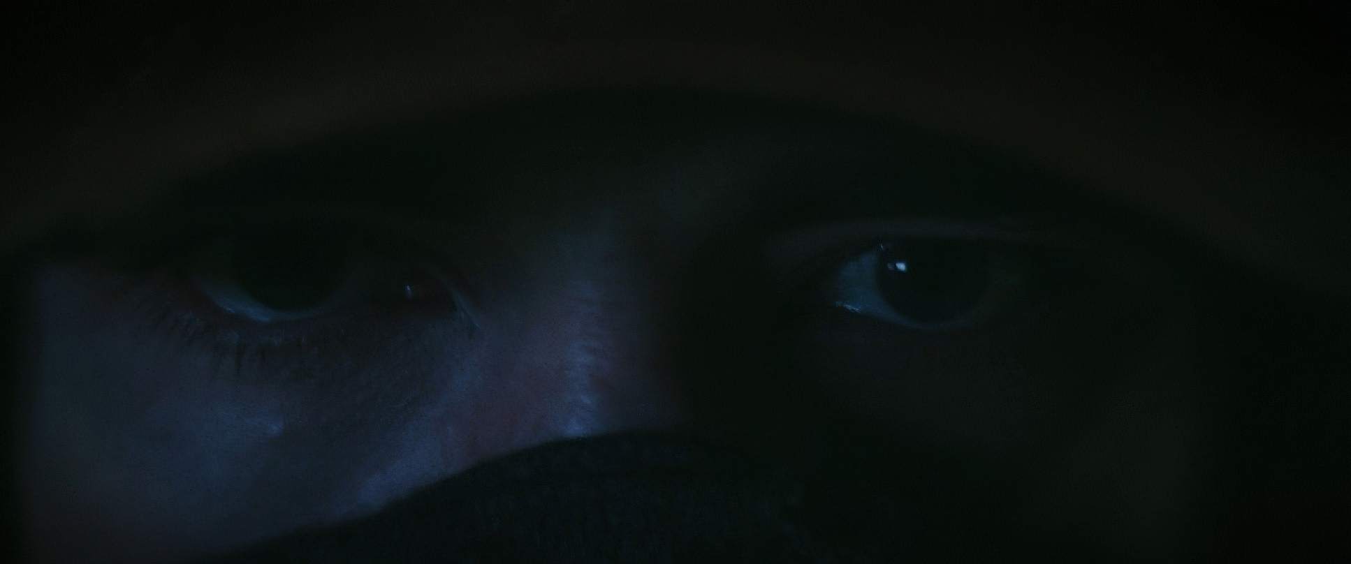
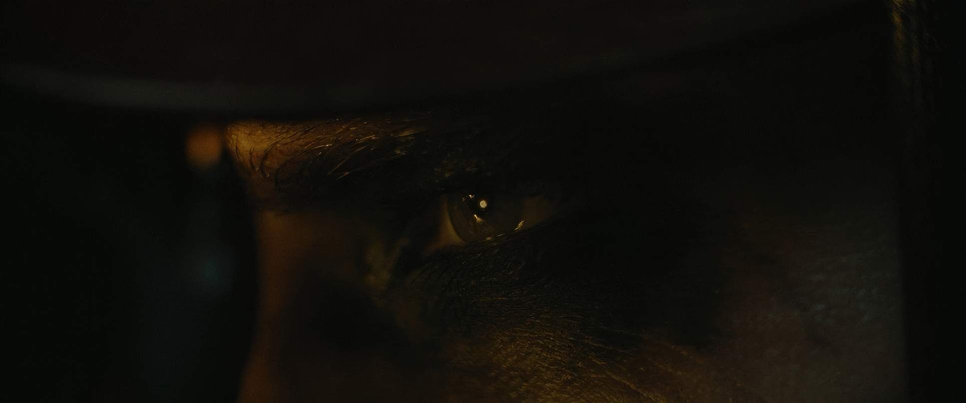
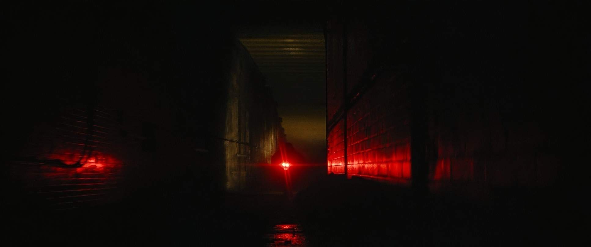
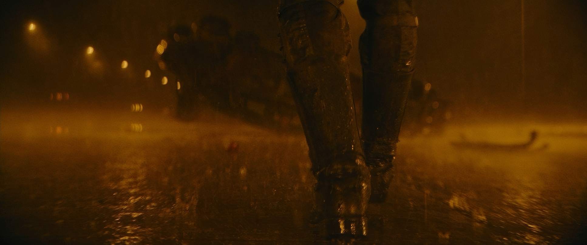
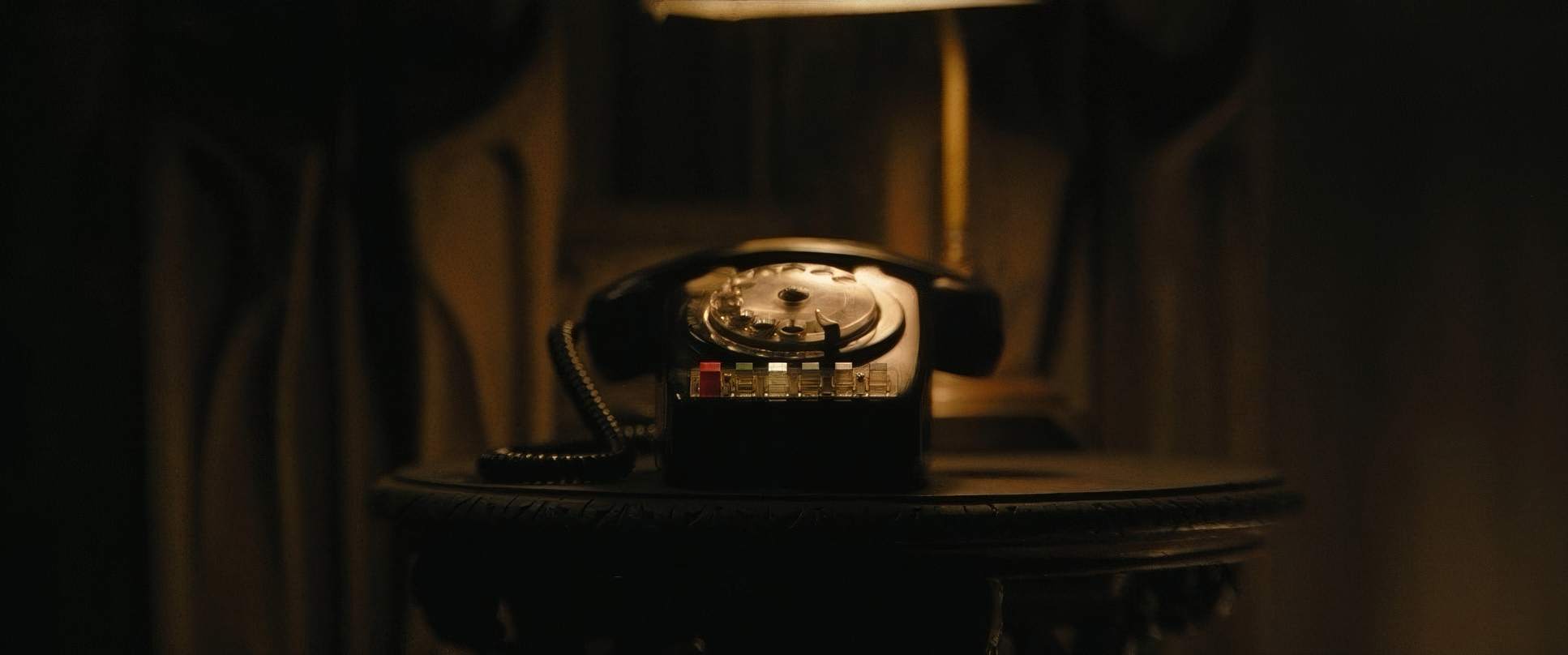
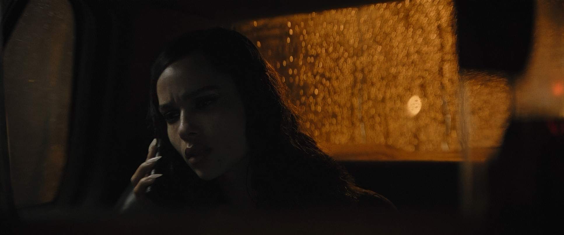
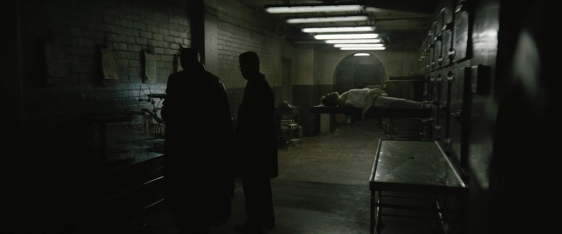
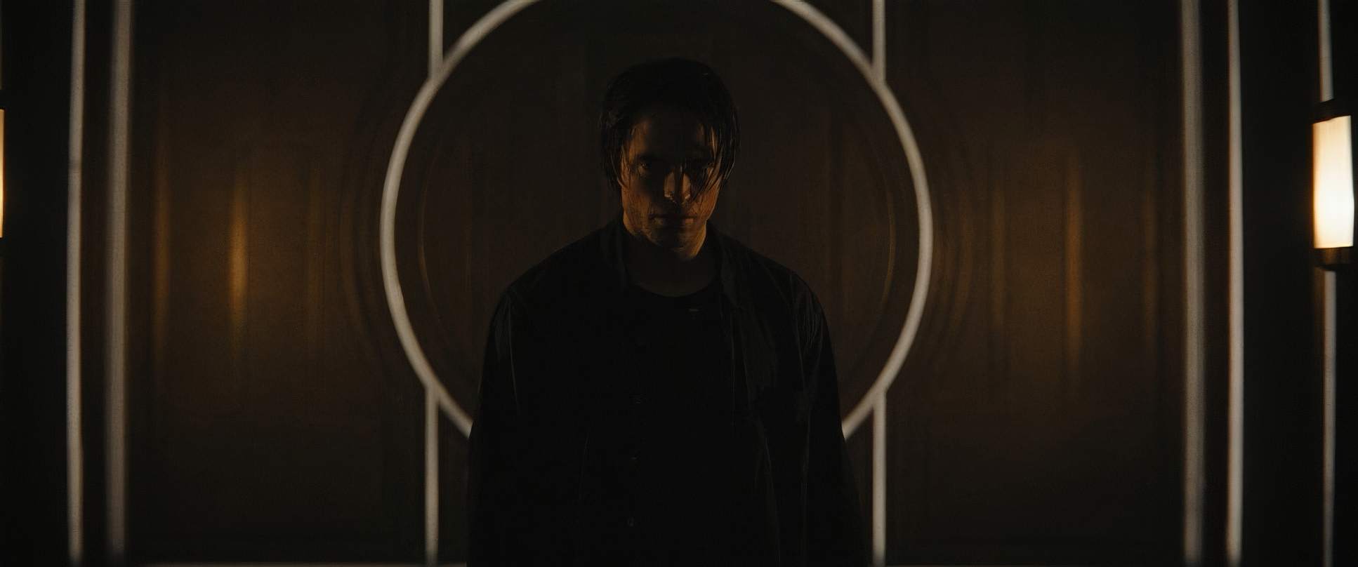
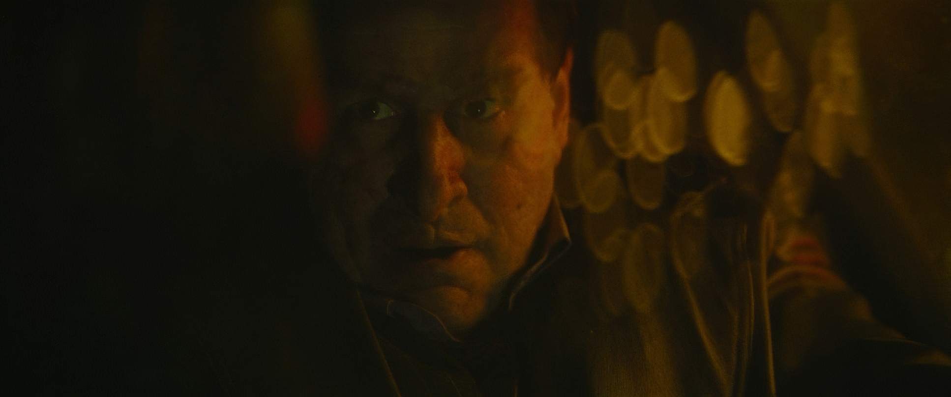
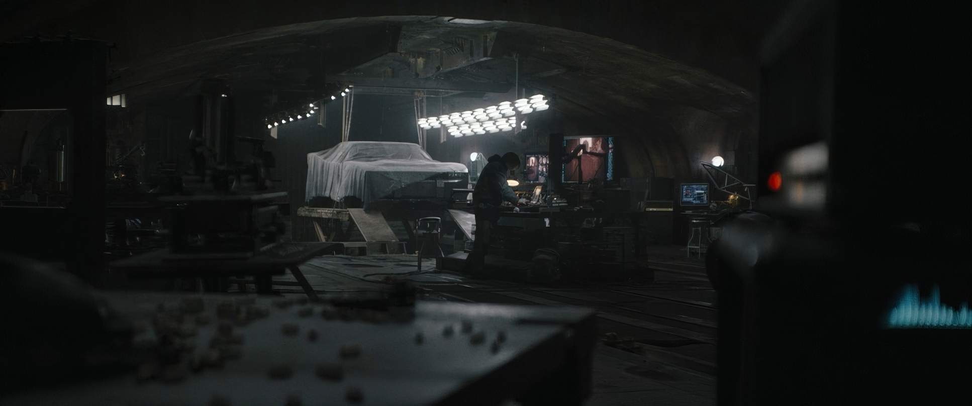
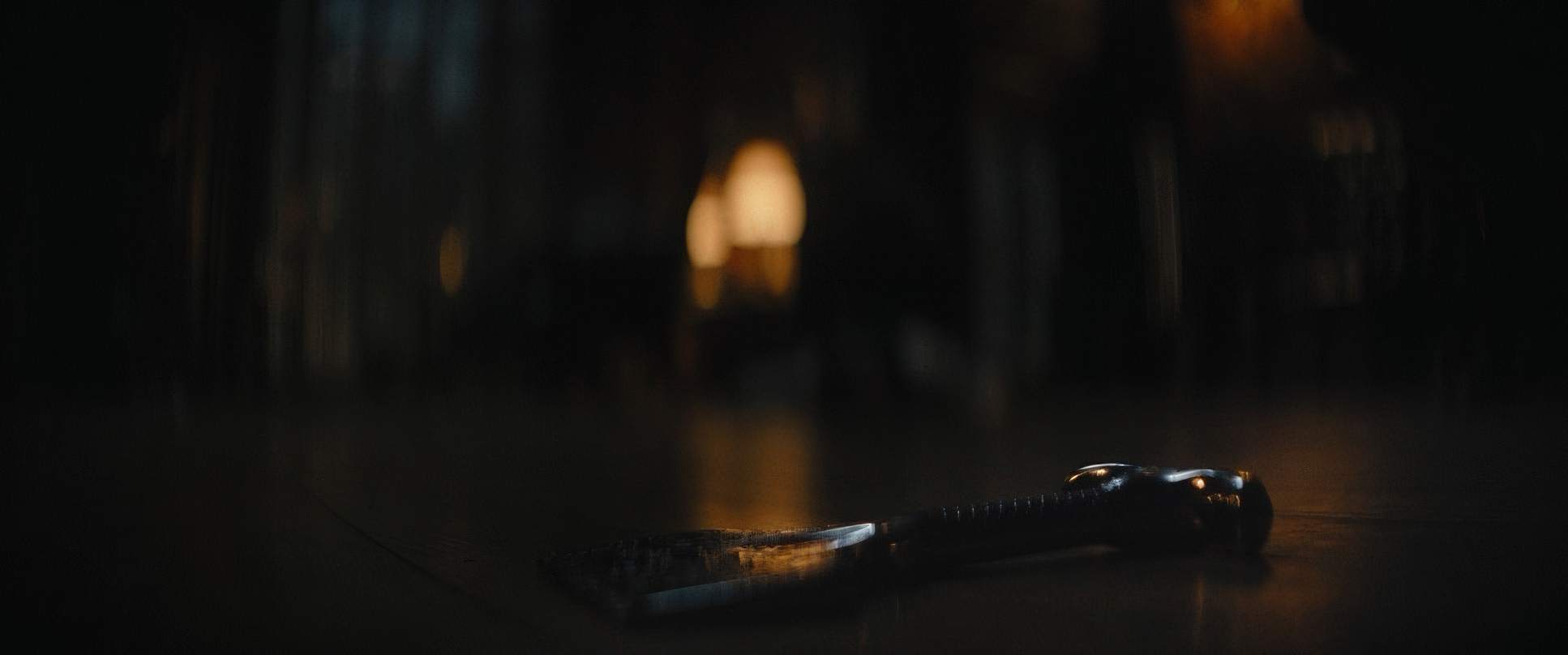
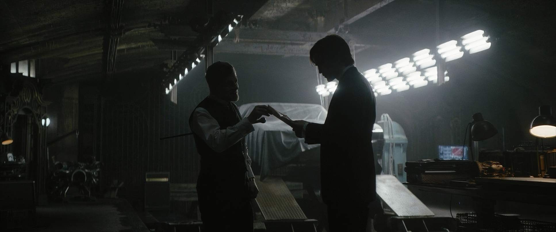
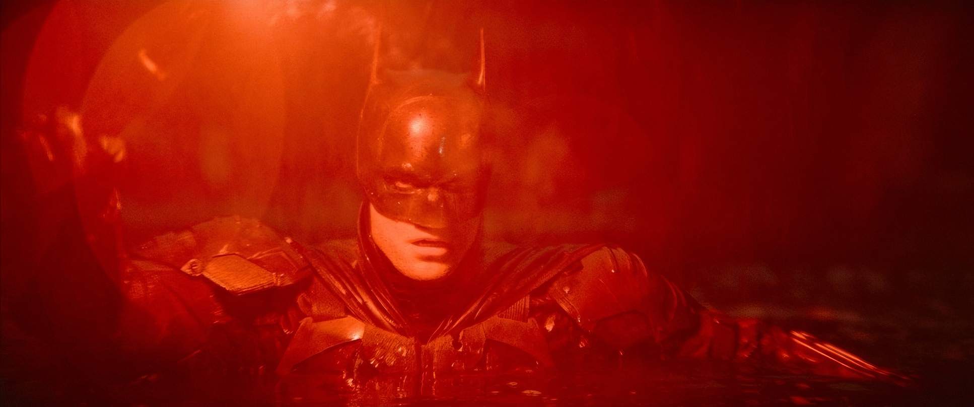
Now, let’s talk about the light. It’s dark really dark. But as a colorist, I can tell you this isn’t just “underexposed” footage. It’s an incredibly intentional use of Chiaroscuro the dramatic contrast between light and dark to create volume.
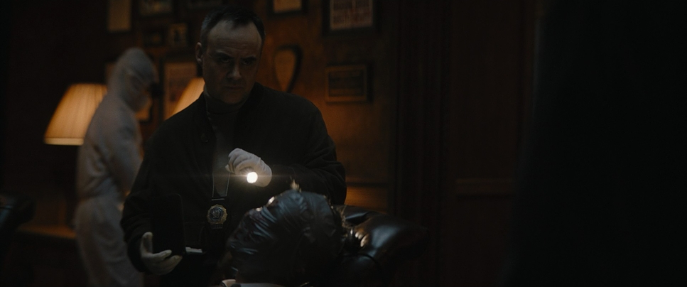
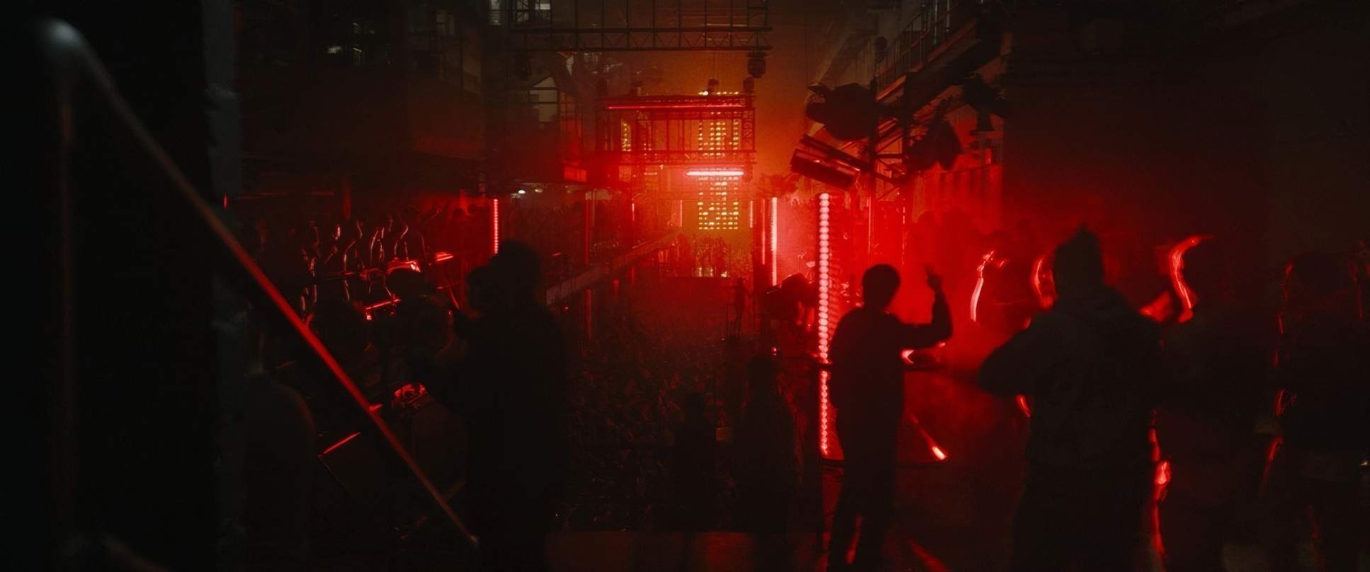
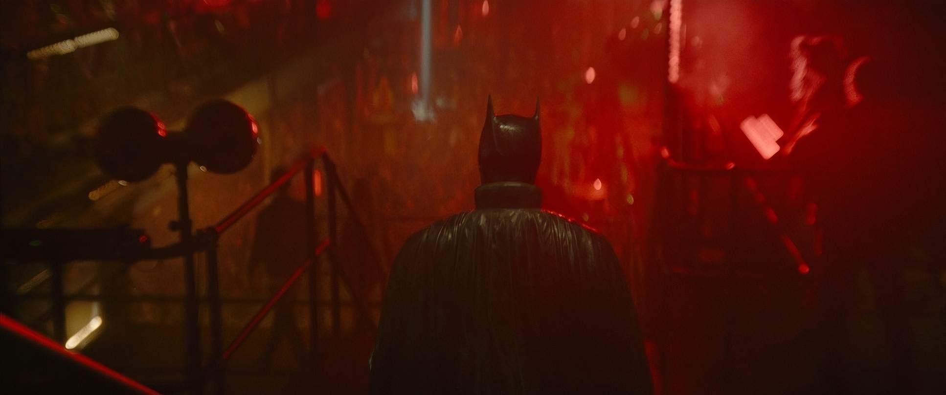
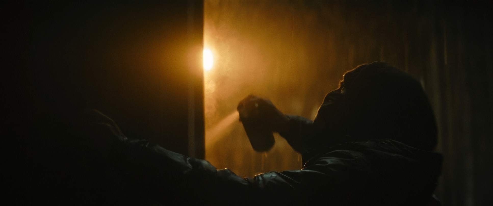
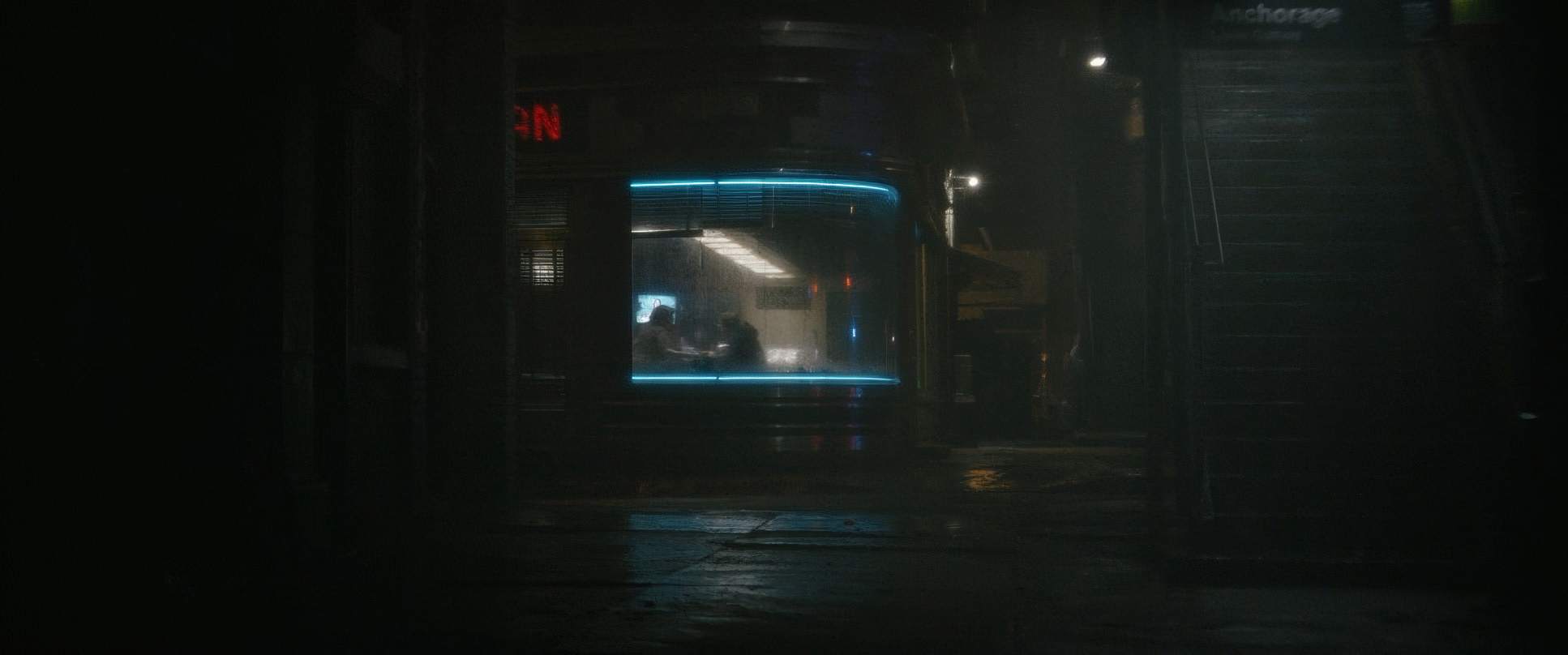
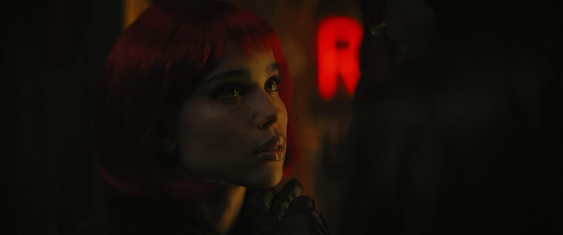
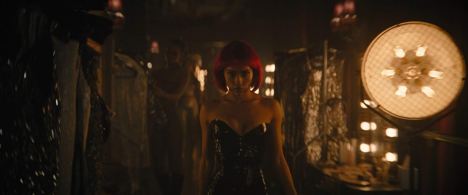
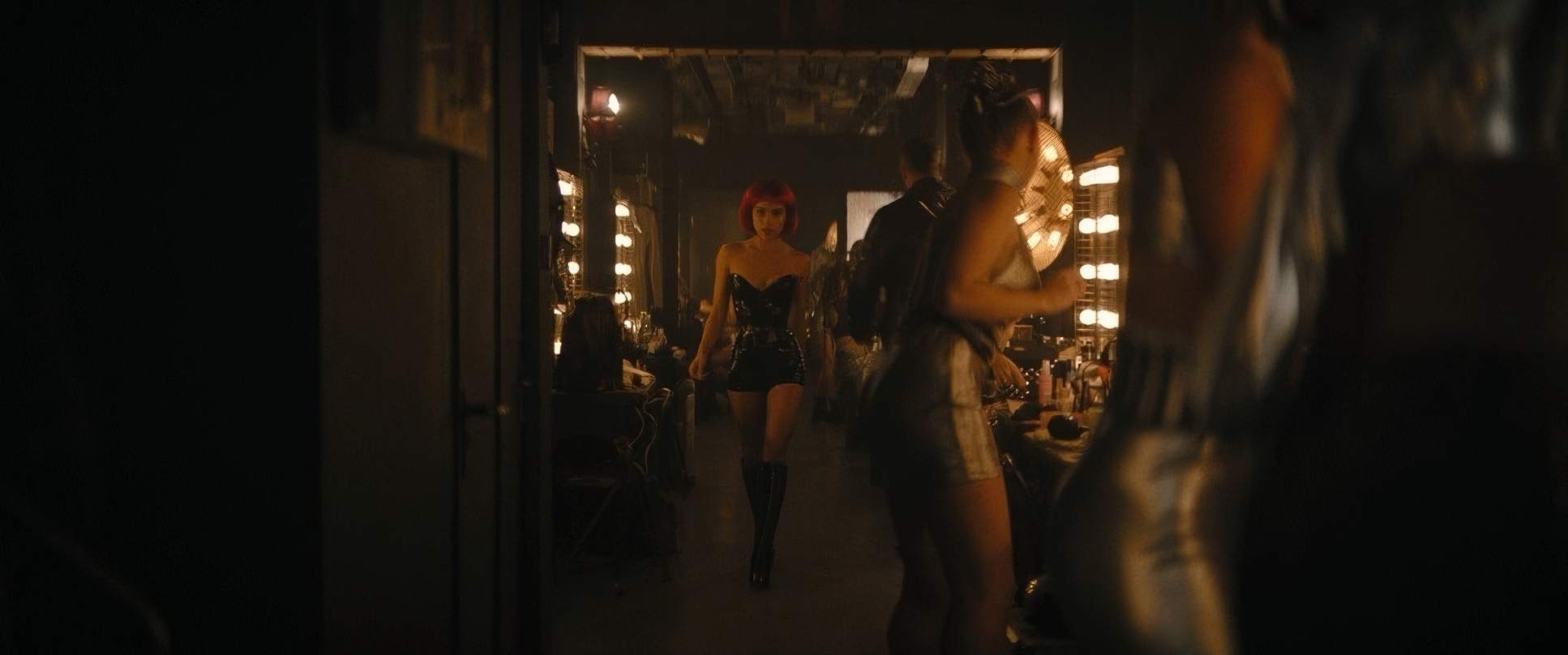
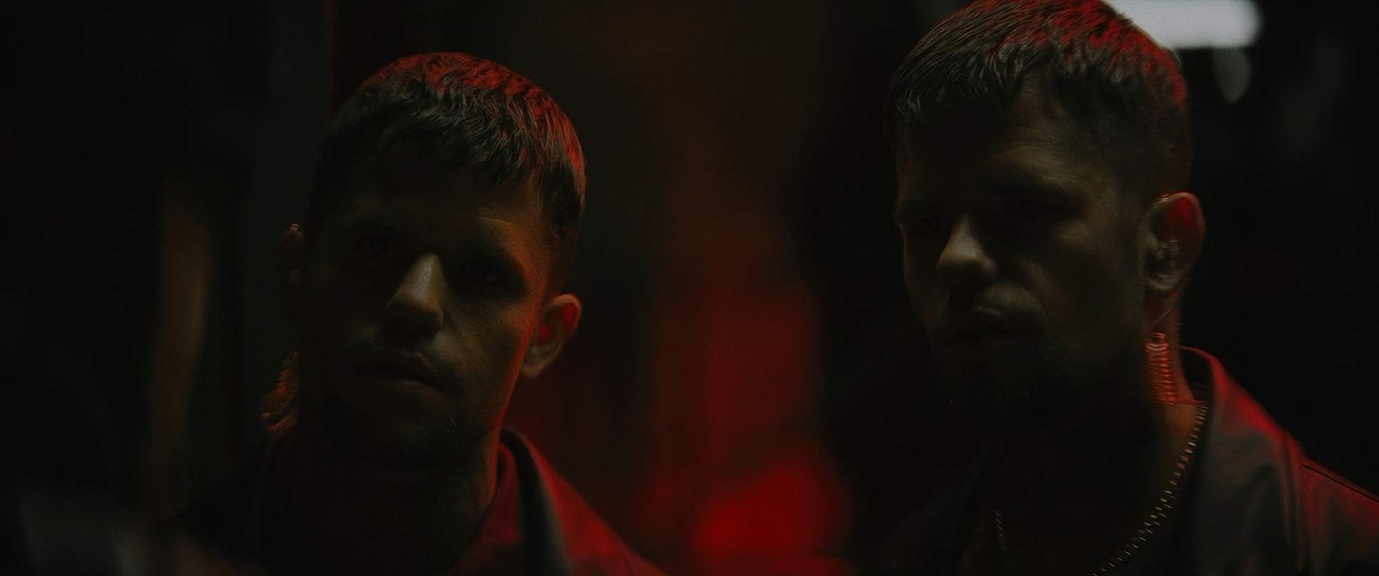
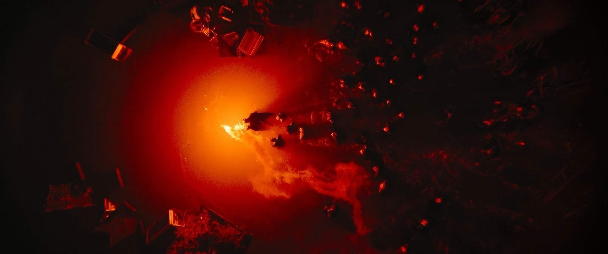
Technically, the light sources are often quite soft, but they are positioned to create sharp, aggressive shadows. It’s all motivated by the environment: the harsh glare of a streetlamp, the flickering light of an interrogation room, or the sickly red and green neon of the city’s underbelly. They use “practical” lights things actually in the scene and then exaggerate them to stretch shadows across the frame.
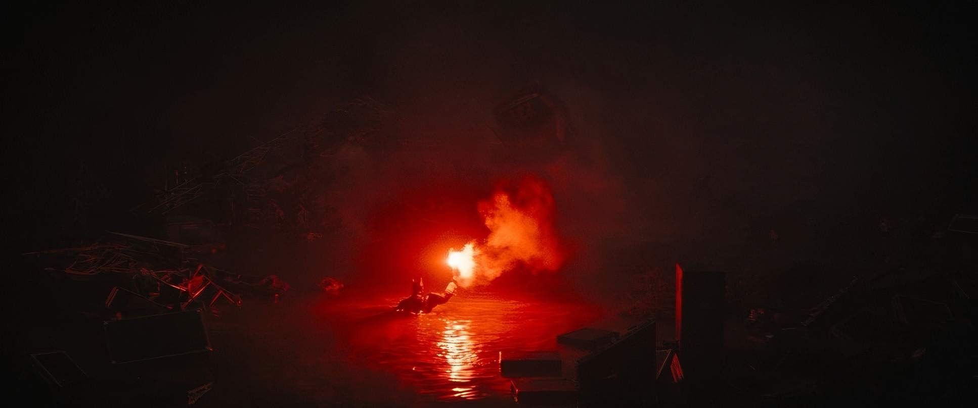
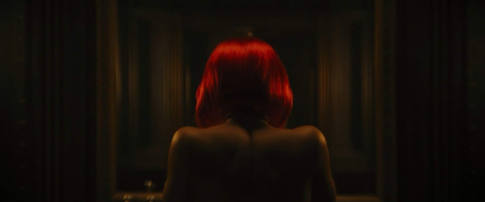
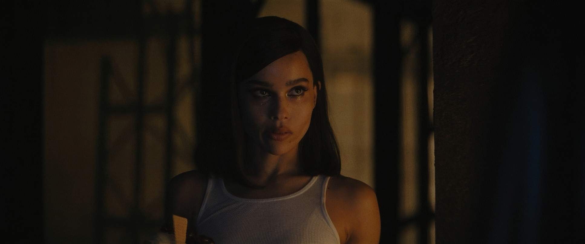
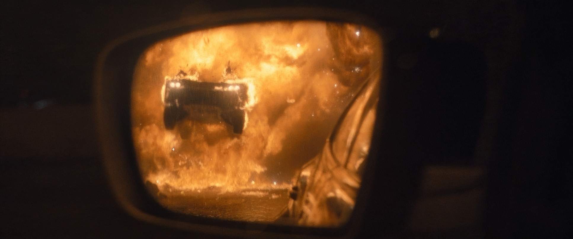
Even in the darkness, they use color to “pronounce” an emotion. The Batcave has this cool, surgical blue that feels isolated and analytical. Then you have these pops of fiery, saturated red the Bat-signal, the Batmobile’s exhaust, or the flare in the hallway. These reds are primal. They symbolize rage and danger, and because the rest of the film is so desaturated, they hit like a punch to the gut.
Lensing and Blocking
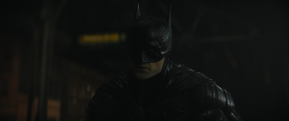
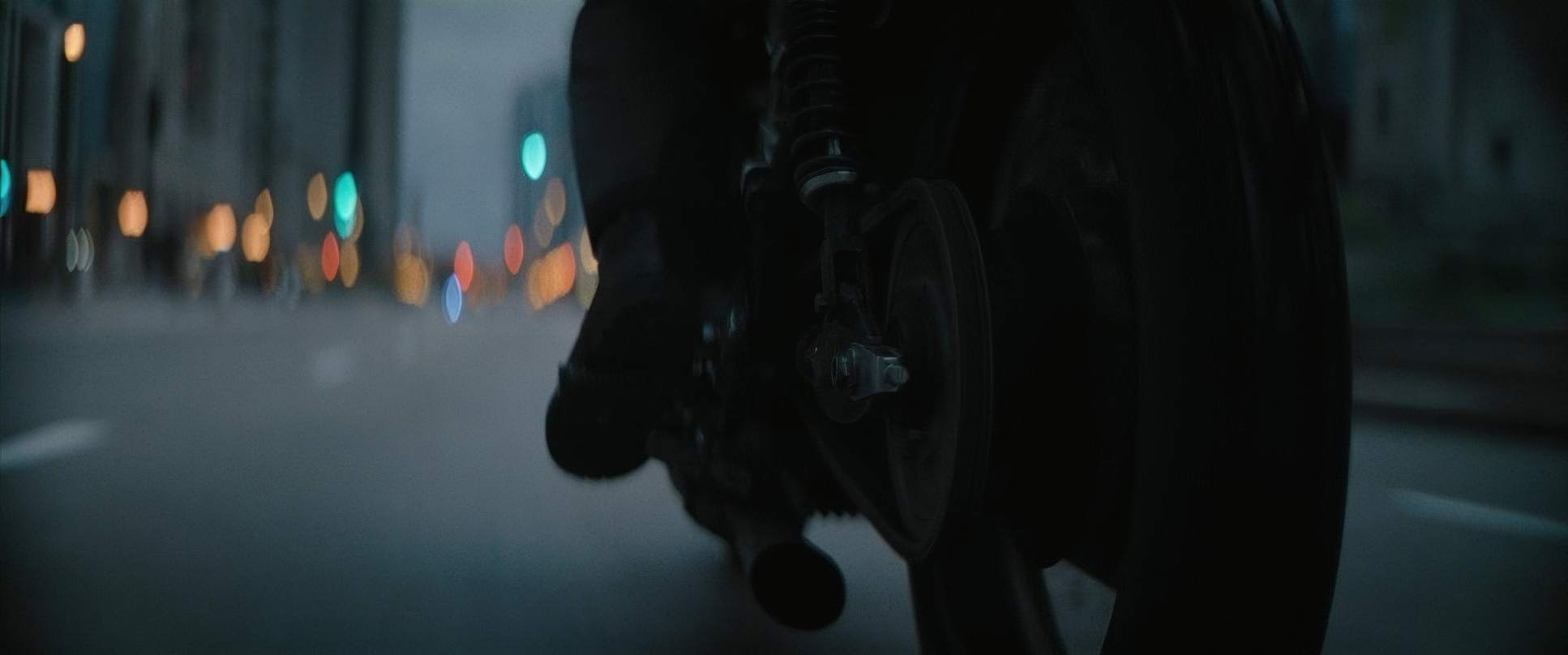
The choice of glass here is a huge part of the “look.” Fraser went with Arri ALFA anamorphic lenses. If you look at the bokeh (the out-of-focus bits), it has that characteristic oval shape and a slightly softer “fall-off” toward the edges of the frame. It gives the film a larger-than-life feel while keeping it grounded.
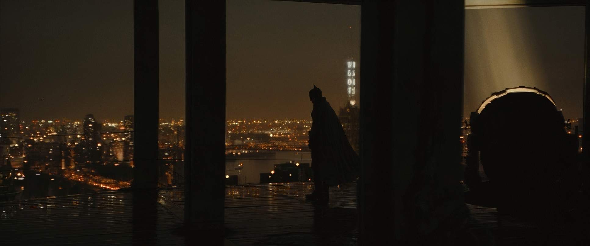
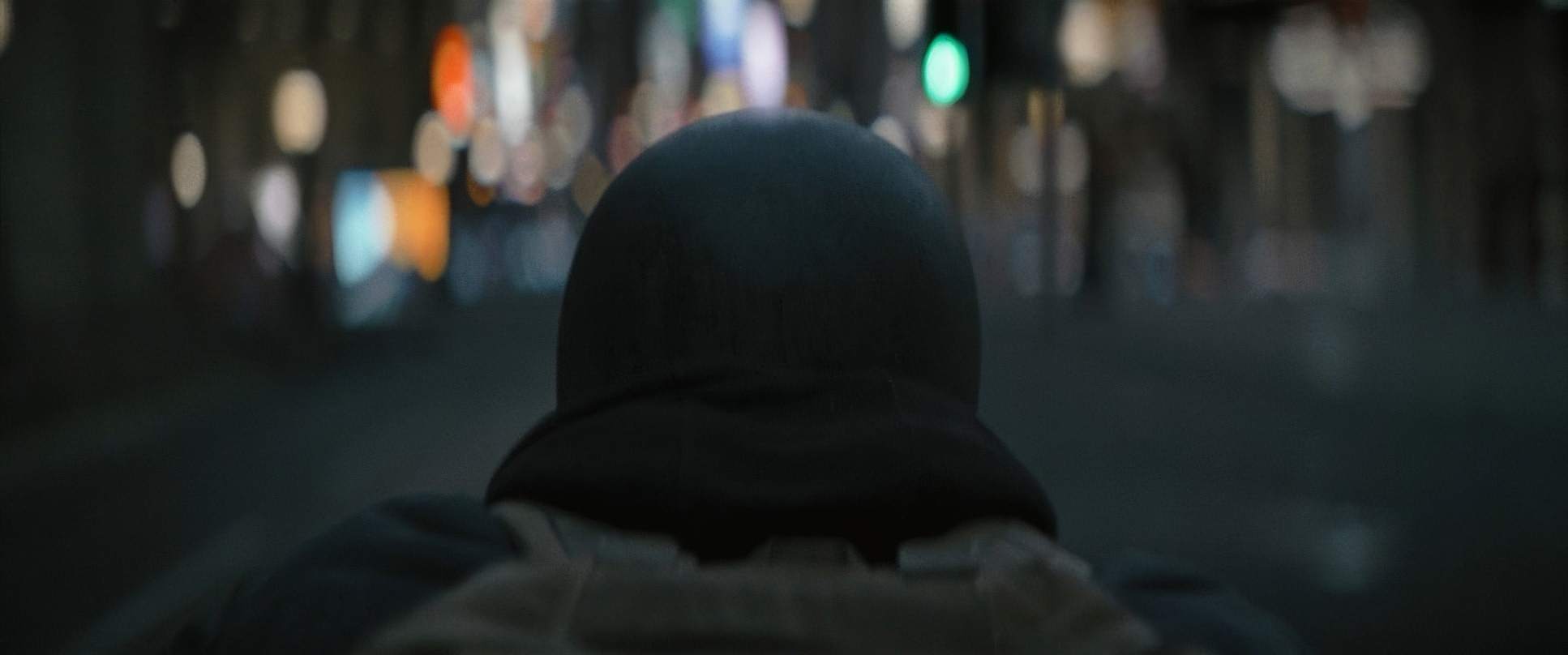
The blocking is just as deliberate. Think about how Batman moves. He’s always framed with massive visual weight. He doesn’t just “appear”; he emerges from deep shadows with a heavy, rhythmic gait. Fraser often shoots him from low angles to make him look imposing.
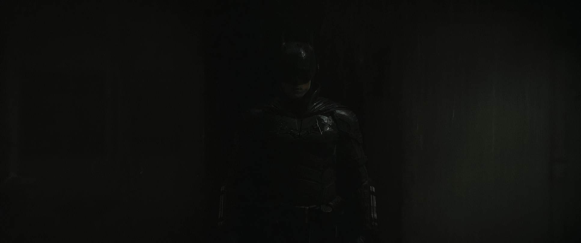
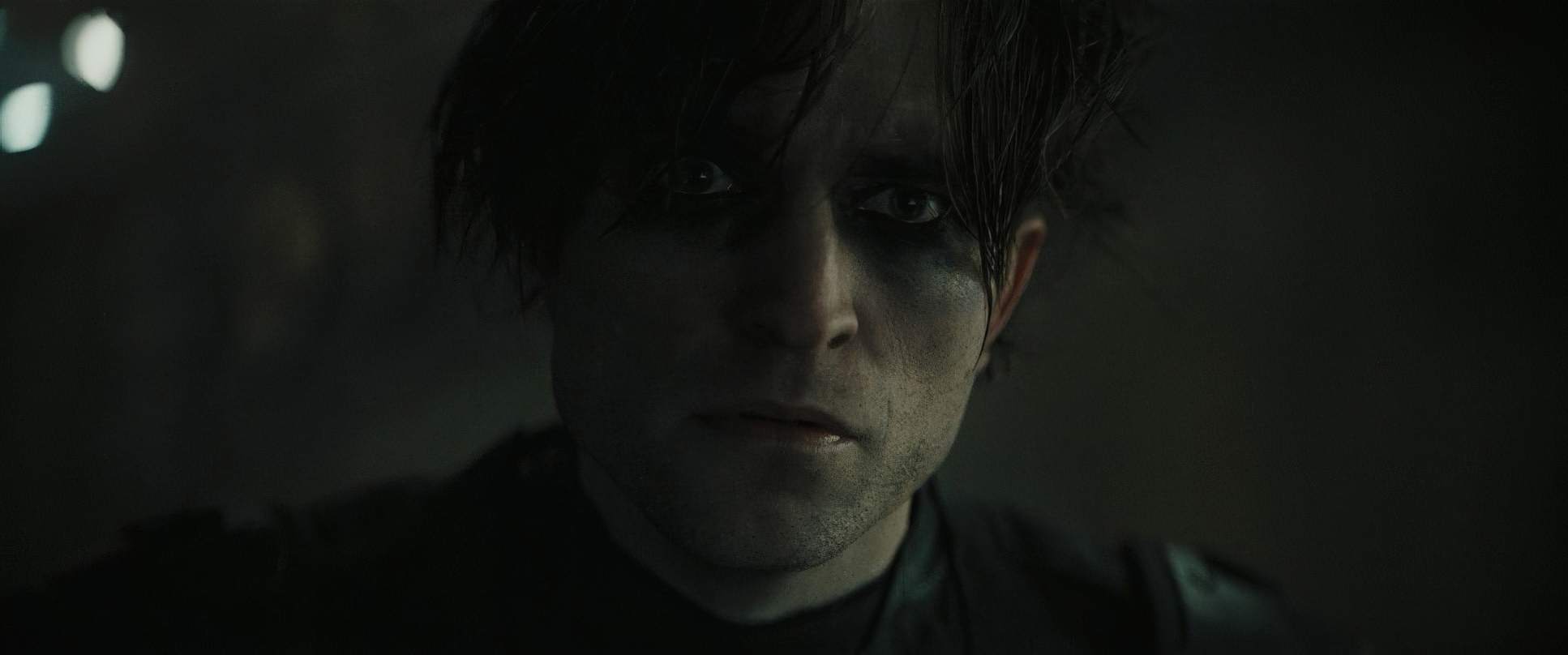
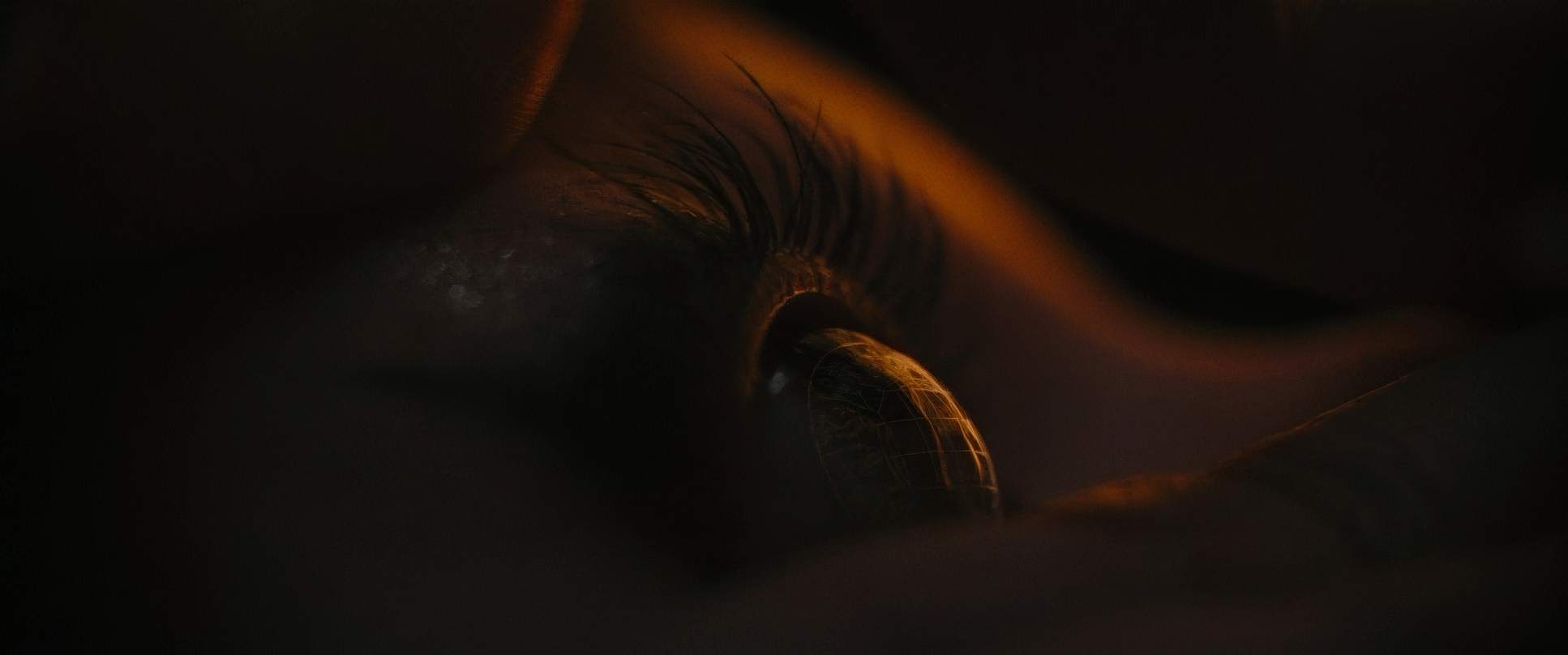
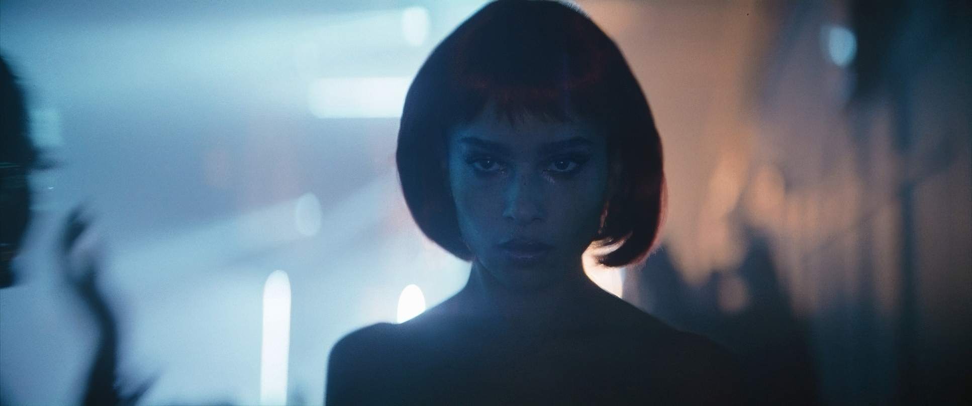
And for Robert Pattinson’s performance, the lens work is everything. Since half his face is covered, the camera stays tight on his eyes. Fraser lights them just enough so you can see the pain and the focus glinting under the cowl. Those subtle moments like him squinting in the sunlight after a night of crime-fighting are amplified by the lens choice, making us connect with Bruce’s internal struggle without him saying a word.
Camera Movements

The camera in The Batman isn’t just sitting there; it feels like it’s participating in the hunt. There’s a voyeuristic quality to the movement that pulls you into the character’s head.
We get a lot of subjective POVs weaving through traffic on the bike or seeing what Selina sees through the contact lenses. It’s a great depth cue that makes the investigative work feel personal. One of my favorite techniques they used was hard-mounting the camera to an object, like a car or a person, and letting it move with the subject. It’s a simple rig, but it adds this incredible kinetic energy and tension.
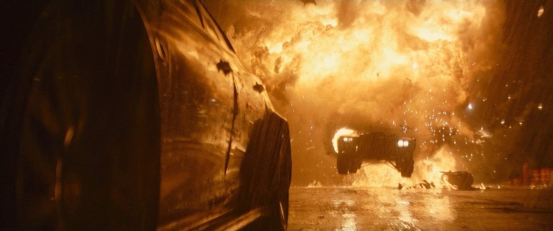
Also, I have to give them credit for the action scenes. Unlike the “shaky-cam” mess we see in many superhero films, Fraser keeps the frame stable and slightly wider. You actually see the impact of every punch. It’s grounded and brutal because the camera gives the action room to breathe.
Compositional Choices
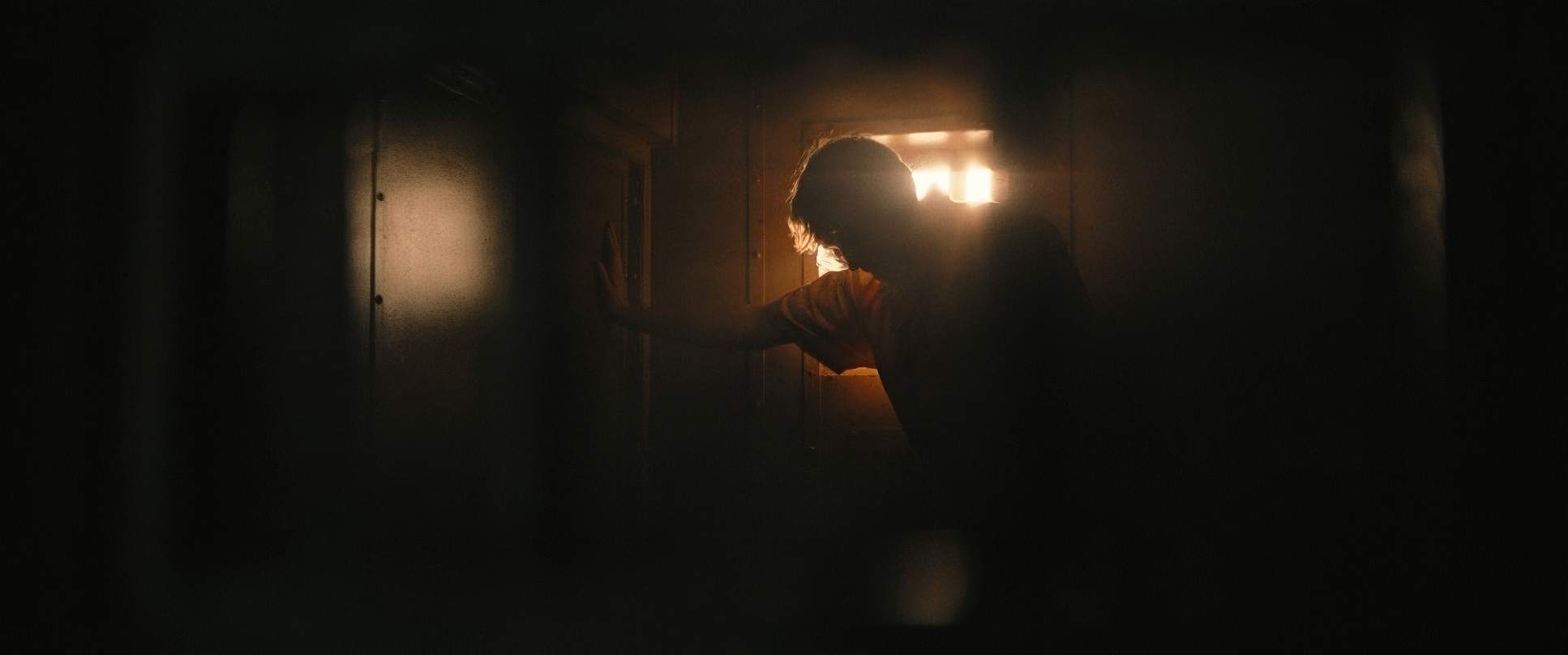
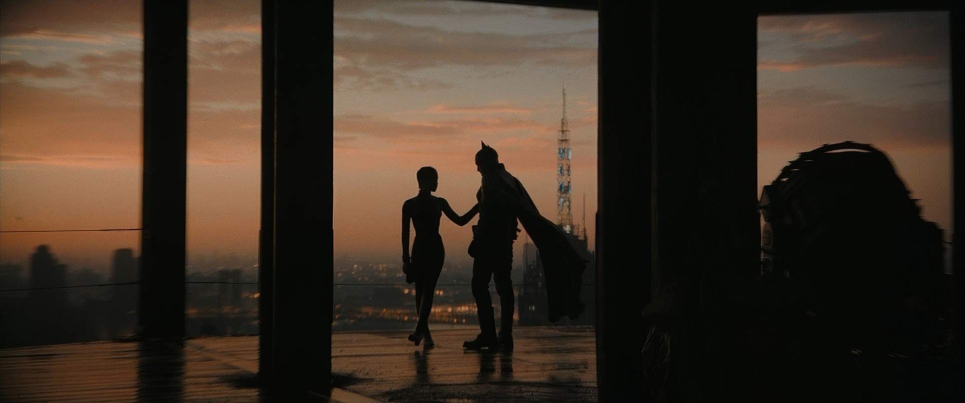
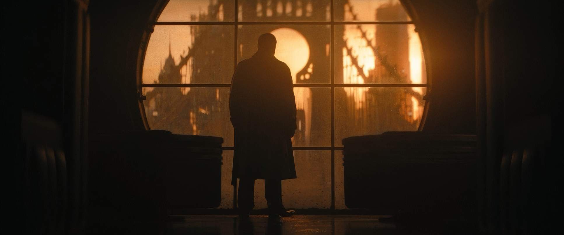
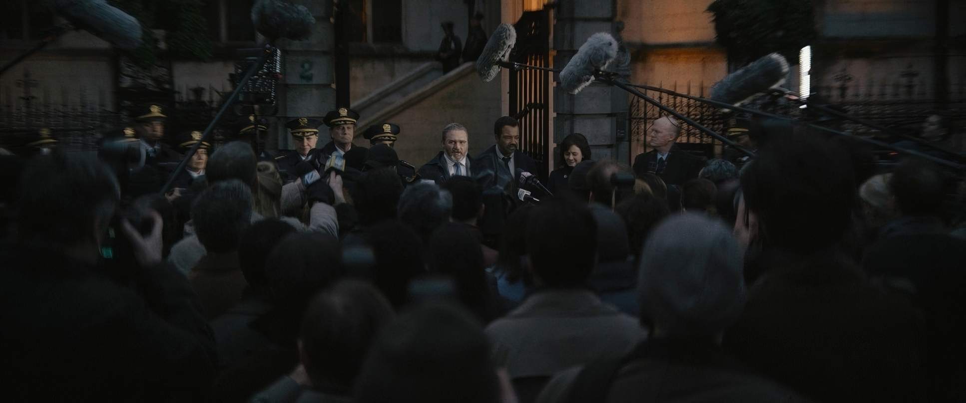
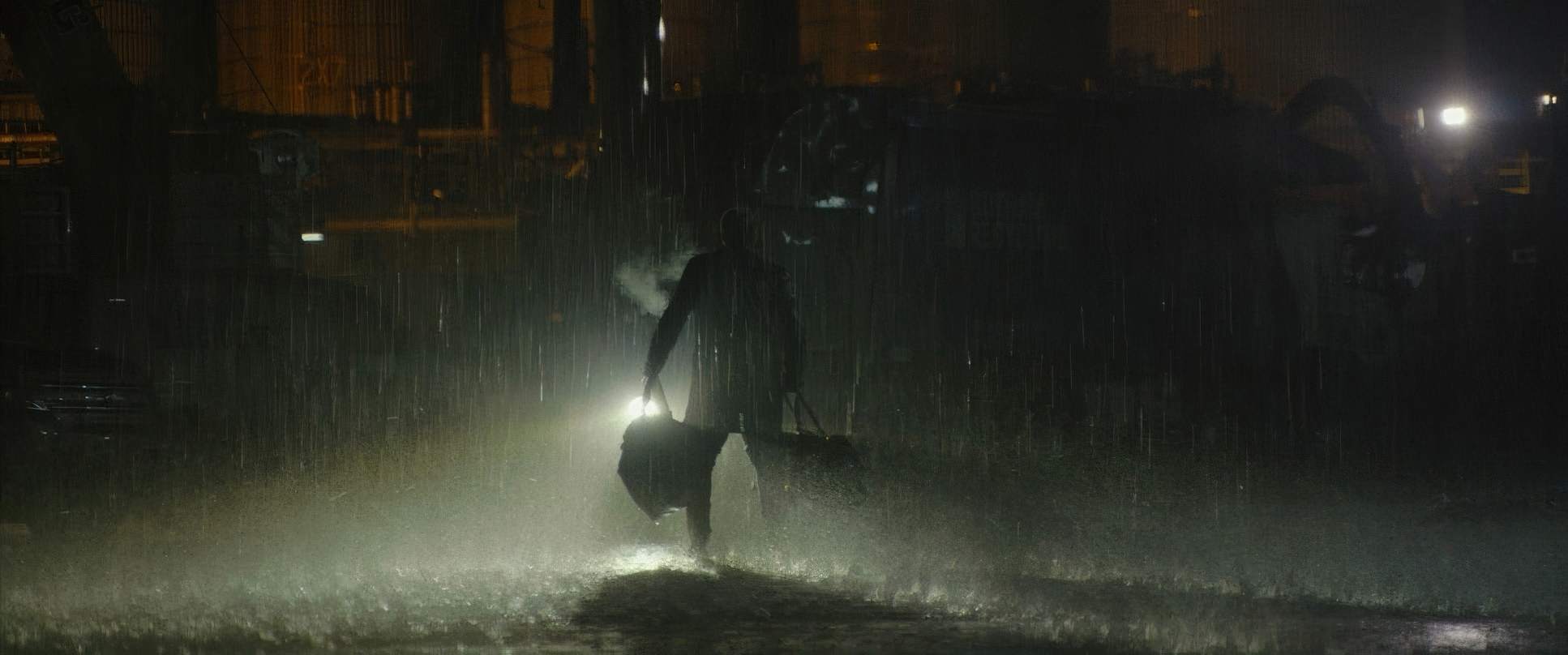
Compositionally, the film is all about power dynamics and isolation. They use wide shots to dwarf the characters against the oppressive architecture of Gotham. Batman is often just a silhouette a lone figure against a vast, indifferent backdrop.
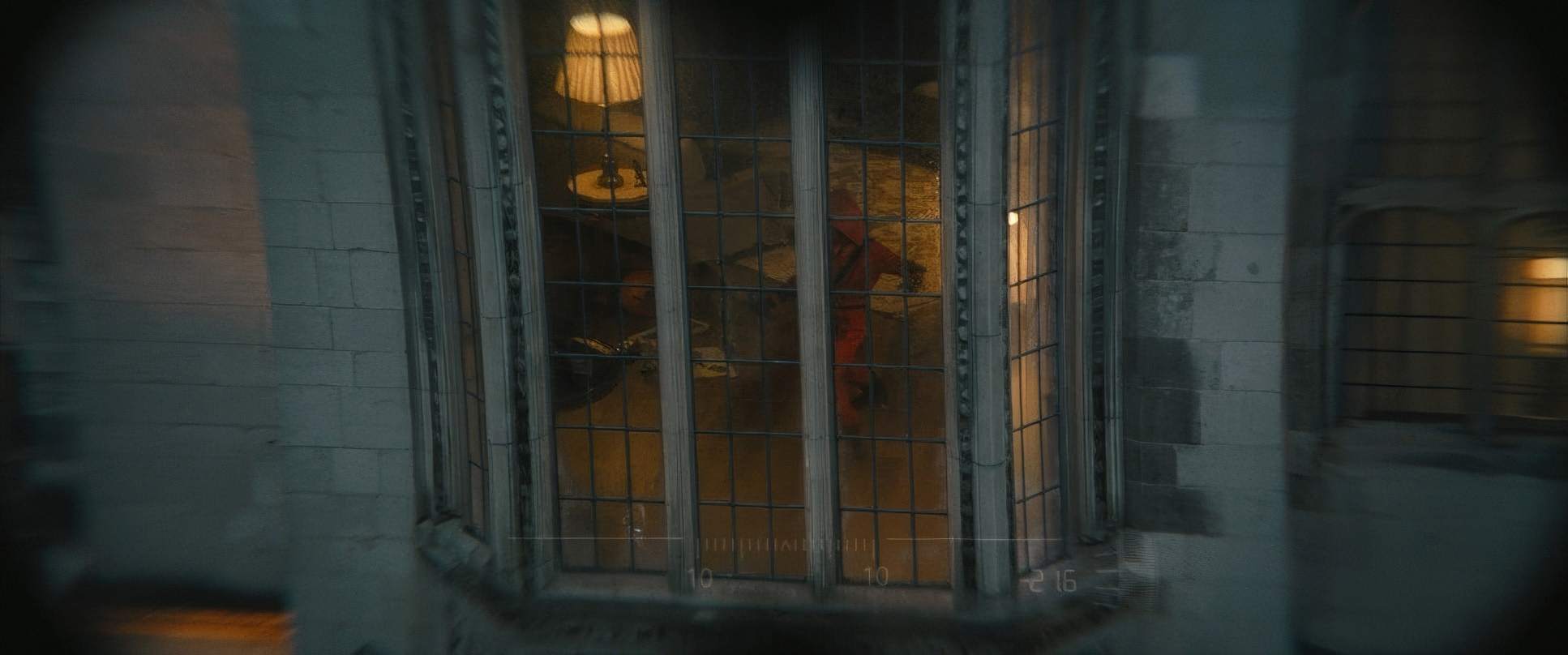
The use of “negative space” is brilliant here. It’s not just empty space; it feels like the city is physically pressing down on him. Characters are often framed off-center, which creates a sense of unease. When the Riddler is stalking a victim, the framing makes you feel like someone is watching from a distance, hidden in the corners of the wide shot. It keeps the audience in a perpetual state of “looking over their shoulder.”
Color Grading Approach
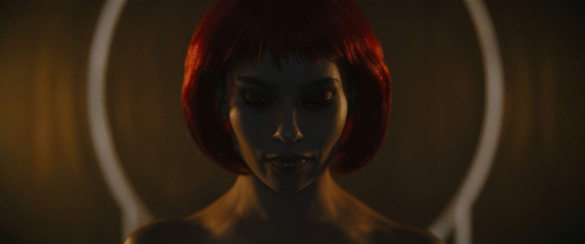
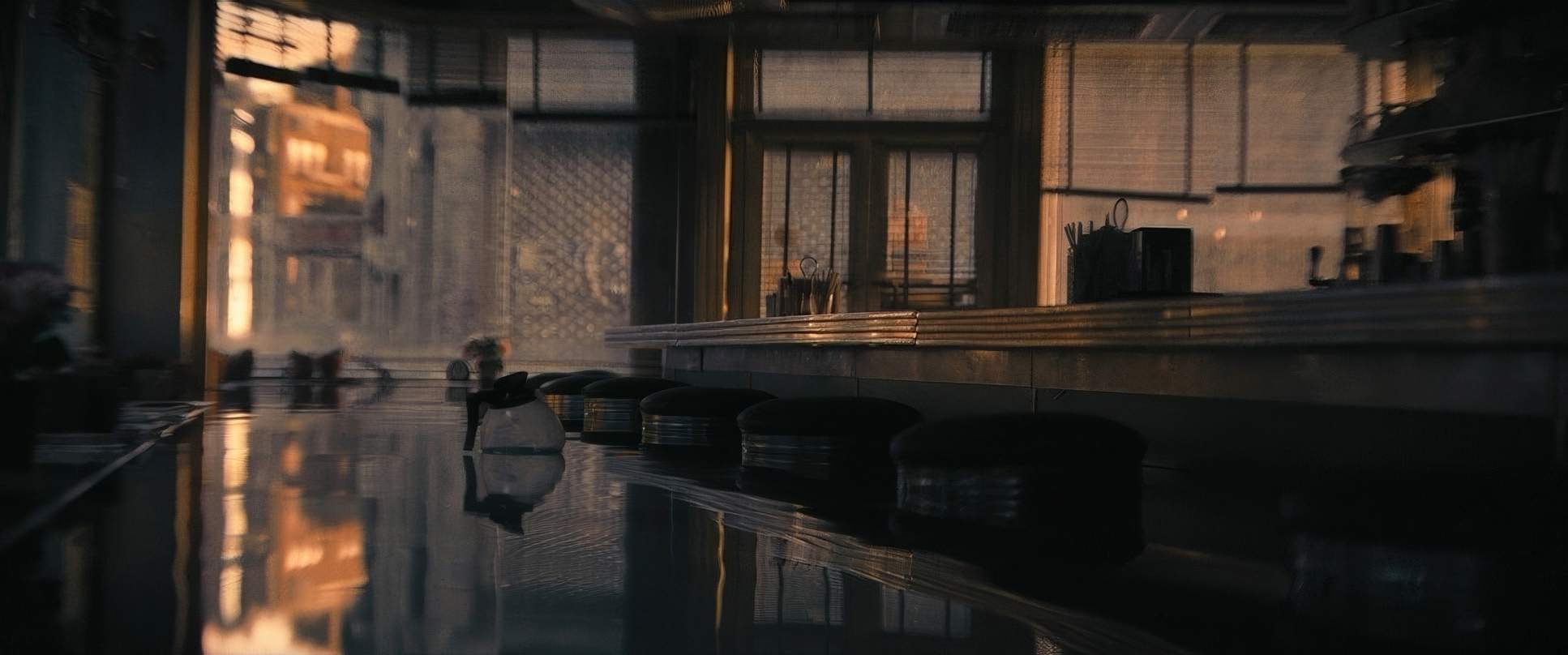
This is the part that really gets my brain firing on all cylinders. As a colorist, I see The Batman as a masterclass in tonal sculpting. It’s not just “desaturated”; it’s a controlled palette where cool blues and murky greens live in the mid-tones and shadows.
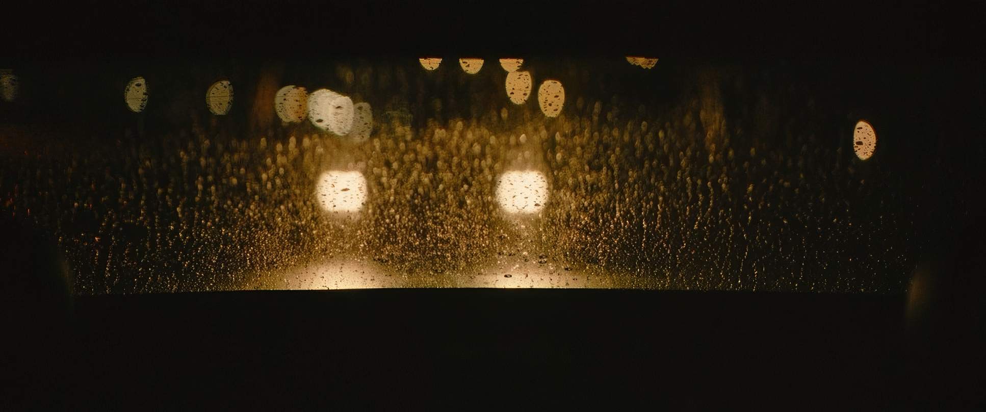
The contrast shaping is aggressive. The shadows are often “crushed,” but if you look closely, there’s just enough detail retained to keep the image from feeling flat. They’ve also dialed in a beautiful “highlight roll-off.” The way the neon signs bloom feels like a print-film stock organic and warm, not like sterile digital clipping. It gives the whole movie a thick, textural richness.
The hue separation is also incredibly smart. Skin tones are pushed toward cooler, desaturated territory to match the bleakness of the city, but they still feel “real.” And as I mentioned before, those reds are weaponized. They stand out because the rest of the image is so carefully restrained. It’s a perfect example of how the grade can elevate the narrative, making the visual experience as heavy as the story itself.
Technical Aspects & Tools
The Batman
Technical Specifications Overview
Under the hood, the tech supporting this vision is fascinating. To get that tactile, immersive feeling of the rain, they didn’t just hope for the best; they used specialized rain deflectors and even let droplets stay on the lens to break the “fourth wall” and make you feel the dampness.
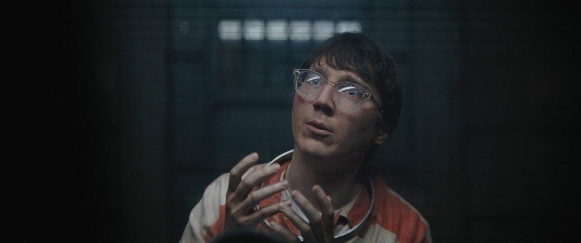
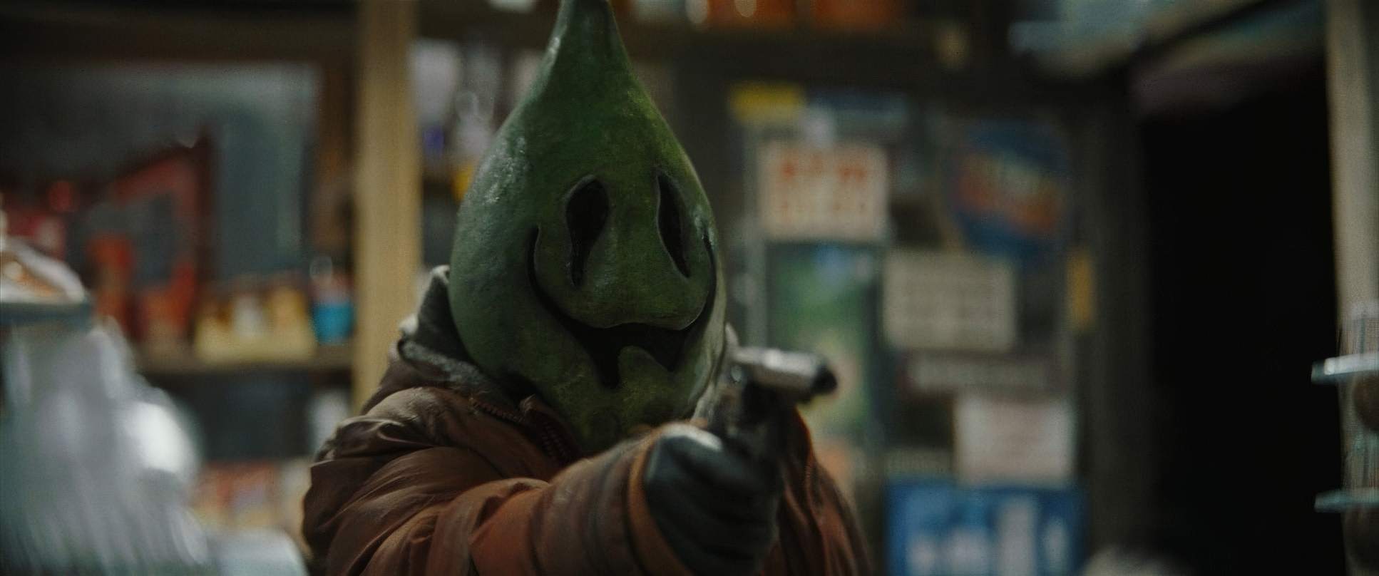
They also leaned into practical effects whenever possible. The Batmobile is a beast built on a custom chassis, and you can feel the physics and the weight of it in the car chase. It’s that tangible reality that CGI usually fails to replicate. Even the makeup for Colin Farrell’s Penguin is a feat of engineering it’s not just a mask; it’s a transformation that lets him use his whole face to act through the prosthetics.
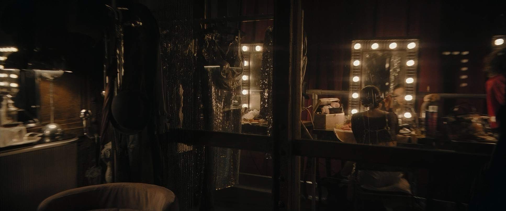
The Batman (2022) Film Stills
A curated reference archive of cinematography stills from The Batman (2022). Study the lighting, color grading, and composition.


- Also read: CAPTAIN AMERICA: CIVIL WAR (2016) – CINEMATOGRAPHY ANALYSIS
- Also read: THE HOBBIT: AN UNEXPECTED JOURNEY (2012) – CINEMATOGRAPHY ANALYSIS
Browse Our Cinematography Analysis Glossary
Explore directors, cinematographers, cameras, lenses, lighting styles, genres, and the visual techniques that shape iconic films.
Explore Glossary →