Avengers (2012) demands a different kind of analysis. It isn’t an arthouse film relying on shadow and suggestion; it is an engineering marvel.When Joss Whedon set out to assemble Earth’s mightiest heroes, the visual challenge was terrifying. He had to stitch together four distinct visual universes (Iron Man’s tech-heavy world, Thor’s fantasy realm, Cap’s period aesthetic, and Hulk’s monster movie vibe) into a single, cohesive frame. If the look failed, the movie failed. Looking back, the success of The Avengers wasn’t just in the writing; it was in a visual language that managed to be technically precise while remaining deeply faithful to its comic book roots.
About the Cinematographer

The man tasked with this balancing act was Seamus McGarvey. For industry heads, this was an inspired, if slightly left-field, choice. McGarvey wasn’t known for explosion-heavy blockbusters; he built his reputation on the gorgeous, textural work of Atonement, We Need to Talk About Kevin, and Anna Karenina.
Hiring a DP known for human drama to shoot a superhero ensemble was the secret weapon. McGarvey understands interiority. He knows how to light a face to convey thought, not just action. For The Avengers, he had to make a larger-than-life narrative feel grounded enough for us to buy into the stakes. He needed to ensure that even amidst a CGI-heavy alien invasion, the human element remained at the forefront. It’s a testament to his skill that the film feels visually consistent, bridging the gap between a spy thriller and a mythological epic.
Inspiration Behind the Cinematography
The visual philosophy here is deceptively simple: Clarity is King. Whedon and McGarvey weren’t trying to create a gritty, realistic war documentary (like Saving Private Ryan); they were trying to bring a comic book panel to life.
This meant a clear, uncluttered visual approach. The inspiration draws heavily from the geometry of comic art strong leading lines, distinct separation of characters from backgrounds, and framing that maximizes information. It possesses the kinetic energy of a classic blockbuster but maintains a “clean” look. The goal was to make every scene with Tony Stark or Loki feel readable instantly. McGarvey achieved this through thoughtful framing that respects the iconic silhouettes of these characters. It’s a tricky balance: capturing the epic scope of a war in New York while maintaining the intimate clarity required to make the team dynamics land.
Camera Movements
When dealing with a sprawling ensemble, camera movement becomes a tool for geography. McGarvey’s strategy is a masterclass in motivated motion. Early in the film, particularly during the introductions, the camera is relatively grounded using precise tracking and dollying. These movements stabilize the characters, allowing us to absorb Mark Ruffalo’s nervous energy or Chris Evans’s displacement in time.
As the team assembles, the camera unchains itself. We see sweeping crane shots on the Helicarrier that sell the scale of the location. But the real genius is in the dialogue scenes. Watch the argument scene in the lab; the camera orbits the Scepter, subtly suggesting its influence on the group’s aggression. It’s a visual cue that the threat is already in the room.
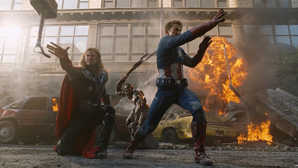
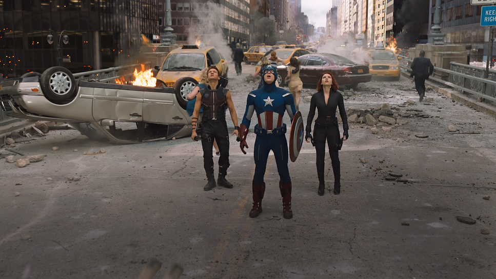
In the Battle of New York, the camera becomes an active participant. We see a mix of Steadicam and handheld work to provide visceral energy, but McGarvey avoids the “shaky cam” trap that plagues many action films. The standout moment, of course, is the famous 360-degree “tie-in” shot of the Avengers stood back-to-back. This isn’t just a “cool shot” it’s a narrative device. It visually cements them as a team for the first time, allowing the audience to grasp the spatial relationships between the heroes without a single cut.
Compositional Choices
Compositionally, The Avengers made a bold choice regarding aspect ratio. While many blockbusters opt for the wider 2.39:1 anamorphic format, Whedon and McGarvey shot 1.85:1 (using a 1.78:1 sensor area). Why? Because of the Hulk.
When you have a character who is eight feet tall standing next to Black Widow, a wide anamorphic frame cuts off head or feet. The taller 1.85:1 aspect ratio gave them the vertical headroom to frame the Hulk and humans together comfortably. McGarvey often utilizes wider lenses to establish these relationships, creating deep staging where characters occupy different planes of depth.
We frequently see triangular compositions, placing Captain America or Iron Man at a visual apex to reinforce leadership. The framing is deliberate and hierarchical. Even in the chaos, you always know where to look. This precision prevents visual clutter a common pitfall for ensemble films and ensures that the “splash page” moments land with maximum impact.
Lighting Style
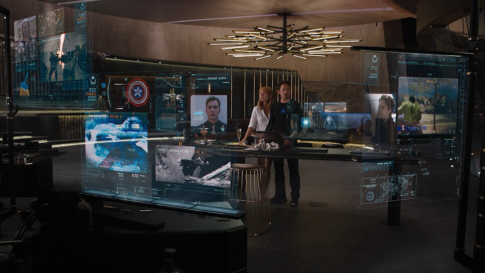
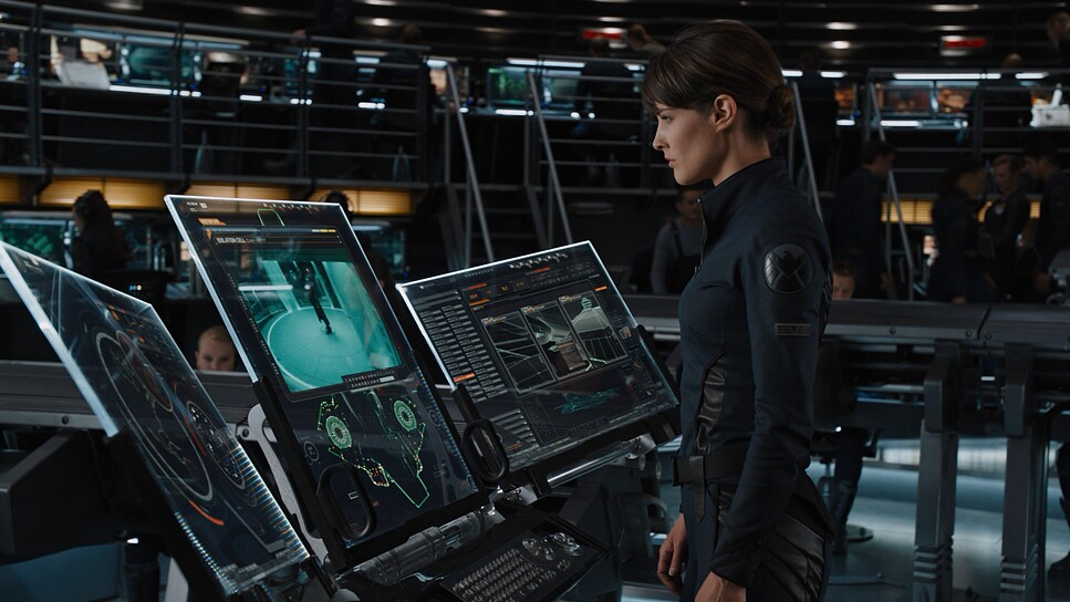
The lighting approach relies on a mix of sources to differentiate environments. The S.H.I.E.L.D. facilities are lit with cool, cyan-heavy fluorescents, emphasizing a sterile, bureaucratic atmosphere. It feels clinical. Contrast this with Stark Tower, which introduces warmer practicals and sophisticated city light, playing into Tony’s extravagant world.
As a colorist, I appreciate that the lighting is primarily motivated but heightened for gloss. McGarvey uses mixed lighting setups—daylight balanced with artificial tungsten and fluorescent sources—to create separation. During the Battle of New York, despite the chaos, the lighting remains directionally consistent (mimicking the sun), but with high-contrast fill to sculpt the characters.
Explosions provide bursts of warm light that interact with the actors, while the Chitauri tech casts harsh, cool illumination. This dynamic range helps sculpt the action. Even in the shadows, detail is preserved. It’s a “commercial” lighting style—polished, flattering, and designed to make the costumes pop.
Lensing and Blocking
Technically, the film is a fascinating hybrid. McGarvey primarily utilized the ARRI Alexa, which was the gold standard for digital cinema in 2012 (and arguably still is). He paired the sensor with Panavision Primo Primes and Canon L-Series lenses (the 19-90mm PCZ).
The choice of Panavision Primes gives the image that classic Hollywood sharpness and contrast, while the use of Canon L-Series glass suggests they needed lightweight, versatile zooms for crash cams or tight setups. Interestingly, for high-speed sequences requiring slow motion, they utilized the Arriflex 435 with Kodak Vision3 5219/7219 500Tstock. Mixing digital acquisition with 35mm film stock is a nightmare for matching texture, but it adds a gritty, organic feel to the explosions and stunts that purely digital cameras sometimes miss.
The blocking is equally precise. In the Helicarrier scenes, characters are positioned to create dynamic tension—Tony pacing, Banner shrinking into corners, Cap standing rigid. Their physical relationship communicates their ideological clashes before they even speak.
Color Grading Approach

Here is where I really lean in. The color grade, executed by Andrew Francis, is a textbook example of “invisible” grading that serves the genre. In an era where many action films were heavily leaning into a crushed, gritty look, The Avengers stayed surprisingly naturalistic, though stylized.
The palette is distinctly cool and desaturated in the shadows leaning into cyans and blues which helps unify the disparity between practical sets and CGI environments. However, the mid-tones and highlights are where the magic happens. Francis and McGarvey ensured distinct hue separation. Iron Man’s red, Cap’s blue, and Hulk’s green are punched up to cut through the neutral urban gray of the background.
The contrast curve is interesting. It’s robust, but the “toe” (the bottom of the curve) is often lifted slightly. This preserves shadow detail in the black suits of Black Widow and Hawkeye, ensuring they don’t turn into black blobs against dark backgrounds. The highlight roll-off on the Alexa is smooth, particularly on metallic surfaces like the Iron Man suit. It avoids that harsh, digital “clipping” you see in cheaper productions. The skin tones are kept on the warmer side of the vector scope, humanizing the characters against the cool, alien invasion backdrop. It’s a clean, commercial grade that prioritizes clarity over heavy atmosphere.
Technical Aspects & Tools
The Avengers (2012)
Technical Specifications| Genre | Action, Adventure, Science Fiction, Superhero |
|---|---|
| Director | Joss Whedon |
| Cinematographer | Seamus McGarvey |
| Production Designer | James Chinlund |
| Costume Designer | Alexandra Byrne |
| Editor | Jeffrey Ford, Lisa Lassek |
| Colorist | Andrew Francis |
| Time Period | 2010s |
| Color Palette | Cool, Saturated, Cyan, Blue |
| Aspect Ratio | 1.78 (Spherical) |
| Format | Digital |
| Lighting Style | High contrast; Artificial, Mixed, Fluorescent |
| VFX | CGI, Digital Composite |
| Story Location | New York City, New York |
| Filming Location | Sandusky, Ohio |
| Camera | ARRI ALEXA, Arriflex 435 |
| Lenses | Canon L-Series, Panavision Compact (19-90mm PCZ), Panavision Primo Primes |
| Film Stock / Resolution | 2.8K ArriRaw, Vision 3 500T (5219/7219) |
In 2012, The Avengers was pushing the boundaries of the digital intermediate (DI) workflow. The integration of the ARRI Alexa footage with the 35mm film elements from the Arriflex 435 required meticulous grain management. You can’t just slap film grain on the digital footage; you have to match the noise floor of the Alexa to the grain structure of the 500T stock to make it seamless.
The VFX integration is technically superb. Factors like matching the lighting direction, camera movement, and depth of field between practical and digital elements were executed flawlessly. The decision to use spherical lenses (rather than anamorphic) helped here, as it removed the complex lens distortions that can make VFX tracking difficult.
- Also read: DEMON SLAYER: KIMETSU NO YAIBA- THE MOVIE – INFINITY CASTLE (2025) – CINEMATOGRAPHY ANALYSIS
- Also read: HIGH AND LOW (1963) – CINEMATOGRAPHY ANALYSIS
Browse Our Cinematography Analysis Glossary
Explore directors, cinematographers, cameras, lenses, lighting styles, genres, and the visual techniques that shape iconic films.
Explore Glossary →