The Artist isn’t just a “silent movie gimmick.” when I revisited this in the suite recently, I was struck by the sheer technical precision involved. It’s a film that demands the audience lean in and relearn a forgotten cinematic language, and it succeeds because every frame feels earned. From the choice of 35mm stock to the way the shadows are sculpted, this is high-level visual storytelling that refuses to take the easy way out.
About the Cinematographer

Guillaume Schiffman didn’t just mimic the 1920s; he interpreted them through a modern lens. What I respect most about his work here is the restraint. It’s easy to throw a “vintage” filter over footage and call it a day, but Schiffman understood the theatricality and the specific visual grammar of the silent era. He wasn’t just chasing a “look”; he was chasing the feeling of photochemical history. His background in French cinema gave him a unique perspective on how to balance that classic Hollywood glamour with a more European, expressive edge.
Technical Aspects & Tools
The Artist
35mm Film | 1.33:1 Aspect Ratio | Vision 3 500T
| Genre | Comedy, Drama, Romance, History, Melodrama, Marriage |
| Director | Michel Hazanavicius |
| Cinematographer | Guillaume Schiffman |
| Production Designer | Laurence Bennett |
| Costume Designer | Mark Bridges |
| Editor | Anne-Sophie Bion, Michel Hazanavicius |
| Colorist | Christian Dutac |
| Time Period | 1920s |
| Aspect Ratio | 1.33 – Spherical |
| Format | Film – 35mm |
| Lighting | Hard light, High contrast, Top light |
| Lighting Type | Artificial light |
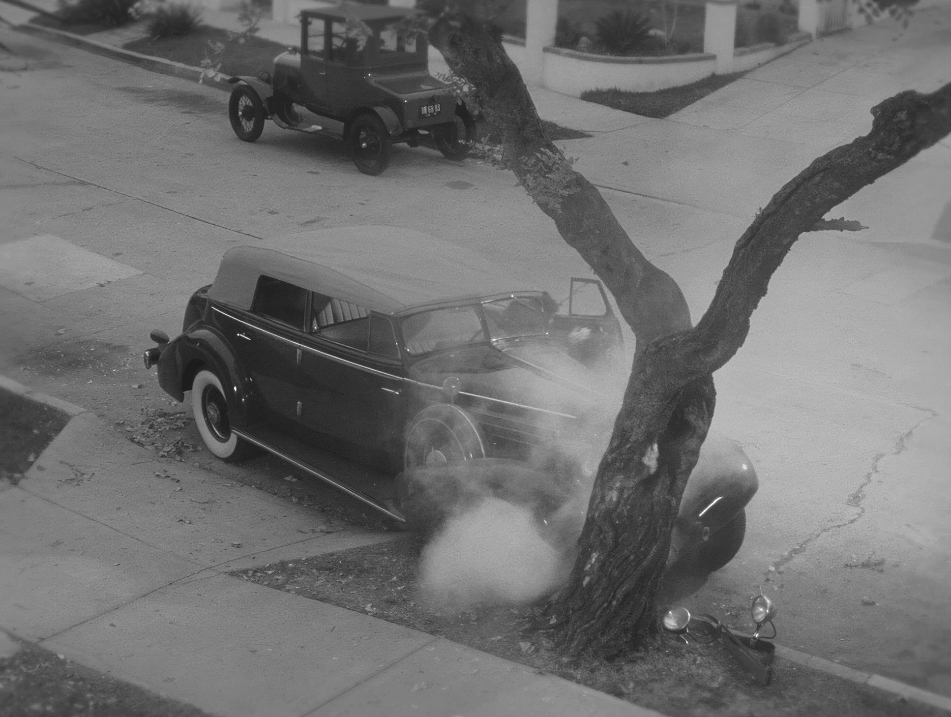
| Story Location | California > Los Angeles |
| Filming Location | California > Los Angeles |
| Camera | Arri 435 / 435ES |
| Film Stock / Resolution | 5219/7219 Vision 3 500T |
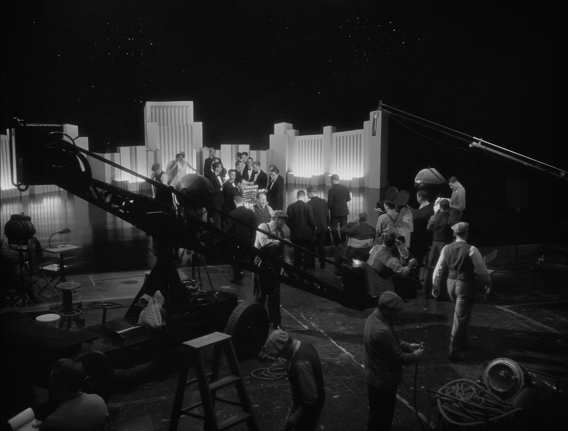
There’s a common misconception that The Artist was shot on digital cameras to save time in the grade. In reality, Schiffman made the bold choice to shoot on 35mm film specifically Kodak Vision3 500T (5219). For those of us who live in the DI (Digital Intermediate) world, that’s a fascinating decision. They shot on high-speed color negative film just to strip the color away later.
Why? Because they needed the specific grain structure and highlight roll-off that only celluloid provides. They used Arriflex 435 cameras, often cranking at 22 frames per second instead of the standard 24. This creates that slightly “nervous,” fast-motion cadence we associate with the silent era when projected at modern speeds. It’s a technical hurdle that most modern productions would avoid, but it’s exactly why the film feels so tactile and authentic.
Compositional Choices

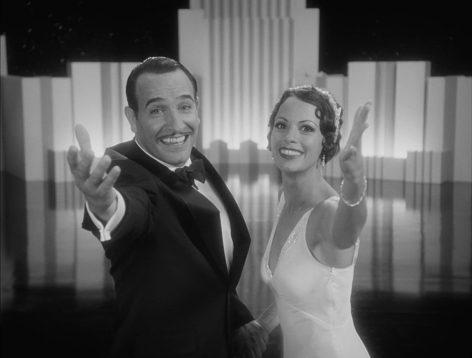
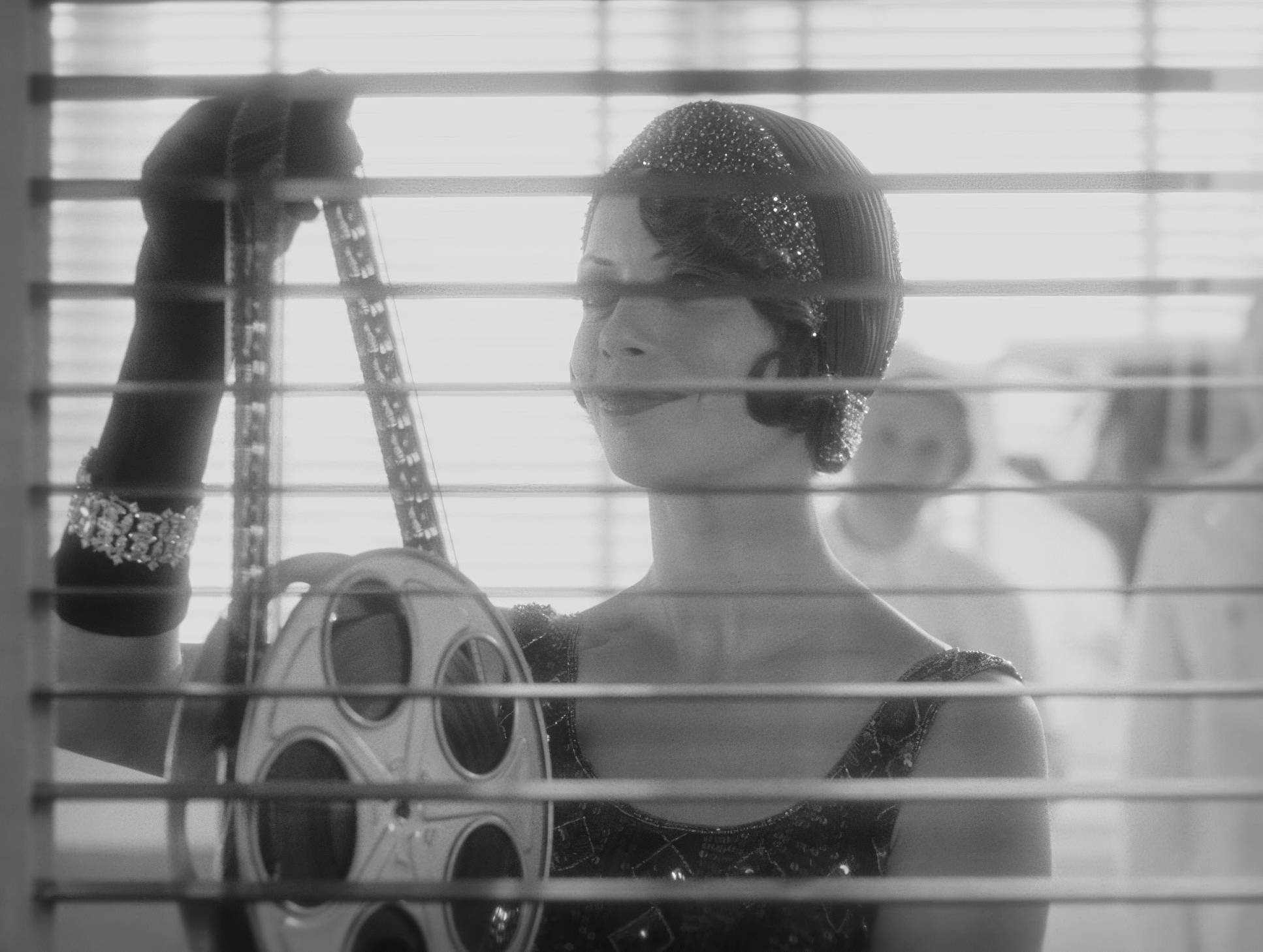
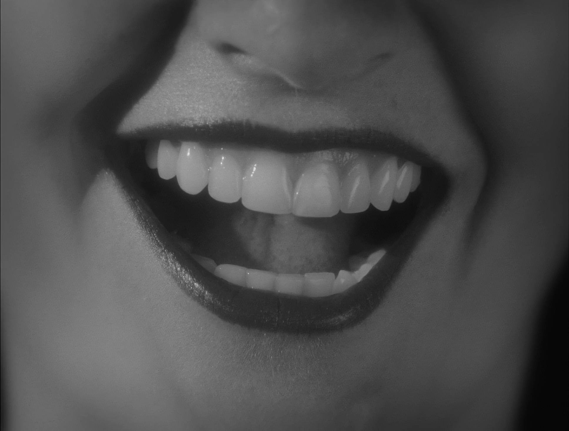
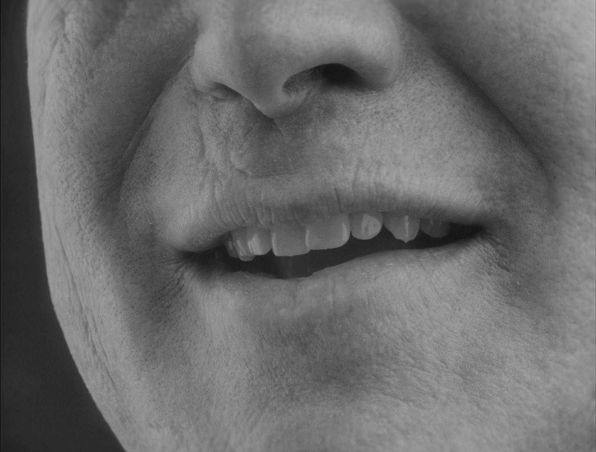
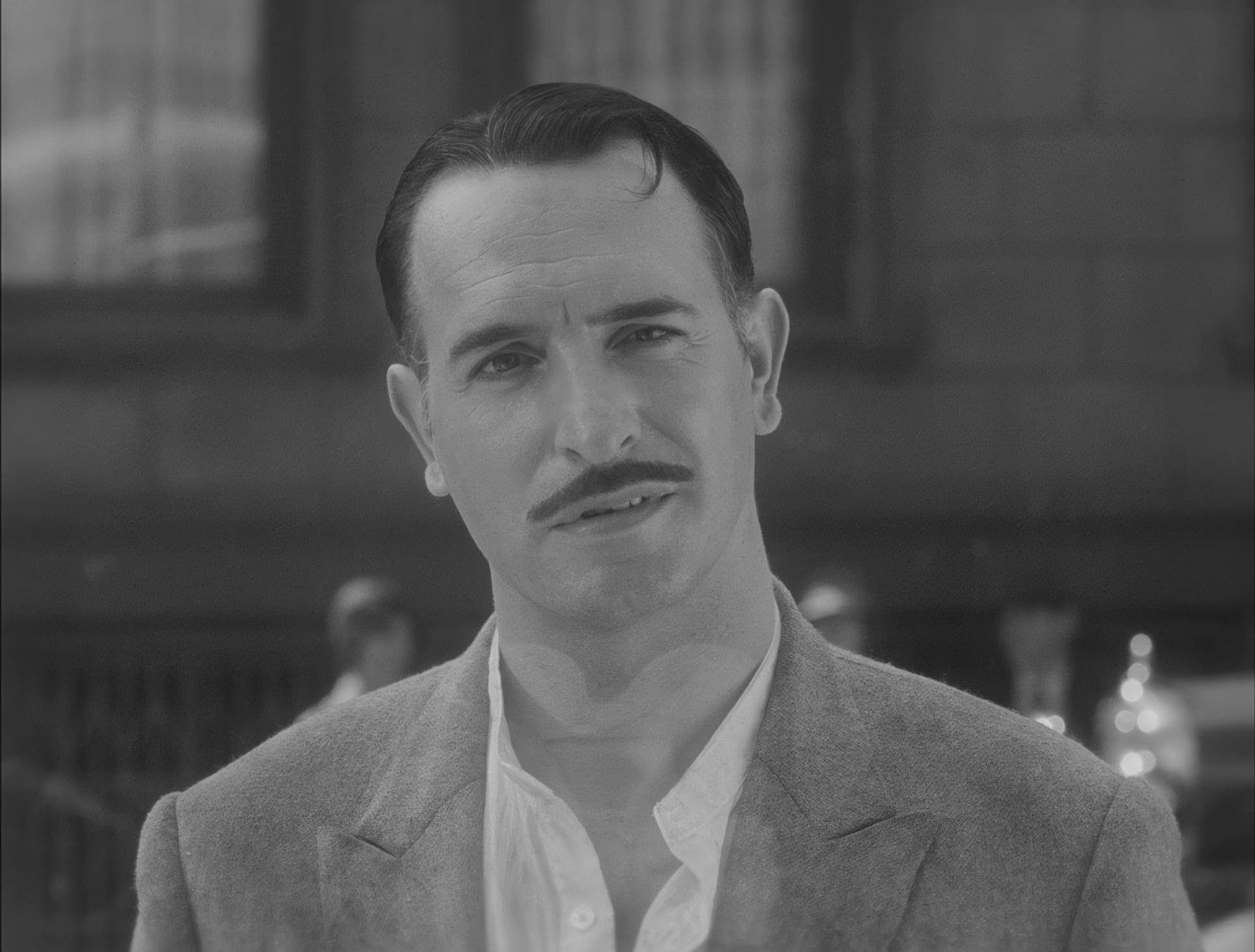
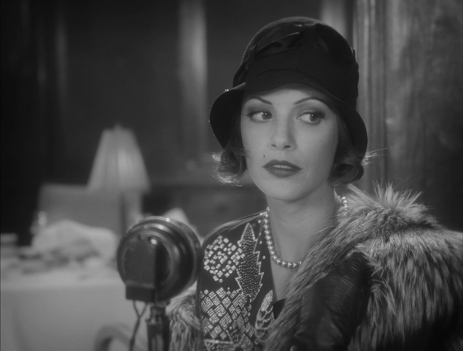
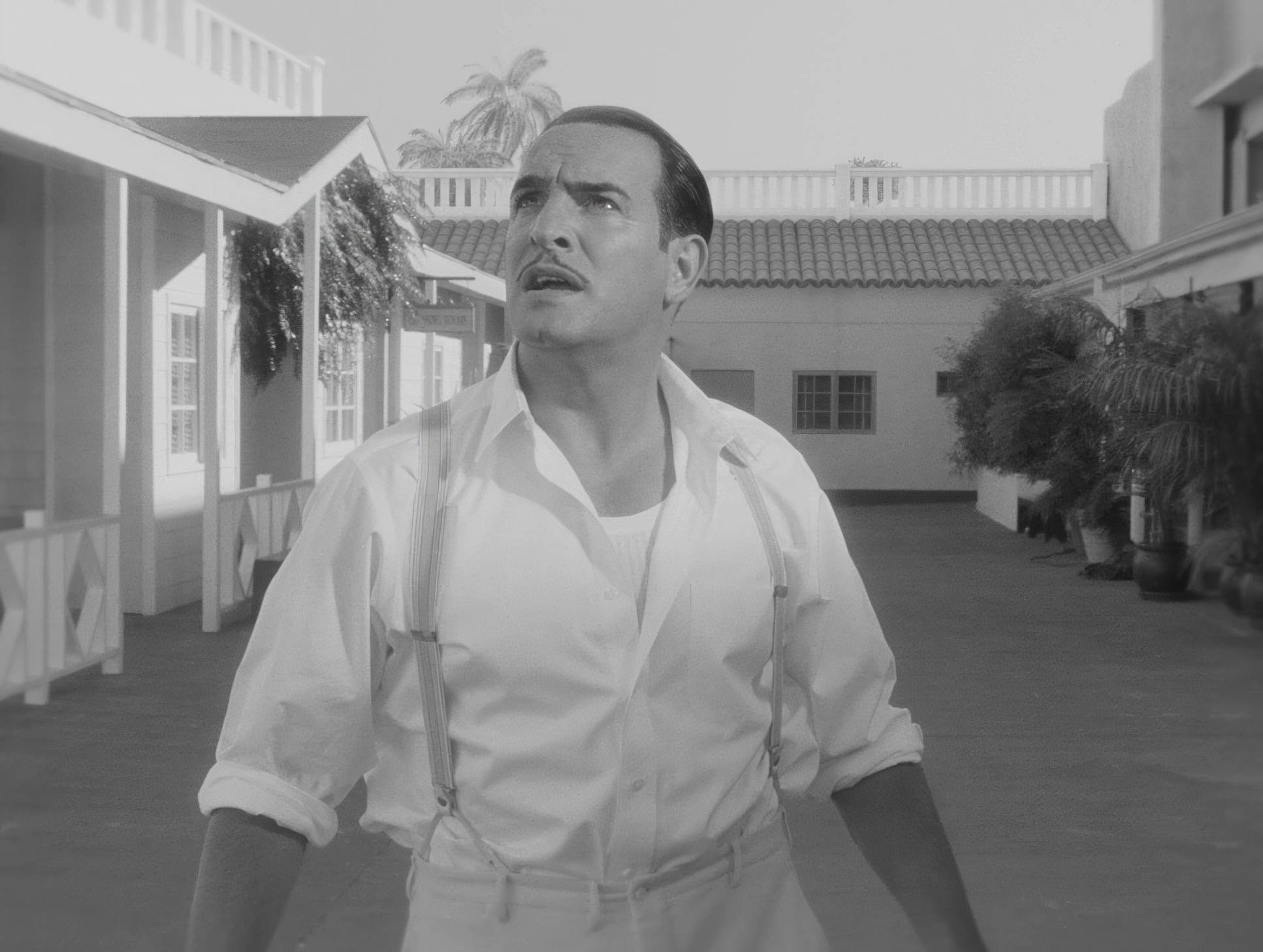
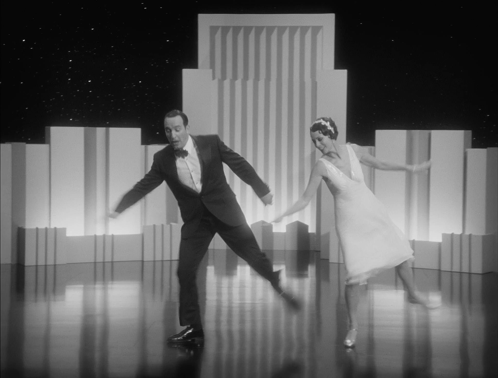
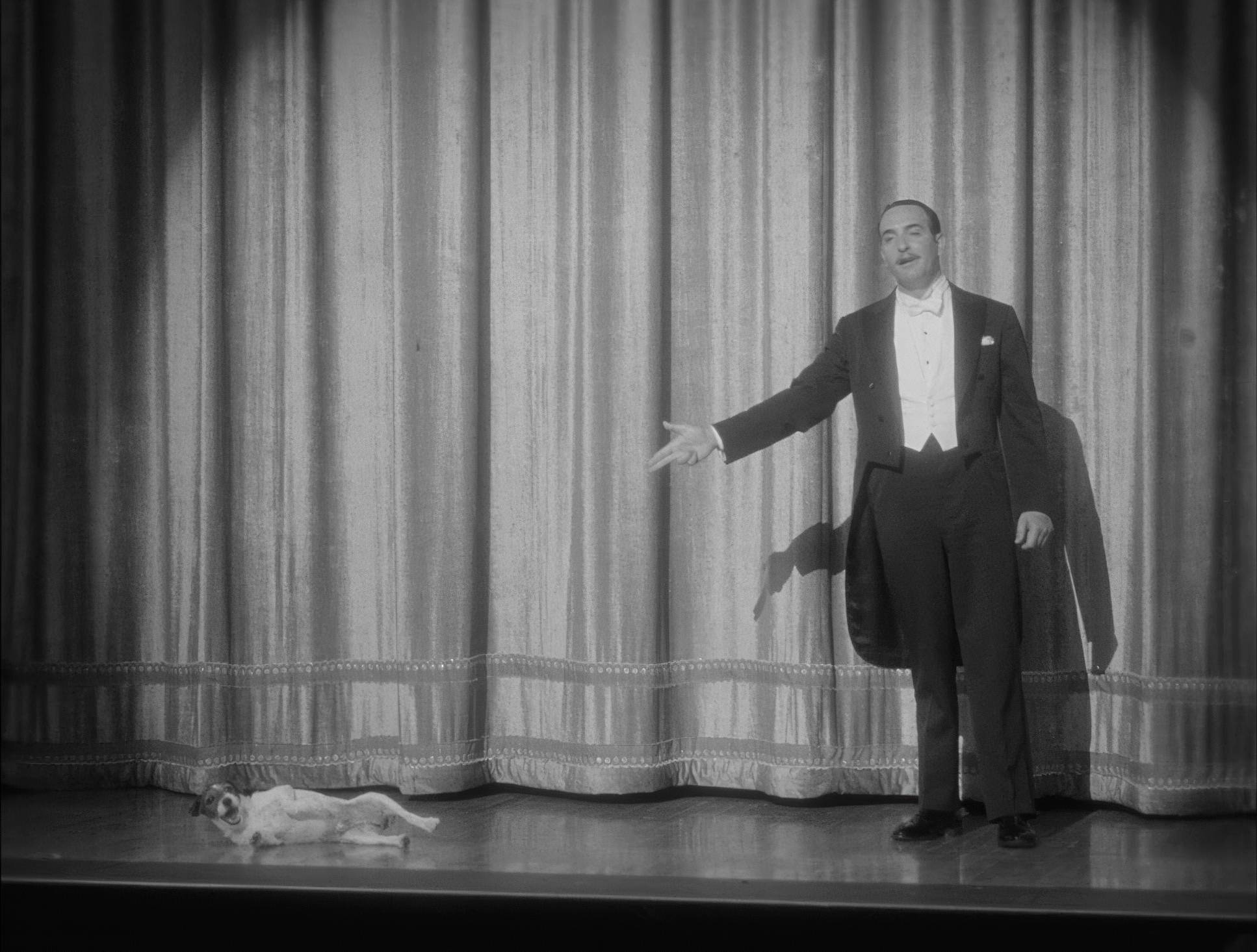
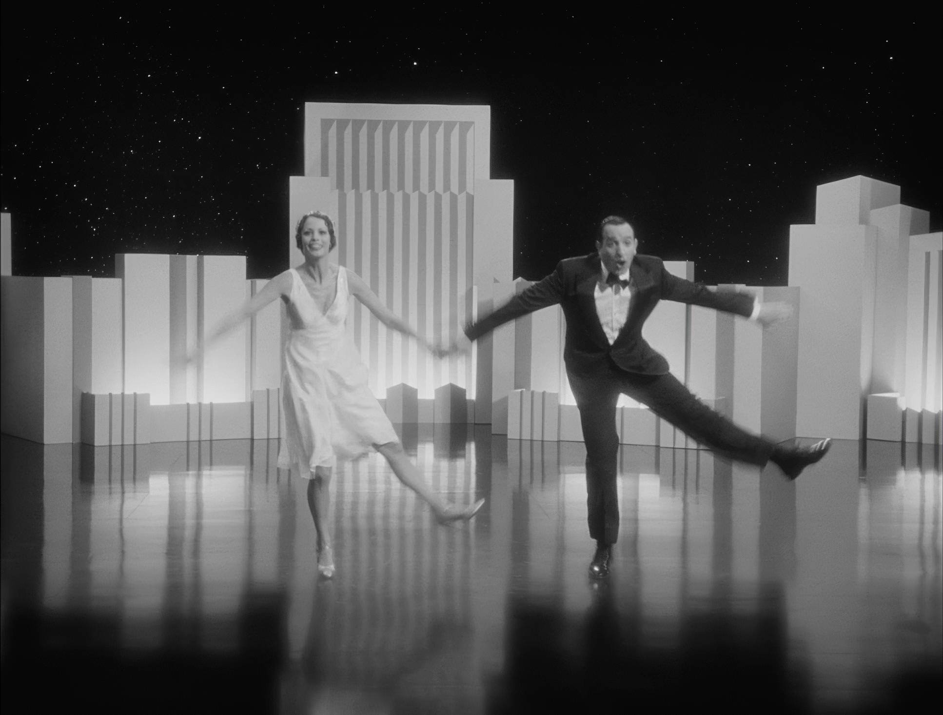
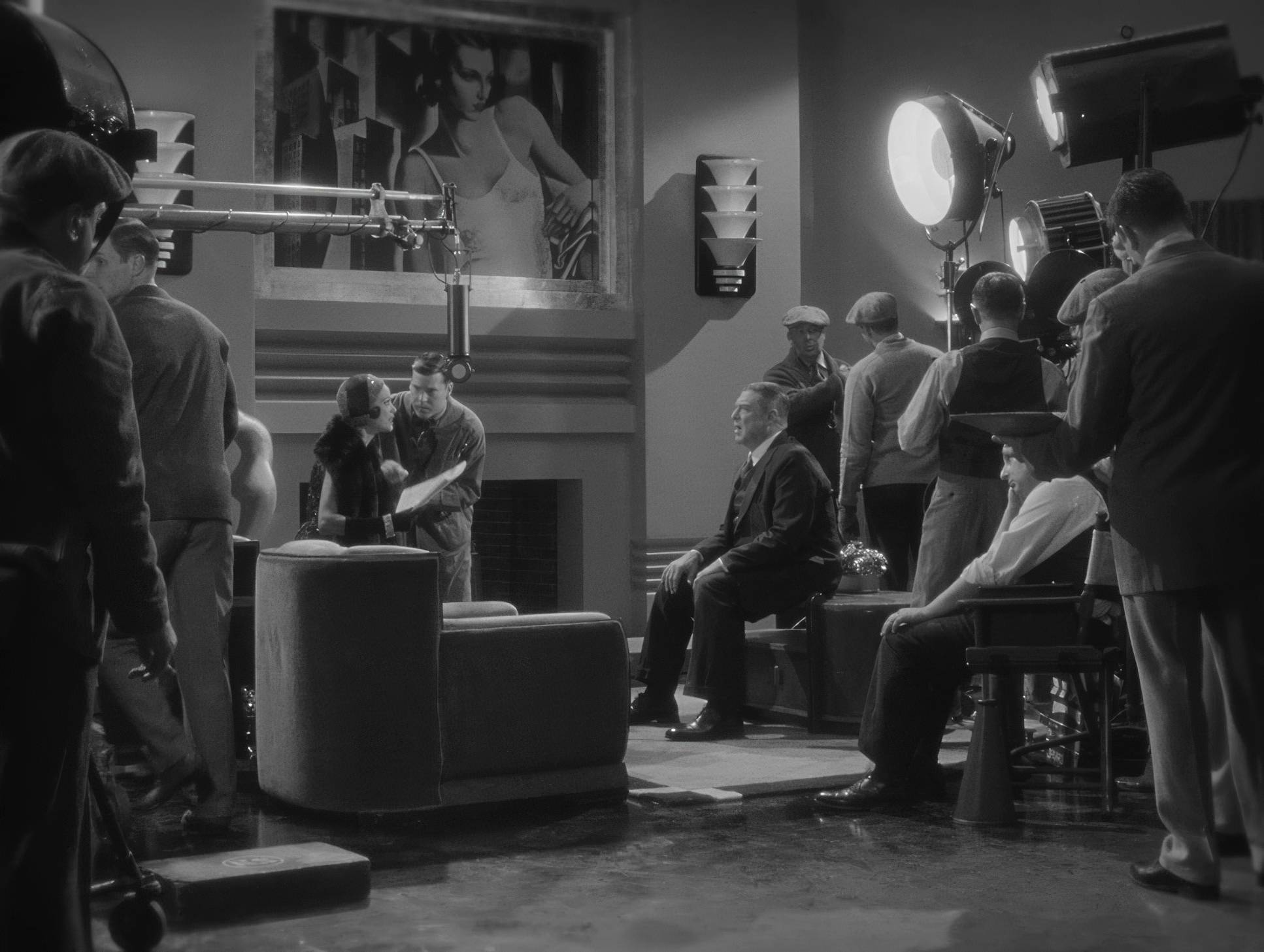
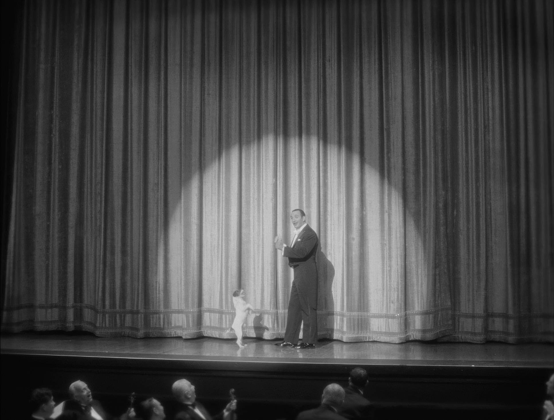
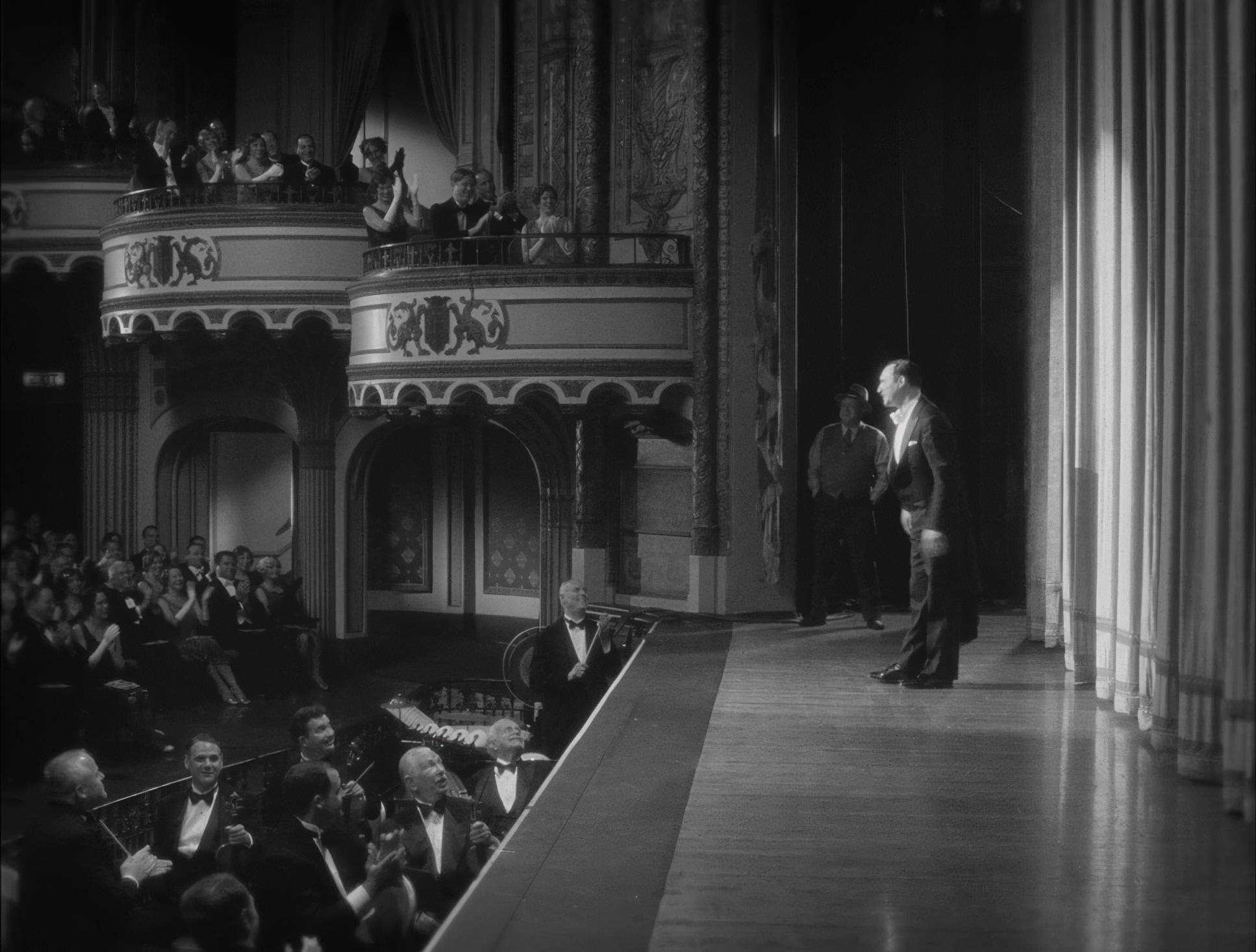
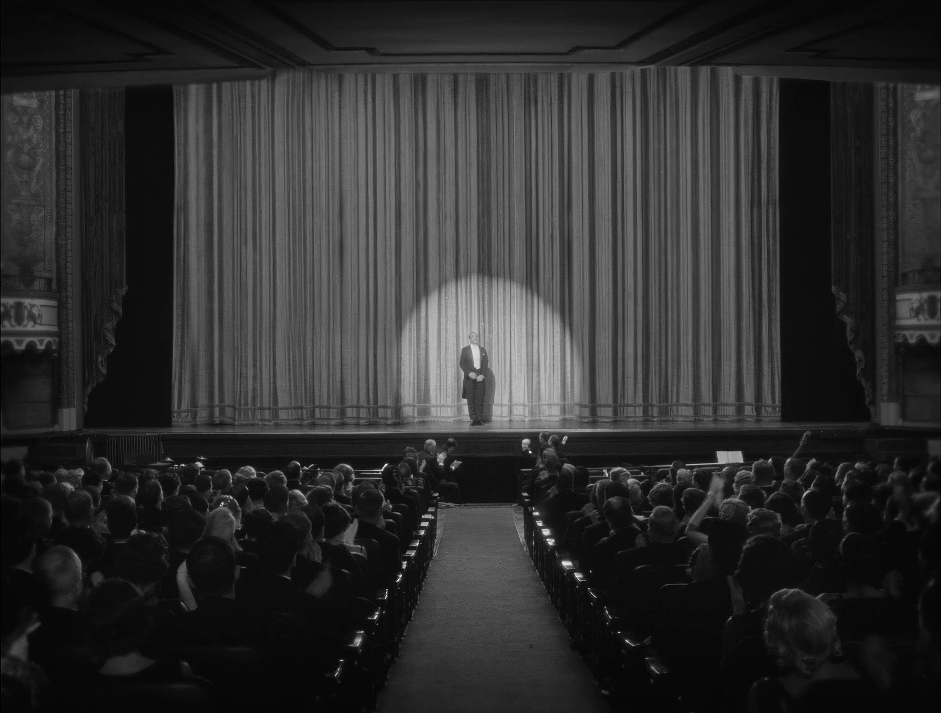
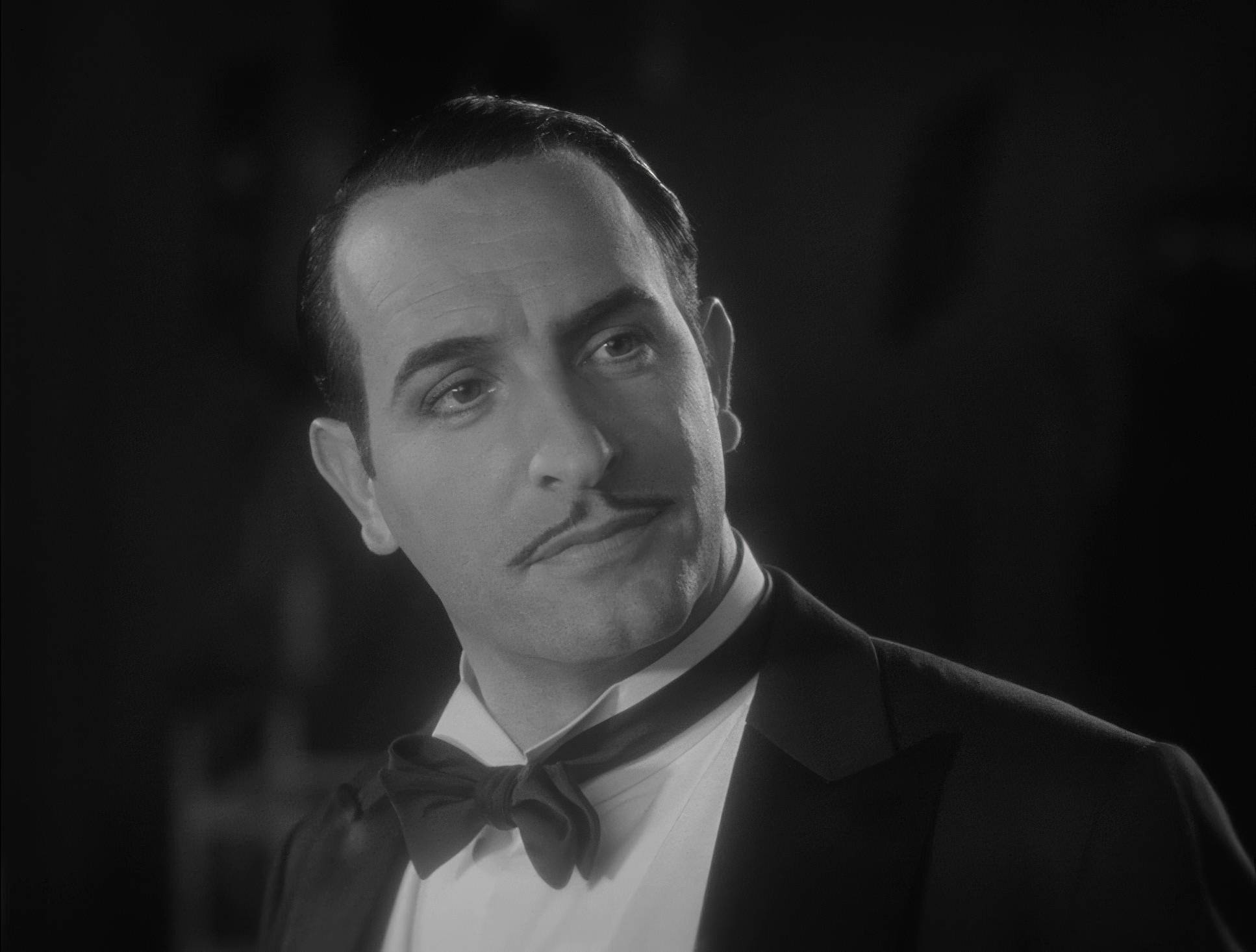
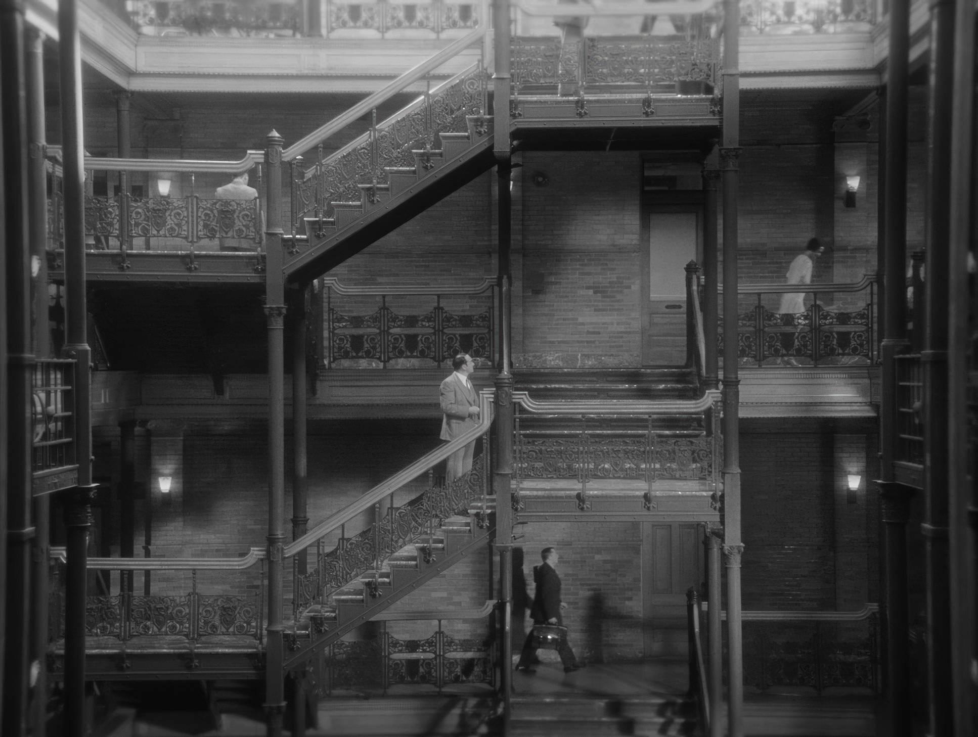
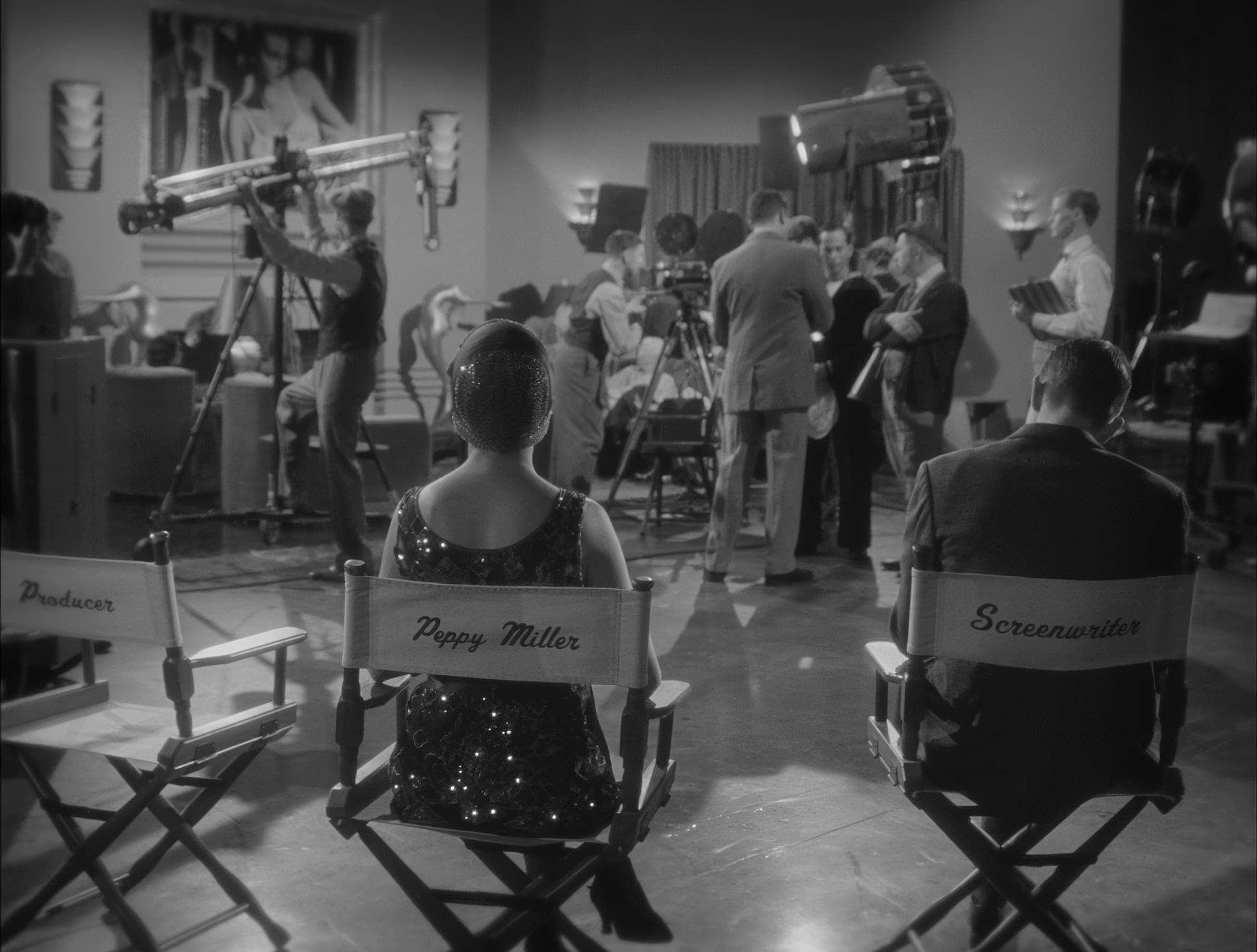
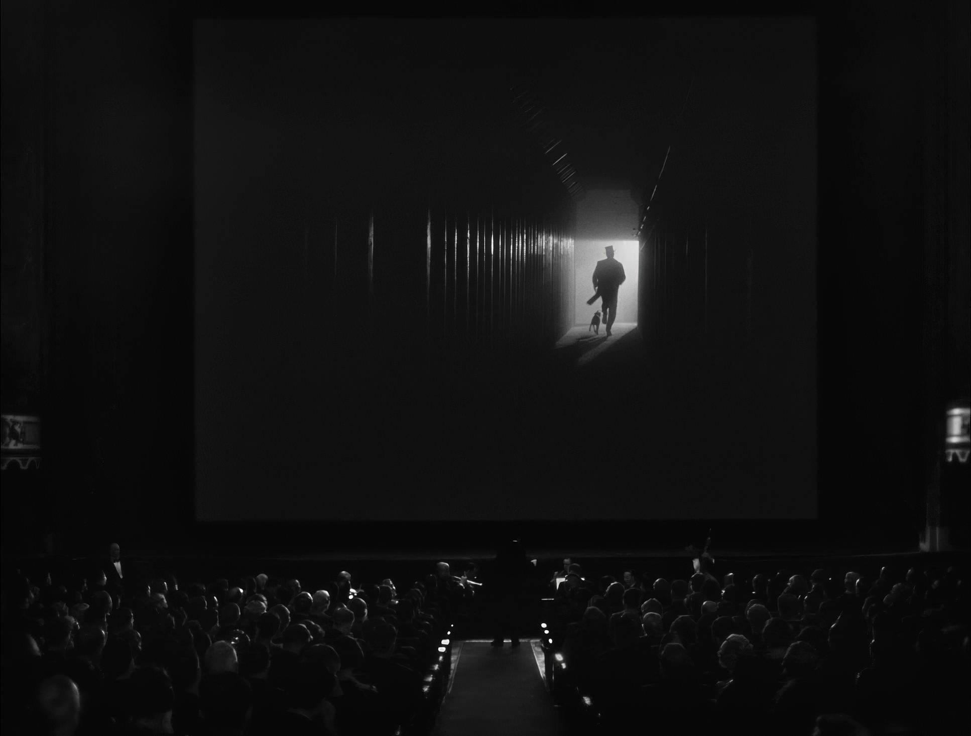
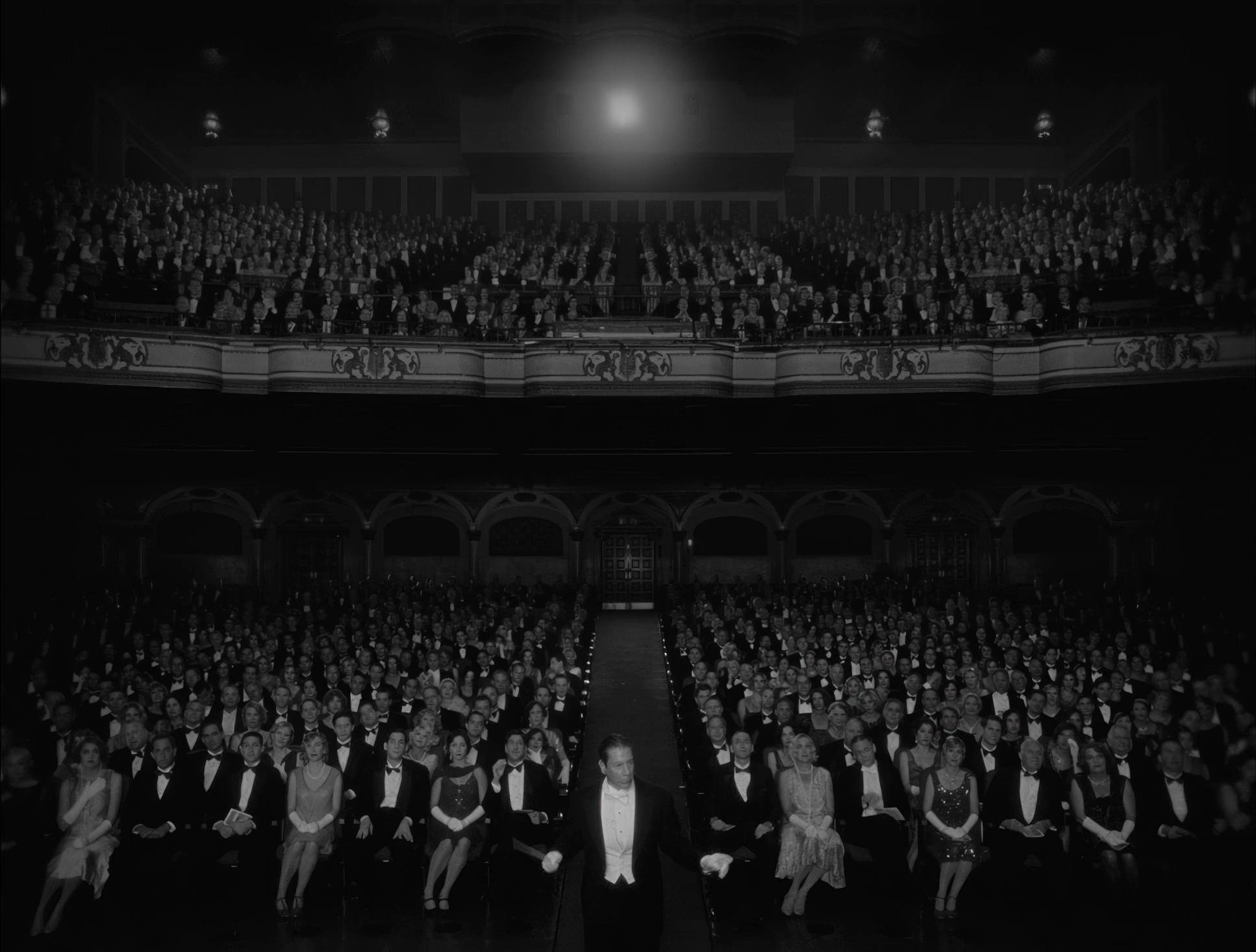
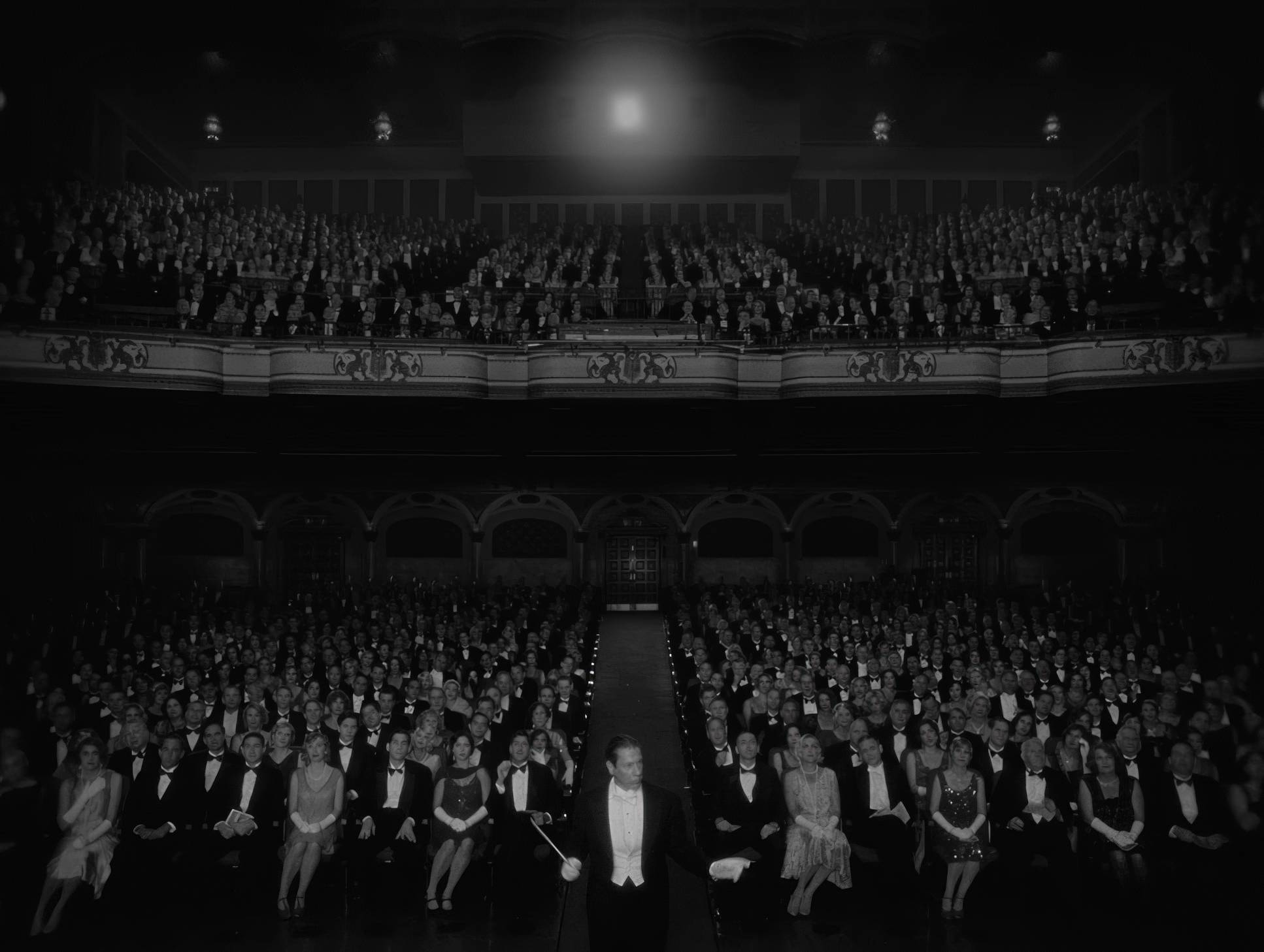
The 1.33:1 (4:3) aspect ratio is the star of the show here. As a colorist, I’m used to looking at widescreen 2.39:1 “scope” frames, so seeing a nearly square frame is always a shock to the system. Schiffman uses this verticality brilliantly. It forces the audience to focus on the human face the “mugging,” as some critics call it which is the primary engine of a silent film.
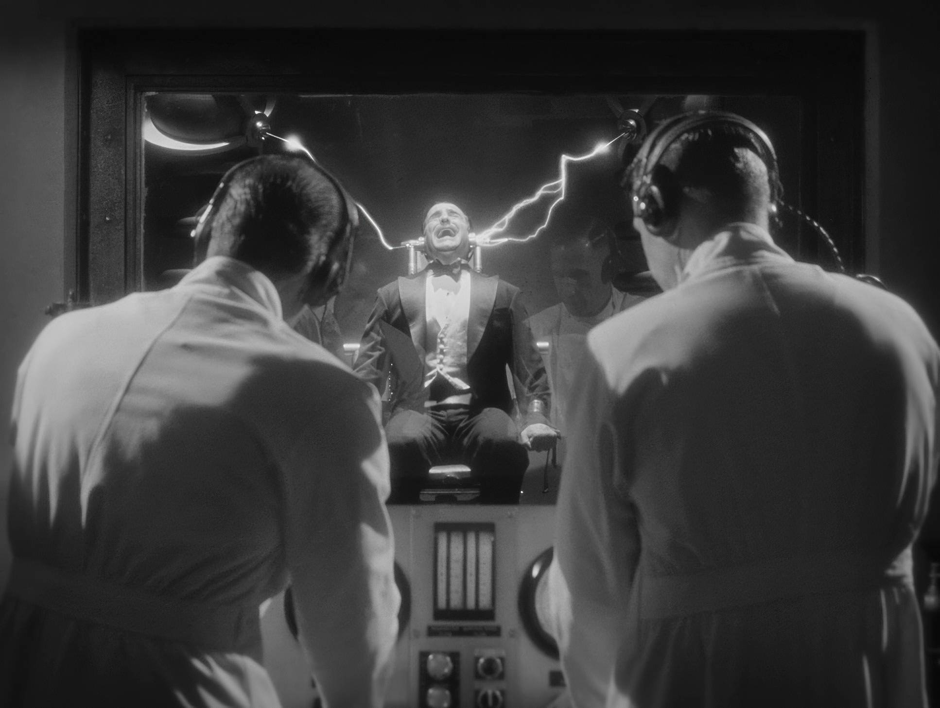
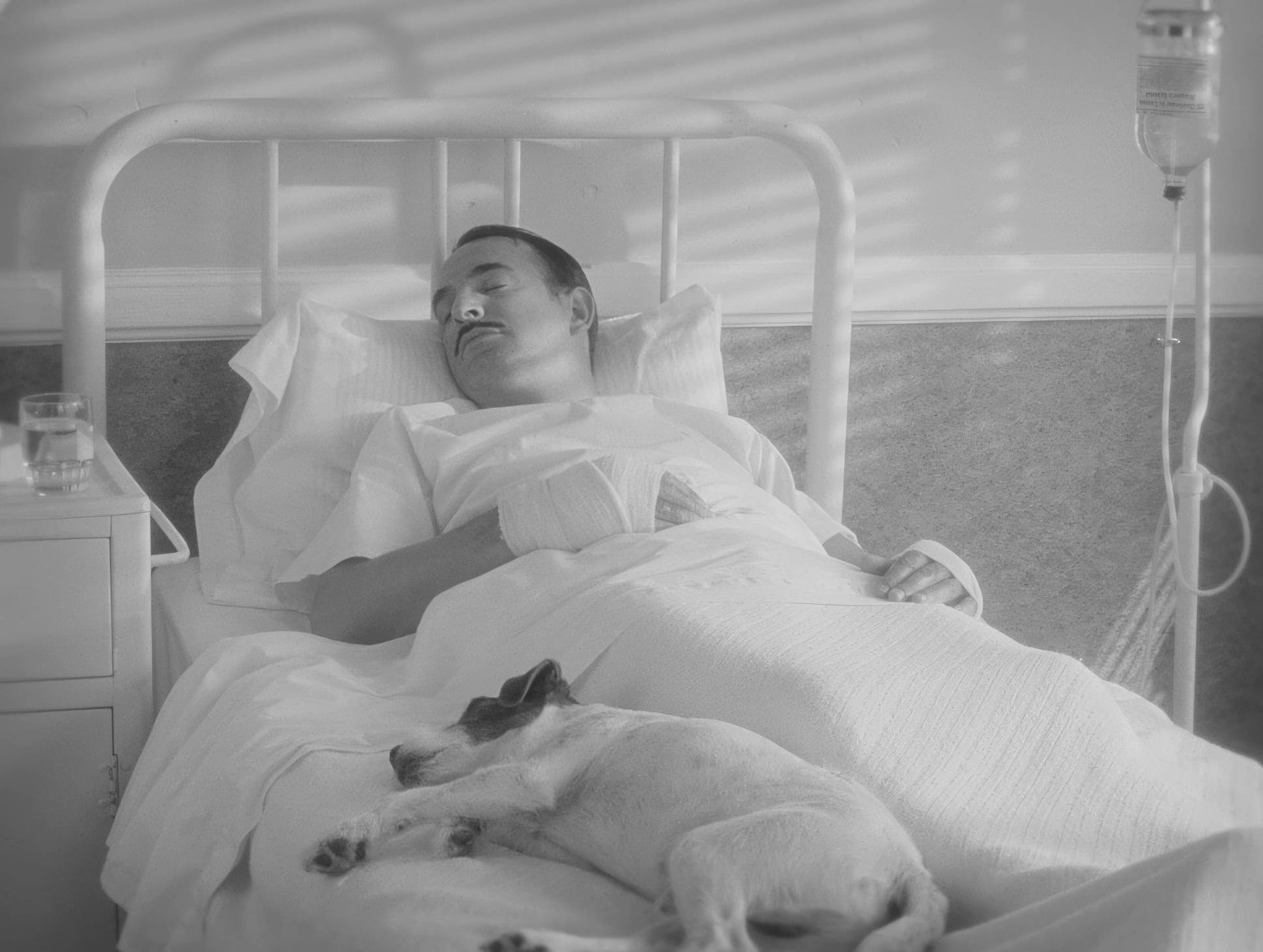
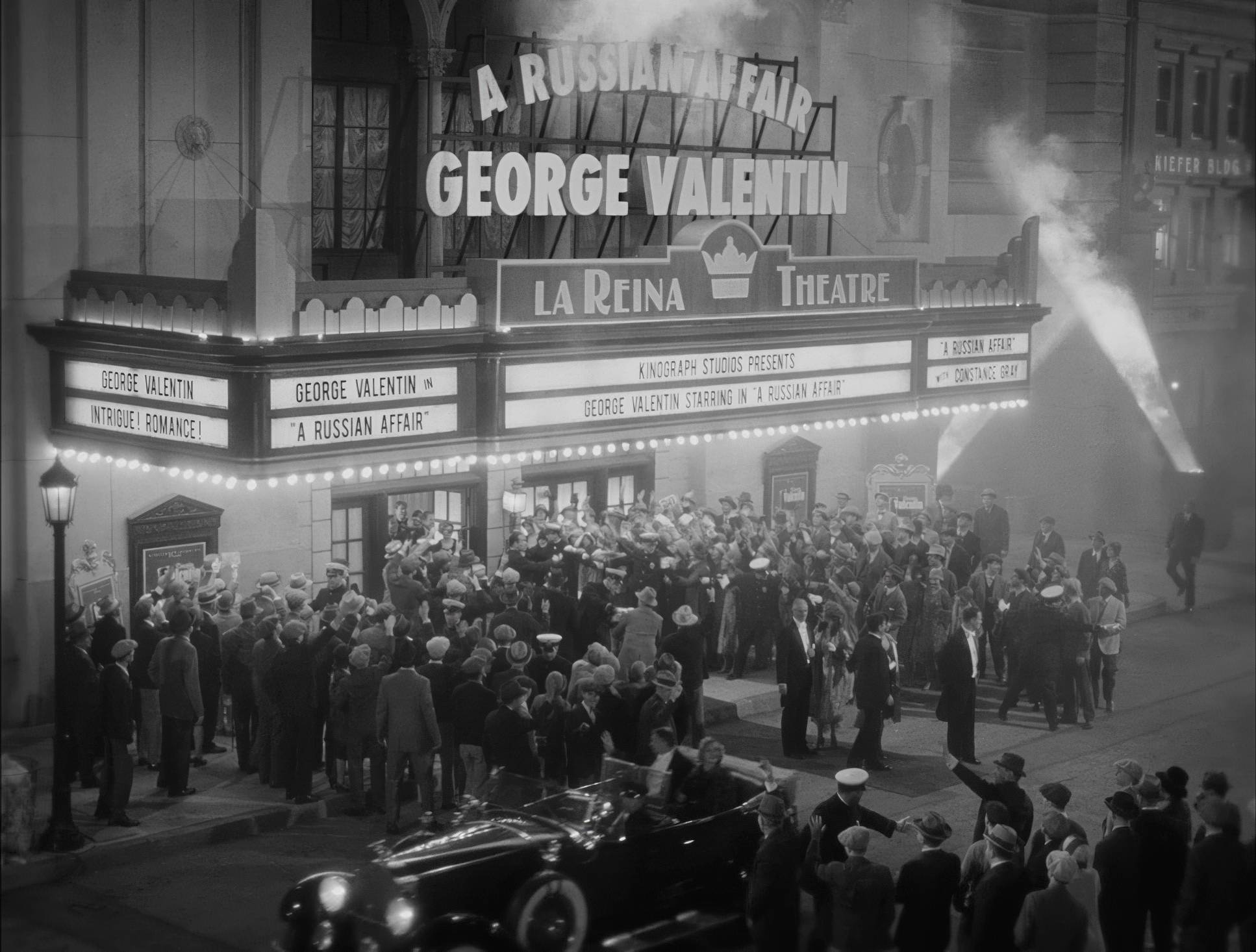
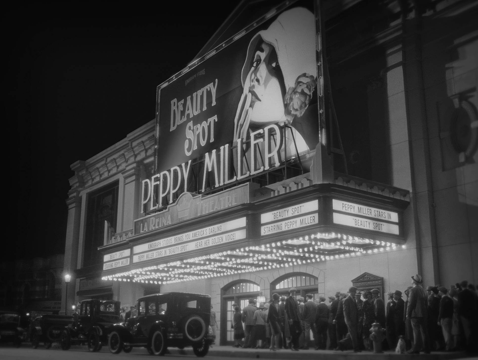
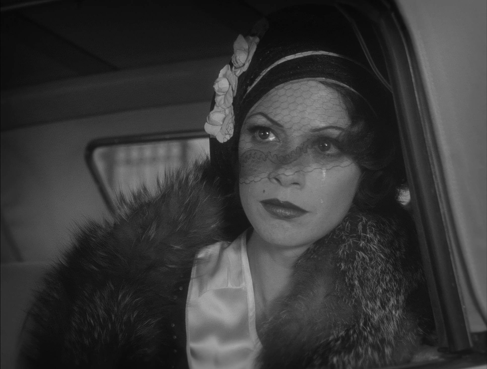
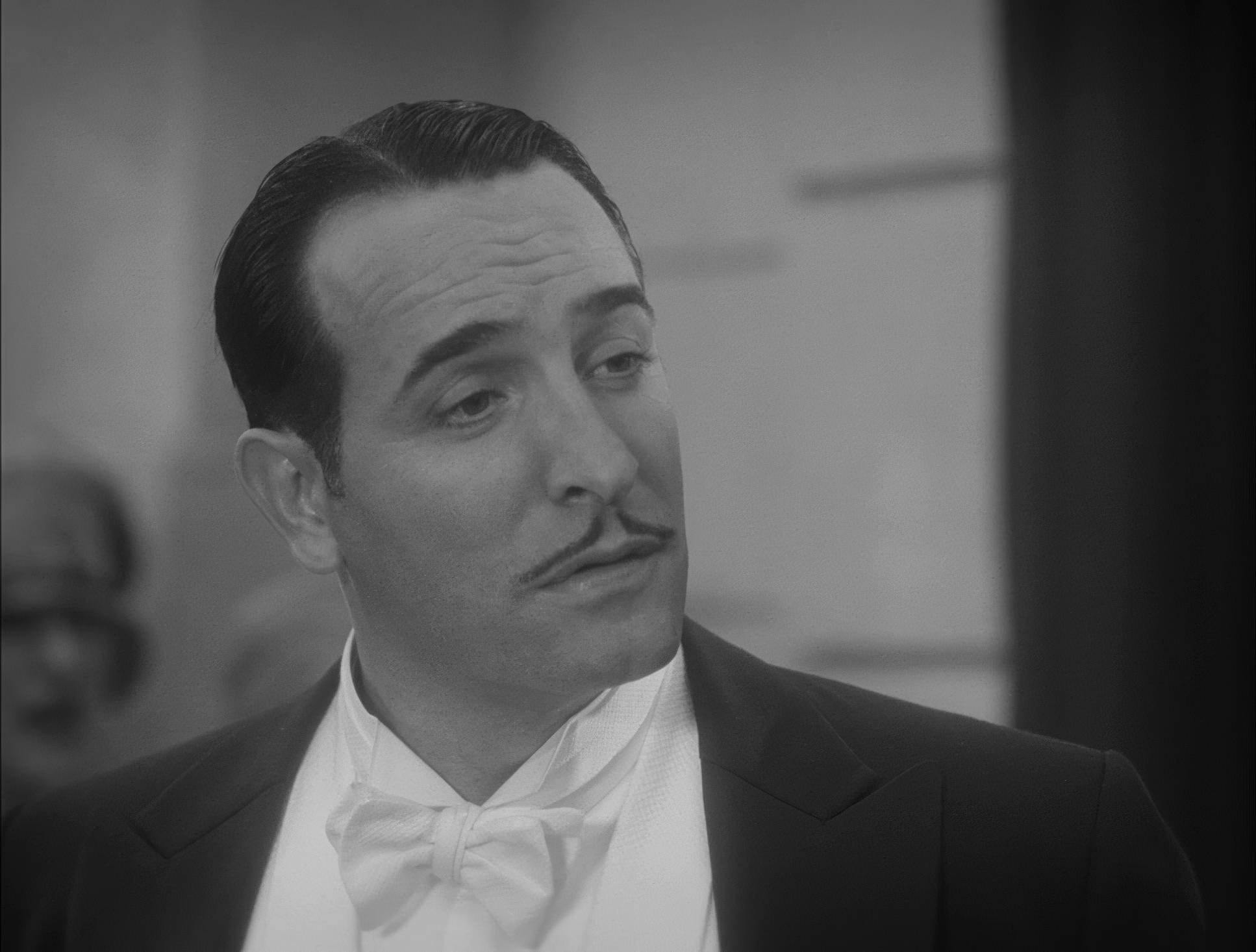
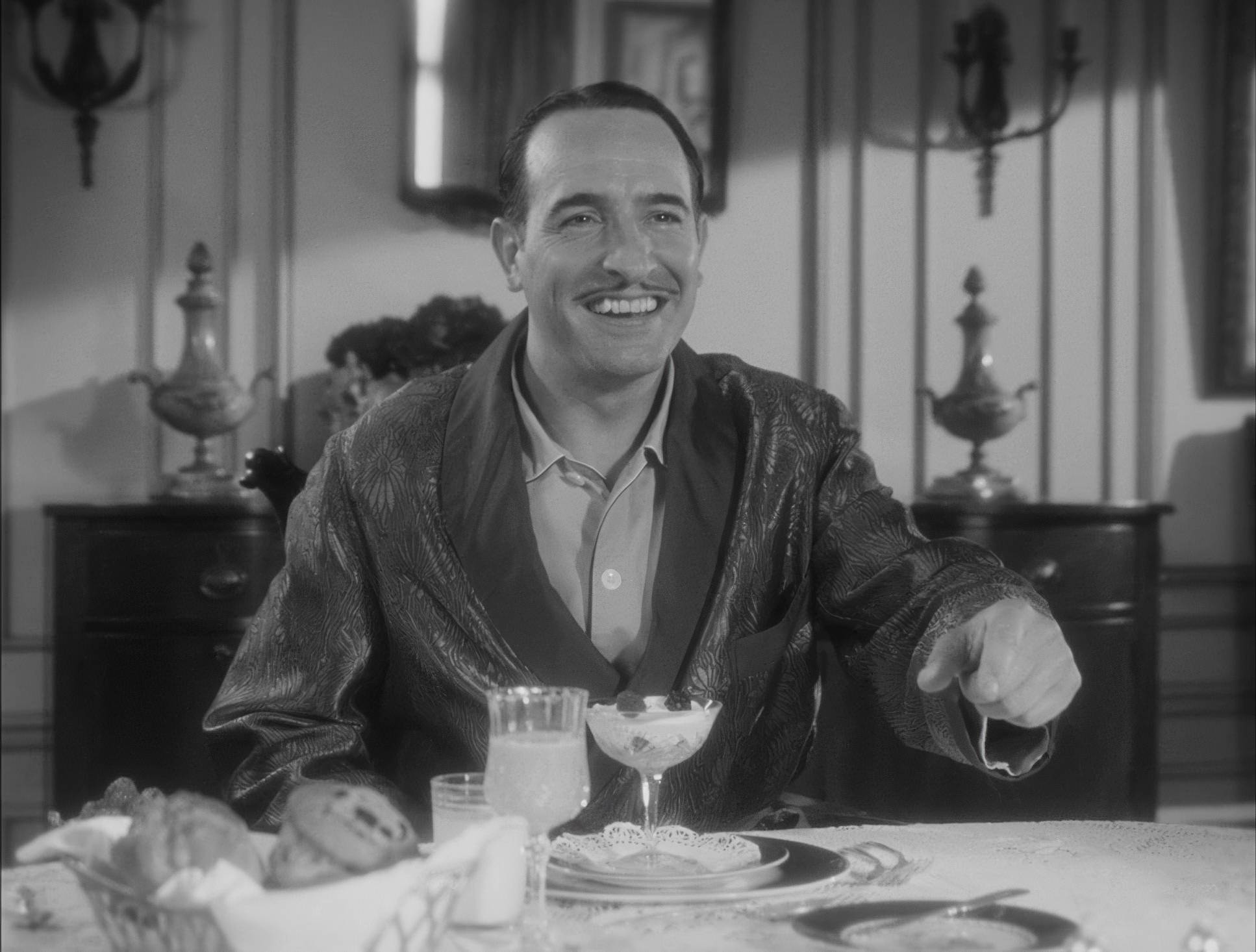
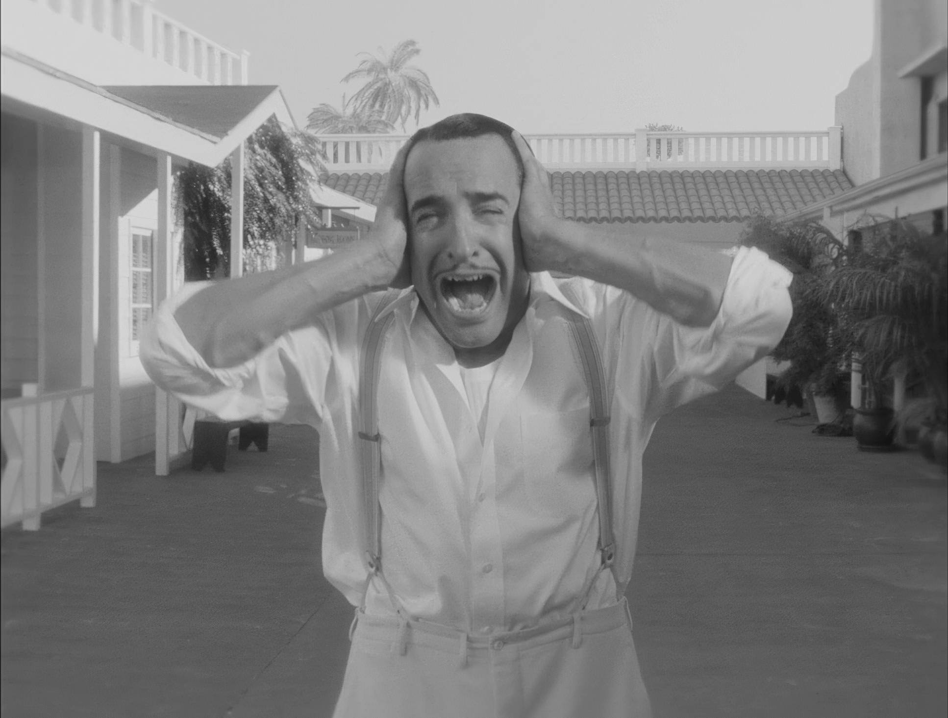
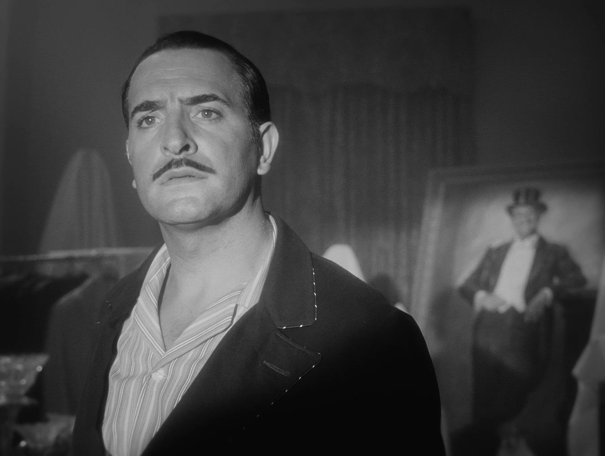
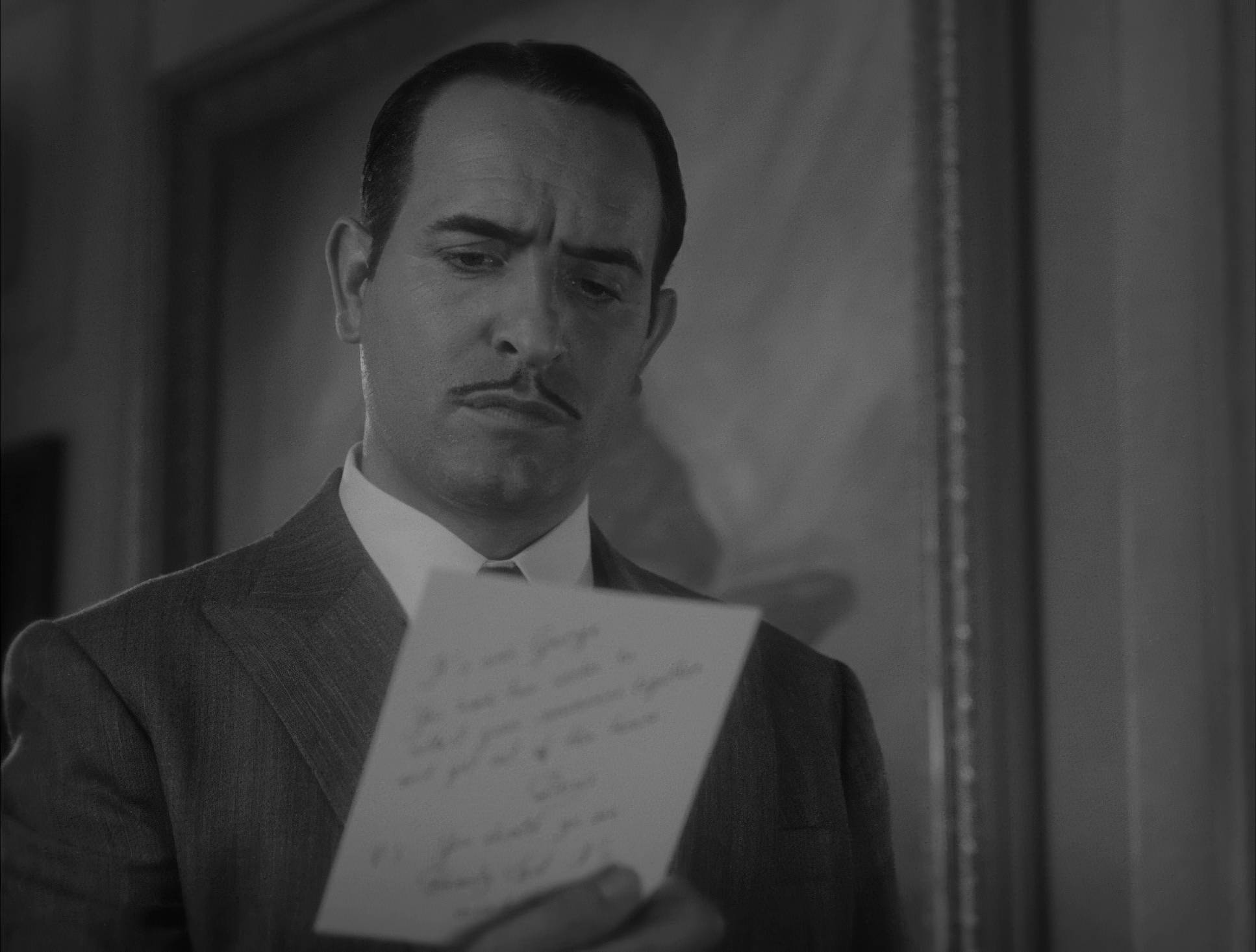
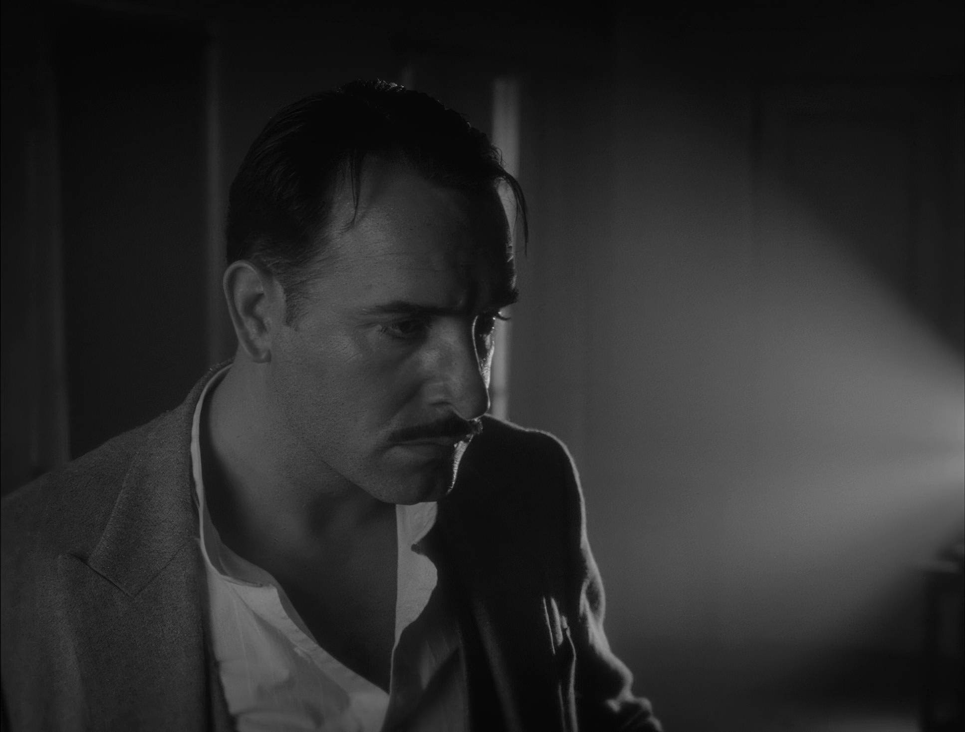
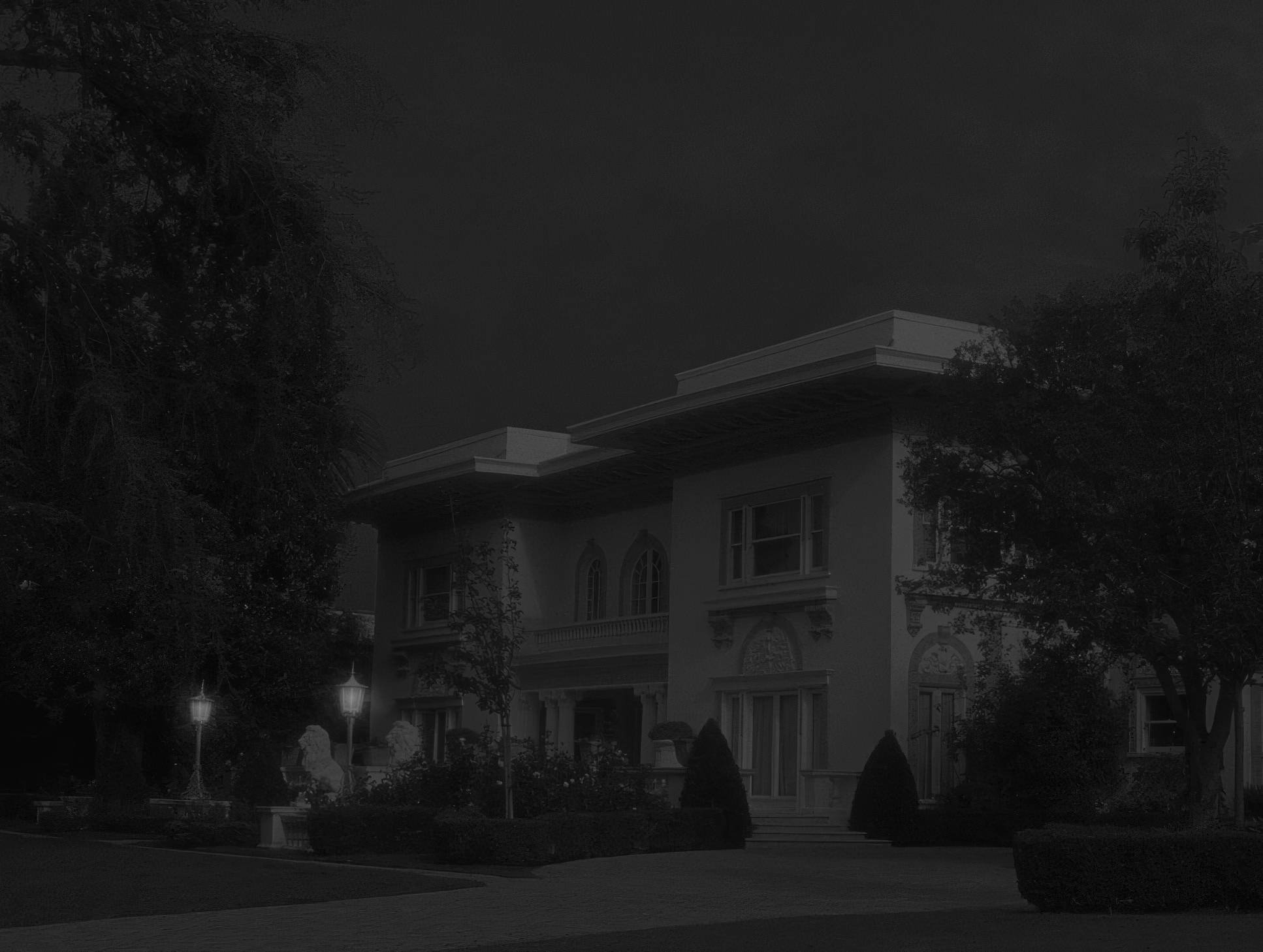
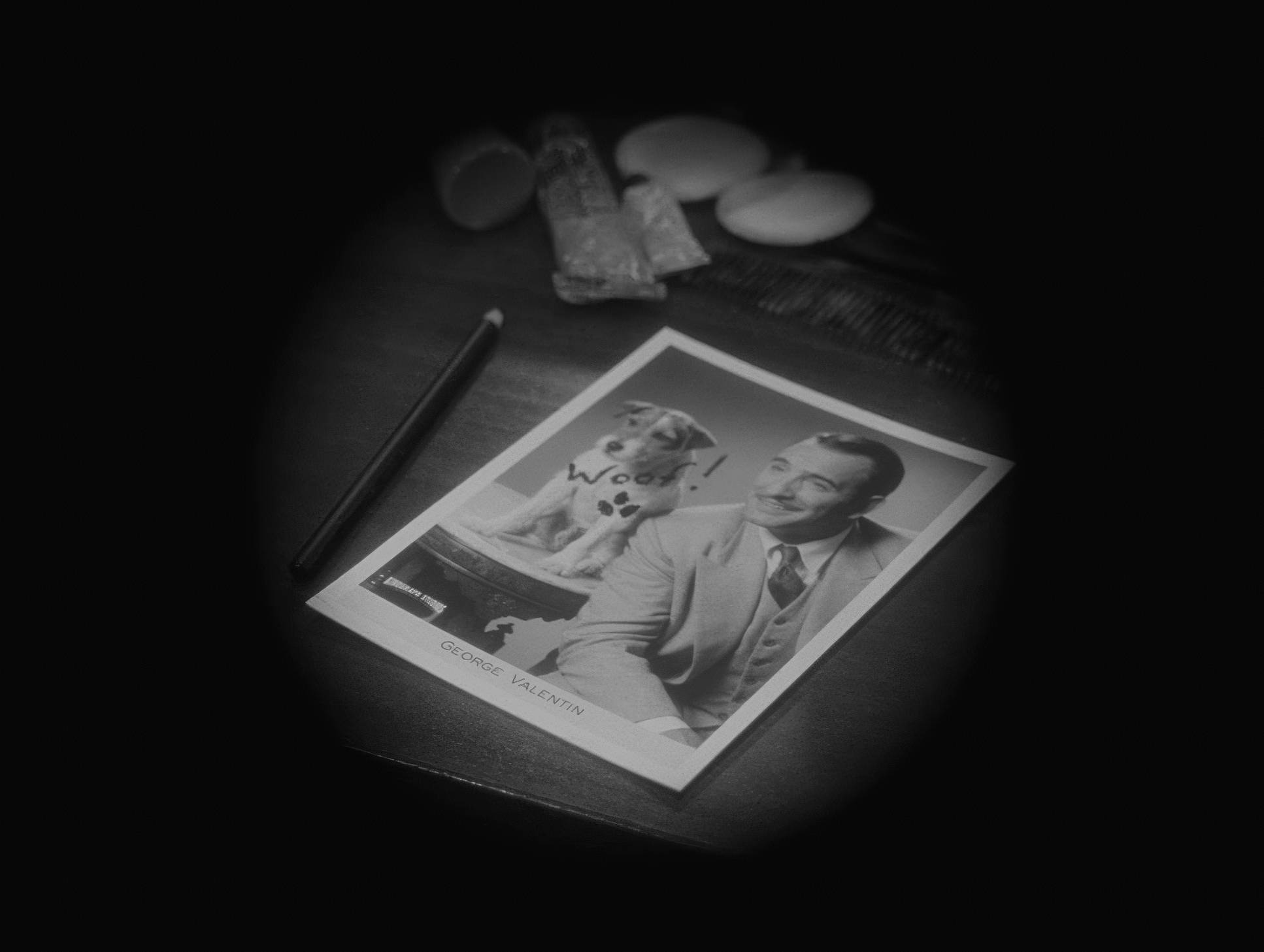
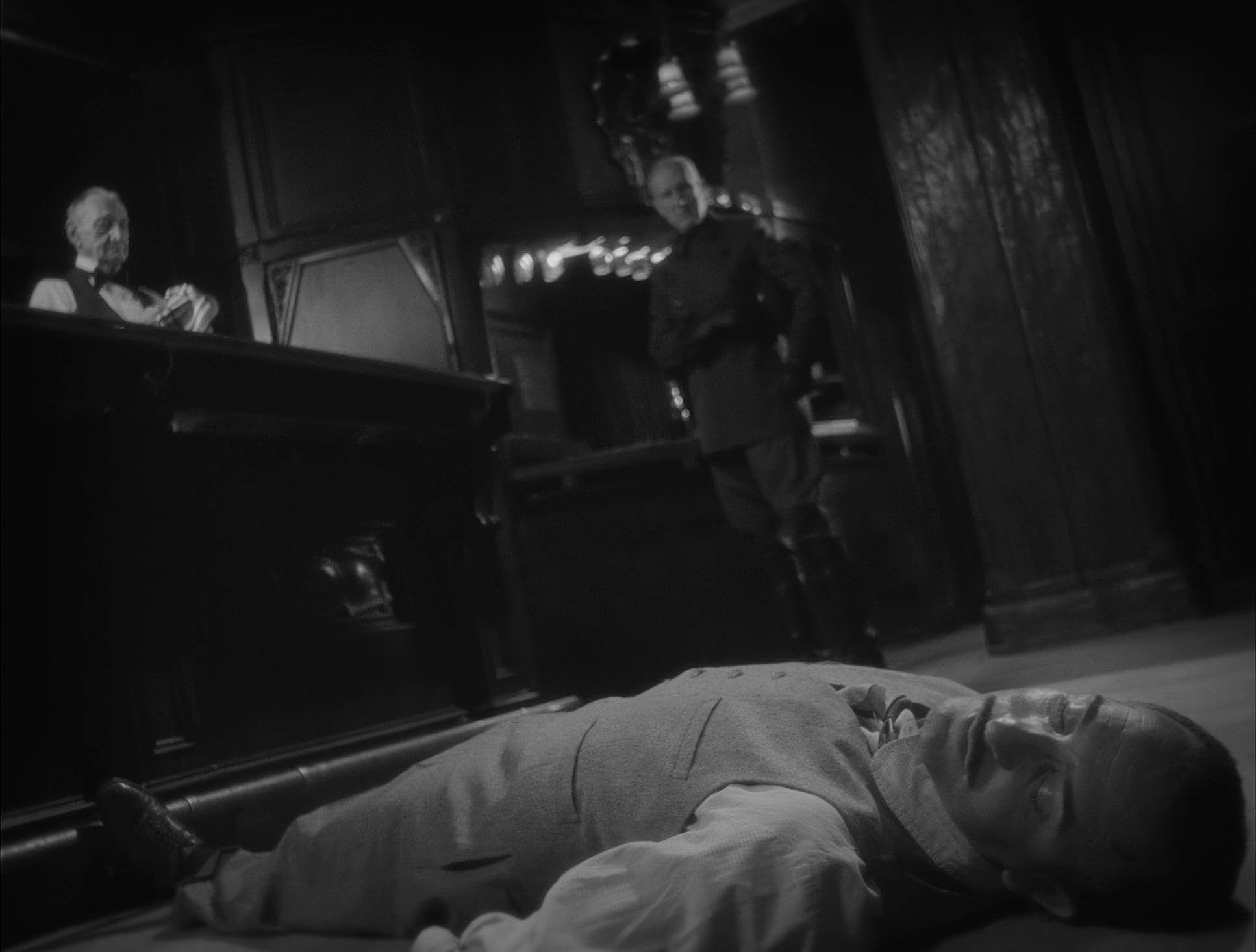
In the early “star-power” scenes, George Valentin is centered, dominant, and framed with plenty of headroom to emphasize his stature. But as his career hits the skids, the compositions tighten. He starts getting “boxed in” by architectural elements or the edge of the frame. It’s a literal visual imprisonment. The composition doesn’t just show the story; it dictates the emotional pressure of the scene.
Color Grading Approach

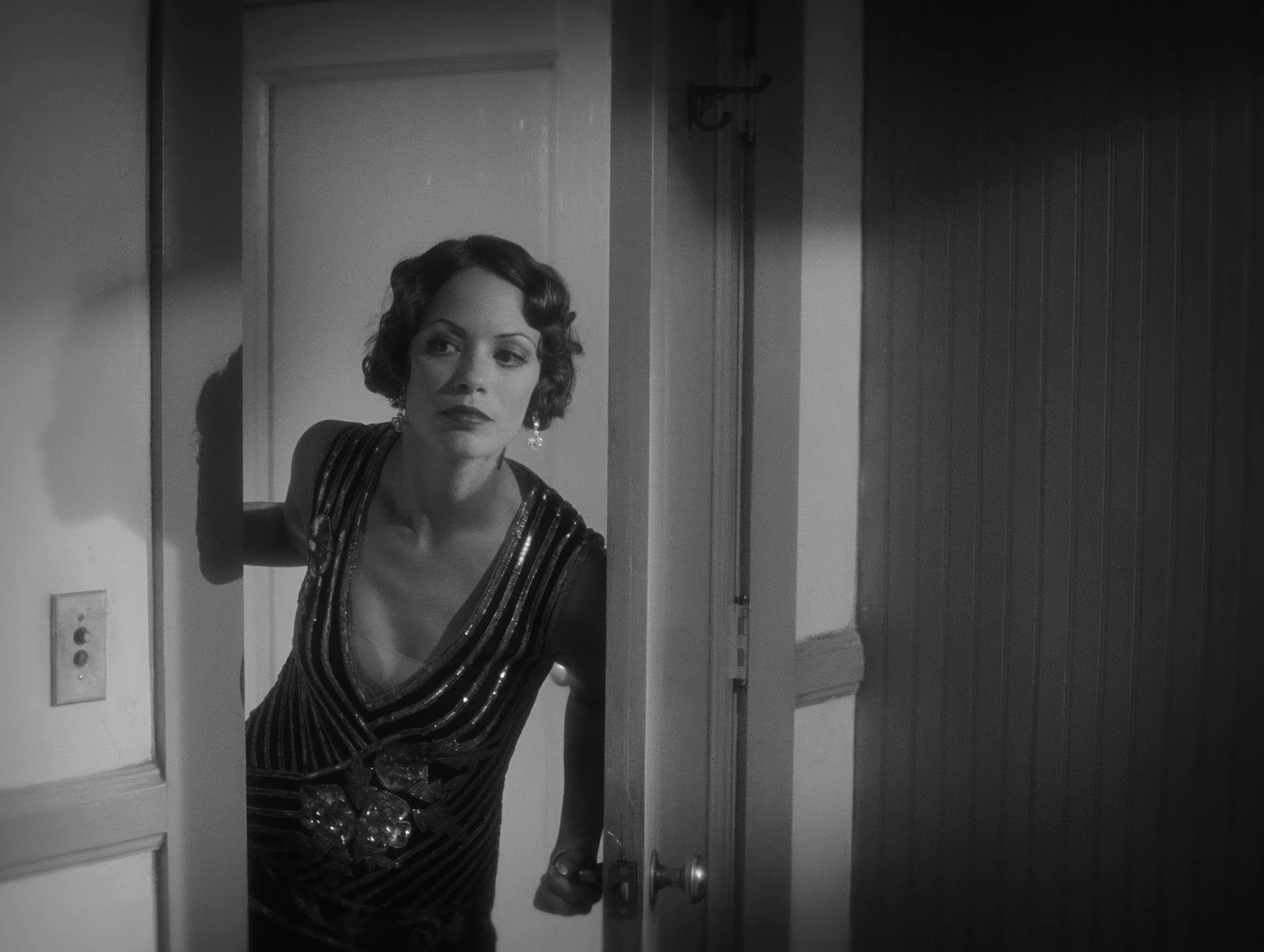
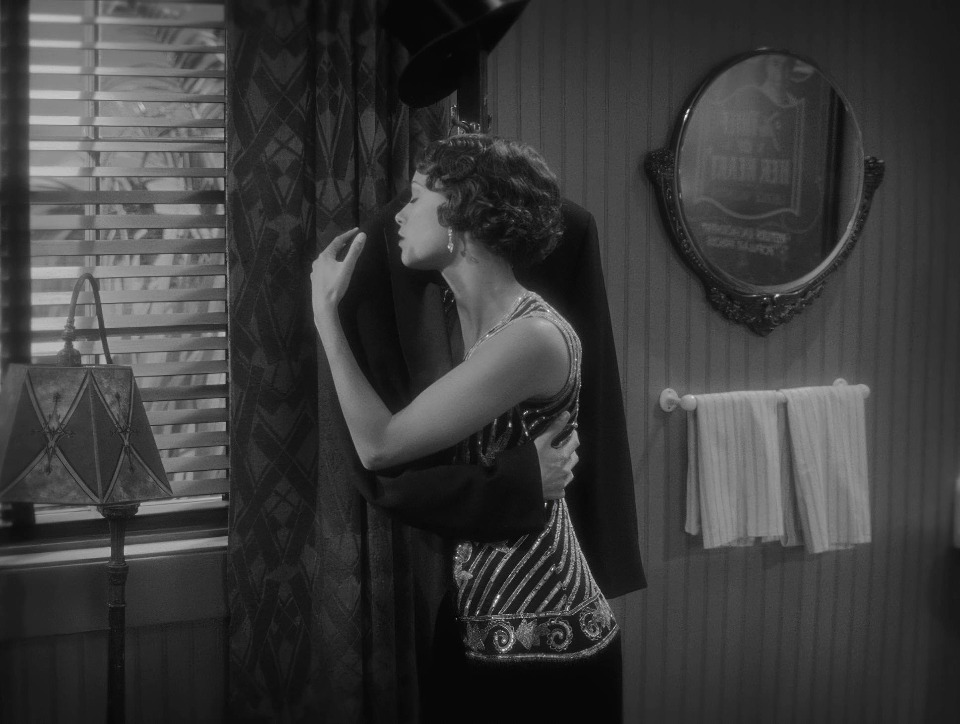
This is where the real “black magic” happens. People often think B&W grading is just hitting the desaturation button, but it’s actually about tonal sculpting. On this project, the goal was to simulate the look of orthochromatic and panchromatic film stocks from a century ago.
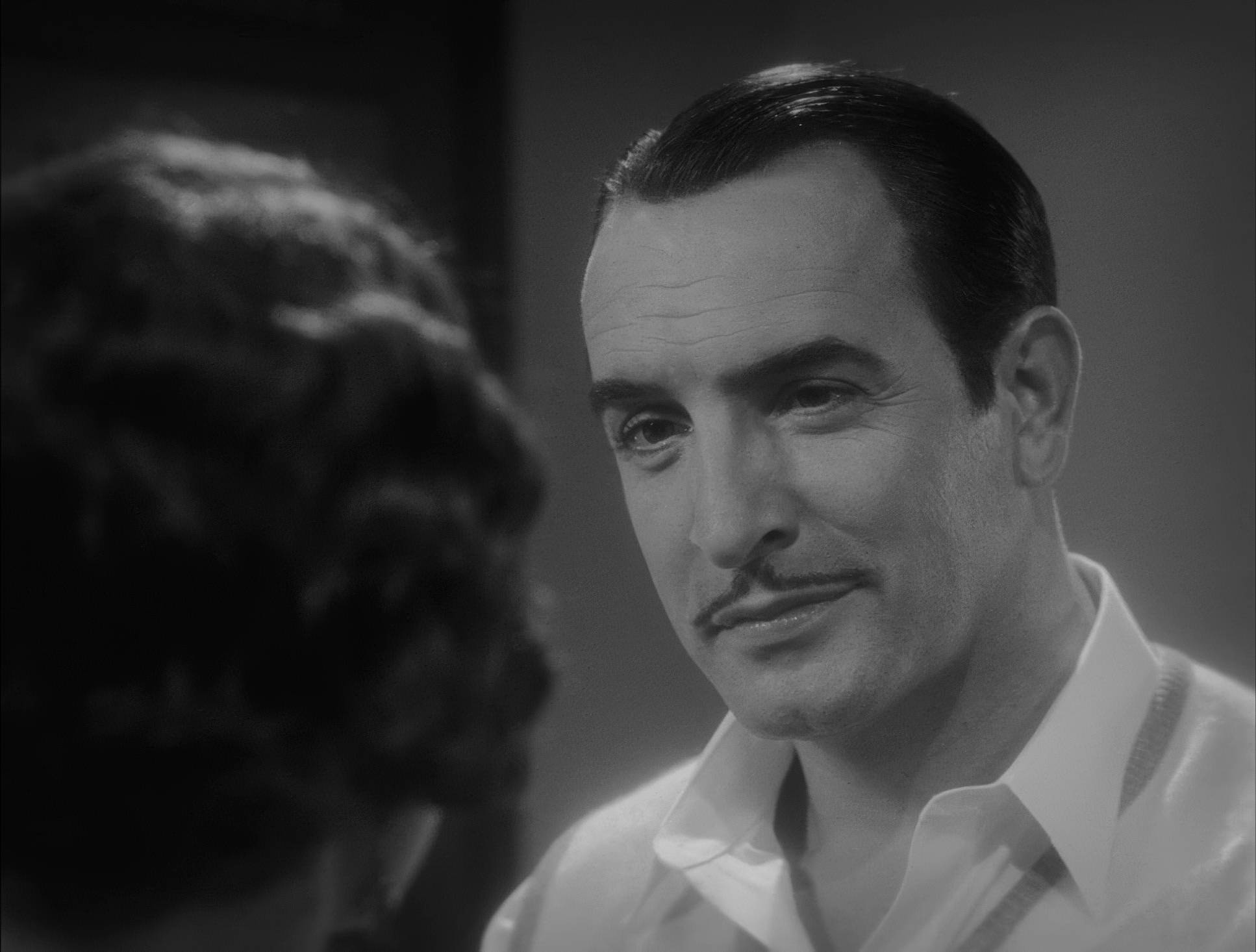
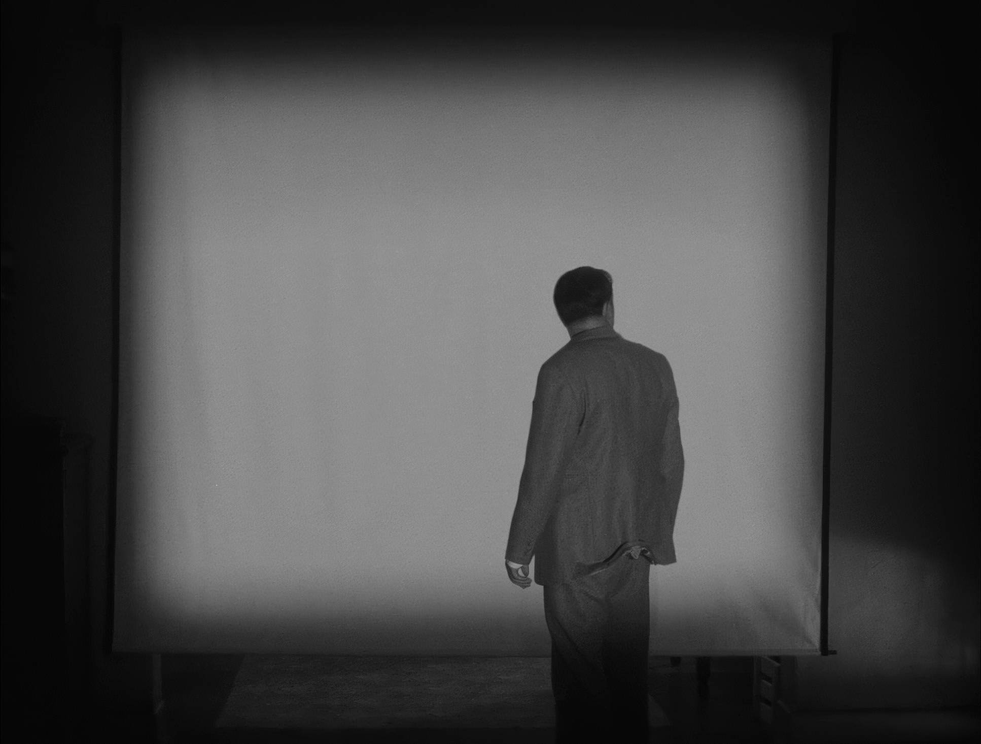
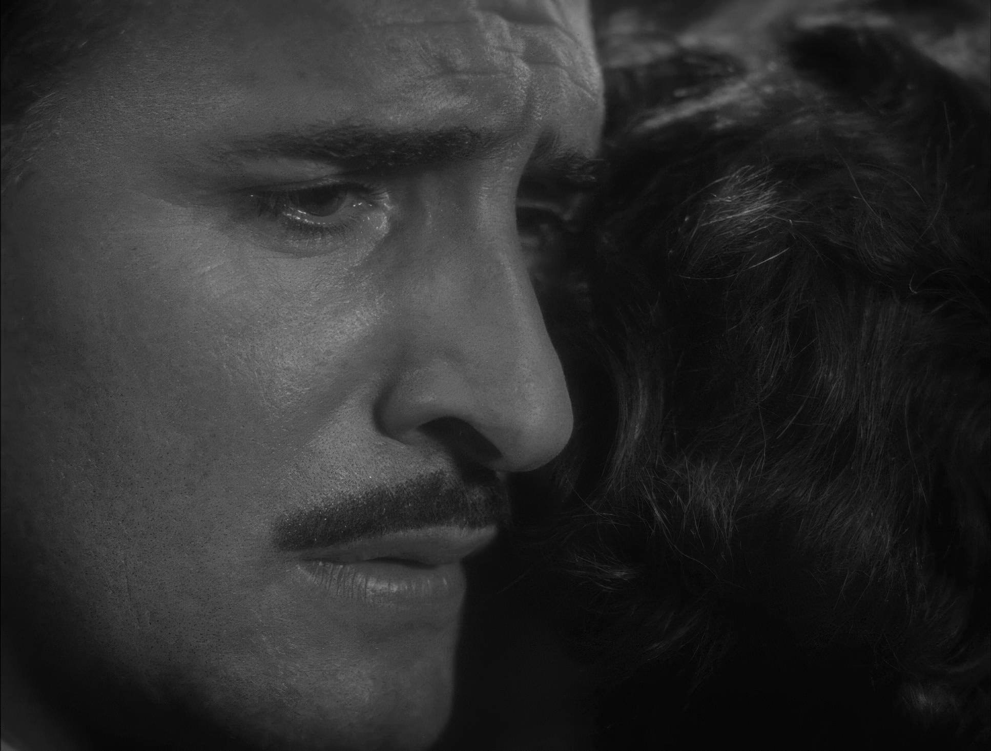
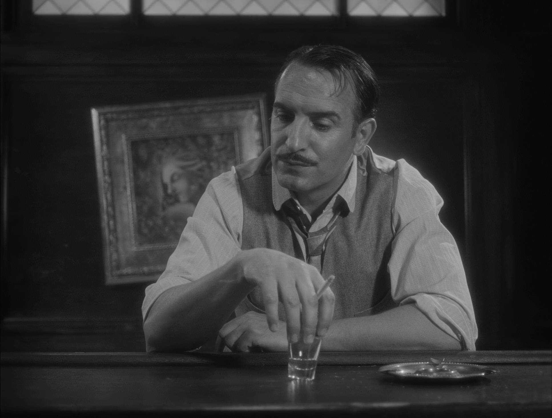
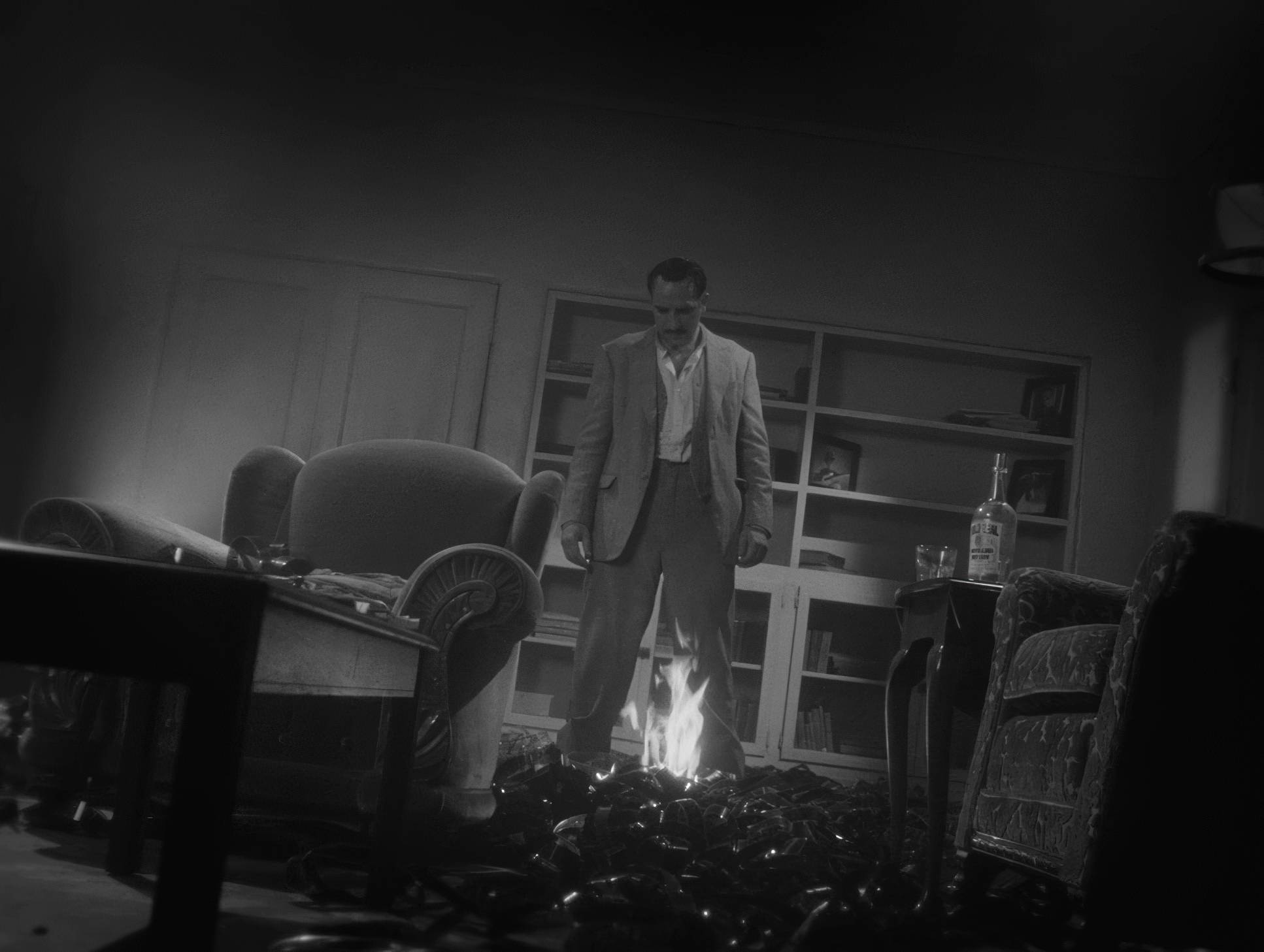
When I look at the grade, I see a meticulous management of the grey scale. It’s about how colors translate into luminance. For instance, in the “Torture Chamber” set, they had to ensure the dark suits didn’t just “bleed” into the dark backgrounds. That requires very specific contrast shaping maintaining detail in the “toe” of the image (the shadows) without letting it look washed out. We’re talking about a “creamy” highlight roll-off that avoids digital clipping and a mid-tone richness that makes the skin look luminous. It’s a “print-film” sensibility where the texture feels baked into the luminance, not just slapped on top.
Lighting Style

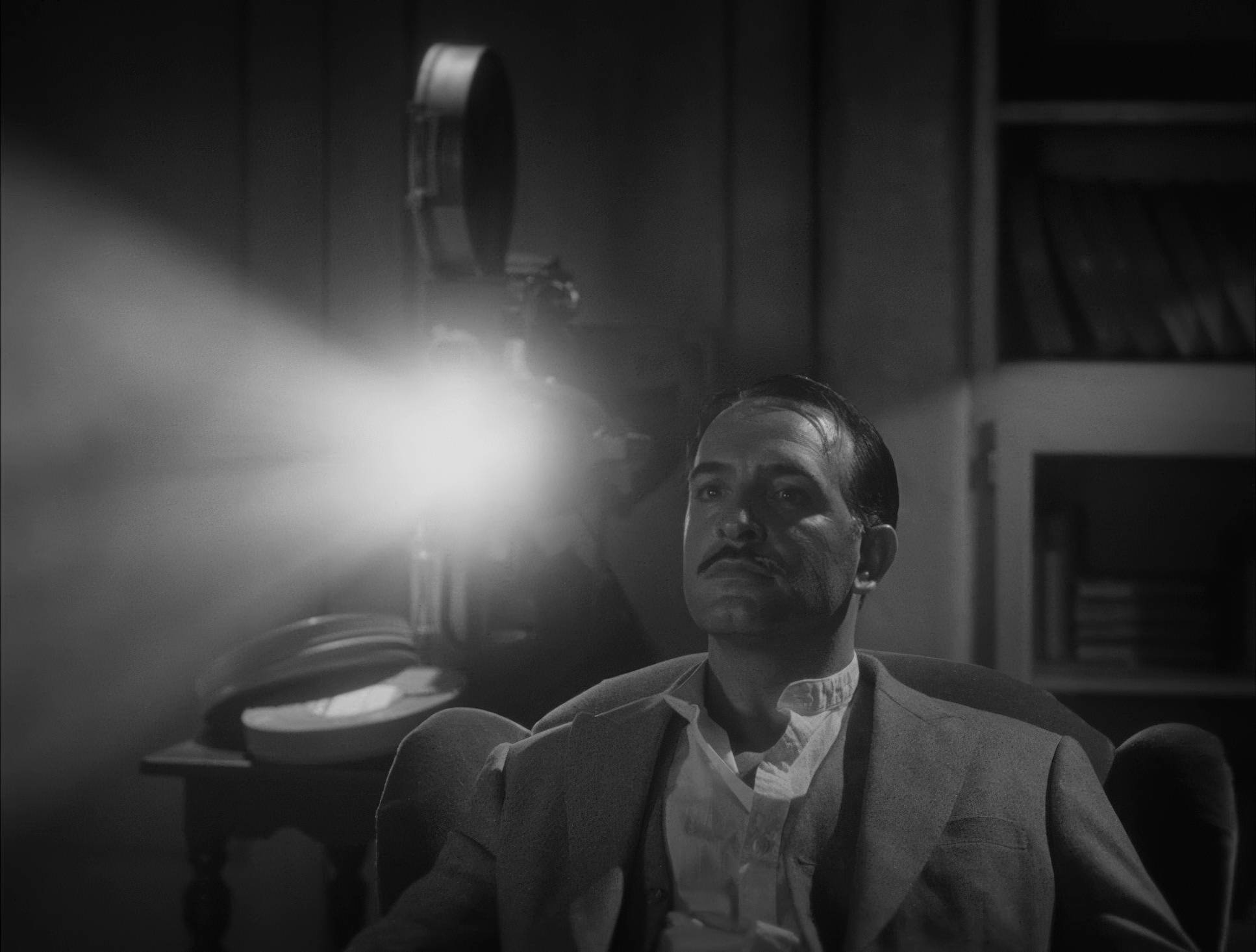
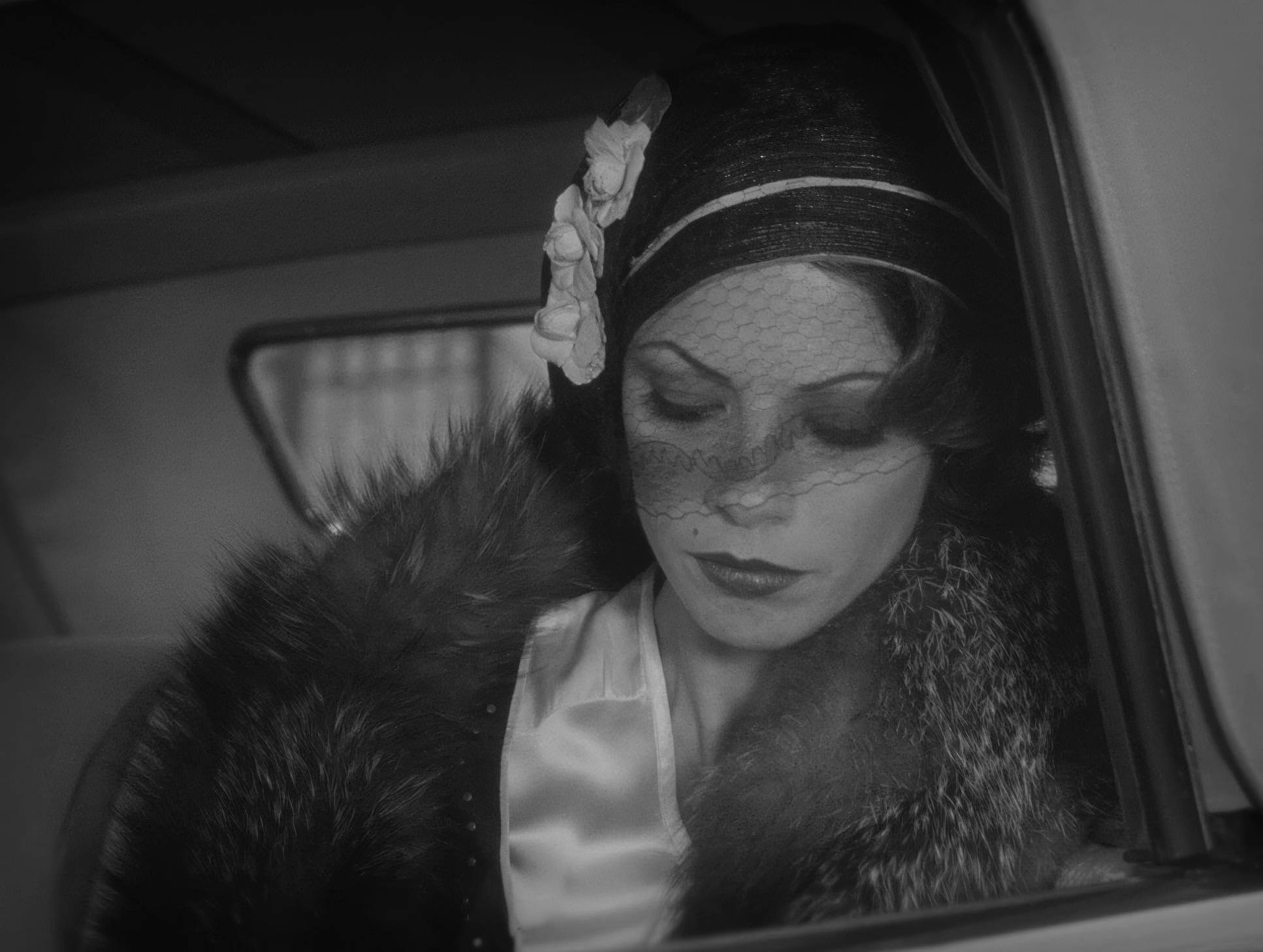
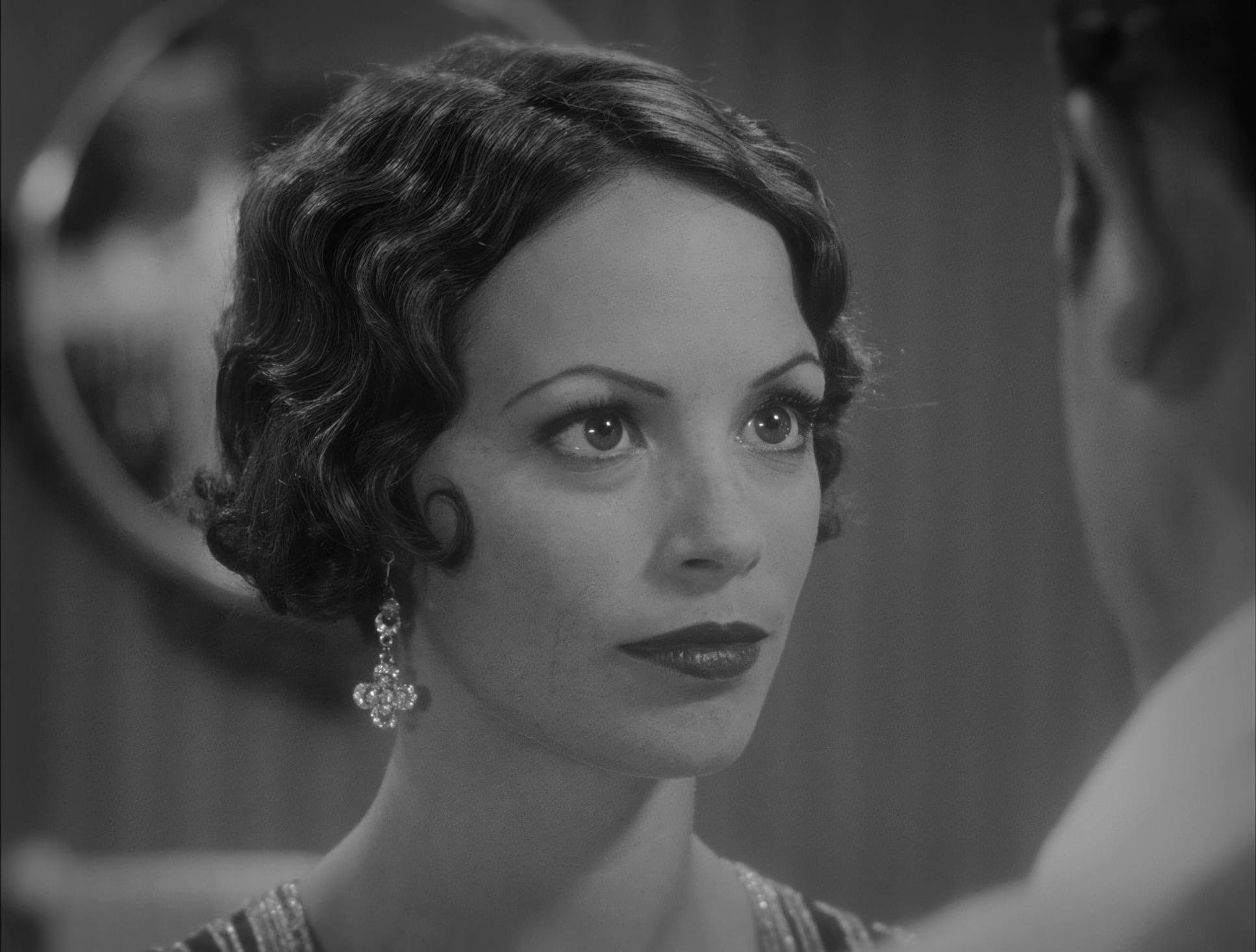
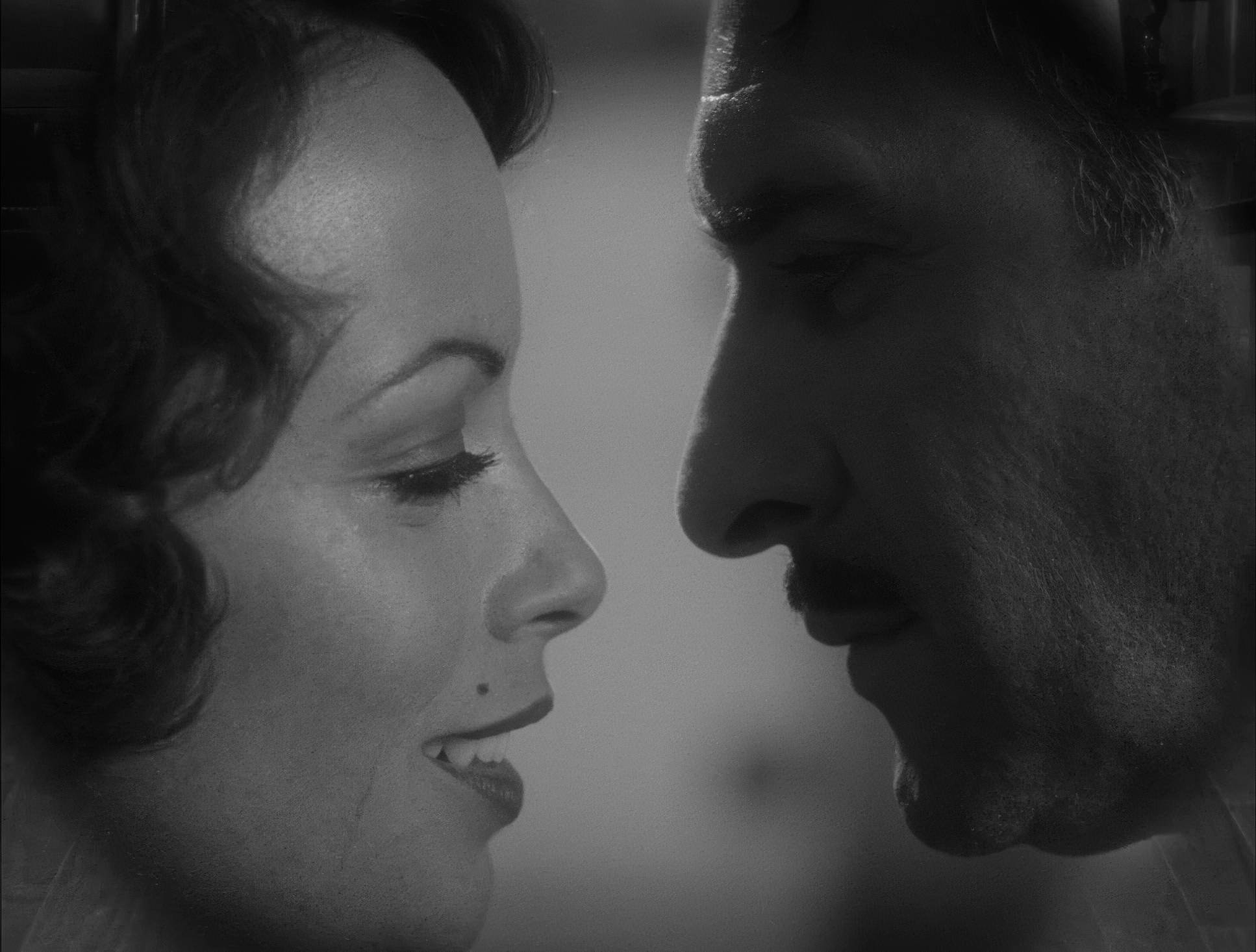
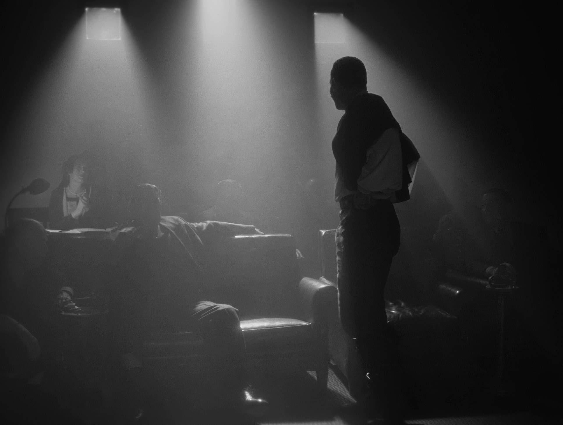
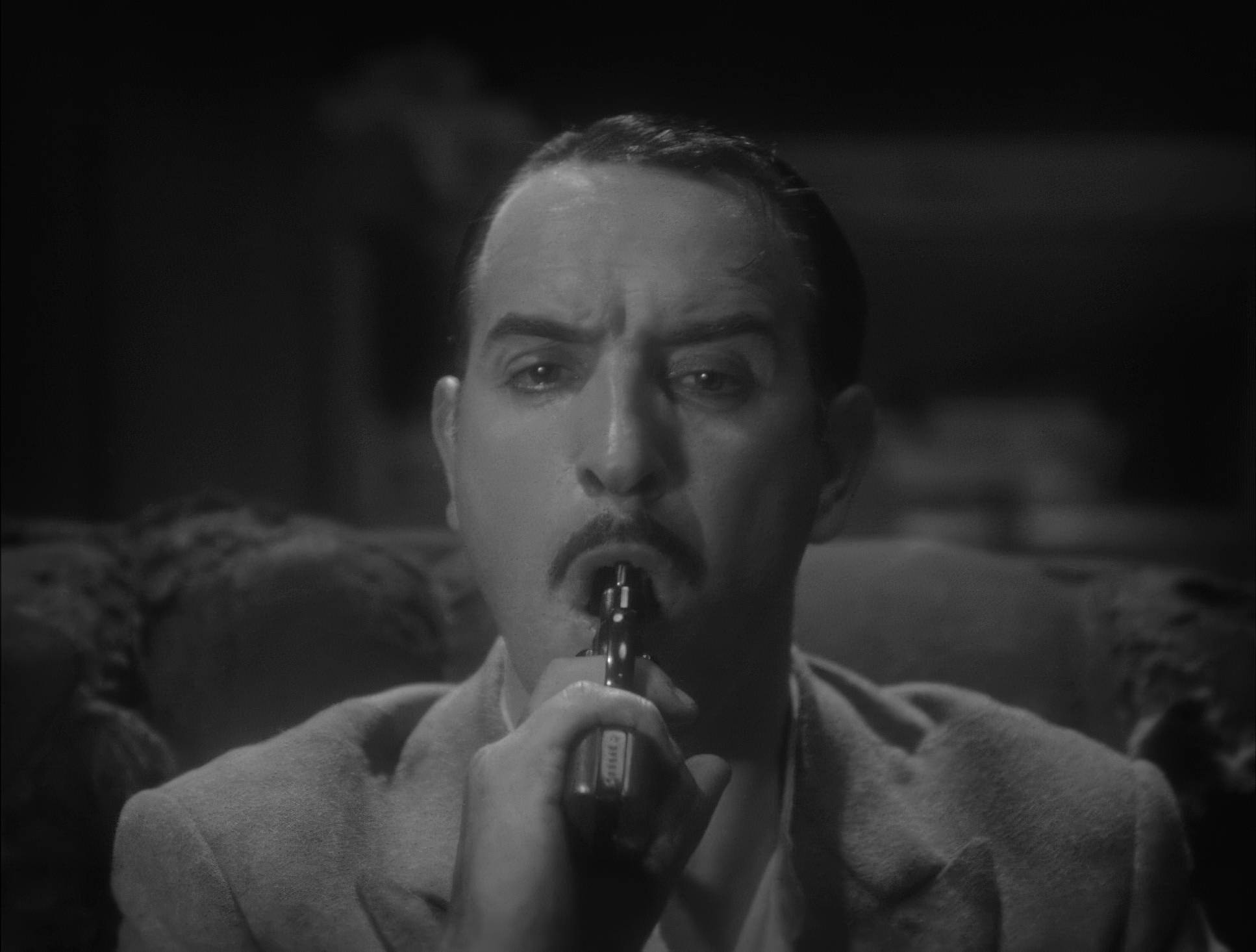
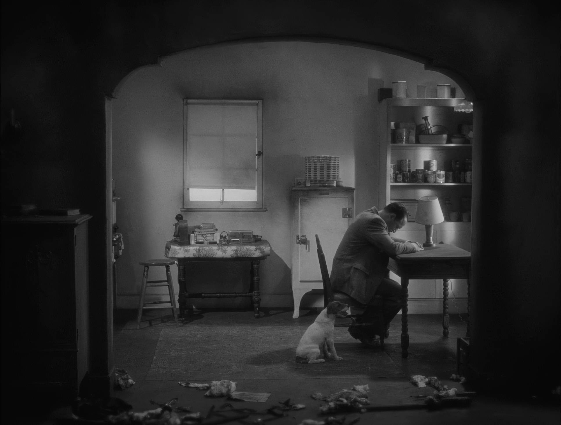
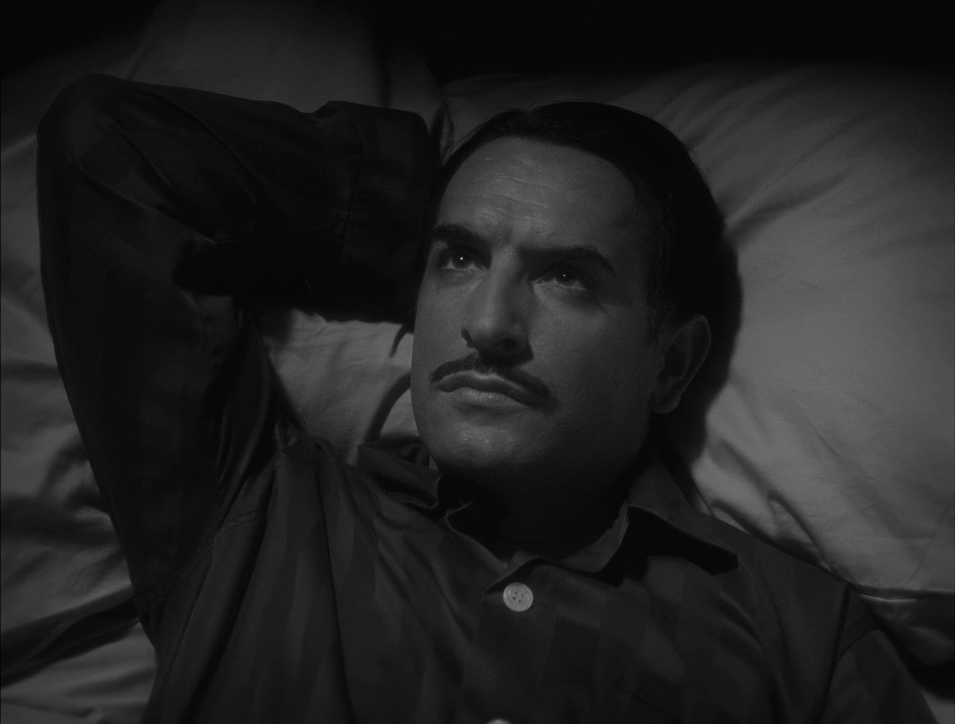
The lighting in The Artist is a masterclass in motivated drama. Schiffman oscillates between two distinct worlds. The first is the “Hollywood Glamour” look: high-key, soft, and radiant. You see those classic “pingy” catchlights in the eyes that make the actors look like gods. They likely used large, soft sources reminiscent of the massive arc lights of the 20s to wrap light around the faces.
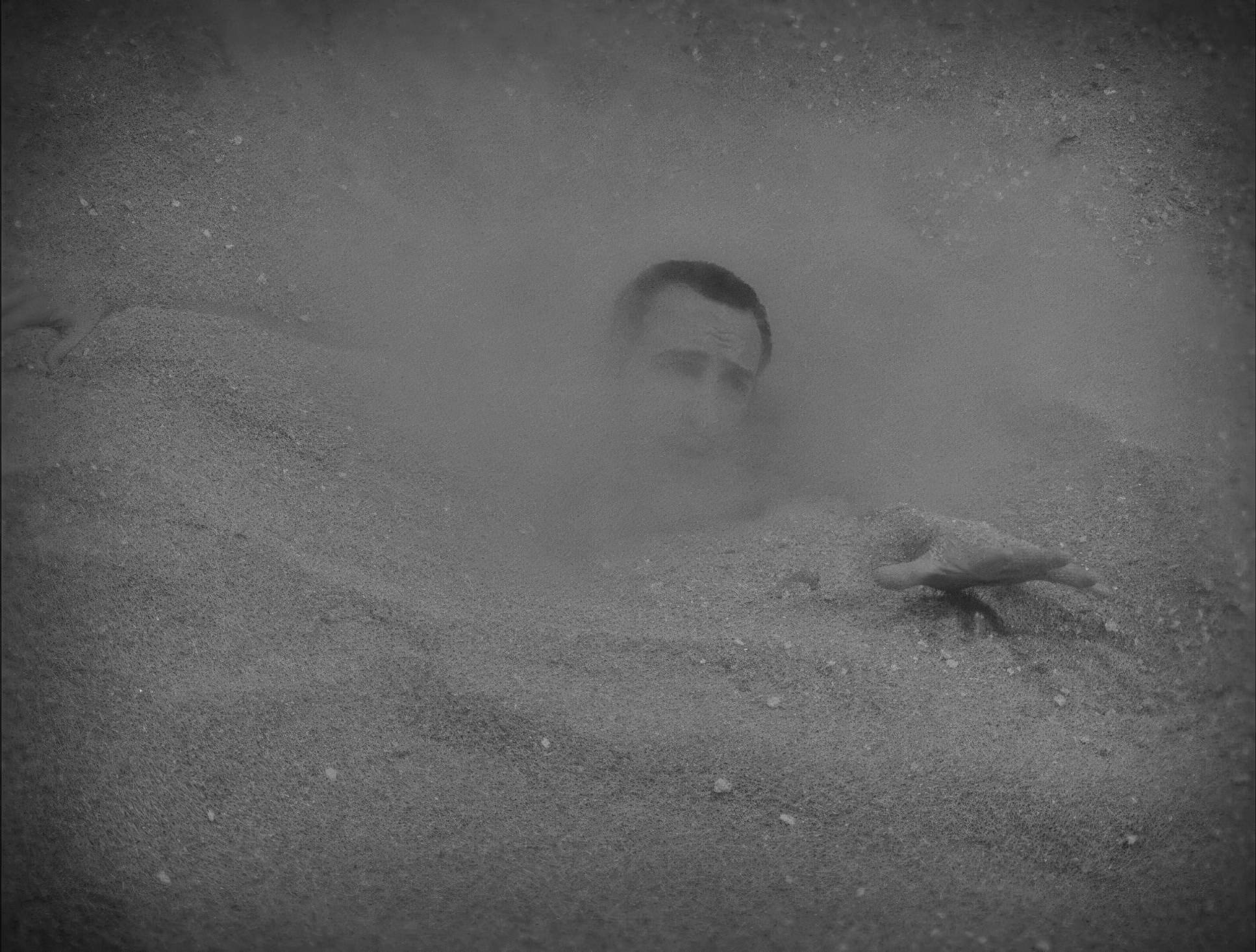
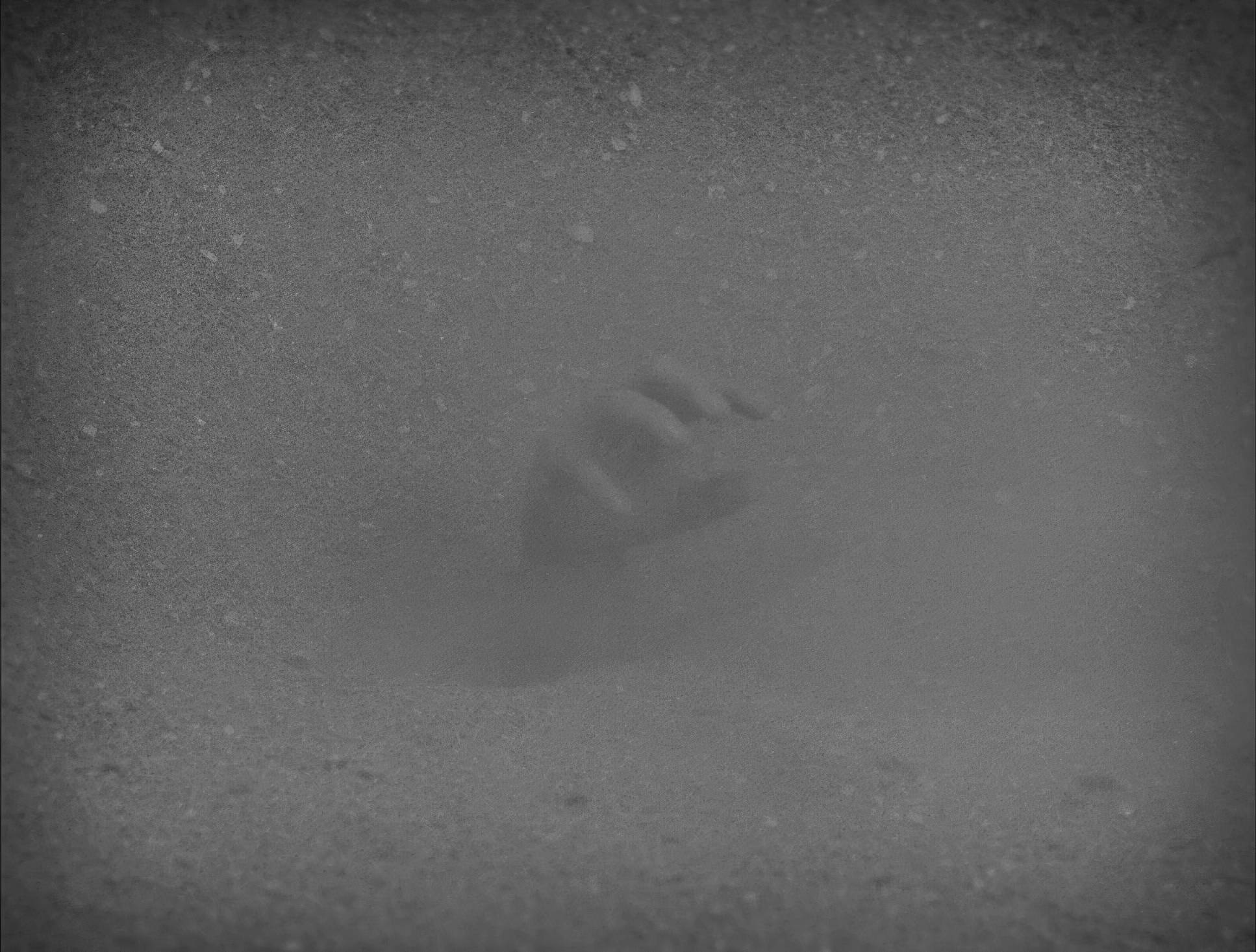
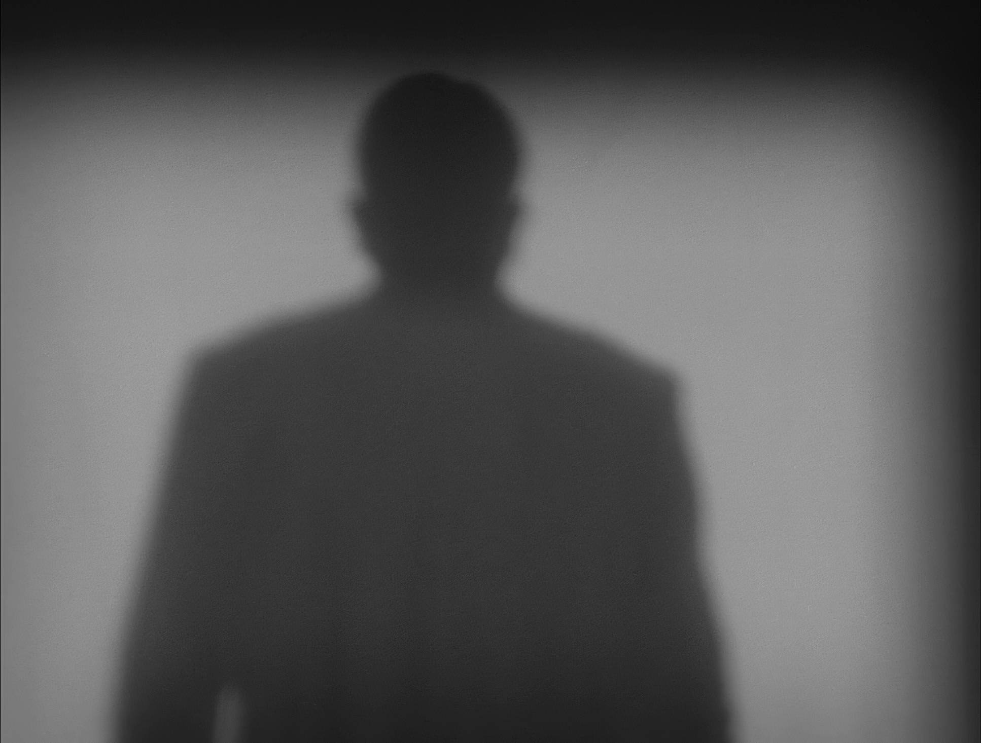
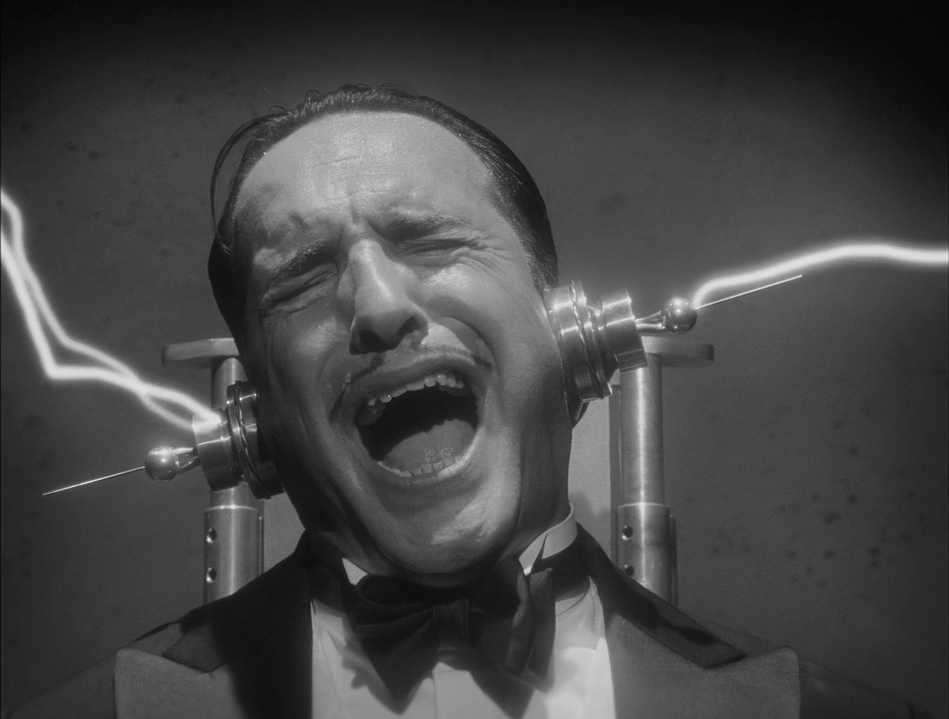
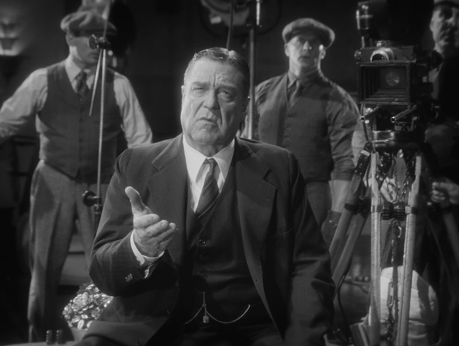
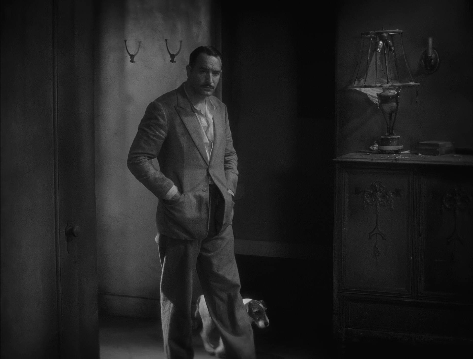
But as the tragedy sets in, the lighting shifts toward German Expressionism. We’re talking hard light, top-down shadows, and high-contrast ratios. In the scenes in George’s deteriorating mansion, the lighting becomes harsh and unforgiving. The shadows aren’t just dark; they are structural elements of the scene. This shift in lighting tells the audience George is losing his grip on reality long before the plot confirms it.
Camera Movements

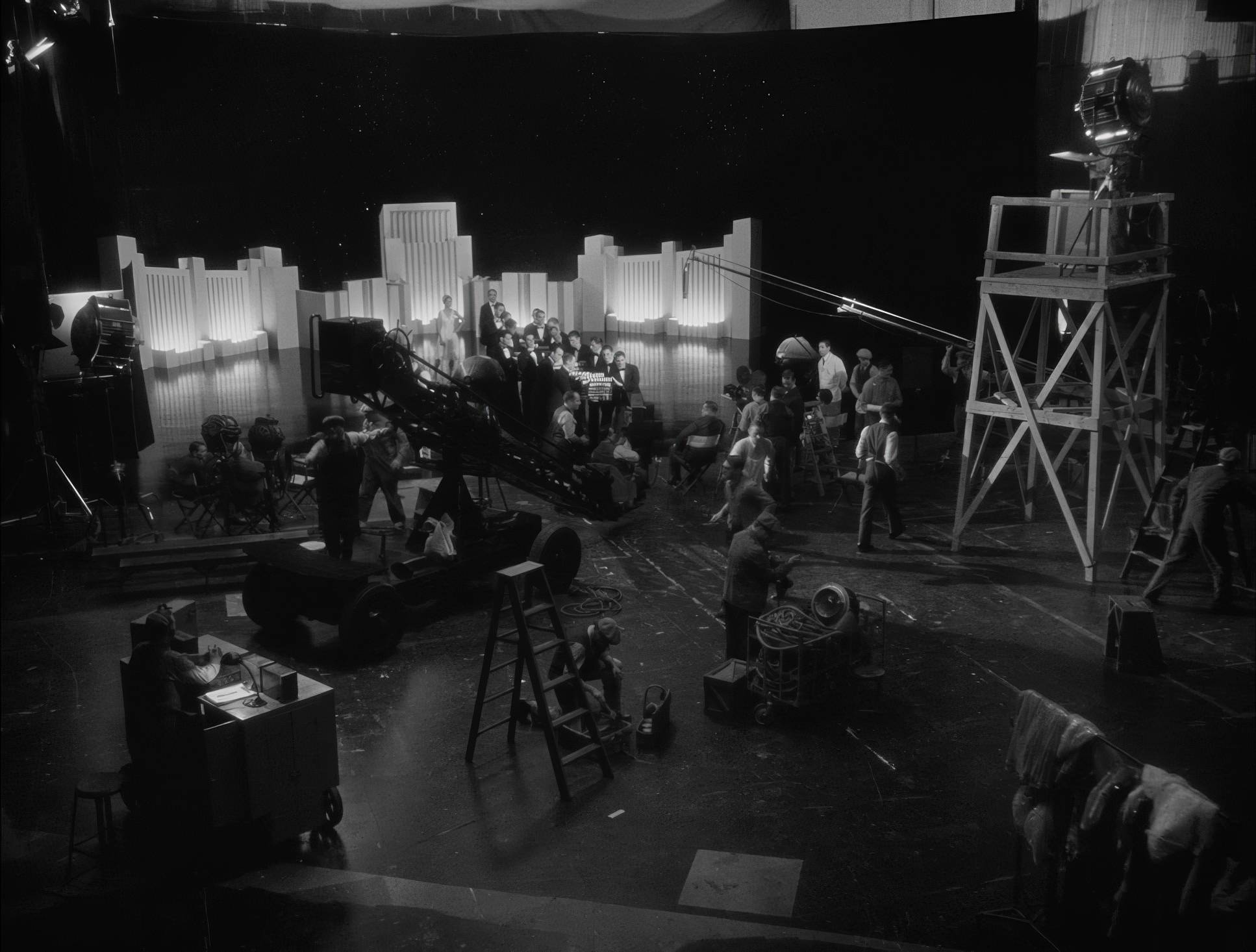
In an age of “shaky-cam” and kinetic drone shots, The Artist is refreshingly deliberate. Schiffman uses the camera with a heavy, elegant restraint that mirrors the bulky gear of the 1920s. We see beautiful, slow dolly shots and tracking movements that feel intentional.
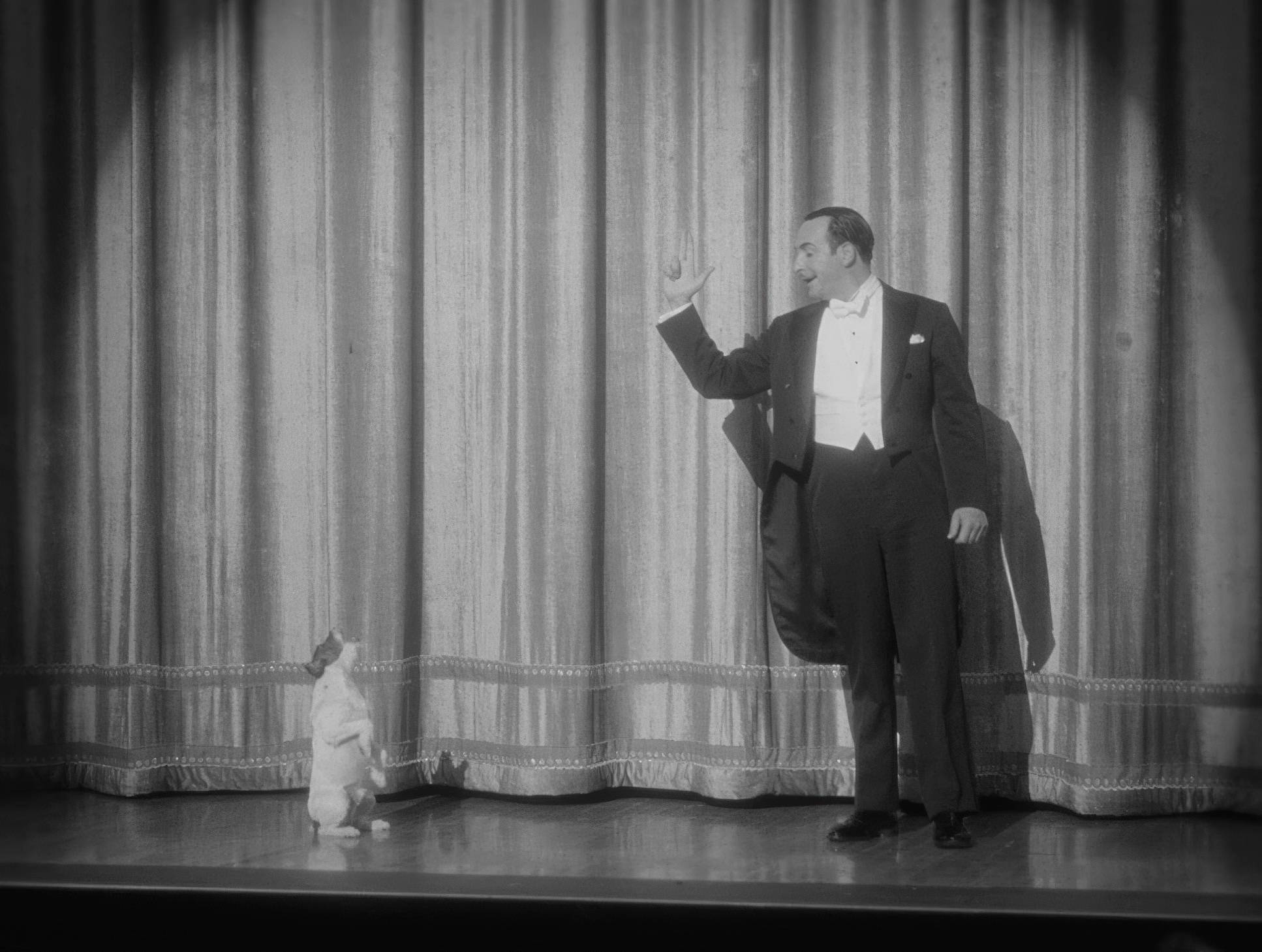
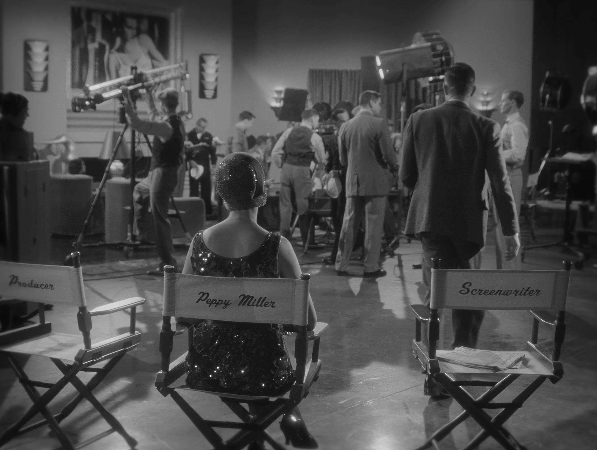
There’s a standout sequence where the camera follows George through his emptying mansion. The movement is smooth but feels “heavy,” almost like the camera itself is burdened by his failure. During the dance numbers, the camera doesn’t cut away or try to be flashy; it maintains a respectful distance, allowing the performers’ physical geometry to tell the story. It’s a reminder that sometimes, the most powerful thing a camera can do is stay still and watch.
Lensing and Blocking

Schiffman leaned into spherical lenses to keep the image clean and period-appropriate. By using a range of focal lengths from ultra-wide for those grand Los Angeles premieres to longer glass for the intimate close-ups he managed to make a small-scale story feel epic.
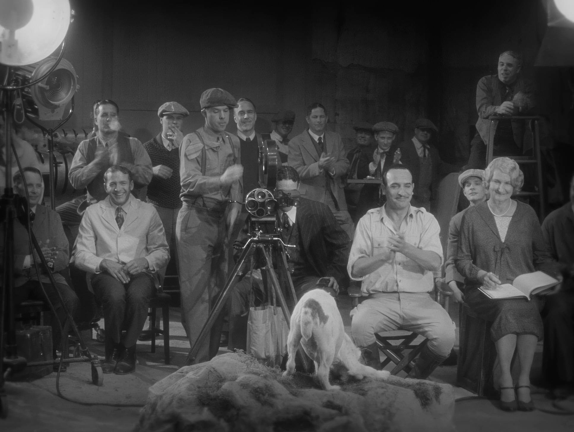
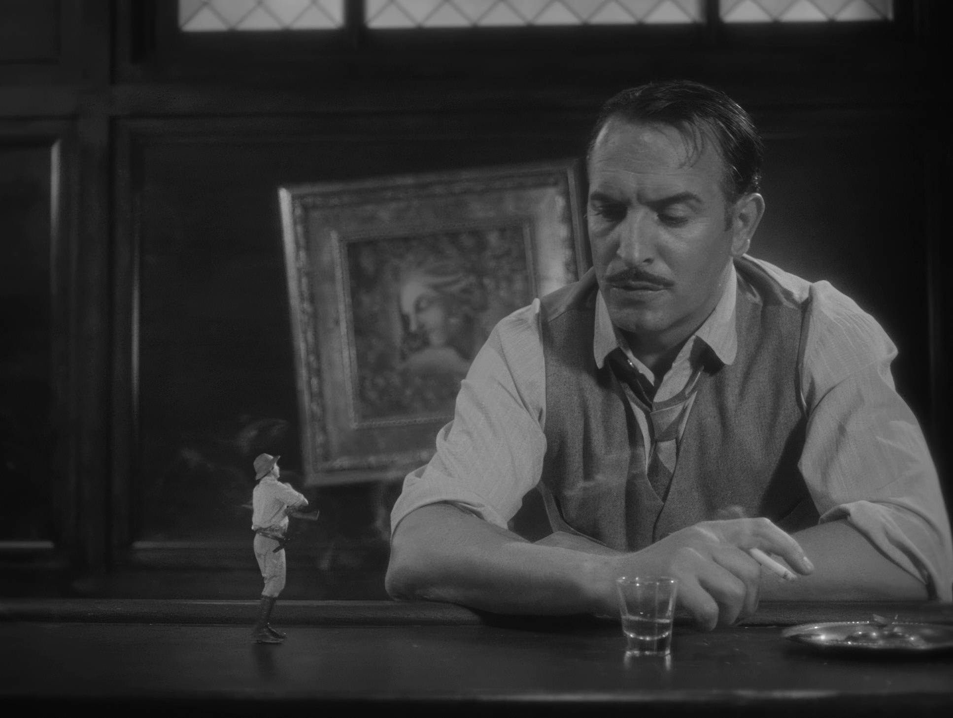
The blocking is where the film’s “theatricality” really shines. Because they were shooting in 4:3, Schiffman used deep staging. You’ll often have a character in the foreground and another in the far background, creating layers of depth without needing to pan the camera. It’s a very “stage-like” way of working that keeps the frame busy and interesting without feeling claustrophobic. Every movement George makes is “big,” designed to be read from the back of a virtual theater, and the lensing captures that energy without ever making it feel like a caricature.
Inspiration Behind the Cinematography

You can see the DNA of masterpieces like Murnau’s Sunrise or Chaplin’s City Lights in every frame. But it’s more than just an homage; it’s a deep dive into the visual language of the 1920s. Schiffman and director Michel Hazanavicius weren’t just looking at the films; they were looking at the limitations of those films and finding the beauty in them.
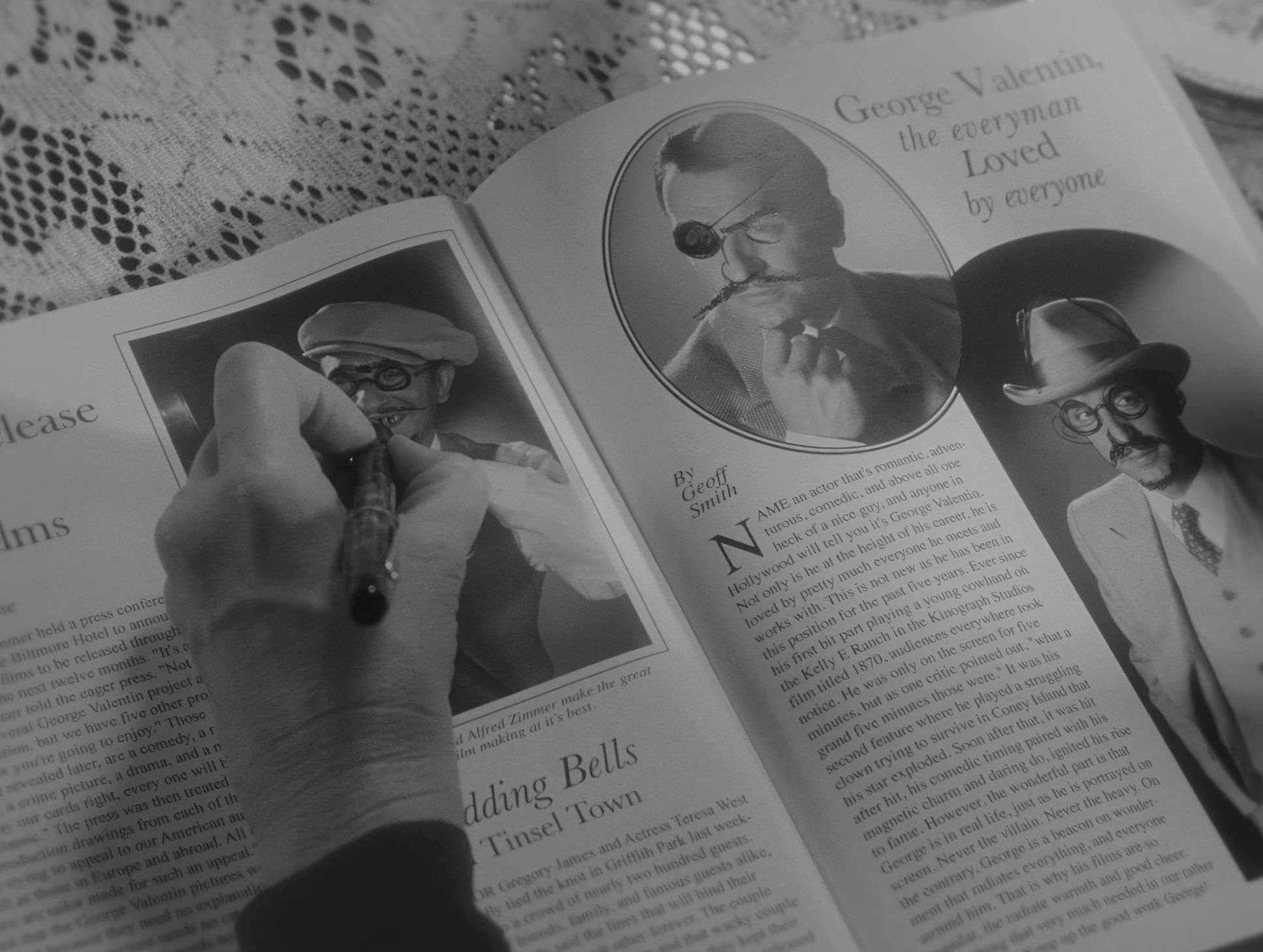
They embraced the reliance on iconography and dramatic flair. The film is designed for the “hardcore film lovers,” but it works because it understands the universal power of a face in the light. It’s a “gateway drug” for anyone who thinks silent film is boring or outdated.
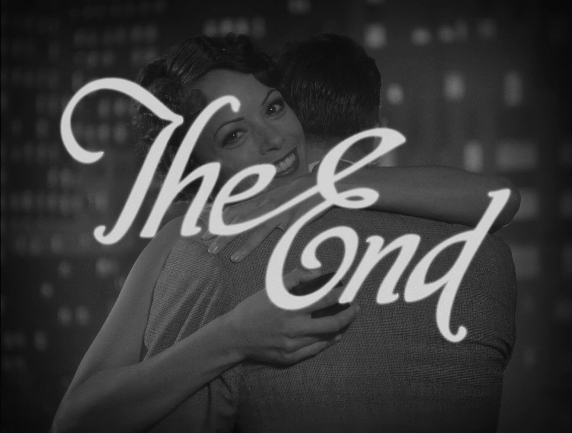
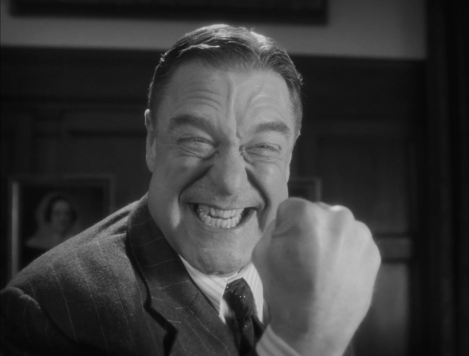
The Artist (2011) Film Stills
A curated reference archive of cinematography stills from The Artist (2011). Study the lighting, color grading, and composition.


- Also read: MR. NOBODY (2009) – CINEMATOGRAPHY ANALYSIS
- Also read: MISERY (1990) – CINEMATOGRAPHY ANALYSIS
Browse Our Cinematography Analysis Glossary
Explore directors, cinematographers, cameras, lenses, lighting styles, genres, and the visual techniques that shape iconic films.
Explore Glossary →