Pedro Almodóvar’s Talk to Her (2002) is not just a movie, it’s a masterclass in how visual choices can carry the weight of a narrative when the characters themselves are literally unable to speak.
About the Cinematographer
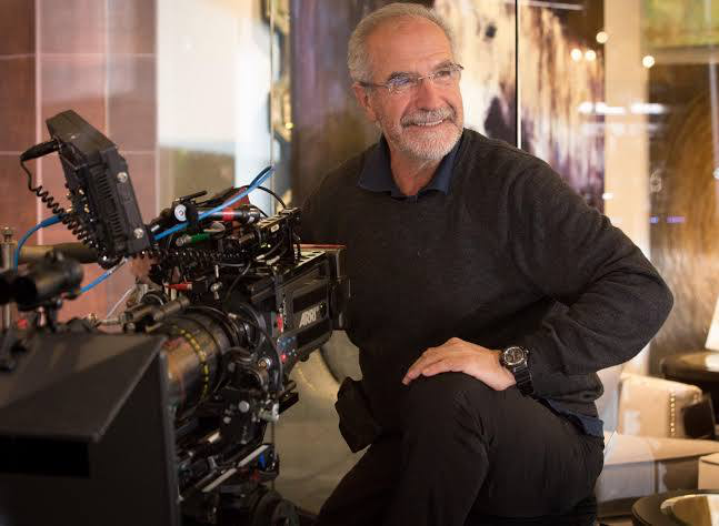
The look of this film belongs to Javier Aguirresarobe. He’s a veteran who knows how to bounce between the starkness of The Others and the warmth of Almodóvar’s world. What I love about Aguirresarobe is that he doesn’t treat Almodóvar’s “theatricality” as a gimmick. He’s an artist who interprets light as a storyteller. In Talk to Her, he manages to make a sterile hospital room feel intimate, almost sacred. There’s a symbiotic relationship here Almodóvar provides the bold, operatic vision, and Aguirresarobe brings the technical grounding to make it feel real rather than just a stage play.
Color Grading Approach
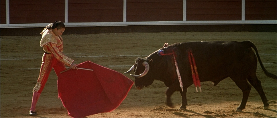
I’m jumping straight to the grade because, as a colorist, this is where I get obsessive. The work done by Kathy Thomson and Paula Ruiz is phenomenal. In an era where we often see digital grades “crushing” the life out of shadows, this film is a reminder of how beautiful film-print contrast can be.
The palette is saturated with those iconic Almodóvar reds, but it’s the hue separation that kills me. The reds feel pure and dangerous, while the greens and blues in the hospital scenes provide a needed respite. If you look at the skin tones, even in the cooler, clinical environments, there’s a warmth in the mid-tones that keeps Alicia and Lydia from looking like objects. It’s a conscious choice to maintain their humanity. The highlight roll-off is smooth and creamy that’s the 35mm negative talking and it gives the whole film a painterly, romantic texture that digital workflows still struggle to mimic without a lot of heavy lifting.
Lensing and Blocking

This film was shot on Panavision Cameras and Lenses, and you can really feel that 2.35:1 anamorphic frame. The lensing is incredibly deliberate. They mostly stick to spherical glass for a naturalistic feel, but the way Aguirresarobe uses focal lengths to isolate Penneño is brilliant.
The blocking often feels like a silent dance. Take the scenes where Penneño and Marco first meet. They’re often separated by physical barriers or literal space in the frame, reflecting their inability to grasp each other’s grief. When the depth of field gets shallow, it’s razor-sharp on Penneño’s face while the background dissolves into this beautiful, soft blur. It forces you to sit with his obsession. Honestly, seeing how they use the width of the anamorphic frame to show “distance” between two people standing in the same room is something I wish more modern directors would study.
Lighting Style
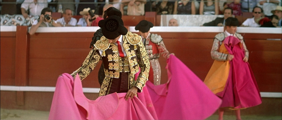
The lighting here is almost entirely motivated, but it has an artistic flourish that stops it from being “boring” realism. Aguirresarobe uses soft, diffused sources big windows, practical lamps to bathe Alicia in a gentle glow. It’s a bit dreamlike, which fits because, for most of the film, she is more of a memory than a person.
However, I’ll say this: the contrast shaping is subtle. It’s not about deep, dark shadows; it’s about the “ratio.” The way the light hits the white hospital walls without blowing them out is a testament to the control they had on set. Even the night interiors in the apartments feel rich and lived-in, using artificial light to cut through the darkness without making it look like a “lit” set.
Compositional Choices
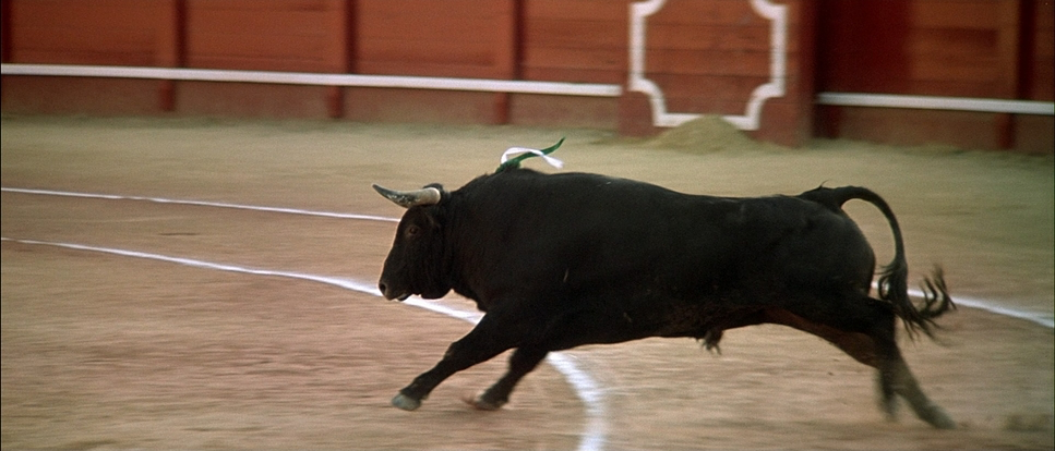
The frame is frequently “left-heavy” or uses architectural elements to box characters in. I noticed how often windows and doorways are used as frames-within-frames. When Penneño is watching Alicia through the window, it’s classic voyeurism, but compositionally, it places her in an entirely different world.
The use of negative space is also worth noting. In the dance studio or the hospital corridors, the characters often look tiny against the architecture. It highlights that “guarding the love” theme—this idea of being destined for a connection that might never actually happen. It’s a bold use of the wide aspect ratio to emphasize loneliness.
Camera Movements
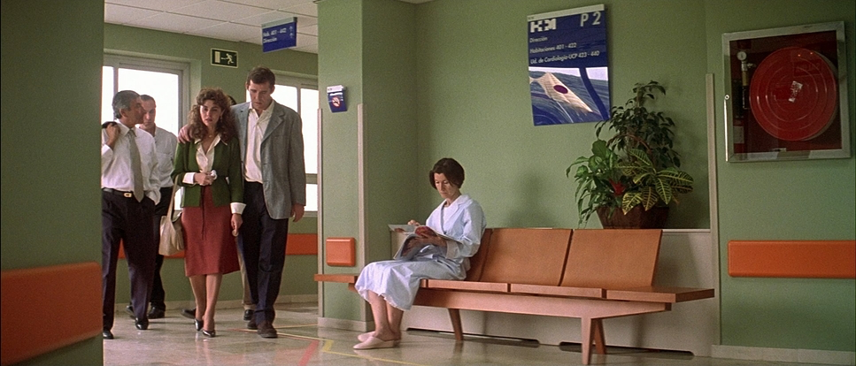
The camera in Talk to Her doesn’t do “acrobatics.” It moves with a meditative breath. You see these slow, deliberate dolly and tracking shots that feel like they’re respectfully observing a private moment rather than intruding on it.
But for me, the static shots are the most powerful. When the camera stops moving, it forces you to confront the stillness of the women in the comas. That lack of motion becomes a visual metaphor for their suspended existence. I’ve always preferred this a camera that knows when to shut up and just let the frame breathe. It’s a refreshing break from the constant “shaky cam” or pointless pans we see too often today.
Inspiration Behind the Cinematography
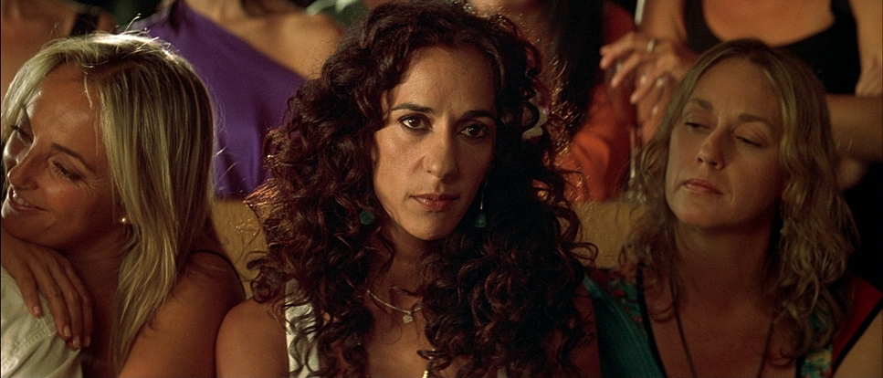
You can see the DNA of Spanish painting and classic Hollywood melodrama here. The core of the film is a paradox: the vibrant, internal world of Penneño’s devotion versus the cold reality of a hospital room. The visual language has to oscillate between those two poles. The fluid movement of the dance sequences (a literal and metaphorical motif) provides the only real “motion” in a story defined by a vegetative state. It’s that tension between movement and stillness that gives the film its pulse.
Technical Aspects & Tools
Talk to Her (2002) — 35mm Anamorphic
| Genre | Drama, Romance, Melodrama, Science-Fiction |
| Director | Pedro Almodóvar |
| Cinematographer | Javier Aguirresarobe |
| Production Designer | Antxón Gómez |
| Costume Designer | Sonia Grande |
| Editor | José Salcedo |
| Colorist | Kathy Thomson, Paula Ruiz |
| Time Period | 2000s |
| Color | Mixed, Saturated, Red, Green, Blue |
| Aspect Ratio | 2.35 – Anamorphic |
| Format | Film – 35mm |
| Lighting | Soft light |
| Lighting Type | Artificial light |
| Story Location | Europe > Spain |
| Filming Location | Europe > Spain |
| Camera | Panavision Cameras |
| Lens | Panavision Lenses |
Shooting on 35mm film in 2002 gave this project an organic texture that you just can’t get from a sensor. Using Panavision gear allowed for that specific “film look” fine grain, incredible latitude in the highlights, and a unique way of rendering primary colors. Since the color timing was likely handled through a traditional lab process or early digital intermediate, there’s an “optical” feel to the final image. It’s not “perfect” in the way modern 8K footage is, and that’s exactly why it works. The technical choices here weren’t just about specs; they were about creating an atmosphere that feels timeless.
- Also read: DANCER IN THE DARK (2000) – CINEMATOGRAPHY ANALYSIS
- Also read: ALL THE PRESIDENT’S MEN (1976) – CINEMATOGRAPHY ANALYSIS
Browse Our Cinematography Analysis Glossary
Explore directors, cinematographers, cameras, lenses, lighting styles, genres, and the visual techniques that shape iconic films.
Explore Glossary →