I want to dive into a film that occupies a complex space in the Star Trek canon, but visually, is an absolute masterclass: J.J. Abrams’ Star Trek Into Darkness (2013). While the narrative choices sparked plenty of debate among the Trek faithful, from a purely aesthetic standpoint, it’s a fascinating beast. It’s “spectacularly shiny,” yes, but there’s a tactile, grounded weight to it that many modern sci-fi blockbusters lack. My goal isn’t to rehash the plot, but to unpack the visual language the deliberate choices in cinematography and color that give this film its high-gloss, high-energy identity.
About the Cinematographer
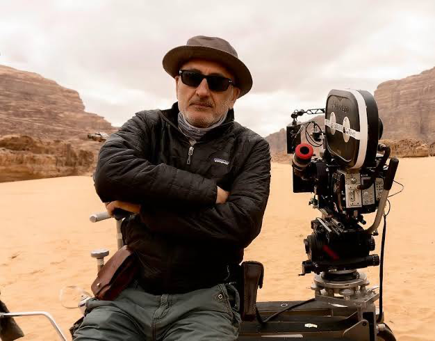
The man behind the lens for Into Darkness was Dan Mindel, a long-time collaborator of J.J. Abrams. Mindel is a bit of a purist in the best way possible; he is a staunch advocate for shooting on film, which is exactly what gives this movie its organic soul. Unlike the clinical sharpness often found in digital sci-fi, Mindel’s work is characterized by texture, “happy accidents” with light, and a deep love for Panavision glass.
His partnership with Abrams is defined by a shared desire to push the boundaries of the frame. Mindel doesn’t just capture a scene; he infuses it with energy, often using physical, in-camera techniques like pointing flashlights into the lens to create that signature “Abrams flare.” It’s a bold, unapologetic style that favors feeling over perfection.
Inspiration Behind the Cinematography
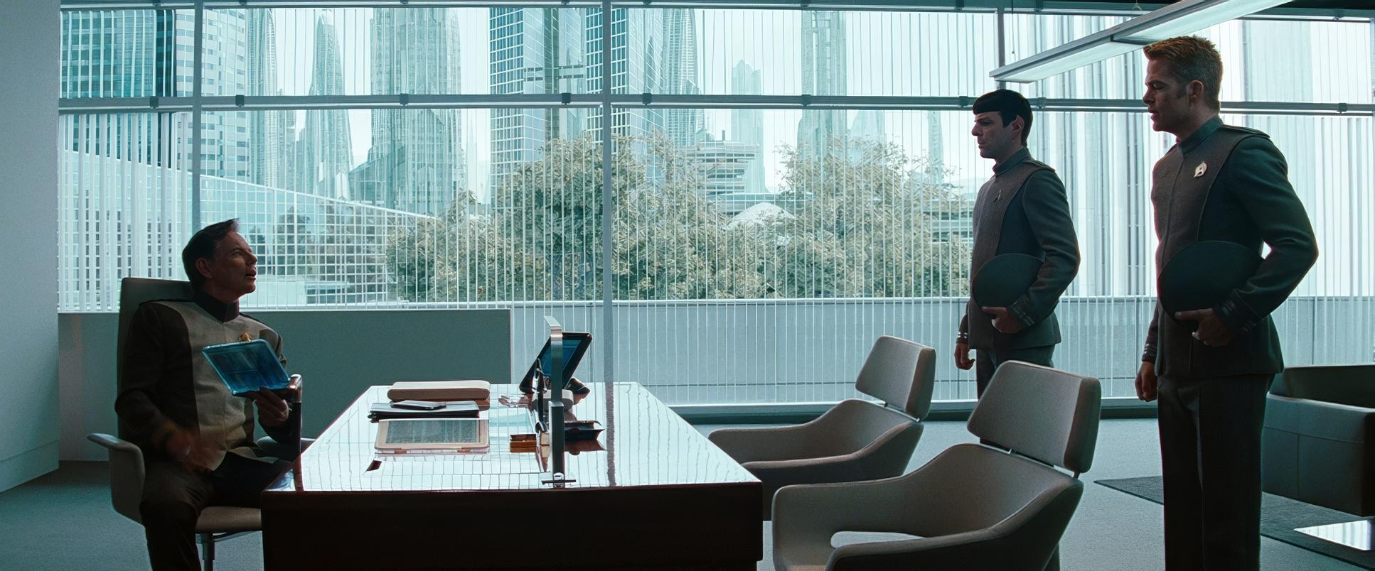
The core visual philosophy of the Abrams reboots was to create a “palpable sense of reality.” For Into Darkness, this meant grounding a space opera in something we could almost touch. The inspiration wasn’t just “futuristic”; it was “tangible.” This is why so much of the Earth-bound footage feels so resonant it’s designed to remind us that these explorers are, at their core, people like us.
The cinematography had to balance a massive, epic scale with these very intimate, human moments. The goal was to make the future feel plausible rather than abstract. By merging 35mm film and IMAX sequences, the visual team created a bridge between the classic cinematic past and a high-octane future. It’s a visual tension: a movie that feels “fresh and new” while respecting the heritage of the franchise through its use of traditional film stocks and anamorphic lenses.
Camera Movements
The camera in Into Darkness is rarely static; it has a restless, almost anxious energy that mirrors the high stakes of the plot.
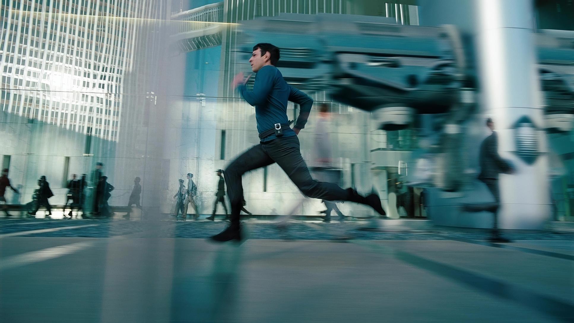
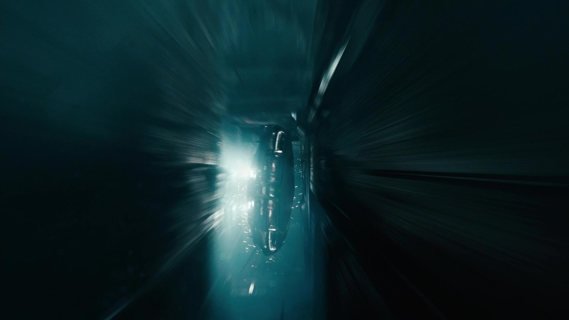
- Handheld Aggression: During the opening chase on Nibiru or the close-quarters combat with Khan, the handheld work is visceral. It’s not just “shaky-cam” for the sake of motion; it’s reactive. It feels like the camera is a character trying to keep up with the chaos, adding a layer of urgency and physical toll to the action.
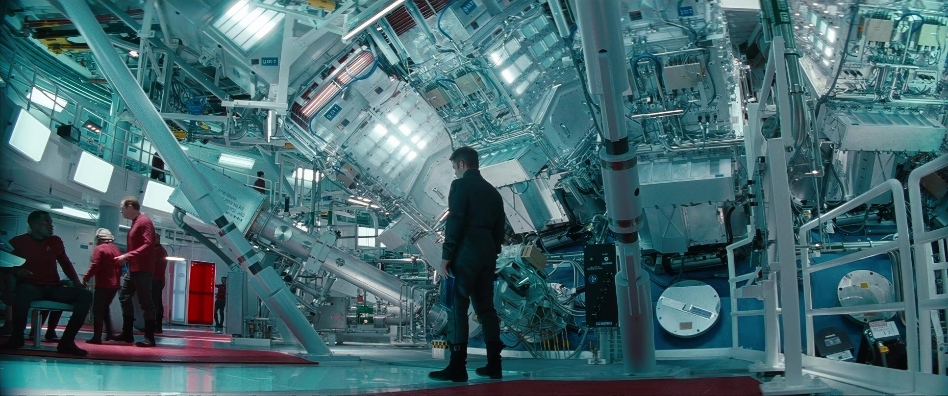
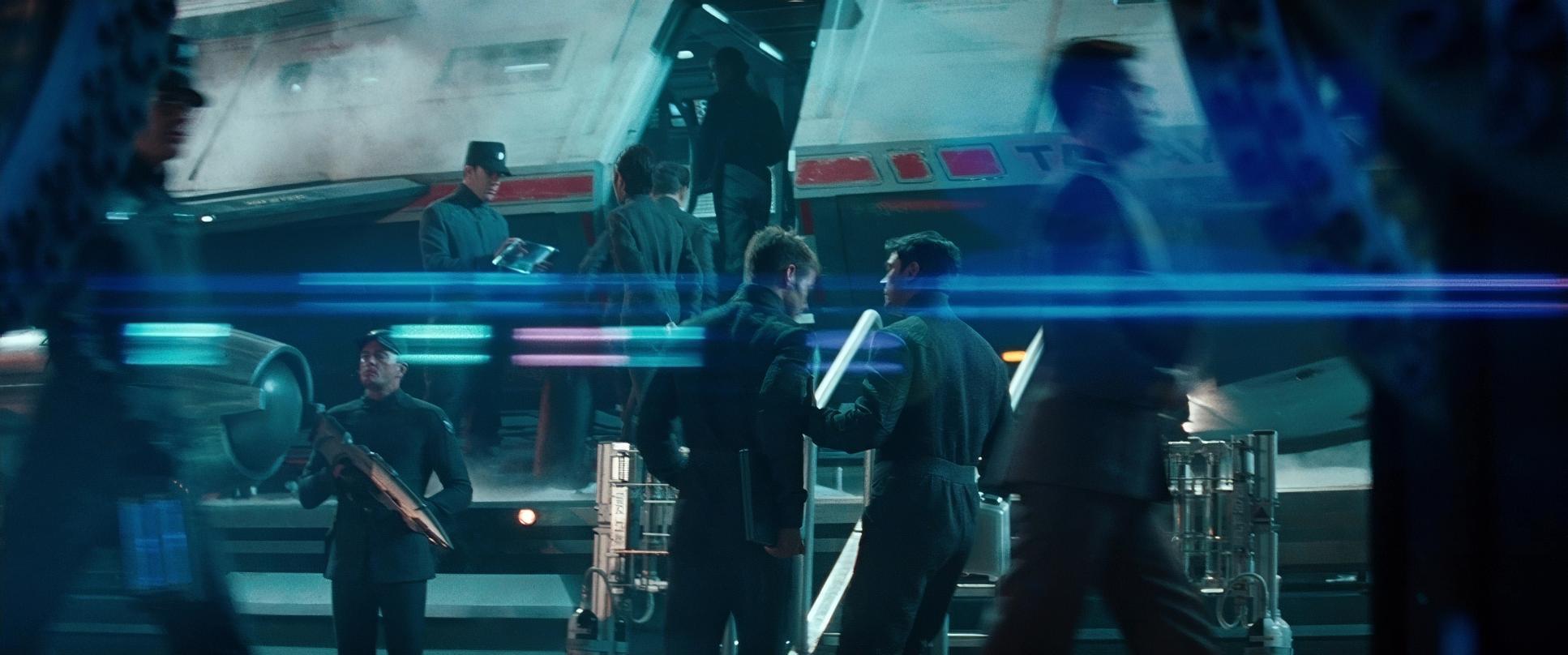
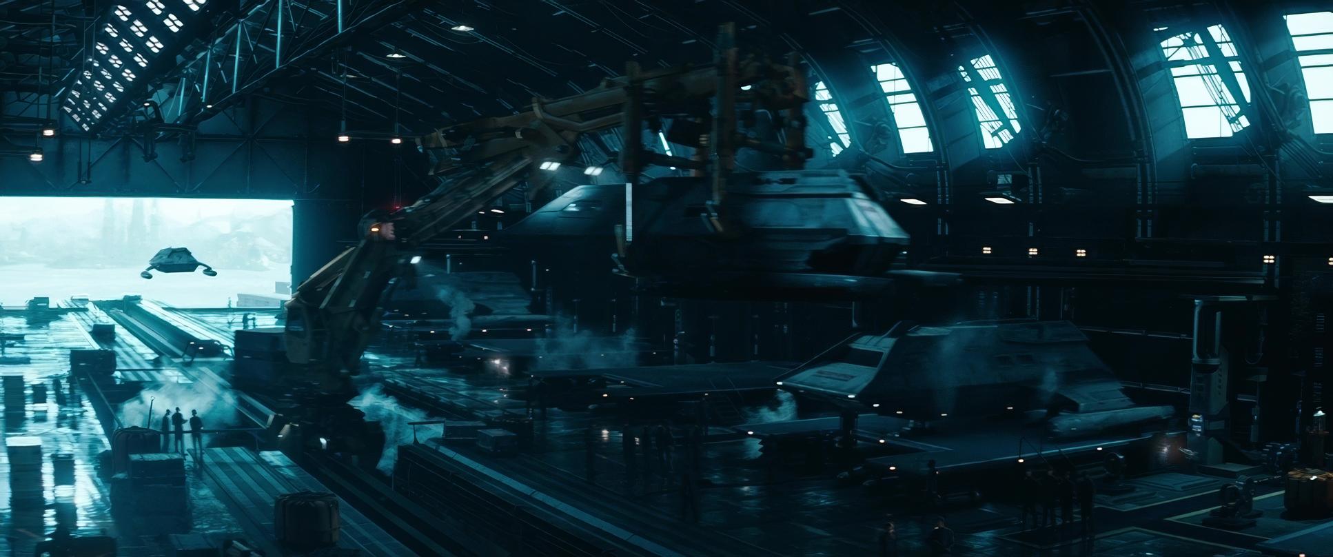
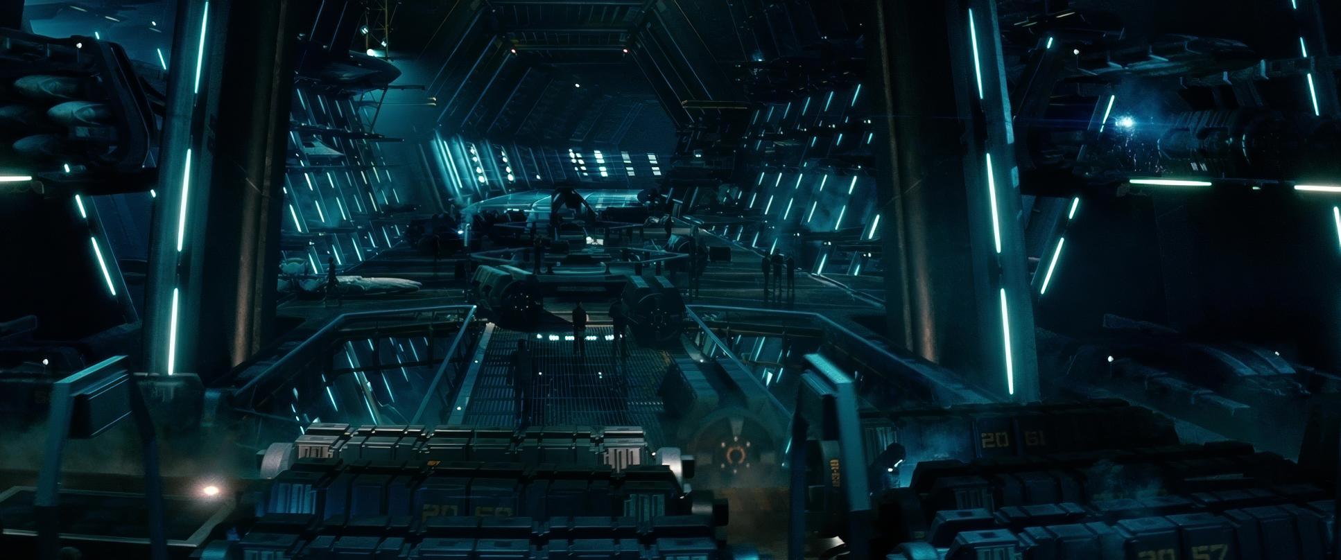
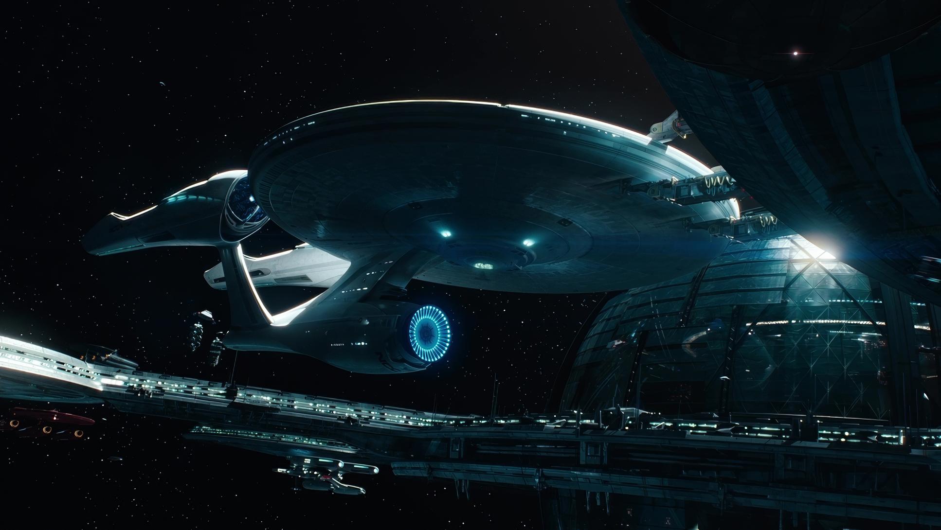
- Steadicam and Fluidity: When we move to the Enterprise or Starfleet HQ, the movement shifts. Here, we see more Steadicam work smooth, sweeping passes that emphasize the scale and “working-class” functionality of the ship. It gives the environments a sense of journey, tracking characters through complex, multi-layered sets.
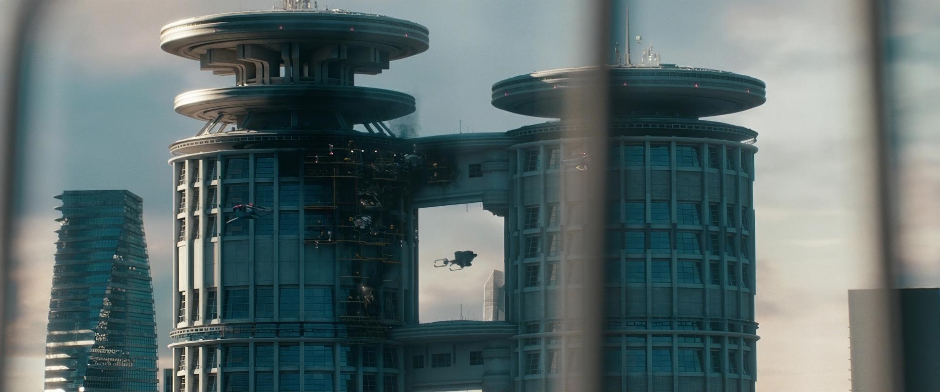
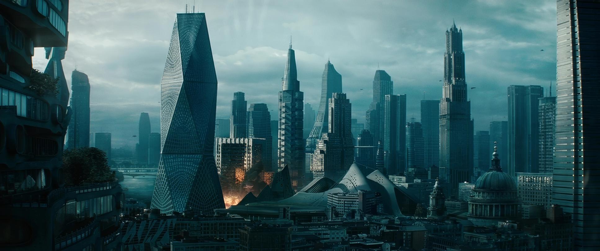
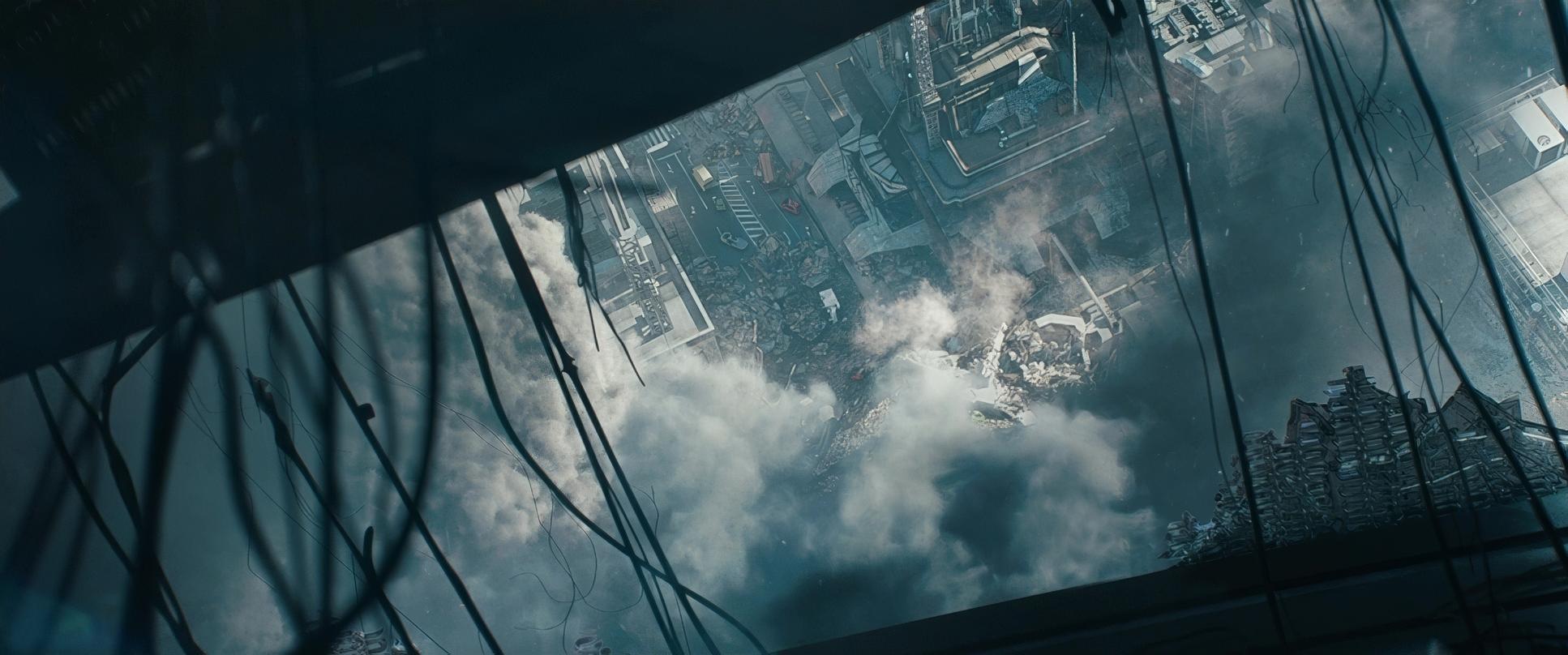
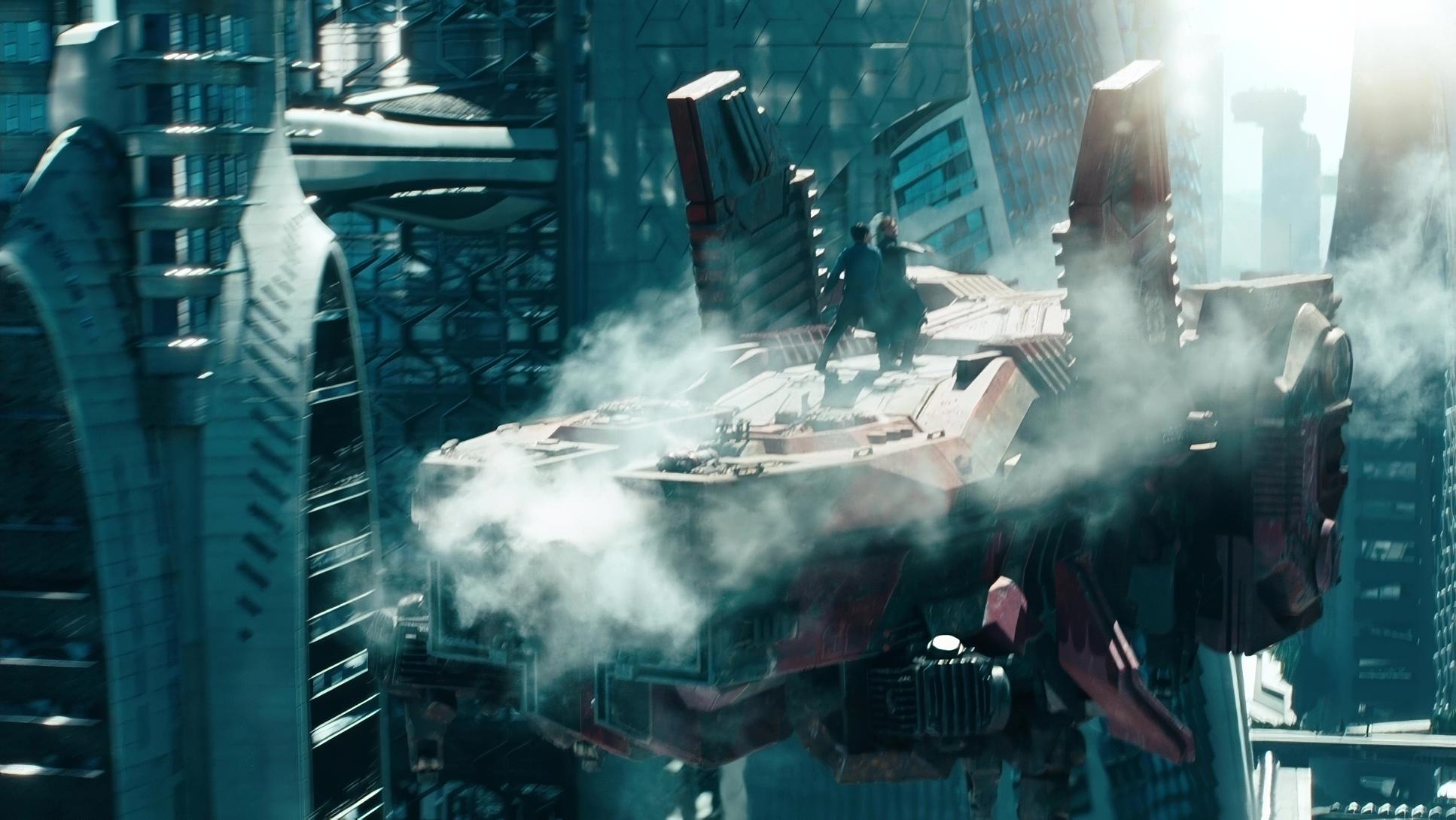
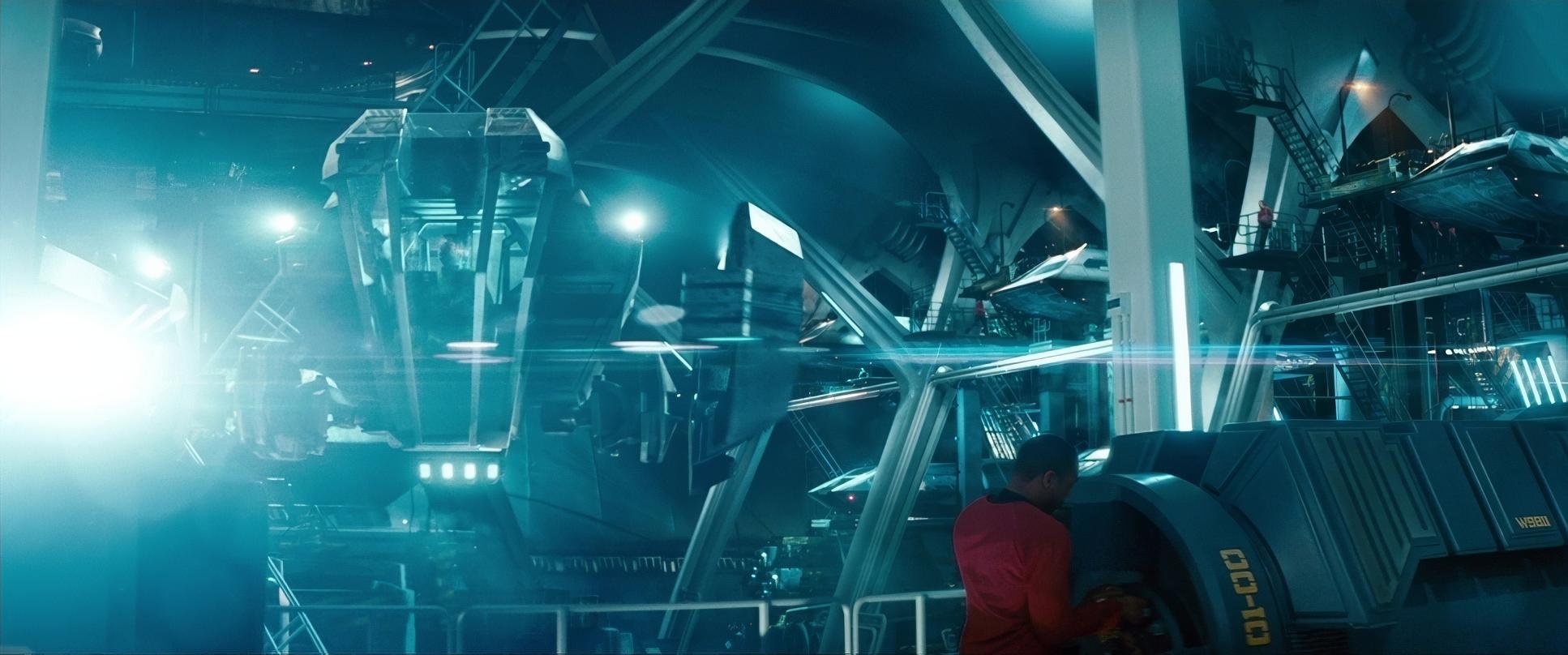
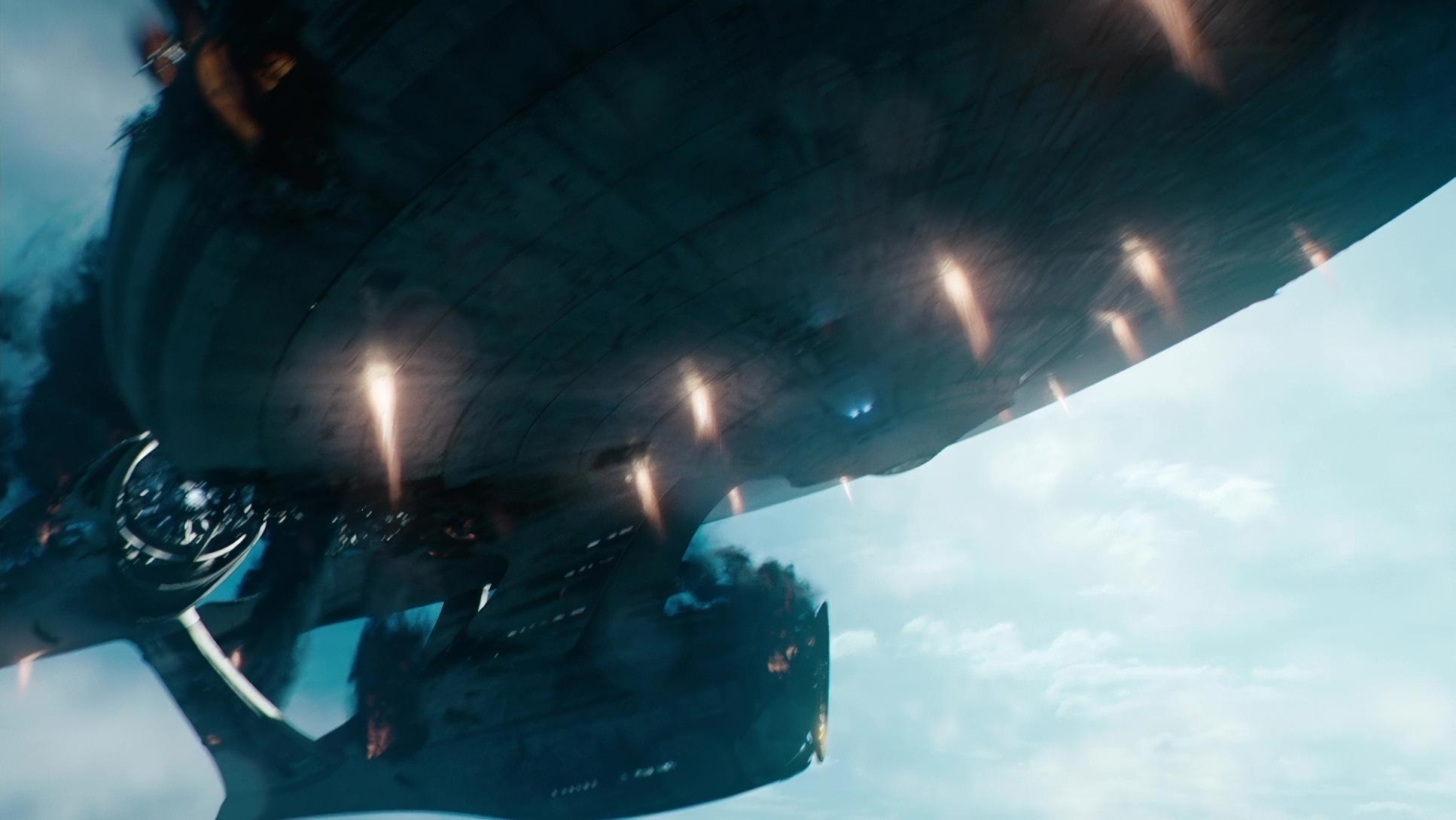
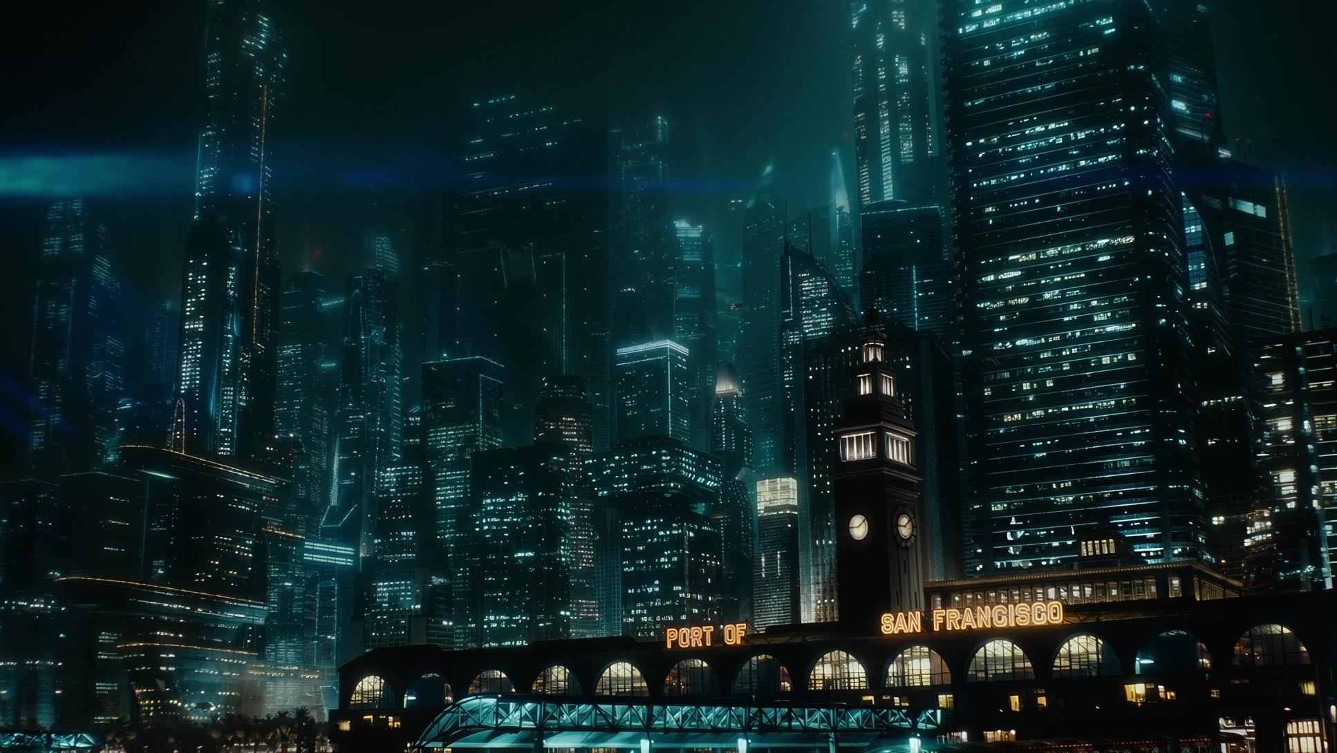
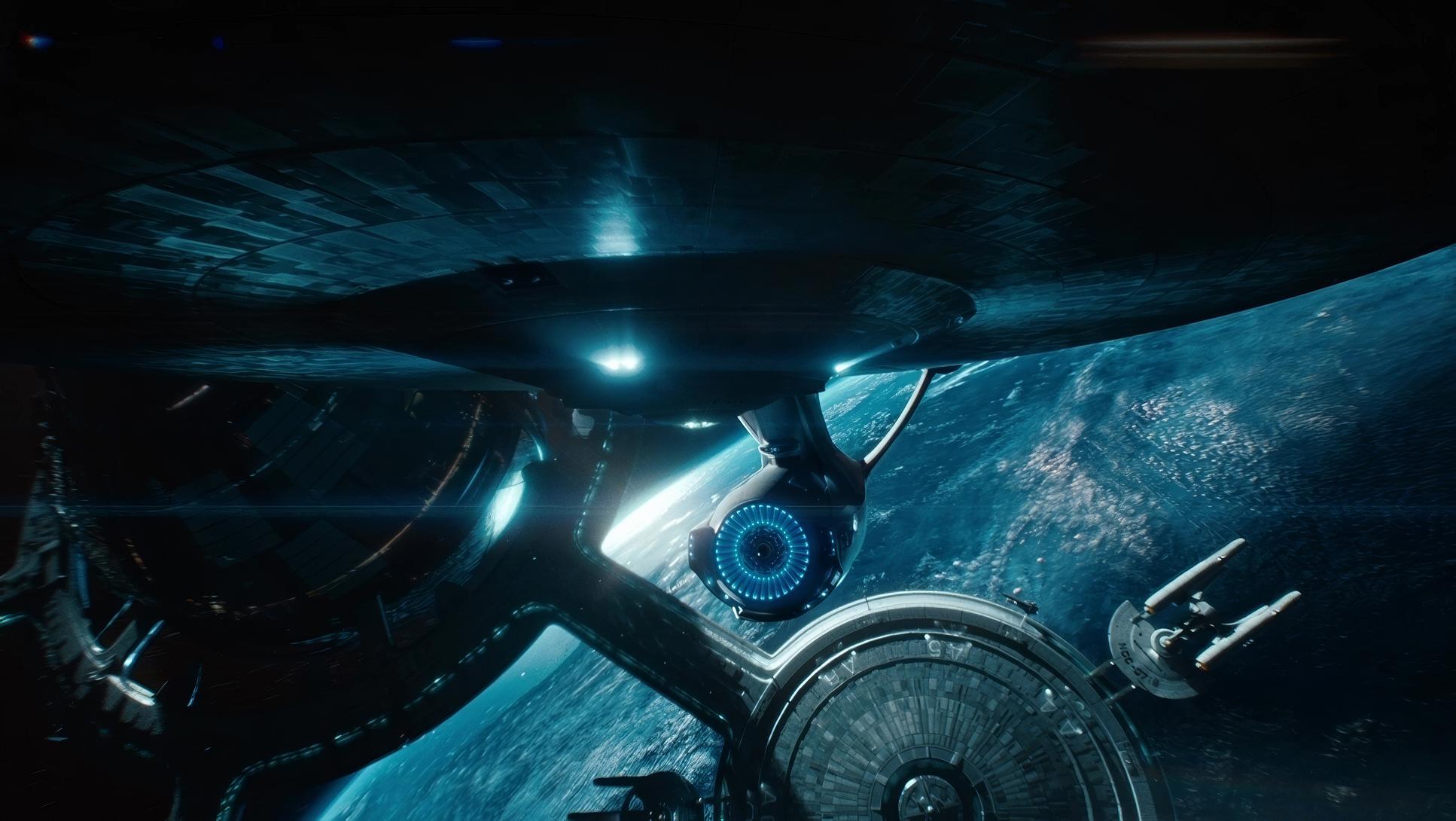
- The Vertigo Effect: Mindel makes frequent use of cranes and dollies for those dizzying, overhead cityscapes. These shots provide the “wow” factor, emphasizing the vertiginous heights of a future London or San Francisco. The blend of these techniques ensures the film never feels stagnant; it’s always driving forward, visually mimicking the relentless pace of the narrative.
Compositional Choices
Mindel’s compositions are built on the idea of contrast not just in light, but in scale.
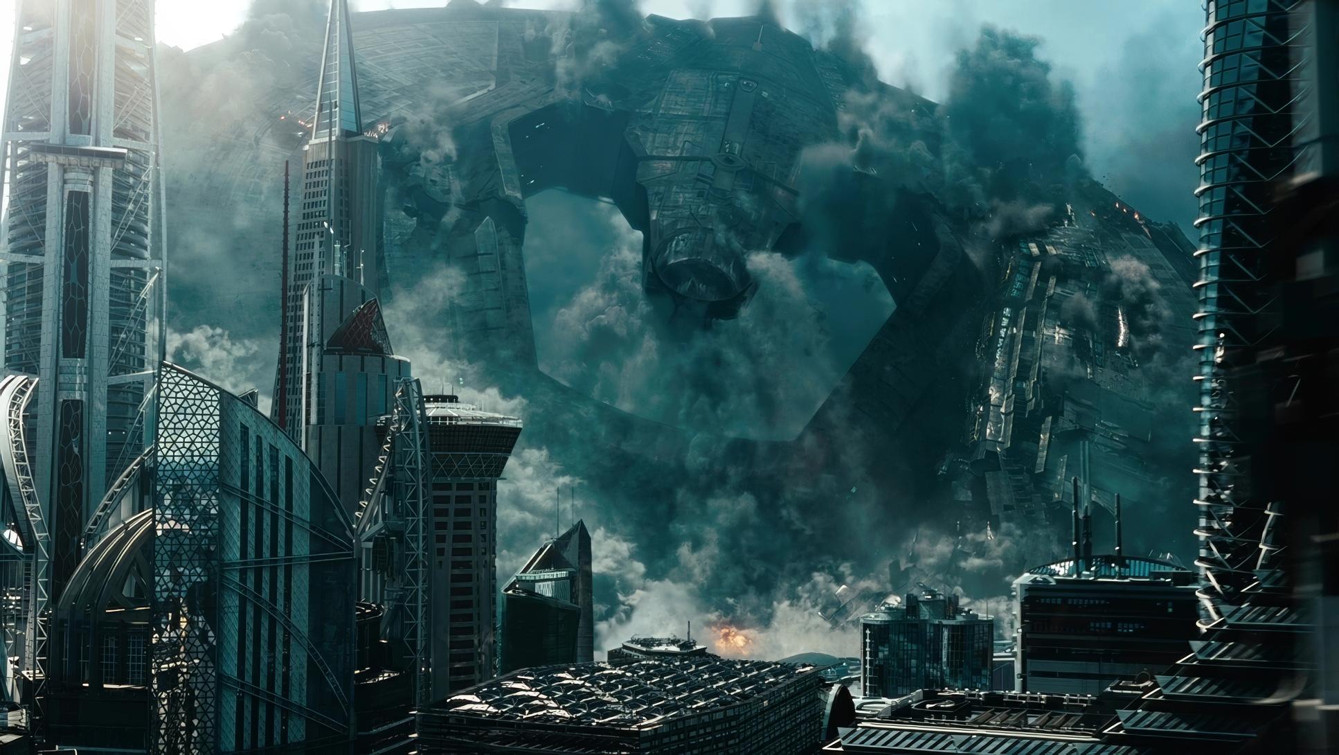
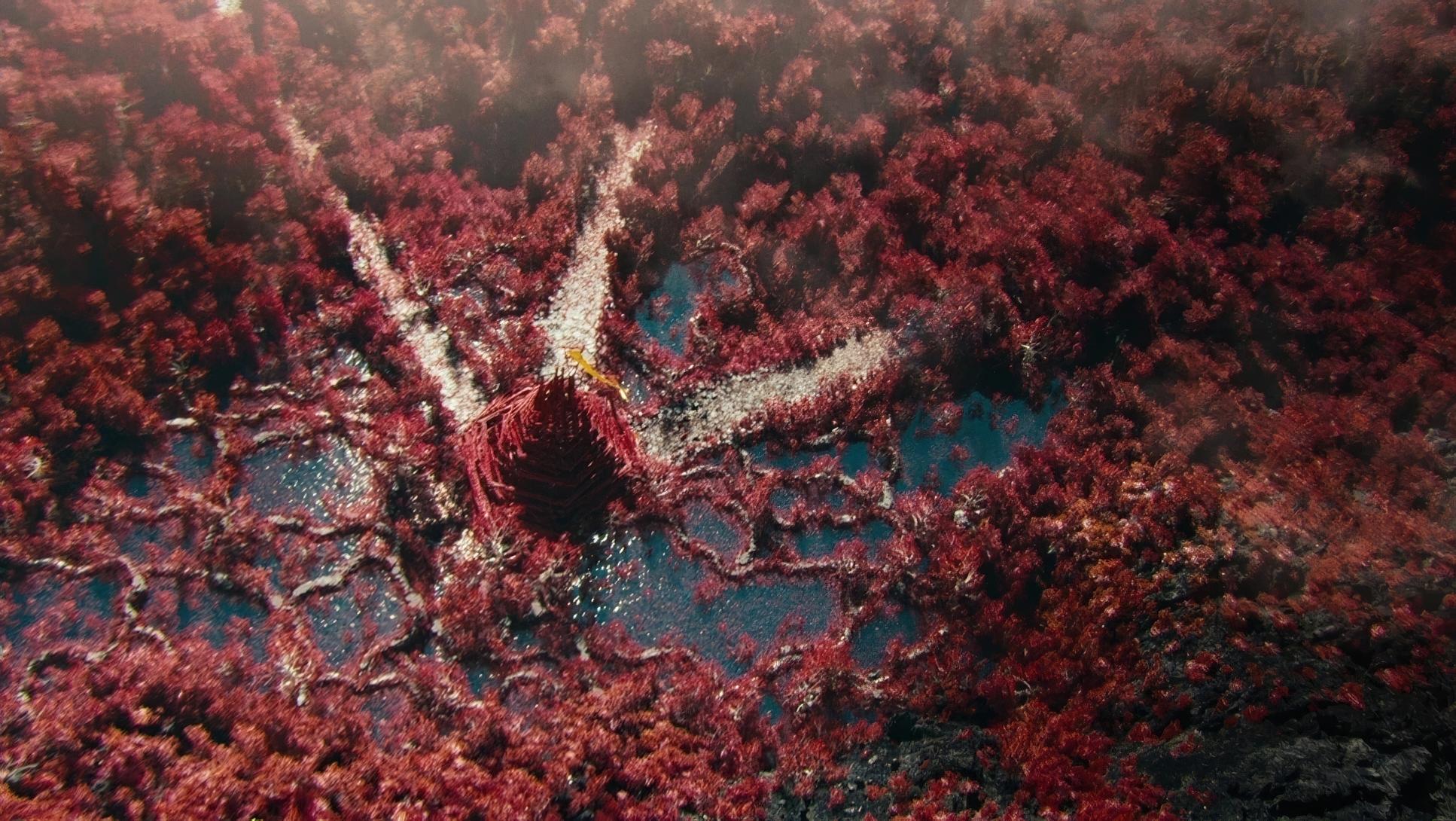
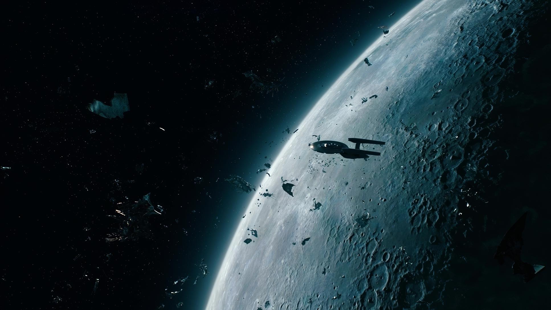
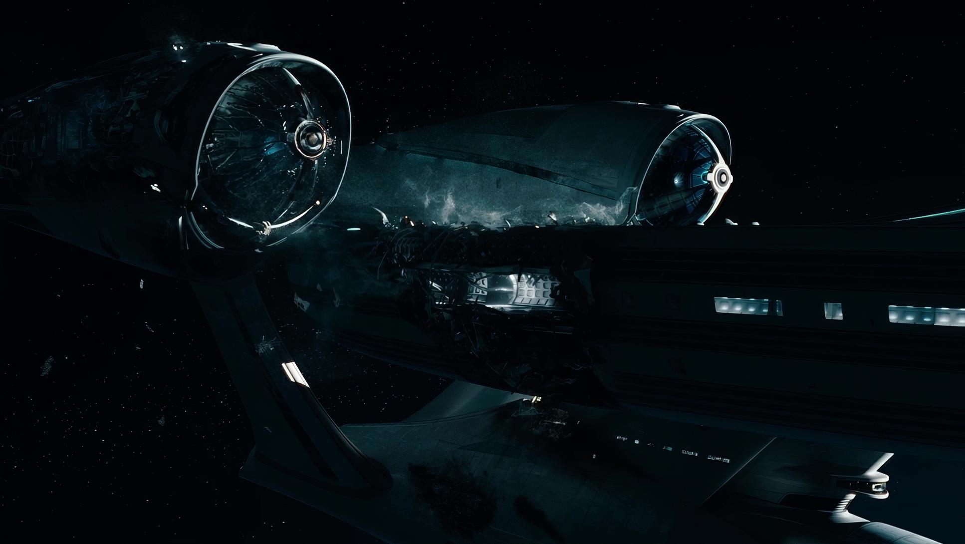
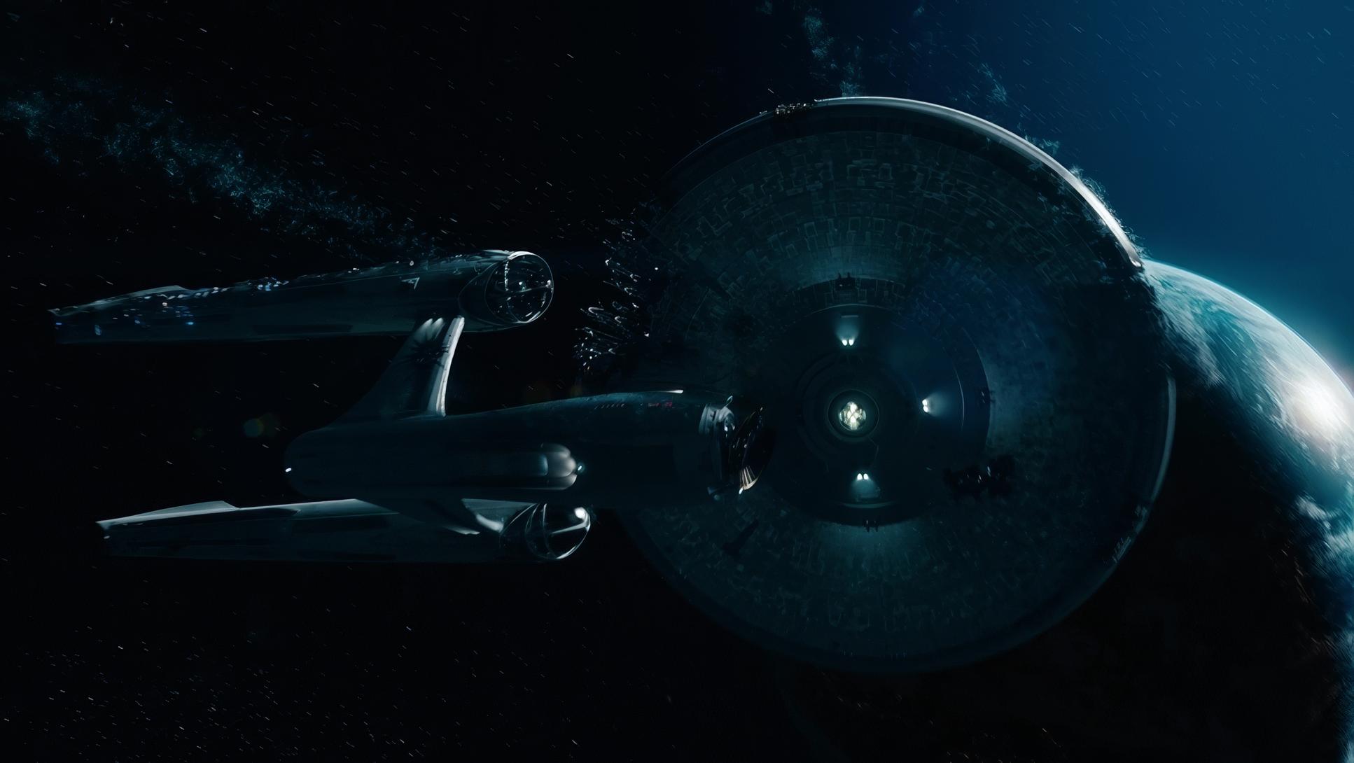
Anamorphic Breadth: Using the 2.39:1 aspect ratio, the film makes incredible use of the horizontal plane. Wide shots of the Enterprise soaring through nebulae or the vastness of the “Klingon” homeworld use negative space to make the characters feel small against the weight of the universe.
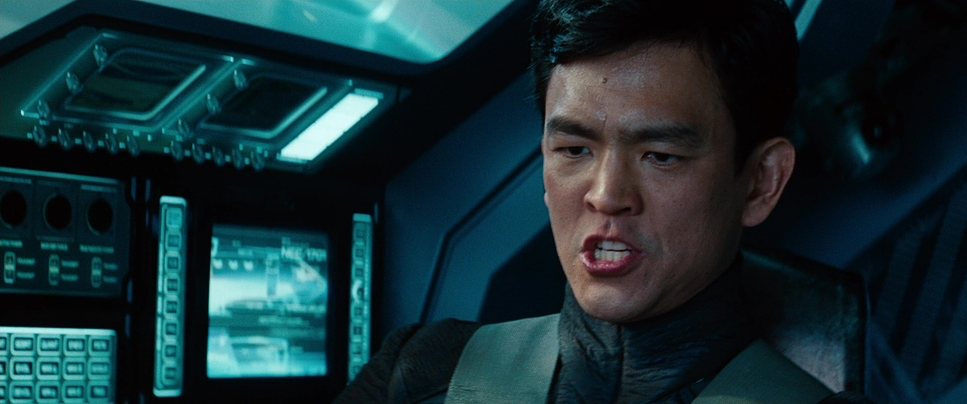
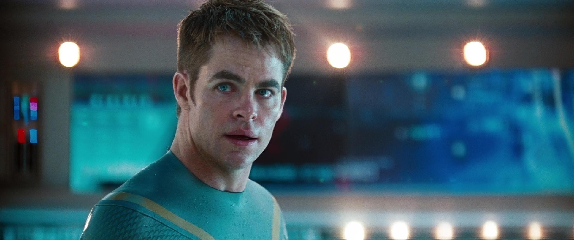
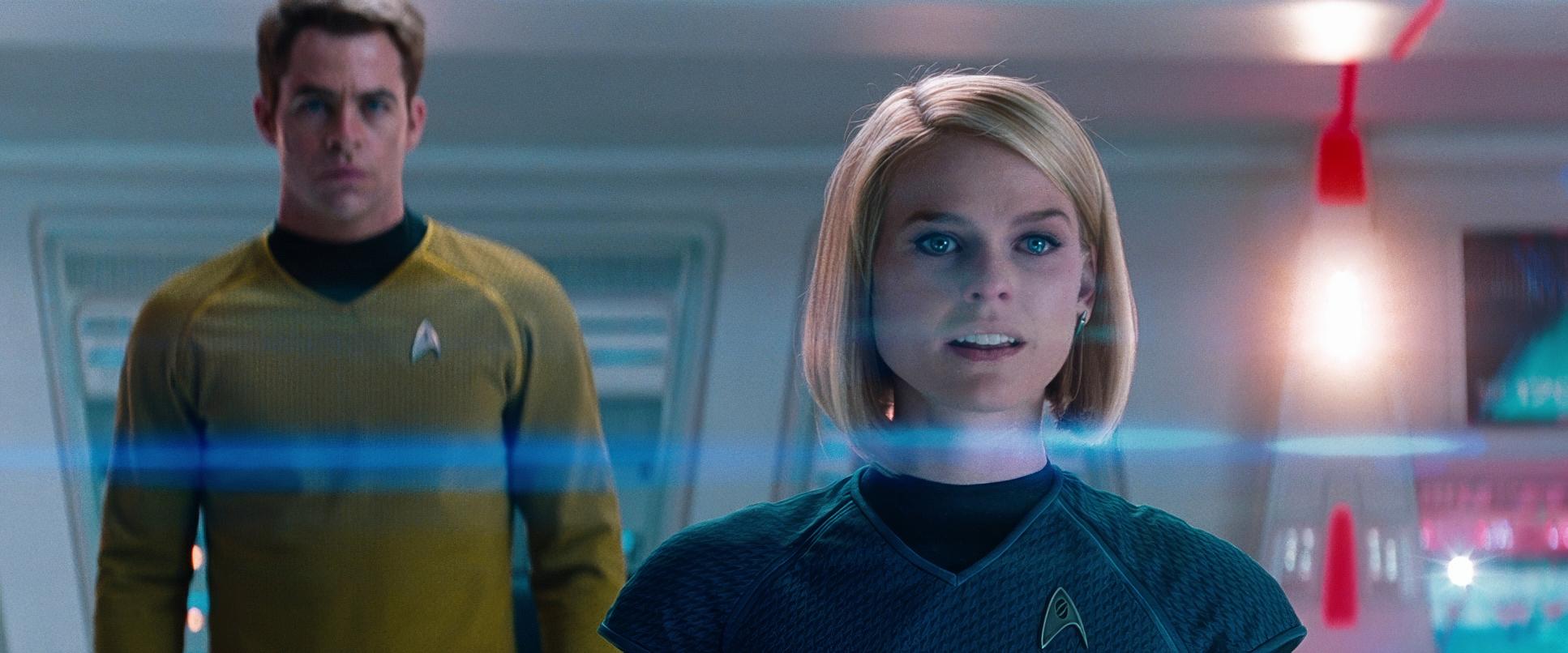
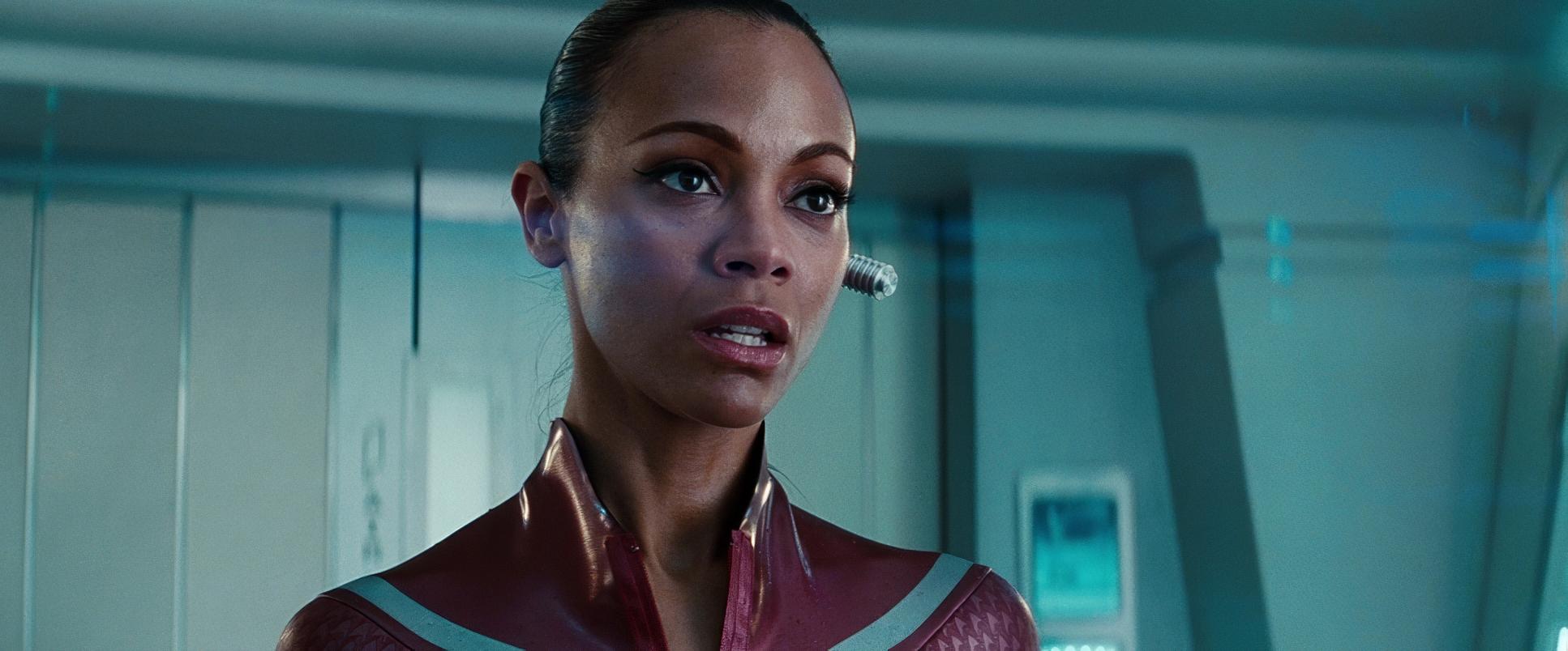
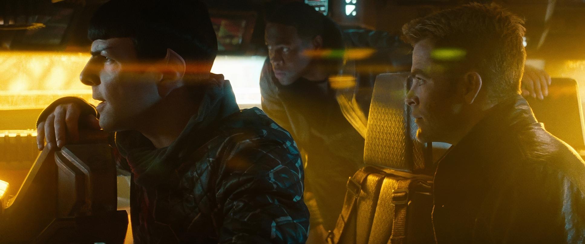
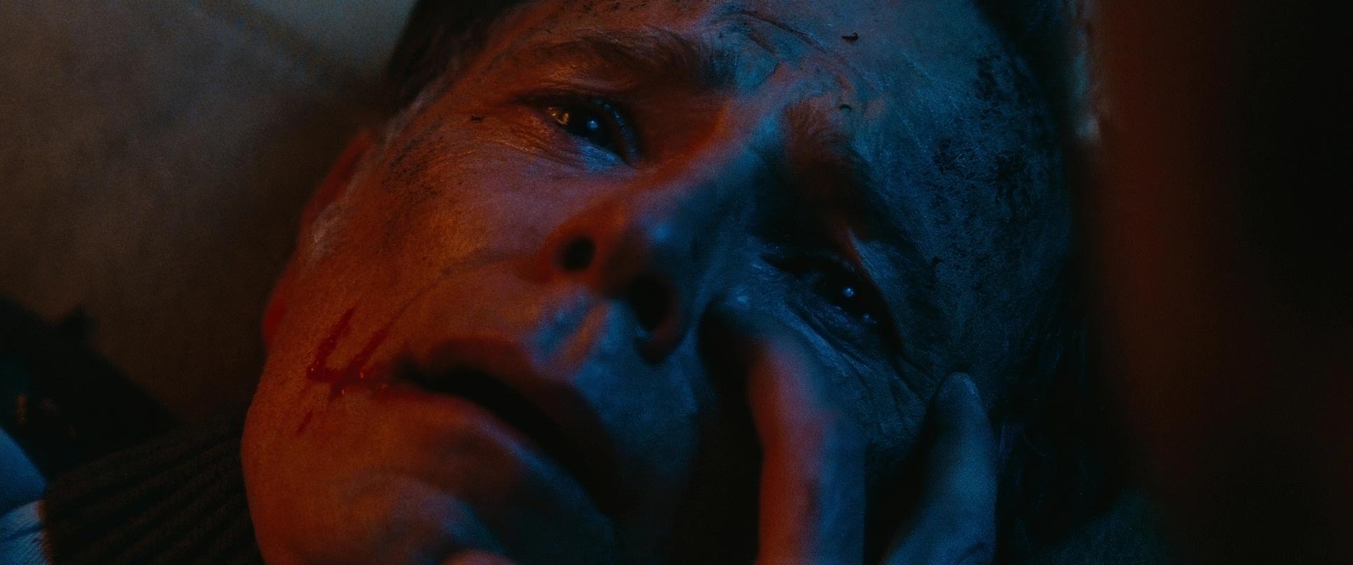
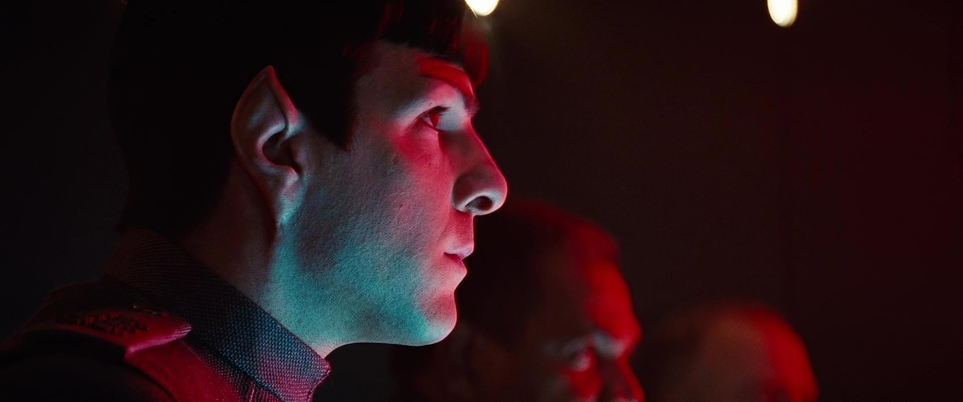
The “In-Your-Face” Close-Up: To counter the epic scale, Abrams and Mindel push the camera remarkably close during dialogue. Occasionally, you’ll see a shoulder or a nose pop into the edge of the frame. It’s an aggressive form of blocking that forces intimacy. It makes the “workplace comedy” moments between Kirk and Spock feel immediate and personal, ensuring that even in a galaxy-spanning conflict, the emotional stakes stay focused on the human (and Vulcan) heart.
Lighting Style
For me, the lighting in Into Darkness is where the “tactile” quality really shines.
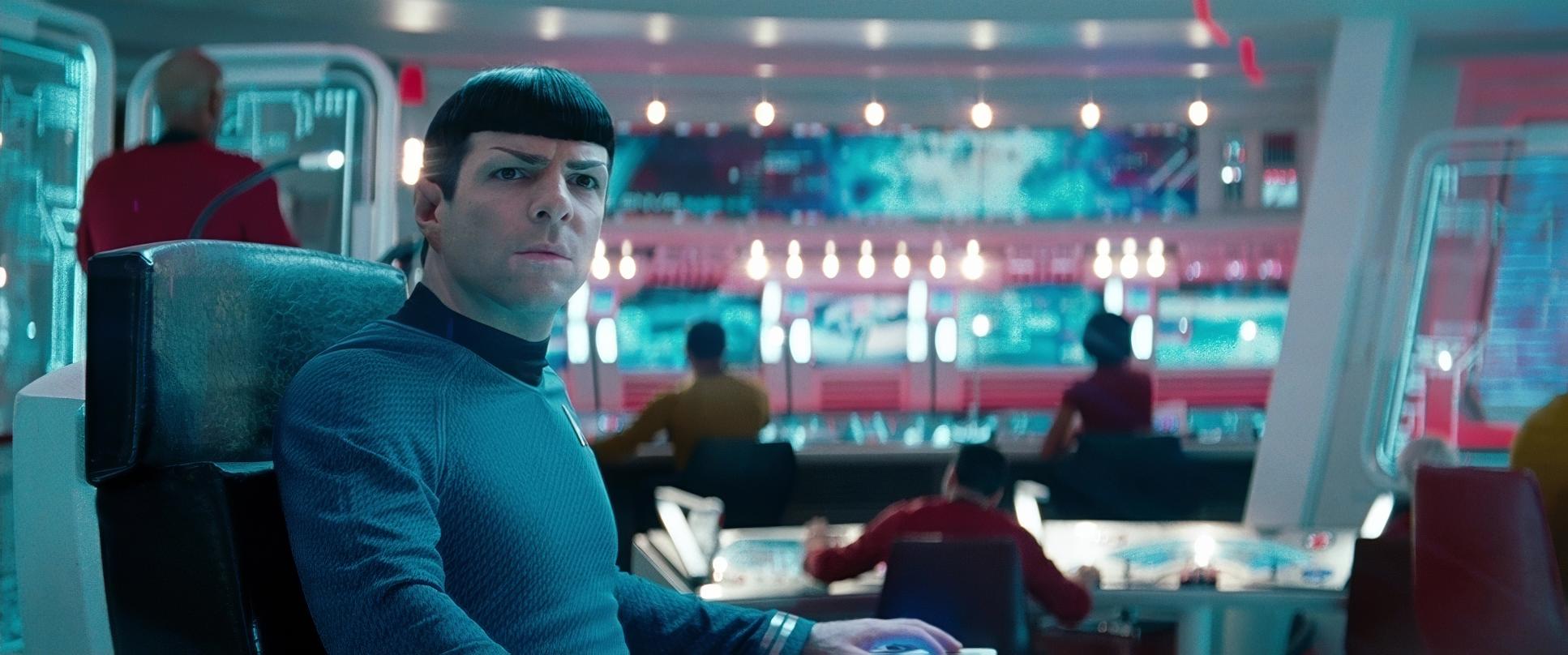
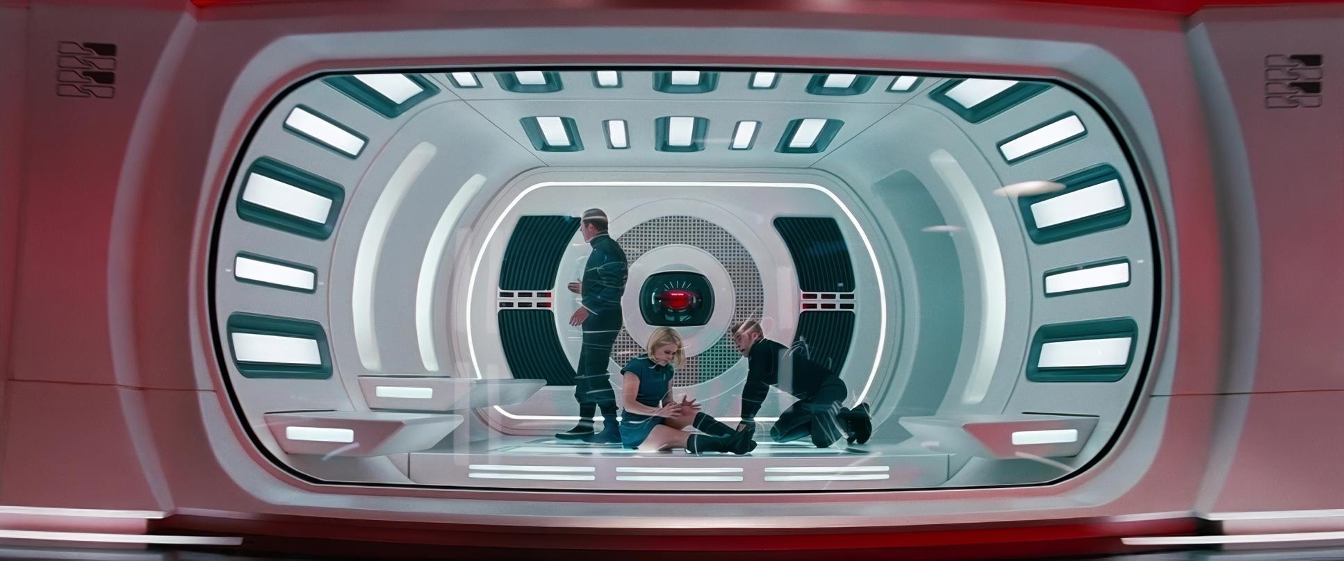
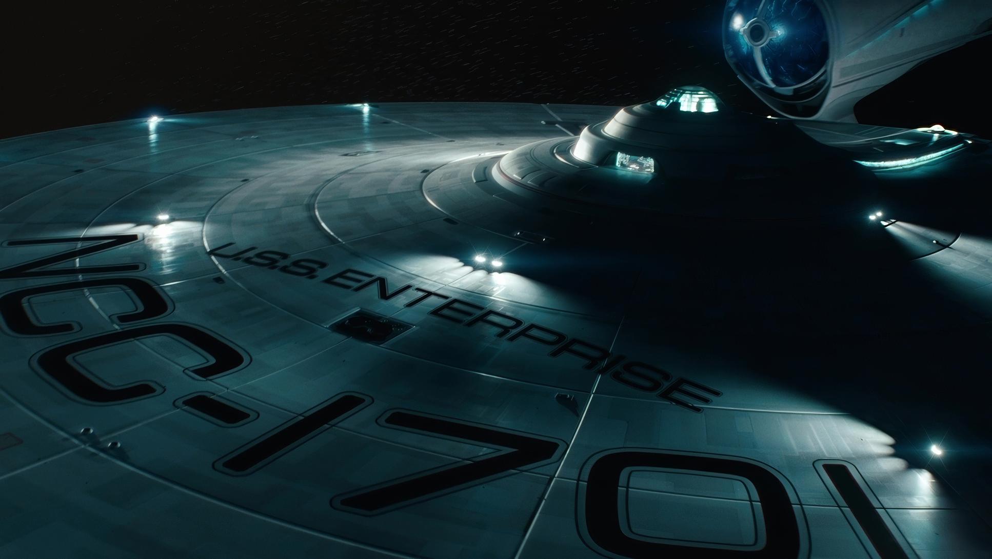
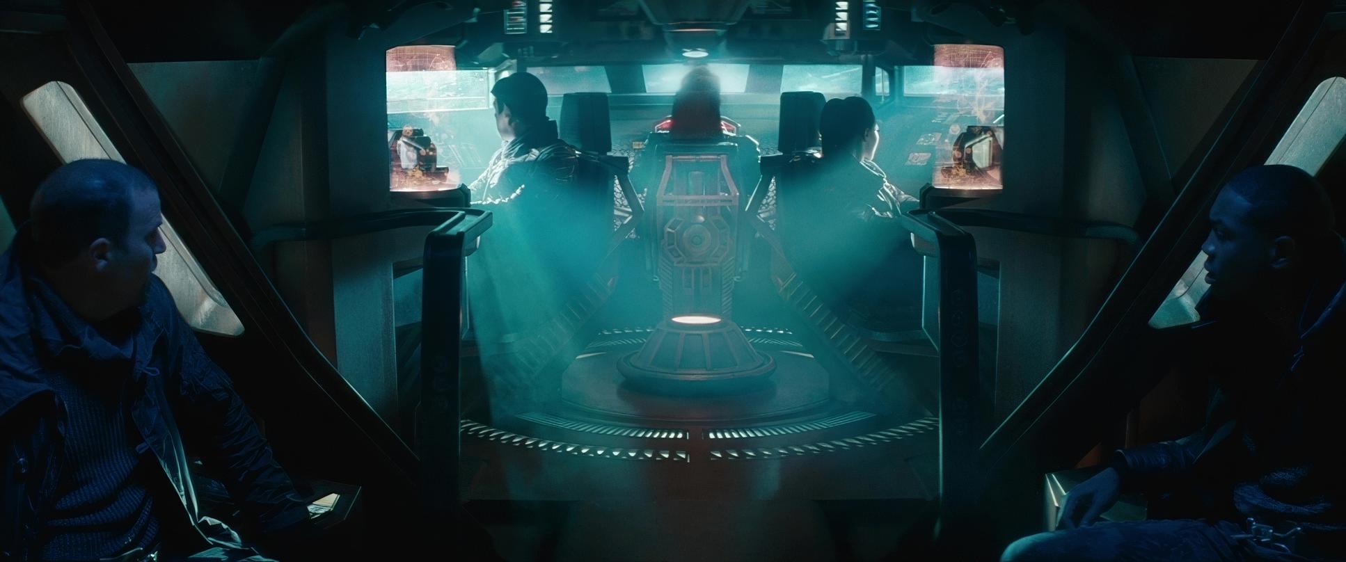
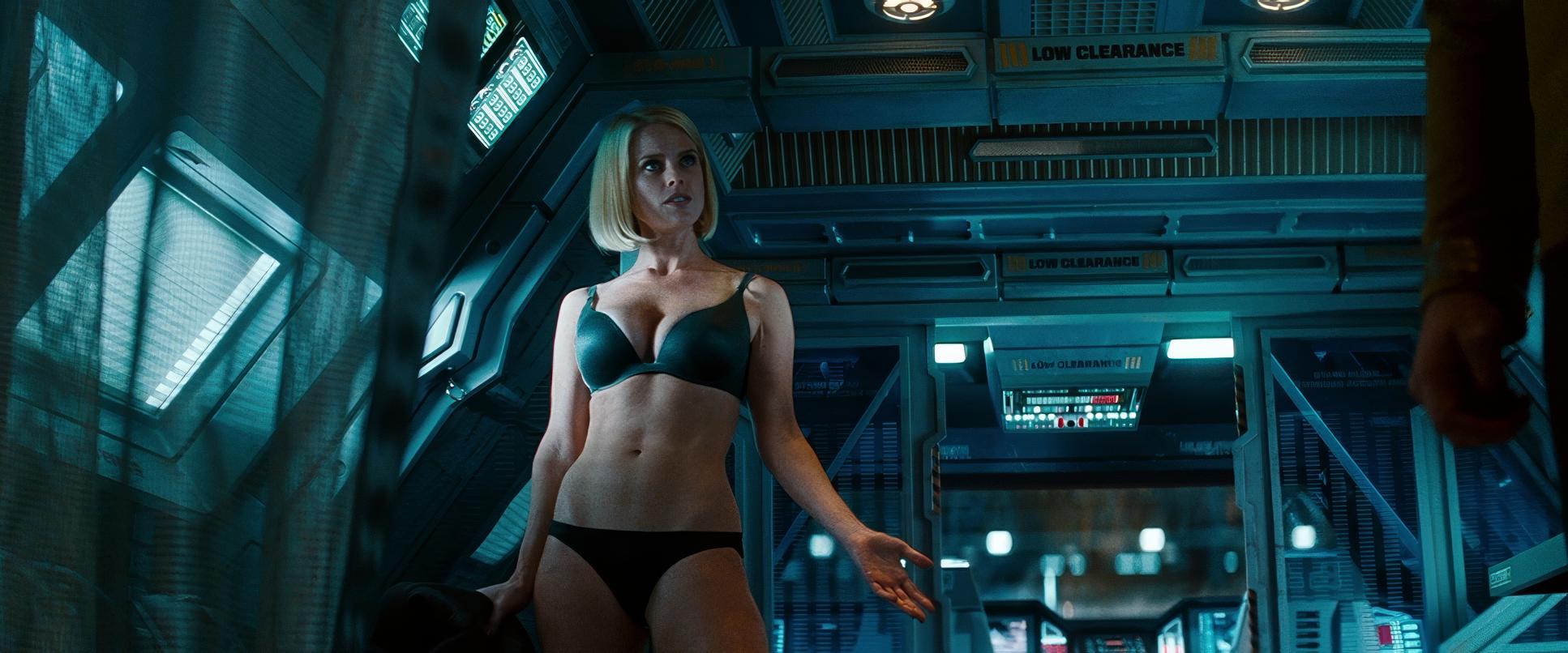
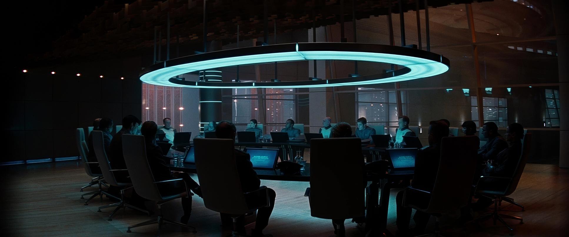
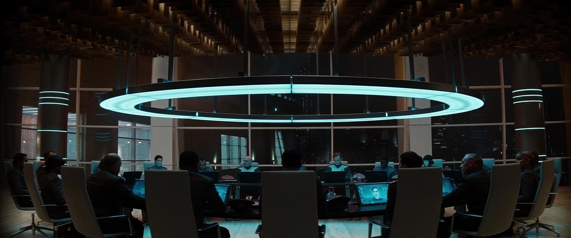
Motivated Practicals: Mindel leans heavily on lights built directly into the sets. The glowing consoles of the Bridge and the fluorescent strips of the medical bay don’t just look cool; they provide the primary source of illumination. This creates a “lived-in” feel that feels organic to the world.
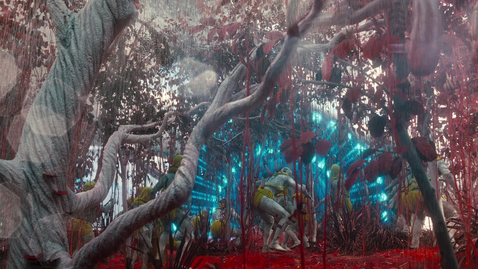
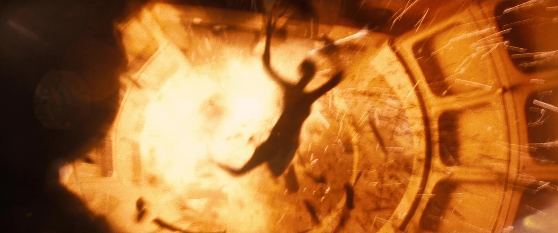
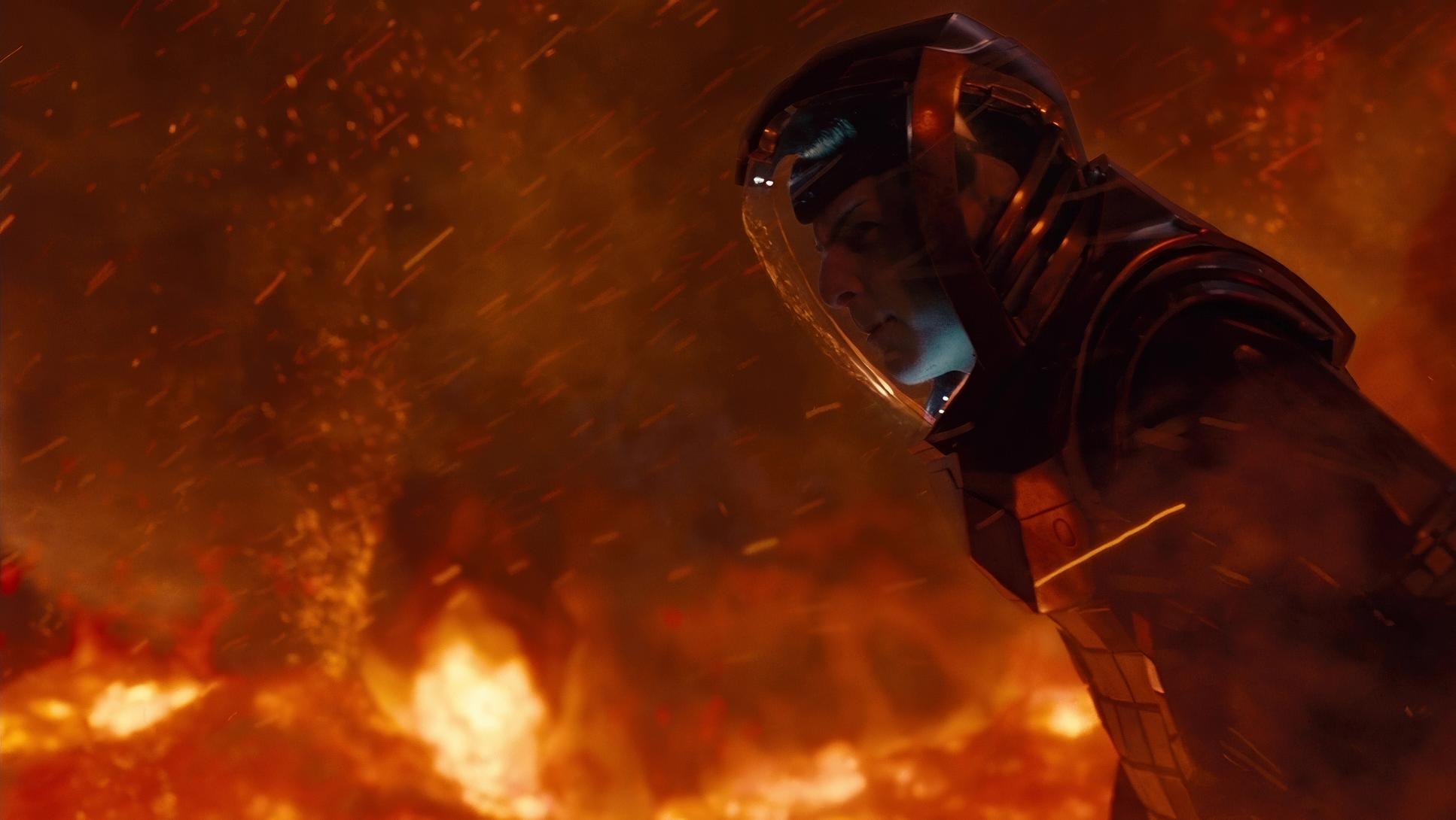
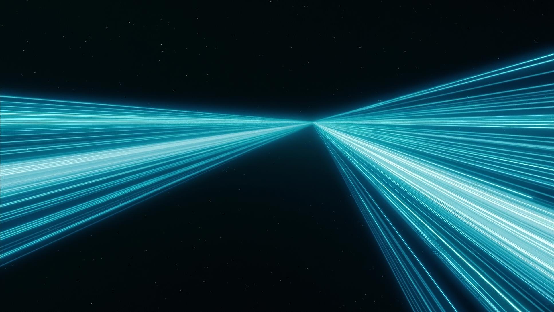
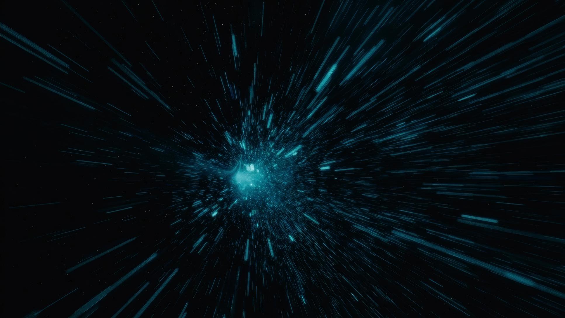
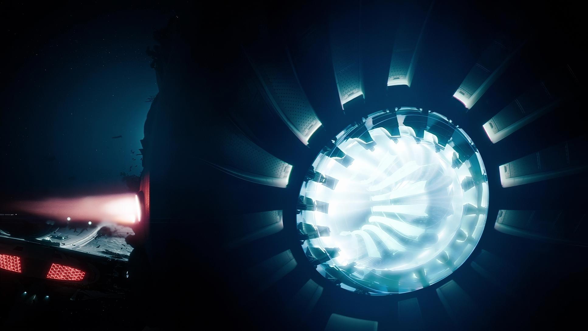
The “Active” Flare: We have to talk about the flares. In this film, they aren’t just a stylistic quirk they are lighting elements. They represent the overwhelming energy of the technology. From a colorist’s perspective, I love how these flares interact with the film grain. They don’t just “clip” to white like they might on a digital sensor; they have a soft, photographic roll-off that adds a sense of brilliance and power to the image.
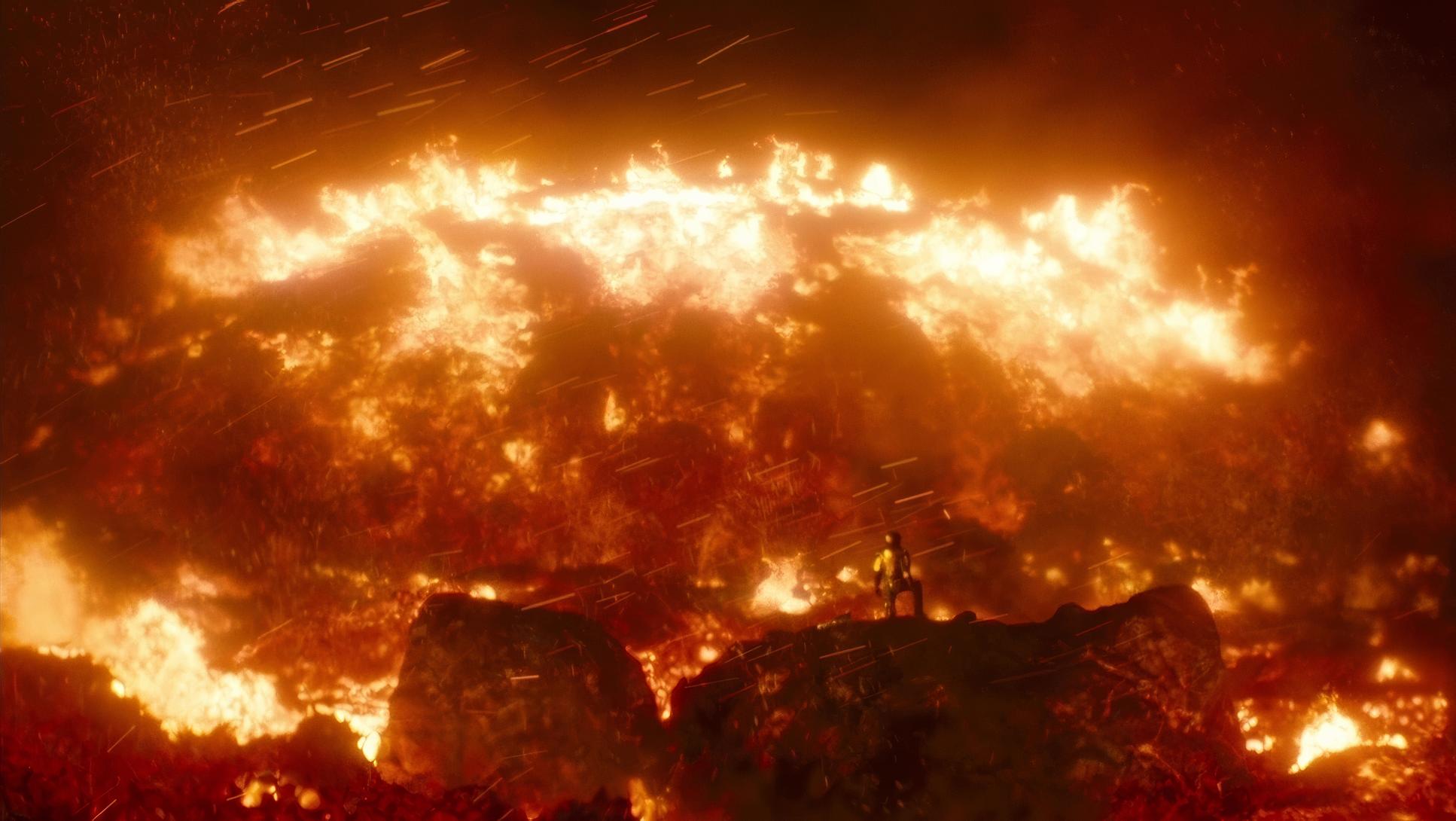
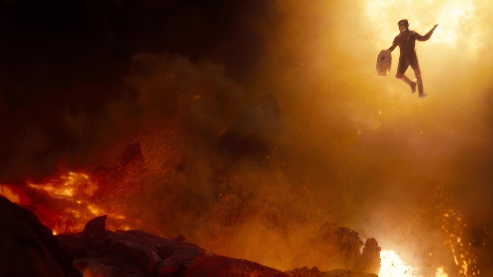
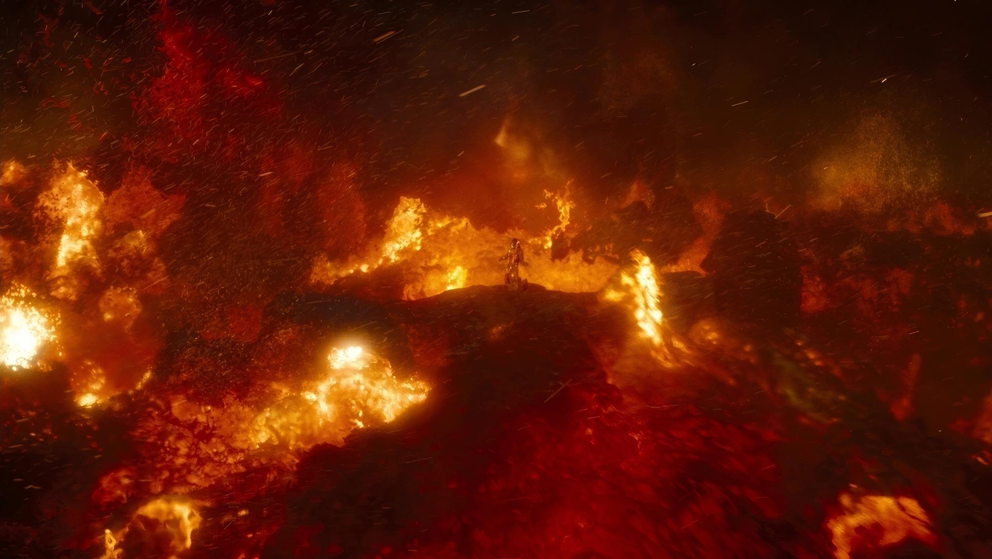
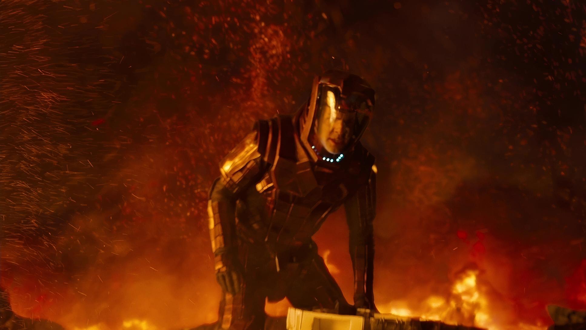
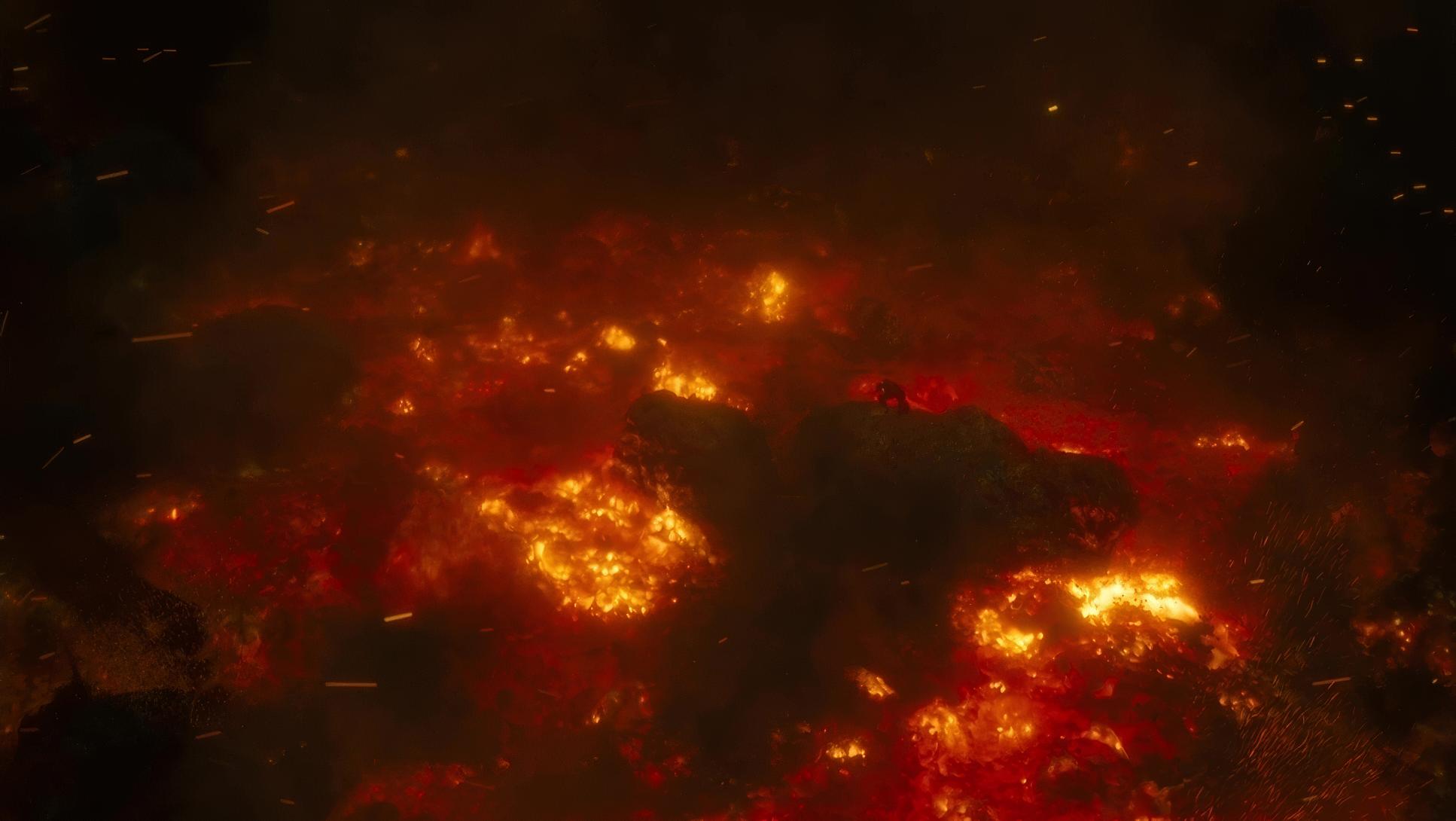
Chiaroscuro and Menace: For the darker segments of the film particularly involving Khan the lighting shifts to high-contrast. Khan is often silhouetted or lit with a harsh “underlight,” making him appear mysterious and threatening. Shadows here aren’t just black holes; they have texture and “density,” a hallmark of the 35mm film capture.
Lensing and Blocking
Mindel utilized Panavision Anamorphic lenses (C-series and E-series), which are legendary in the industry. These lenses are responsible for the iconic oval bokeh and the horizontal blue streaks.
Anamorphic Magic: These lenses do something special to the “Z-axis.” They isolate the characters from the background with a beautiful, shallow depth of field that feels more “cinematic” than “realistic.” The way the lens distorts slightly at the edges adds a vintage, textured quality that balances the high-tech VFX.
Dynamic Blocking: The blocking is choreographed to emphasize the ensemble dynamic. Whether it’s the crew gathered on the bridge or the frantic energy of a shuttle interior, the placement of characters feels natural. The tight framing during intense conversations forces the audience into the characters’ personal space, making us feel the “emotional resonance” Abrams was aiming for.
Color Grading Approach
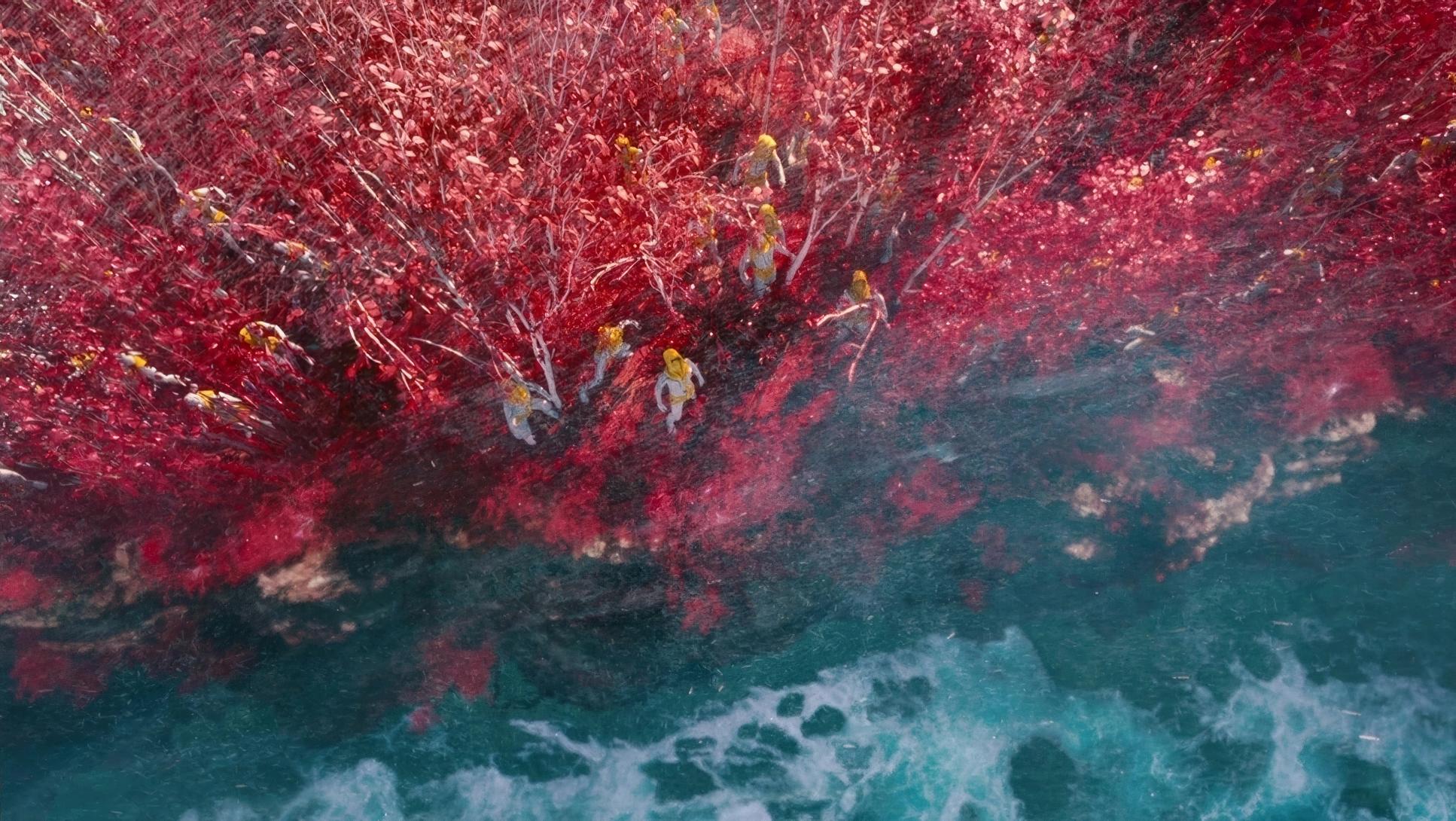
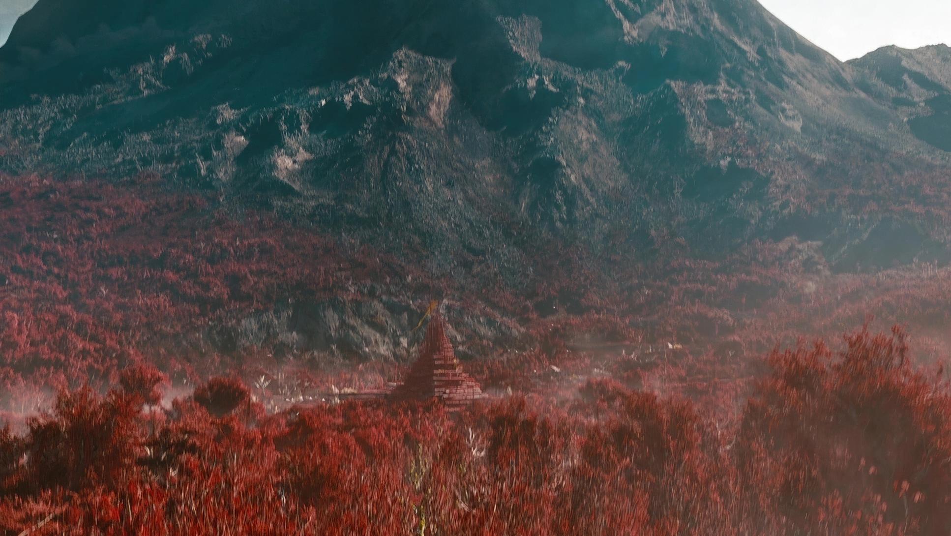
This is where I really lean in. The grade, handled by the legendary Stefan Sonnenfeld, is a masterclass in modern, high-contrast aesthetics.
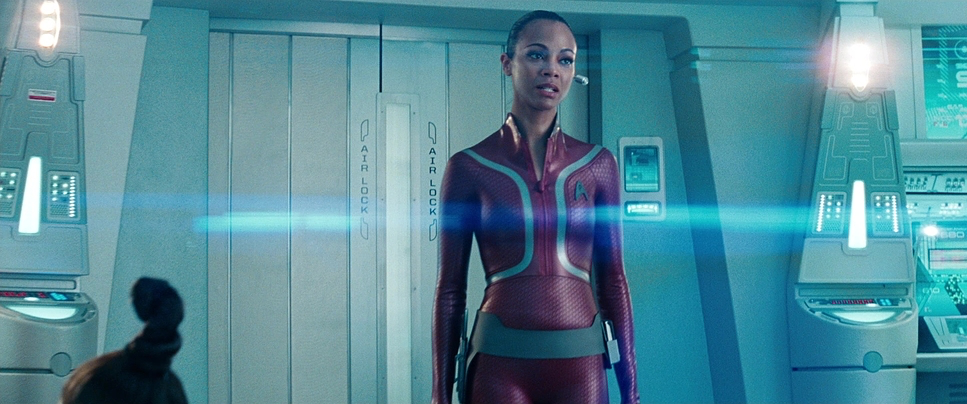
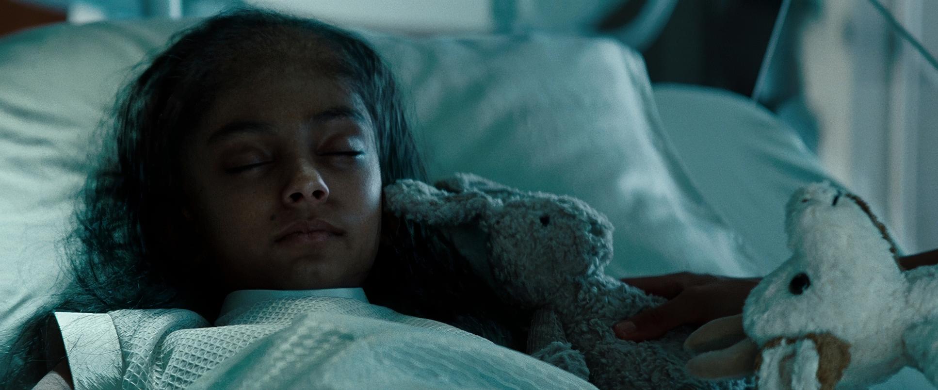
The “Sonnenfeld” Punch: The film has a very strong “toe” (the bottom part of the contrast curve). The blacks are deep and rich, but they aren’t “muddy.” There’s a sophisticated split-tone happening: the shadows often lean into a cool cyan/blue, while the mid-tones especially skin tones are carefully protected to remain warm and natural.
Hue Separation: The color separation is incredible. The primary reds of the uniforms, the green of Spock’s blood, and the orange of explosions pop with surgical precision against the cooler, clinical environments of the ship. As a colorist, I admire how they maintained “density” in the colors. Even in the brightest highlights, the color feels “thick” and saturated, rather than washed out. This is the benefit of a film-to-digital (DI) workflow you get the best of both worlds.
Technical Aspects & Tools
Star Trek Into Darkness (2013) — 35mm Anamorphic & IMAX
| Genre | Action, Adventure, Science Fiction |
| Director | J.J. Abrams |
| Cinematographer | Dan Mindel |
| Production Designer | Scott Chambliss |
| Costume Designer | Michael Kaplan |
| Editor | Maryann Brandon, Mary Jo Markey |
| Colorist | Stefan Sonnenfeld |
| Time Period | Future |
| Color | Mixed, Saturated |
| Aspect Ratio | 2.39 – Spherical |
| Format | Film – 35mm |
| Lighting | Soft light, Underlight |
| Lighting Type | Daylight, Artificial light |
| Story Location | Alien Planet |
| Filming Location | California > Los Angeles |
| Camera | Arri 435 / 435ES, Panavision Millennium / Millenium XL / XL2 |
| Lens | Panavision 40-80 (Bailey zoom – AWZ2), Panavision 70-200mm (ATZ), Panavision C series, Panavision E series, Panavision Primo Classic |
The technical footprint of this film is massive. It was a hybrid beast.
- Film Stocks: Shot primarily on 35mm anamorphic, but for the “big” sequences, they moved to 15/65mm IMAX film. You can feel the shift in resolution and depth; the IMAX sequences have a clarity that is staggering, yet they still retain that organic film texture.
- The Panavision Kit: Using Arri 435 and Panavision Millennium cameras, Mindel was able to capture a dynamic range that was, at the time, superior to most digital offerings. This allowed Sonnenfeld in the grading suite to really “sculpt” the light, pushing the contrast without losing the delicate highlights of the lens flares.
- VFX Synergy: The integration of CGI is seamless because the “plate” (the live-action footage) has such strong lighting cues. When you have real light hitting the lens in-camera, the VFX artists have a perfect reference for how the digital elements should behave. It bridges the gap between the “fake” and the “real.”
Star Trek Into Darkness (2013) Film Stills
A curated reference archive of cinematography stills from STAR TREK INTO DARKNESS (2013). Study the lighting, color grading, and composition.


- Also read: SICARIO (2015) – CINEMATOGRAPHY ANALYSIS
- Also read: TANGLED (2010) – CINEMATOGRAPHY ANALYSIS
Browse Our Cinematography Analysis Glossary
Explore directors, cinematographers, cameras, lenses, lighting styles, genres, and the visual techniques that shape iconic films.
Explore Glossary →