Alright, let’s talk about a film that stands as a textbook example of cinematic revitalization: J.J. Abrams’ Star Trek (2009). Diving into the visual language of this movie isn’t just an academic exercise for me, it’s a look at how texture, grain, and lighting can completely reinvent an IP. When I sit down in my grading suite at Color Culture, I’m constantly looking at how light sculpts emotion. Star Trek in 2009 didn’t just reboot the timeline; it rebooted the visual palette of the genre. It wasn’t just a movie for Trekkies; it was a high-octane action film that just happened to be set in space. Visually, it delivered that promise with a massive jolt of adrenaline.
About the Cinematographer
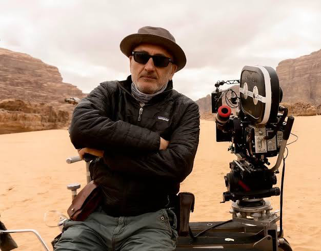
The man behind the lens was Dan Mindel, ASC, BSC. Mindel is a brilliant cinematographer with a specific affinity for the anamorphic format and a long history of collaborating with Abrams (shooting Mission: Impossible III and The Force Awakens). His style is characterized by a “dirty,” kinetic energy he embraces the imperfections of the lens rather than trying to hide them. He isn’t afraid to push boundaries or let a shot breathe with handheld movement. For Star Trek, this meant translating a fresh origin story into a visual spectacle that honored the franchise’s legacy while dragging it kicking and screaming into a modern, tactile reality.
Inspiration Behind the Cinematography
The core inspiration was clearly a desire to strip away the sterile, static feel of previous Star Trek iterations. Abrams wanted this to feel like The Right Stuff meets Star Wars grounded, industrial, and dangerous. This ambition directly informed the visual approach. Gone were the theatrical, stage-bound compositions of the 90s era. In their place was a kinetic, immersive style that grabbed you immediately.
Take the opening sequence on the USS Kelvin. It’s a traumatic birth amidst chaos. The impact is visceral. The cinematography drives this by refusing to be polite; it puts you right in the middle of the sparks and the debris. It established Kirk’s origin against a backdrop of immense personal sacrifice, using visual storytelling that was immediate and relentless.
Camera Movements
If one thing defines the cinematography of Star Trek (2009), it’s the refusal to sit still. There are very few “locked-off” tripod shots. Instead, the camera is perpetually alive, maintaining a high level of kinetic energy that keeps the audience on edge.
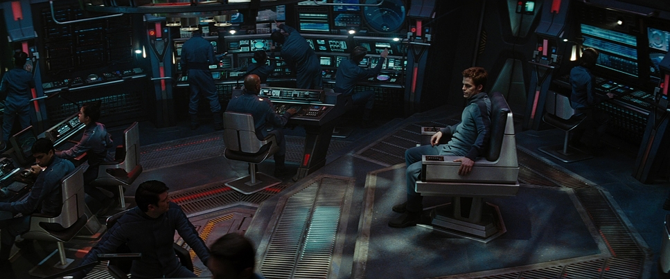
We see this vividly in the ship sequences. The camera glides through corridors or snaps violently around the bridge as explosions rock the Enterprise. It acts like a documentary observer, reacting to the action rather than predicting it. There’s a particular sequence where Spock enters an elevator, and in one flowing motion, we follow him onto the bridge. It conveys the vastness and interconnectedness of the Enterprise without needing a cut. Even the “shaky cam” often a lazy technique in other films feels motivated here. It grounds the fantastical elements, making the warp jumps and photon torpedo hits feel like physical events that actually shake the floorboards.
Compositional Choices
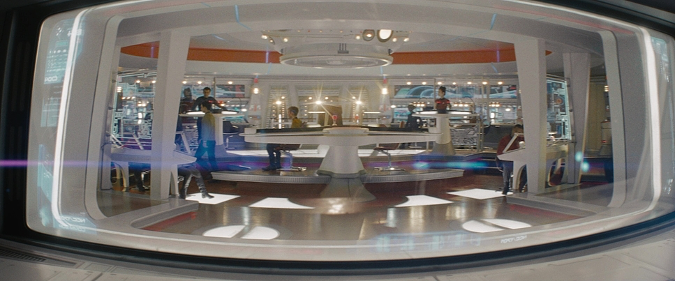
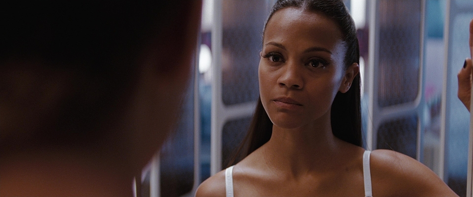
Mindel’s compositional choices balance the epic 2.39:1 widescreen scope with intense intimacy. He frequently uses wide shots to emphasize the colossal scale of the starships making the Enterprise feel imposing against the infinite canvas of space but then juxtaposes this with tight, claustrophobic close-ups during character moments.
The framing consistently puts characters in active, evolving spaces. On the bridge, the layout feels familiar, yet the camera’s perspective is constantly shifting, often shooting through foreground elements (consoles, chairs, other crew members) to add depth. This approach keeps the compositions from feeling flat. Even in establishing shots, like the destruction of Vulcan, the composition emphasizes the brutal finality of the event. It’s not just a planet disappearing; it’s a carefully framed tragedy.
Lighting Style
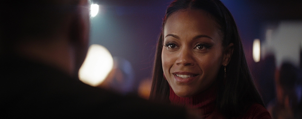
The lighting in Star Trek creates a specific “future-industrial” atmosphere. Mindel employs a technique utilizing practical light sources within the set fluorescents, console glows, warning strobes to illuminate specific areas. This “underlighting” gives the bridge a functional, naval feel while allowing for dramatic shaping of faces.
And then, there are the flares. You can’t talk about this film without talking about the anamorphic lens flares. While they became a meme later, in 2009, they served a specific purpose: they acted as visible light sources within the frame, creating a sense of overwhelming brightness. It suggested that the future was so bright, the camera lens itself could barely contain it. The lighting is often motivated by the environment the red emergency pulses of the Kelvin or the cool, clean light of the Enterprise signaling danger or safety purely through color temperature and intensity.
Lensing and Blocking
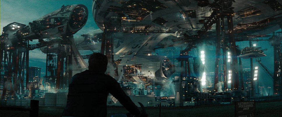
Mindel shot this film using Panavision Platinum and Arriflex 435 cameras, paired with Panavision C and E series anamorphic lenses. This choice is crucial. Anamorphic glass doesn’t just give you a widescreen image; it gives you oval bokeh, barrel distortion, and those distinct horizontal flares. It adds an organic texture that spherical lenses just can’t replicate. It pulls the audience into the vastness of space while keeping the image feeling “filmic” rather than digital.
Blocking is meticulously orchestrated to convey character dynamics. The relationship between Kirk and Spock is constantly emphasized through their physical spacing in the frame. They start at odds, physically separated by the blocking, and gradually move into closer, harmonious frames as they find common ground. The characters move purposefully through the sets, and the wide anamorphic frame captures that movement without needing to cut, reinforcing the scale of the ship.
Color Grading Approach
As a colorist, this is where the film really shows its age in the best way possible. The grade (handled by Christopher Savides) is a definitive example of the “Teal and Orange” era, but executed with a high-end, photochemical sensibility. The palette leans heavily into cool, steely cyans, especially in the shadows and mid-tones of the Enterprise, punctuated by warm skin tones and amber-orange warning lights.
The contrast shaping is aggressive. We are looking at deep, crushed blacks that give the image a punchy, high-impact feel. This isn’t a flat log image; the shadows are dense, hiding detail to create mood. This is paired with highlights that are allowed to blow out comfortably, especially in those lens flares.
Hue separation is key here. The blues are pushed toward cyan/teal, while the golds of Kirk’s uniform and the reds of the engineering decks pop with high saturation. Because it was shot on Kodak Vision2 500T (5218) and 100T (5212) film, there is a natural grain structure that the grade preserves. It has a “print-film” density rich colors, a slightly compressed highlight roll-off, and a texture that feels organic despite the heavy VFX. It manages to look futuristic without looking like a video game.
Technical Aspects & Tools
Star Trek (2009) – Technical Specs
| Genre | Action, Adventure, Science Fiction, Space, Science-Fiction |
|---|---|
| Director | J.J. Abrams |
| Cinematographer | Dan Mindel |
| Production Designer | Scott Chambliss |
| Costume Designer | Michael Kaplan |
| Editor | Maryann Brandon, Mary Jo Markey |
| Colorist | Christopher Savides |
| Time Period | Future |
| Color | Cool, Desaturated, Cyan, Blue |
| Aspect Ratio | 2.39 |
| Lighting | Underlight |
| Lighting Type | Practical light, Fluorescent |
| VFX | CGI |
| Story Location | … Space > The Narada |
| Filming Location | … Los Angeles > 5555 Melrose Avenue |
| Camera | Arriflex 435, Panavision Platinum |
| Lens | Panavision C series, Panavision E series |
| Film Stock / Resolution | 5212/7212 Vision 2 100T, 5218/7218 Vision 2 500T |
It is a common misconception that this “modern” look was achieved digitally. In reality, Mindel and Abrams shot on 35mm film stock (Kodak Vision2 5218 and 5212). The choice of the Vision2 500T stock specifically allowed them to capture those dark, moody interiors while retaining the natural grain that gives the film its grit. The Arriflex 435 was likely the workhorse for the high-speed action beats.
The production also integrated physical sets with VFX in a way that was groundbreaking for the time. The “window” on the bridge wasn’t just a green screen; they used interactive lighting to cast the correct reflections and color shifts onto the actors, marrying the live-action footage with the CGI environments. This fusion of old-school craftsmanship (shooting on film, using practical lights) with modern digital tools is why the movie still looks great today.
- Also read: BOHEMIAN RHAPSODY (2018) – CINEMATOGRAPHY ANALYSIS
- Also read: TOY STORY 2 (1999) – CINEMATOGRAPHY ANALYSIS
Browse Our Cinematography Analysis Glossary
Explore directors, cinematographers, cameras, lenses, lighting styles, genres, and the visual techniques that shape iconic films.
Explore Glossary →