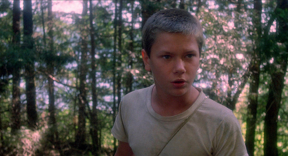
For those of us who grew up loving cinema, Rob Reiner’s Stand By Me feels less like a movie and more like a captured memory. I’m drawn to stories that manage the delicate balance between narrative, performance, and cinematography without letting the tech overshadow the heart. When I revisit this film, I’m struck not just by the young cast, but by the quiet, effective visual language that binds it all together. It’s a perfect example of how subtle choices behind the camera can root a fantastical journey in undeniable reality.
About the Cinematographer
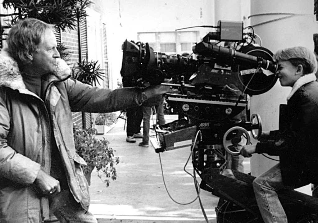
The man responsible for framing the journey of Gordy, Chris, Teddy, and Vern was Thomas Del Ruth. While Del Ruth might not have the celebrity status of some DPs, his filmography from The Breakfast Club to Stand By Me shows a master at work. We also have to credit colorist Terry Haggar, whose work on the timing helped cement that specific, sun-drenched nostalgic look.
What I appreciate about the work here is its pragmatism. Del Ruth isn’t chasing trends or showing off with the Panavision Panaflex camera; he serves the story with an invisible hand. His approach feels like an extension of Reiner’s own directorial philosophy: get out of the way and let the messy humanity of the characters shine. The cinematography doesn’t scream for attention; it whispers, guiding your eye without you realizing it. That is the mark of true craftsmanship.
Inspiration Behind the Cinematography
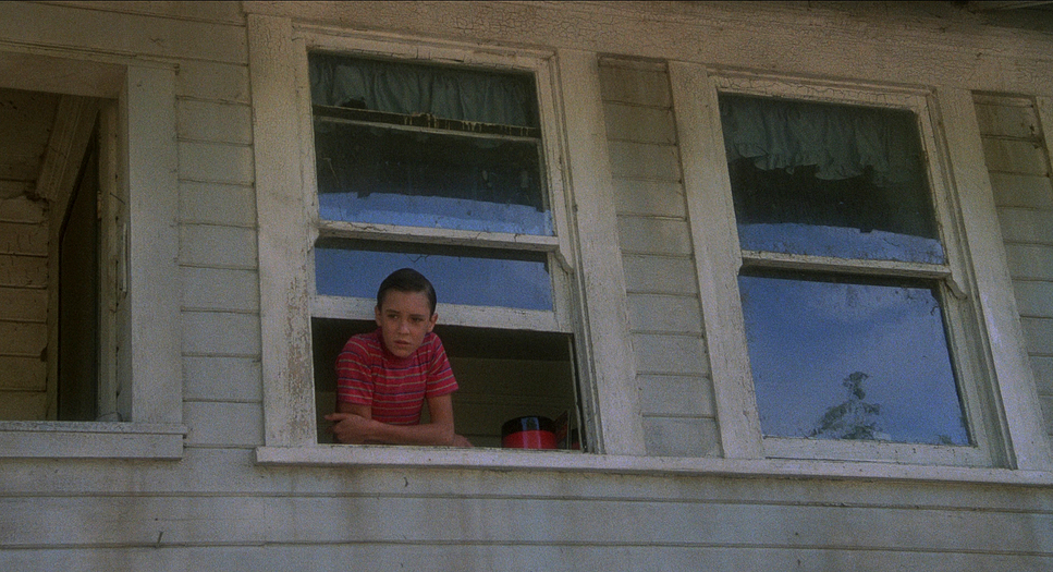
Stand By Me operates as a memory piece an adult Gordy LeChance looking back on a pivotal moment, filtered through bittersweet reflection. Reiner specifically wanted to show “the youth of the 1950s without it becoming a stereotype like Happy Days,” and that directive drove the visual treatment. Del Ruth captured an authenticity that transcends mere period recreation.
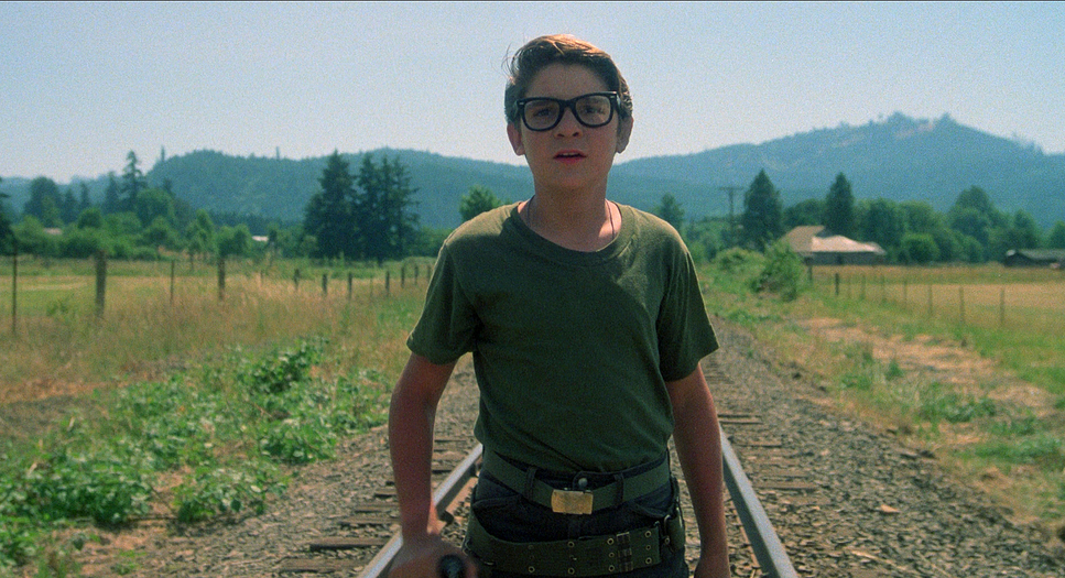
The journey into the deep woods to find a dead body is an internal loss of innocence as much as a physical trek. The visual style reflects this transition, moving from the comfortable, idealized small town into the rugged, untamed wilderness, before settling into the somber reality of their discovery. The imagery leans into the “magical” quality of boys walking the train tracks an aesthetic that evokes freedom and the boundless horizons of childhood. It’s visual shorthand for the feeling of being invincible, a feeling the adult Gordy reminds us we rarely find again.
Camera Movements
Restraint is the operating principle here. You won’t find gratuitous crane shots or dizzying handheld sequences. Instead, the camera acts as a patient observer, often allowing the boys to drive the scene through their own movement.
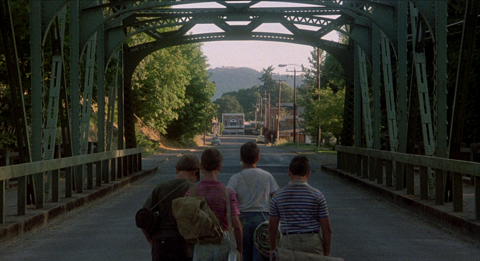
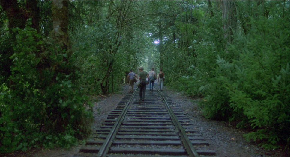
Take the iconic tracking shots following the boys along the train tracks. These aren’t just practical ways to keep characters in frame; they represent the collective journey. The camera maintains a distance but keeps them grouped, emphasizing their bond. It moves with them like a silent companion, privy to their jokes and vulnerabilities. These smooth, gliding movements create a dreamlike quality, reinforcing the idea that we’re watching a memory unfold.
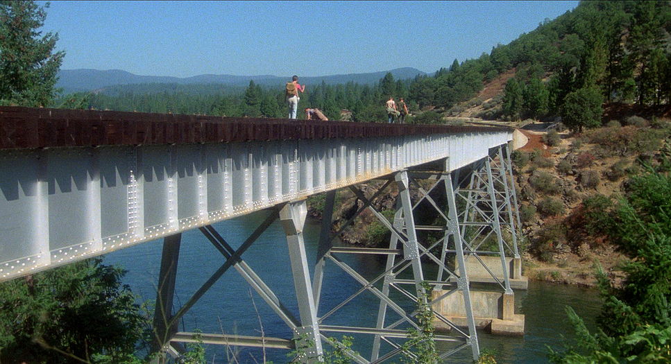
However, when the tension spikes, the movement shifts. In the train trestle scene, the camera tracks frantically with the boys, mirroring their rising panic. While the train itself was actually quite far away (an effect sold by a long lens), the kinetic energy of the camera sells the terror. This deliberate shift in pacing from gentle observation to reactive dynamism modulates the emotional intensity, keeping us engaged on a visceral level.
Compositional Choices
The frames in Stand By Me balance grandeur with intimacy. As the boys trek through Oregon, we see them framed against vast landscapes using deep focus, emphasizing how small they are against the looming unknown. These wider shots provide constant depth cues, expressing the sheer scale of their journey.
But Del Ruth is equally adept at bringing us into their private world. The campfire scene perfectly illustrates this. Even though it was shot inside a warehouse dressed to look like the outdoors, the compositions pull us tight into the circle of light. We see every nuance of their expressions. It’s this push and pull between wide establishing shots and tight, character-focused framing that gives the film its rhythm. The recurring image of the four boys on the tracks is a prime example of blocking always together, usually in a loose line, creating a strong horizontal element that grounds them in the frame.
Lighting Style
The lighting is largely naturalistic, grounding the 1950s setting in reality. Exterior day scenes rely on what feels like ambient daylight, likely augmented with HMI units or negative fill to shape the faces. This creates the bright, open feel of childhood summers.
Where the lighting truly shines is in the nocturnal scenes. The campfire sequence uses motivated lighting from the fire to create a beautiful chiaroscuro effect. The flickering flames cast dancing shadows, highlighting faces while plunging the background into darkness. This isn’t just aesthetics; it’s psychology. The intimacy of the firelight underscores the vulnerability of the conversation between Chris and Gordy. As a colorist, I love how these scenes lean into the warmth, allowing highlights to bloom while retaining texture in the shadows. It’s a masterful use of practicals to shape mood.
Lensing and Blocking
The film was shot spherically in a 1.85 aspect ratio, avoiding the anamorphic flares or stretched bokeh that might have made it feel too “Hollywood.” This choice keeps the look un-stylized and focused on the characters. Using Panavision wider to mid-range lenses for most character work maintains a sense of perspective, keeping the boys firmly connected to their environment rather than isolating them with an extremely shallow depth of field.
A key technical detail is the use of an extremely long telephoto lens (likely in the 300mm to 600mm range) for the train trestle scene. This compresses the perspective, making the train appear mere yards behind the boys when it was actually at a safe distance. It transforms a safety precaution into a psychological weapon, translating the characters’ panic directly to the audience.
Color Grading Approach
From a colorist’s perspective, Stand By Me is a fascinating study in 35mm aesthetics. Shot on Eastman 5247 a robust 100T stock known for its fine grain and excellent latitude the look is inherently organic. The original theatrical prints would have had that distinct print-film sensibility: rich blacks, pleasing grain, and a subtle desaturation that feels period-appropriate.
The color timing seems aimed at a warm, nostalgic palette, particularly in the sun-drenched exteriors. The greens of the Oregon forests aren’t hyper-saturated; they are muted and earthy. Skin tones are healthy and natural, with just enough warmth to evoke a summer glow.
If I were grading this today, I’d focus on preserving that print-film emulation. I’d sculpt the tonal range to ensure robust shadow detail while allowing the highlights to breathe never letting it look digital or harsh. I would lean into subtle hue separation, letting the reds and oranges pop gently against the cooler greens, but always within a naturalistic framework. The only exception would be the “Lard-Ass” pie-eating contest; that sequence invites a deliberate spike in saturation to make it feel like the vibrant, cartoonish memory it’s meant to be.
Technical Aspects & Tools
| Genre | Crime, Drama, Road Trip |
|---|---|
| Director | Rob Reiner |
| Cinematographer | Thomas Del Ruth |
| Production Designer | J. Dennis Washington |
| Costume Designer | Sue Moore |
| Editor | Robert Leighton |
| Colorist | Terry Haggar |
| Time Period | 1950s |
| Color | Saturated |
| Aspect Ratio | 1.85 (Spherical) |
| Format | Film – 35mm |
| Lighting | Soft light, Side light |
| Lighting Type | Daylight |
| Story Location | Oregon > Castlerock |
| Filming Location | United States > Oregon |
| Camera | Panavision Panaflex |
| Lens | Panavision Lenses |
| Film Stock | Eastman 100T 5247 |
In 1986, the toolkit was defined by reliability. Del Ruth utilized the Panavision Panaflex system, a workhorse of the industry. The choice of Eastman 5247 stock was crucial its slow speed meant they needed plenty of light, but it paid off in the resolution and texture of the final image.
The production was also incredibly resourceful. The decision to shoot the campfire scene in a warehouse allowed for meticulous control over lighting that a real forest night simply wouldn’t permit. Similarly, the “man-made” pond for the leech scene demonstrates a pragmatic approach to a difficult sequence. These aren’t shortcuts; they are the practical solutions that allow the visual storytelling to succeed.
- Also read: THE EXORCIST (1973) – CINEMATOGRAPHY ANALYSIS
- Also read: THE HELP (2011) – CINEMATOGRAPHY ANALYSIS
Browse Our Cinematography Analysis Glossary
Explore directors, cinematographers, cameras, lenses, lighting styles, genres, and the visual techniques that shape iconic films.
Explore Glossary →