Stalker (1979) is famously not an “easy” watch. It’s long, it’s agonizingly slow, and it refuses to give you a straight answer. It asks you to just sit with it and let the atmosphere wash over you. But it’s a revelation because it proves that cinematography isn’t just about making things look pretty; it’s about “sculpting in time,” as Tarkovsky put it. You can feel him stretching and twisting every second to serve a spiritual journey that’s as much about the viewer as it is the characters.
About the Cinematographer
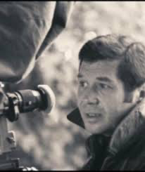
The production of Stalker was, frankly, a total hellscape. It was a “Zone” of its own, filled with egos and technical disasters. We credit the final, iconic look to Alexander Knyazhinsky, but he was actually the third DP to step into the ring.
First, there was Georgi Rerberg. He was a brilliant, stubborn artist who had worked with Tarkovsky on The Mirror, but their “artistic push-and-pull” turned explosive. Then came the technical catastrophe: they shot an entire version of the film on the then-experimental Kodak 5247 stock. When the footage came back from the Soviet labs, it was ruined dark, muddy, and sickly green. As a colorist, the thought of losing months of work to a lab error makes my stomach turn.
Tarkovsky fired Rerberg, tried again with Leonid Kalashnikov, and fired him too when the “magic” wasn’t there. Knyazhinsky was the one who finally survived the process. This isn’t just trivia; it’s a reminder that sometimes the most beautiful frames are born out of sheer, bloody-minded tenacity and a total refusal to compromise.
Inspiration Behind the Cinematography
Tarkovsky didn’t just dislike conventional sci-fi; he had a deep contempt for it. He famously hated Kubrick’s 2001: A Space Odyssey, calling it too sterile and commercial. His response? “Let’s make our space station look like a broken-down bus.”
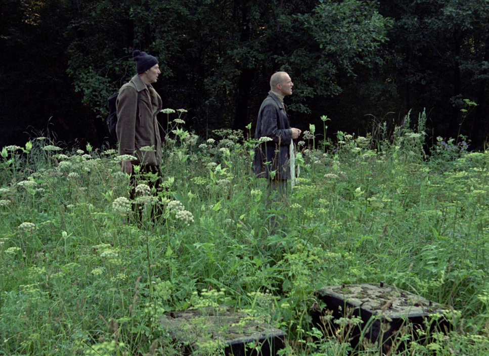
He wanted to strip away the “comic book” flashy effects to find something raw and human. In the Zone, he wasn’t looking for futuristic tech; he was using the landscape as a mirror for the characters’ souls. My favorite story from the set is production designer Rashid Safulin mentioning that Tarkovsky wouldn’t tolerate “a single unmotivated flower” in the frame. Every puddle, every piece of debris, and every sliver of light had to have a poetic reason for existing. It wasn’t about entertaining the audience; it was about absorbing them.
Camera Movements

The camera movements in Stalker aren’t about action; they’re a slow, deliberate dance. Tarkovsky’s “sculpting in time” means the camera doesn’t just observe it experiences.
In the opening sepia sequences, the camera feels heavy and tethered, capturing that sense of entrapment. Then you get the handcar journey into the Zone a tracking shot that feels like it lasts an eternity. As a viewer, you stop being a passive observer and start feeling like you’re on that railcar. The pace forces your mind to wander and meditate. There are these ethereal floating shots over submerged objects that blur the line between reality and a dreamscape. By refusing to use rapid cuts or handheld work, Tarkovsky forces you to actually look at the texture of the world.
Compositional Choices
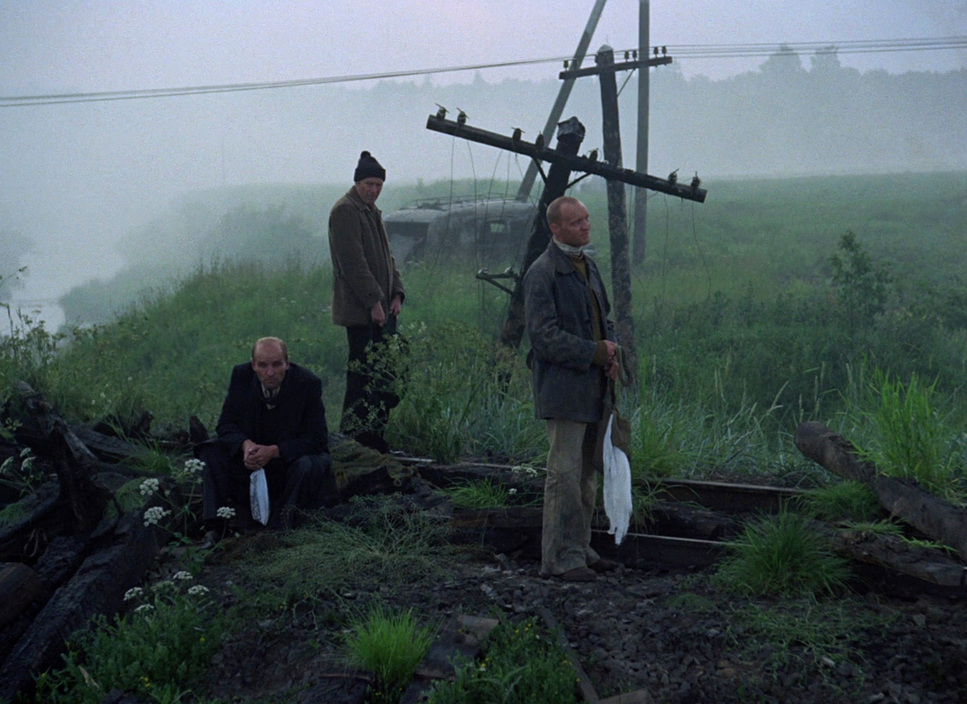
Tarkovsky’s eye for composition is masterful. He takes these decrepit, industrial ruins and turns them into canvases of desolation. He often frames the three protagonists as tiny figures against massive, crumbling structures, which perfectly highlights the existential weight of the film.
He uses deep focus to create layers of information. You’ll have a character in the foreground, but your eye is constantly pulled toward the mysterious depths of the background. While the official records mention the Mitchell BNC and Zeiss glass, there’s an almost painterly precision to how he uses the 1.37 aspect ratio. Every doorway or overgrown archway acts as a psychological portal. There’s an asymmetrical balance to his frames that doesn’t tell you where to look, but rather invites you to explore, creating a tension that you can feel in your gut.
Lighting Style
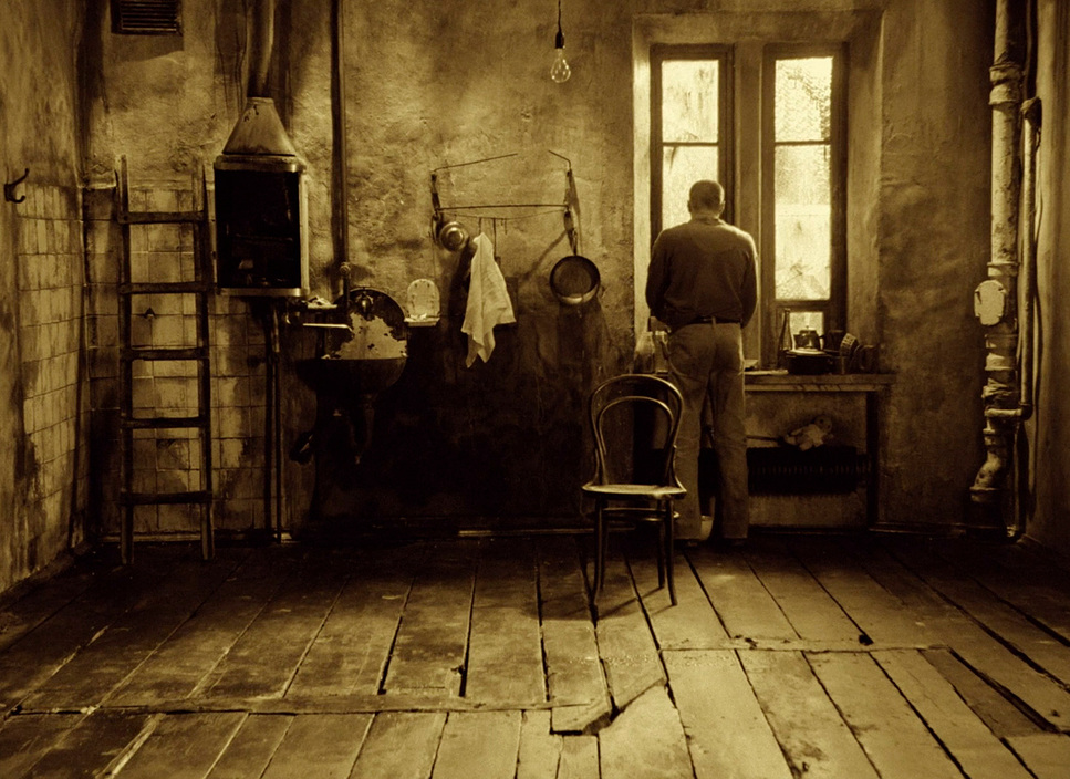
The lighting here is all about mood and texture, not just “illumination.” Outside the Zone, the light is flat and drained it’s “motivated” by a world that has lost its hope.
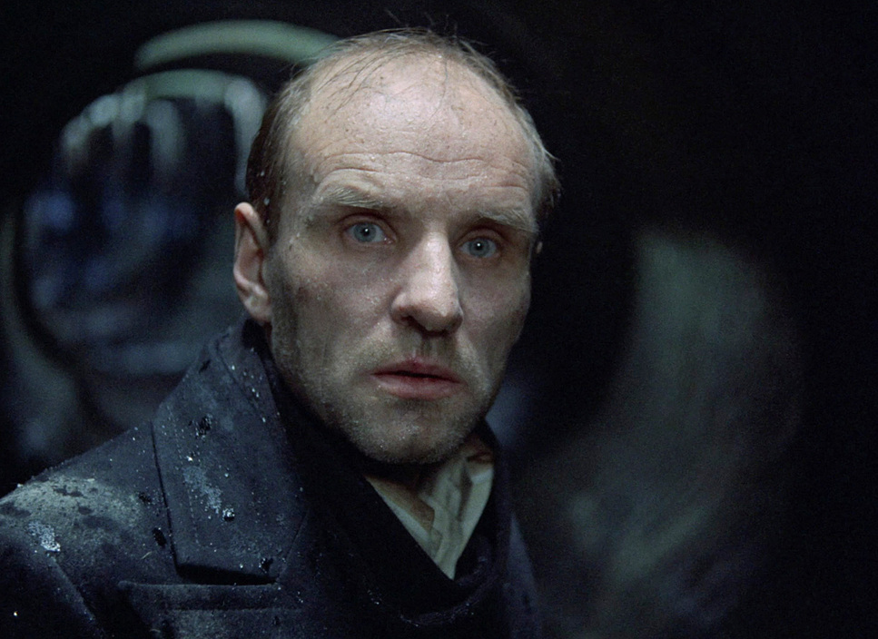
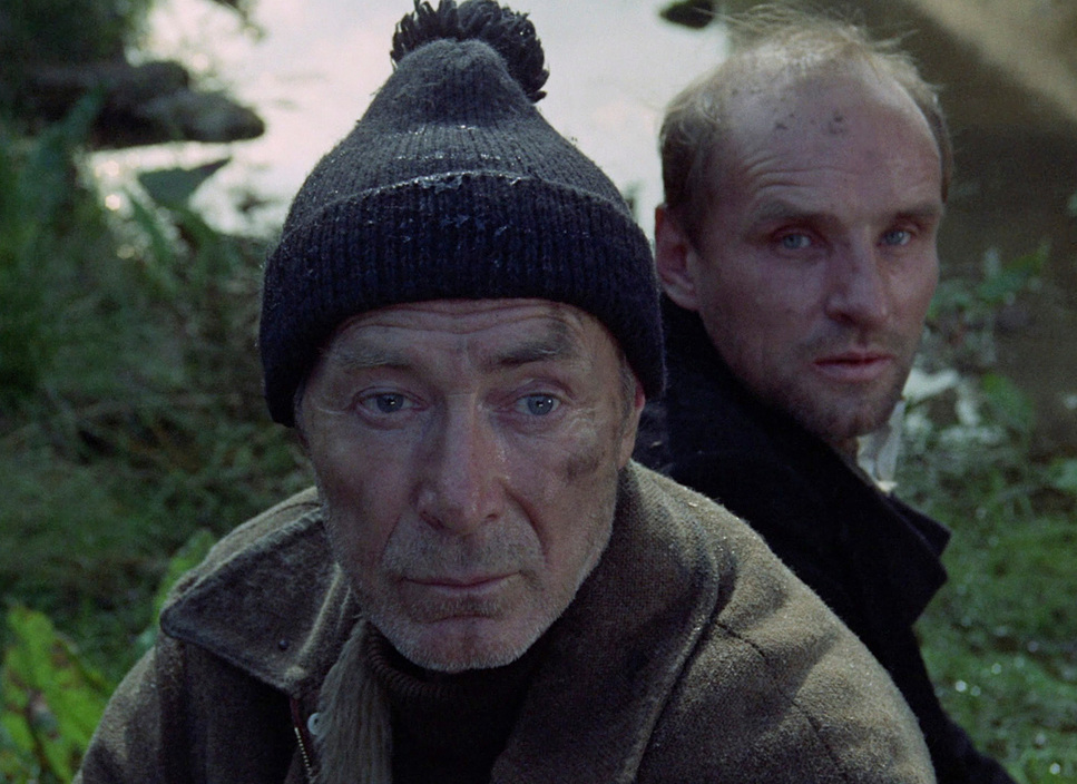
Once they cross into the Zone, things shift. It’s still mostly naturalistic, but it gains this diffused, otherworldly quality. It’s rarely harsh. Instead, you get this soft, milky light filtering through fog or dense foliage. It reveals the “stinking puddles of oil” and the “effluent discharge” in a way that is both disgusting and strangely beautiful. This low-key approach allows shadows and ambiguity to do the heavy lifting, keeping the Zone’s power feeling elusive and dangerous.
Lensing and Blocking
The technical workhorse of the Zone was the Cooke 20-100mm T3.1 zoom. In the industry, we describe lenses like this as being “as big as an artillery shell.” These old Cookes are legendary for their “warmth” they have a beautiful fall-off and an organic feel that digital sensors still struggle to replicate. Using a massive zoom allowed Tarkovsky to make subtle framing adjustments during those long takes without breaking the immersion.
The blocking is equally deliberate. The Stalker, the Writer, and the Professor are constantly being repositioned to show their shifting allegiances. Sometimes they’re huddled together in a shared moment of vulnerability; other times, they’re miles apart in the frame, reflecting their philosophical divides. They move through the depth of the space, not just across it, which makes the journey feel three-dimensional.
Color Grading Approach
This is the part that hits home for me. The color in Stalker is a fundamental thematic tool.
The “outside” world is a masterclass in tonal sculpting. As a colorist, I see the crushed black points and the lifted whites that drain the dynamic range until the image feels suffocating. It’s a monochromatic world of browns and grays with a sickly green undertone that suggests decay. It’s not just a filter; it’s visual philosophy.
Then comes the transition. When they enter the Zone and the film shifts to a naturalistic palette, it feels like a gasp of oxygen. The blacks get richer, the greens become “lush,” and the highlights get that beautiful, organic roll-off that only 35mm film provides.
I often wonder if that original “ruined” Kodak footage the stuff that came back dark and greenish actually inspired the final look. Maybe that disaster gave Tarkovsky the reference point he needed for the Zone’s sickly, verdant glow. And that final scene with Munkie? Reintroducing color outside the Zone is a brilliant move. It suggests the “magic” is bleeding out, leaving us with more questions than answers.
Technical Aspects & Tools
Stalker (1979) | Technical Specifications
| Genre | Science Fiction, Thriller, Cosmic Horror, Drama, Lo-Fi Sci-Fi, Magical Realism, Mystery |
| Director | Andrei Tarkovsky |
| Cinematographer | Aleksandr Knyazhinsky, Leonid Kalashnikov |
| Production Designer | Aleksandr Boym, Andrei Tarkovsky |
| Costume Designer | Nelli Fomina |
| Editor | Lyudmila Fejginova |
| Colorist | Bozhena Maslennikova |
| Time Period | Future |
| Color | Cool, Desaturated |
| Aspect Ratio | 1.37 – Spherical |
| Format | Film – 35mm |
| Lighting | Hard light, Low contrast |
| Lighting Type | Artificial light |
| Story Location | Earth |
| Filming Location | Russia > Moscow |
| Camera | Mitchell BNC |
| Lens | Zeiss Super Speed, Cooke Varotel Zoom lenses |
The technical hurdles behind this film are bordering on mythical. Using a KSN camera (the Soviet Mitchell) meant they were hauling around a massive, stable platform that wasn’t exactly “nimble” in a swamp.
The shooting locations were characters in themselves and they were lethal. They filmed in abandoned hydroelectric stations and chemical factories in Estonia. The crew was literally “up to their knees in stinking puddles of oil.” The tragedy is that this wasn’t just uncomfortable; it was likely fatal. The deaths of several key crew members, including Tarkovsky himself, have been linked to the toxic “effluent discharge” they were exposed to on set.
Even with a falling-apart budget during reshoots, the ingenuity was incredible. Safulin had to make three tanks look like a whole graveyard of them by covering them in moss in a matter of hours. These aren’t just tech specs; they are testaments to the sacrifice required to make this film.
- Also read: ROMAN HOLIDAY (1953) – CINEMATOGRAPHY ANALYSIS
- Also read: DOGVILLE (2003) – CINEMATOGRAPHY ANALYSIS
Browse Our Cinematography Analysis Glossary
Explore directors, cinematographers, cameras, lenses, lighting styles, genres, and the visual techniques that shape iconic films.
Explore Glossary →