When I first watched Spotlight (2015), I was immediately struck by its quiet power. It’s a film that, on the surface, doesn’t scream for attention with flashy visuals, yet its cinematography is precisely what makes it so profoundly effective.
The challenge that director Tom McCarthy and his team faced was how to tell a story about investigative print journalism a profession that, frankly, is often a long, tedious process full of dead ends and monotonous paperwork. In other words, the work itself is boring. But you can’t make a boring movie just to be authentic. The genius of Spotlight‘s visual approach lies in its ability to dramatize the undramatic without resorting to cinematic theatrics. It shows us what the work really looks like when it’s done right. It’s a masterclass in understatement, allowing the arduous, meticulous process of journalism to shine through without distraction.
About the Cinematographer
When we talk about the cinematography of Spotlight, we’re diving into the work of Masanobu Takayanagi. As filmmakers, we often look for that sync between a director’s vision and a DP’s execution, and Takayanagi’s approach here is a textbook example of that synergy. He’s known for a naturalistic style, often favoring a very grounded aesthetic which perfectly aligned with McCarthy’s goal. It wasn’t about imposing a grand visual signature but rather about serving the narrative with a sense of quiet authenticity. This isn’t the kind of film where the cinematography announces itself with bold, stylized flourishes; rather, it disappears into the fabric of the story, like a good journalist whose presence is felt through the meticulous reporting, not their personal charisma.
Inspiration Behind the Cinematography
The primary inspiration behind Spotlight‘s look was a resolute commitment to realism and a deliberate rejection of the “Hollywood version” of reporting. You know the type dark alleys, mysterious sources in parking garages. While classics like All the President’s Men visualized the antagonism with deep shadows and high contrast, Spotlight takes that foundation and pushes the concept of understatement even further.
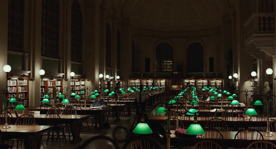
The filmmakers wanted to capture the unglamorous, daily slog of the job. This isn’t about crusading superheroes; it’s about a group of people acquiring information in a systemic way. To achieve this, they stripped the aesthetic down to the bone what they called “destialized.” The cinematography is simple, the color palette is muted, and the camera movements are functional. This isn’t a knock on the craft; quite the opposite. It takes immense skill to create a reserved aesthetic that doesn’t call attention to itself while still being visually compelling. It tells us something vital about the nature of good journalism: the work is sober, and its practitioners are meticulous. This isn’t just an artistic choice; it’s a thematic one.
Camera Movements
From a camera movement perspective, Spotlight is a symphony of restraint. There are no flashy whip pans, no aggressive handheld sequences designed to inject artificial tension. Instead, the camera operates with a quiet diligence, mirroring the journalistic process itself. We primarily see static shots, subtle pushes, and slow, deliberate dollying.
When the camera does move, it’s always motivated. It might gently track alongside a reporter walking through a chaotic newsroom, allowing us to feel the bustling environment without drawing attention to the lens. Or it might execute a gradual push-in during an intense interview, slowly tightening the frame as the weight of a revelation settles. These movements are functional they guide our eye or emphasize a moment, but they never scream for attention. It’s like the steady hand of a reporter sifting through documents; it’s calm, focused, and utterly precise. This careful choreography of stillness and subtle motion creates a sense of observational authenticity, as if we are silent members of the Spotlight team watching the story unfold in real-time.
Compositional Choices
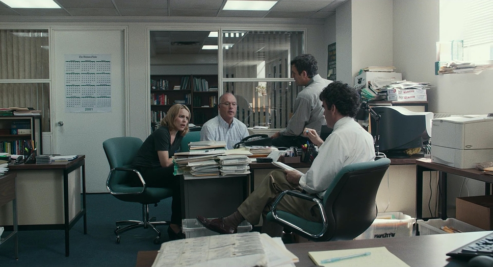
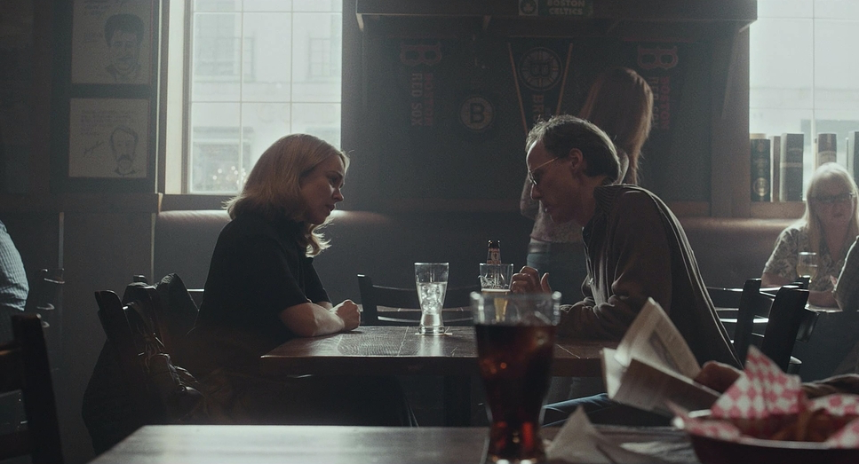
The compositional choices in Spotlight are equally thoughtful and grounded in realism. The film employs a 1.85:1 aspect ratio a spherical format that feels taller and more akin to a photograph or a printed page than the wider, more cinematic 2.39:1 anamorphic ratio. In the newsroom scenes, they frequently use wider focal lengths with a deeper depth of field. This allows multiple characters and elements to remain in focus within the frame, emphasizing the collaborative nature of the team and the sheer volume of paperwork surrounding them.
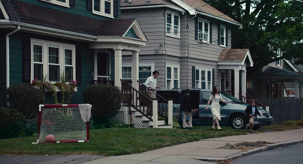
You’ll often see medium-wide shots that frame the journalists within their natural environments whether it’s around a cluttered desk or in a crowded archive. There’s a particular beauty in how they compose scenes with multiple characters. The blocking feels incredibly natural, with actors moving organically within the frame rather than being rigidly posed. This helps reinforce the idea of these individuals as a collective unit.
I remember watching one scene where they’re all poring over directories, cross-referencing names for a spreadsheet. The composition keeps everyone visible and engaged in their task. It underscores the mind-numbing work essential to investigative journalism. There’s an avoidance of overly dramatic low-angle hero shots; instead, the compositions are largely at eye-level or centered, fostering a sense of egalitarianism and direct observation.
Lighting Style
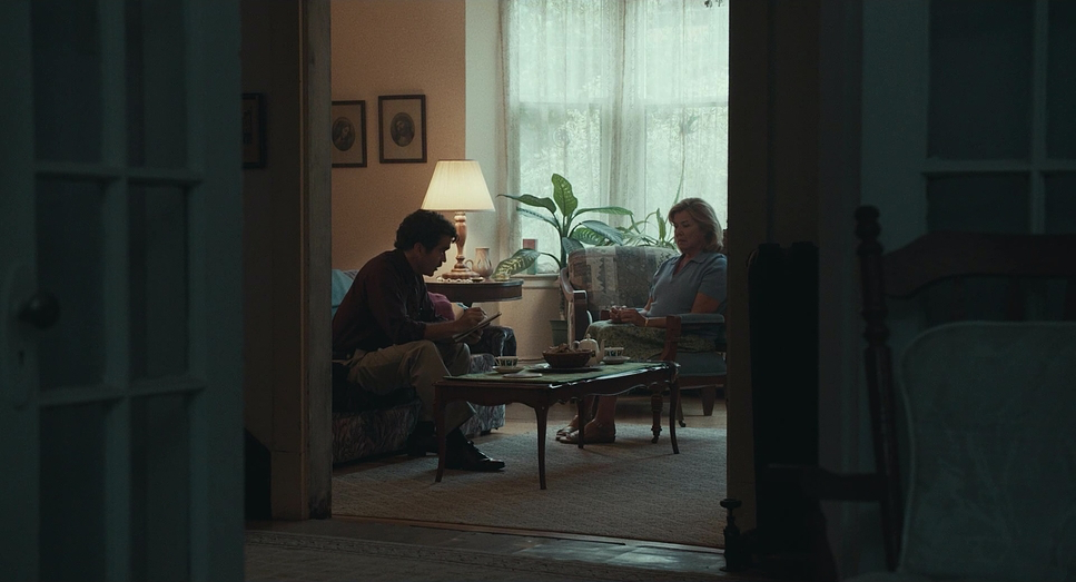
When it comes to lighting, Spotlight feels incredibly naturalistic, but don’t let that fool you it is meticulously crafted. The metadata confirms the heavy use of Artificial Tungsten light, often employed as soft top-lighting. This mimics the practical, overhead fluorescent lighting you’d expect in a busy office or the drab interiors of municipal buildings.
What’s interesting here is the color temperature management. While Tungsten is naturally warm (3200K), the film has a distinctively cool, blue undertone. As a colorist, I suspect they either gelled the tungsten units or set the camera’s white balance to push those artificial sources toward a cooler, more clinical look. This choice prevents any single character from being overly dramatized. The lighting remains motivated and objective.
For interviews and exterior scenes, there’s a palpable effort to avoid drawing attention to the light itself; no dramatic shafts of light cutting through smoke, no overtly cinematic rim lights designed to sculpt actors’ faces for emotional impact. It’s lighting designed to illuminate truth, not to generate visual excitement. It provides a clean canvas where the tonal sculpting isn’t about exaggerated shadows, but about subtle shifts and preserving detail across the dynamic range.
Lensing and Blocking
The lensing choices in Spotlight are integral to its grounded aesthetic, and this is where the gear really matters. They didn’t go for vintage glass to add “character” or nostalgia. Instead, they shot on Zeiss Ultra Primes. These are incredibly sharp, high-contrast, modern lenses. They are clinically precise.
This choice reinforces the film’s theme: facts matter. Clarity matters. The Ultra Primes don’t distort or soften the edges; they present the world exactly as it is. In the newsroom, this allows for expansive shots that show the entire team at work without the distracting aberrations you might get from older lenses. It allows the audience to scan the frame and absorb the details, much like an investigator sifting through information.
Blocking, consequently, is very organic. Because the lenses are sharp and the depth of field is managed well, actors can move within these wider frames naturally. Imagine a scene where a character walks across the newsroom to grab a document; the camera doesn’t need to cut. It allows the actors’ performances which are famously restrained to take center stage, unencumbered by overly stylized visual framing.
Color Grading Approach
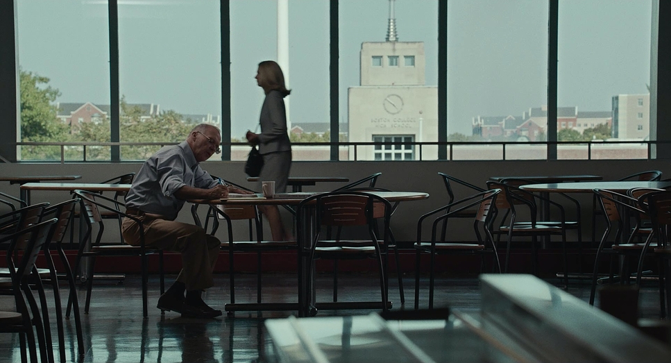
Ah, now we’re talking my language. The color grading in Spotlight is a prime example of how a muted palette can be emotionally resonant. The metadata explicitly notes a Blue color profile, and you can feel it everywhere. This isn’t a film designed for vibrant, saturated hues. Instead, the grade leans into a desaturated, slightly cool, and often greenish-blue aesthetic, particularly in the interiors and urban exteriors of Boston.
The contrast shaping is subtle but powerful. It’s not about crushing blacks for dramatic depth. The film maintains a healthy, mid-range contrast that preserves detail in the shadows. This decision is crucial for a film about uncovering truth; you need to see all the information, even in the darkest corners of the frame. The highlight roll-off is gentle, avoiding any harsh clipping that might make a scene feel artificial.
Hue separation is also meticulously handled. While the overall palette is muted dominated by the grays, beiges, and blues of office wear and newsprint skin tones are kept natural but not overly “pretty.” It creates a look that feels almost journalistic in its objectivity. It doesn’t attempt to manipulate your emotions through aggressive color choices but rather supports the film’s grounded reality.
Technical Aspects & Tools
Spotlight – Technical Specs
| Genre | Drama, History, Thriller |
|---|---|
| Director | Tom McCarthy |
| Cinematographer | Masanobu Takayanagi |
| Production Designer | Stephen H. Carter |
| Costume Designer | Wendy Chuck |
| Editor | Tom McArdle |
| Colorist | Tom Poole |
| Time Period | 2000s |
| Color | Blue |
| Aspect Ratio | 1.85 – Spherical |
| Format | Digital |
| Lighting | Soft light, Top light |
| Lighting Type | Artificial light, Tungsten |
| Story Location | Massachusetts > Boston |
| Camera | ARRI ALEXA XT / XTplus |
| Lens | Zeiss Ultra Prime |
From a technical standpoint, the team made choices that prioritized reliability and dynamic range over “vibe.” They shot on the ARRI ALEXA XT (and XT Plus). The Alexa sensor is famous for its natural color rendition and highlight handling, which was essential for capturing the mix of bright windows and interior office lighting without the image falling apart.
Pairing the Alexa XT with Zeiss Ultra Primes was a deliberate move away from the “textured” look that is so popular right now. They didn’t want the subconscious emotional baggage of vintage glass. They wanted the optical equivalent of a fact-check.
Stabilization was paramount for those functional moves, likely utilizing dollies and stable tripods to keep the frame rock-steady. The lighting approach, relying on Soft Top Light and Tungsten sources, created that consistent, believable office illumination. The entire technical approach supports the film’s unglamorous depiction of journalism. It’s about precision, control, and delivering a clean, truthful image that doesn’t overshadow the narrative with technical flair.
- Also read: RUSH (2013) – CINEMATOGRAPHY ANALYSIS
- Also read: FORD V FERRARI (2019) – CINEMATOGRAPHY ANALYSIS
Browse Our Cinematography Analysis Glossary
Explore directors, cinematographers, cameras, lenses, lighting styles, genres, and the visual techniques that shape iconic films.
Explore Glossary →