Let’s talk about Spider-Man: No Way Home. Looking past the deafening hype and the meme culture surrounding it, this film is actually a fascinating case study for those of us in post-production. The challenge here wasn’t just the script; it was the visual continuity. You have Mauro Fiore (the DP) attempting to blend the warm, analog nostalgia of the Raimi era, the sharp digital grit of the Webb films, and the clean, high-gloss look of the MCU. It’s a logistical nightmare on paper—trying to make three distinct cinematic universes coexist without it looking like a jarring mash-up. But somehow, they mostly stuck the landing.
About the Cinematographer

The man entrusted with this visual juggling act was Mauro Fiore, ASC. When you look at his resume, the choice makes perfect sense. He won an Oscar for Avatar, meaning he knows how to handle a production that is 90% blue screen and heavy VFX. But he also shot The Equalizer and Training Day, which proves he has an eye for gritty, grounded texture.
This duality is exactly what No Way Home needed. You have sequences that are pure digital fabrication, like the Mirror Dimension, which require a technical, clinical approach to lighting. But then you have the emotional beats—Peter’s grief, the rooftop conversations—which need to feel tactile and human. Fiore’s background allowed him to pivot between these modes without the film feeling disjointed. He brought a sense of weight to the CGI heavy-lifting that lesser DPs might have glossed over.
Inspiration Behind the Cinematography
The core inspiration clearly stems from the concept of “visual dialects.” We aren’t just seeing characters return; we are seeing their lighting logic return. The Raimi films were characterized by a certain golden-hour warmth and heavy contrast. The Amazing Spider-Man films were cooler, sharper, and more “digital” in their texture.
The challenge was to acknowledge that visual lore without letting it break the film’s unity. You can see it in how the villains are treated. When Doc Ock arrives, the camera feels heavier, the framing more classical. When Electro shows up, the lighting becomes more erratic and source-heavy. It’s a subtle nod to where they came from. It isn’t a direct copy-paste of the old looks—that would be a grading disaster—but rather a harmonization. They leaned into specific visual tones for character beats while keeping the overall “container” of the image consistent with the modern MCU aesthetic.
Camera Movements
Where the MCU often defaults to a standard “coverage” style, Fiore pushed the camera movement to match Peter’s internal state.
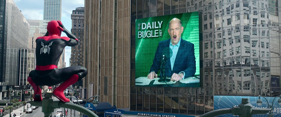
When Peter’s identity is first revealed, the camera work is frantic and voyeuristic. It mimics the chaos of a paparazzi lens, with longer focal lengths and shaky handheld moves. It doesn’t feel like a movie camera; it feels like an intrusion. It effectively sells Peter’s disorientation better than the dialogue does.
Contrast that with the bridge fight or the statue battle. The camera adopts a much smoother, almost hydraulic fluidity. It tracks the acrobatics with precision. This isn’t just “shaky cam” to hide bad fight choreography; there is a clear geography to the action. However, the best choices were often the simplest. In the third act, during the emotional climax, the camera settles down. Gentle dolly moves, solid lock-offs. They stopped trying to wow us with movement and just let Tom Holland act.
Compositional Choices
Compositionally, No Way Home had to solve a math problem: How do you frame three superheroes and five villains without the shot looking like a messy group selfie?
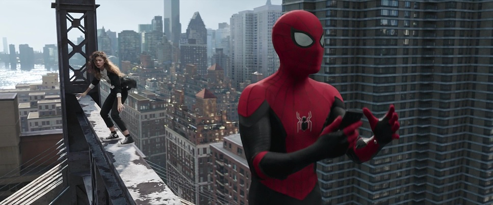
For the grander moments, Fiore utilized the large format sensor to hold wideness without distortion. This allowed them to establish scale showing the smallness of the heroes against the backdrop of a breaking multiverse. But the film really shines in the two-shots and three-shots.
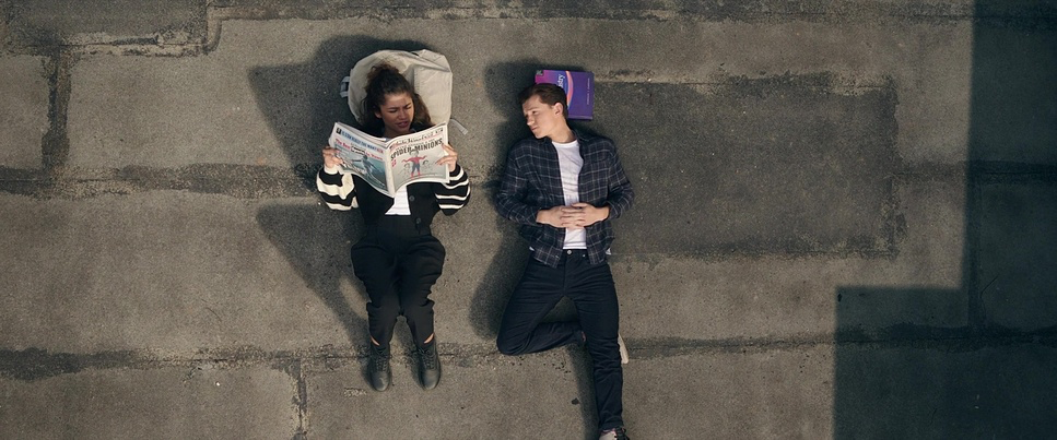
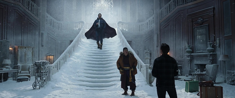
There is a discipline to the framing in the dialogue scenes between the three Peters. They are often framed in medium shots with plenty of negative space, allowing the actors to breathe. They avoided the “overstuffed” feeling by giving each character their own plane of focus. Depth cues were also used cleverly, especially in the Sanctum Sanctorum, using foreground elements to create layers. It makes the world feel lived-in rather than just a digital set extension.
Lighting Style
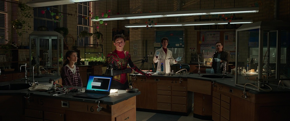
Fiore’s lighting here balances the “comic book” requirement with grounded realism. In the apartment scenes or the school, the lighting relies heavily on practicals—lamps, windows, ambient bounce. It feels mundane, which grounds the story before the magic kicks in.
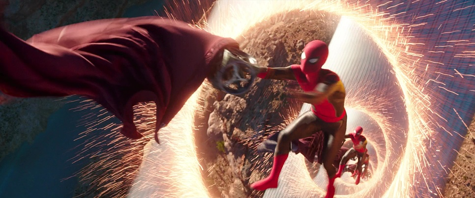
Once the villains enter, the lighting becomes motivated by their powers. Electro is essentially a giant, walking lighting fixture. As a colorist, I appreciate how they handled this. Often, blue and yellow electricity will clip the digital sensor instantly, turning to pure white. Here, the lighting on the actors’ faces retains color information even in the highlights.
Green Goblin, largely due to the mask being destroyed early on, is lit with much harder contrast. They let Willem Dafoe’s face fall into deep shadow, sculpting the menace. It’s a “Rembrandt” style approach that separates him from the softer, flatter lighting used on the younger characters.
Lensing and Blocking
There was some speculation early on about anamorphic lenses, but looking at the bokeh and the field of view, Fiore shot this on the Panavision Panaspeed series. These are spherical lenses, not anamorphic.
This was a smart technical choice. Anamorphic lenses (like those used in Eternals) have distinct flares and distortion that might have distracted from the heavy VFX work. The Panaspeeds are high-speed (T1.4) and cover the large format sensor of the Alexa LF. This gave Fiore that shallow depth of field and “creamy” falloff even on wider shots. It helps isolate Peter from the background chaos without the image getting muddy.
Blocking-wise, the team deserves credit for spatial management. In the final battle on the Statue of Liberty, it is very easy to lose track of who is where. The blocking groups the characters logically—separating the fights into distinct zones so the audience never feels lost. It’s efficient, functional filmmaking.
Color Grading Approach
From a grading perspective, the film is cleaner than I usually prefer, but technically immaculate. The goal was clearly “unifying wash.” They had to make the vibrant red and blue of the suits pop without clashing with the often monochromatic background of the night scenes.
The hue separation is excellent. In the forest chase sequence with Strange, you have orange portals, blue skies, and skin tones all occupying the same frame. A lesser grade would have let these bleed into each other, but here the separation is distinct.
The highlight roll-off is where the high-budget finish really shows. Digital cameras can be harsh on bright sources (explosions, magic spells). In No Way Home, the transition from color to peak white is smooth and organic. It avoids that “video” look where highlights just chop off.
If I have one critique, the black levels in the darker scenes—specifically the Sanctum basement—felt a little lifted for my taste. It looked like they were protecting shadow detail for lower-contrast theater projection, but on a high-end OLED display, it can look slightly milky rather than rich, deep black. But overall, the contrast shaping guided the eye exactly where it needed to go.
Technical Aspects & Tools
Spider-Man: No Way Home – Technical Specifications
| Genre | Action, Adventure, Science Fiction, Superhero, Coming-of-Age |
| Director | Jon Watts |
| Cinematographer | Mauro Fiore |
| Production Designer | Darren Gilford |
| Costume Designer | Sanja Milkovic Hays |
| Editor | Jeffrey Ford, Leigh Folsom Boyd |
| Colorist | Jill Bogdanowicz |
| Time Period | 2020s |
| Color Palette | Cool, Blue, Magenta |
| Aspect Ratio | 2.39 – Spherical |
| Format | Digital |
| Lighting | Hard light, High contrast, Side light |
| Lighting Type | Daylight |
| VFX | CGI |
| Story Location | New York City, Ed Koch Queensboro Bridge |
| Filming Location | United States, New York |
| Camera | ARRI ALEXA LF, ARRI ALEXA Mini LF |
| Lens | Panavision Panaspeed |
| Resolution | ARRIRAW (4.5K) |
The film was shot on the ARRI Alexa LF and Mini LF. Shooting Large Format (LF) was crucial for this story. The larger sensor size means you can shoot with wider lenses to capture the massive scope of the action, but still get a shallow depth of field to separate the actors from the background.
At 4.5K resolution in ARRIRAW, the VFX team had massive amounts of data to work with. This matters for things like green screen extraction. When you have Spider-Man flipping through a complex environment, the resolution helps get clean edges on the motion blur.
The pipeline from set to post had to be rigorous. Fiore’s experience on Avatar likely informed how they captured the plates. The integration of the live-action lighting with the CGI environments is seamless. You rarely see that “sticker effect” where the actor looks like they were pasted on top of a background. The light wraps around them correctly, which is a testament to both the on-set lighting team and the compositors.
- Also read: DIE HARD (1988) – CINEMATOGRAPHY ANALYSIS
- Also read: A BEAUTIFUL MIND (2001) – CINEMATOGRAPHY ANALYSIS
Browse Our Cinematography Analysis Glossary
Explore directors, cinematographers, cameras, lenses, lighting styles, genres, and the visual techniques that shape iconic films.
Explore Glossary →