Spartacus (1960) isn’t one of them. This thing is a beast a monumental battle of egos, craft, and raw ambition. Even though Stanley Kubrick famously tried to disown it later in his career, you can’t look at this film and not see a masterclass in massive-scale, practical filmmaking. For anyone working in the industry today, it’s a sobering reminder of what was possible before we started fixing everything in post.
About the Cinematographer

We have to talk about Russell Metty. Most people focus on Kubrick, but Spartacus is as much Metty’s victory as anyone’s and he has the Oscar to prove it. He wasn’t some wide-eyed assistant; he was a seasoned pro who’d already shot Orson Welles’ Touch of Evil.
The shoot was legendary for the friction on set. You have a young, perfectionist Kubrick clashing with a veteran DP who had zero interest in being a “yes man.” They spent nearly two years fighting over crane moves and lighting setups. It’s a miracle the film looks this cohesive given the behind-the-scenes vitriol. It’s a perfect example of how creative tension while exhausting can actually force a level of excellence that “safe” sets never reach. Metty stood his ground on his vision, and frankly, the film is better for it.
Inspiration Behind the Cinematography
This was the era of the “Mega-Epic.” Kirk Douglas basically willed this movie into existence because he was pissed about being passed over for Ben-Hur. He wanted to out-scope everyone. The mandate was simple: make it huge, make it tactile, and make it real.
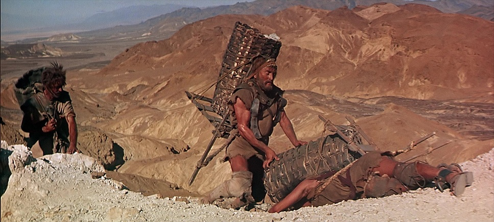
They weren’t interested in the tiny, “faked” feel of miniatures or early optical composites. They wanted 8,000 real extras and a sea of horses moving across the frame. The visual goal was to overwhelm. They were building a “must-see” spectacle to pull people away from their brand-new television sets and back into theaters with giant, curved screens. It wasn’t just about the story of a slave revolt; it was a flex of cinematic power.
Lighting Style
As a colorist, this is where the film gets really interesting for me. If you look at Ben-Hur, everything is blasted with high-key front light to keep the focus sharp and deep. Metty went the opposite direction. He treated an ancient epic like a noir.
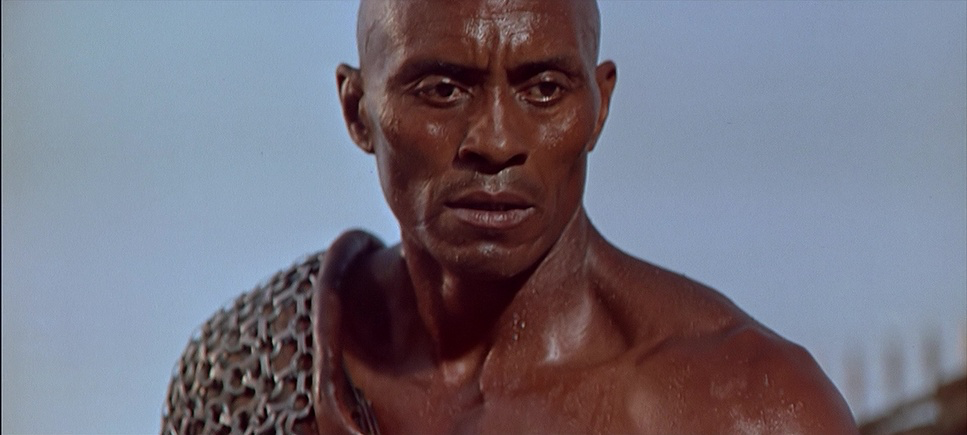
He leaned into a soft key and let the shadows fall to true black. This was a ballsy move at the time. Because they were shooting on Eastman 50T and 25T with a massive negative size, he had the dynamic range to play with. The highlight roll-off on the actors’ faces especially the close-ups of Jean Simmons and Kirk Douglas is just stunning. It doesn’t feel like a “movie set”; it feels like a real place with real atmosphere. He wasn’t afraid to let the “shadow floor” drop, which gives the film a weight and grit that most epics of that era lacked.
Lensing and Blocking
This is where Metty and Kubrick’s styles did a weird, fascinating dance. We usually associate Kubrick with those clinical, ultra-wide-angle shots. But Spartacus uses Super Telephoto lenses (Cooke Telepancros up to 406mm) in a way that’s totally different.
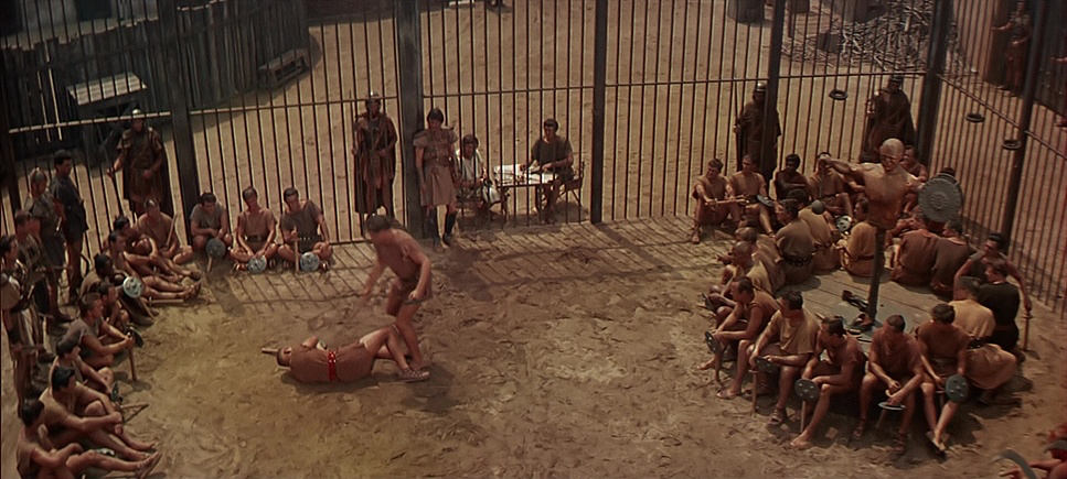
Telephoto lenses flatten space. When you’re filming 6,000 extras, a long lens compresses them into a “wall of humanity.” It makes the Roman legions look like an impenetrable, terrifying machine rather than just a group of guys in costumes. The blocking is insane choreographing that many bodies without the help of a “crowd sim” button in Houdini is mind-boggling. Every movement had to be timed to the second to work with the lens compression. It’s controlled chaos on a scale we just don’t see anymore.
Camera Movements
The camera work here is all about power. They used a Chapman crane with a custom 35-foot arm to follow the slave army, but when that wasn’t enough, they literally built 100-foot towers just to get the right perspective.
These movements aren’t just “flashy”; they’re authoritative. The camera sweeps through the Roman formations with a sense of inevitability. It gives the viewer the feeling of being an observer of history rather than just watching a play. It’s dynamic, purposeful, and heavy you can feel the physical weight of the gear in the way the shots move.
Compositional Choices
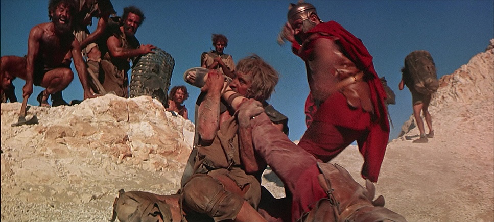
Even in the most crowded frames, the “readability” is incredible. Metty and Kubrick sculpted these masses of people into geometric shapes. There’s a shot of the Roman legions forming a red crescent on the horizon that is arguably one of the best-composed frames in cinema history.
They used the massive Super Technirama 70 frame to create layers of depth. Even in the intimate scenes, the blocking is deliberate. They use the width of the frame to keep you aware of the world outside the immediate conversation. It’s about visual weight; every character, whether a senator or a slave, is placed with mathematical precision to tell you exactly who holds the power in that moment.
Technical Aspects & Tools
Spartacus (1960) — Technical Specifications
| Genre | Action, Adventure, Drama, Epic, History, Ancient Wars, Military, Pre-Industrial Wars, War |
| Director | Stanley Kubrick |
| Cinematographer | Russell Metty |
| Production Designer | Alexander Golitzen, Roger K. Furse |
| Costume Designer | Bill Thomas, Valles |
| Editor | Robert Lawrence, Irving Lerner |
| Time Period | Ancient: 2000BC-500AD |
| Color | Cool, Desaturated, Blue |
| Aspect Ratio | 2.20 – Anamorphic |
| Format | Film – 35mm |
| Lighting | Soft light, Top light, Side light |
| Story Location | Europe > Italy |
| Lens | Panavision Lenses |
The foundation of the look is Super Technirama 70. This wasn’t just a format; it was a massive logistical headache that paid off. They ran 35mm film horizontally (VistaVision style), squeezed it 1.5x, and then blew it up to 70mm for the theaters. The result? A negative with twice the detail of standard CinemaScope.
Then you have the matte paintings by Russell Lawson. In an era before green screens, these guys were masters of “invisible” trickery. Metty would use smoke, haze, and very specific exposures to hide the seams between the real California landscapes and the painted Roman skylines. Most of the audience never knew they were looking at a painting, which is the highest compliment you can pay a VFX artist.
Color Grading Approach
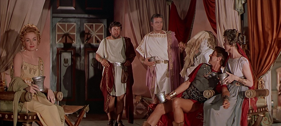
Looking at this through the lens of a modern colorist, the “photochemical timing” is a dream. They used hue separation to make the storytelling clearer: Romans get the “expensive” colors crimson, bronze, and polished silver. The slaves are stuck in earth tones, mud, and faded blues.
If I were grading a restoration of this today, the goal would be to preserve that 70mm “pop.” You don’t want to “modernize” this by adding a teal-and-orange LUT. You want to honor the way those Eastman stocks handled skin tones and the way the shadows retained that inky, rich texture without looking “crushed.” The clarity is still astonishing 60+ years later, and a good grade should just get out of the way and let that 70mm glass do the talking.
- Also read: THIS IS SPINAL TAP (1984) – CINEMATOGRAPHY ANALYSIS
- Also read: ROPE (1948) – CINEMATOGRAPHY ANALYSIS
Browse Our Cinematography Analysis Glossary
Explore directors, cinematographers, cameras, lenses, lighting styles, genres, and the visual techniques that shape iconic films.
Explore Glossary →