Soul isn’t just another entry in the Pixar canon; it is a piece of visual art that challenges the very notion of what animation can do. Usually, I’m analyzing live-action footage, but watching Soul felt like a reset button. It grapples with purpose and passion themes we all struggle with but it supports them with a visual language so sophisticated it rivals the best live-action dramas.
It’s one of those films that resonated with me instantly, not just for the narrative, but for the sheer audacity of its craft. There’s a visual elegance here that supports the film’s weighty themes. It doesn’t rely on the usual animated tropes; instead, it uses light, shadow, and color density to ask the audience to stop looking and start seeing.
About the Cinematographer

In animation, the role of “Cinematographer” is often split between layout (camera) and lighting. For Soul, Ian Megibben handled the camera layout, but the real curveball was Pixar bringing in Bradford Young as a lighting consultant.
If you know Young’s work on Arrival or Selma, you know he doesn’t do “perfect” lighting. He loves underexposure, available light, and deep, murky shadows. He brings a raw, naturalistic nuance that is incredibly difficult to replicate in a sterile CG environment. seeing that “dirty,” soulful lighting style translated into Pixar’s clean render pipeline is what gives this film its texture. It’s a fascinating collaboration: Megibben’s camera provides the structure, while Young’s lighting sculpts the emotional landscape.
Inspiration Behind the Cinematography
The visual backbone of Soul is the clash between two worlds: the tangible, gritty reality of New York City versus the ethereal abstraction of the “Great Before.” This dichotomy isn’t just a setting change; it’s the film’s visual heartbeat.
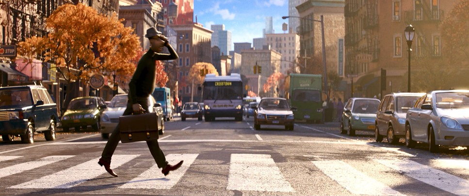
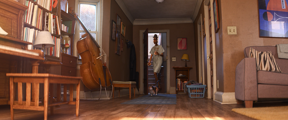
For the Earth sequences, the team didn’t want a cartoon city; they wanted the real thing. The inspiration was clearly rooted in 1970s jazz photography and urban street portraits. We see the dust motes in the air, the scratched surfaces of the barber shop, and the chaotic clutter of Joe’s apartment. The goal was to make Joe’s world feel lived-in and textured to make him an “ordinary average Joe” in a world that feels physically heavy.
Conversely, the Great Before necessitated a complete departure from physics. The design here leans into minimalism and architectural modernism. The filmmakers essentially had to invent a new visual logic for the afterlife something abstract yet readable. The “blue blob stuff” (as the team jokingly called the soul matter) required a language that felt ancient and non-physical. This duality allowed the cinematographers to play with two distinct palettes: the gritty realism of life and the clean surrealism of the afterlife.
Camera Movements
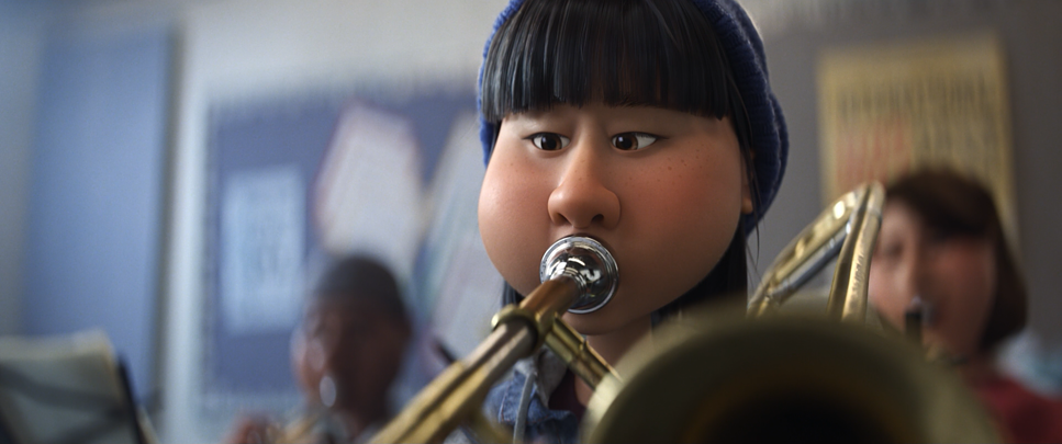
The camera work in Soul is incredibly deliberate. In the NYC sequences, the camera feels heavy. It breathes. You see handheld jitter, imperfect tracking shots, and rack focuses that miss the mark slightly before finding sharpness. When Joe is rushing through the streets, the camera tracks him with a tactile energy, echoing the chaotic rhythm of the city. In the school band scenes, the camera feels constrained and static, mirroring Joe’s professional stagnation.
However, once we transition to the Great Before, that weight vanishes. The virtual camera becomes a steady, omniscient observer. It glides. Crane shots and drone-like movements emphasize the scale of this spiritual training ground. The contrast creates a subconscious shift in how we process the scene one is frantic and mortal, the other is eternal and calm. Even when Joe becomes a cat, the camera adopts a lower, wider, and more frenetic perspective, effectively forcing us to feel his disorientation.
Compositional Choices
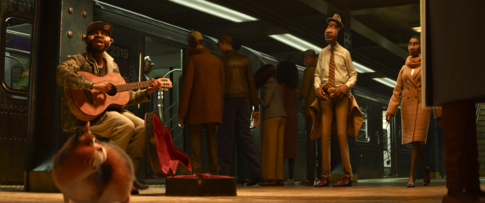
The framing tells the story before the characters even speak. In the Earth sequences, especially early on, the compositions often feel restrictive. Joe is frequently framed with oppressive headspace or pushed into the corner of the frame visually trapping him in his unfulfilling routine. The depth cues are crucial here; the barbershop and jazz club are packed with foreground elements, creating a sense of a vibrant, crowded community that Joe often takes for granted.
In contrast, the Great Before employs massive negative space. Souls are rendered as tiny elements within vast, soft-lit landscapes, underscoring their insignificance against the scale of eternity. The framing of the “Jerrys” (the counselors) emphasizes their abstract nature through symmetrical, flat compositions that command respect.
This is where I find myself thinking about the psychology of the frame. It’s not just about aesthetics; it’s about control. When Joe finally sits down to play the piano and enters “the zone,” the composition changes. It becomes intimate, isolating him in a focused tableau. The background falls away, and the frame allows for a visual silence space for reflection.
Lighting Style
This is where Bradford Young’s influence screams at you. The lighting acts as the primary separator between the realms.
On Earth, the lighting is grounded and motivated. The school scenes have a stark, cool fluorescent wash that sucks the vibrancy out of the room it feels clinical. Contrast that with the Half Note jazz club. Here, the lighting is rich with texture. We see warm, tungsten practicals blowing out slightly (a lovely touch of realism), creating deep shadows and luminous highlights. It evokes the improvisational nature of jazz. The rim lighting used to separate characters from the dark backgrounds gives them a three-dimensional, tangible presence.
Moving to the Great Before, the lighting shifts to an ethereal, unmotivated style. There is no “sun” or “lamp”; the light seems to emanate from the geometry itself. It’s a soft, global illumination that minimizes shadows and wraps around everything. The volumetric lighting is heavy here, creating atmospheric hazes that soften edges. It creates a dreamlike state where nothing feels solid, effectively communicating the tension between the messy beauty of life and the sterile perfection of the afterlife.
Lensing and Blocking

Pixar didn’t just stick to a generic virtual lens for this film. The NYC scenes often feel like they were shot on vintage anamorphic glass you can catch subtle barrel distortion and chromatic aberration in the corners of the frame. They tend to use wider focal lengths to show the context of the city, but punch in with what looks like a virtual 85mm or 100mm for the emotional beats, compressing the background and isolating the character.
Blocking where the characters are placed is equally crucial. The body-swap sequence is a masterclass in this. When 22 is in Joe’s body, the blocking changes to reflect her unfamiliarity with his limbs. She is fidgety and awkward, while the cat (Joe) is desperate and focused. The scene in Des’s barbershop relies heavily on this physical comedy, but it also uses blocking to show 22’s integration into the community. She is placed in the center of the conversation, visually reinforcing her discovery of the “spark” of human connection.
Color Grading Approach

As a colorist, this is where I really start to geek out. The grade in Soul is fundamental to its storytelling, operating on two completely different wavebands.
For the Earth sequences, the grade is rich, contrasty, and leans into an earthy palette browns, terracottas, and deep urban greys. If I were grading a scene like the jazz club, I’d be looking at the waveform and seeing a thick, dense low-mid range. They aren’t afraid of crushing the blacks to get that moody atmosphere. The highlights streetlights, reflections have a soft roll-off, avoiding digital clipping to mimic the response of film stock, likely creating a look similar to Kodak Vision3 500T.
The Great Before is the polar opposite: high-key, pastel, and mathematically clean. It’s dominated by cooler cyans, soft purples, and pure whites. In Resolve, this looks like a softer contrast curve no harsh toe or shoulder, just a smooth, linear roll-off that makes everything feel weightless. Hue separation is paramount here to keep the “blue souls” from blending into the “blue background.” The way these two palettes eventually bleed into each other during the epiphany montage is where the grading shines, subtly linking the emotional arcs across disparate worlds.
Technical Aspects & Tools
Soul – Technical Specifications
| Genre | Animation, Comedy, Family, Fantasy, Music, CGI Animation, Musical, Drama, Magical Realism |
|---|---|
| Director | Pete Docter |
| Cinematographer | Ian Megibben, Matt Aspbury |
| Production Designer | Steve Pilcher |
| Editor | Kevin Nolting |
| Colorist | Mark Dinicola |
| Time Period | 2020s |
| Color | Warm |
| Aspect Ratio | 2.39 |
| Format | Animation |
| Lighting Type | Daylight, Sunny |
| Story Location | … New York > New York City |
| Film Stock / Resolution | 4K |
While Soul doesn’t use physical cameras, the technical ambition is staggering. Pixar’s RenderMan software was pushed to its limits here.
Achieving the live-action realism in NYC required sophisticated global illumination techniques, mimicking how light bounces and bleeds in the real world. This isn’t just simple ray-tracing; it’s complex texture mapping and subsurface scattering to make skin look fleshy and real.
For the Great Before, the challenge was “volumetrics.” The team had to simulate light passing through dense, atmospheric media to create those soft, glowing edges around the souls. They developed custom shaders to give the characters a distinct material quality making them look like 3D fog that is soft but still defines a silhouette. That is a nightmare to render without noise, but the result is seamless.
- Also read: MONTY PYTHON’S LIFE OF BRIAN (1979) – CINEMATOGRAPHY ANALYSIS
- Also read: THE PRINCESS BRIDE (1987) – CINEMATOGRAPHY ANALYSIS
Browse Our Cinematography Analysis Glossary
Explore directors, cinematographers, cameras, lenses, lighting styles, genres, and the visual techniques that shape iconic films.
Explore Glossary →