There are films that look beautiful, and then there are films that feel like they were pulled directly from a dream you forgot you had. Song of the Sea is the latter. It’s more than just an animated feature; it’s a masterstroke in visual storytelling. It was nominated for an Academy Award, sure, but it still feels criminally overlooked in the mainstream. It has a quiet, haunting magic that deserves to be studied, not just watched.
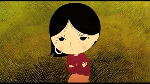
At its heart, this is a Celtic myth used as a scalpel to explore grief. We follow Ben, a young boy drowning in resentment toward his sister, Sersha, blaming her for their mother’s disappearance. It’s a hero’s journey, but it’s dressed in the textures of Irish folklore selkies, owl witches, and fairies. But these aren’t just “fantasy elements.” They are manifestations of human coping mechanisms. When I look at a frame, I’m looking for the emotional logic. In this film, you don’t have to look hard; the visual language is as deep and cold as the North Atlantic.
About the Visionary Behind the Cinematography
In 2D animation, the “cinematographer” is a bit of a phantom role. You don’t have a DP standing behind a physical lens; instead, the director in this case, Tom Moore acts as the primary architect. Moore, along with co-writer Will Collins and the crew at Cartoon Saloon, didn’t just “draw” a movie. They built a universe that feels ancient yet intimately personal.
Moore’s real strength is his restraint. He takes these massive, heavy Celtic myths and adapts them without stripping away their soul for the sake of “accessibility.” He’s a storyteller in the most traditional sense like a bard traveling from village to village, tweaking the narrative to hit the heart of the audience. This allows the visual style to be incredibly fluid. It draws from a massive well of cultural history but never loses sight of the emotional beat of the scene. It’s a delicate balance to strike, and Moore does it with more grace than almost anyone in animation today.
Inspiration Behind the Cinematography
If you look at the DNA of Song of the Sea, it’s a gorgeous middle ground between traditional fine art and a very conscious, stylized graphic language. People call it a “storybook look,” but that feels like a bit of a simplification. You can see the ghost of mid-century studios like UPA (United Productions of America) in the line work that graphic, economical, yet wildly expressive style.
This isn’t the photorealistic, detail-heavy CG that Disney or Pixar have perfected. This is a moving painting. Everything every ripple in the water, every moss-covered stone feels intentional. I’ve seen reviews compare it to the “cheaper” look of old Hanna-Barbera, but that’s missing the point. Song of the Sea proves that “economical” doesn’t mean “simple.” It means precision. The ocean, specifically, is a triumph of design; it’s terrifying and beautiful all at once, perfectly mirroring the sorrow at the film’s core. It’s a reminder that creative constraints usually lead to the most unique visual identities.
Compositional Choices
The compositions in this film are breathtaking period. Every frame is worth a high-res print on your wall. This isn’t accidental; it’s a result of incredibly deliberate spatial choices. Moore often places characters within these massive, sweeping landscapes, making them look tiny against the weight of nature and myth.
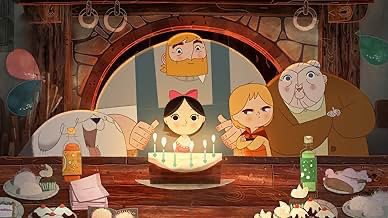
One of the most brilliant visual parallels is the comparison between the Krenog (Maka’s dwelling) and Granny’s house. The layouts are nearly identical. It’s a genius move establishing a visual link between a mythic owl witch and a mundane grandmother. It tells you, without a single line of dialogue, that grief and the “need to protect” are universal, whether you’re a human or a spirit. Then you have the island of Mac Lear, shaped like a slumped giant next to Conor’s lighthouse. It’s a literal manifestation of Conor’s petrified grief. This isn’t just “good layout”; it’s narrative architecture.
Lensing and Blocking
When we talk about “lensing” in a 2D space, we’re really talking about the implied focal length. Moore uses wide “lenses” to establish the scale of the Irish coast, using layered parallax animation to give a 2D world a sense of 3D volume. It feels vast. But when things get heavy, the “lens” gets tighter. We’re pushed into Ben’s face as he struggles with his anger, or Sersha’s as she discovers her true nature.
The blocking is just as sophisticated. Characters aren’t just moving from point A to point B; their movement is the exposition. Ben’s rigid, defensive posture speaks volumes about his trauma before he even opens his mouth. Sersha has this ethereal, almost weightless way of moving that makes her connection to the sea feel inevitable. Even the way Ben withholds their mother’s conch shell the blocking of that interaction perfectly captures their fractured relationship.
Camera Movements
In this film, the “camera” doesn’t just capture action; it punctuates emotion. The movements are subtle, almost reverent. We get these fluid, horizontal pans that mimic the tide, or slow, deliberate pushes that draw us into a character’s internal world.
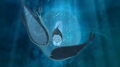
When Sersha is underwater, the camera glides. It’s effortless, making the mystical feel natural. Compare that to the scenes where Ben feels trapped the camera becomes static, the frames feel tighter, and the world stops moving. Even a simple slow zoom becomes a powerful tool here, drawing the viewer into the character’s burgeoning realization. It’s a masterclass in using movement as punctuation rather than just a way to follow the plot.
Lighting Style
The lighting here isn’t trying to be photorealistic; it’s trying to be atmospheric. It’s soft, diffused, and always motivated by the story. You see that classic “storm outside, calm inside” contrast that creates a sense of refuge or a false sense of security.
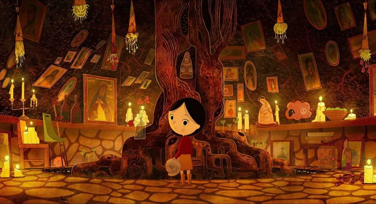
The contrast between Sersha’s world and Conor’s world is where the lighting really shines. Sersha’s underwater world has this ethereal, bioluminescent glow, while the lighthouse is bathed in muted, melancholic tones that feel like they’re being choked by Conor’s sorrow. When Ben enters Maka’s house, the light is initially warm and welcoming a “deceptive warm” before the chilling reality of her jars is revealed. The dynamic range here, shifting from soft glows to sharp, unsettling shadows, is what sets the stakes for the characters.
Color Grading Approach
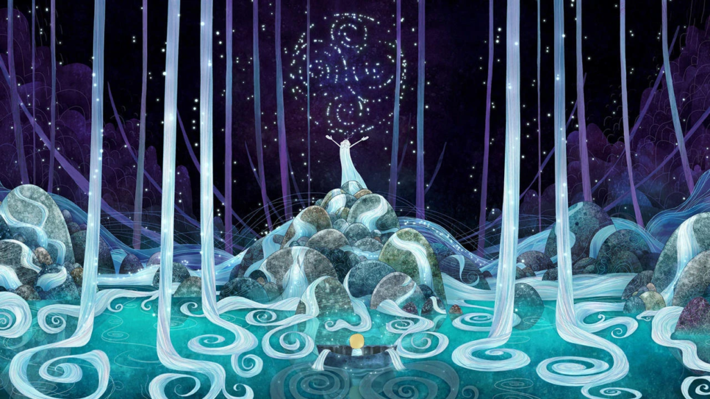
This is the part that gets me excited. The color grading in Song of the Sea is exceptional. The mundane world is built on a palette of earthy, desaturated tones moss greens, steely grays, and muddy browns. It grounds the film in the Irish soil. But that “dullness” is a deliberate choice; it makes the magical elements hit so much harder.
When Sersha’s powers activate, the film explodes with jewel-toned blues and purples. The hue separation is perfect. It’s a clean, decisive split between the ordinary and the fey. As a colorist, I especially love the “print-film” sensibilities. The highlight roll-off is beautiful. When you see the lighthouse lamp or a magical glow, the highlights don’t just clip; they bloom softly, like they would on an old film stock. The blues of the ocean aren’t just one color; they’re a spectrum of tranquility and terror, articulated through tiny shifts in saturation and luminance. The grade isn’t just decorative it’s the emotional current that pulls you through the story.
Technical Aspects & Tools
We have to remember this is a Cartoon Saloon project. The “tech” here isn’t about the latest sensor or a fancy rig; it’s about the marriage of hand-drawn artistry and digital precision. The film relies on traditional 2D animation eschewing the motion-capture and heavy CGI that usually populates modern features.
The line work is “economical,” but the backgrounds are incredibly dense. This isn’t a “cheap” look; it’s a design philosophy. They used digital tools for the compositing and the coloring, which gave them that insane level of control over the lighting effects and the final grade. That seamless blend of the human hand and digital refinement is what gives the film its “ethereal beauty.” It’s about using technology to amplify the art, not replace it.
- Also read: LA STRADA (1954) – CINEMATOGRAPHY ANALYSIS
- Also read: G.O.R.A. (2004) – CINEMATOGRAPHY ANALYSIS
Browse Our Cinematography Analysis Glossary
Explore directors, cinematographers, cameras, lenses, lighting styles, genres, and the visual techniques that shape iconic films.
Explore Glossary →