Guy Ritchie’s Snatch (2000) is a textbook example of how to manage chaos in post-production. As a colorist and filmmaker, I don’t just watch this movie for the dialogue; I watch it to see how the team balanced a visual style that threatens to fly off the rails at any second. It’s a masterclass in “controlled chaos.” Two decades later, the film doesn’t just hold up; it still feels aggressive. While the writing gets the credit for the attitude, the enduring appeal really comes down to the bold, idiosyncratic cinematography that defines the film’s visual DNA.
From frame one, Snatch doesn’t ease you in. It throws you into rapid-fire editing and a massive ensemble cast. My job usually involves dissecting the why behind an image, and with Snatch, the visual strategy is as frenetic as the plot itself. It fuses diamond heists, underground boxing, and a dozen subplots into one package. Here is a breakdown of the visual language that makes Snatch a cult classic.
About the Cinematographer
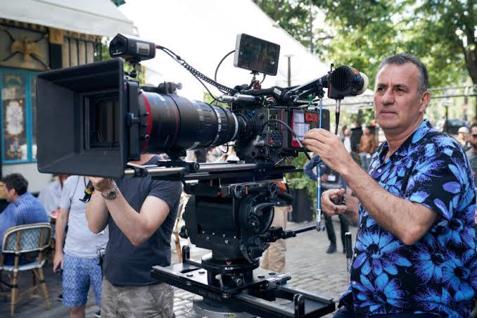
The man behind the lens was Tim Maurice-Jones. His collaboration with Ritchie created a formidable shorthand that is evident throughout the film. This wasn’t a case of a director imposing a rigid style; it was a partnership where the cinematographer was clearly given space to push boundaries. While Ritchie’s direction and uncredited editing set the pace, it was Maurice-Jones who brought the stylized filmmaking to life. He wasn’t just pointing a camera; he was employing split screens, speed ramps, and aggressive angles to create a signature rhythm. His work here is a prime example of a cinematographer operating as a co-author of the film’s narrative voice.
Inspiration Behind the Cinematography
Snatch operates as a spiritual successor to Ritchie’s debut, Lock, Stock and Two Smoking Barrels, but with a bigger budget and higher stakes. The goal was clearly to double down on the formula that worked: a fast-paced, ensemble-driven crime film set in London’s gritty underworld. The aesthetic needed to feel grounded enough to convey that grit, but simultaneously heightened to match the dark comedy.
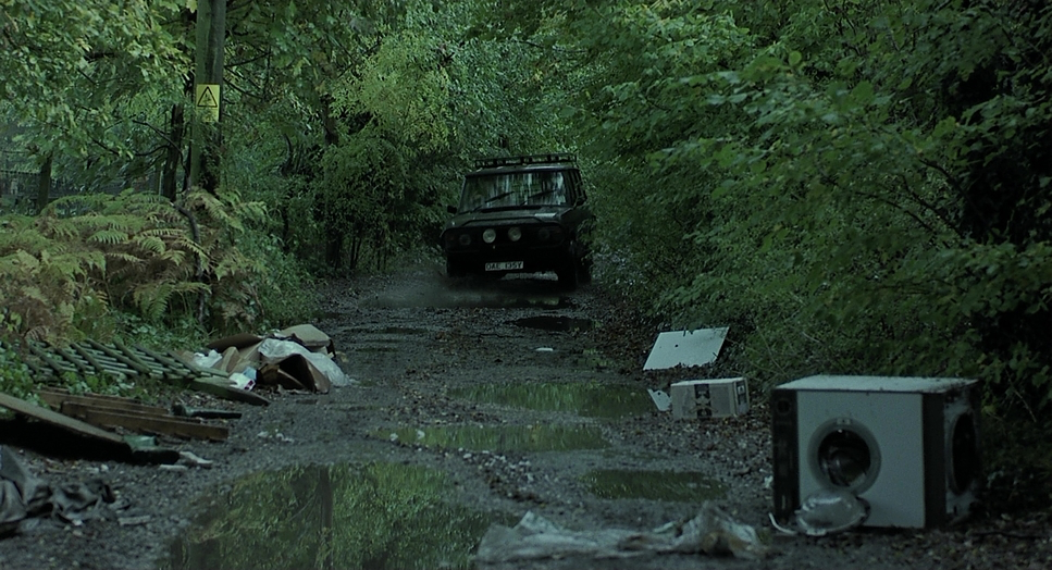
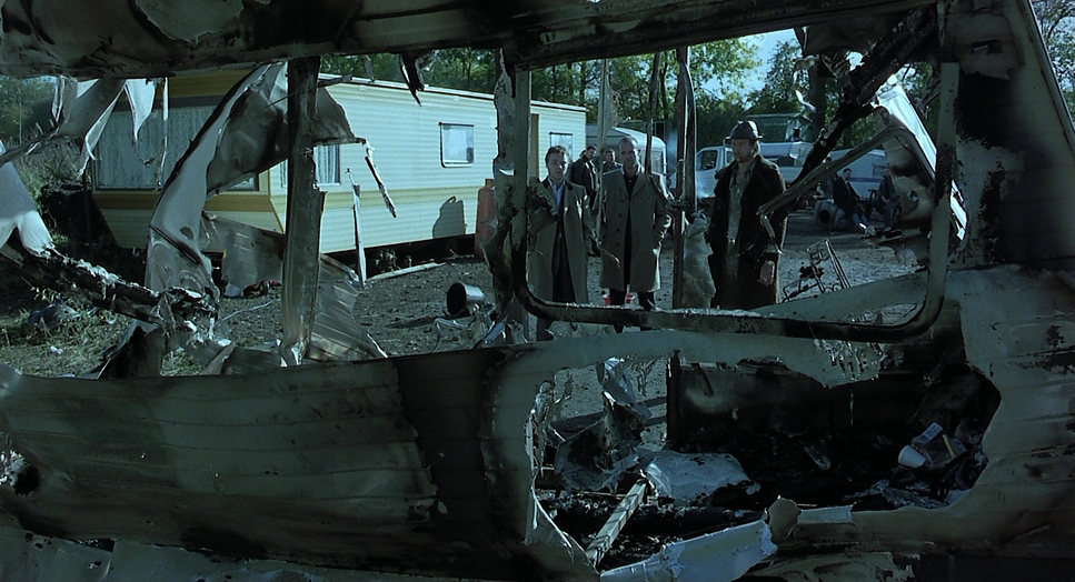
I view the look as a blend of hyper-realism and comic book dynamism. The stories were drawn from real-life London gangsters, demanding a world that felt tangible, yet the outlandish characters required something theatrical. The cinematography actively participates in creating this comically elevated universe. It takes mundane locations—rain-slicked streets, dingy betting shops—and infuses them with a palpable sense of danger. It makes London feel like a character rather than just a backdrop.
Camera Movements
If there’s one defining characteristic of this film, it’s the relentless camera movement. Maurice-Jones leans into a dynamic approach that propels the narrative forward. We see aggressive whip pans that snap between characters, mirroring the rapid-fire dialogue and shifting power dynamics. There are fast tracking shots—often Steadicam—that plunge us directly into the street brawls and chase sequences.
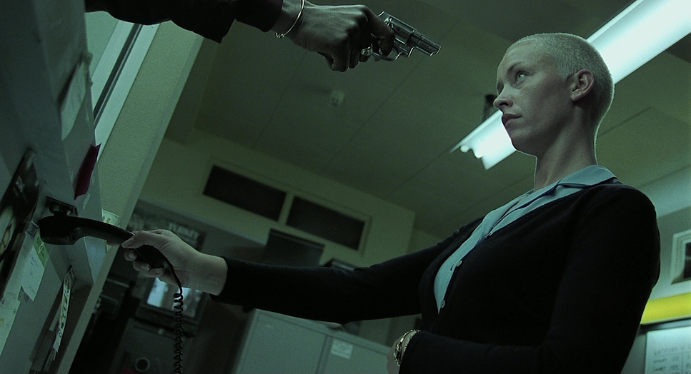
The dynamic camera angles are crucial here. It’s not just about movement, but perspective. We get low angles emphasizing dominance and high angles making characters look vulnerable. The famous slow-motion shots are used sparingly but effectively, usually to punctuate moments of extreme violence or a character’s internal realization. This manipulation of time disrupts audience expectation, creating a visual rhythm that mirrors the film’s intricate, rearranged chronology.
Compositional Choices
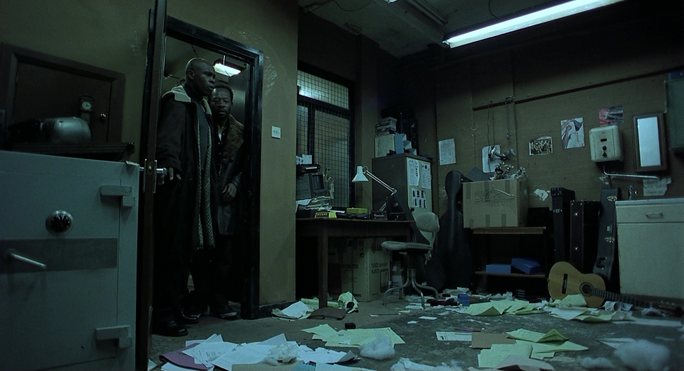
The compositions in Snatch are as busy as its plot. With an ensemble cast that feels like it has a dozen main characters, Maurice-Jones often employs wider frames to capture multiple people interacting, allowing their distinct personalities to clash within a single shot. The depth cues are interesting; close-ups are often shallow, isolating the immediate reaction, while wider group shots utilize deep focus to keep the chaotic environment in play.
There is a strong emphasis on framing within frames—using doorways, windows, or car interiors to compartmentalize characters. This creates a sense of entrapment, underscoring the constant danger of the underworld. The compositions are rarely static or symmetrical; they lean into asymmetry and visual tension, often placing characters off-center or using leading lines to draw the eye through the chaos.
Lighting Style
The lighting in Snatch is fundamental to its gritty production design. While the fact sheets might technically classify scenes like the bank interior as “soft light,” the film’s overall impression is defined by a raw, high-contrast approach. Motivated lighting is key here; practicals like bare bulbs, streetlights, and neon signs are integrated into the frame and then pushed for dramatic effect.
Think of the dingy boxing gyms or the back alleys. The lighting creates pockets of intense exposure and deep, rich shadows. While it feels naturalistic, it’s a highly controlled naturalism. The decision to embrace darkness—allowing shadows to swallow parts of the frame—lends a sense of foreboding that grounds the fantastical elements. It creates an atmosphere that is dangerous yet strangely alluring, matching the film’s blend of comedy and crime.
Lensing and Blocking
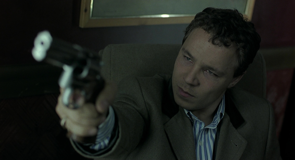
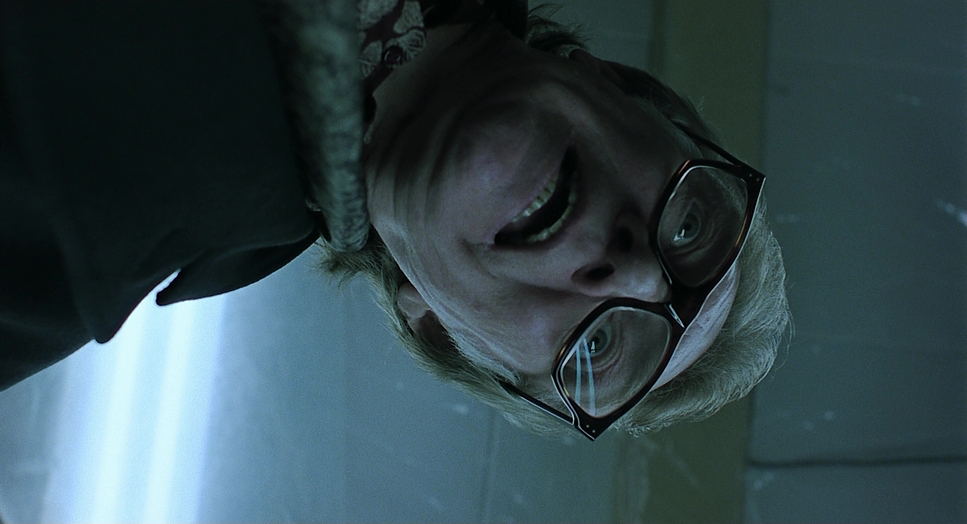
The lensing choices play a huge role in the film’s unique feel. Maurice-Jones frequently uses wider-angle lenses close to the actors’ faces. This creates a slight distortion—a deliberate choice that caricatures the subjects. For instance, Brad Pitt’s “Mickey,” with his incomprehensible accent, feels larger-than-life and intensely present because the lens is practically in his face. These wider lenses also allow more of the environment to be captured in establishing shots while maintaining intimacy.
Blocking works in tandem with these lenses. Given the rapid editing style, characters are constantly moving within the frame, entering and exiting, creating a “dance” that keeps the visual plane active. Ritchie and Maurice-Jones orchestrate complex blocking patterns, having characters move through various planes of depth. This ensures that when a cut happens, it lands with impact.
Color Grading Approach
As a colorist, the grade on Snatch is immediately recognizable as a product of the early 2000s, heavily influenced by the Bleach Bypass look. This isn’t about hyper-realism; it’s about texture. The process (or the digital emulation of it) skips the bleaching stage in development, retaining silver in the emulsion. The result is high contrast, desaturated colors, and crushed blacks that feel dense and heavy.
There is a clear emphasis on hue separation. While the overall palette leans cool and greenish to emphasize the London grit, skin tones are preserved, allowing the performances to cut through the grime. We also see selective saturation—the red of a boxing glove or a specific costume—which guides the viewer’s eye. The highlight roll-off is smooth, avoiding the harsh digital clipping we often see in modern shot-on-digital productions. It’s an aggressive, confident grade that mirrors the film’s narrative swagger.
Technical Aspects & Tools
Snatch (2000) — Technical Specifications
| Genre | Comedy, Crime, Gangster, Heist, Thriller, Gambling |
| Director | Guy Ritchie |
| Cinematographer | Tim Maurice-Jones |
| Production Designer | Hugo Luczyc-Wyhowski |
| Costume Designer | Verity Hawkes |
| Editor | Jon Harris |
| Colorist | David Rees |
| Time Period | 1980s |
| Color | Cool |
| Aspect Ratio | 1.85 – Spherical |
| Format | Film – 35mm |
| Lighting | Soft light |
| Lighting Type | Practical light |
| Story Location | United Kingdom > London |
| Filming Location | United Kingdom > London |
| Camera | Moviecam Compact, Arriflex |
Shot on 35mm film (likely using Moviecam Compacts and Arriflex bodies), Snatch benefits immensely from the organic grain structure. That grain adds a texture that digital acquisition often struggles to replicate. It provides a grit that supports the high-contrast lighting style. The film’s latitude—its ability to handle the difference between the deep shadows of the boxing ring and the bright practical lights—was crucial for this look.
The non-linear narrative posed logistical hurdles, and since Ritchie served as an uncredited editor, the shooting style was designed to facilitate the edit. The extensive use of split screens wasn’t just a stylistic flourish; it was a necessary tool to present parallel actions simultaneously, solving the problem of narrative density. These technical choices weren’t just for show; they were the engine that drove the storytelling.
- Also read: SPIDER-MAN: NO WAY HOME (2021) – CINEMATOGRAPHY ANALYSIS
- Also read: DIE HARD (1988) – CINEMATOGRAPHY ANALYSIS
Browse Our Cinematography Analysis Glossary
Explore directors, cinematographers, cameras, lenses, lighting styles, genres, and the visual techniques that shape iconic films.
Explore Glossary →