Sin City released in 2005, it wasn’t just another comic book adaptation; it was a line in the sand. It declared that cinema didn’t have to apologize for its source material it could just be the source material. From my vantage point, it stands as a pivotal moment in digital filmmaking. It proved you could abandon photorealism and still hook an audience. Watching it now, it feels less like a movie and more like a fever dream rendered in high-contrast ink.
About the Cinematographer
You can’t talk about the look of Sin City without talking about Robert Rodriguez. He credits himself as the cinematographer (and editor, and director, and composer), which tells you everything you need to know about his workflow. Rodriguez is a one-man army. He runs Troublemaker Studios in Austin, and he’s famous for shooting fast, cheap, and strictly on his own terms. Unlike the traditional Hollywood system where a DP might agonize over a lighting setup for three hours, Rodriguez shoots for the edit.
For Sin City, he did something unheard of: he brought Frank Miller on as a co-director. He didn’t just want Miller’s approval; he wanted Miller to be the quality control. This wasn’t about “interpreting” the comic; it was about transposing it. Rodriguez’s background jumping from the guerilla style of El Mariachi to tech-heavy films like Spy Kids made him the only guy crazy enough to try this. He merged artistic ambition with a “fix it in post” mentality that actually worked because the post-production was the production.
Inspiration Behind the Cinematography
The visual bible for this film was literally Frank Miller’s graphic novels. The mandate was simple: if it’s not in the panel, it’s not in the frame. Rodriguez famously said this wasn’t an adaptation, but a “translation.” Miller’s art is defined by high-contrast black and white no greyscale, just ink and void.
The team treated the comic panels as holy scripture. If a character had a jagged shadow across their face in the book, the gaffer had to replicate that hard cut on set. I remember when 300 came out a few years later and everyone lost their minds over the “comic book look,” but Sin City did it first and, honestly, did it with more purity. They didn’t just grade the footage to look dark; they built a visual language that felt alien. It was about capturing the emotional weight of those stark contrasts.
Camera Movements
Because the movie is based on static panels, the camera movement is surprisingly restrained. It’s observant. It holds shots longer than a modern action movie would, mirroring the time you take to scan a page. When the camera does move, it’s usually a precise track or a pan to reveal information, not to create artificial energy.
You won’t find shaky handheld footage here to ramp up tension. The tension comes from the composition. Tracking shots tend to glide, keeping those graphic lines straight and clean. The zooms are snap-zooms, punching in on a face or a gun, mimicking the way your eye snaps to a detail in a comic panel. It’s refreshing to see a film that trusts its framing enough to sit still.
Compositional Choices
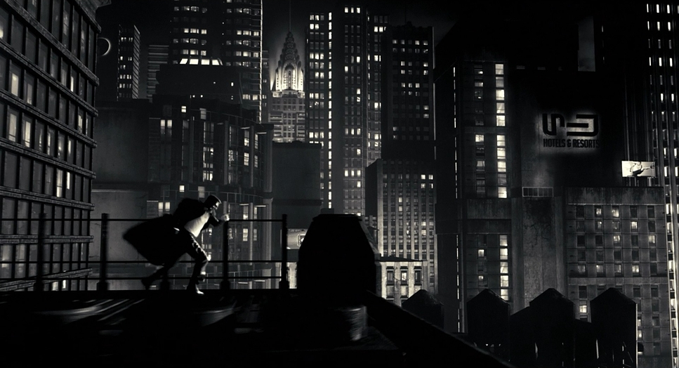
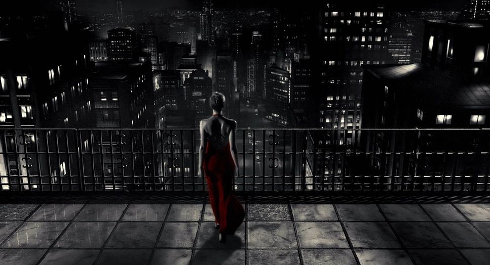
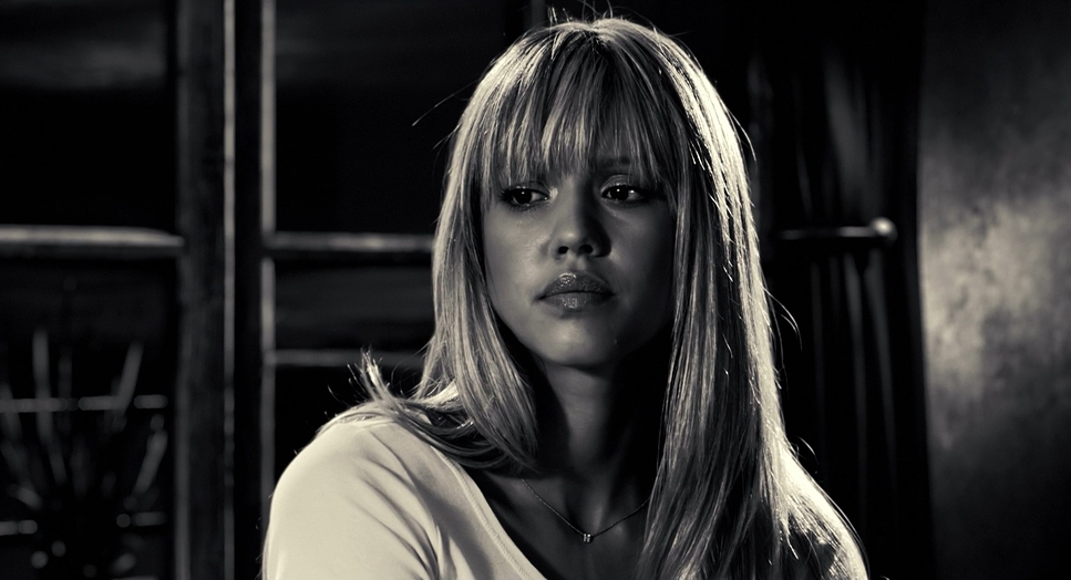
This is where the film really flexes. The composition is entirely built on negative space. Characters are often just silhouettes against a white void or a splash of rain. As a filmmaker, I’m always trying to find depth, but Sin City often embraces flatness to honor the 2-dimensionality of the page.
The framing is theatrical. You get these low angles that make Marv look like a monolith, or high angles that swallow characters whole. Because so much of the background was green screen, the composition could be manipulated endlessly in post. They could move a building five feet to the left just to balance the frame. Deep focus is used often to keep foreground and background sharp like a drawing but they switch to shallow focus instantly to isolate a character. It’s a masterclass in using the frame to tell the story before a single word is spoken.
Lighting Style
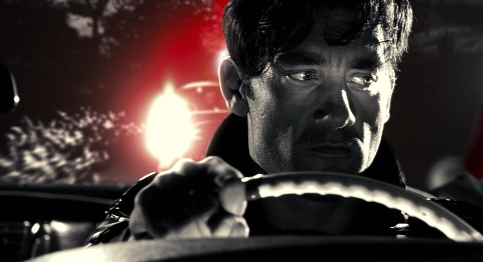
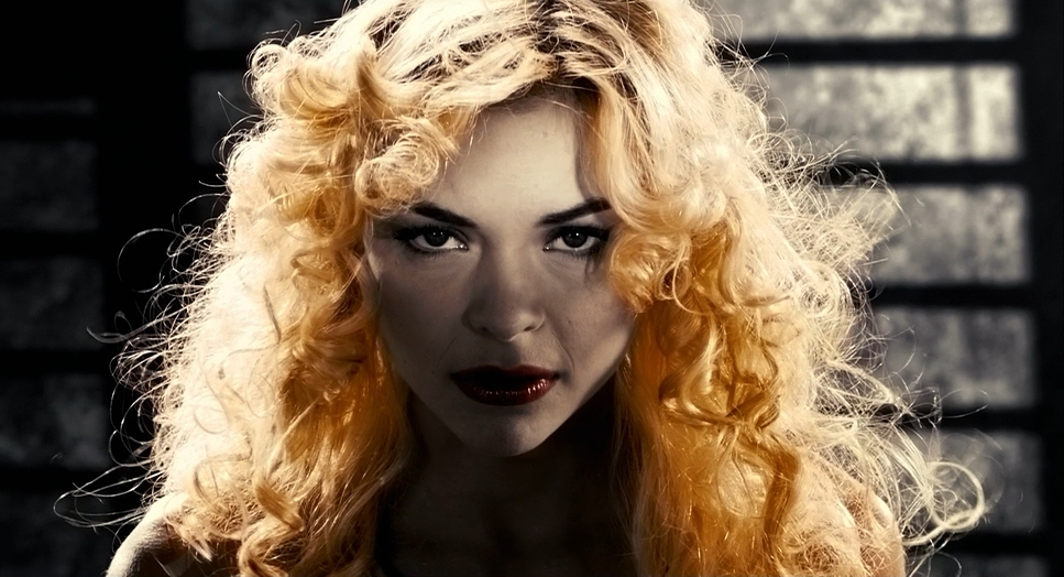
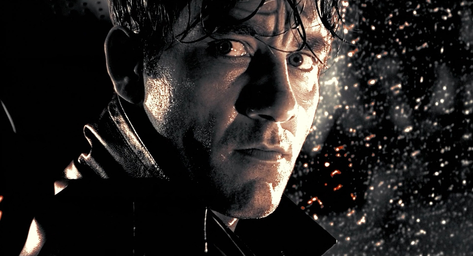
Lighting in Sin City isn’t about illumination; it’s about separation. The film uses extreme hard light. There’s no soft, wrap-around beauty lighting here. It’s harsh, motivated sources that carve the actors out of the darkness.
From a technical standpoint, this is risky. Hard light reveals every pore and imperfection (especially on early digital sensors), but here it adds to the grit. The shadows are crushed to absolute zero. They aren’t just dark; they are data-less voids. The lights act as anchors a streetlamp rim-lighting a fedora, or a hard beam hitting eyes. It sculpts the faces into something almost architectural. It’s classic Noir lighting on steroids.
Lensing and Blocking
The lensing feels incredibly sharp, likely shooting on primes to keep those edges crisp for the green screen compositing. There’s a mix of wide shots to establish the digital cityscapes and extreme close-ups that feel almost claustrophobic.
Blocking was a unique challenge because the actors were often performing in empty green rooms. They aren’t interacting with a physical space; they’re positioned within the frame like chess pieces. A character might be shoved into the corner of the screen to emphasize isolation. The choreography had to be precise because the environment was going to be painted in later. It creates a weird, disjointed feeling that actually suits the psychopathic nature of Basin City.
Color Grading Approach
As a colorist, this is the fun part. The grade on Sin City is iconic. It’s not just a black and white conversion. If you just desaturate a digital image, it looks flat and gray. To get this look, they had to crush the blacks aggressively and blow out the highlights, destroying the mid-tones to create that “ink” aesthetic.
And then there’s the selective color. We’ve seen this gimmick before (Schindler’s List, etc.), but here it’s aggressive. It’s not subtle. The red of the blood isn’t a realistic blood tone; it’s a primary, saturated #FF0000. It pops because the rest of the image is so stark.
Technically, pulling these keys is harder than it looks. Isolating a skin tone or a dress when the lighting is so high-contrast requires clean matte extraction. You have to manage the noise in the shadows so the image doesn’t fall apart when you crush it. The “Yellow Bastard” is a great example his skin is a sickly, jaundiced yellow that looks unnatural, which is exactly the point. The grade is doing half the storytelling work.
Technical Aspects & Tools
Sin City (2005) – Technical Specifications
| Genre | Action, Crime, Thriller, Film Noir, Gangster, Neo-Noir |
|---|---|
| Director | Frank Miller, Robert Rodriguez, Quentin Tarantino |
| Cinematographer | Robert Rodriguez |
| Production Designer | Steve Joyner, Jeanette Scott |
| Costume Designer | Nina Proctor |
| Editor | Robert Rodriguez |
| Colorist | Jim Passon |
| Color | Warm, Desaturated |
| Aspect Ratio | 1.85 – Spherical |
| Format | Digital |
| Lighting | Hard light, High contrast |
| Lighting Type | Artificial light, Fluorescent |
| Story Location | United States > Basin City |
| Filming Location | Texas > Austin |
| Camera | Sony CineAlta HDC-F950 |
| Lens | Fujinon E Series |
The tech behind this was groundbreaking for 2005. They shot on the Sony CineAlta HDC-F950 one of the early heavy-hitters in digital cinema. This was before the ARRI Alexa took over, so the sensor had a very specific, sharp video look that Rodriguez leaned into.
The “green screen everything” approach was a massive gamble. Rodriguez basically used his studio as a laboratory. By keeping everything in-house at Troublemaker Studios, he saved a fortune on practical locations. They could build the world in the computer. They shot “proof of concepts” to see if the tech would hold up. It’s a testament to efficient filmmaking using limited resources (relatively speaking, for a $40M movie) to create something that looks expensive.
- Also read: KILL BILL: VOL. 2 (2004) – CINEMATOGRAPHY ANALYSIS
- Also read: THE IMITATION GAME (2014) – CINEMATOGRAPHY ANALYSIS
Browse Our Cinematography Analysis Glossary
Explore directors, cinematographers, cameras, lenses, lighting styles, genres, and the visual techniques that shape iconic films.
Explore Glossary →