When I watch a film like Silver Linings Playbook, I’m looking past the dialogue to see how the image itself speaks. David O. Russell’s 2012 dramedy shouldn’t work on paper it’s a chaotic mix of bipolar disorder, sports obsession, and a dance competition. But it resonates because the visuals don’t try to “fix” the characters. Instead of polished perfection, we get a visual language that is as raw and unpredictable as Pat and Tiffany themselves. It’s a masterclass in how subtle, gritty choices can give a narrative more emotional weight than a hundred “perfect” shots.
Technical Aspects & Tools
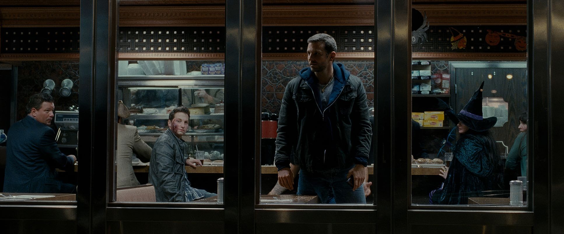
Silver Linings Playbook — 35mm Film | 2.39:1
| Genre | Comedy, Drama, Romance, Dance |
| Director | David O. Russell |
| Cinematographer | Masanobu Takayanagi |
| Production Designer | Judy Becker |
| Costume Designer | Mark Bridges |
| Editor | Jay Cassidy, Crispin Struthers |
| Colorist | Tony Dustin |
| Time Period | 2010s |
| Color | Warm, Desaturated |
| Aspect Ratio | 2.39 – Spherical, Super 35, 3 perf |
| Format | Film – 35mm |
| Lighting | Soft light, Side light |
| Lighting Type | Artificial light, Tungsten |
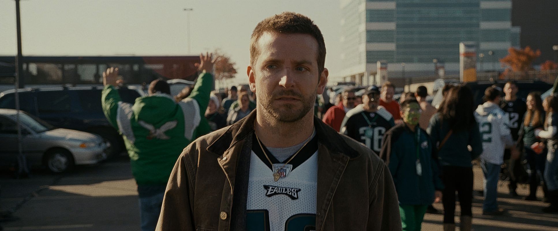
| Story Location | Pennsylvania > Philadelphia |
| Filming Location | Pennsylvania > Philadelphia |
| Camera | Arricam LT, Arricam ST |
| Lens | Zeiss Master Primes, Angenieux Optimo Zooms |
| Film Stock / Resolution | 5219/7219 Vision 3 500T, 5213/7213 Vision 3 200T |
I have to correct a common misconception here: while 2012 was the era where the ARRI Alexa began its industry takeover, Masanobu Takayanagi actually shot Silver Linings Playbook on 35mm film (specifically the Arricam LT and ST). You can feel the difference. Using Kodak Vision3 500T and 200T stocks gives the film a naturalistic density and a highlight roll-off that digital is still trying to perfectly emulate.
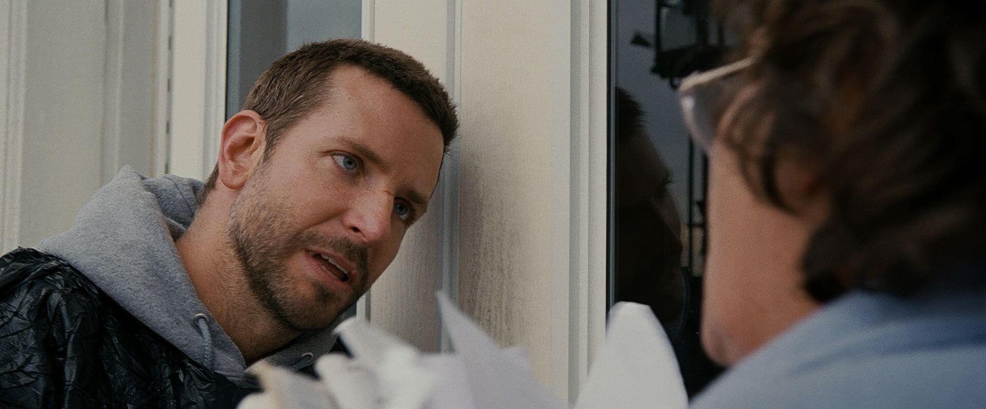
The lens choice is equally interesting. They paired the Arricams with Zeiss Master Primes and Angenieux Optimo Zooms. Master Primes are known for being incredibly sharp and “clean,” but when you put them on a handheld film camera in a cramped Philadelphia attic, that sharpness just makes the grit feel more immediate. It doesn’t feel like “movie” glass; it feels like you’re standing three feet away from a man having a breakdown.
About the Cinematographer
Masanobu Takayanagi is a DP who prioritizes energy over formal aesthetics. If you look at his work on The Grey or Warrior, there’s a consistent thread of grounded realism. He isn’t the type of cinematographer who demands perfect symmetry or highly stylized lighting for the sake of a “pretty” frame.
I’ve always viewed DPs on a spectrum between “painters” and “journalists.” Takayanagi is definitely a journalist. He’s observing, reacting, and breathing with the actors. In Silver Linings, his camera feels like a silent character in the Solitano household one that’s just as anxious as everyone else. His collaborative rhythm with David O. Russell, who is famous for encouraging improvisation, is what allows the film to feel so “present.”
Inspiration Behind the Cinematography
The visual DNA here is a direct evolution of what Russell started in The Fighter. There’s a restless, almost neurotic observation to the camera work. It’s designed to mirror the internal chaos of Pat’s bipolar disorder. When Pat wakes up with a completely different mindset, the camera isn’t sitting back in a wide shot; it’s right there, unmoored and shifting.
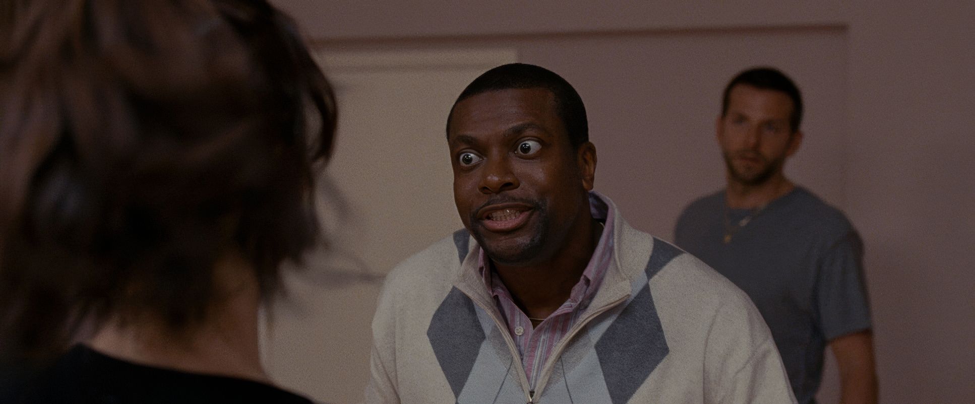
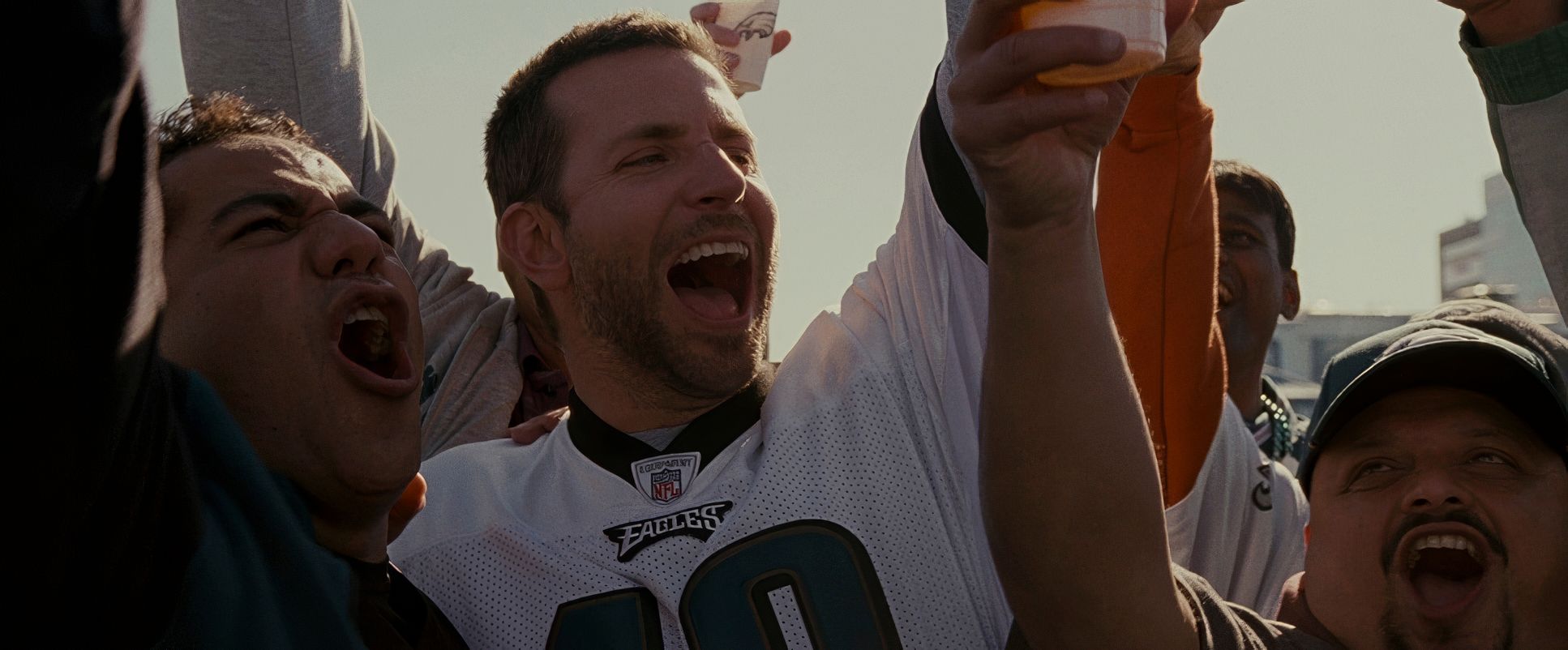
The film embraces the “screwball” nature of the story without romanticizing the mental illness. The inspiration wasn’t to make the characters look like movie stars, but to make them look like neighbors. The camera doesn’t shy away from the tics, the sweat, or the awkwardness. It’s an aesthetic of empathy it forces you to relate to these “over-the-top” people because the camera treats their world as tangible and real, not as a theatrical set.
Camera Movements
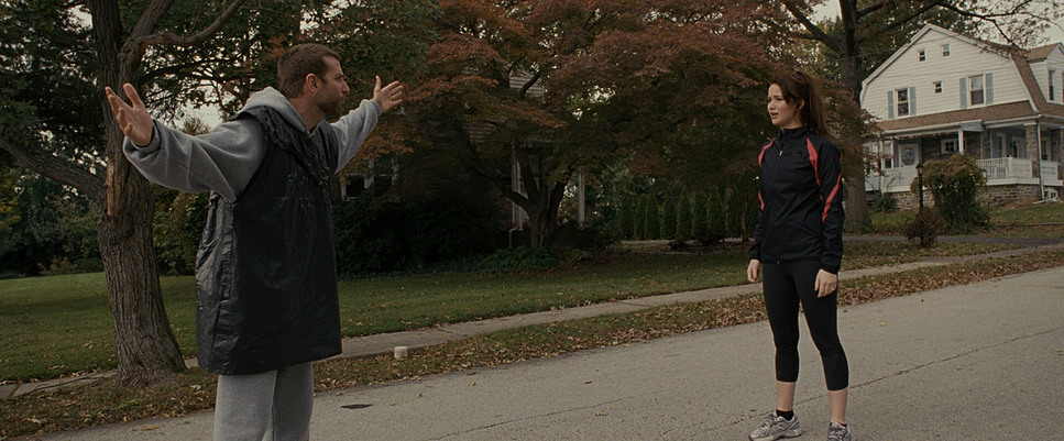
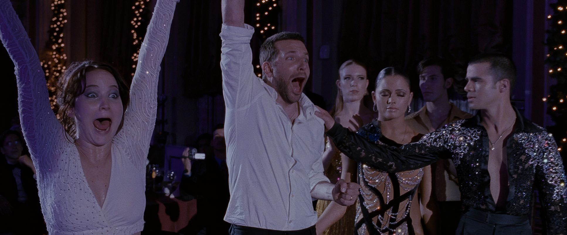
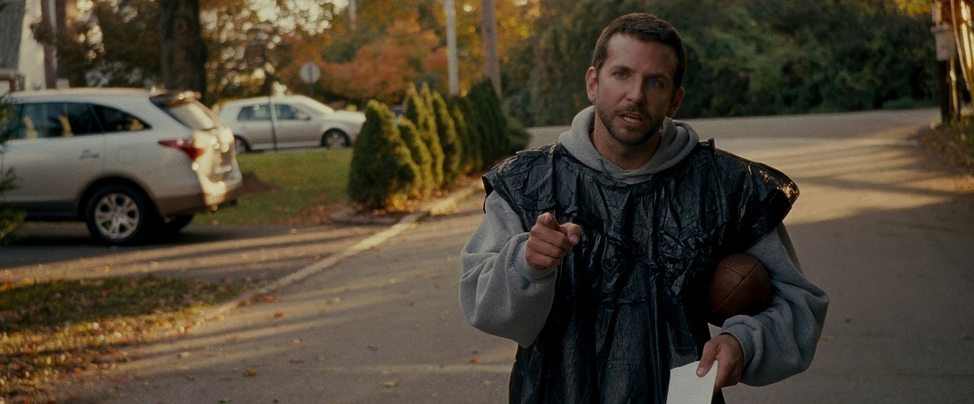
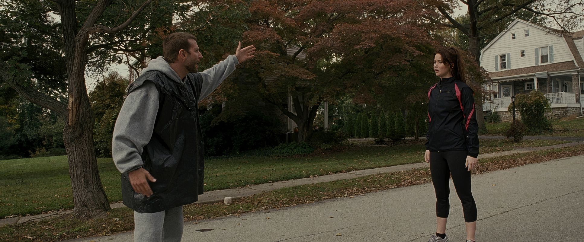
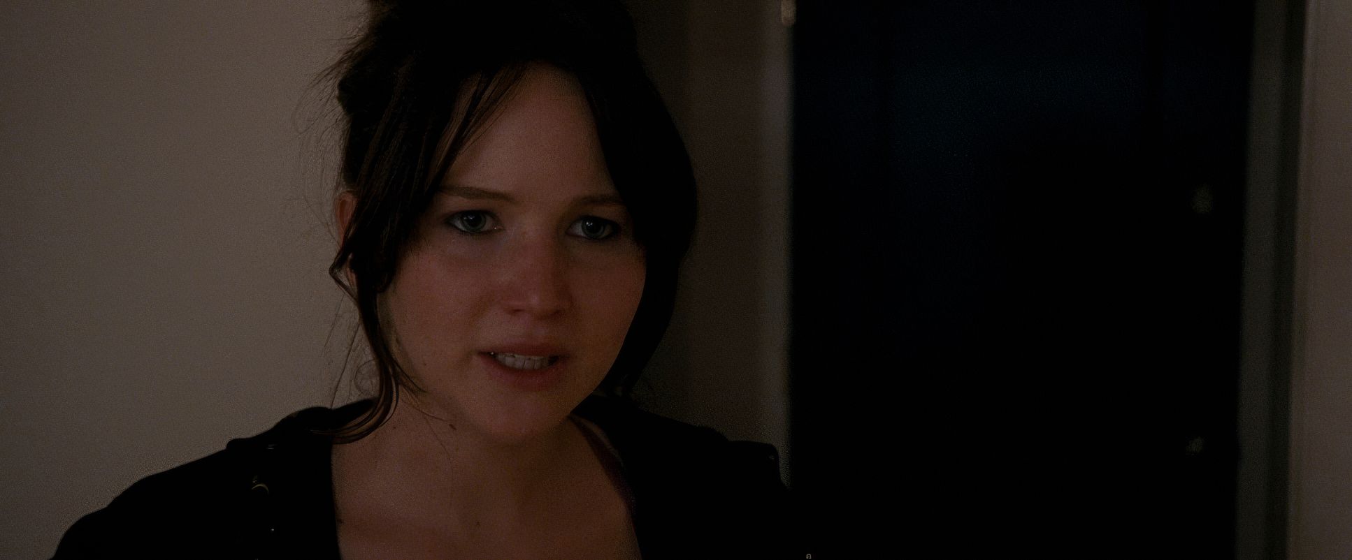
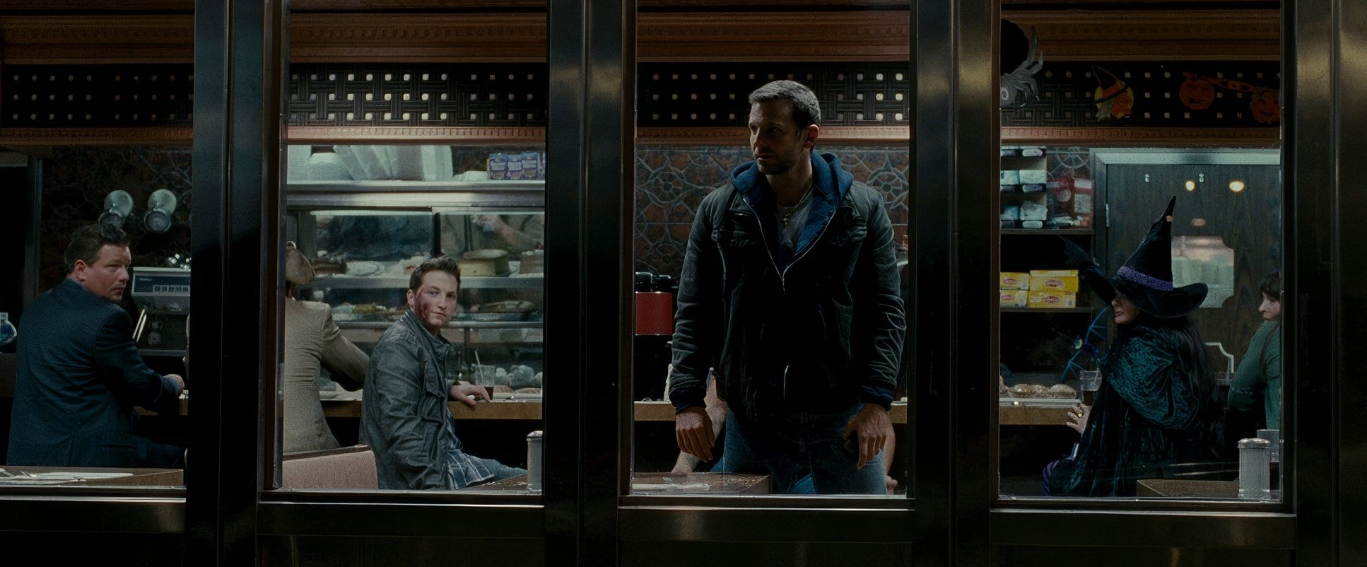
The camera in Silver Linings Playbook is rarely static. The handheld operation is pervasive, but it isn’t “shaky cam” for the sake of action; it’s an emotional kineticism. We see these quick, jarring pans and sudden zooms that jump-cut into the characters’ personal space. These aren’t just stylistic flourishes they’re depth cues.
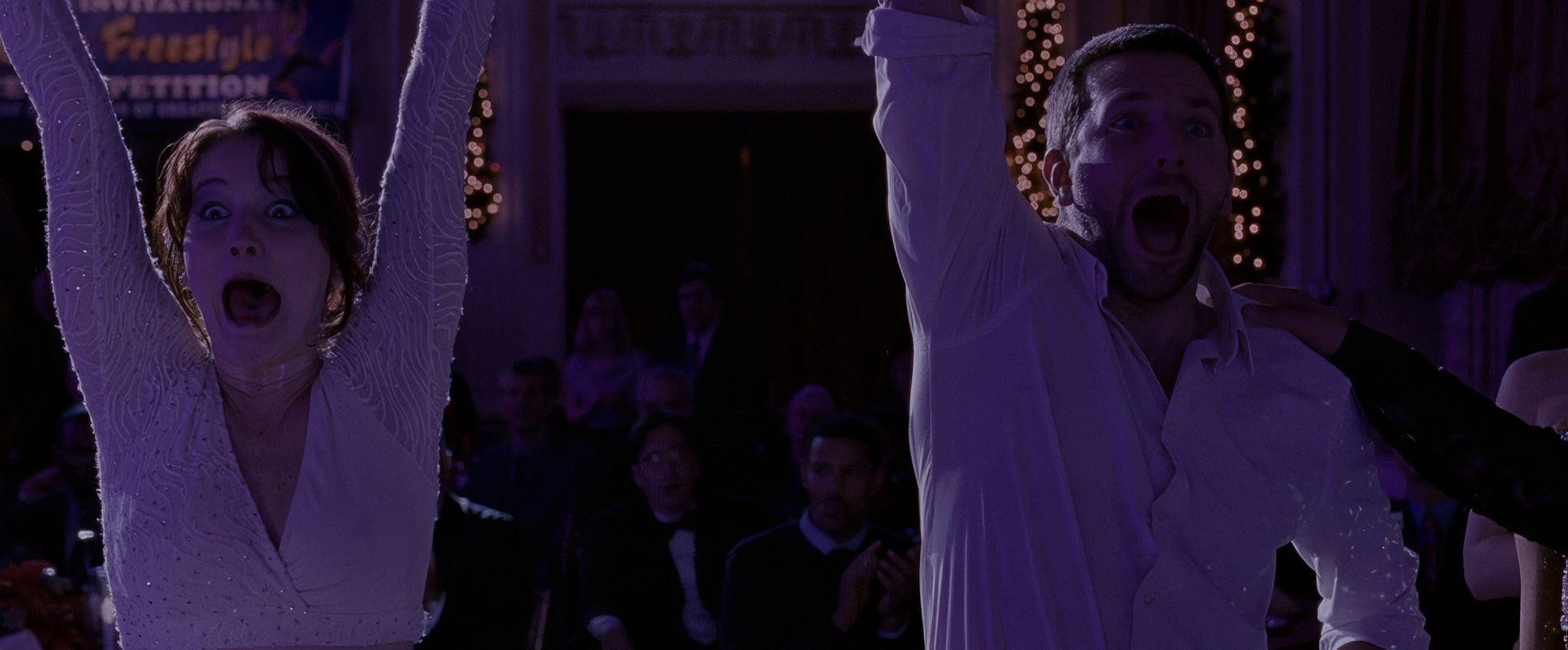
When Pat is spiraling, the camera whips around as if it’s trying to keep up with his racing thoughts. But notice how it changes when Pat and Tiffany start to connect; the motion softens into a gentler sway. It keeps the audience on edge, mirroring the way Pat’s family is constantly “on edge” around him. You never quite get to settle into a comfortable viewing experience, which is exactly how life feels for the characters.
Compositional Choices
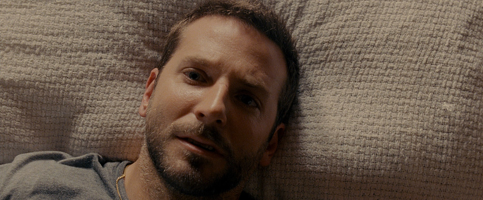
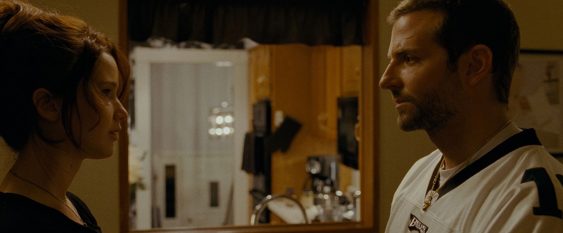
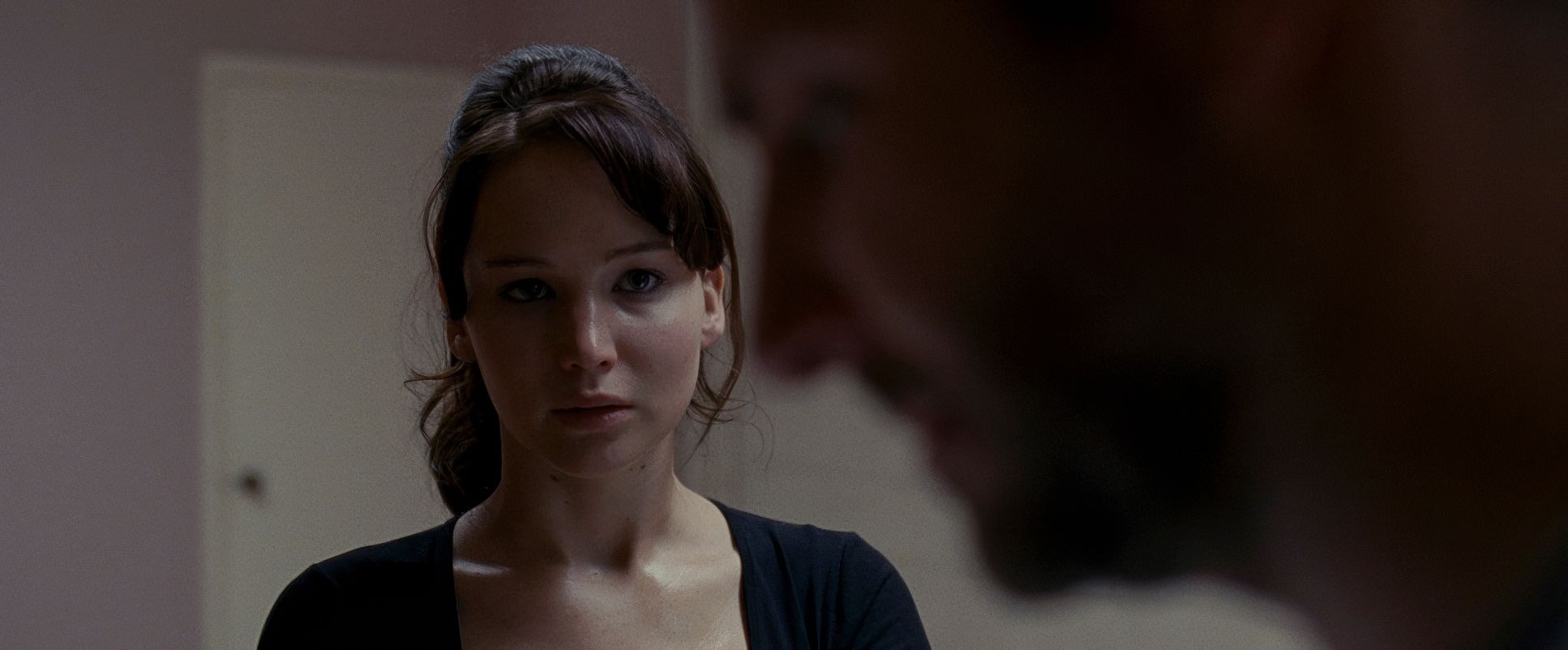
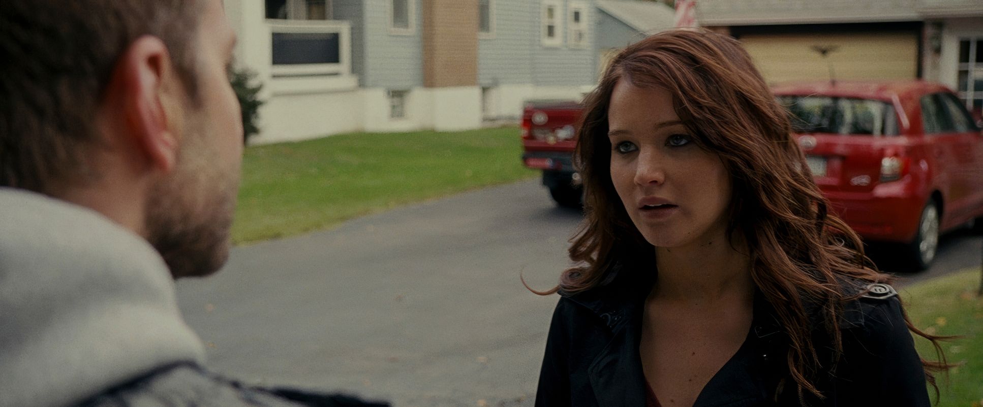
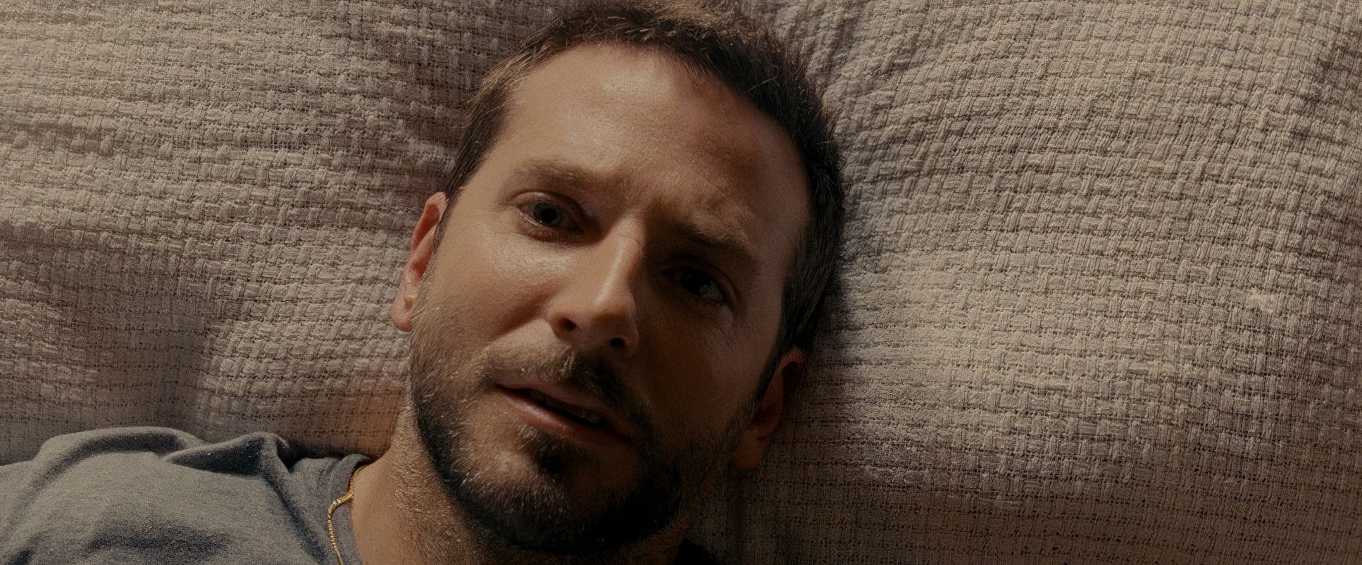
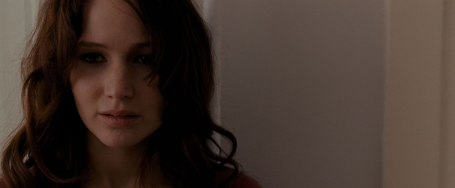
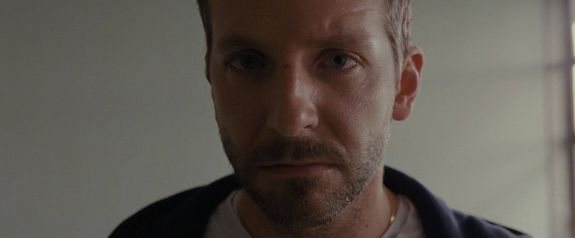
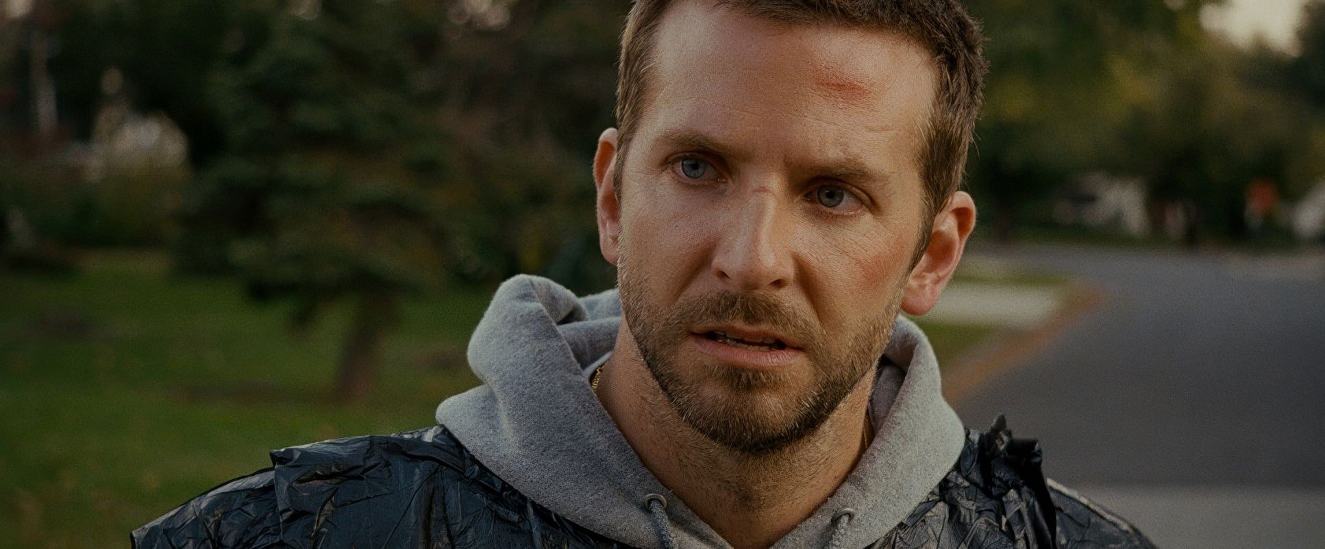
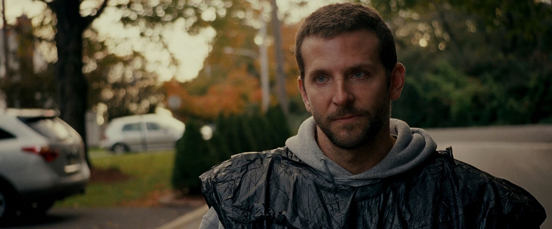
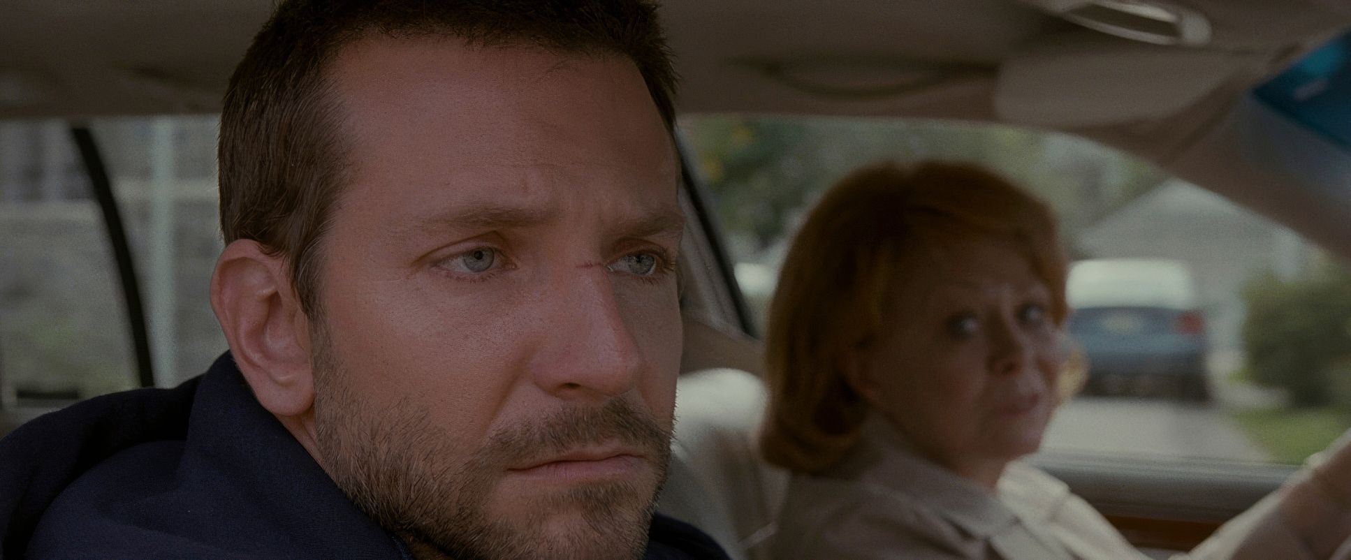
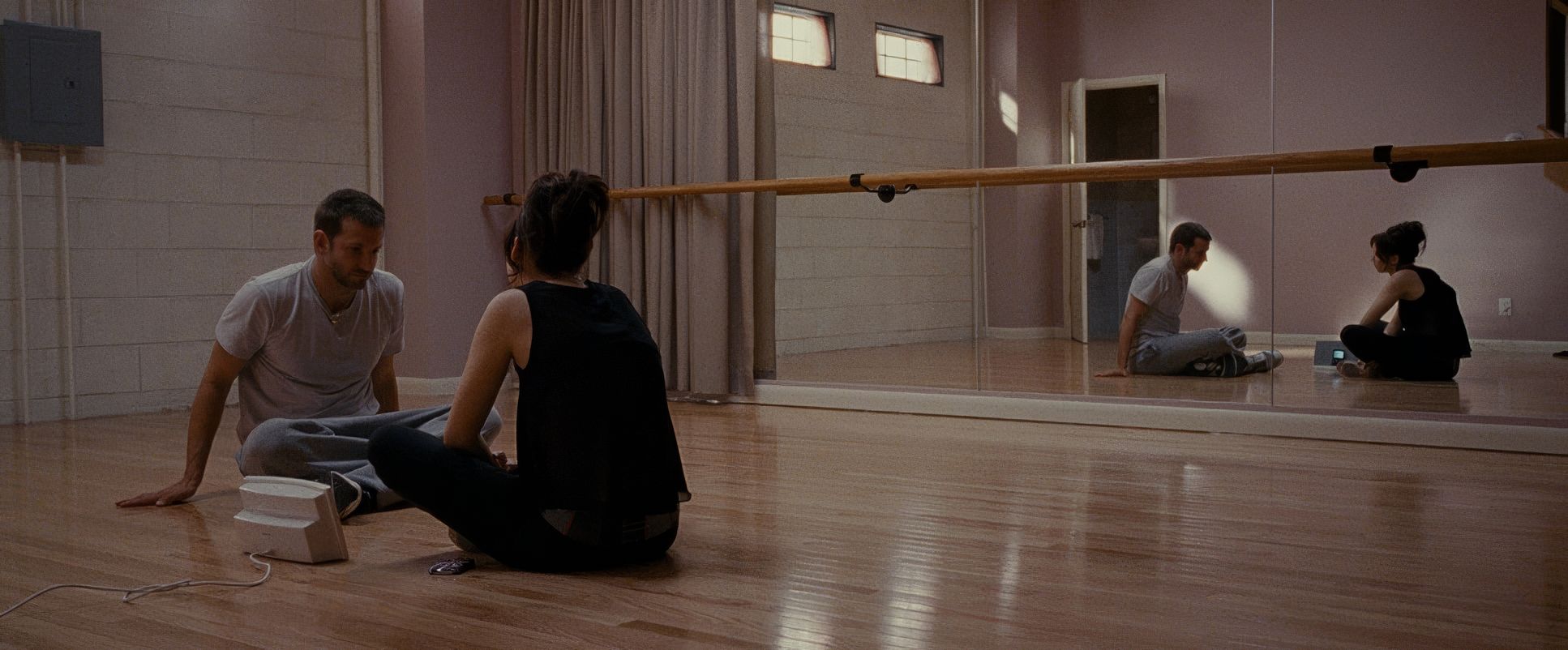
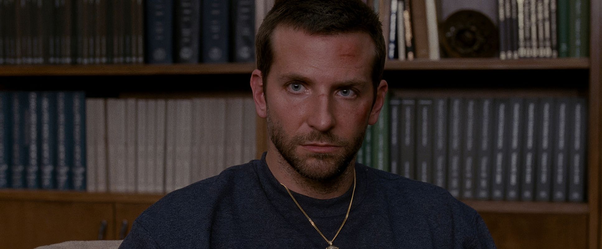
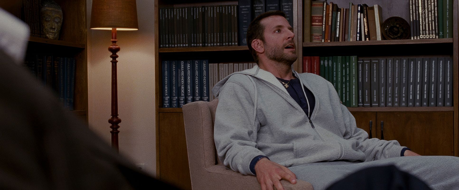
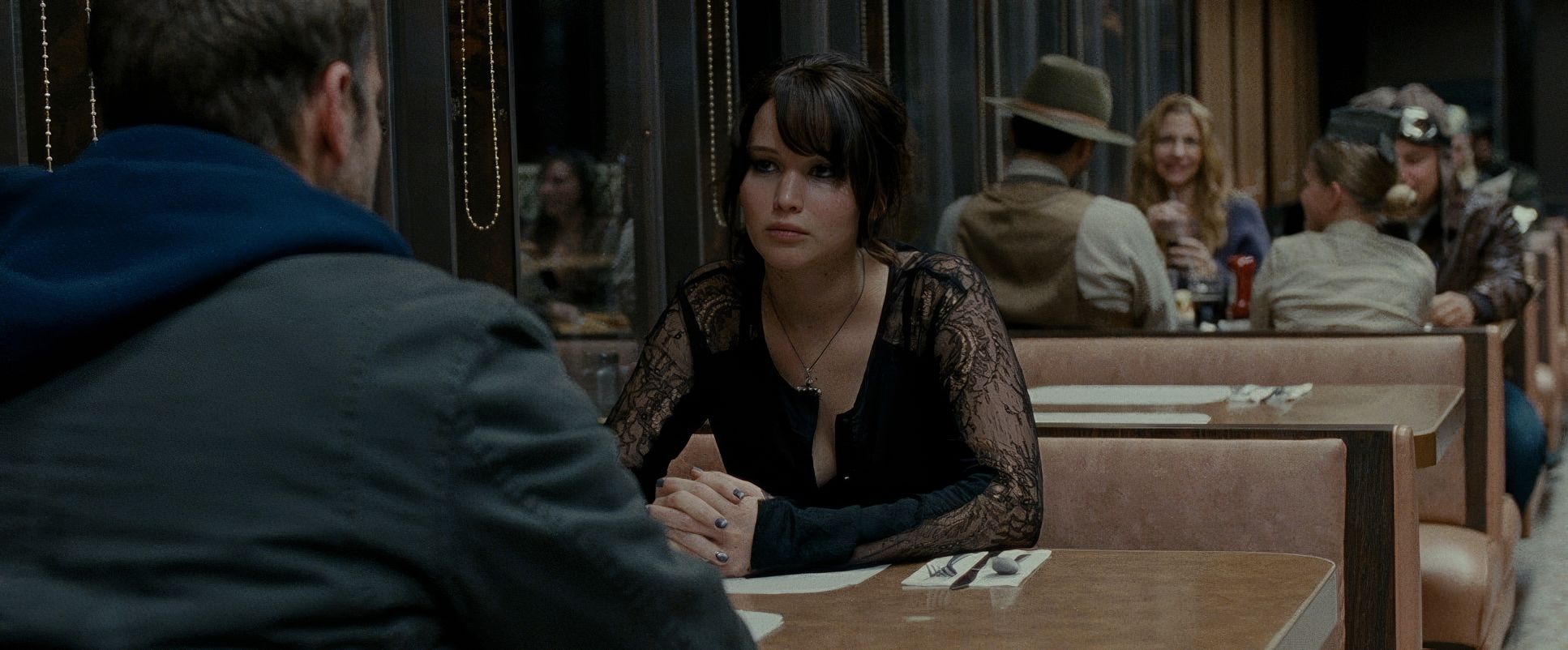
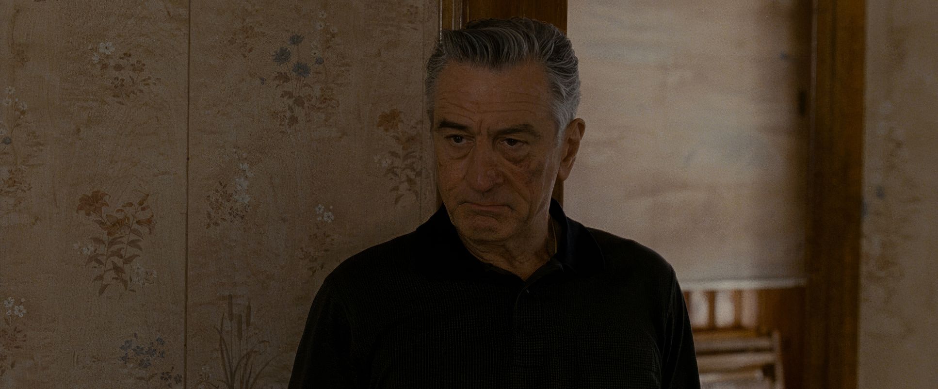
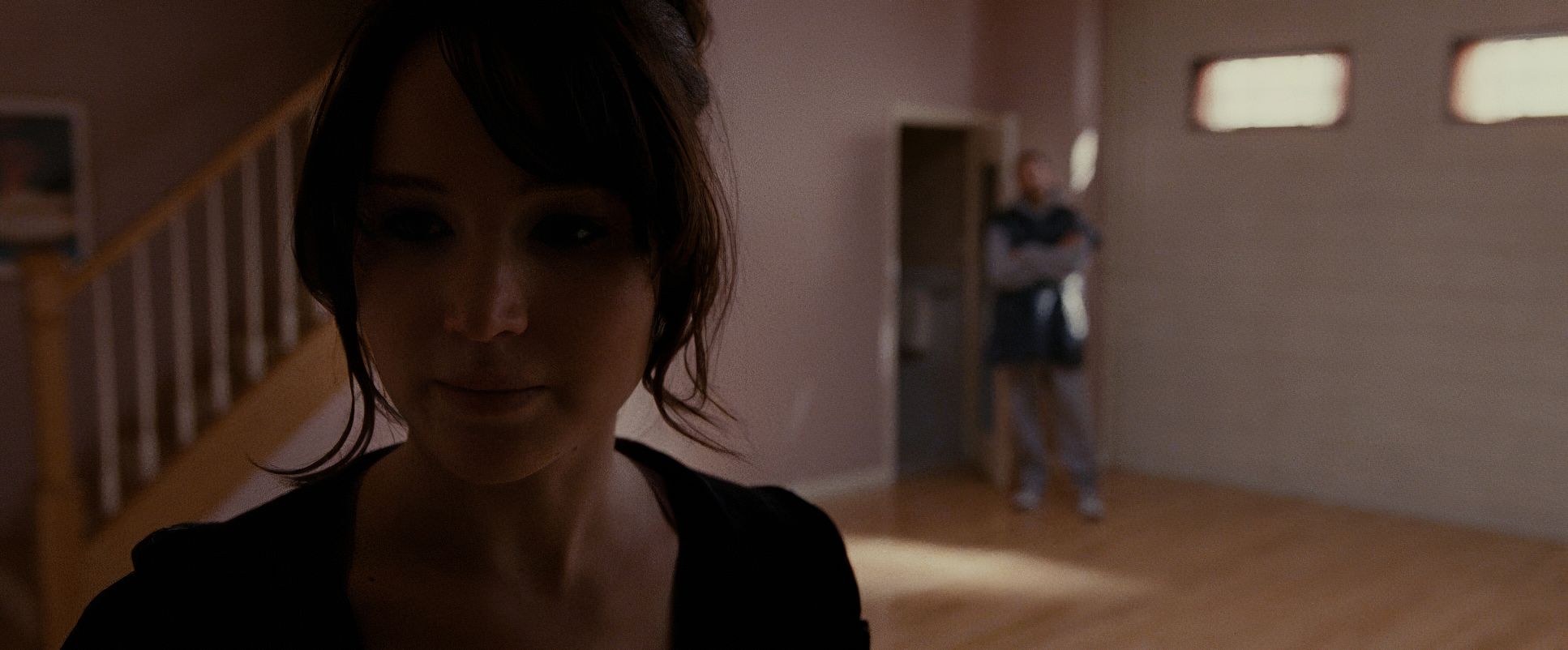
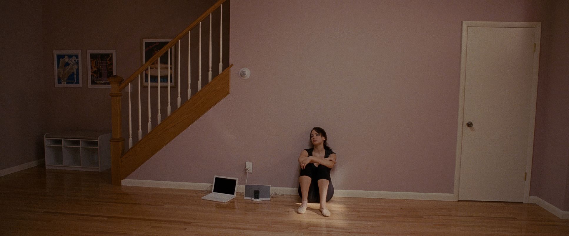
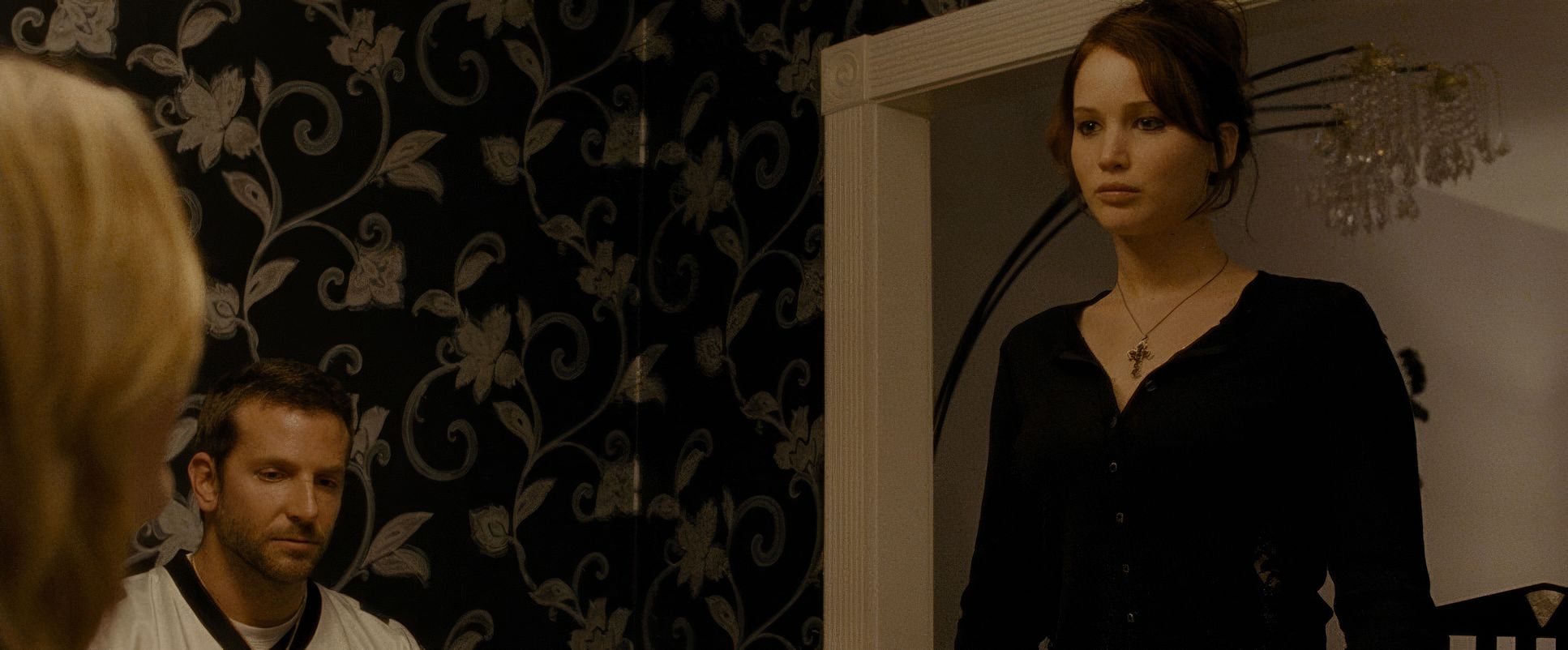
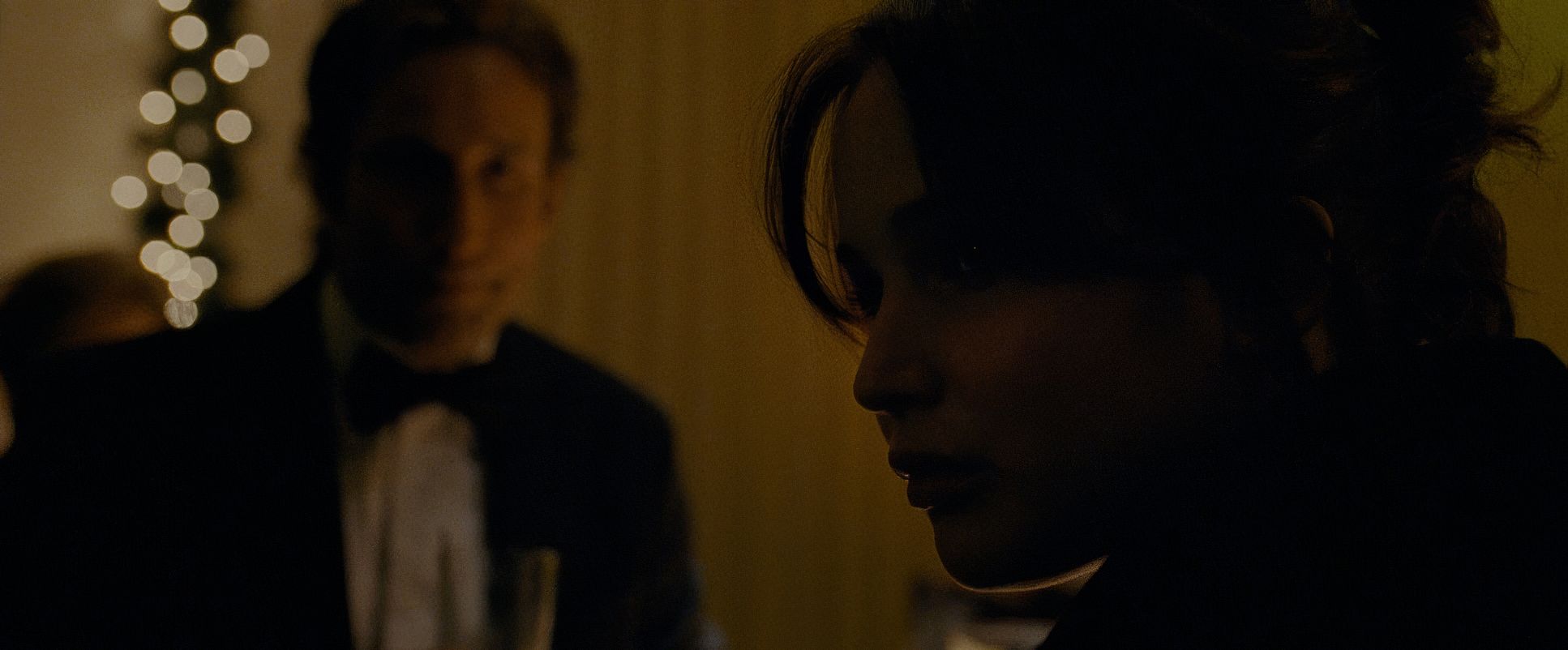
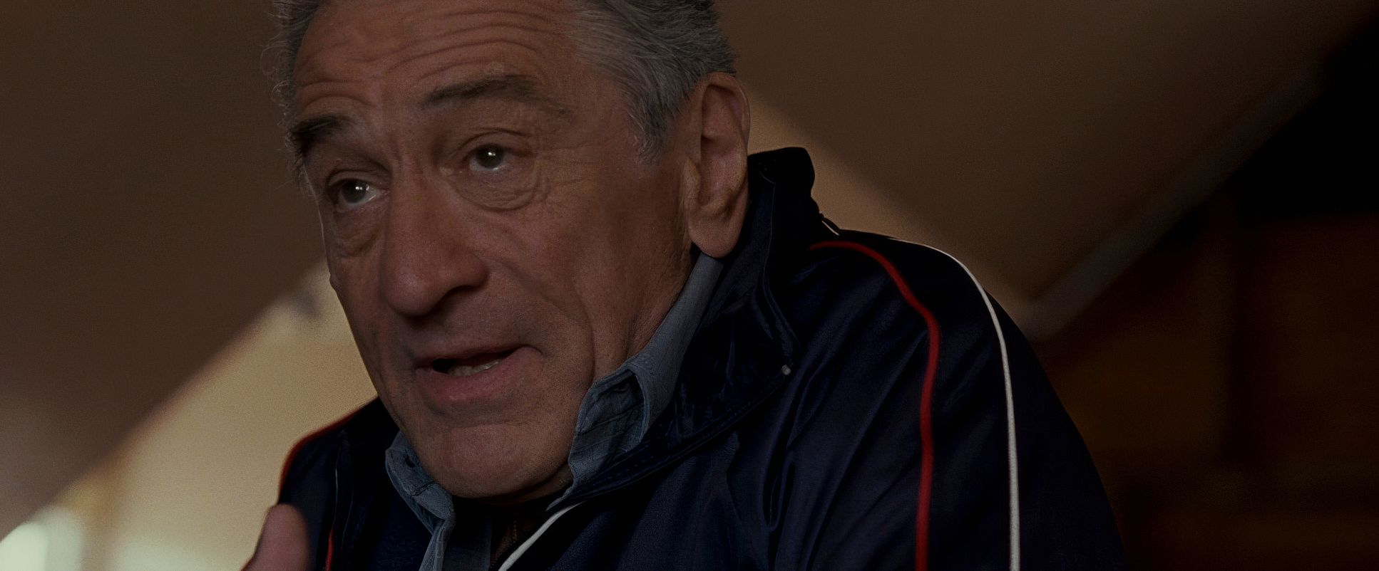
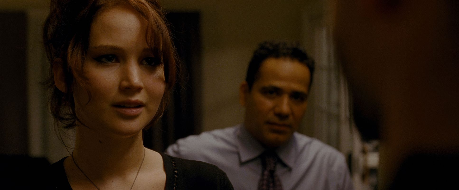
Takayanagi’s compositions are deceptively simple. He leans heavily on tight close-ups, but they’re often framed slightly off-kilter. This isn’t “pretty” framing; it’s framing that emphasizes vulnerability. By keeping the camera tight on Pat and Tiffany’s faces, we’re forced to confront every twitch and micro-expression.
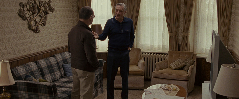
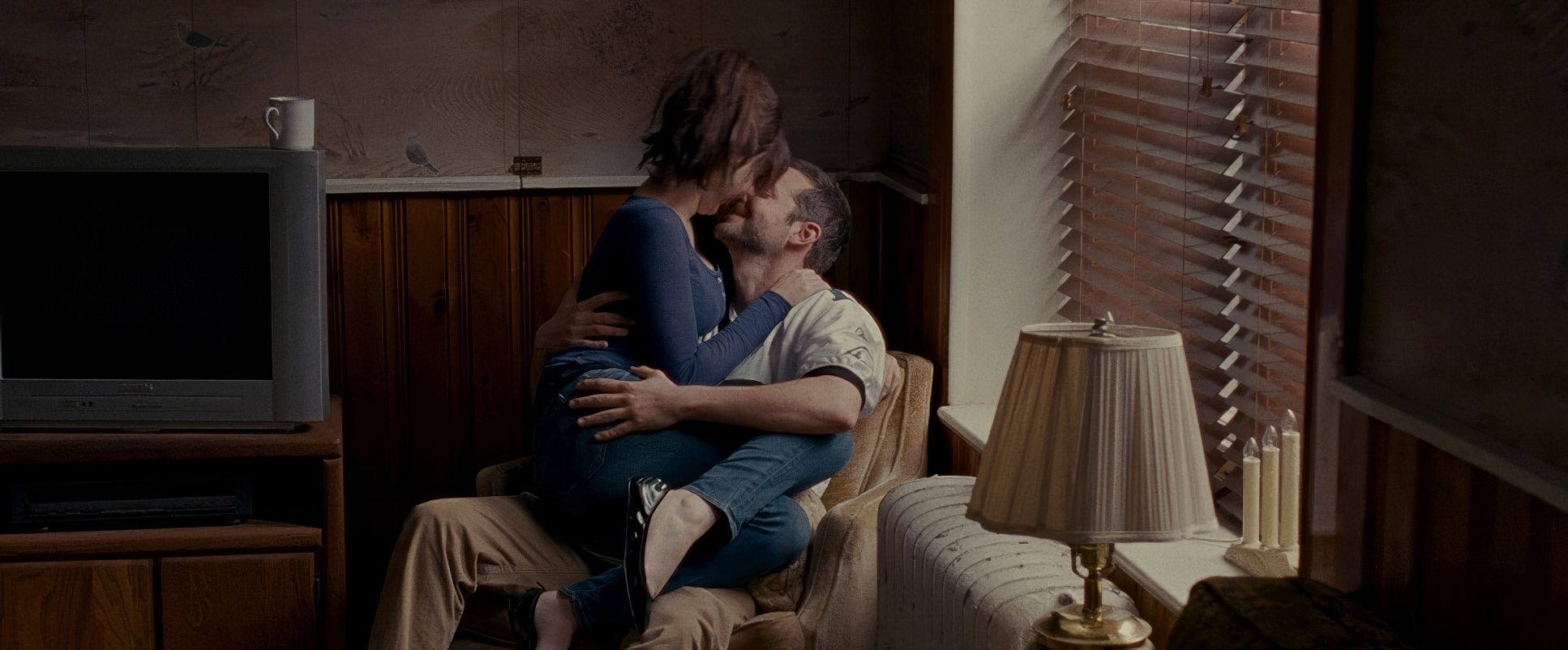
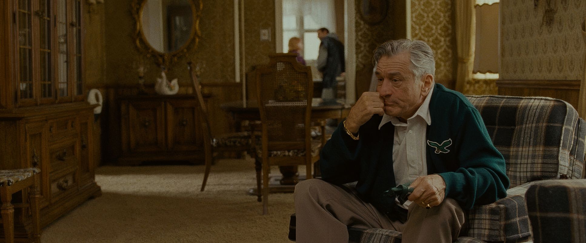
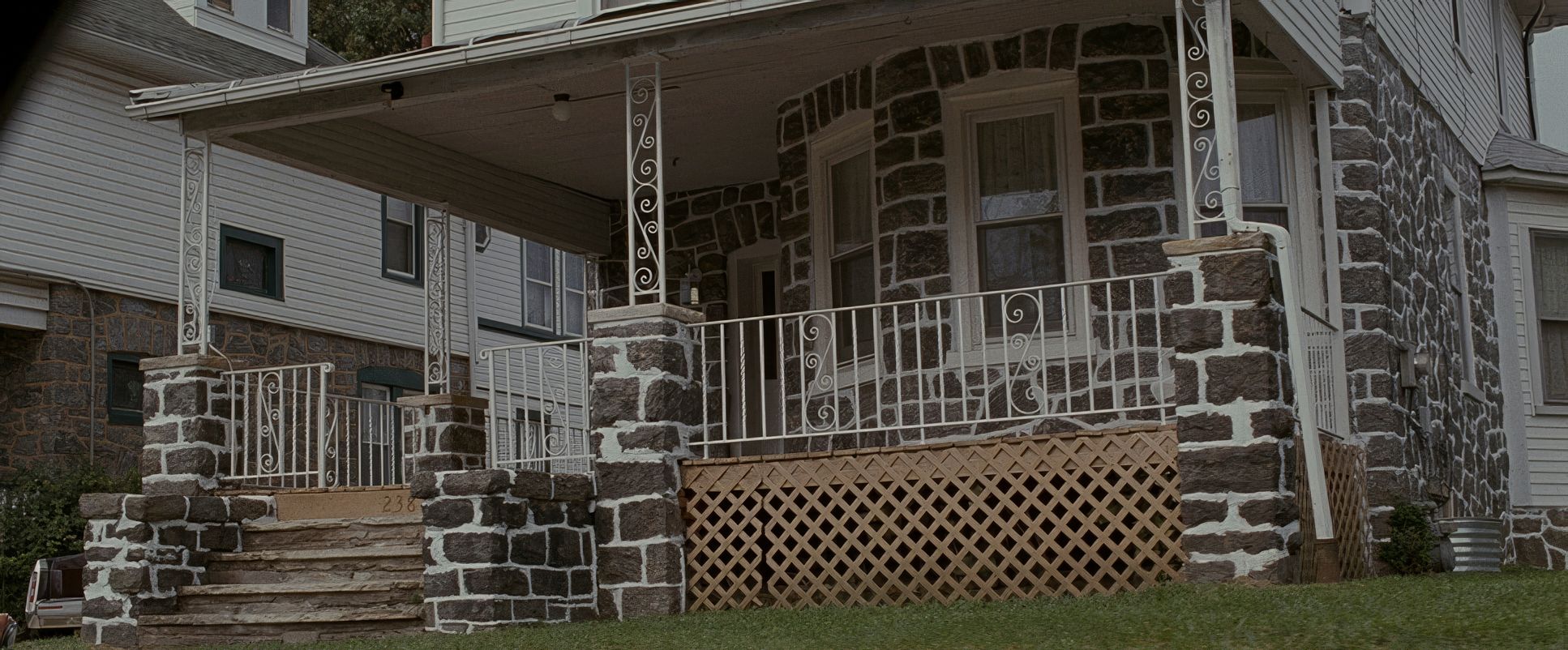
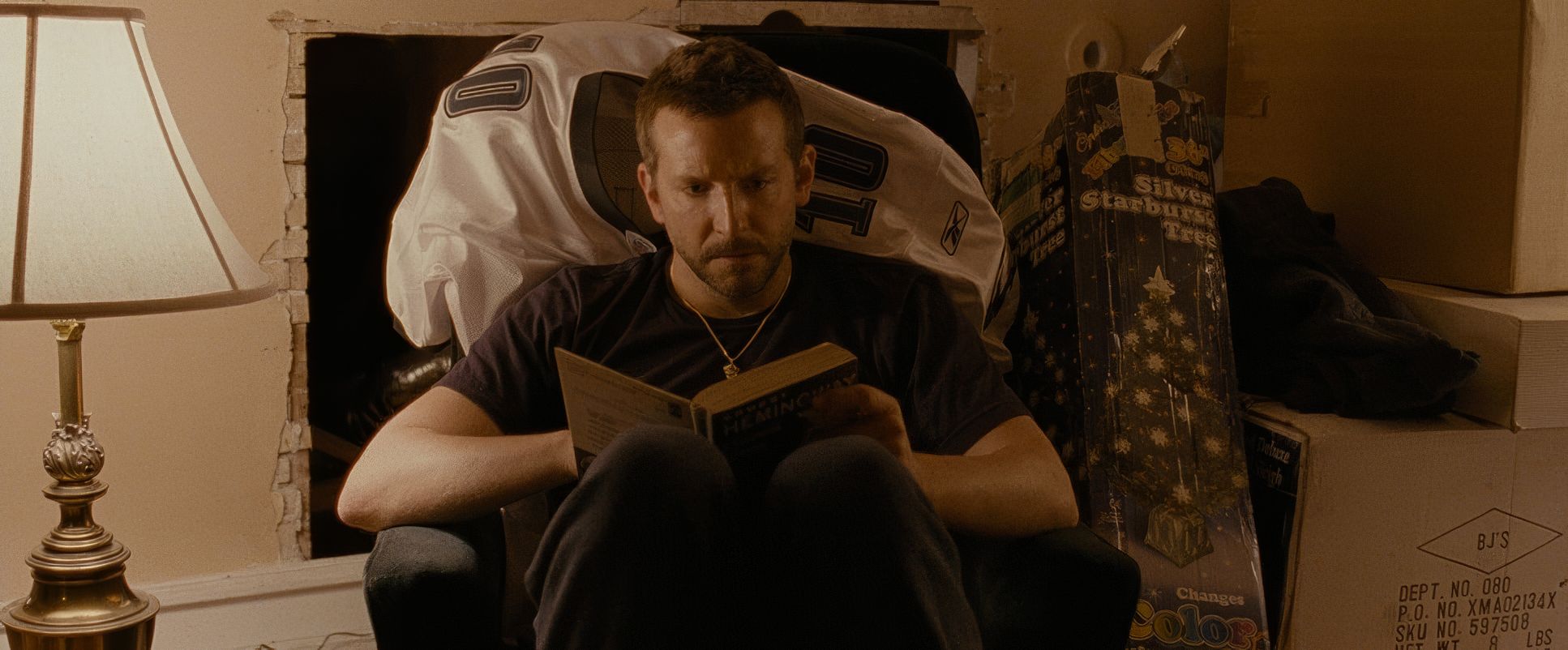
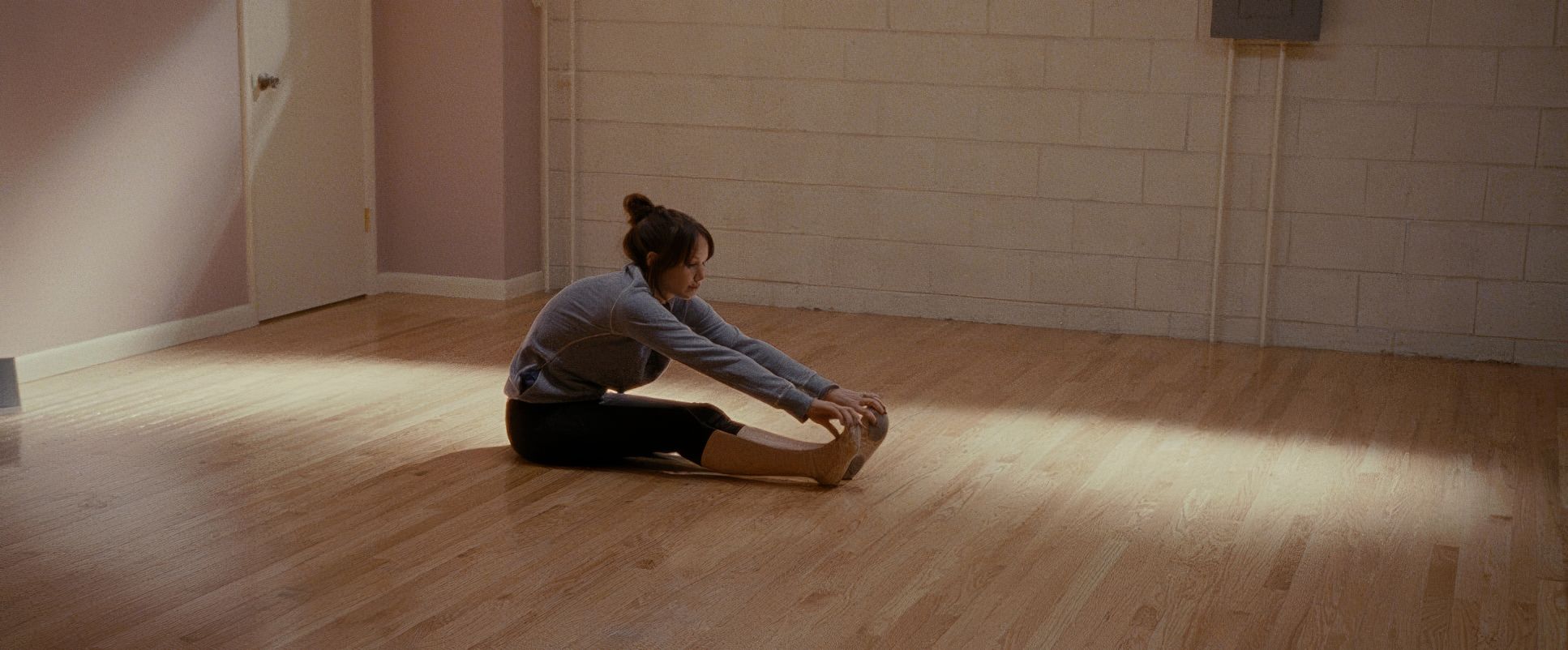
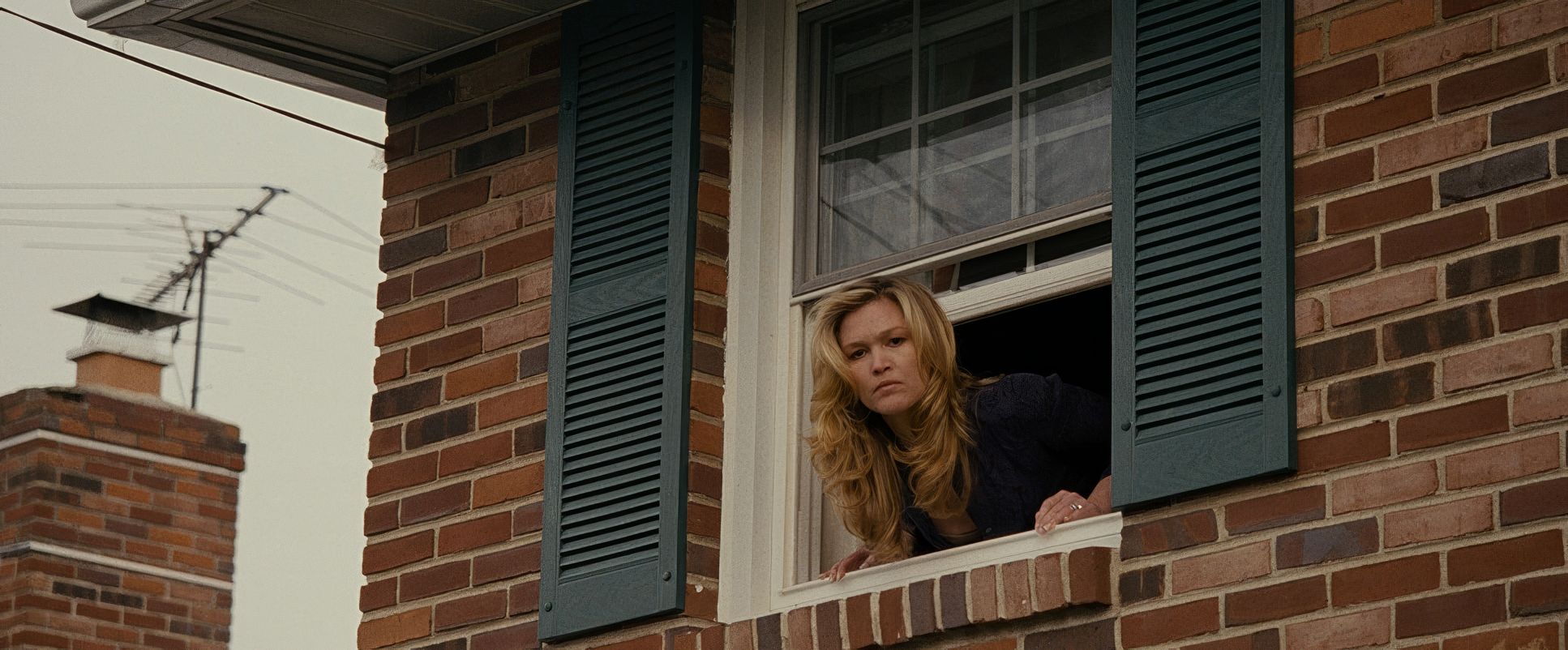
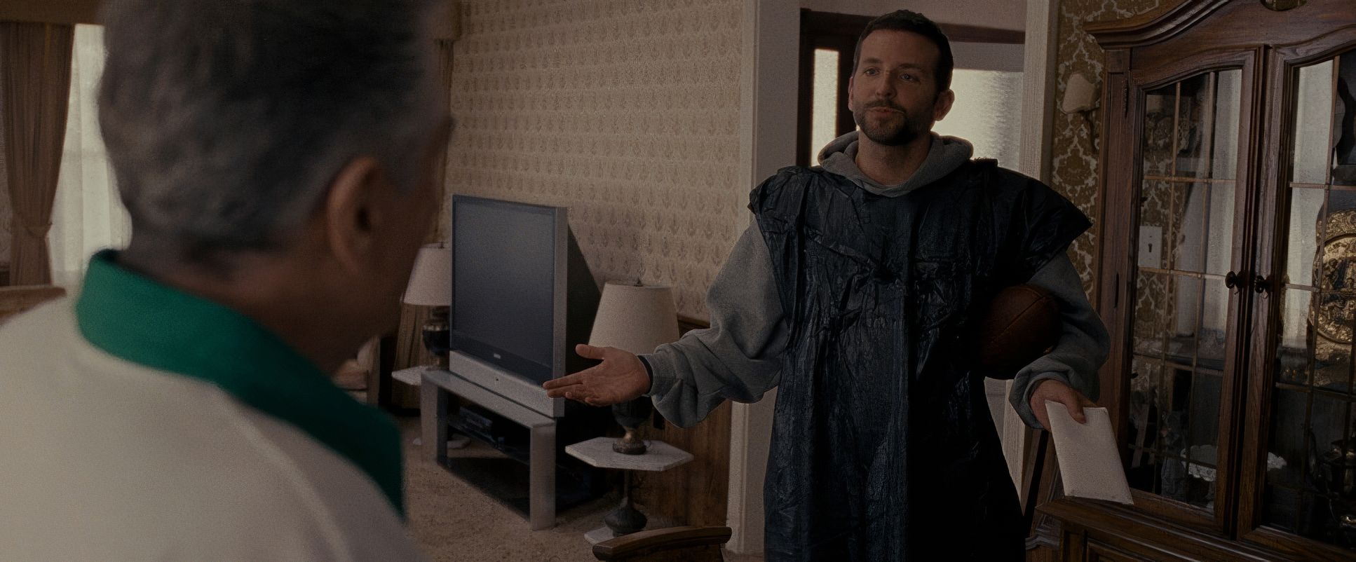
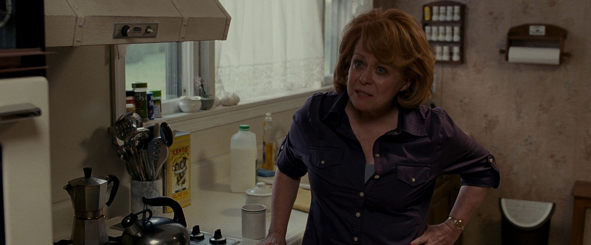
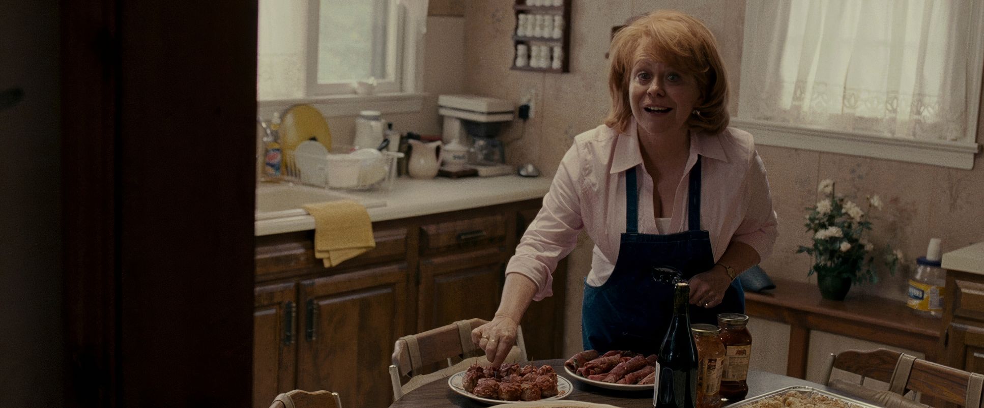
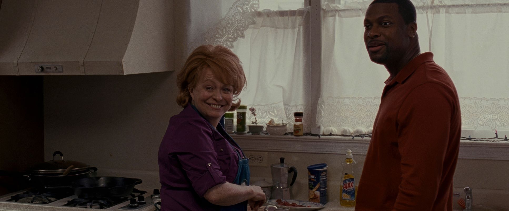
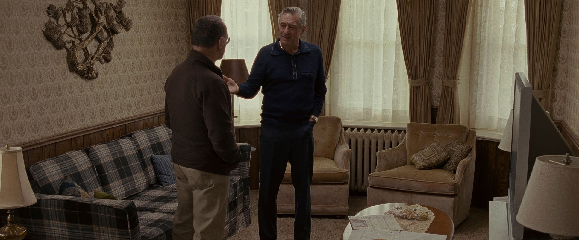
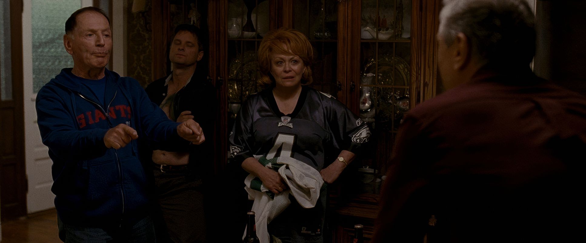
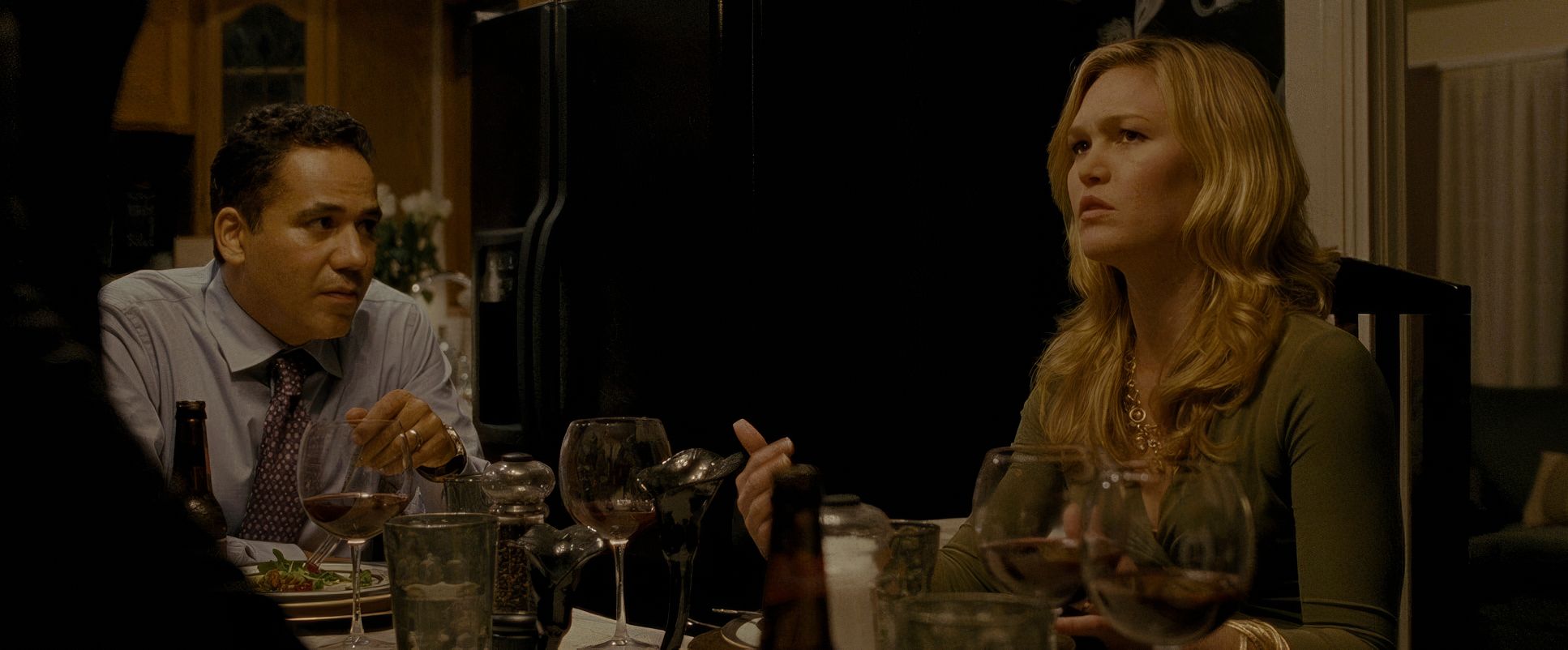
In the family scenes, the composition becomes intentionally crowded. He uses the architecture of the Philadelphia home to creates a sense of claustrophobia. You often see multiple characters squeezed into the frame, reflecting the tension of a family that loves each other but doesn’t know how to give each other space. Then, you have those beautiful moments of isolation like Tiffany and Pat in the attic where the shallow depth of field cuts out the world, leaving only their connection.
Lighting Style

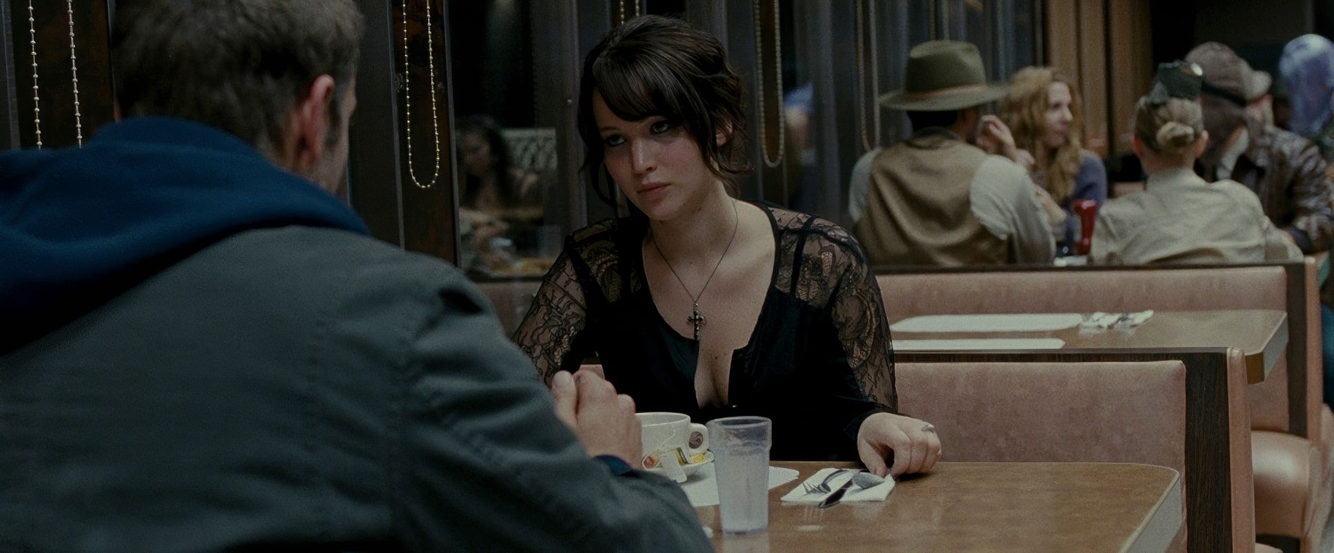
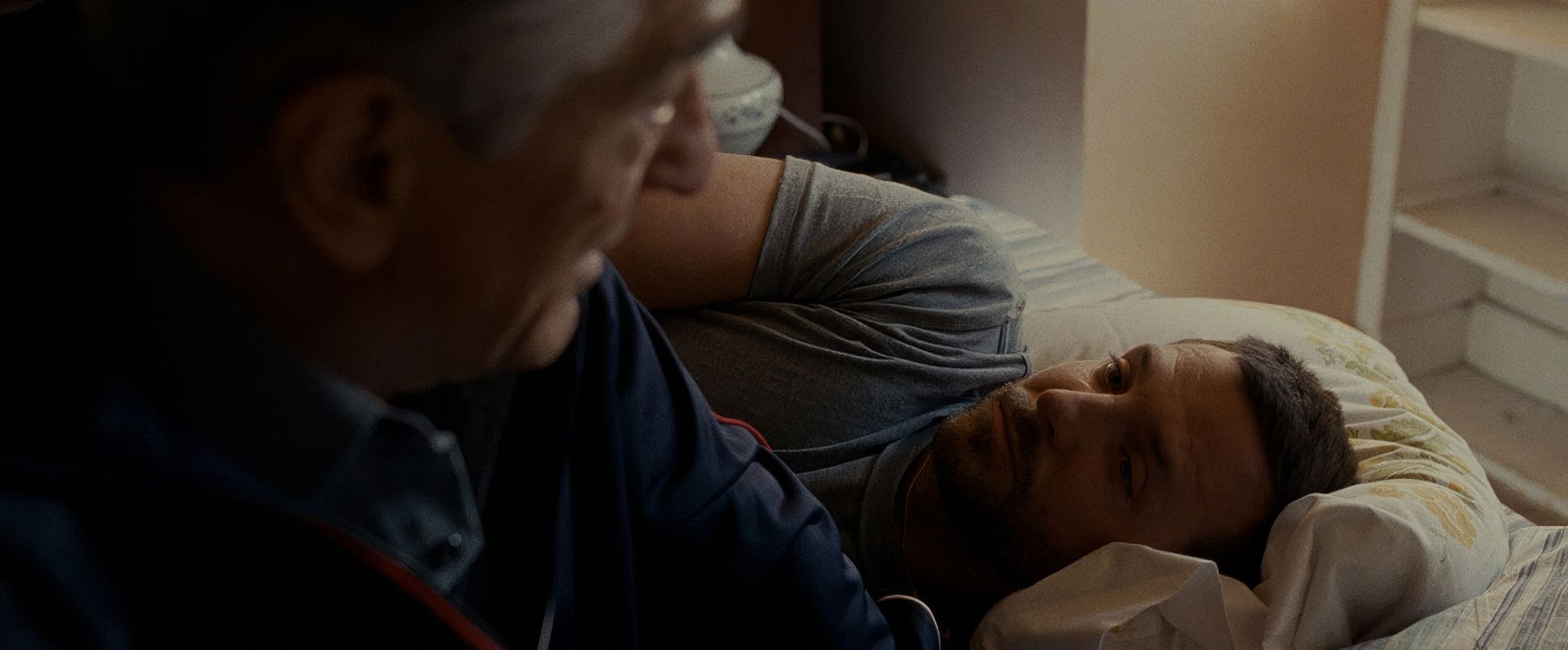
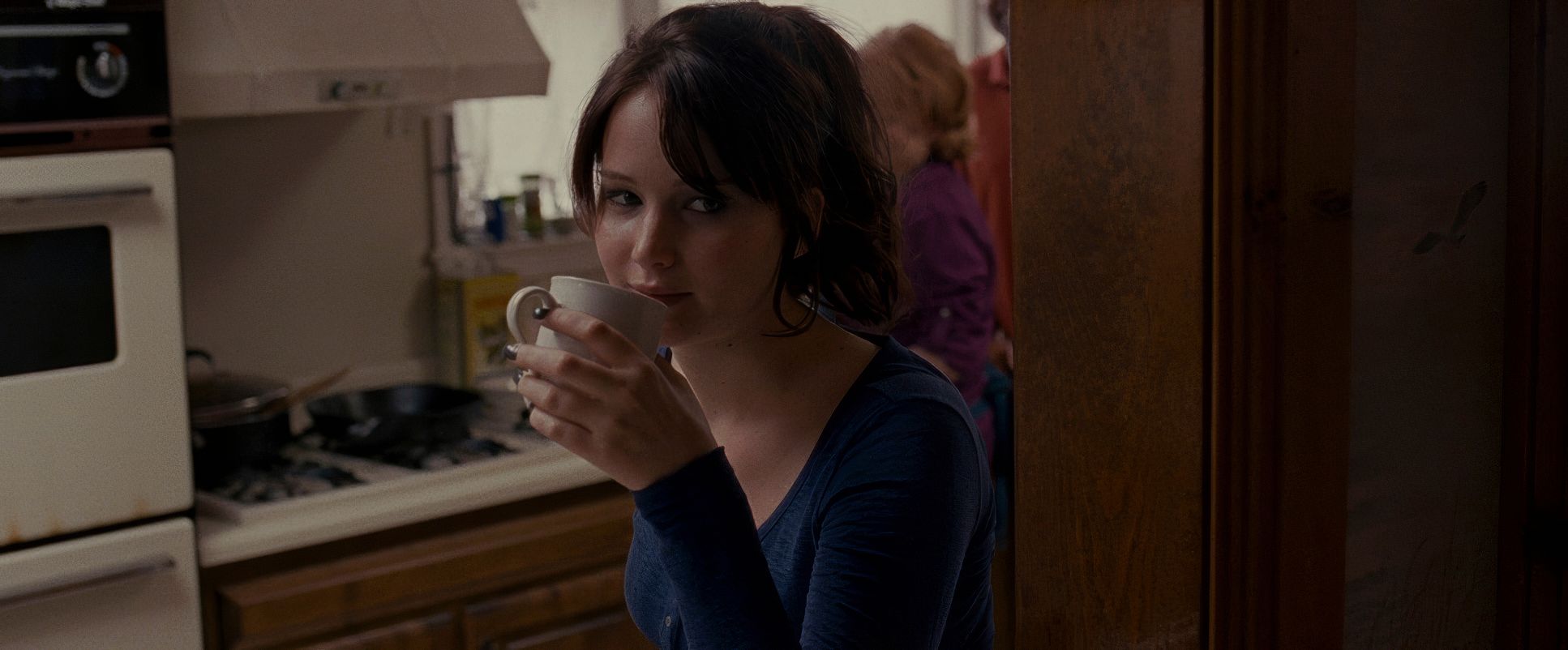
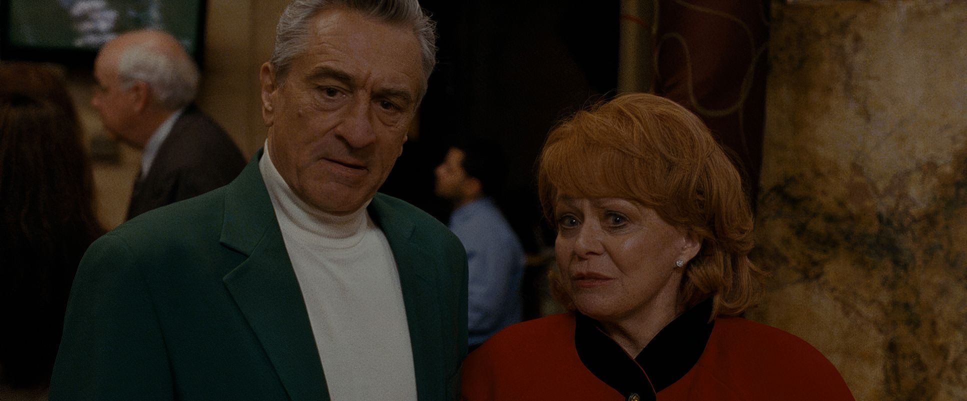
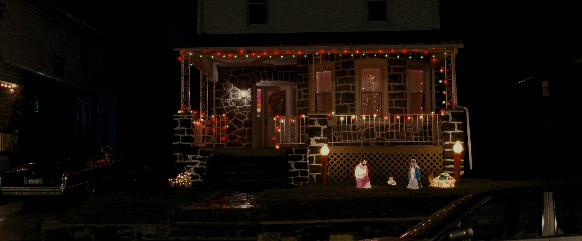
The lighting adheres to a “simulated naturalism.” While the film looks like it’s lit by window light and household lamps, there’s a lot of professional craft going on to keep it looking that “unpolished.” It’s largely soft, side-lit tungsten light that feels like it’s coming from the practical fixtures in the room.
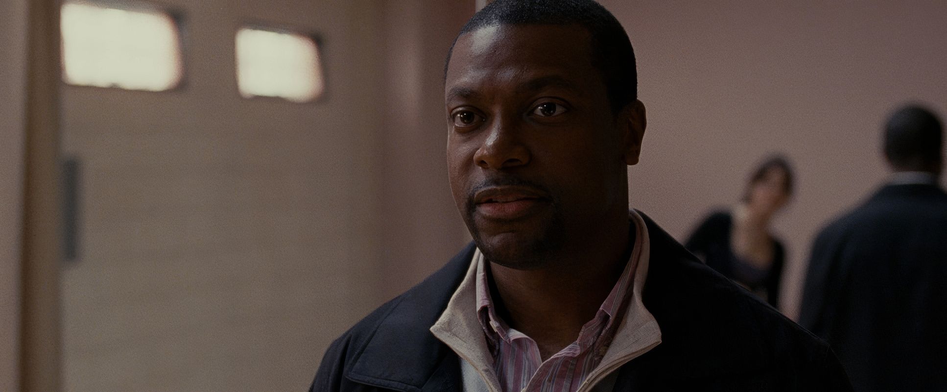
In the Solitano house, the lighting has an everyday, slightly lived-in quality. There are no “crushed” blacks or overly dramatic shadows that scream “film noir.” Instead, the dynamic range is handled with a soft touch, preserving detail in the shadows to maintain that grounded Philadelphia atmosphere. It’s a quiet approach that allows the performances to breathe without the distraction of “capital-C” Cinematography.
Lensing and Blocking

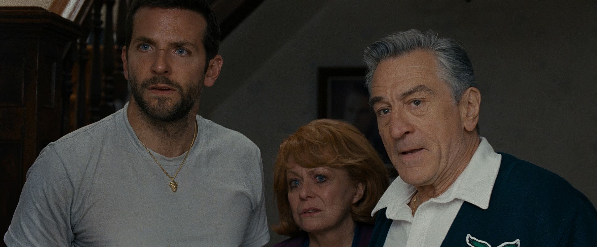
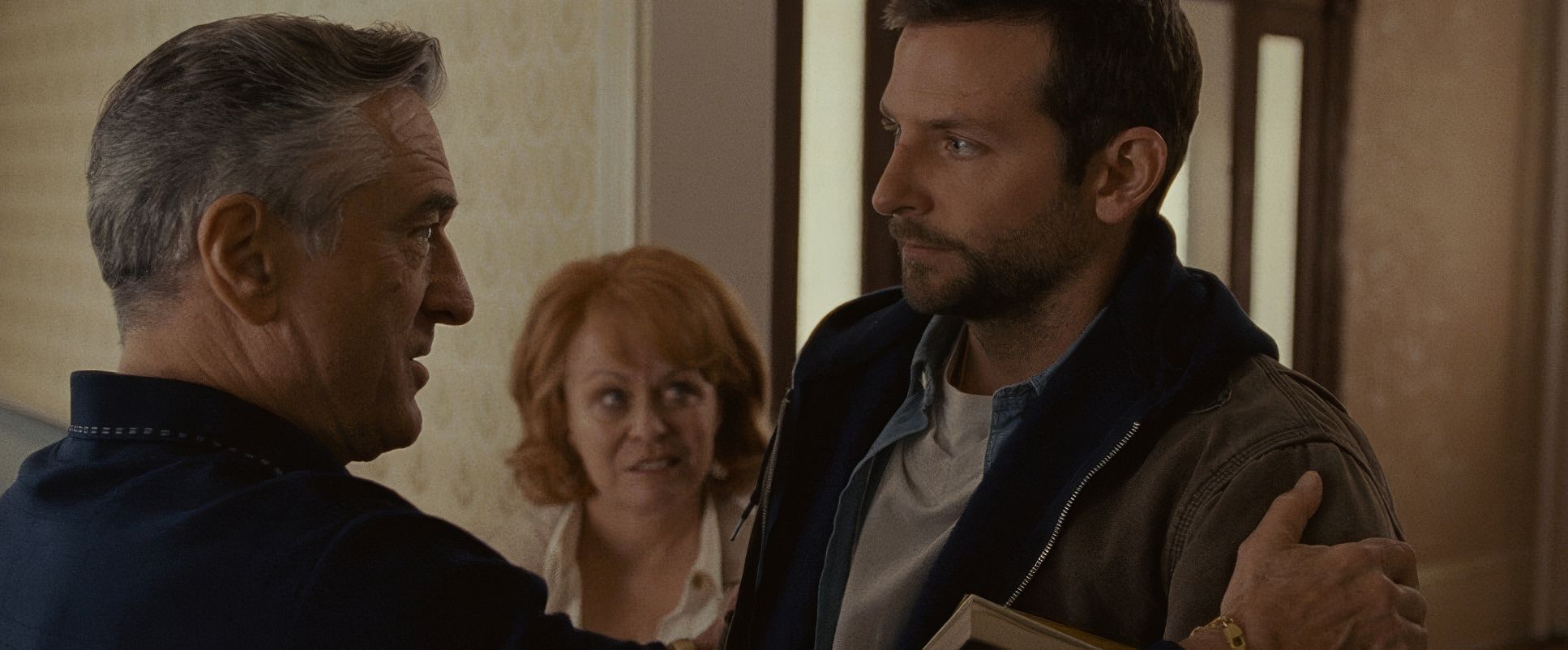
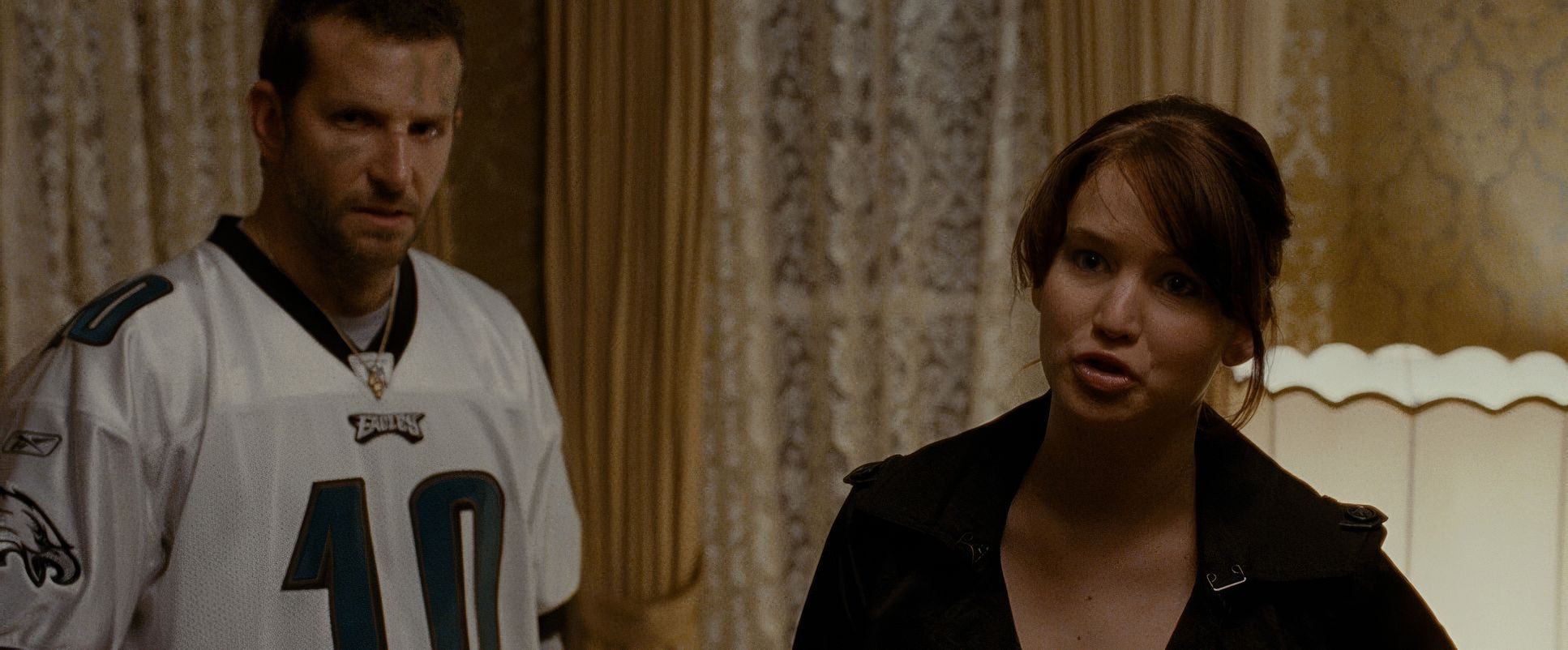
Because they were shooting handheld with Master Primes, the blocking feels wonderfully unscripted. Characters move in and out of each other’s personal space, and the camera just follows. It feels improvisational. When Robert De Niro and Bradley Cooper are in a scene, the physical interplay the gestures and the posture is just as important as the dialogue.
The use of wider focal lengths (even for close-ups) means we never lose the sense of the environment. We see the wood paneling of the walls and the clutter of the living room even when we’re focused on the actors. This choice makes the world feel “lived-in.” The blocking doesn’t feel like actors hitting marks; it feels like a family navigating a small house they’ve lived in for thirty years.
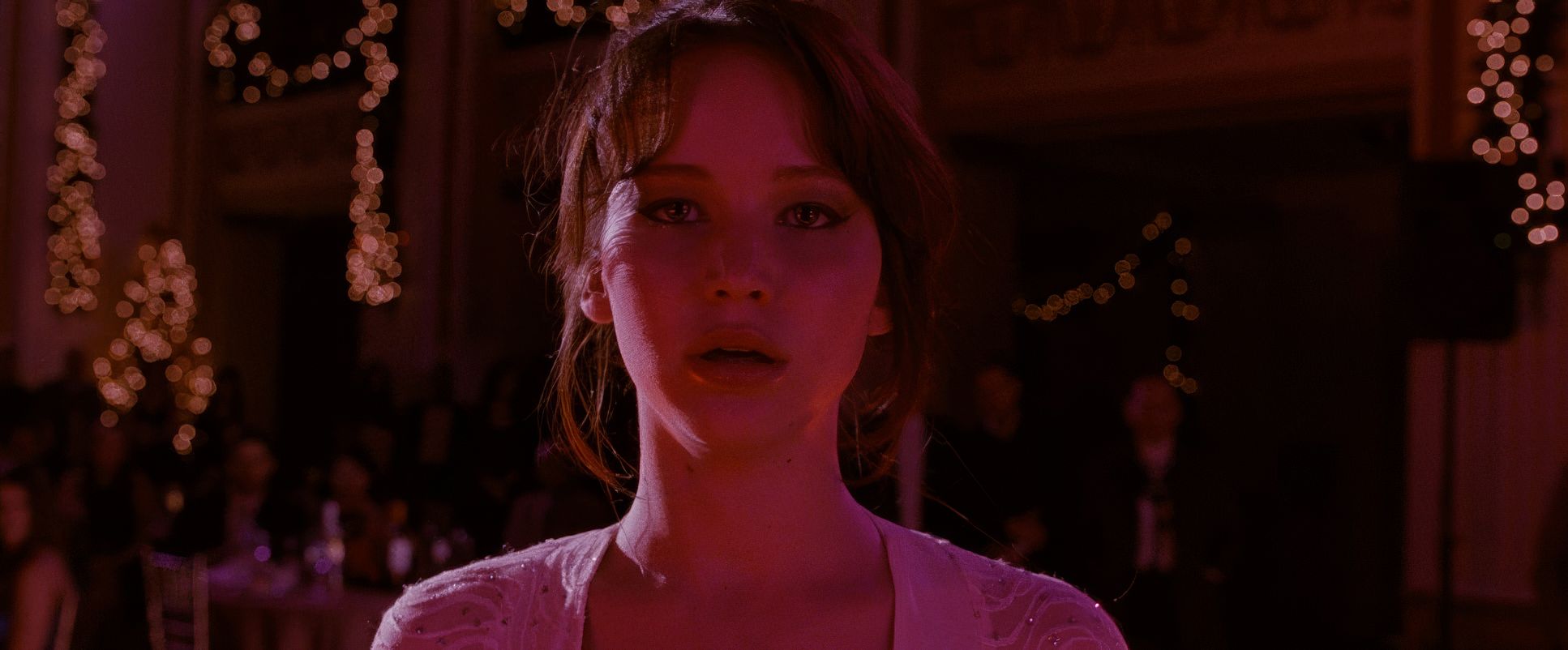
Color Grading Approach
As a colorist, I really appreciate what Tony Dustin did here. The grade isn’t trying to be a “look.” It feels like a high-quality film print naturalistic but with a clear intentionality. The palette has a slightly cool, gray-bias for the Philly exteriors, which makes the warmer, tungsten-heavy interiors feel like a refuge (even if they are chaotic).
The contrast isn’t punchy or “commercial.” There’s a rich mid-tone density that gives the image a photographic truth. I especially love the highlight roll-off on the film stock; look at the bright windows or the lamps in the background they don’t clip harshly like digital. They bleed into the frame with a soft, organic texture. The skin tones are kept incredibly authentic, which is vital for a film that relies entirely on human performance. It’s a masterclass in “invisible” grading the kind that makes the movie look beautiful without the audience ever realizing a colorist was involved.
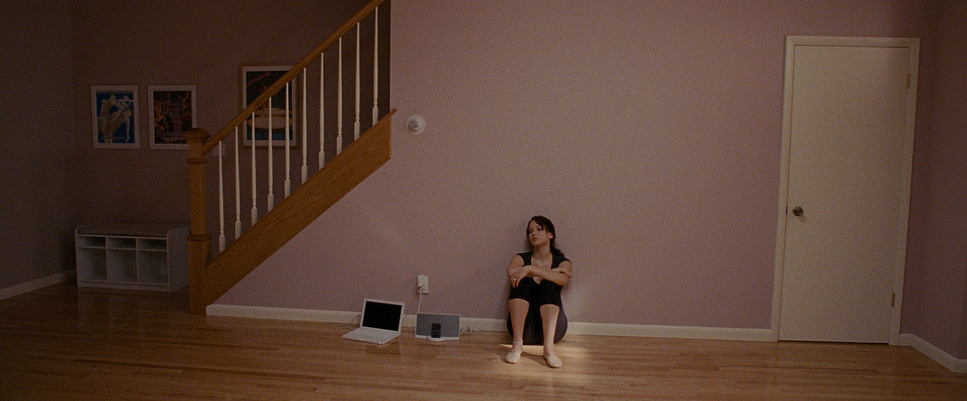
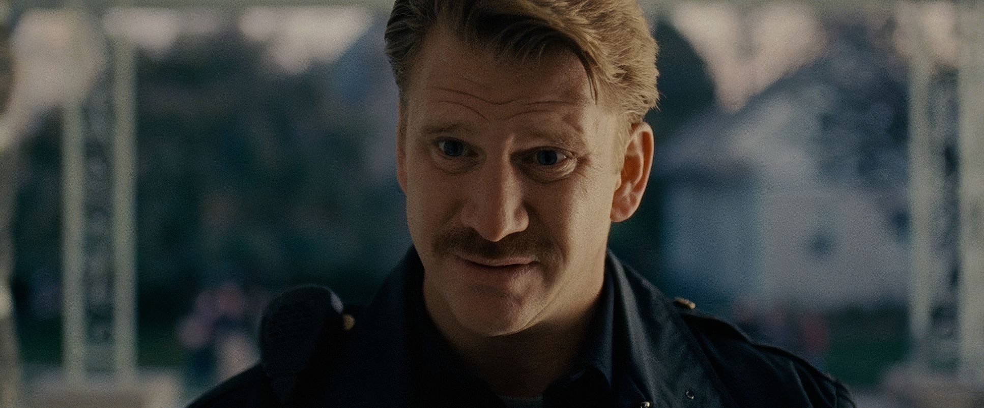
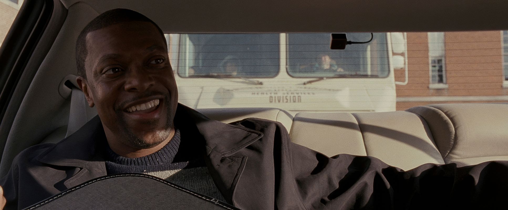
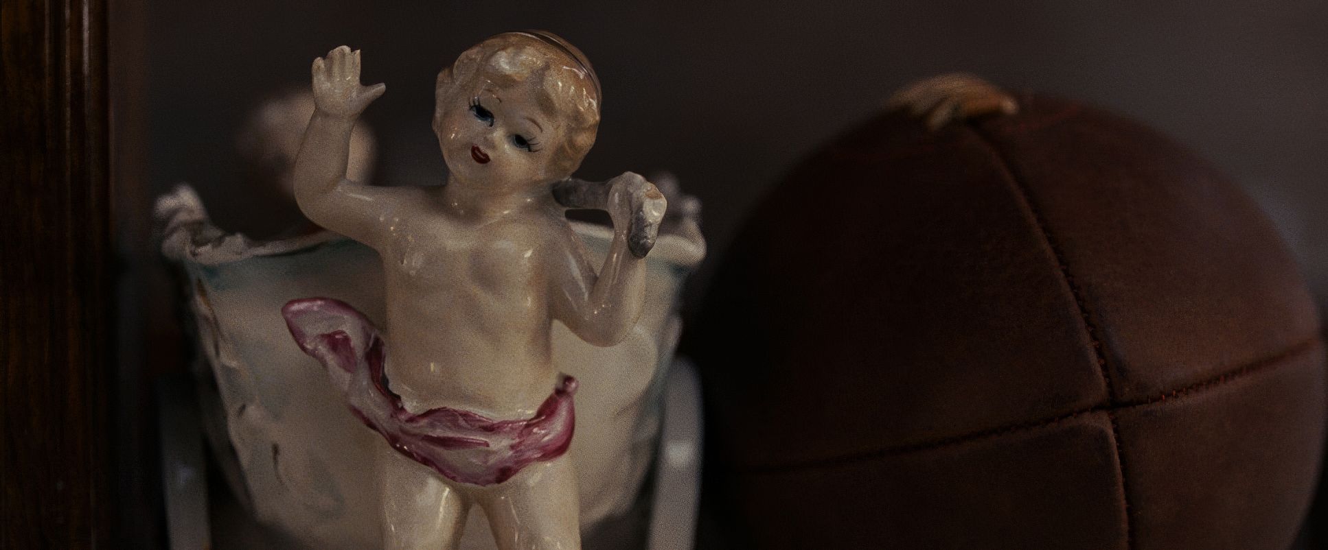
Silver Linings Playbook (2012) Film Stills
A curated reference archive of cinematography stills from Silver Linings Playbook (2012). Study the lighting, color grading, and composition.


- Also read: THE HANGOVER (2009) – CINEMATOGRAPHY ANALYSIS
- Also read: HARRY POTTER AND THE SORCERER’S STONE (2001) – CINEMATOGRAPHY ANALYSIS
Browse Our Cinematography Analysis Glossary
Explore directors, cinematographers, cameras, lenses, lighting styles, genres, and the visual techniques that shape iconic films.
Explore Glossary →