Let’s dive into Sicko, Michael Moore’s 2007 documentary that dared to shine a stark light on the American healthcare system. As a filmmaker and full-time colorist running Color Culture, I spend my days obsessing over how a single point of saturation or a specific tonal curve can change a viewer’s heart rate. With Sicko, the visual language isn’t just an aesthetic choice it’s the film’s strongest weapon. It’s not just about what the camera captures; it’s about how that frame shapes our outrage, our empathy, and ultimately, our understanding of a broken system.
Moore is often dismissed as a mere “provocateur” or a performance artist, but looking at Sicko through a professional lens reveals a visual grammar that is surprisingly direct and profoundly manipulative in the best way possible.
About the Cinematographer

While Moore is the face of the film, the heavy lifting behind the lens was handled by Andrew Black. In high-stakes documentary filmmaking, the DP’s role is basically “controlled chaos.” You’re moving from impromptu confrontations to rapid-fire production schedules where you can’t exactly ask for a second take of a genuine emotional breakdown.
Black’s work here is defined by an almost journalistic immediacy. There’s no room for flashy, “look-at-me” camera work.Instead, it’s about agility. Whether they were following Moore on a “stunt” or sitting in a quiet living room with a family facing bankruptcy, Black and his team had to be unflinching. It’s a tough tightrope to walk: you have to maintain raw authenticity while still delivering a compelling narrative arc. That’s not just technical skill; it’s an intuitive understanding of human psychology and knowing exactly when to let the camera linger.
Inspiration Behind the Cinematography

The core inspiration for Sicko’s look is Moore’s central, biting argument: the American healthcare system is profit-driven and, frankly, failing. To sell that, the visual strategy had to evoke empathy and quiet desperation.
In the film’s first half, the camera is an investigative tool. It’s intimate sometimes uncomfortably so. It lingers on the “tales of woe” with a grounded, bleak realism. But then, notice the shift. When Moore travels to Canada, the UK, or France, the cinematography breathes. The look becomes cleaner, perhaps even a bit idealized. It’s a deliberate visual contrast. Moore paints “rosy” portraits of international systems to make the American “grimness” feel even more inexcusable. The visual language itself becomes a rhetorical device, pushing us to ask: Why don’t we have this?
Lensing and Blocking
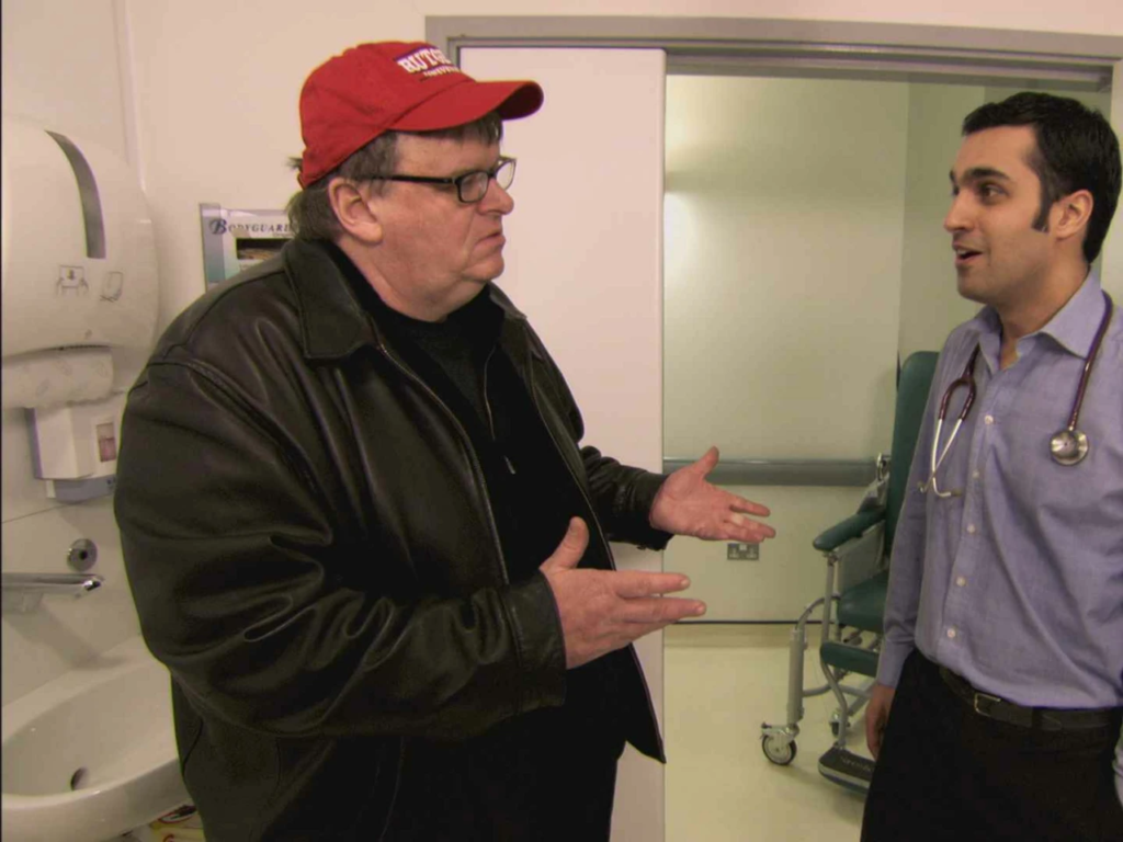
The lens choices in Sicko are all about the distance between the viewer and the pain. Wider lenses (think 20mm or 35mm equivalents) are used to swallow the subjects. We see them dwarfed by the massive, impersonal architecture of hospitals or the endless paperwork in an insurance office. It makes the individual feel small an ant in a machine.
Conversely, when things get personal, we move to normal or mild telephoto lenses. This is where Moore’s “ruthlessness” comes in. The camera bears down on a grieving mother or a widow, catching every micro-expression of pain. These lenses compress the background, forcing us to ignore the world and focus solely on the person’s suffering. The blocking isn’t pre-planned like a feature film, but it’s strategic. It’s about Andrew Black finding the angle that captures the most “truthful” performance on the fly, keeping the camera in a position of challenge or quiet witness.
Conversely, when things get personal, we move to normal or mild telephoto lenses. This is where Moore’s “ruthlessness” comes in. The camera bears down on a grieving mother or a widow, catching every micro-expression of pain. These lenses compress the background, forcing us to ignore the world and focus solely on the person’s suffering. The blocking isn’t choreographed like a feature film, but it’s strategic. It’s about the DP finding the angle that captures the most “truthful” performance on the fly, keeping the camera in a position of challenge or quiet witness.
Camera Movements
Forget elaborate dolly shots. In Sicko, handheld is king. And for good reason. Handheld motion isn’t just “shaky cam”; it’s an injection of raw authenticity. It makes us feel like witnesses, not just passive observers. When the camera sways slightly while recording a woman wrangling with her insurance company, it humanizes the frame. It feels personal and urgent.
Beyond the handheld “eyewitness” feel, the film uses deliberate zooms and pans. A slow pan across a hospital waiting room quietly underscores the sheer scale and the anonymity of suffering. A sudden zoom in on a face during a Moore interview is a classic doc technique to isolate an emotional beat. It’s not about aesthetics; it’s about utility. Every movement serves to reinforce the vulnerability of the people Moore is championing.
Compositional Choices
Composition in Sicko is a masterclass in emotional storytelling. The most striking choice? The close-ups. Moore is famous for showing people crying at least seven or eight major instances in this film. These aren’t accidents. They are tightly framed, stripped-down shots designed to elicit profound empathy.
Then, there’s the negative space. When depicting systemic problems, Black often uses wider shots that show patients lost in the scale of the institutions. It’s a visual push-pull: the suffocating intimacy of a close-up versus the crushing loneliness of a vast, impersonal waiting area. The compositions guide the viewer’s eye through leading lines like a long, receding hospital corridor suggesting an uncertain or inaccessible future for those within it.
Lighting Style: The “Fluorescent-Bleak” Aesthetic
As a colorist, I look at the lighting in Sicko and see a world of “motivated naturalism.” We aren’t looking at “pretty” three-point lighting. We’re looking at the harsh, utilitarian reality of fluorescent office lights and sun-drenched, unvarnished living rooms.
But don’t be fooled”naturalistic” doesn’t mean “unplanned.” A pro like Andrew Black knows how to work with available light to make it feel even more “real.” In the US segments, the lighting often feels cooler and harsher, with deep shadows that enhance the sense of dread. When we move to the “humane” systems of Europe, the lighting softens. It’s brighter, more even, and frankly, more inviting. It’s a delicate dance between capturing authenticity and using light to nudge the audience’s emotions.
Color Grading Approach: My Domain
This is where my world truly intersects with Sicko. If I were the lead colorist on this project, the grading would be my primary tool for shaping the audience’s gut reaction.
For the American chapters, I’d push for a slightly desaturated, cool aesthetic. We’d use contrast shaping to keep the blacks rich but preserve detail in those dark hospital corners. I’d want a gentle highlight roll-off to give the digital footage a more filmic, melancholic texture. It’s about building an atmosphere of gravity.
When the film transitions to Canada or France, I’d pivot. I’d introduce hue separation pushing for warmer skin tones, richer blues, and more luminous greens. It’s not about making it look like a cartoon; it’s about making the image feel healthy. I also love to use tonal sculpting, perhaps using subtle vignettes to draw the eye toward a subject’s eyes in a crowded scene. As a colorist, I always aim for “print-film sensibilities” adding a touch of organic grain to ensure the image feels human, not sterile and digital.
Technical Aspects & Tools
Back in 2007, the digital revolution was still finding its legs. Sicko was likely shot on high-definition (HD) digital video cameras, which fit Moore’s run-and-gun style much better than 16mm film would have.
Likely candidates from that era were professional HD camcorders from Panasonic (like the Varicam series) or Sony (the CineAlta series). These cameras offered just enough dynamic range to handle the tricky lighting of hospital interiors without losing the highlights. In the edit suite using Avid or Final Cut Pro and later in the color suite (likely DaVinci Resolve or Apple Color), the team would have meticulously managed the codec and recording formats to ensure they had the flexibility to create the visual shifts we’ve discussed. Even with the limitations of 2007 tech, they managed to craft a robust, professional image that still holds up.
- Also read: DARA OF JASENOVAC (2020) – CINEMATOGRAPHY ANALYSIS
- Also read: WHO’S AFRAID OF VIRGINIA WOOLF? (1966) – CINEMATOGRAPHY ANALYSIS
Browse Our Cinematography Analysis Glossary
Explore directors, cinematographers, cameras, lenses, lighting styles, genres, and the visual techniques that shape iconic films.
Explore Glossary →