I’m obsessed with fixing skin tones or balancing exposure, but recently I re-watched Shrek. Twenty-plus years later, I realized something surprising: this movie isn’t just a meme factory; it’s a masterclass in visual storytelling.
Shrek was the first-ever Oscar winner for Best Animated Feature, but more importantly, it was a middle finger to the industry standard. It arrived like a grumpy ogre stomping through the manicured gardens of Disney, dismantling everything we knew about fairy tales. This subversion wasn’t just in the script or the voice acting; it was baked into the image itself. The lighting, framing, and texture of the world did just as much heavy lifting as the jokes.
About the Cinematographer
In animation, “cinematography” is a bit of a misnomer. There isn’t one person holding a camera; it’s a committee of layout artists, lighting supervisors, and directors working in a vacuum. For Shrek, the challenge was massive: they had to invent a visual language that felt “real” enough to ground the story, but stylized enough to be funny.
The team didn’t just render pixels; they simulated lens choices and blocking as if they were on a physical set. The rumor has always been that the initial spark came from Spielberg, who saw the philosophical potential in the source material, but it was DreamWorks that had to build the pipeline to pull it off. They weren’t just making a cartoon; they were trying to emulate live-action cinema inside a computer.
Inspiration Behind the Cinematography
The visual strategy for Shrek was simple: take the Disney rulebook and set it on fire. For decades, animated fairy tales looked pristine flat lighting, saturated primary colors, and clean lines. Shrek leaned into the grit.
The opening sequence tells you everything. Instead of a sweeping crane shot over a sparkling castle, we open on an ogre showering in mud. This wasn’t just a gag; it was a visual statement of intent. The cinematography establishes a world that feels texturally gross and earthy. Shrek’s swamp is messy and chaotic, a direct contrast to the geometric perfection of Sleeping Beauty’s world. The team deliberately designed a “DreamWorks style” that prioritized texture and imperfection over the polished veneer of their competitors.
Camera Movements
Where traditional animation often floats the camera to feel “magical,” Shrek keeps it heavy. The camera feels grounded, often simulating the weight of a handheld operator.
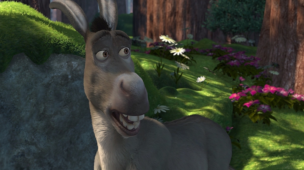
When Shrek and Donkey are trekking, the camera stays at eye level, making us feel the distance. It’s not afraid to be a little shaky or reactive, especially when Donkey is bouncing around the frame. It mimics the energy of a documentary rather than a stage play. This choice paradoxically makes the fantasy elements feel more real. When Fiona fights Robin Hood’s men, the camera whips around with dynamic energy it feels like an action movie, emphasizing her brutality rather than her grace. The movement is driven by character motivation, not just because the animators wanted to show off the 3D space.
Compositional Choices
The framing in Shrek is all about contrast.
For Shrek, we get wide shots that emphasize his isolation. He fills the frame, often surrounded by the negative space of his swamp. It visually communicates his desire to be left alone without a single line of dialogue.
Then you have Lord Farquaad’s Duloc. This place is a nightmare of rigid symmetry. If you look closely, Duloc is framed with oppressive, straight lines and geometric perfection. Farquaad is frequently center-punched in the frame, surrounded by empty space or identical knights, which highlights his obsession with control (and compensates for his height). It’s visual shorthand for fascism disguised as a theme park. The contrast between the organic mess of the swamp and the sterile geometry of Duloc creates the film’s central conflict before the characters even meet.
Lighting Style
As a colorist, lighting is where I really geek out on this film. Shrek’s lighting was revolutionary because it introduced “atmosphere” to 3D animation.
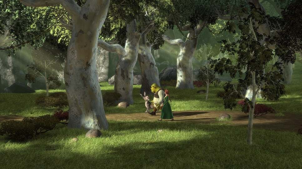
The swamp is bathed in motivated, natural light. You get dappled sunlight breaking through trees and soft, ambient bounces. The highlights have a gentle roll-off, avoiding that harsh, clipped “digital” look that plagued early 2000s CGI. It feels humid.
Duloc, by comparison, looks like a sitcom set. The lighting is flat, bright, and uniform. There are barely any shadows. It looks artificial because it is artificial.
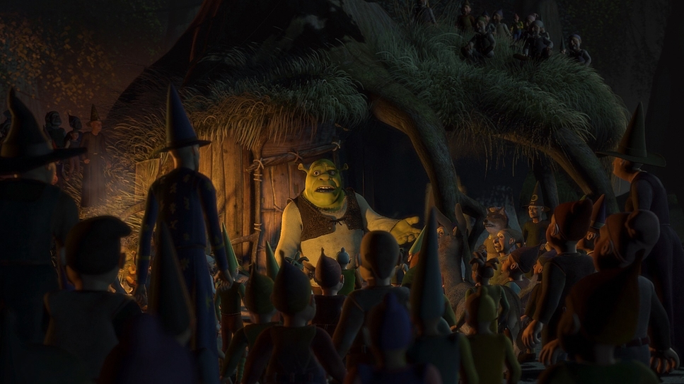
The standout for me is the Dragon’s Keep. The team used motivated lighting from the torches to cast flickering, dramatic shadows. It feels like a horror movie setup. For a film made when global illumination was still in its infancy, the way they handled light wrapping around skin and fabric is technically impressive. They managed to give the world weight through shadow density.
Lensing and Blocking
Shrek generally avoids the wacky, “elastic” lenses of cartoons. You don’t see massive distortion unless it’s for a specific comedic beat. Instead, they stuck to what feels like 35mm and 50mm equivalents grounded, human focal lengths. This helps us connect with Shrek as a person, not a caricature.
The blocking (where characters stand) does the rest of the work. Watch the early scenes with Donkey: he is constantly invading Shrek’s personal space, forcing himself into the foreground. Shrek tries to turn away, but the blocking forces them together.
Conversely, Farquaad is often placed on high balconies or at the end of long tables. Even when he’s tiny in the frame, the blocking forces everyone else to look up at him. It’s a textbook use of power dynamics in staging.
Color Grading Approach
While this movie wasn’t “graded” in a DaVinci Resolve suite like we do today, the final look was meticulously crafted by the art and lighting departments to emulate a film print.
The palette is distinct. Shrek isn’t just “green”; he’s a specific, desaturated mossy hue that anchors the image. The world has a “film density” to it the shadows are rich and heavy, sitting low on the waveform, unlike the lifted, milky shadows of cheaper animation.
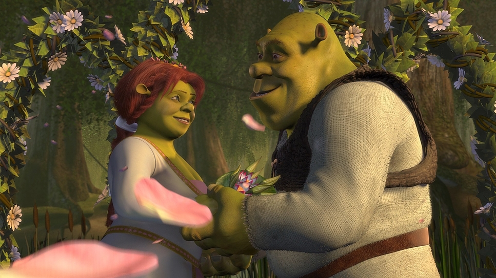
The hue separation is excellent. Characters pop against backgrounds not because of outlines, but because of complementary color theory. Fiona’s transformation is the ultimate color story: she goes from the warm, golden tones of a princess to the verdant, earthy tones of an ogre. The film visually rewards this shift, treating the green palette as the “correct” and happy conclusion. It’s a sophisticated use of color psychology that holds up incredibly well.
Technical Aspects & Tools
| Shrek – Technical Specifications | |
|---|---|
| Genre | Adventure, Animation, Comedy, Family, Fantasy, CGI Animation, Satire, Rom-Com, Romance, Fairytale |
| Director | Andrew Adamson, Vicky Jenson |
| Production Designer | James Hegedus |
| Costume Designer | Isis Mussenden |
| Editor | Sim Evan-Jones |
| Colorist | Terry Claborn |
| Time Period | Renaissance: 1400-1700 |
| Color | Warm, Saturated, Yellow |
| Aspect Ratio | 1.78 |
| Format | Animation |
| Lighting Type | Daylight |
We have to remember that in 2001, this was bleeding-edge tech. There’s an old industry joke that half the budget went into the physics engine just to get the milk to pour correctly in the Gingerbread Man scene. While that’s an exaggeration, the struggle was real.
Simulating fluids, mud, and hair (the “shampoo effect”) was a nightmare back then. The lighting team had to fight the software to get soft shadows and realistic bounces. The fact that Shrek’s skin has texture and responds to light changes was a massive leap forward. They weren’t just animating; they were writing new code to simulate physics. This technical foundation is what allowed the “cinematography” to shine you can’t have moody lighting if your render engine can’t calculate a soft shadow.
- Also read: THOR: RAGNAROK (2017) – CINEMATOGRAPHY ANALYSIS
- Also read: IRON MAN (2008) – CINEMATOGRAPHY ANALYSIS
Browse Our Cinematography Analysis Glossary
Explore directors, cinematographers, cameras, lenses, lighting styles, genres, and the visual techniques that shape iconic films.
Explore Glossary →