Let’s dig into Short Term 12. This 2013 indie gem is a masterclass in understated storytelling. It feels effortless, yet every frame is clearly intentional.
When a film lands this authentically, you have to look at the craft behind it. Short Term 12 isn’t a blockbuster. It doesn’t rely on spectacle. Instead, it captures the human condition in a way that’s rare to see. It drops you into a foster care center for troubled teens and makes you feel every tremor of hope and every quiet struggle. For me, dissecting its cinematography is about understanding how simple, honest choices create empathy.
It isn’t just about pretty pictures; it’s about making the audience feel invested from the first frame to the last.
About the Cinematographer
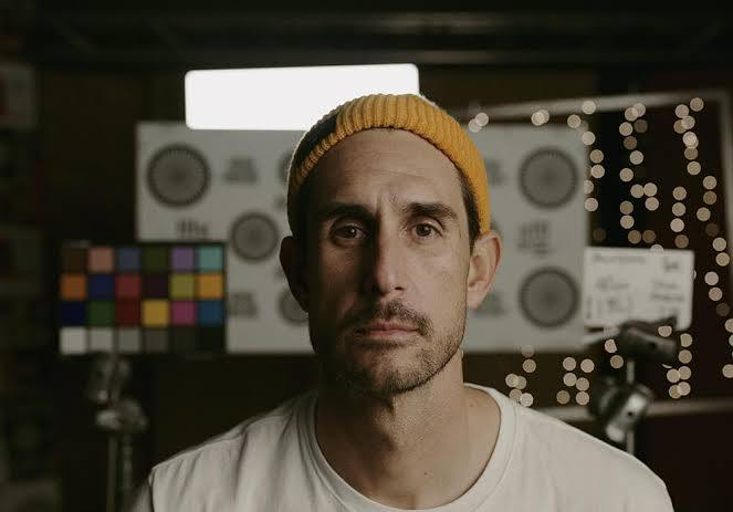
The raw honesty we see on screen belongs to Brett Pawlak. He’s a frequent collaborator with writer-director Destin Daniel Cretton, and you can tell their partnership is built on a shared language of nuanced human experience. Pawlak’s style is quiet and observational. He doesn’t draw attention to the camera; he subtly guides your eyes.
For a story this delicate, that collaborative vibe is everything. Pawlak doesn’t show off with a “signature” style that gets in the way of the actors. Instead, his work feels organic like an extension of the characters’ inner lives. It’s a tough balance to strike: being present enough to guide the story, but invisible enough not to distract. Pawlak nails it.
Inspiration Behind the Cinematography
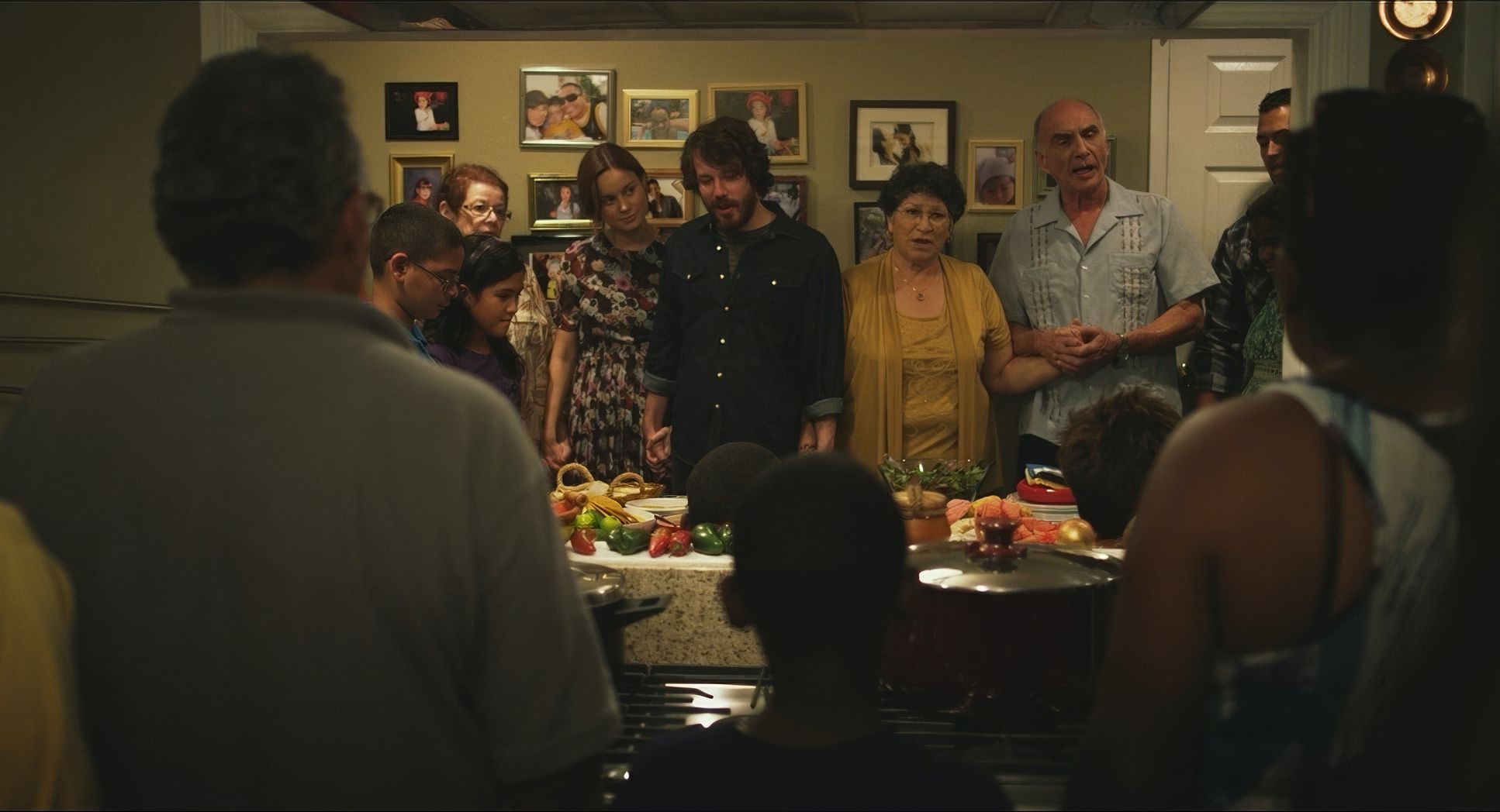
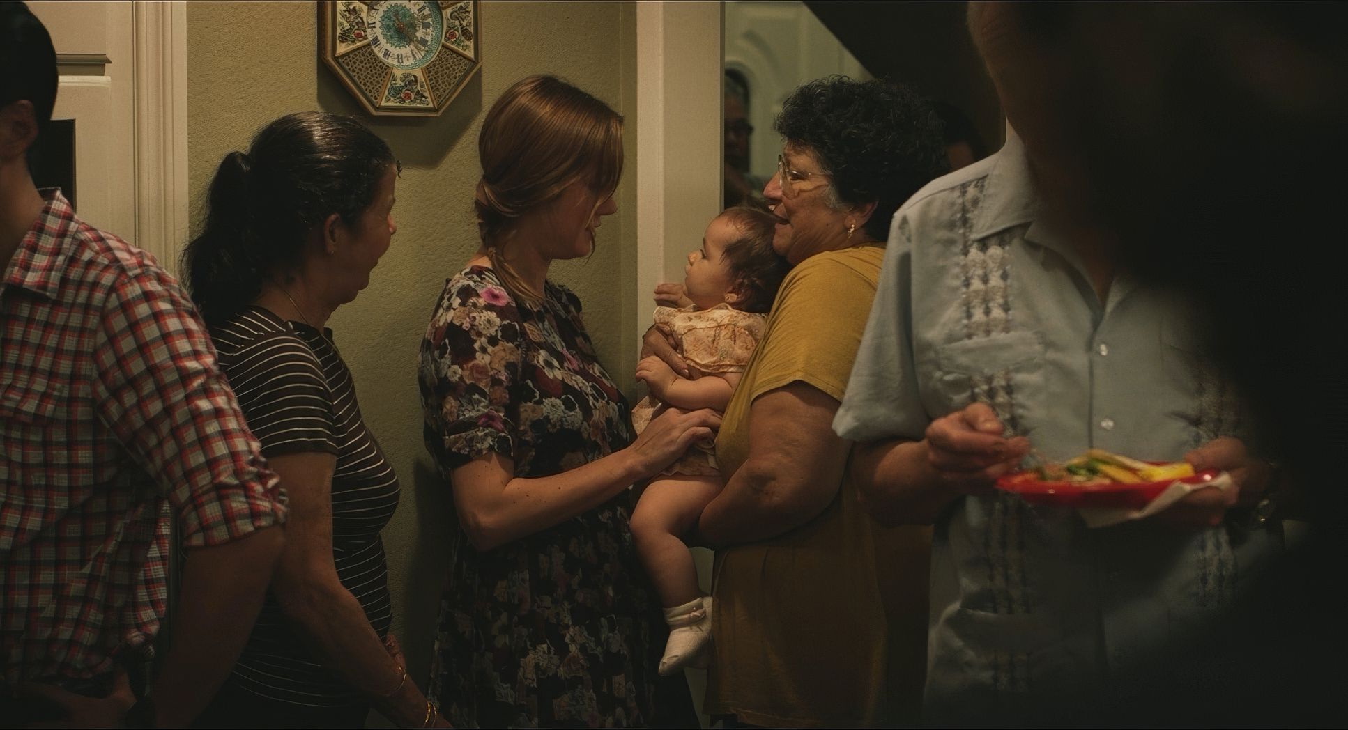
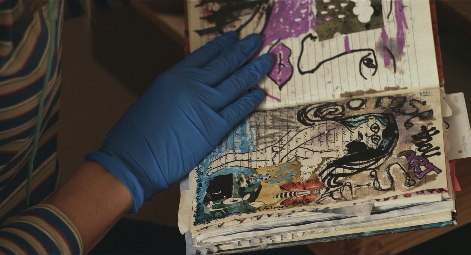
The defining trait of Short Term 12 is how real it feels. A lot of that comes from Destin Daniel Cretton’s documentary background. You can feel that influence in every scene. The goal wasn’t to dramatize or “glamorize” the foster care system, but to present it with total truth.
There’s a visual humility here. The camera acts like a careful observer rather than a storyteller trying to force a reaction. It reminds me of a Frederick Wiseman documentary direct, observational, and committed to showing life as it is. This visual language trusts us to interpret the emotions on our own. It creates an environment where no moment feels false, giving the performances room to breathe.
Technical Aspects & Tools
Short Term 12
RED Epic // Zeiss CP.2 // 5KFor a film this intimate, the gear choices were driven by performance, not just specs. They shot this on the RED Epicwith Zeiss Compact Prime CP.2 lenses.
On paper, that’s a very sharp, clean digital setup. But the craftsmanship lies in how they made that technology disappear. The agile, handheld work suggests a lightweight setup that allowed Pawlak to move freely with the actors. He wasn’t dictating their movements; he was reacting to them. The 5K resolution gave them plenty of room to work, but the final image feels far from “digital” or clinical. It feels human.
Camera Movements
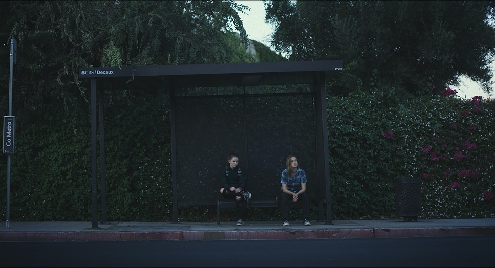
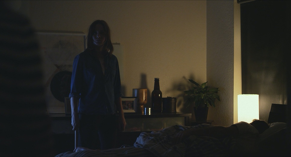
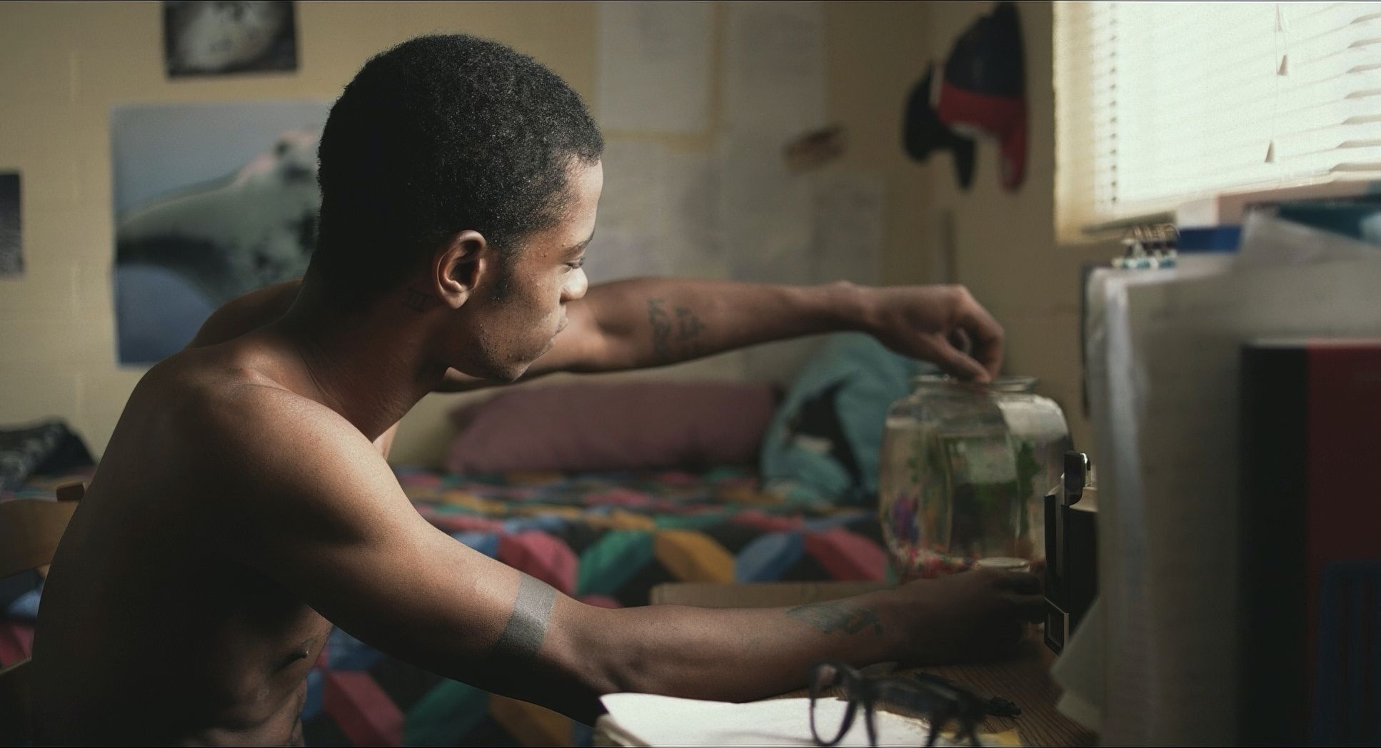
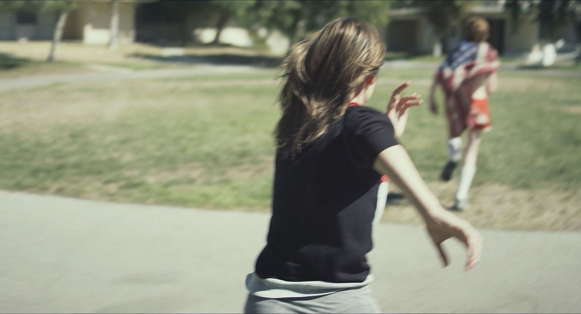
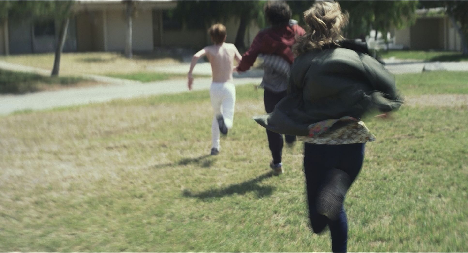
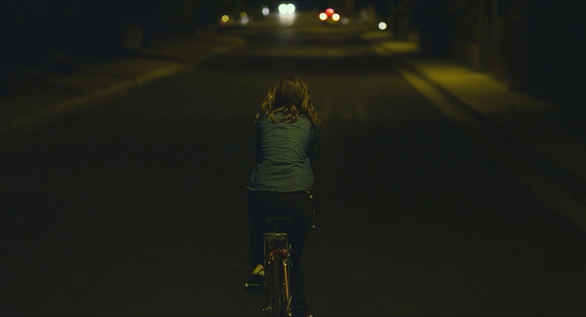
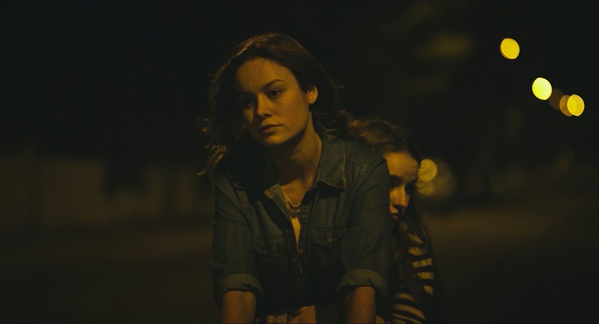
The movement in Short Term 12 is deliberate. The handheld nature gives it that immediate, “shaky” documentary feel, but it’s never gratuitous. It doesn’t give you a headache; it just places you in the room with Grace and the teens. It feels like you’re an invisible companion witnessing these raw interactions.
The film also uses long takes effectively. These allow scenes to unfold in real-time, letting the emotional beats build naturally without the interruption of a cut. When Grace is trying to connect with a kid, the camera stays on them. We see every subtle shift in expression and every breakthrough. It mirrors real life, where moments aren’t neatly edited.
Lensing and Blocking
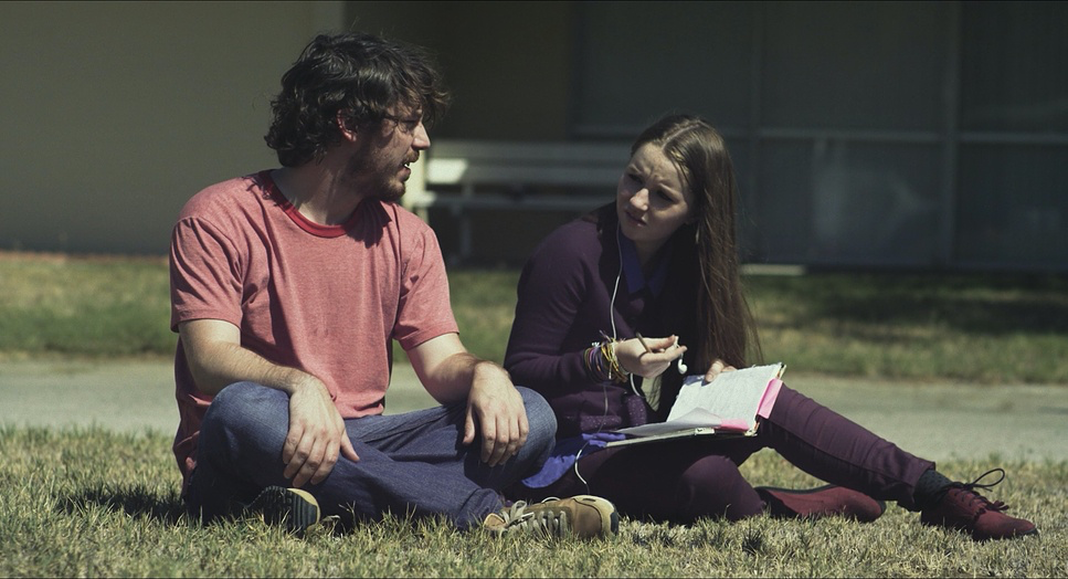
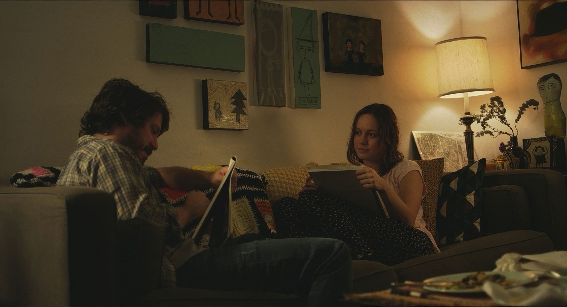
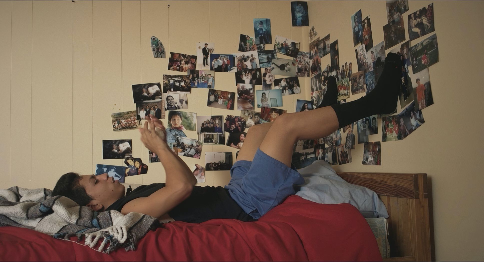
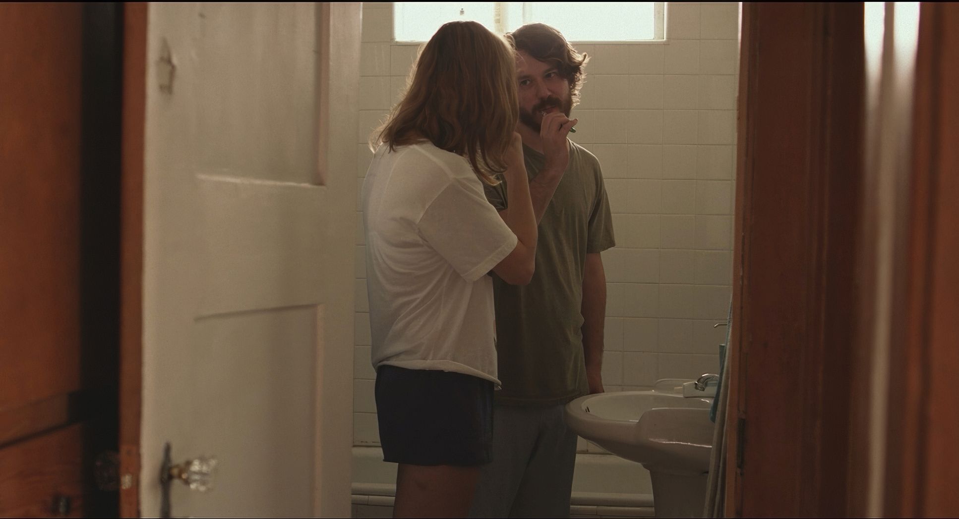
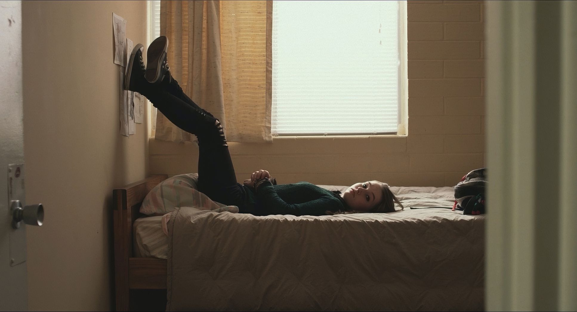
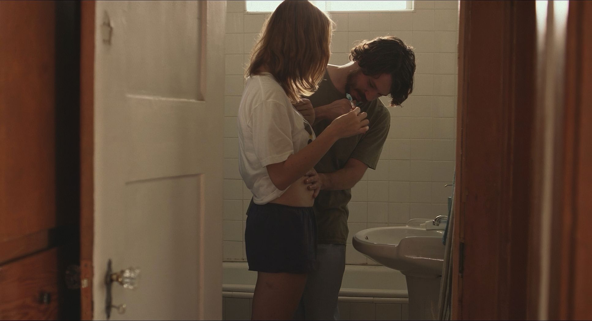
By sticking with the Zeiss CP.2 primes, they kept the perspective close to human vision. Most of the conversational scenes feel like they were shot on 28mm or 50mm lenses focal lengths that don’t distort the space. You don’t get those extreme wide-angle or telephoto looks that remind you you’re watching a movie.
The blocking follows suit. Actors aren’t rigidly hitting marks. They move through the messy common areas and staff rooms like real people would. The camera just adjusts to follow. This fluidity makes the world feel unscripted and keeps the “illusion” of reality intact.
Compositional Choices
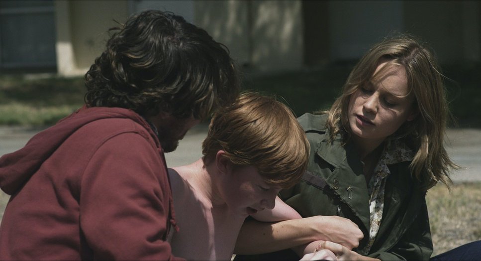
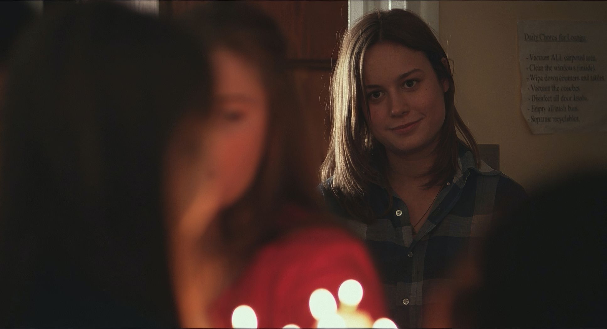
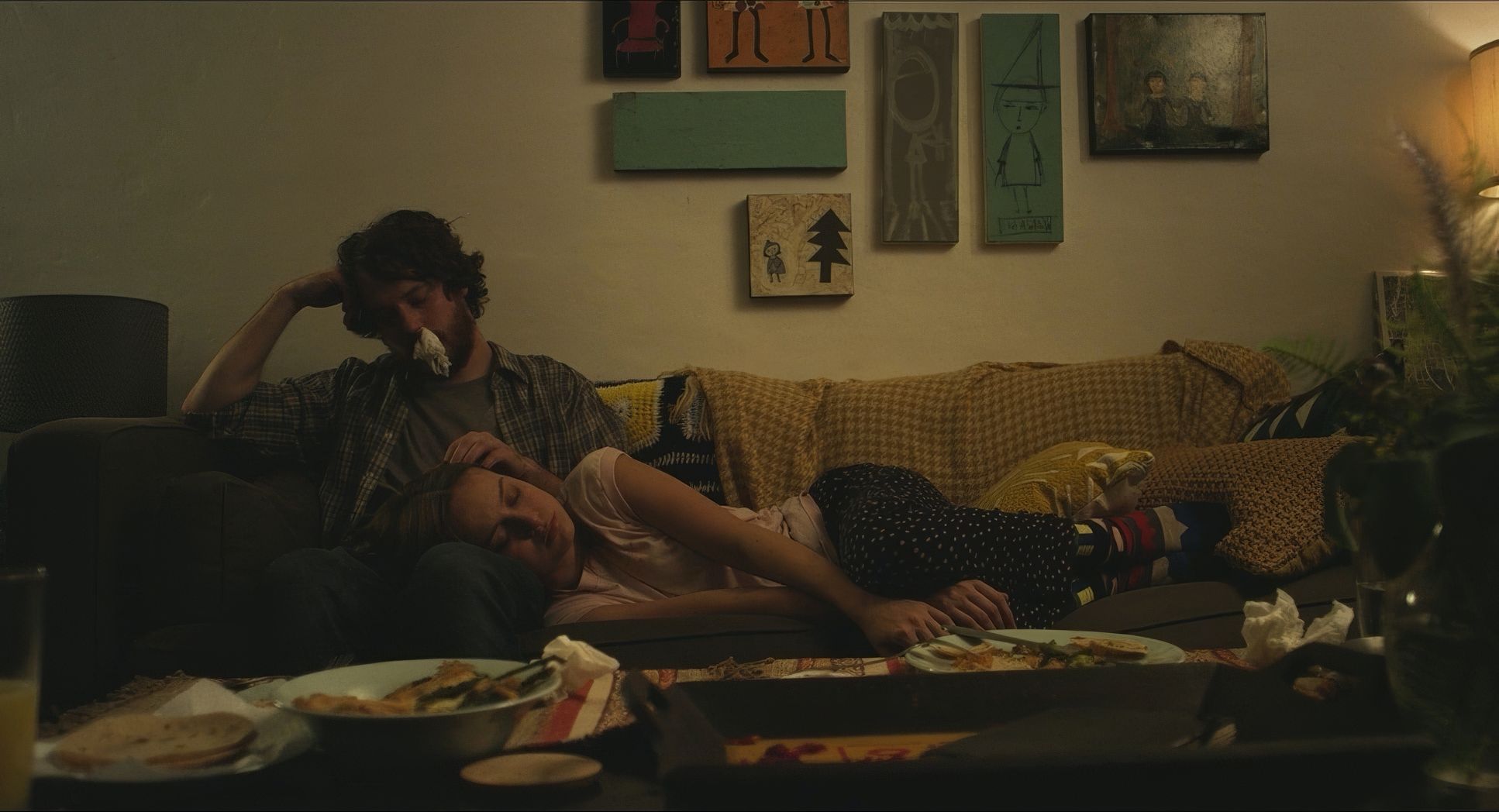
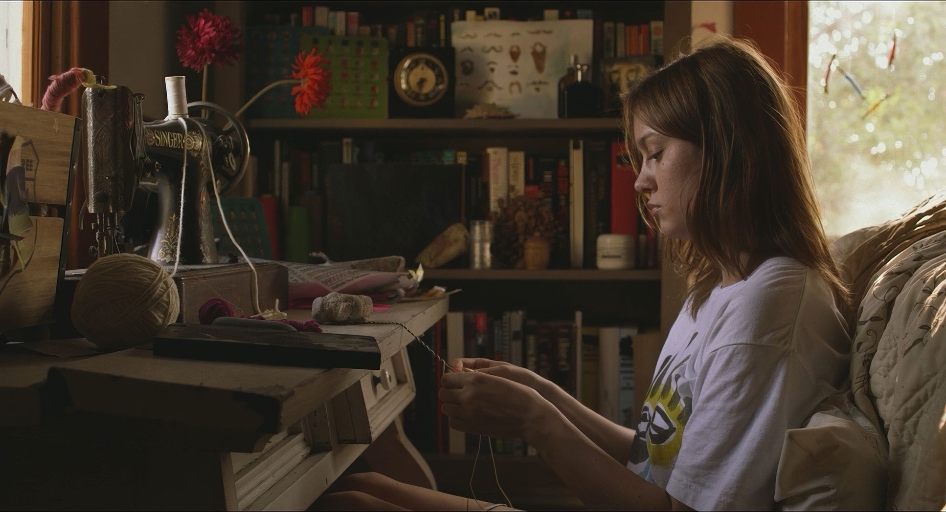
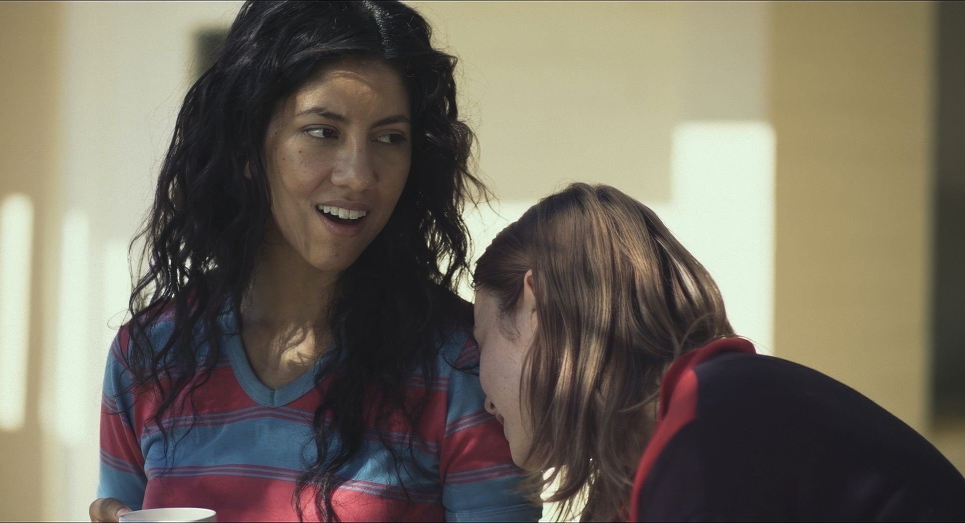
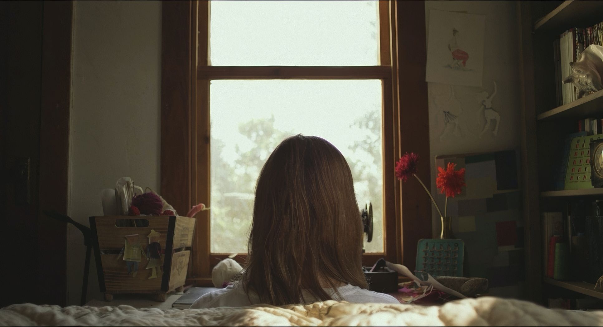
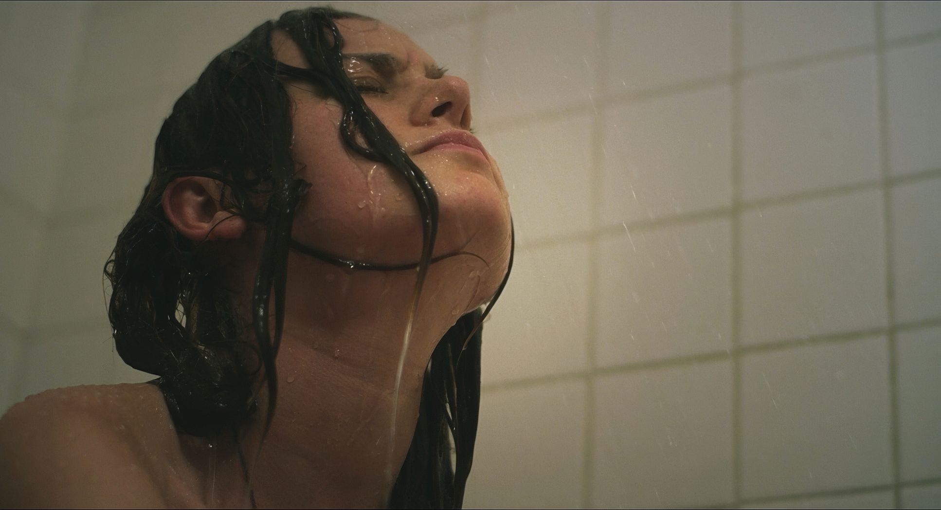
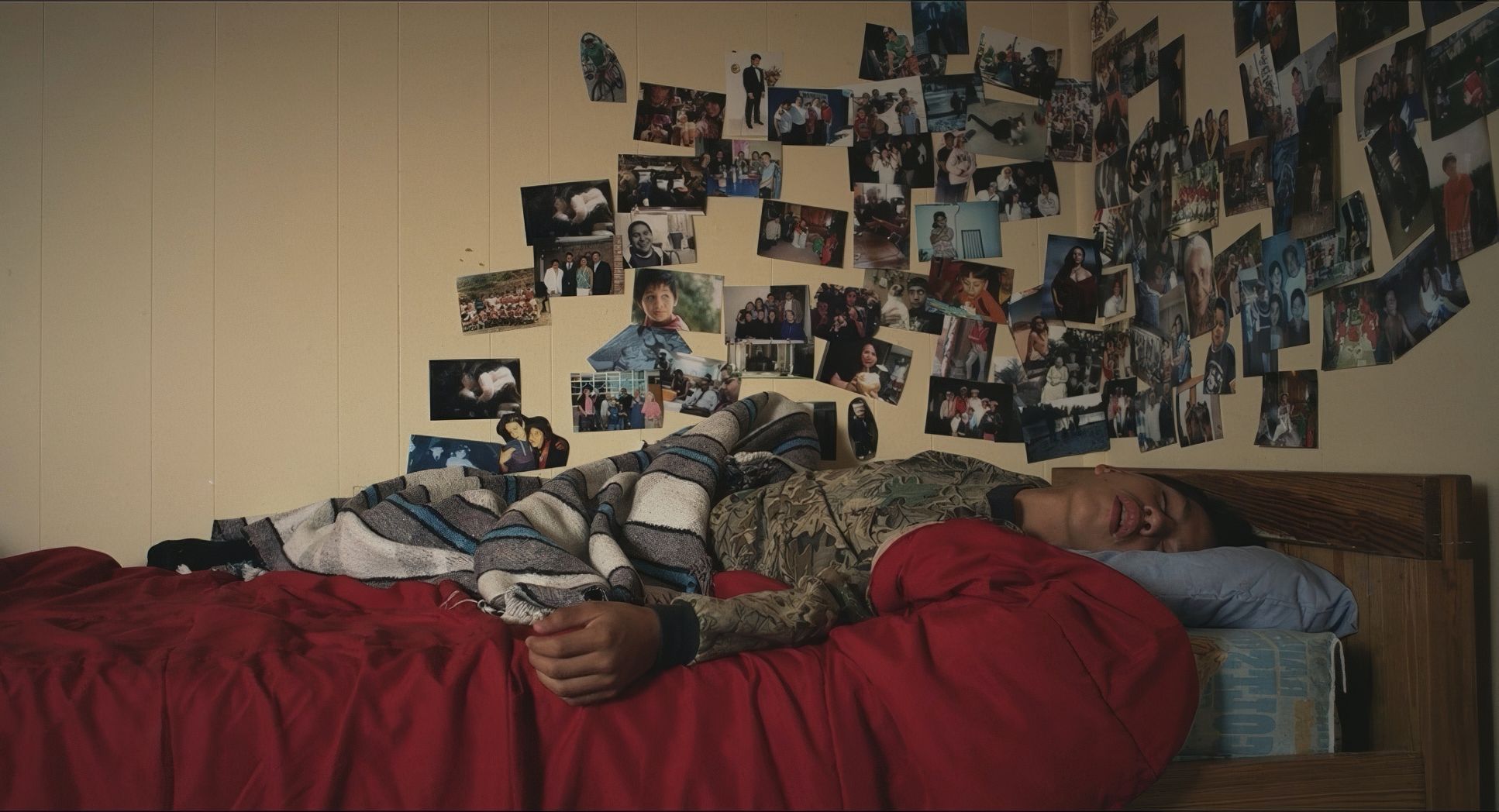
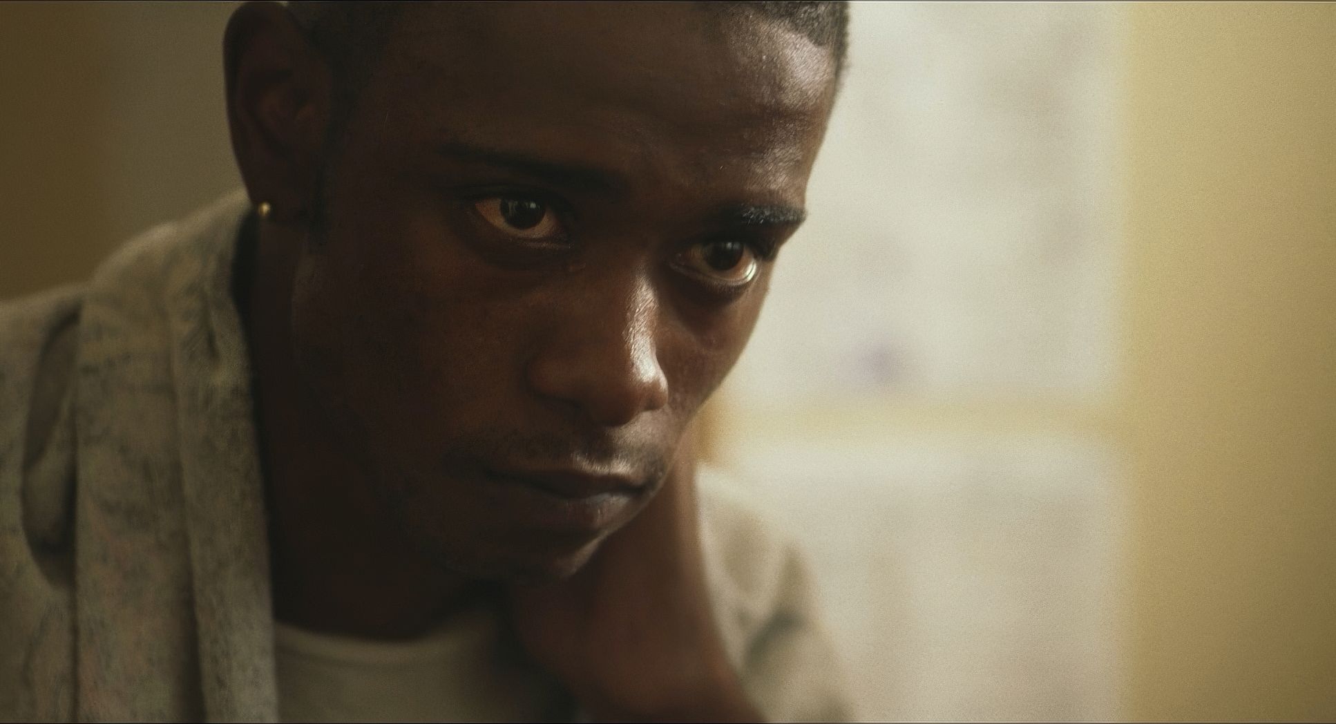
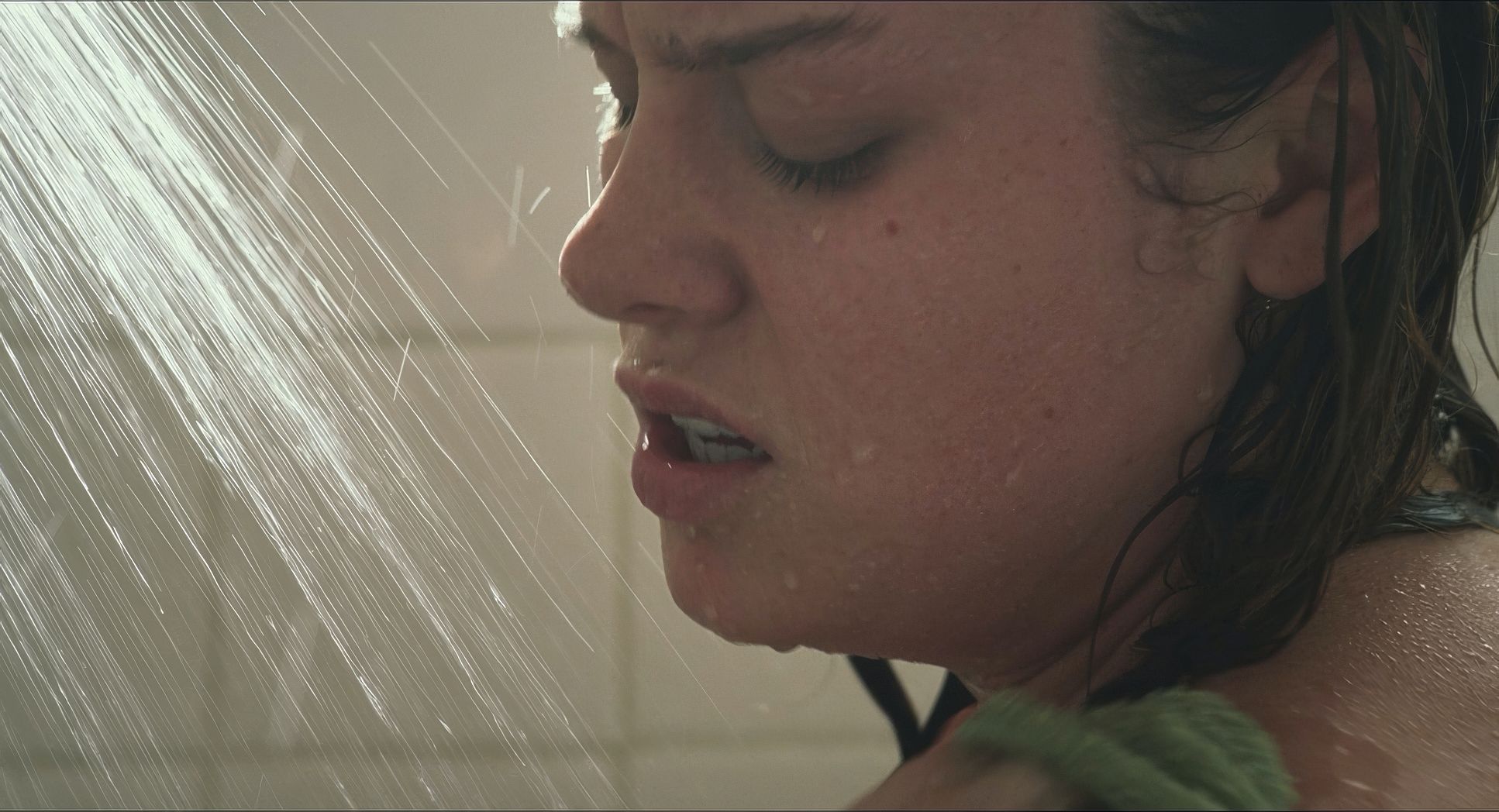
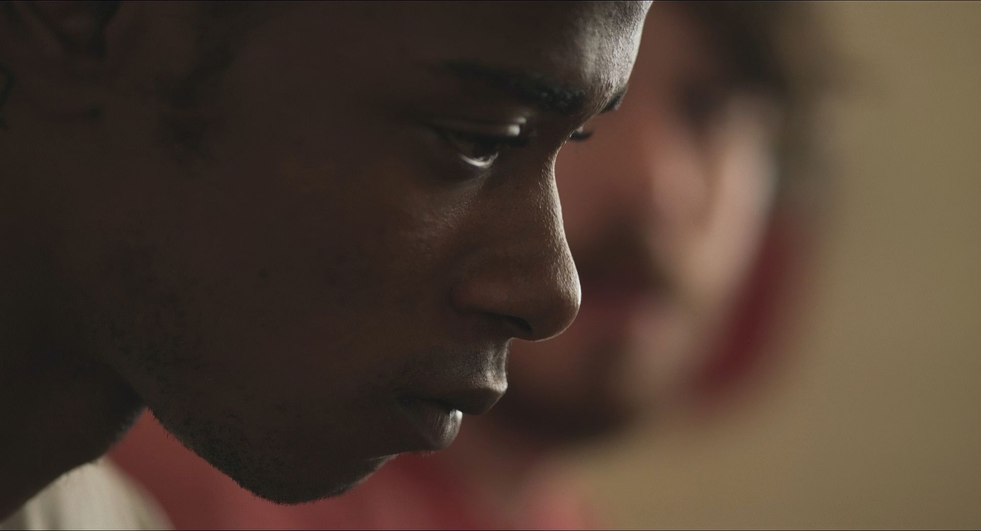
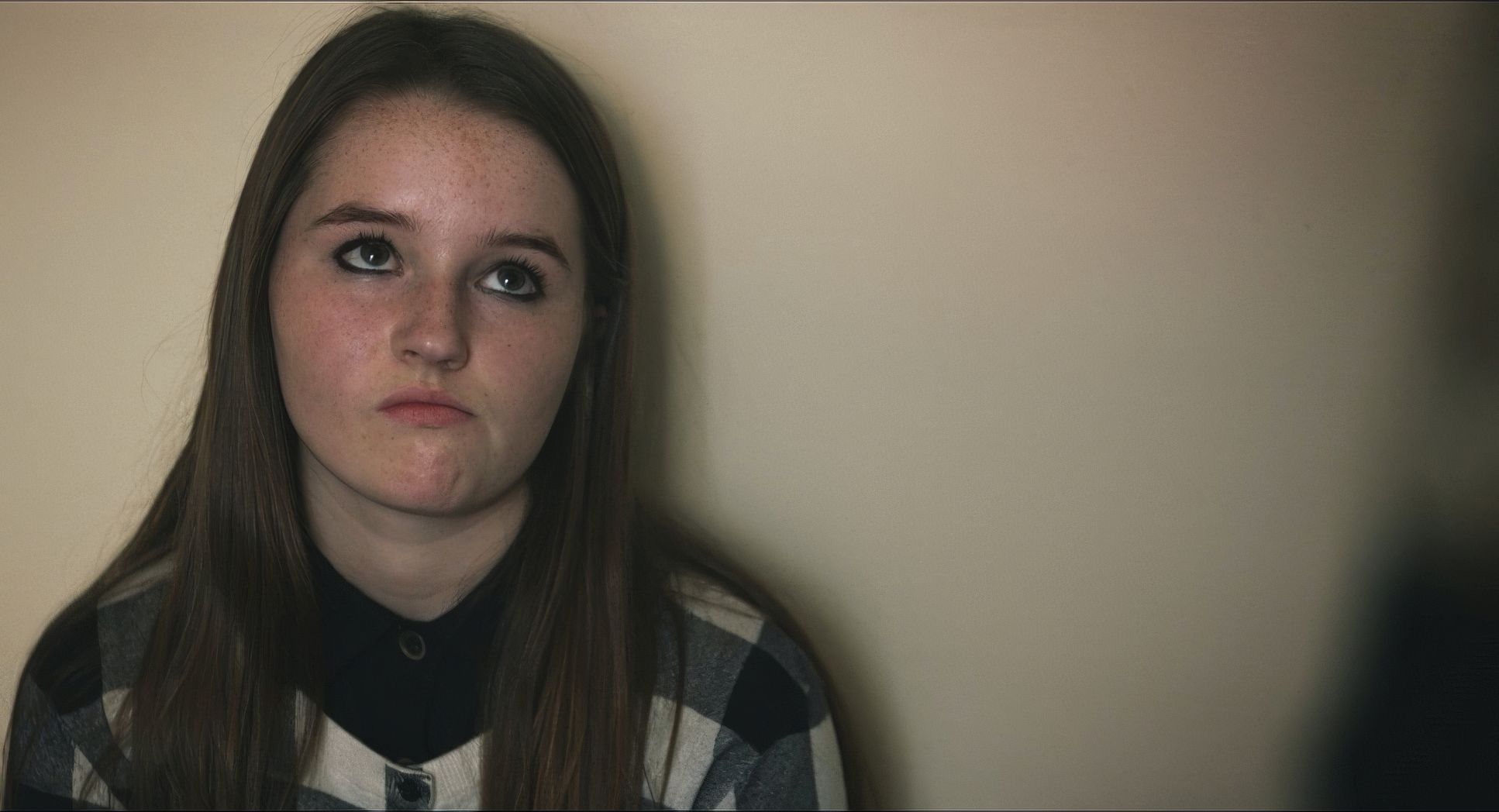
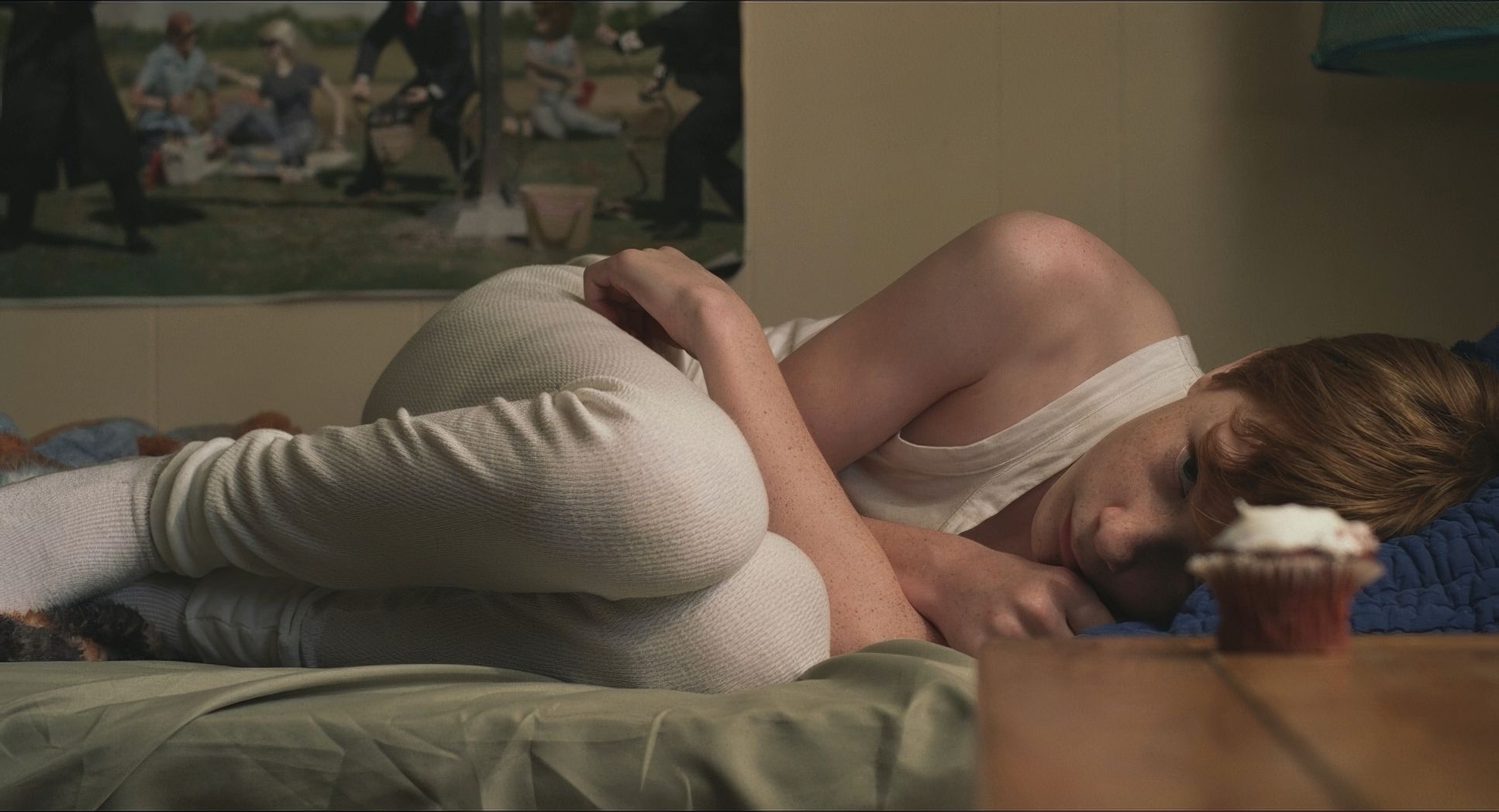
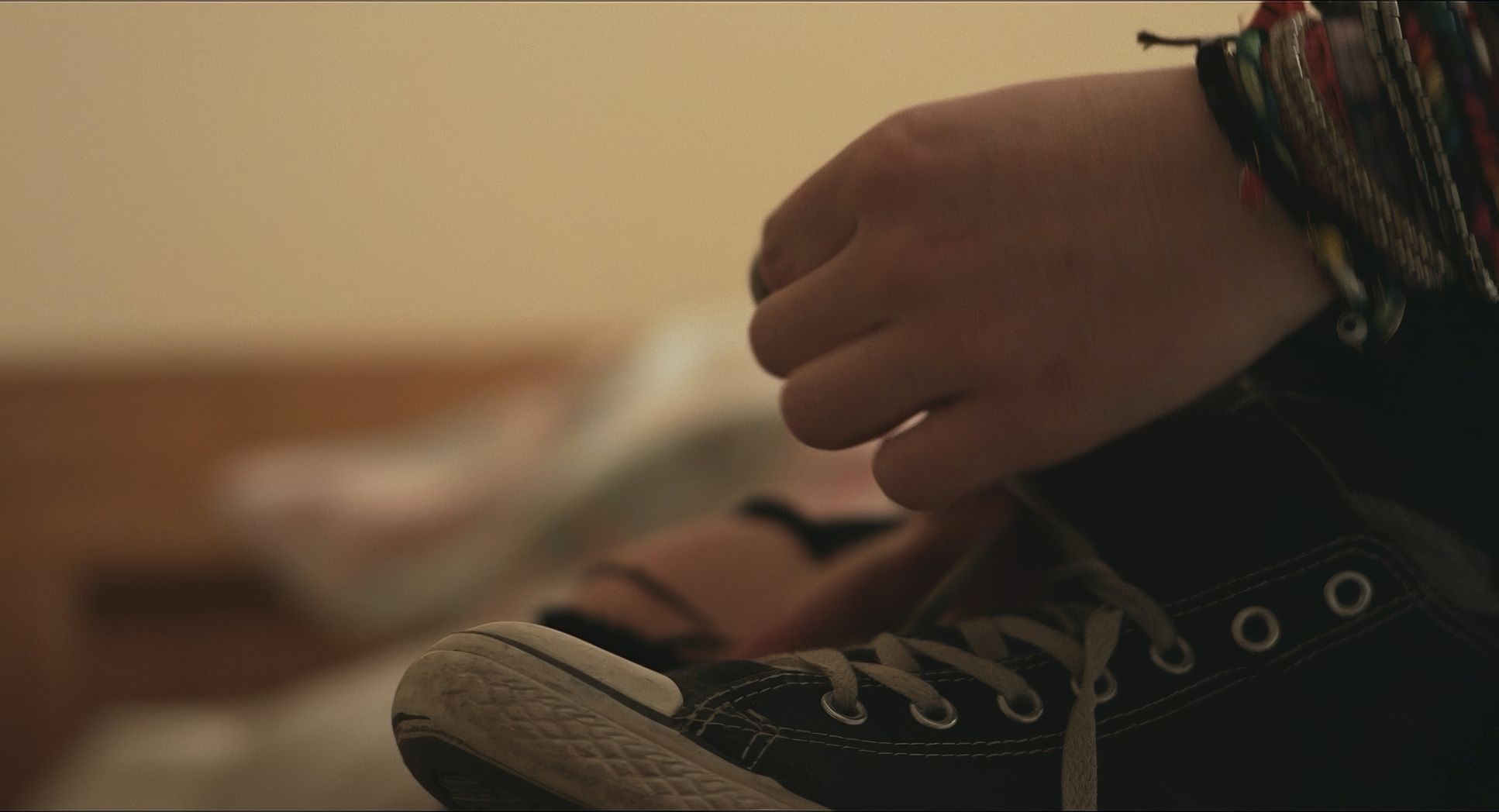
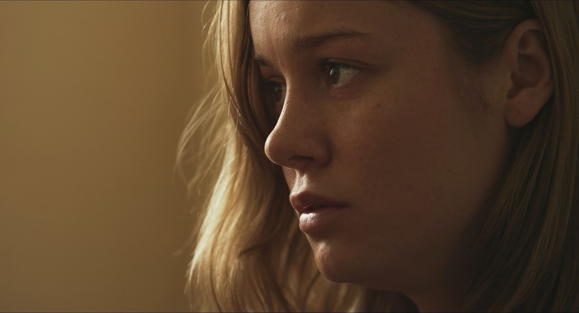
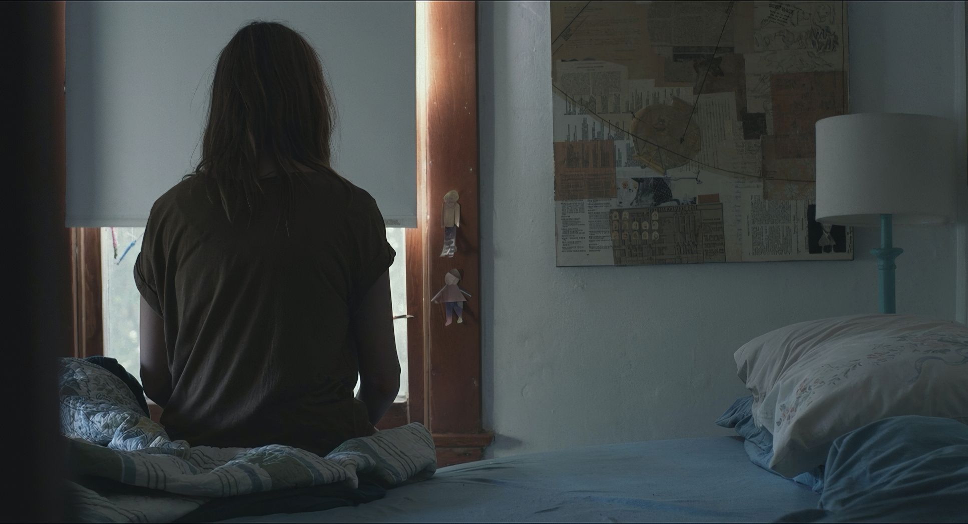
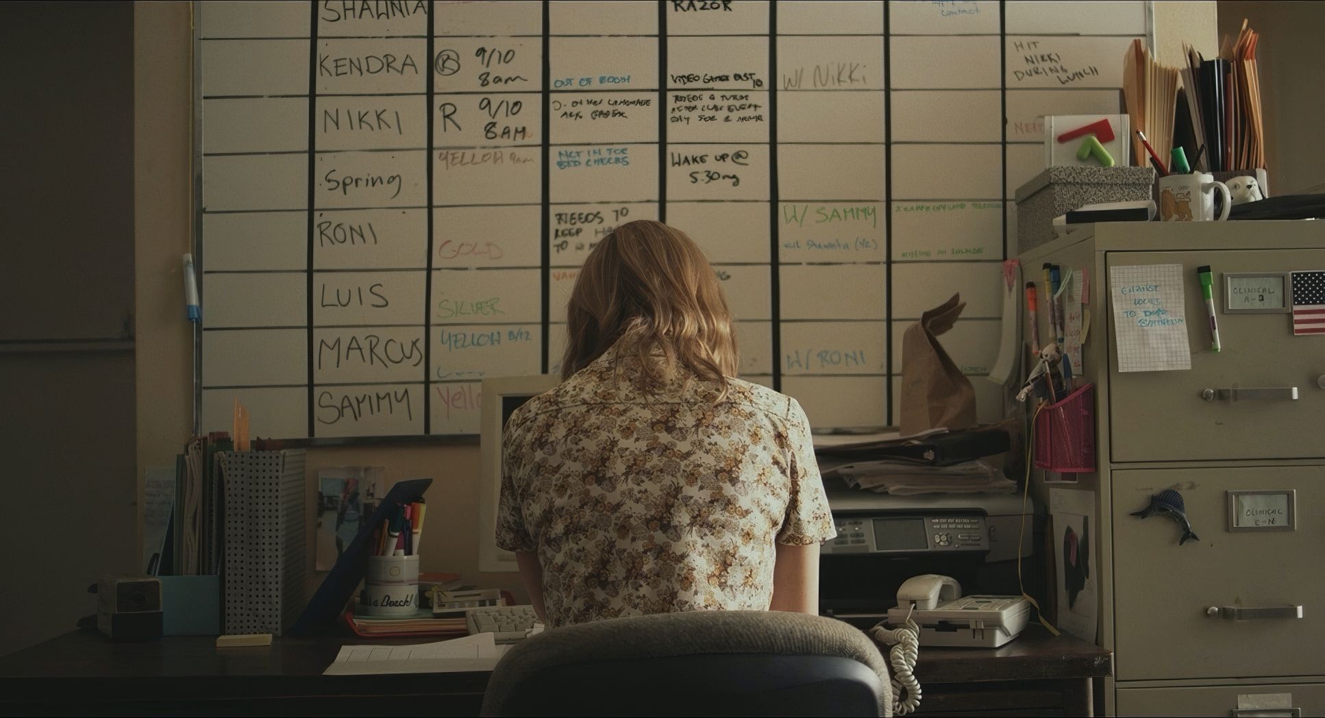
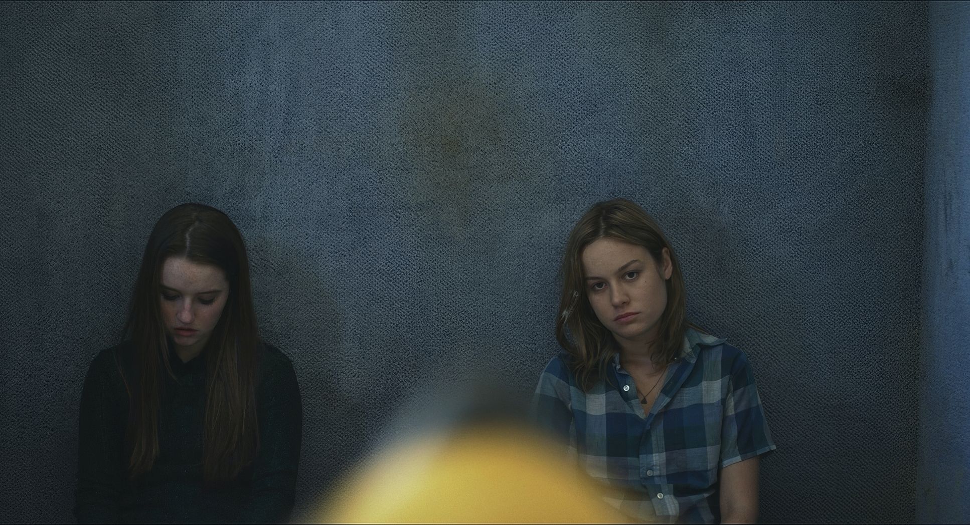
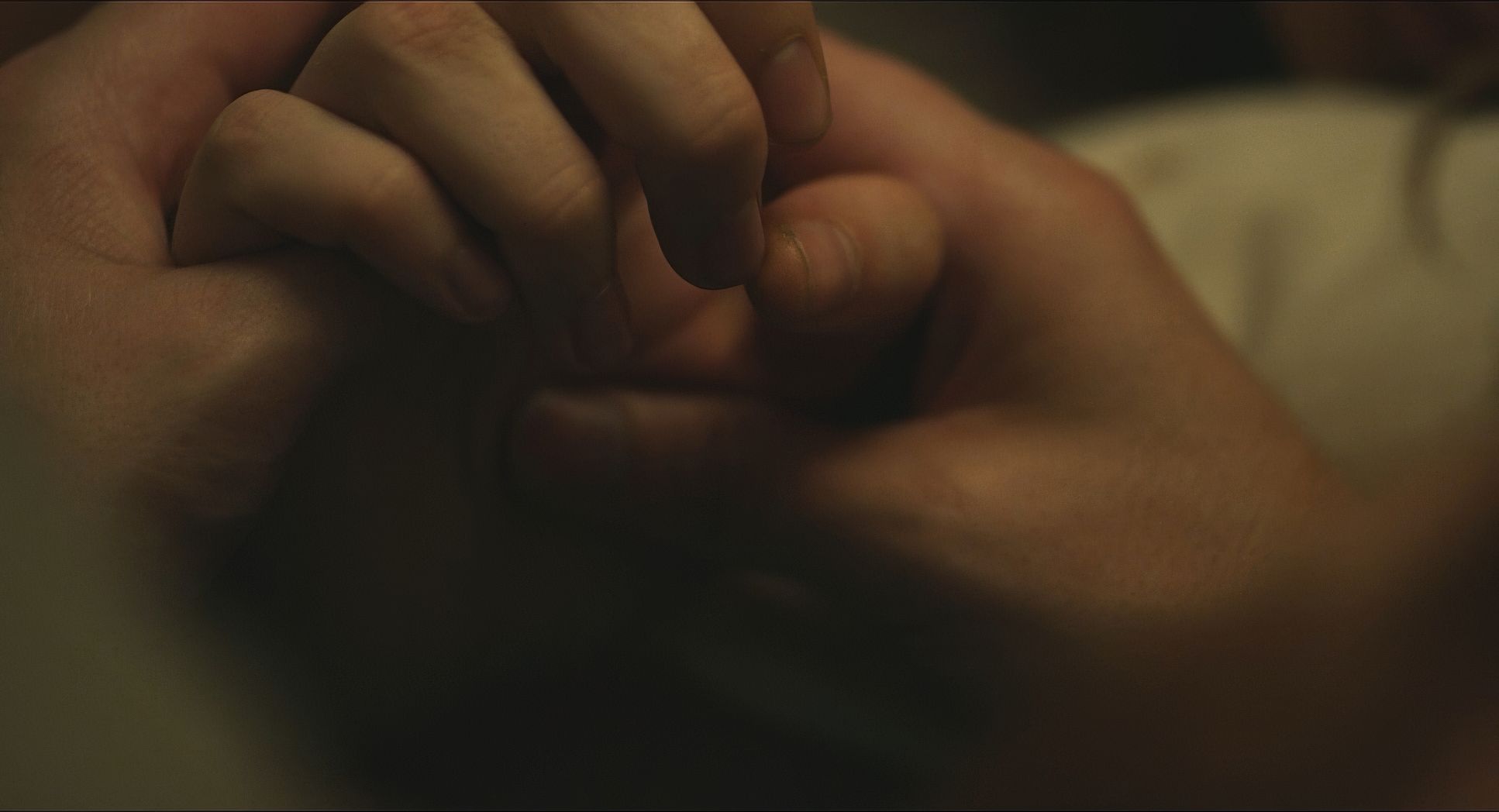
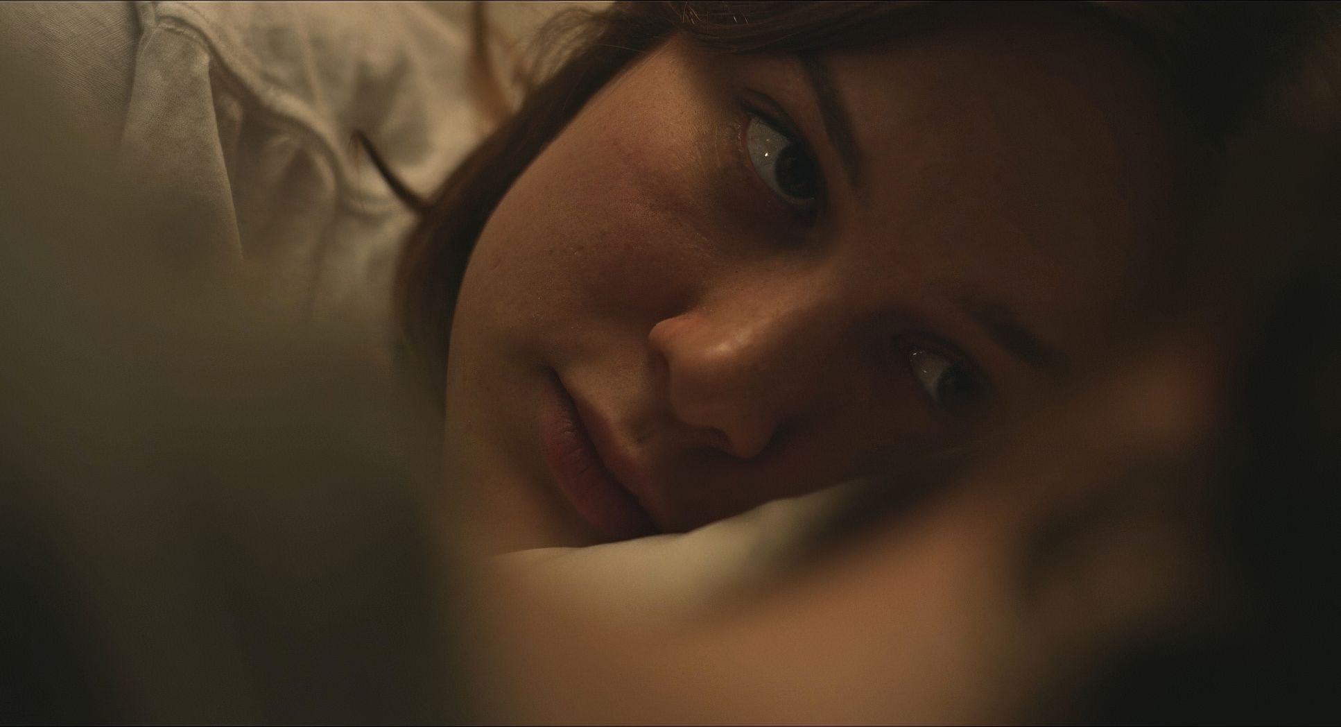
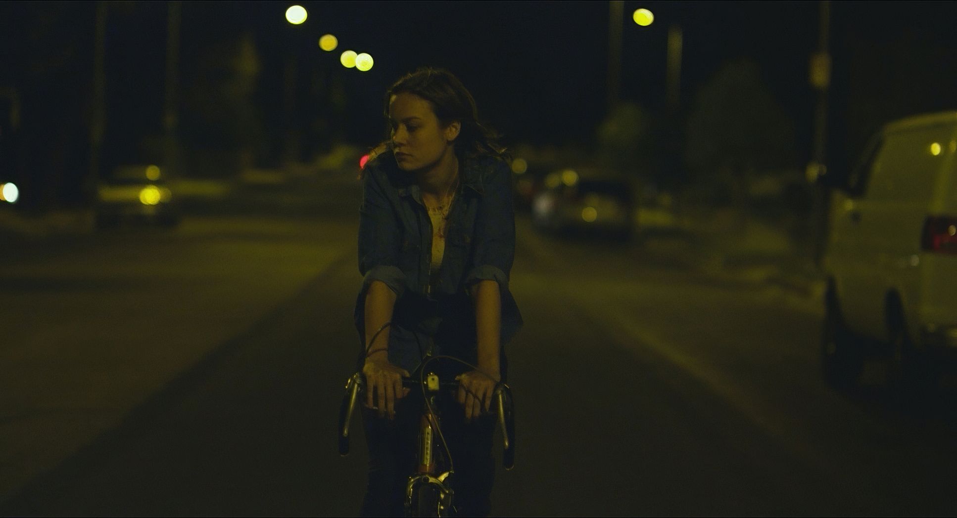
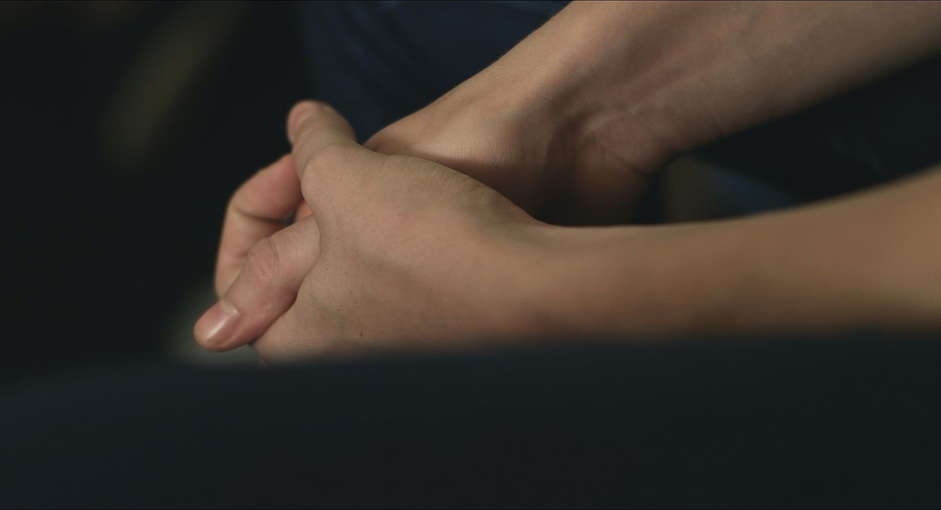
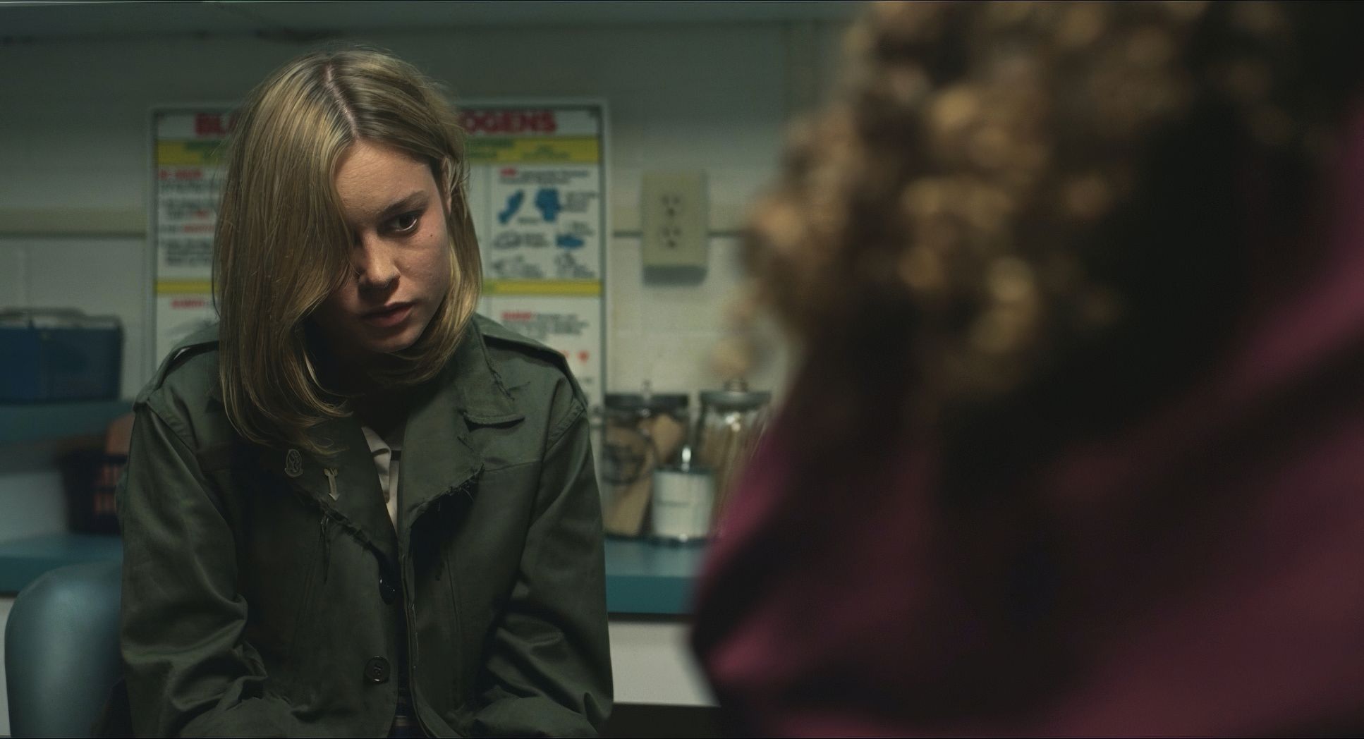
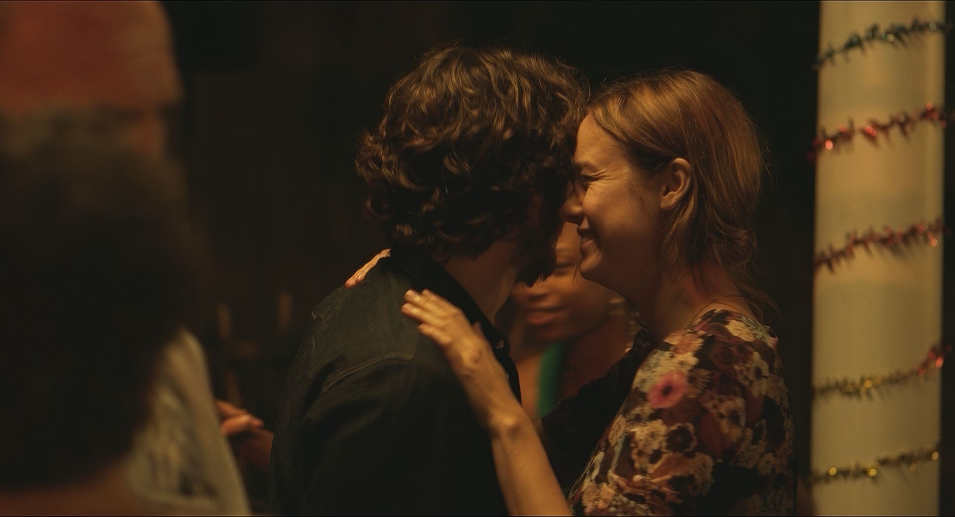
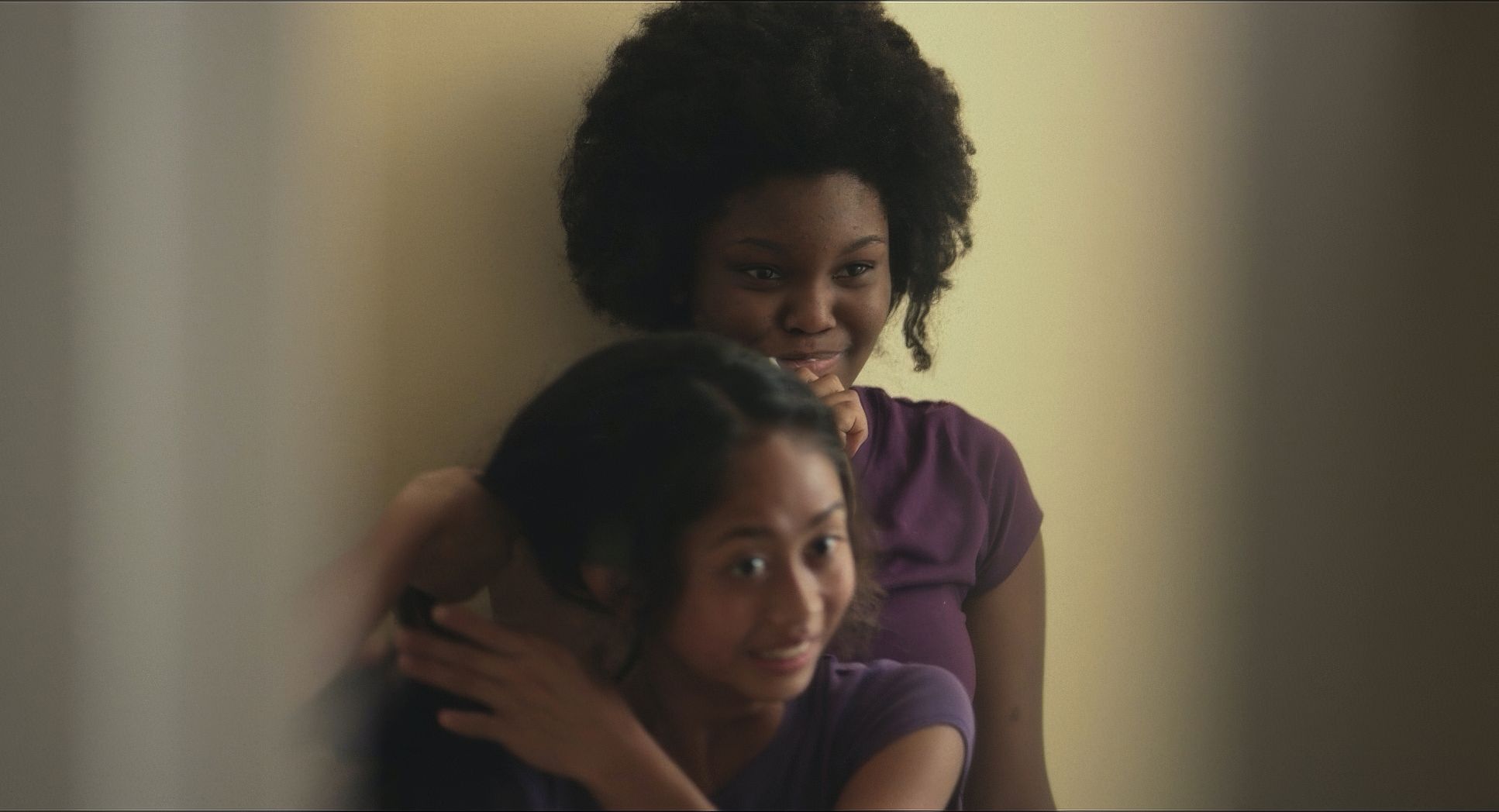
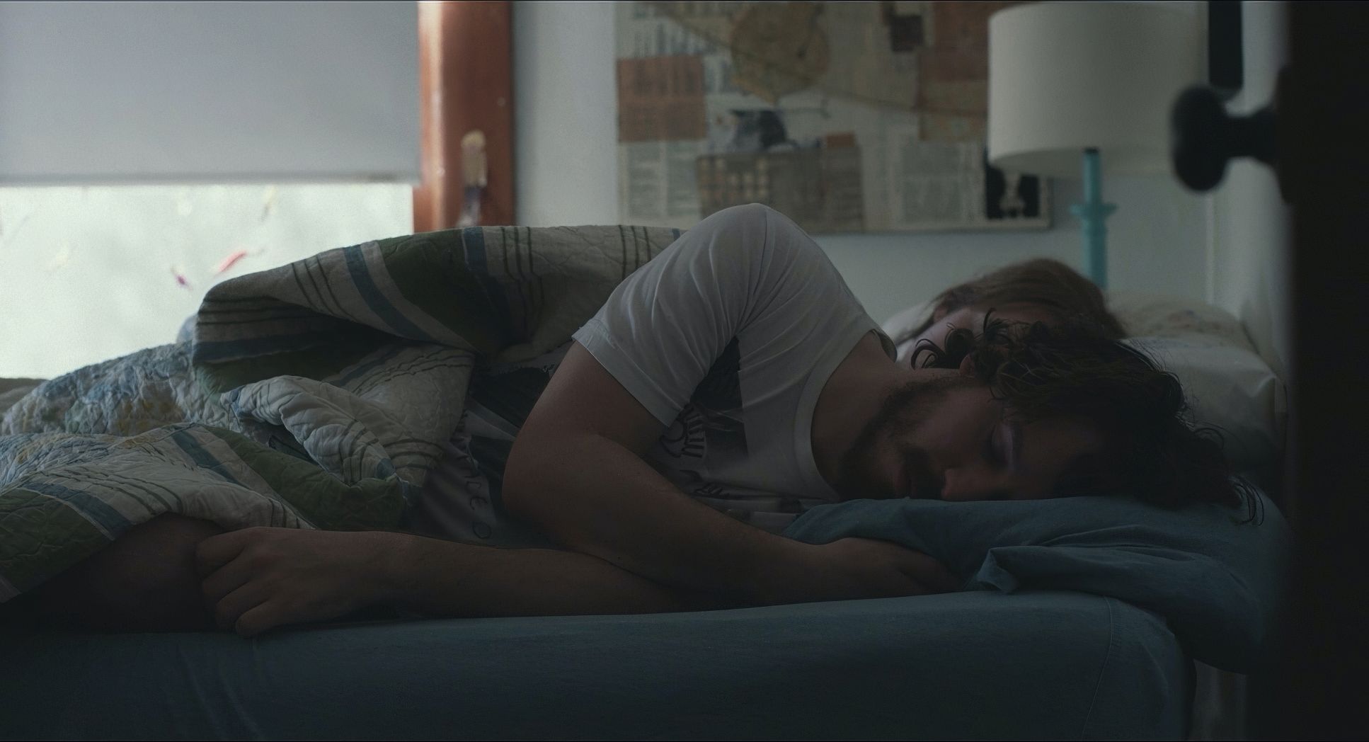
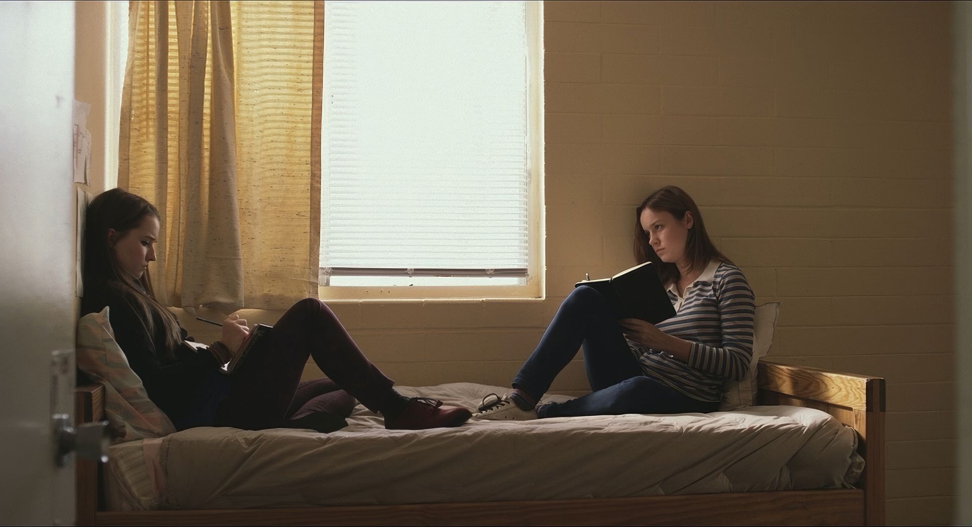
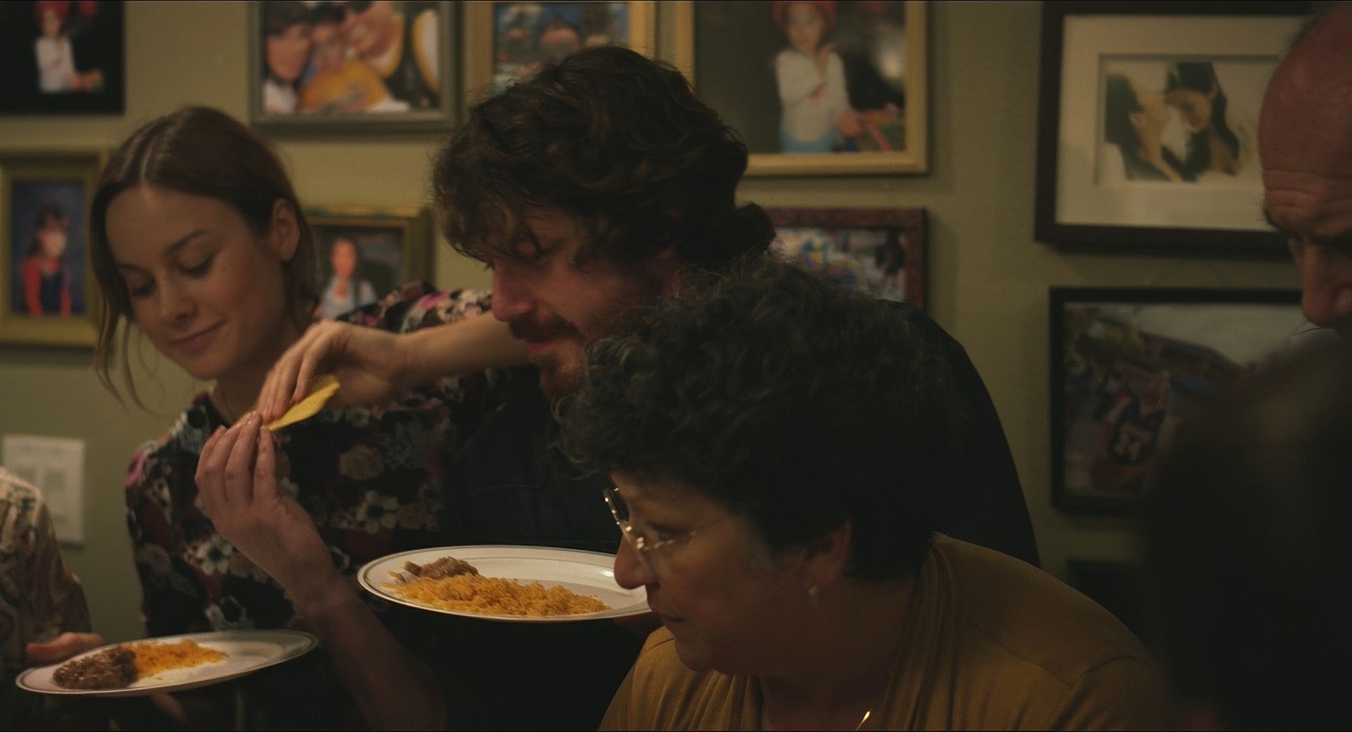
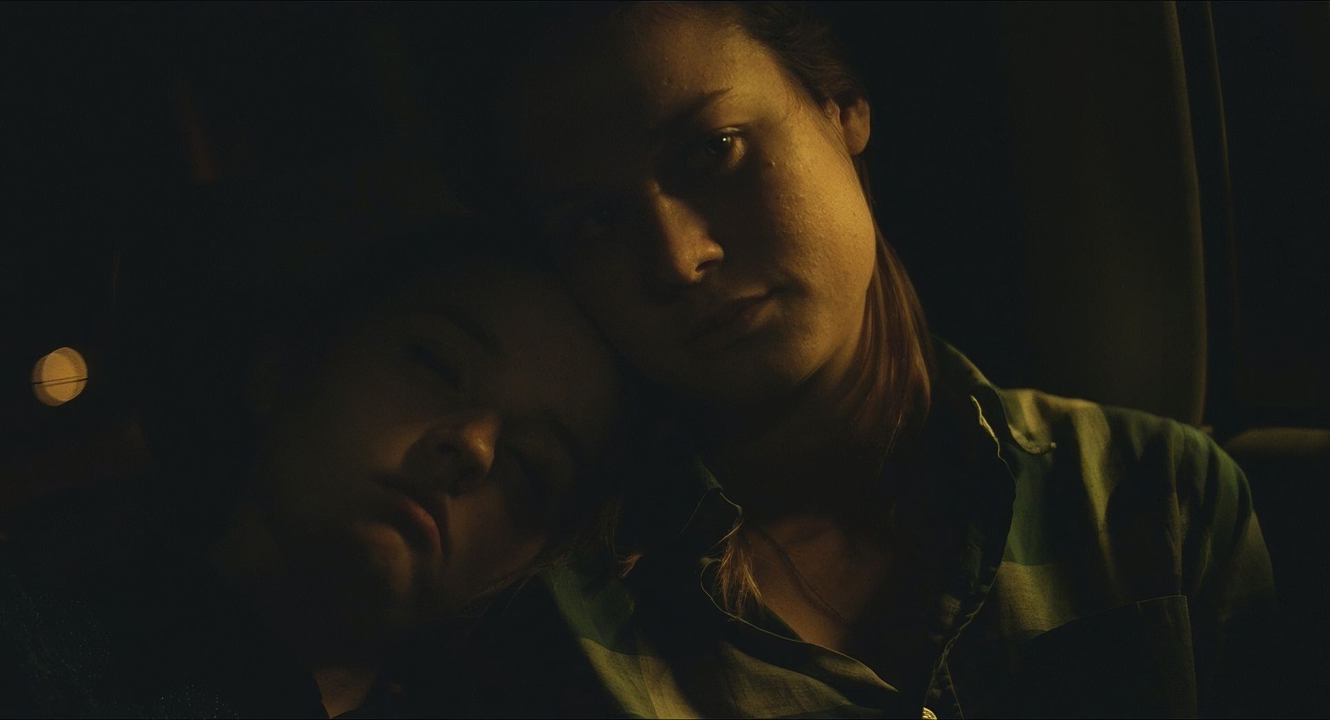
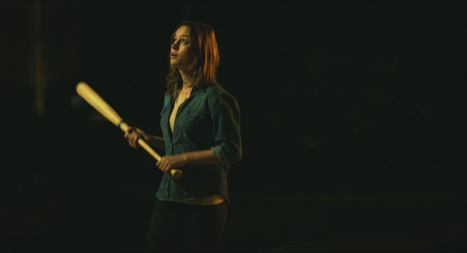
The framing is all about connection and isolation. The close-ups are particularly heavy hitters here. They aren’t just for drama; they’re windows into the characters’ heads. Brie Larson, as Grace, is often held in these tight frames, letting us see the tiny “ticks” of her anxiety.
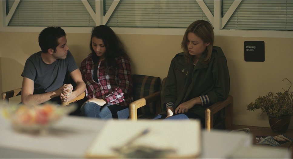
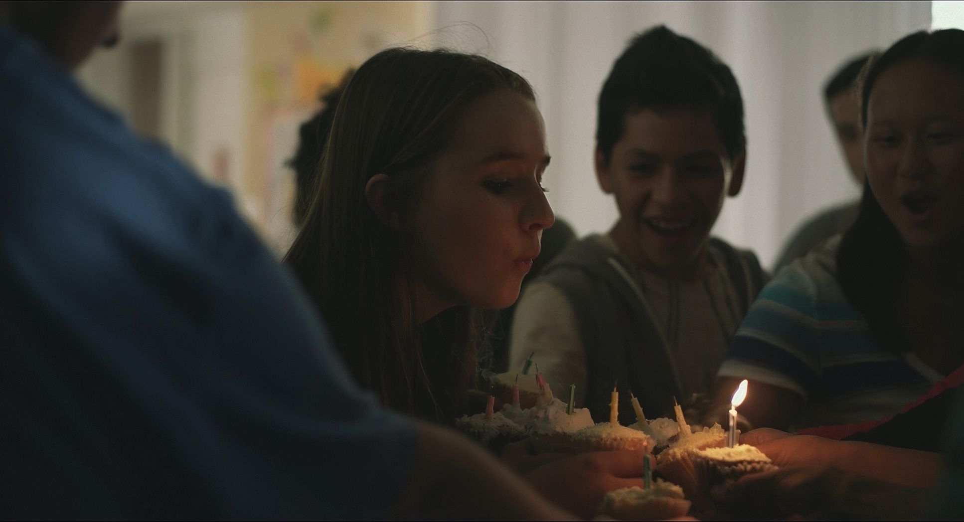
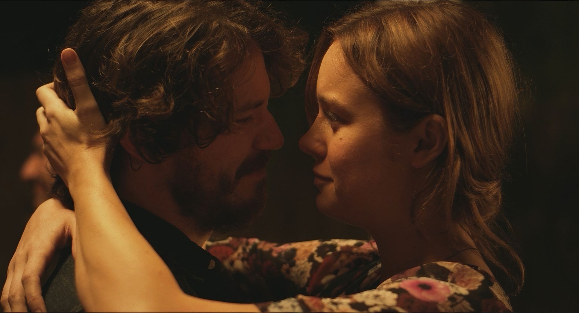
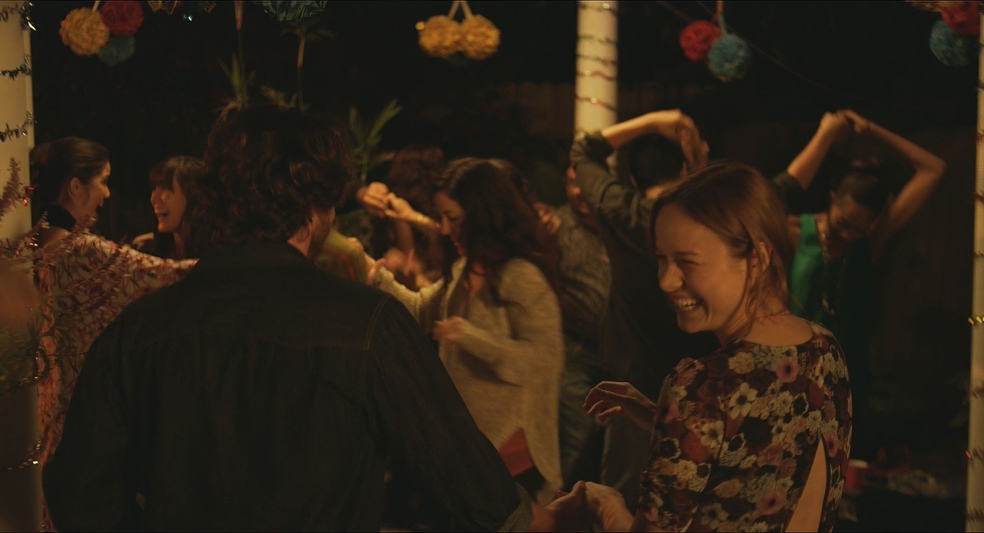
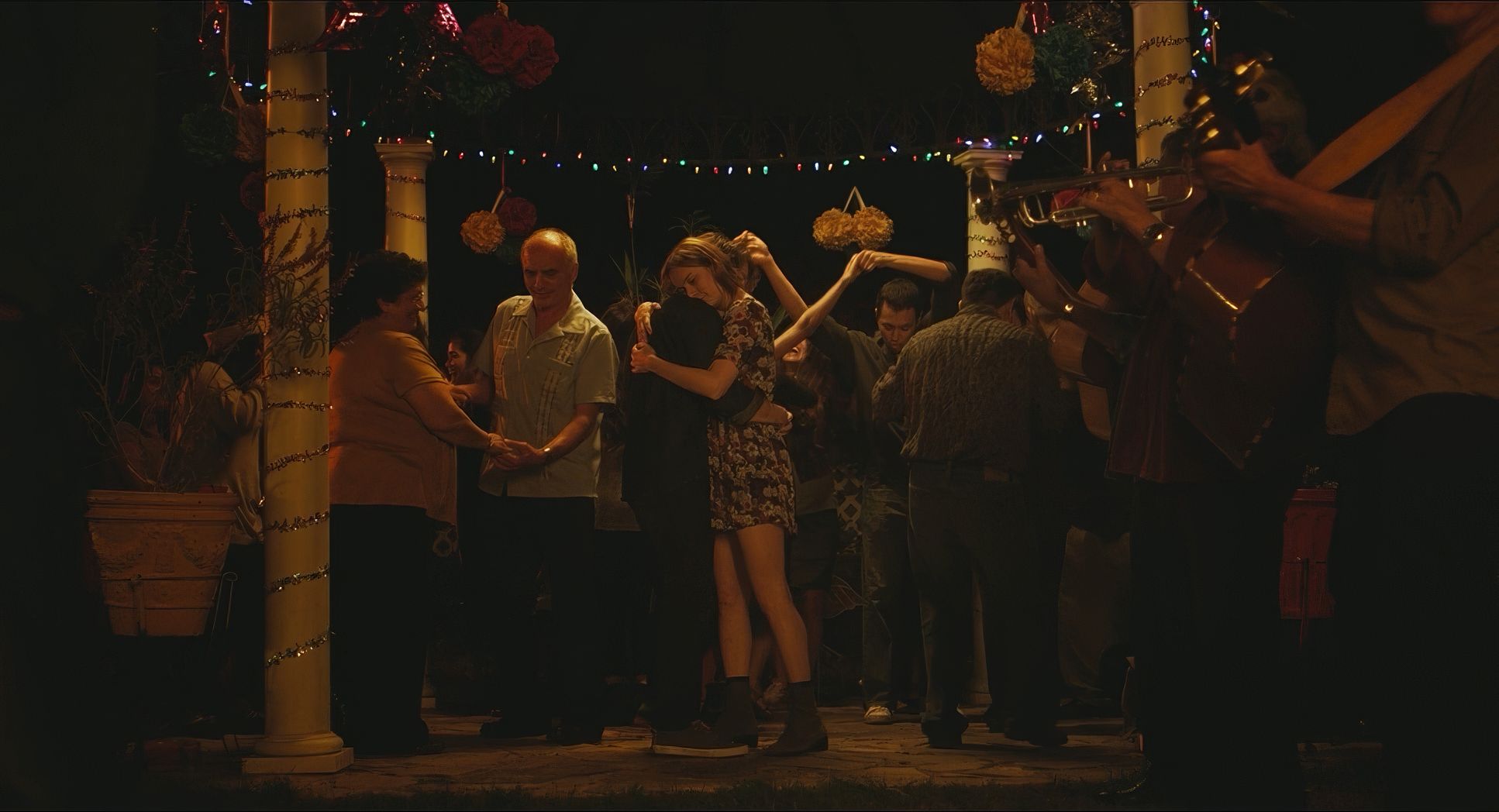
Beyond that, the framing often emphasizes the institutional setting. We see characters framed in doorways or against sterile backdrops, highlighting how precarious their lives are. Yet, there are also those beautiful two-shots between Grace and Mason that visually reinforce their bond. Every character gets their moment because the framing draws your eye to who matters in that specific beat.
Lighting Style
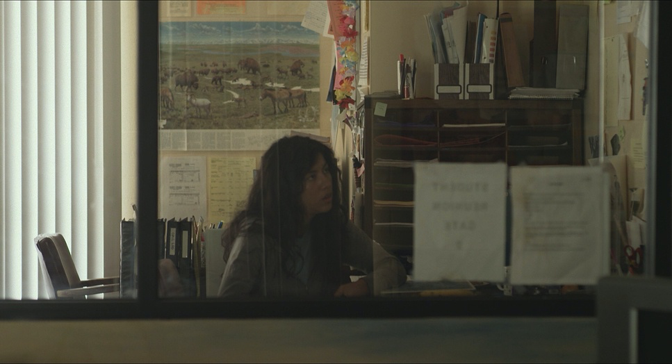
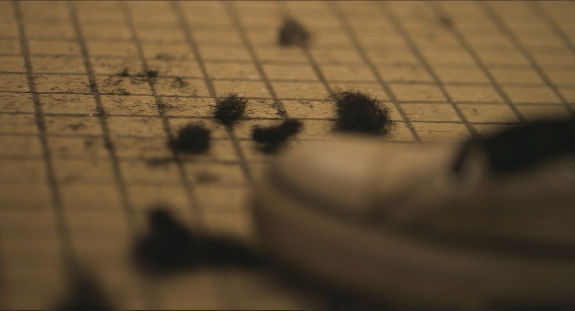
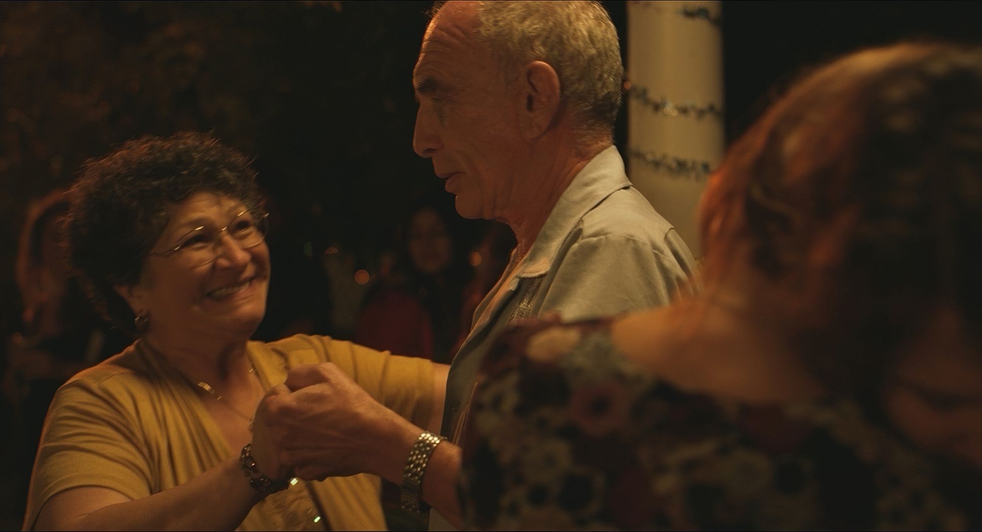
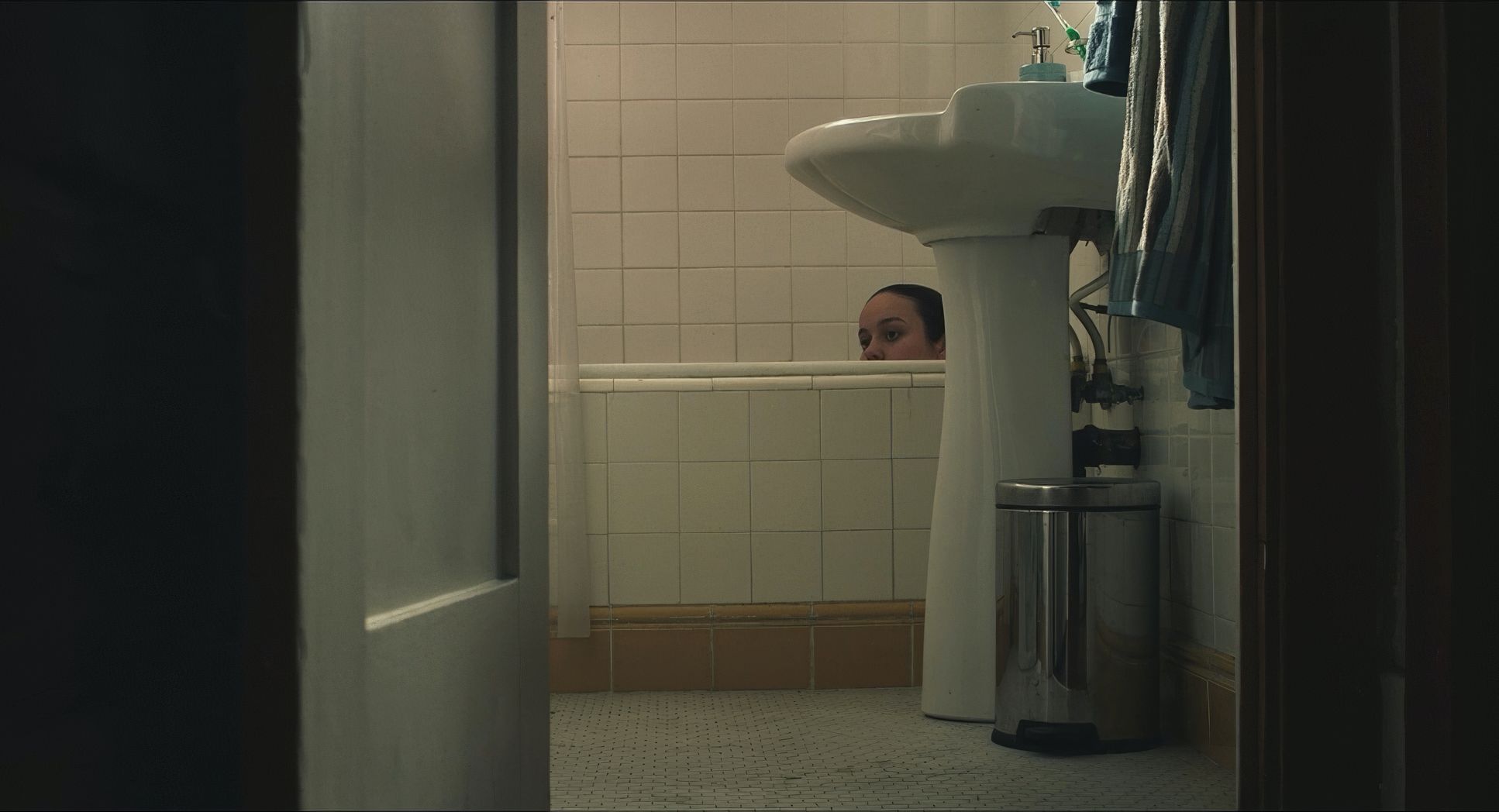
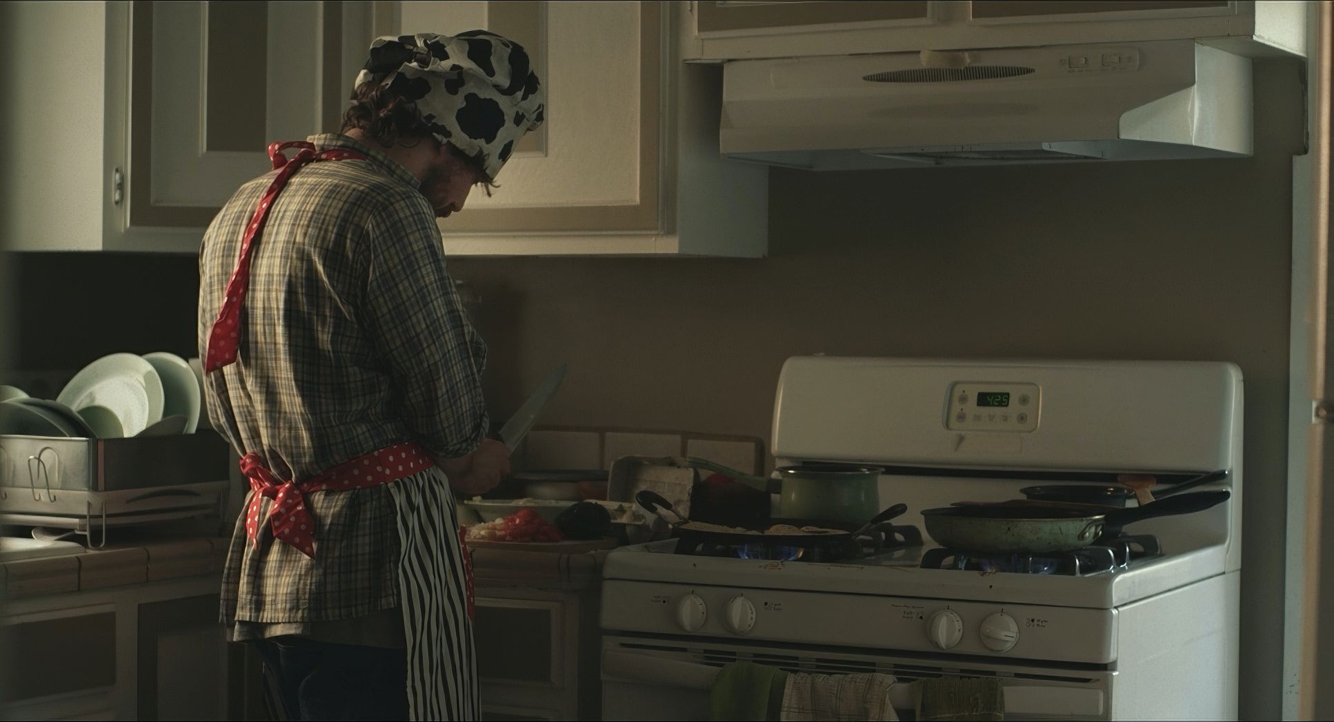
The lighting is powerful because it’s so unassuming. It’s naturalistic and motivated. Most of the interiors look like they’re lit by whatever was available sunlight through windows or the fluorescent hum of overhead lights.
This grounds the film. Shadows are soft and natural, never “sculpted” or artificial. By avoiding theatrical lighting, the filmmakers let the weight of the performances do the heavy lifting. The lighting doesn’t tell you how to feel; it just presents the scene. It allows a “positive energy” to emerge even in a setting that could easily feel bleak.
Color Grading Approach
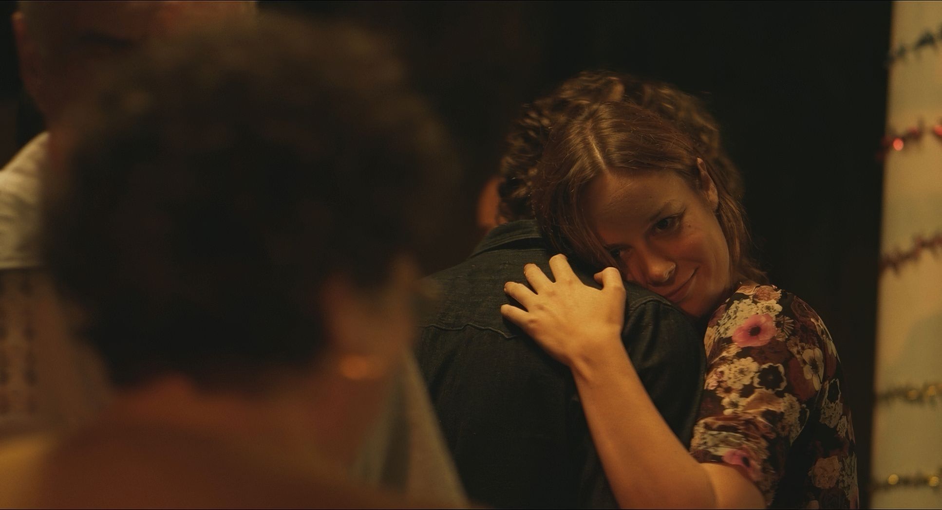
This is where I really get excited as a colorist. Ian Vertovec handled the grade here, and it’s a masterclass in emotional logic. The palette is grounded in muted, desaturated tones lots of institutional greens and grays.
But here’s the pro move: the skin tones stay vibrant and warm. Vertovec clearly prioritized protecting those red and orange channels so that the humans look “alive” even in a sterile environment. The contrast is gentle, not punchy. There are no inky blacks or blown-out highlights. Instead, the roll-off is soft, giving it a “print-film” feel that takes the digital edge off the RED sensor. It’s a grade that supports the theme of empathy it doesn’t scream at you, but it feels deep.
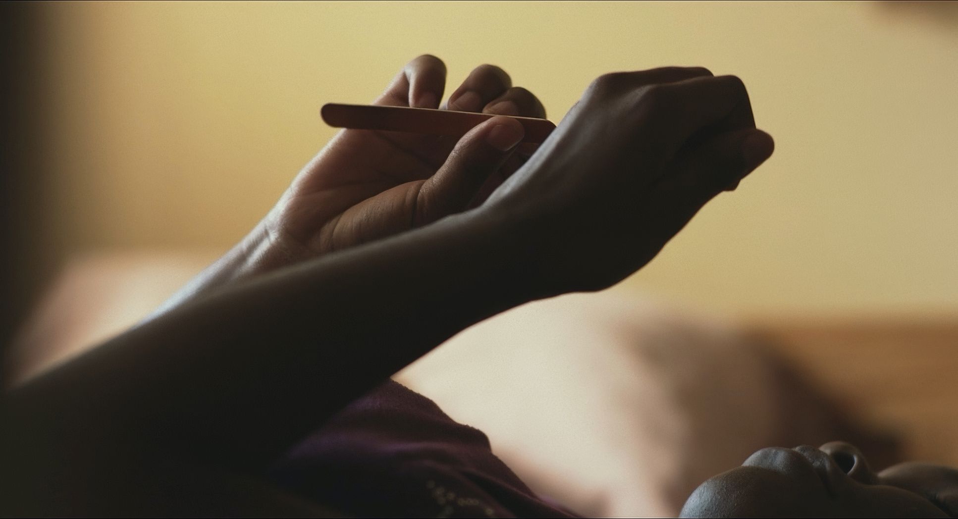
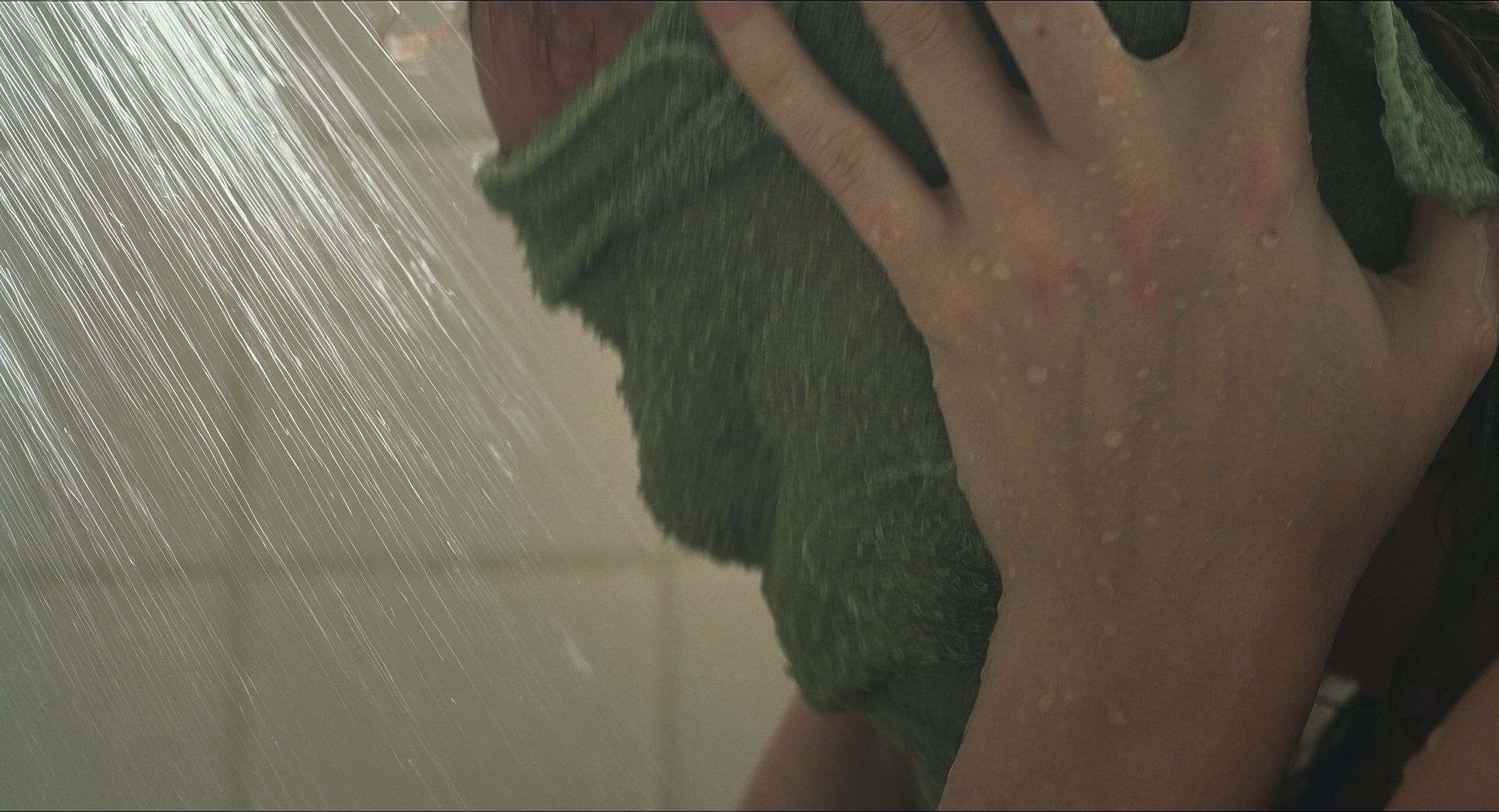
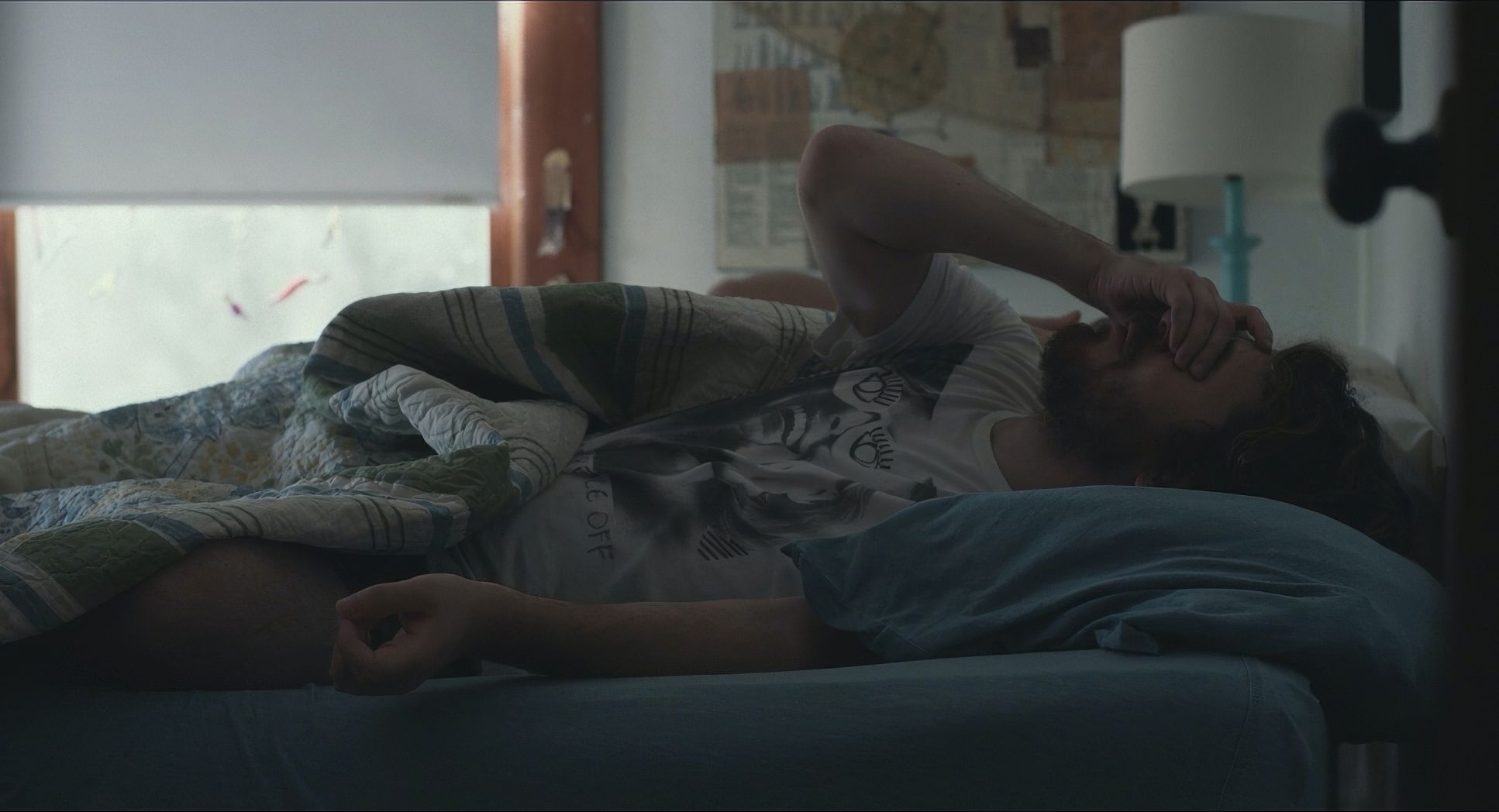
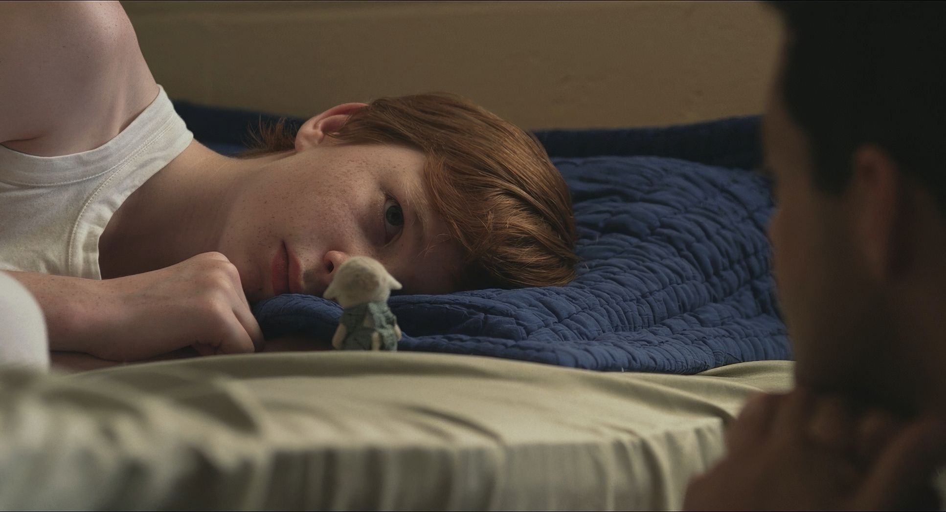
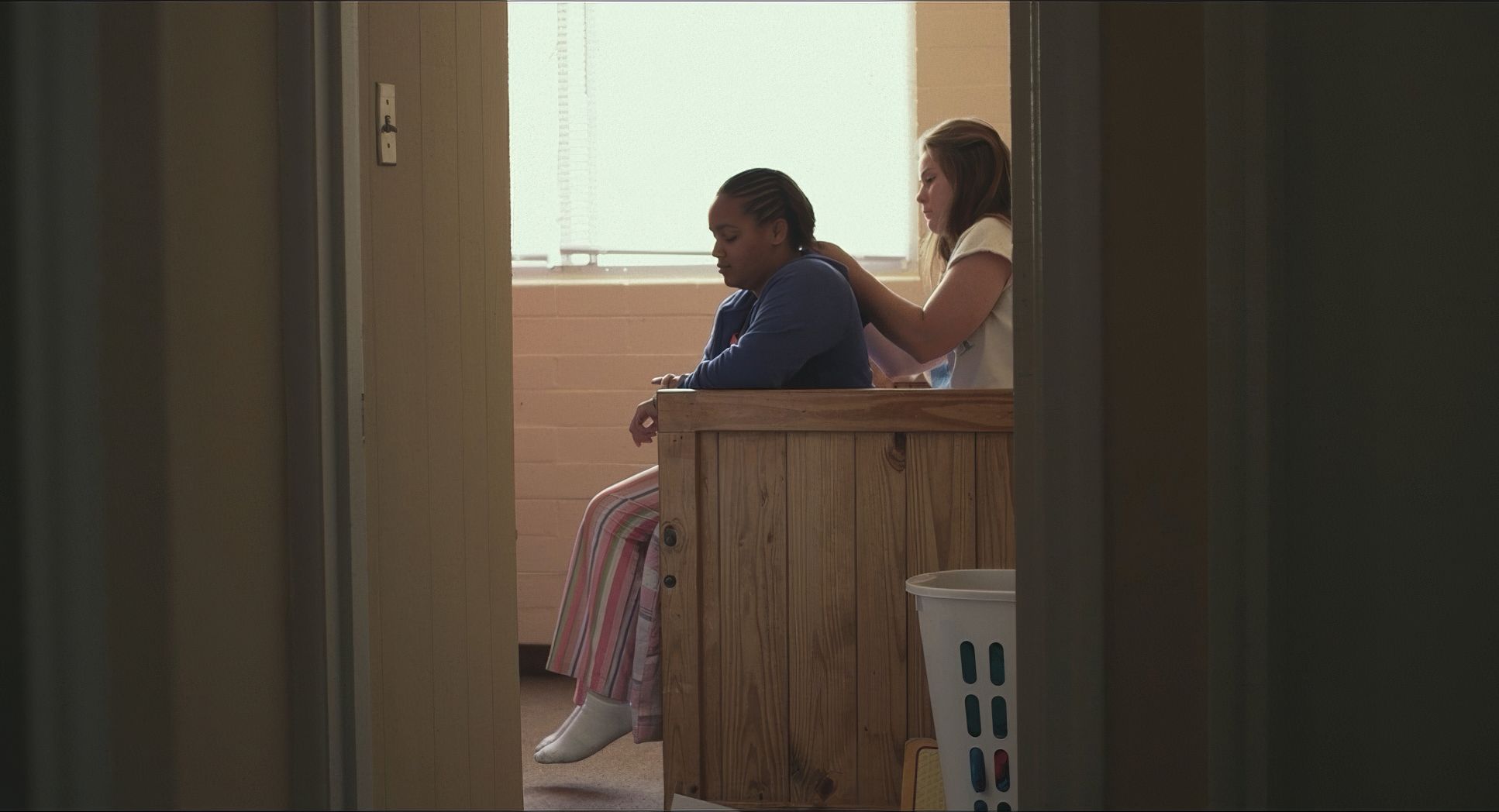
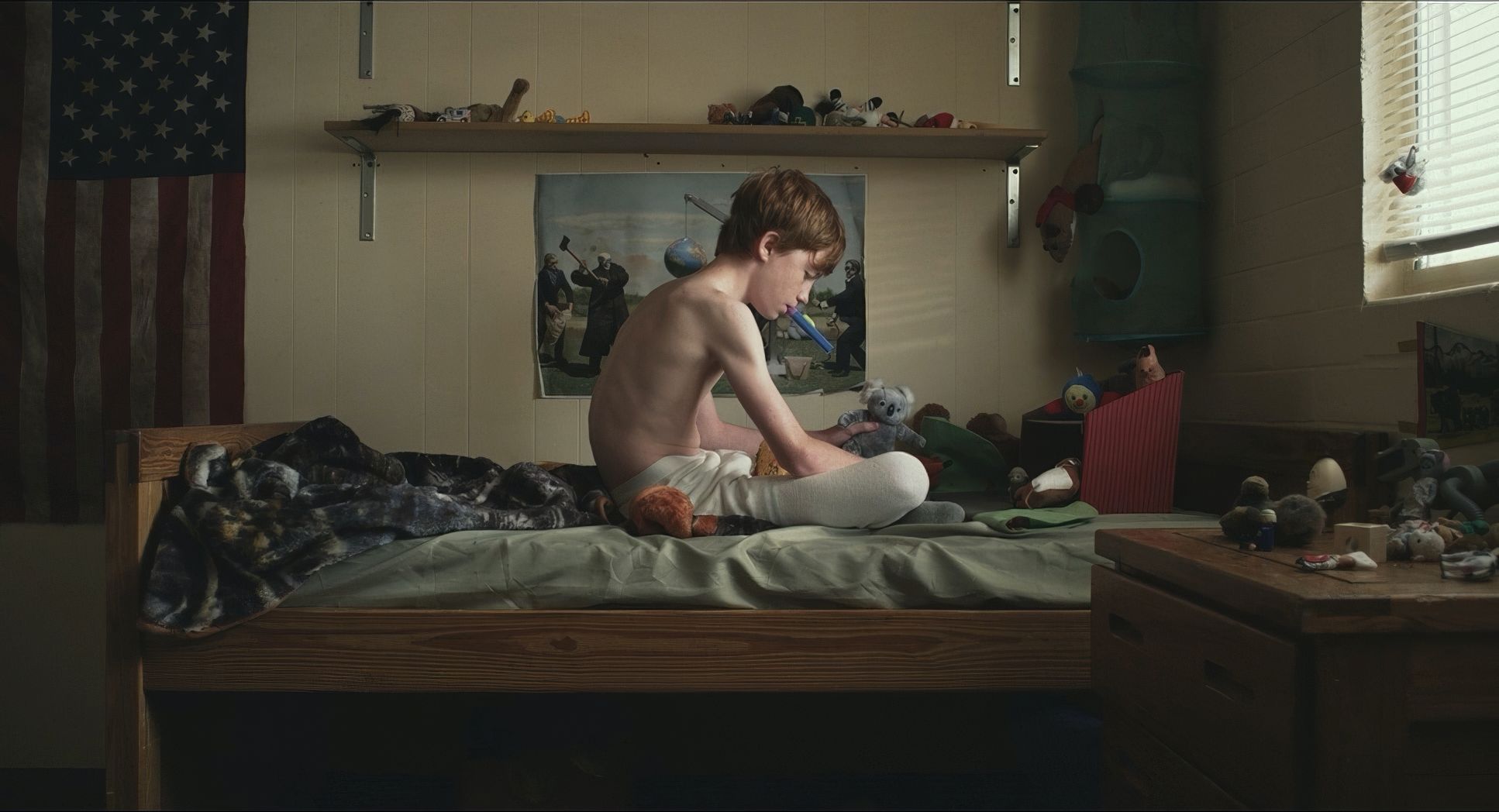
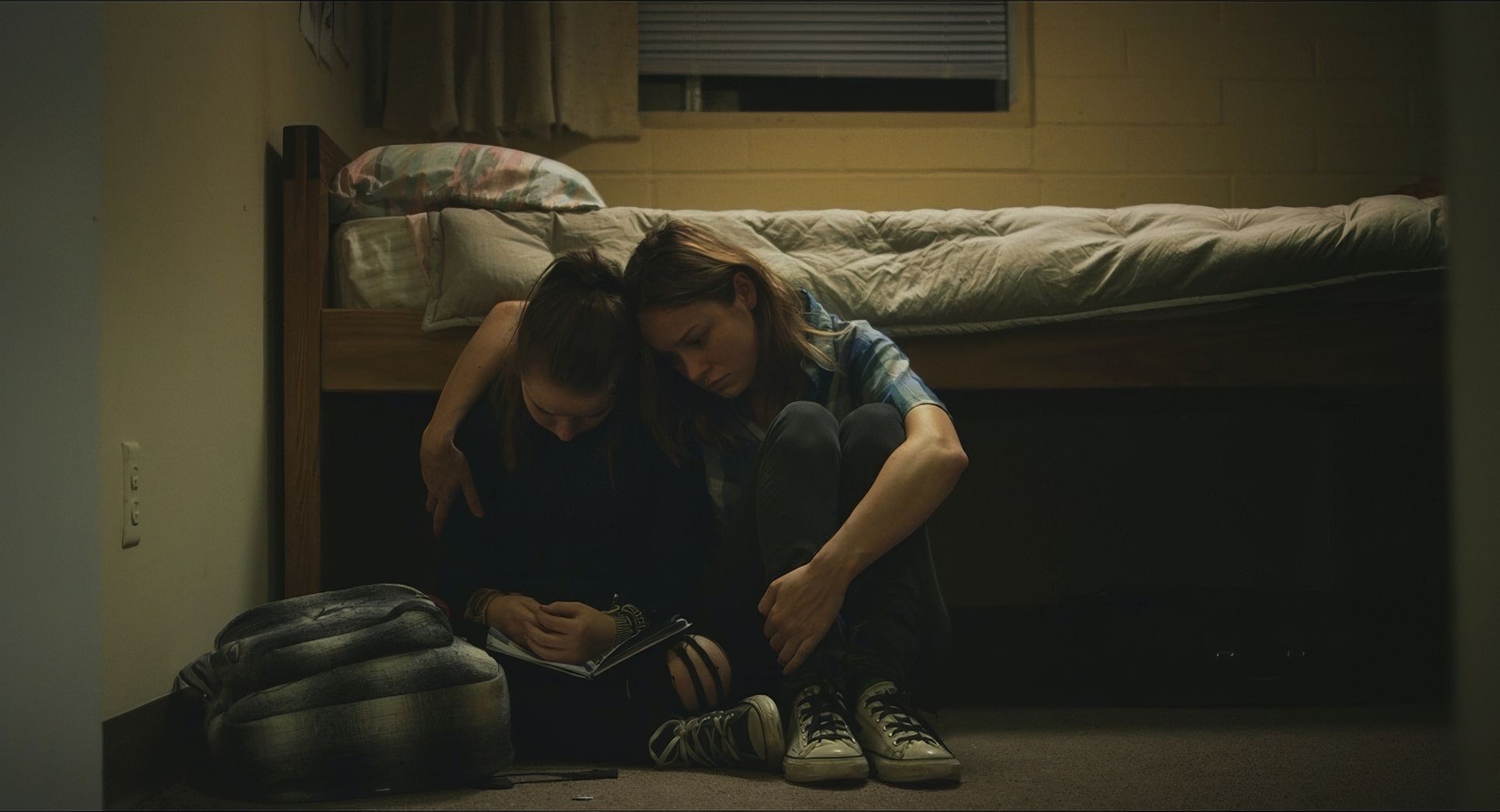
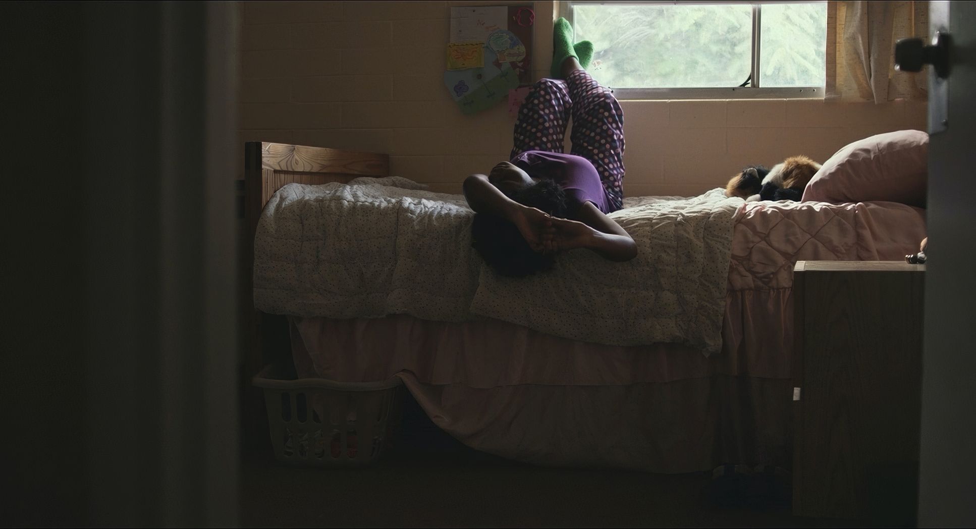
Short Term 12 (2013) Film Stills
A curated reference archive of cinematography stills from Short Term 12 (2013). Study the lighting, color grading, and composition.


- Also read: KING KONG (1933) – CINEMATOGRAPHY ANALYSIS
- Also read: PERFECT DAYS (2023) – CINEMATOGRAPHY ANALYSIS
Browse Our Cinematography Analysis Glossary
Explore directors, cinematographers, cameras, lenses, lighting styles, genres, and the visual techniques that shape iconic films.
Explore Glossary →