You know, there’s a special kind of magic that happens when a television show gets a second life as a feature film. For Joss Whedon’s Firefly, that magic was Serenity (2005). As a filmmaker and someone who spends my days shaping the visual mood of stories, I approach this film with a specific lens. It wasn’t just about giving the fans a conclusion; it was about translating a gritty, space-western aesthetic from the small screen to the massive canvas of cinema. This wasn’t just a bigger budget; it was a bigger ambition. They had to make it feel grander and more expansive, yet still intimate enough to resonate with the characters we’d grown to love. By golly, they pulled it off.
About the Cinematographer
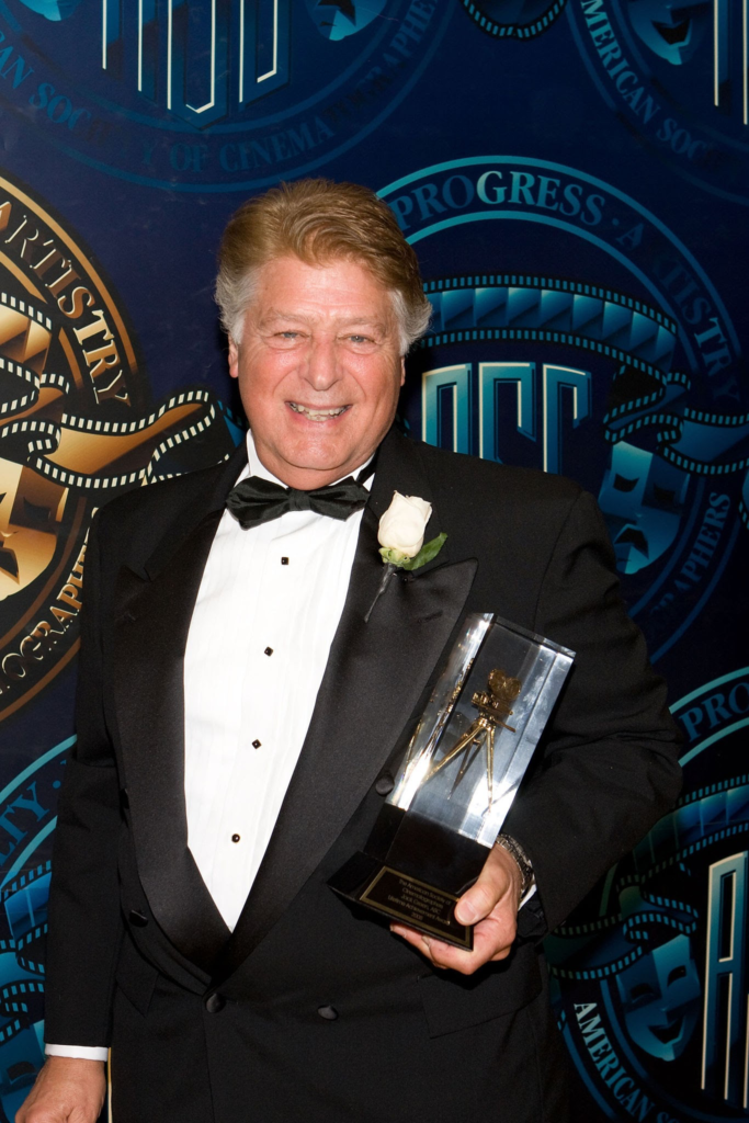
The man behind the glass for Serenity was Jack N. Green, ASC. If that name doesn’t immediately ring a bell, it absolutely should in filmmaking circles. Green is a legend, largely known for his long collaboration with Clint Eastwood, having shot everything from Unforgiven to The Bridges of Madison County.
What Green brings to the table is a profound understanding of classic cinematic language: rich textures, deeply motivated lighting, and a grounded realism. His approach usually favors a naturalistic look, letting the performances speak for themselves. This proved to be a masterful choice here. While the film dives headfirst into sci-fi, Green’s grounded sensibility meant that even amidst spaceships and psychic powers, the human element the dirt, the rust, the worn faces of the crew always felt authentic. He knows how to make a frame breathe and how to make a world feel tangible.
Technical Aspects & Tools
Serenity (2005) — Technical Specifications
| Genre | Science Fiction, Thriller, Action, Adventure, Space, Science-Fiction |
| Director | Joss Whedon |
| Cinematographer | Jack Green |
| Production Designer | Barry Chusid |
| Costume Designer | Ruth E. Carter |
| Editor | Lisa Lassek |
| Colorist | Walter Volpatto |
| Time Period | Future |
| Color | Cool, Saturated, Cyan, Blue |
| Aspect Ratio | 2.35 – Spherical |
| Format | Film – 35mm |
| Lighting | Soft light, High contrast, Top light |
| Lighting Type | Artificial light, Practical light |
| Story Location | Alliance Homeworld |
| Filming Location | California > Los Angeles |
| Camera | Panavision Millennium / Millenium XL / XL2, Panavision Panaflex Platinum |
| Lens | Panavision Primo Primes |
Let’s look under the hood for a second. Unlike the show, Serenity was shot on 35mm film using the Panavision Millennium and Millennium XL2 systems. Choosing film in 2005 gave the image an inherent organic quality and a natural grain structure that digital was still years away from perfecting.
The production used Panavision Primo Primes, which are famous for their sharpness and contrast while still maintaining a “filmic” soul. But the real game-changer was the Digital Intermediate (DI) process. While DI was still somewhat nascent in the mid-2000s, it allowed the team to scan the negative and manipulate the image with unprecedented precision. This allowed for the nuanced shifts between the frontier worlds and the Alliance homeworld that define the film’s look. It’s also why the visual effects despite a modest budget blend so seamlessly; the colorist was able to match the light spill and grain of the CGI elements to the practical 35mm footage perfectly.
Inspiration Behind the Cinematography
The core inspiration obviously sprang from Firefly itself: the space Western. But for the film, they clearly cranked that dial up to eleven. The mandate was to retain the show’s unique fusion of old-west grit and futuristic tech, but with the resources of a feature film.
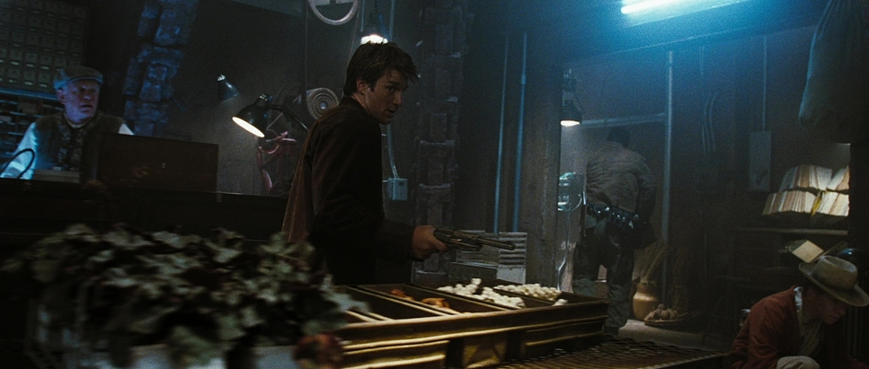
You see this duality everywhere. The bank robbery takes place in a town that looks like it’s straight out of a John Ford movie, but with speeders instead of horses. Then you have the contrast with the Alliance worlds, which have a silvery, sterile sheen. This visual dichotomy isn’t just set dressing; it’s central to the theme of Freedom vs. Control. The cinematography uses these visual cues to instantly tell you where you are in the moral landscape of the ‘Verse.
Lighting Style
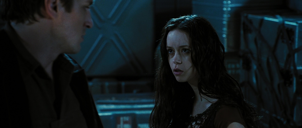
The lighting in Serenity is a testament to Green’s ability to blend naturalism with high-end artistry. From my perspective, I’m always looking at the shadow density. Inside the ship, the lighting is warm and soft, motivated by practical lamps and glowing panels. It creates a cozy, lived-in glow that reinforces the ship as a sanctuary. The shadows are rich, but Green is careful never to “crush” them entirely, maintaining detail in the lower tonal range to give the image depth.
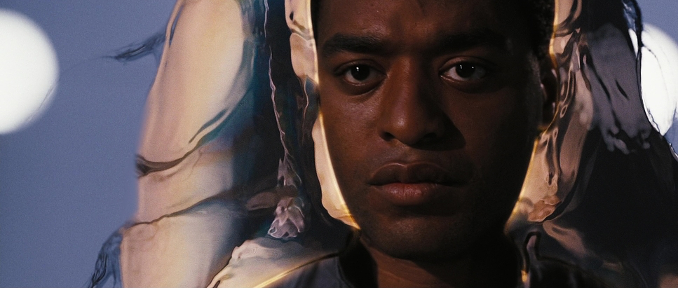
When we shift to Alliance environments, the lighting becomes noticeably cooler and starker often high-key with an almost surgical precision. The cold, impersonal interrogation rooms are bathed in harsh, unflattering light that scrubs away any humanity. Conversely, for the planet Miranda, the lighting shifts to something unsettling: low-key, deep shadows, and sickly green undertones that evoke a sense of desolation. It’s controlled, but it never feels artificial.
Color Grading Approach
Now for my favorite part. The colorist for Serenity was Walter Volpatto, and you can see his fingerprints all over the tonal sculpting. The film’s palette leans into an earthy, desaturated richness for the frontier worlds warm browns, muted oranges, and deep greens that feel like a well-used leather saddle.
For the Alliance settings, Volpatto shifted the palette dramatically to cooler, sterile tones: steely blues and clinical whites. This hue separation is critical; it distinguishes the two worlds psychologically. As a colorist, I especially appreciate the highlight roll-off in this film. There’s a wonderful, organic “bloom” to the highlights that prevents that harsh digital clipping. Shadows are deep but hold information, avoiding that aggressive “crushed blacks” look that was unfortunately common in early digital grades.
For the Miranda sequence, the grade leans into horror. We see desaturated, almost monochromatic tones with subtle, sickly cyan pushes. It heightens the spine-chilling nature of the Reavers’ origin. The DI workflow allowed Volpatto to push the dynamic range of the 35mm stock to its absolute limit.
Lensing and Blocking
Shooting spherical on Primo Primes for a 2.35:1 widescreen aspect ratio was a deliberate choice. It gives you that epic scale without the geometric distortions or “anamorphic mumps” you sometimes get with older glass.
Green used wide lenses to capture the expansive frontier landscapes, emphasizing the smallness of our heroes against the vastness of space. These deep-focus shots keep the background in sharp detail, which really helps with world-building. On the flip side, when the emotional stakes get high, they switch to tighter telephoto lenses to create a shallow depth of field. This pulls the audience into an intimate close-up, blurring the world away so we’re stuck in the character’s internal conflict.
The blocking is equally precise. Think about the confrontations between Mal and the Operative. The Operative moves with a balletic, efficient precision reflecting his ideology of “civilization.” Mal moves with a rugged, desperate energy. Their positioning within the frame, often with one dominating the foreground while the other recedes, tells the story of their power struggle before they even say a word.
Camera Movements
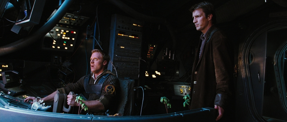
When it comes to movement, Joss Whedon and Jack Green used the camera to define the geography of the ship. The famous “one-shot” walk-through early in the film is a standout. It glides through the ship as Mal greets the crew, giving us an immersive sense of the layout.
Now, looking at it with a professional eye, I’m fairly certain there’s a hidden splice when the camera transitions between Mal and Simon Tam. But honestly? The execution is so smooth it doesn’t matter. The effect is what counts: it establishes the ship as a character and a sanctuary. Beyond that, the film uses a sophisticated mix of steady dolly moves for weight and handheld/Steadicam shots for the kinetic energy of the action scenes. It’s a balanced language that knows when to be still and when to be frantic.
Compositional Choices
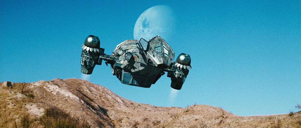
Green’s composition is rooted in classical principles. He isn’t afraid of negative space, especially in those wide shots of the Serenity navigating the void. It underscores the crew’s isolation.
He also layers his frames beautifully. We see characters positioned against environmental elements that reinforce their story Mal is frequently framed against the rugged, rusted metal of his ship, while the Operative is often centered against symmetrical, imposing Alliance architecture. This visually communicates the Operative’s unwavering belief system. It’s not about flashy, abstract shots; it’s about emotional clarity and guiding the viewer’s eye to exactly where the subtext lives.
- Also read: THE FUGITIVE (1993) – CINEMATOGRAPHY ANALYSIS
- Also read: MANCHESTER BY THE SEA (2016) – CINEMATOGRAPHY ANALYSIS
Browse Our Cinematography Analysis Glossary
Explore directors, cinematographers, cameras, lenses, lighting styles, genres, and the visual techniques that shape iconic films.
Explore Glossary →