Most documentaries today look too clean. We’re obsessed with 6K resolution, perfect gimbals, and sensors that can see in the dark. Then you watch Searching for Sugar Man (2012), and it reminds you that none of that matters if the story isn’t there.
This film? It breaks every technical rule in the book. It mixes grainy Super 8 with archival news footage and famously shots from a cheap iPhone app. And yet, it works. It doesn’t just work; it pulls you in. It proves that visual storytelling isn’t about pixel count; it’s about emotion.
About the Cinematographer
Usually, when you talk about cinematography, you’re talking about a specific DP with a specific style. Here, it’s messy. While Camilla Skagerström and Adam Stone are credited, director Malik Bendjelloul shot a massive chunk of this himself. And he did it because he was broke.
When they ran out of money for Super 8 film, Bendjelloul finished the movie using a $1.99 app (8mm Vintage Camera) on his iPhone. In the industry, we usually roll our eyes at “iPhone cinematography,” but here, it wasn’t a gimmick; it was survival. The genius wasn’t the gear; it was the commitment to the aesthetic. The challenge wasn’t “how do we get the best dynamic range?” It was “how do we make this shaky phone footage cut seamlessly with 1970s archival tape?” That’s not just directing; that’s a post-production high-wire act.
Inspiration Behind the Cinematography
The look of the film is built entirely on a lie or rather, a myth. Sixto Rodriguez was a ghost. In South Africa, he was bigger than Elvis; in Detroit, he was carrying debris on a construction site.
The visuals had to sell that contrast. The “inspiration” here is the gap between the dream and the reality. South Africa looks like a fever dream wide, hazy, legendary. It needed to feel like a place where a myth could grow unchecked in the pre-internet age. Detroit, by comparison, had to look hard. Cold. Industrial. The camera doesn’t just show us these places; it adopts the attitude of the environment. If the visuals were consistent throughout, the movie would have failed. We needed that visual whiplash to understand the absurdity of Rodriguez’s situation.
Camera Movements
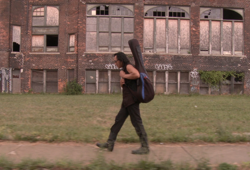
There is a nervous energy to the camera work here that you can’t fake with a stabilizer. A lot of the footage is handheld, but not in that polished “handheld mode” way modern cameras do. It feels reactive. We are literally following Stephen “Sugar” Segerman and Craig Bartholomew Strydom, and the camera bumps and shakes along with them.
But look closer at the landscape shots. When the camera pans across the Cape Town coast or the Detroit streets, it’s slow. Deliberate. It’s a reveal. It’s not just establishing a location; it’s building anticipation.
Then you have the interviews. They are dead still. This is smart directing. When you have a story this wild, you don’t need the camera spinning around the subject. You lock it off, frame them comfortably, and let them talk. The stillness anchors the chaos of the mixed-media archival footage.
Compositional Choices
The framing does one thing brilliantly: it hides Rodriguez.
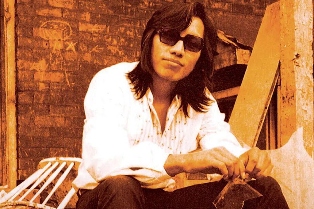
The film spends half its runtime building a legend, so the composition respects that mystery. We see shots of him from behind, silhouettes in windows, reflections. It’s the “Jaws” effect the less you see of the monster (or in this case, the rock star), the more interested you are.
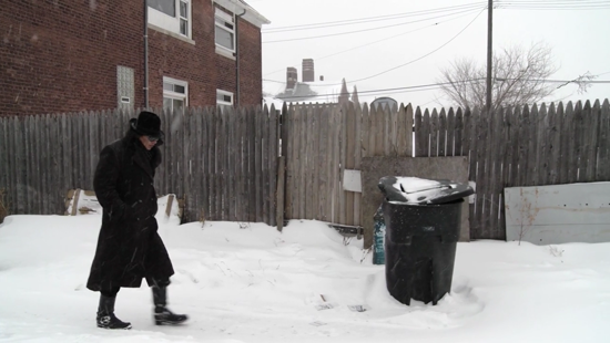
In South Africa, the frames are wide open. Lots of negative space. It feels like there is room to breathe. In Detroit, the framing gets claustrophobic. Close-ups on weathered hands, boots walking on pavement, tight shots of rundown buildings. It forces you to look at the grit. The composition tells you everything you need to know about his anonymity before a single word is spoken.
Lighting Style
Lighting is where the mood shifts from “Documentary” to “Cinema.”
The South African sequences are drenched in what looks like Golden Hour sun. It’s high-key, warm, and optimistic. It mimics the feeling of listening to the “Cold Fact” album on a summer day. It feels like freedom.
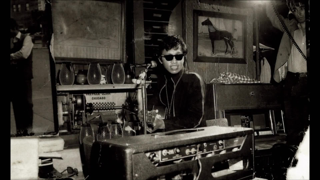
Cut to Detroit, and the lights go out. We’re dealing with available light streetlamps, overcast skies, and interior tungsten that hasn’t been color-corrected to perfection. It’s shadowy and moody. They didn’t try to fill in the shadows to make it “pretty.” They let the shadows crush. It reinforces the idea that Rodriguez was living in the dark, totally unaware of his fame.
Lensing and Blocking
I love that the filmmakers didn’t overcomplicate the lens choices. Wide lenses for the context, tighter lenses for the emotion.
The blocking—where the subjects are placed is fascinating because of how un-staged it feels. But there is intent there. Putting Rodriguez with his back to the camera isn’t just an “artsy” choice; it characterizes him. He doesn’t want the fame. He turns away from us.
I remember grading a short film a few years ago where the director was obsessed with getting a specific complex dolly shot. We spent four hours lighting it. But in the edit, the shot that actually made the audience cry was a simple, slightly out-of-focus handheld shot of the actor’s nervous hands. Searching for Sugar Man leans into that truth. A simple shot of a man walking away down a snowy street says more than a dozen perfectly lit close-ups.
Color Grading Approach
This is the part that usually gives me a headache, but here, it’s a triumph. As a colorist, if you handed me a timeline with Super 8, 16mm, SD broadcast tape, and iPhone video, I would probably panic. The noise floors are different, the color spaces don’t match, and the compression artifacts are a nightmare.
But the grade ties it all together with a heavy, stylized look. They didn’t try to make it look “accurate” (Rec.709 correct). They went for a vibe.
- South Africa: The mids are pushed warm. The blues in the sky are shifted toward teal/cyan—a classic film print look. The highlights roll off softly, probably using a film emulation LUT to hide the harsh digital clipping of the phone camera. It feels nostalgic.
- Detroit: They pulled the saturation out. The blacks are crushed harder here, likely to hide noise in the low-light footage, but narratively it works to make the city feel tough. The palette shifts to steely blues and desaturated greens.
The most impressive part? The grain. They likely overlaid a consistent film grain scan across the entire timeline (even the digital stuff) to glue the textures together. It tricks your brain into thinking it’s all one medium.
Technical Aspects & Tools
We know they used a patchwork of cameras, but the post-production workflow is the unsung hero here. Matching an iPhone sensor (which has terrible dynamic range and falls apart in low light) to Super 8 film (which has great highlight retention but heavy grain) is difficult.
You can’t just slap a LUT on and call it a day. You have to go in and manually denoise the digital footage, then add texture back in. You have to qualify the skin tones to make sure they don’t look plastic on the phone shots.
They also played with aspect ratios. Documentary footage is often 4:3, while modern footage is 16:9 or wider. Instead of cropping everything to fill the screen (and losing resolution), they often let the formats exist as they are, or cropped strategically. It feels like a collage rather than a mistake. It proves that if the story is good enough, the audience will forgive the technical “flaws.”
- Also read: INSIDE JOB (2010) – CINEMATOGRAPHY ANALYSIS
- Also read: THE PERKS OF BEING A WALLFLOWER (2012) – CINEMATOGRAPHY ANALYSIS
Browse Our Cinematography Analysis Glossary
Explore directors, cinematographers, cameras, lenses, lighting styles, genres, and the visual techniques that shape iconic films.
Explore Glossary →