Rebecca (1940) is a masterclass in visual design that proves you don’t need a single drop of color to terrify an audience.This was Hitchcock’s first American feature and his only Best Picture winner. But for me, it’s not just a museum piece or a gothic romance. It is a suffocating descent into a young woman’s psyche, visualized through lighting so precise it feels predatory. It’s a reminder that a cinematographer can shape the narrative just as much as the writer, especially when they are handcuffed by the technology and strict censorship of the 1940s.
Before he became the undisputed heavy hitter of Hollywood suspense, Hitchcock was a British icon crossing the Atlantic to work for producer David O. Selznick. And the timing was intense Selznick was fresh off the massive success of Gone with the Wind. The mission was to adapt Daphne du Maurier’s best-selling novel, Rebecca, into something that would work on screen without losing its dark soul.
What they pulled off visually is staggering, especially when you consider the limitations. They didn’t have the luxury of modern post-production to fix moodiness; they had to bake it into the negative. The film relies heavily on atmosphere, building dread not through jump scares, but through an oppressive interplay of light and shadow. The Production Code at the time was strict sex and violence were big no-nos so Hitchcock and his team had to push those themes into the subtext. The cinematography does the heavy lifting here, turning the psychological domination of the plot into a physical reality on screen.
About the Cinematographer
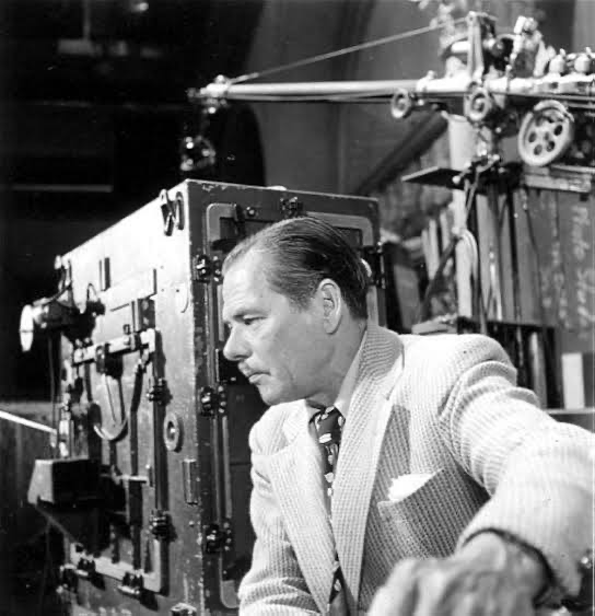
The guy responsible for translating Hitchcock’s paranoia into light was George Barnes. By 1940, Barnes wasn’t some fresh-faced film school grad; he was a veteran with over a hundred credits, having shot classics like The Devil’s Party. He wasn’t necessarily known as a flashy “auteur” cinematographer, but looking at his work here, he was exactly the technician Hitchcock needed.
Barnes had a style that leaned into deep focus and rich textures. He understood that in black and white, texture is color. His collaboration with Hitchcock was critical because Hitchcock didn’t just want a scene lit; he wanted subjective camera work that put us inside the character’s head. Barnes had to deliver technical precision while sculpting spaces that felt alive with menace. He didn’t just illuminate the set; he made the shadows feel heavy.
Inspiration Behind the Cinematography
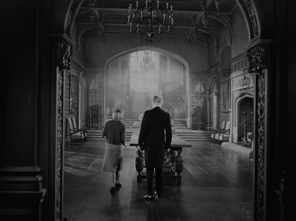
The main visual reference was obviously the novel itself grand, oppressive, and haunting. The visual language had to mirror the protagonist’s identity crisis. Hitchcock and Barnes treated the setting, the mansion of Manderley, as the film’s antagonist. It needed to look beautiful, but also like a cage.
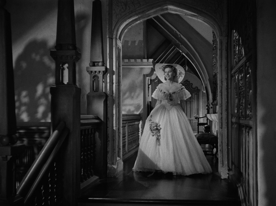
The film’s “psychological brutality” is all in the lighting cues. The script describes “large arches, dark, cavernous hallways, grandiose staircases,” but on set, Barnes had to figure out how to light those so they felt crushing. The architecture is designed to make the new Mrs. de Winter look insignificant. They often used matte paintings to artificially extend the ceilings and hallways, enhancing that “overbearing feeling.” Since they couldn’t be explicit about the twisted dynamics of the marriage, they used visual metaphors. Every shadow acts as a stand-in for the things the characters are too afraid (or censored) to say.
Camera Movements
In Rebecca, the camera doesn’t move just to look cool; it moves to make you uncomfortable. Hitchcock was already flexing his signature style here. There’s a specific “point of view walk down a staircase” that plunges us right into Mrs. de Winter’s anxiety. It’s not just an establishing shot; it’s an immersive tool to make us feel her vertigo.
Then you have Mrs. Danvers, the housekeeper from hell. Notice how the camera treats her. She rarely walks; she glides. The tracking shots used on her are smooth and ghost-like, emphasizing her “unearthly presence.” She just appears in the frame. This deliberate control of motion keeps us off-balance. There’s also a really specific, almost awkward moment a “gawkily camera move” when Maxim recounts Rebecca’s final night. The camera feels like it’s physically recoiling, mirroring the revulsion in the story. It’s a subtle touch, but it shows the camera acting as an emotional barometer.
Compositional Choices
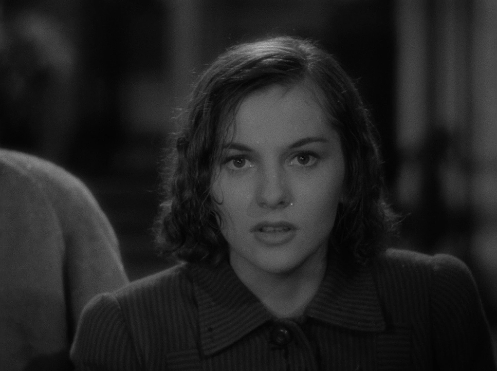
Barnes’ framing is a lesson in power dynamics 101. The vastness of Manderley constantly dwarfs the new Mrs. de Winter. He uses negative space and deep perspective to isolate her. You’ll see her framed in massive doorways or at the bottom of sweeping staircases, literally swallowed by the furniture and the house itself. It creates a visual hierarchy where she is always at the bottom.
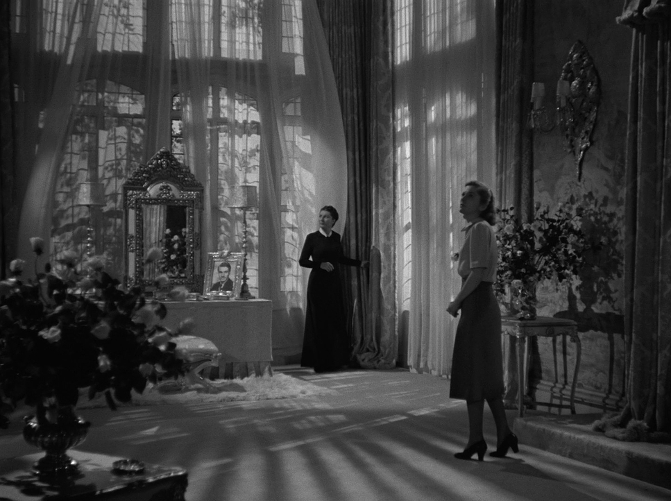
Mrs. Danvers gets the opposite treatment. She is framed to dominate. Low-angle shots make her look tall and imposing, almost supernatural. Her sudden appearances “popping up out of the darkness” are achieved through clever blocking and staging rather than editing tricks. She emerges from the deep blacks of the set design. The foreground elements often act as bars or barriers, creating a suffocating atmosphere where every frame feels like a trap.
Lighting Style
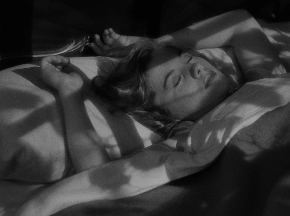
This is where the film really shines or rather, where it really embraces the dark. Barnes uses a classic chiaroscuro style, but he dials the contrast up to eleven. It’s not just about visibility; it’s about hiding information.
The shadows in Manderley are deep and consuming. Mrs. Danvers is frequently lit with a “cold, hostile” key light, often emerging from total darkness. This isn’t “natural” lighting in the realistic sense; it’s emotional realism. The scene where she shows off Rebecca’s preserved bedroom is a perfect example. It starts seemingly normal, but the lighting shifts to become “claustrophobic and sinister” as the scene progresses. The shadows close in. The highlights are controlled carefully catching the glint in Danvers’ eyes or the sheen of expensive fabric while everything else falls into the void. It creates a visually dense world where the darkness feels like a physical threat.
Lensing and Blocking
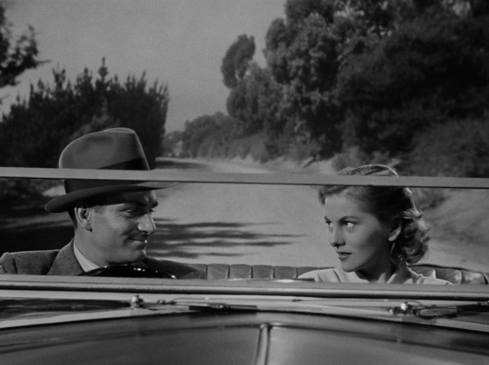
We don’t have the camera logs, but you can feel the lens choices. They likely used wider glass for those grand shots of Manderley to exaggerate the scale and make the protagonist look tiny. The subtle distortion of a wide lens on a close-up adds a layer of unease. Conversely, longer lenses isolate the characters, detaching them from reality during moments of emotional turmoil.
The blocking is rigorous. Mrs. Danvers physically dominates the frame, often standing over Mrs. de Winter or positioning herself between the girl and the exit. Think about the scene where Maxim steps “into the light of a projector,” literally blocking out the happy memories on the screen. That’s not just a plot point; it’s a brilliant piece of blocking that visually negates the happiness. The use of depth, placing characters on different planes, establishes the pecking order long before anyone speaks a line of dialogue.
Color Grading Approach
This is where my daily work comes in. Even though Rebecca is black and white, I view it through the lens of a colorist. If I were grading this in DaVinci Resolve today, I wouldn’t be thinking about hue; I’d be thinking about tonal separation and “density.”
In 1940, their “grade” was determined by the film stock and the development bath. But Barnes achieves exactly what we try to do digitally. The darkness in Manderley isn’t just underexposed; it’s a specific choice to crush the lower end of the luminance spectrum. Modern sensors (and nervous clients) are often terrified of “clipping” the blacks, but Rebeccaproves that letting the shadows roll off into an inky abyss is powerful.
Mrs. Danvers is sculpted with heavy mid-tones and shadows, giving her a “visual weight” that anchors her in the frame. Mrs. de Winter, when she’s hopeful, gets brighter, softer values (higher luminance). The film separates characters not by color contrast, but by luminance contrast. The “highlight roll-off” on the practical lamps and windows creates a soft, organic bloom that digital cameras still struggle to emulate perfectly. The lack of color forces you to focus purely on shape and form. It’s a reminder to me that sometimes, the best color palette is just strictly controlling your contrast ratio.
Technical Aspects & Tools
Rebecca (1940) — Technical Specs
| Genre | Drama, Mystery, Psychological Horror, Murder Mystery, Horror, Thriller |
|---|---|
| Director | Alfred Hitchcock |
| Cinematographer | George Barnes |
| Production Designer | Lyle R. Wheeler, William Cameron Menzies |
| Costume Designer | Irene |
| Editor | W. Donn Hayes |
| Time Period | 1940s |
| Color | Desaturated, Black and White |
| Aspect Ratio | 1.33 – Spherical |
| Original Aspect Ratio | 1.37 |
| Format | Film – 35mm |
| Lighting | Hard light, High contrast, Underlight, Side light |
| Story Location | … England > Manderley |
| Filming Location | … Culver city > Selznick International Studios – 9336 Washington Blvd |
Technically, this was a beast of a production. They were likely shooting on Mitchell BNC cameras, which were the industry standard tanks heavy, reliable, and smooth, which explains the stability of those tracking shots. The film stocks were likely slow by today’s standards (orthochromatic or panchromatic), meaning they needed a lot of light.
To get those deep shadows, Barnes would have been blasting the set with massive arc lamps and incandescent fixtures, then cutting that light with flags and scrims. It would have been hot and loud on that stage. The practical lights (lamps in the shot) help sell the reality, but the real work was being done by huge units off-camera. And we have to mention the matte paintings hand-painted glass placed in front of the camera to extend the sets. It’s a lost art that allowed them to create that expansive, expensive look without actually building the roof of the mansion.
- Also read: NETWORK (1976) – CINEMATOGRAPHY ANALYSIS
- Also read: THE HANDMAIDEN (2016) – CINEMATOGRAPHY ANALYSIS
Browse Our Cinematography Analysis Glossary
Explore directors, cinematographers, cameras, lenses, lighting styles, genres, and the visual techniques that shape iconic films.
Explore Glossary →