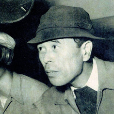
It’s not just a historical epic; Ran Japanese for “chaos” is a masterclass in visual tension. While critics often cite Seven Samurai as Kurosawa’s peak, I find myself constantly returning to Ran. The sheer visual ambition is staggering, especially when you consider Kurosawa was 75 years old and practically blind when he directed it. For us in the post-production world, where we often fix things in the suite, Ran is a humbling reminder of what happens when you commit to a vision in camera. It’s a calculated assault of light, shadow, and hue designed to pull you into its madness.
About the Cinematographer
Kurosawa is famously known for storyboarding every single shot essentially pre-visualizing the entire film as a series of paintings but the execution on set fell to a triumvirate of cinematographers: Asakazu Nakai, Takao Saito, and Shoji Ueda. It’s a fascinating dynamic to consider: a director with an almost dictatorial visual aesthetic relying on three separate DPs to maintain a singular look.
Kurosawa started as a painter, and it shows. He spent a decade storyboarding Ran before a single frame of film was exposed. Because his eyesight was failing, these storyboards weren’t just creative guides; they were technical necessities. This meant the DPs weren’t “finding the shot” on the day. They were executing a meticulously planned visual score. It allowed them to focus entirely on the nuances of exposure and lens choice, knowing the composition was locked. This collaborative yet rigid environment resulted in imagery that feels less like cinema and more like moving canvas.
Inspiration Behind the Cinematography
The narrative is obviously Shakespeare’s King Lear meets the legend of Mori Motonari, but visually, the inspiration is the concept of “chaos” itself. The title isn’t just a label; it’s the visual directive.
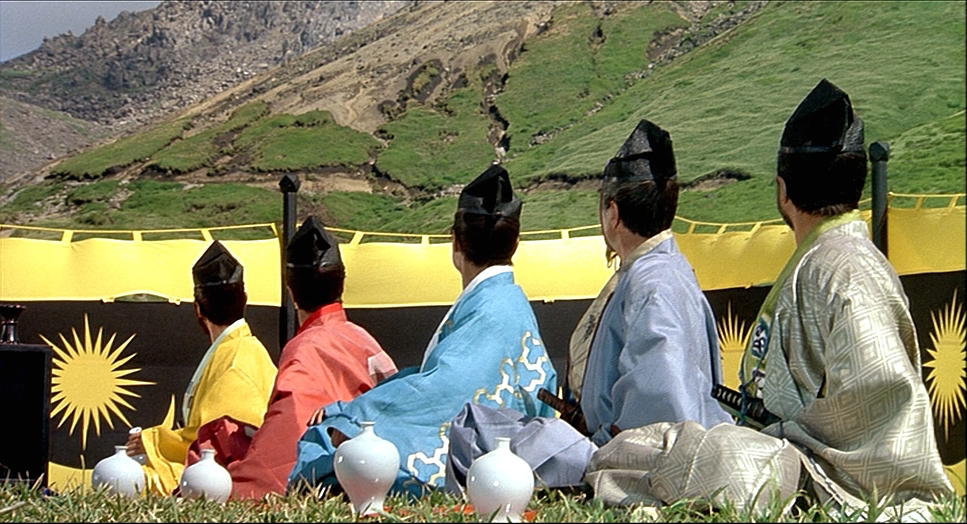
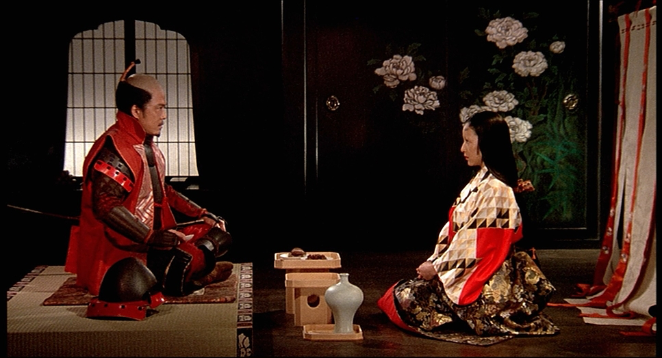
You can feel Kurosawa’s painting background in every frame. The composition often mimics classical Japanese art flat, composed, and deliberate but with a kinetic energy that builds tension. The color coding of the warring clans isn’t just a costume choice; it’s a theatrical device that highlights the ensuing brutality. Take the opening scene: the samurai are dressed in distinct primary colors, standing perfectly still against a vast sky. It’s a visual metaphor for the fragile peace that Hidetora has built, a stillness that makes the inevitable violence feel all the more shattering. Kurosawa and his DPs sculpted the light to serve this tragic narrative, ensuring the visual language was always pessimistic, always heavy.
Camera Movements

In an era where “chaos” is often filmed with shaky, handheld cameras to simulate confusion, Kurosawa exercised remarkable restraint. He opted for static, wide-angle shots that force the audience to observe the tragedy from a distance. We are positioned as helpless witnesses.
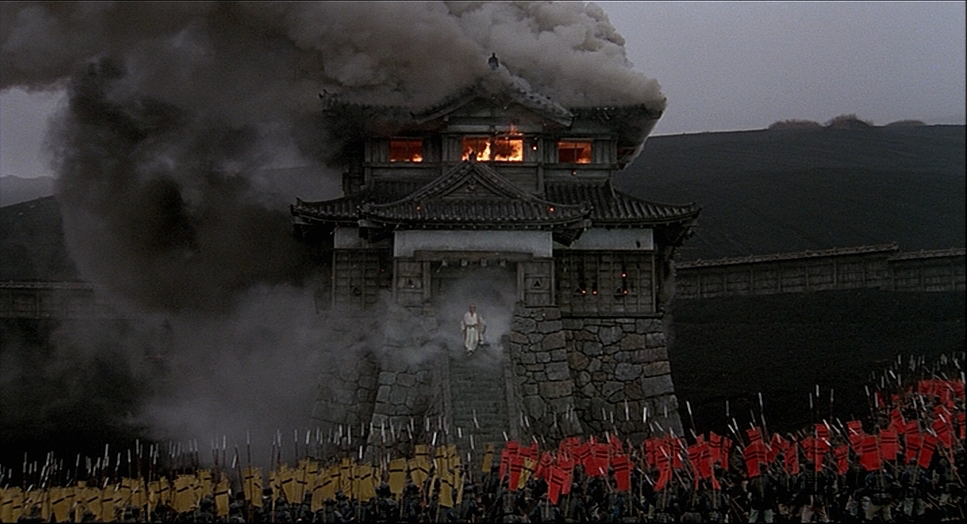
But this isn’t laziness; it’s confident blocking. When the camera does move, it cuts deep. We see deliberate, slow pans that reveal the sheer scale of the armies. During the battle sequences, particularly the castle burning, the movement remains composed, tracking arrows or following a lone figure like Hidetora emerging from the smoke. That specific shot of Hidetora captured in one take is a testament to the crew’s precision. It captures his descent into madness without a single cut or frantic whip-pan. Kurosawa understood that a steady frame allows the chaos within the image to breathe. It creates a rhythm an ebb and flow between stillness and motion that mirrors the collapse of Hidetora’s world.
Compositional Choices
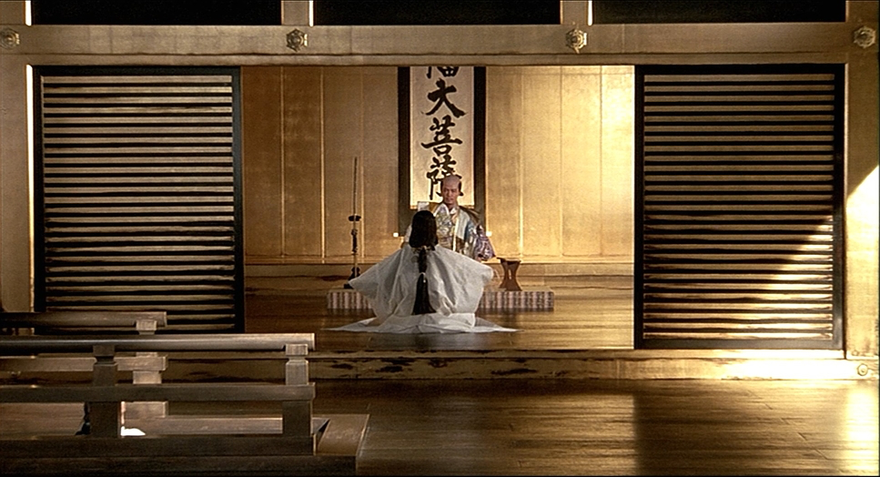
The composition in Ran is a lesson in hierarchy. Kurosawa frequently uses the “frame within a frame” technique shooting through gates, pillars, or formations of soldiers to direct the viewer’s eye. But what strikes me most is his use of negative space. Characters are often dwarfed by their environment, emphasizing their insignificance against nature or the tides of war.
He utilizes the horizontal plane exquisitely. By positioning characters at various depths, he creates a rich, three-dimensional tableau even on a 2D screen. In the battle scenes, the hundreds of extras aren’t just background noise; they are blocked as dynamic masses that sweep across the frame. There is a distinct portrait-like quality to the quieter moments, where samurai stand poised like a photographic still life. This creates a jarring contrast when the action erupts. The interplay of figure and ground is always intentional whether it’s the tension of a lone figure against a towering sky or the claustrophobia of a besieged castle, the framing serves the story.
Lighting Style
The lighting in Ran favors a heightened naturalism. It doesn’t look like the over-lit studio productions of the 80s; instead, it leans into the harshness of the elements.
The production relied heavily on natural light, often waiting for specific times of day to capture the right mood. The scene with Hidetora and his past victim, bathed in a powerful sunset, is a prime example. You can’t fake the specific quality of golden hour light hitting a 35mm negative; the DPs had to chase it. Indoors, the lighting simulates torchlight and window spill, creating a high-contrast, gritty atmosphere that feels historically accurate.
However, the most impressive lighting feat is the castle burning scene. The fire itself becomes the key light, casting stark, dancing shadows. Managing the dynamic range here would have been a nightmare. They had to preserve detail in the raging highlights of the fire while keeping enough information in the shadows to convey the panic. It’s a masterclass in exposure control, using light and shadow not just for visibility, but as emotional cues. The darkening skies throughout the film aren’t just weather; they are a lighting choice that mirrors the narrative’s descent into darkness.
Lensing and Blocking

Kurosawa didn’t just use wide lenses for epic scale; his signature in Ran is the use of long telephoto lenses (likely the Cooke 20-100mm zooms or Panavision glass).
Telephoto lenses compress perspective, flattening the background and foreground. This makes distances seem shorter and the visual field denser. Kurosawa used this to terrifying effect in the battle scenes. By stacking layers of soldiers on a long lens, the armies look overwhelmingly vast, an endless sea of humanity. It also creates a psychological claustrophobia characters appear trapped, unable to escape their fate.
The blocking matches this lens choice perfectly. This wasn’t just moving actors; it was choreographing human geometry. The armies surge and retreat with tactical precision. It feels like a dress rehearsal for war. Even in the widest shots, individual actors are placed with mathematical exactness. This combination of compression and meticulous blocking allows the film to feel epic and intimate simultaneously we see the grand scale of the war, but we feel the suffocating pressure on the individual characters.
Color Grading Approach
From a colorist’s perspective, Ran is where the rubber meets the road. Kurosawa, who made his name in black and white, used color here as a narrative weapon.
The distinct color assignments yellow, red, and blue are pure genius in their simplicity. It’s a visual shorthand that lets the audience track loyalties instantly. But what I love is how these colors interact physically on the film stock. When the armies clash, the primary colors bleed into one another, creating a muddy, chaotic violet-brown mess that symbolizes the breakdown of order. And the blood it’s a specific, bright, almost theatrical vermilion that pops violently against the muted earth tones.
In terms of grading (or timing, as it would have been photochemically), the film pushes saturation without breaking the image. The highlights glinting armor, roaring fire roll off beautifully, retaining texture where a digital sensor might just clip to white. The shadows are dense. They aren’t the lifted, milky shadows we see in modern “cinematic” LUTs; they have true weight. This is the beauty of subtractive color on 35mm film. The sunsets burn with a density that feels almost unreal, a nostalgic, dream-like quality that is incredibly hard to emulate digitally. It’s a palette that isn’t just “pretty”; it enhances the emotional logic of the scene.
Technical Aspects & Tools
| Ran (1985) — Technical Specifications | |
|---|---|
| Genre | Action, Drama, History, Shakespeare on Screen, Stage Adaptation |
| Director | Akira Kurosawa |
| Cinematographer | Asakazu Nakai, Takao Sait?, Sh |
| Production Designer | Yoshirô Muraki |
| Costume Designer | Emi Wada |
| Editor | Akira Kurosawa |
| Time Period | 1800s |
| Color | Green |
| Aspect Ratio | 1.85 – Spherical |
| Format | Film – 35mm |
| Lighting | Hard light, Top light |
| Lighting Type | Daylight, Sunny |
| Story Location | … Asia > Japan |
| Filming Location | … Asia > Japan |
| Camera | Panavision Panaflex |
| Lens | Cooke 20-100mm, Panavision Super Speed Zeiss MKII |
Given the scale, the technical execution had to be flawless. Shooting on 35mm film with period-appropriate cameras (Panavision Panaflex), the team had no safety net.
The choice of stock was critical. They needed something with enough latitude to handle the blazing fires of the night scenes and the harsh mid-day sun of the exterior battles. Capturing those rich, saturated reds a notoriously difficult color for film stocks of that era to render without bleeding required perfect exposure.
The “one-take” requirement for the castle burning scene is the stuff of legend. There was no “we’ll fix it in post.” The castle was actually burning. The heat, the smoke, the timing of the extras, the camera move, the focus pull it all had to be synchronized perfectly. This practical approach lends a physical weight to the image that CGI simply cannot replicate. When you see heat distortion in Ran, it’s real heat. When you see smoke, it’s choking the actors. It’s a reminder that sometimes, the most advanced tool in filmmaking is simply preparation.
- Also read: DIAL M FOR MURDER (1954) – CINEMATOGRAPHY ANALYSIS
- Also read: THE WILD ROBOT (2024) – CINEMATOGRAPHY ANALYSIS
Browse Our Cinematography Analysis Glossary
Explore directors, cinematographers, cameras, lenses, lighting styles, genres, and the visual techniques that shape iconic films.
Explore Glossary →