Let’s talk Princess Mononoke. As a filmmaker and full-time colorist running Color Culture, there are certain films that act as north stars projects that don’t just tell a story, but define the visual language of their medium. Hayao Miyazaki’s Princess Mononoke is one of those cinematic behemoths. It demands your full attention, rewarding the viewer with layers of meaning and breathtaking artistry that reveal themselves differently with every rewatch.
Released in 1997, this film marked a significant pivot for Studio Ghibli. It was a departure from the whimsical innocence of My Neighbor Totoro or Kiki’s Delivery Service. It is gritty, violent, and explores mature, complex themes. Yet, despite its darker edges, it retains that signature Miyazaki magic a thread of hope woven through a tapestry of conflict. For someone who lives and breathes visual nuance, this film is a goldmine of craft, intention, and emotional logic.
About the Cinematographer
In the realm of animation, the role of “cinematographer” is unique. While Atsushi Okui served as the Director of Digital Imaging, Hayao Miyazaki acts as the true visual architect. He is a director who understands that in animation, nothing is accidental; every shadow, movement, and frame edge is a choice.
Miyazaki’s attention to detail isn’t just aesthetic; it’s foundational to the narrative. He is deeply concerned with authentic human behavior. This translates into a cinematic approach where the “camera” doesn’t just observe—it feels. Even though these characters are technically 2D illustrations, they carry a physical weight and presence that rivals live-action performance. He crafts a visual language that builds environments so richly textured that they evoke genuine empathy. It’s a directorial vision so complete that the cinematography becomes an extension of the storytelling, effectively making Miyazaki one of the greatest visual directors in history, regardless of the medium.
Inspiration Behind the Cinematography
The visual language of Princess Mononoke is a fascinating blend of diverse influences. On one hand, you can see the lineage of Western animation the sophistication of early Disney but pushed into a realm of maturity that the West rarely touched. More importantly, Miyazaki draws heavily from the language of live-action epics. The sweeping grandeur of the landscapes and the composition of the battles echo the wide-format mastery of David Lean (director of Lawrence of Arabia). You can feel that sense of scale; the characters are small, and the world is massive.
However, the soul of the film’s identity lies in Japanese history and mythology. Set during the Muromachi period (1336-1573 CE), the film anchors its fantasy in a tangible reality. This grounding makes the spiritual conflicts feel historical rather than purely magical. Miyazaki notably drew inspiration from Daijiro Morohoshi’s manga Mudmen for the unique, unsettling design of the Nightwalker and the Kodama, blending ancient lore with specific artistic tributes.
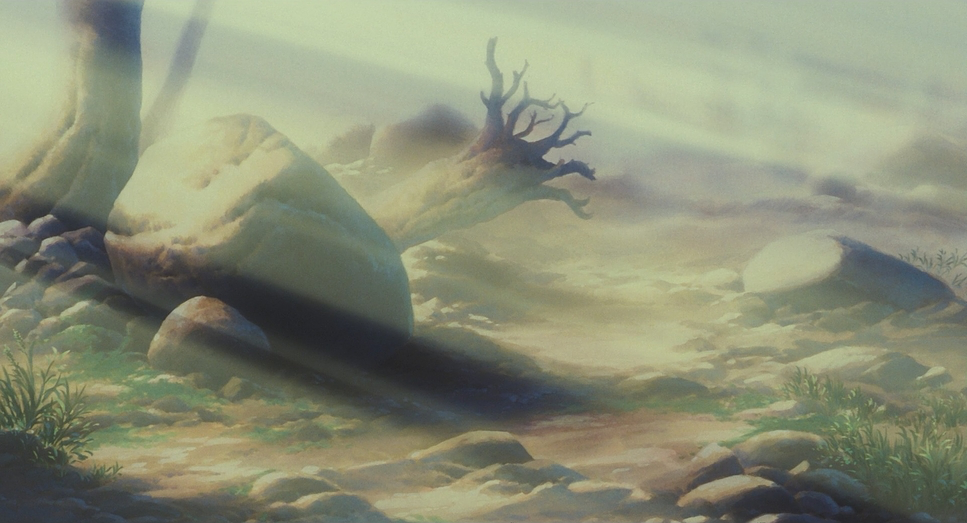
Visually, the primary reference was nature itself. The production team’s research trip to the ancient forests of Yakushima heavily influenced the film’s setting. The moss-draped trees, the density of the foliage, and the pervasive mist of the “Cedar Forest” are direct visual echoes of Yakushima. This commitment to real-world reference points grounds the cinematography in a profound sense of naturalism, making the fantasy elements feel all the more intrusive and powerful.
Camera Movements
Miyazaki’s approach to camera movement here is a masterclass in controlled dynamism. Unlike his gentler films, the violence of Mononoke necessitated a more active, almost aggressive camera.
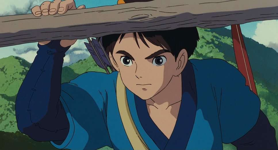
When Ashitaka confronts the demon boar Nago in the opening sequence, the “camera” tracking is swift and brutal. It mimics the urgency of handheld operating, emphasizing the sheer power and speed of the corrupted god. Later, during the battles between Iron Town and the forest creatures, we get expansive tracking shots that showcase the sheer scale of the conflict. These aren’t just chaotic pans; the timing is perfectly synced with the editing to maximize visual awe. We see dolly-like moves that glide through the carnage, offering clear spatial information while maintaining emotional impact.
But it’s not all adrenaline. Miyazaki relishes the “Ma” the emptiness or pause. He is confident enough to let the camera linger on the mundane. A slow pan across a quiet forest or a gentle push-in on a character eating these are moves designed to build internal tension. They allow the audience to breathe and absorb the environment. This variety in pacing, where quiet observation is contrasted with explosive movement, makes the action sequences feel exponentially more spectacular.
Compositional Choices

The compositions in Princess Mononoke are strictly hierarchical and deeply intentional. Every frame feels meticulously crafted to reinforce the power dynamics between Man and Nature.
Miyazaki employs extreme wide shots to emphasize the terrifying beauty of the environment. Human figures are often dwarfed by ancient trees and mist-shrouded mountains, establishing the overwhelming power of the natural world. The use of depth cues foreground foliage, mid-ground action, and background haze creates a profound sense of three-dimensionality within the 2D medium.
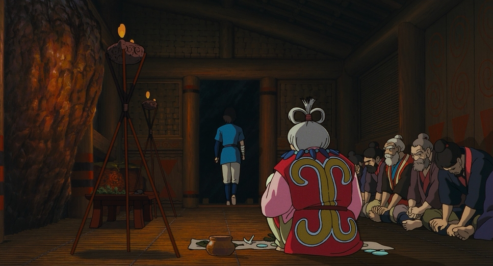
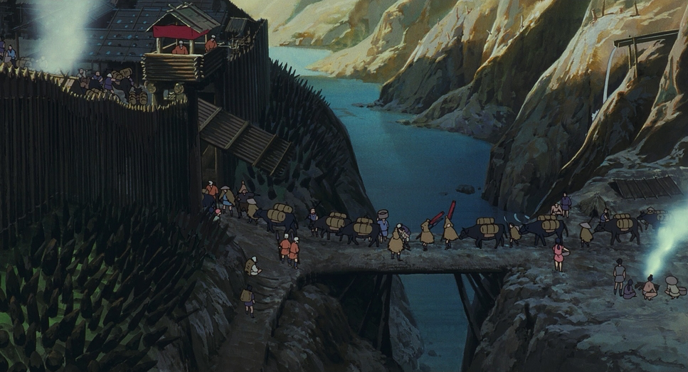
Conversely, for intimate moments involving Ashitaka and San, the framing tightens. Characters are frequently placed off-center using the rule of thirds, creating negative space that speaks to their isolation. The depiction of Iron Town is another compositional marvel. It feels like a functioning industrial complex. The blocking of the characters the lepers, the women working the bellows shows us the “politics” of the space without a word of dialogue. We understand how the town functions and how it physically fortifies itself against the forest simply through the arrangement of buildings and people within the frame.
Lighting Style
As a colorist, I am fascinated by how Mononoke handles light. Without a physical sensor to capture photons, the “lighting” is entirely a result of paint and compositing choices. Miyazaki utilizes a blend of naturalism and expressionism.
The forest scenes are often defined by dappled light sunlight filtering through a dense canopy (komorebi). This creates pockets of high contrast and shadow that give the environment texture. You can practically feel the humidity. However, the lighting shifts into expressionism when the supernatural enters. The Kodama glow with an ethereal luminescence that serves as a visual depth cue. The Nightwalker is accompanied by an otherworldly, cosmic glow that transforms the landscape into something sublime.
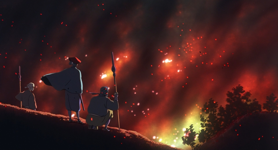
In Iron Town, the lighting is motivated by fire and industry. The orange glow of the tatara furnaces and the harsh, smoky atmosphere contrast sharply with the cool, clean light of the forest. Miyazaki understands that shadow is just as important as light; the deep blacks in the night scenes add mystery and danger without obscuring the action.
Lensing and Blocking
When we discuss “lensing” in animation, we are talking about the implied focal length. Miyazaki uses this tool to control emotional distance. We see wide-angle distortion for the vast landscapes and the corrupted gods, making them feel larger than life and encroaching on the viewer. Conversely, intimate character moments use a tighter, flatter field of view, simulating a telephoto lens to isolate the subject from the background.
Blocking the arrangement of characters in the space is exceptionally strong here. In Iron Town, the blocking is dense and purposeful, showing a community working in unison like a machine. In the forest, the movement becomes fluid and wild. The way San moves low to the ground, agile, integrated with the wolves contrasts with the upright, rigid posture of the samurai and soldiers. This physical blocking reinforces the thematic conflict: the rigid order of industry versus the fluid chaos of nature.
Color Grading Approach
This is where the film truly excels. Princess Mononoke’s color palette is a masterclass in restrictive storytelling. Since this was primarily traditional cel animation, the “grading” was done during the paint selection phase, but the result creates a specific, cohesive look that rivals modern digital intermediate workflows.
The film leans into a subtractive color model with print-film sensibilities. The forest is awash in deep, vibrant greens and earthy browns, but they aren’t neon or digital; they have an organic density. There is incredible hue separation in the foliage distinct teals, moss greens, and yellow-greens which sculpts the environment.
The contrast shaping is intelligent. In the forest, the shadows are allowed to sit in the deep blacks, preserving mystery. However, when the Nightwalker appears, the palette shifts into cool cyans and transparent blues, indicating a departure from the natural order. In stark contrast, Iron Town is desaturated, dominated by the grays of iron, the rust of decay, and the reds of fire. Even the blood and there is a lot of it is a deep, oxidized maroon rather than a bright candy apple red. This specific palette choice ensures the violence feels “heavy” and grounded, rather than cartoonish.
Technical Aspects & Tools
| Princess Mononoke – Technical Specs | |
|---|---|
| Genre | Adventure, Animation, Fantasy, Traditional Animation, Nature, Drama, Wildlife, Anime |
| Director | Hayao Miyazaki |
| Cinematographer | Atsushi Okui |
| Editor | Hayao Miyazaki, Takeshi Seyama |
| Colorist | Hiroaki Hirabayashi |
| Time Period | Renaissance: 1400-1700 |
| Color | Cool, Saturated, Green |
| Aspect Ratio | 1.85 |
| Format | Animation |
| Lighting | Hard light |
| Story Location | Japan > Okinawa |
Princess Mononoke sits at a unique intersection in animation history. It is one of the final, great testaments to hand-drawn cel animation, yet it was also the first Ghibli film to incorporate digital ink and paint (Toononz) and 3D CGI for specific elements.
The “demon worms” that infect Nago and Ashitaka were procedurally generated to achieve a complexity of movement that would be impossible to animate by hand. However, Miyazaki insisted that these digital elements be textured to match the hand-drawn cels seamlessly. The result is a film that feels handcrafted but possesses a scale and complexity enabled by technology. The texture of the background paintings rendered in poster color provides a rich, painterly backdrop that contrasts with the clean lines of the characters. It’s a testament to using technology not as a crutch, but as a tool to expand the boundaries of traditional craft.
- Also read: HOWL’S MOVING CASTLE (2004) – CINEMATOGRAPHY ANALYSIS
- Also read: THE THING (1982) – CINEMATOGRAPHY ANALYSIS
Browse Our Cinematography Analysis Glossary
Explore directors, cinematographers, cameras, lenses, lighting styles, genres, and the visual techniques that shape iconic films.
Explore Glossary →