When I sit down to analyze Oliver Stone’s Platoon, I’m not looking at a reference for pretty, polished cinematography. If you put this film on a waveform monitor today, the scopes would probably look messy crushed blacks, clipped highlights, and noise floors that would make a modern streaming service QC fail. But that is exactly why it works. It doesn’t look like a movie; it looks like a memory that’s been dragged through the mud.
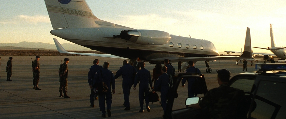
Platoon (1986) landed when Hollywood was still trying to figure out the visual language of Vietnam. Apocalypse Nowwas operatic and surreal; Full Metal Jacket was clinical and cold. Platoon went the other direction. It is sweaty, claustrophobic, and technically rough around the edges. From the moment Chris Taylor steps off the plane, the film abandons the romanticism of war. You don’t just watch the humidity; you feel the film stock swelling with it.
About the Cinematographer
Robert Richardson is a legend now, known for those hard, hot toplights in his work with Tarantino and Scorsese. But Platoon captures him at a different stage raw and reactive. He wasn’t trying to create a “look” in the traditional sense; he was trying to survive the shoot.
Richardson understands that technical perfection often kills emotion. In this film, he isn’t afraid to let the image fall apart. There are shots where the focus buzzes, or the exposure dips dangerously into the mud. A different DP might have called for a reshoot or pumped in fill light, but Richardson leans into the grit. He uses the camera not as an observer, but as a participant that is just as tired and disoriented as the grunts on screen.
Inspiration Behind the Cinematography
The visual bible for Platoon wasn’t a lookbook; it was Oliver Stone’s actual PTSD. Stone didn’t want a historical drama; he wanted a simulation of his own tour in Vietnam. He knew that the only way to get that “thousand-yard stare” was to actually exhaust the people making the movie.
Consequently, the cinematography is a direct result of the production conditions. Stone put the cast and by extension, the crew through a brutal training camp in the Philippines. They were sleep-deprived and eating MREs. When you see the camera shake or a delayed pan, that isn’t always an aesthetic choice that is operator fatigue. The genius of the film is that it captures this legitimate physical exhaustion. The camera stops chasing beauty and starts chasing survival.
Camera Movements
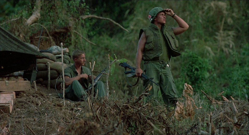
The camera in Platoon hates tripods. It’s almost entirely handheld, but not in that modern, “shaky-cam” action movie way where we use gimbals to fake chaos. This is heavy, shoulder-mounted movement. You can feel the weight of the Arriflex on the operator’s shoulder.
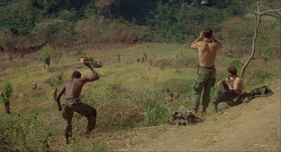
In the firefights, the operation borders on frantic. The lens is constantly seeking, peering over shoulders and getting whipped by foliage. It mimics the tunnel vision of adrenaline. We are limited to Taylor’s perspective we don’t see the enemy until he does.
Even in the walking scenes, the tracking shots are laborious. The camera fights the jungle just as much as the actors do. There is a specific 180-degree whip pan early in the film that signals Taylor’s descent into the underworld. It’s a simple move, but the aggression with which it’s executed tells you everything you need to know: we are leaving civilization behind.
Compositional Choices
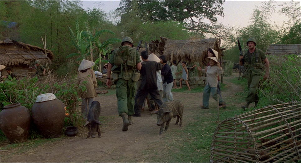
Richardson’s framing is a masterclass in claustrophobia. He utilizes the 1.85:1 aspect ratio to box the characters in. The jungle is allowed to dominate the frame, often creating a “frame within a frame” using vines and trees that obscures our view. It’s frustrating to look at, which is the point.
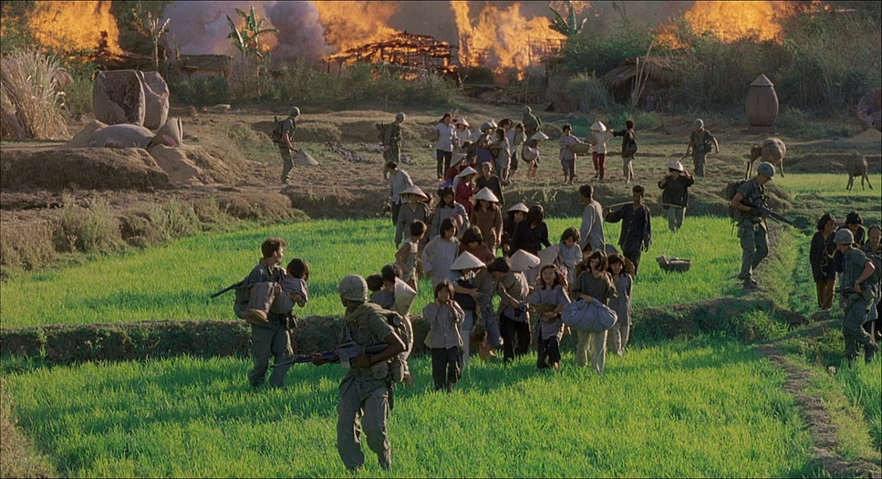
The composition often emphasizes the lack of individuality. On patrol, the soldiers are strung out in deep focus, just ants in a green hell. But what I love most are the close-ups. They are uncomfortably tight. When we are in the bunkers, the camera is right in their faces, distorting features slightly with wide angles. It forces an intimacy that feels almost violated. During the village raid, the juxtaposition of wide shots of destruction against tight, sweaty close-ups of the soldiers’ faces anchors the horror in human reaction rather than just pyrotechnics.
Lighting Style
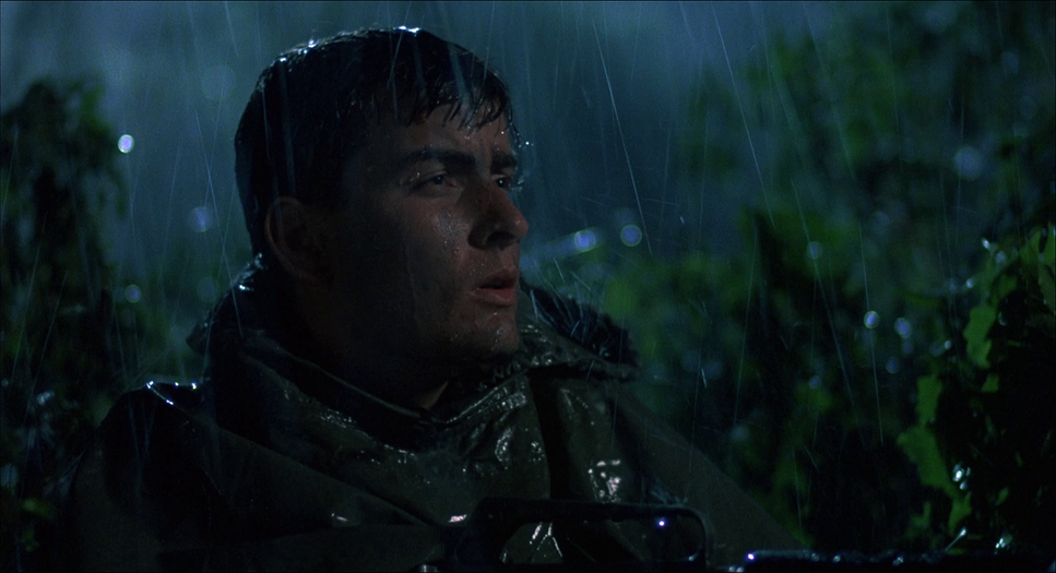
Lighting a jungle is a nightmare. The canopy eats light, meaning at midday you are dealing with dappled, high-contrast spots that blow out digital sensors, and at night, it is pitch black. Richardson didn’t fight this; he used it.
The daylight scenes rely heavily on natural light diffusion from the trees, creating a twilight effect at noon. It makes the soldiers look perpetually gray and sickly. But the night scenes are where the film truly shines. Richardson wasn’t afraid of true darkness. He lights scenes with flares and muzzle flashes.
From a technical standpoint, this is risky. A flare is an uncontrolled, moving key light. It swings shadows wildly across the frame and creates massive exposure changes in a split second. But the result is terrifying. The light is sickly—magnesium whites and burning oranges that render skin tones almost alien. It’s a perfect example of how “bad” lighting conditions create the best dramatic atmosphere.
Lensing and Blocking
While I don’t have the camera logs, the visual language screams spherical prime lenses, likely in the wider 24mm to 35mm range for the patrols. These lenses expand the background, making the jungle feel infinite while keeping the subject close. You can see the distortion on the edges of the frame the world literally bending around the characters.
However, Richardson switches to longer glass to compress the space when he wants to show the collective mass of the unit or the unseen enemy. The blocking is rigorous. The soldiers move in a snake-like formation, a single organism. The spatial relationship between Barnes and Elias is particularly interesting; Barnes is often center-frame, dominating the space, while Elias is blocked on the edges or in motion, suggesting his spiritual separation from the group’s brutality.
Color Grading Approach
If I were grading this film today in DaVinci Resolve, I wouldn’t be reaching for a “Teal and Orange” Hollywood blockbuster LUT. The palette of Platoon is defined by what it lacks. It is a lesson in subtractive color.
The greens are dense and muddy, not vibrant. In color theory, we often push green away from skin tones to make actors pop, but here, the skin tones are often infected by the green spill of the jungle. It creates a sickly cohesion between the men and the environment. They are becoming part of the landscape.
The contrast curve is where the film feels most “analog.” The toe of the curve (the shadows) is lifted just enough to see the grain, but the blacks are heavy. The highlights sweat on a forehead, a sun flare roll off gently rather than clipping into digital white. As a colorist, you look at this image and you can feel the film density. The colors are earth-toned: dried blood, wet mud, and rust. It’s a dirty palette. We aren’t trying to make the actors look healthy; we are visually rotting them as the movie progresses.
Technical Aspects & Tools
Platoon — Technical Specifications
| Genre | Action, Drama, War, Military, Vietnam War, History |
| Director | Oliver Stone |
| Cinematographer | Robert Richardson |
| Production Designer | Bruno Rubeo |
| Costume Designer | Wynn Arenas |
| Editor | Claire Simpson |
| Time Period | 1960s |
| Color | Desaturated |
| Aspect Ratio | 1.85 – Spherical |
| Format | Film – 35mm |
| Lighting | Hard light |
| Lighting Type | Sunny |
| Filming Location | … Philippines > Manila |
| Camera | Arriflex BL3 |
The movie was shot on 35mm film using Arriflex cameras (likely the BL3 given the era and sync sound requirements). The choice of stock was crucial here. They needed high-speed stock to expose in that dense jungle, and the tradeoff was grain. Lots of it.
In the 4K era, we are obsessed with denoising and sharpening, but Platoon proves that texture is emotional. The grain structure in the low-light scenes vibrates; it gives the image a nervous energy that a clean digital sensor simply cannot replicate.
But the most important tool wasn’t the camera; it was the method acting applied to the cinematography. By putting the crew through the same hell as the cast, the film achieved a “documentary” reactive quality that you can’t fake on a soundstage. The focus puller was tired. The operator was sweating. That physical struggle is embedded in the negative itself.
- Also read: ROOM (2015) – CINEMATOGRAPHY ANALYSIS
- Also read: STAND BY ME (1986) – CINEMATOGRAPHY ANALYSIS
Browse Our Cinematography Analysis Glossary
Explore directors, cinematographers, cameras, lenses, lighting styles, genres, and the visual techniques that shape iconic films.
Explore Glossary →