1968’s Planet of the Apes is a total masterclass in this. It’s a stark, heavy piece of science fiction that is every bit as compelling in its visuals as it is in its narrative. Most people remember the iconic twist, but for me, the real “gut punch” starts in the very first frame. It’s one of those rare films that deepens every time I watch it; once you get past the initial shock of the ending, you start seeing how the cinematography was whispering the truth to you the entire time.
About the Cinematographer
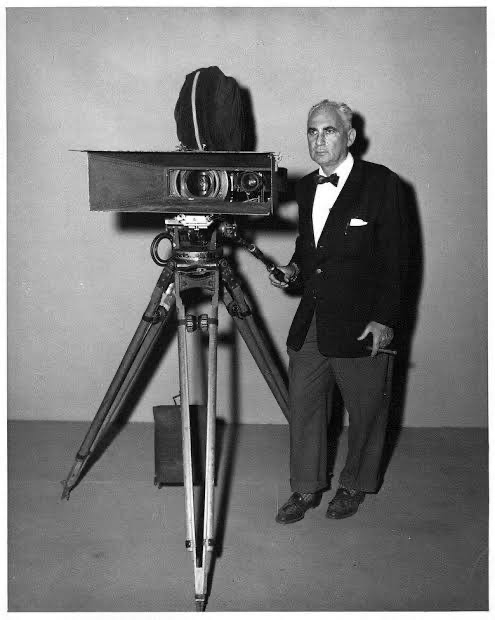
The visual architect here was Leon Shamroy. The man was a titan 18 Oscar nominations and four wins. He was a veteran DP from the Golden Age, the guy who shot Cleopatra and Leave Her to Heaven.
I’ll be honest: when I’m deep in the weeds of a modern digital workflow, obsessing over individual pixels, I sometimes forget the giants whose shoulders we’re standing on. Shamroy was at the absolute frontier of color cinematography. He didn’t just have a toolkit; he had a deep, intuitive sense of how to fill a wide frame to make a point. For Apes, he brought a level of gravitas that was mandatory. Without his technical prowess, the “man in a suit” premise could have fallen apart. He wasn’t just pointing a camera; he was world-building through a lens, balancing the epic scale of the desert with the intimate horror of Taylor’s situation.
Inspiration Behind the Cinematography
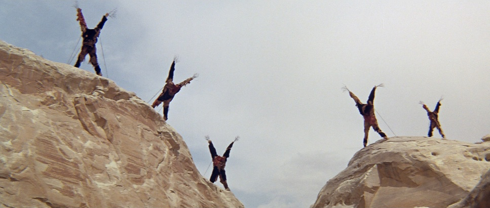
The look of this film is a perfect example of how budget constraints can actually spark genius. Originally, Rod Serling’s script had a high-tech ape city with flying machines. The studio looked at the bill and said, “No.” So, we got a primitive, agrarian society instead.
That pivot was the best thing that could have happened to the film’s aesthetic. The desolation isn’t just a backdrop; it’s a character. People joke about the “Grand Canyon porn” in this movie, but those shots are essential. They sell the isolation and the sheer weight of being stranded. This wasn’t a lush, “Ewok-style” jungle it was a parched, unforgiving world that felt like it was silently judging the characters. Shamroy used the environment to mirror humanity’s self-inflicted wounds, making the planet feel ancient and worn-out long before we see the ruins of our own civilization.
Camera Movements
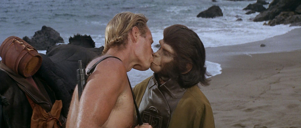
Shamroy’s camera is incredibly patient. In the opening act, as the astronauts trek across the wasteland, there are long stretches with zero dialogue. The camera just watches. It’s an observational style that forces you to sit in that heat and dust with them. These aren’t the frantic, “shaky-cam” movements we see in modern blockbusters; they’re deliberate and heavy.
When the apes finally show up, the energy shifts. We get these tracking shots that follow Taylor as he’s being herded like cattle, putting the audience right in his shoes. Then you have those slow, imposing pans across the ape council chambers. It feels rigid and bureaucratic, emphasizing Taylor’s total lack of agency. Every move feels “motivated” the camera doesn’t move unless Taylor’s status changes. We go from wide, confident shots of an explorer to tight, suffocating movements as he becomes a hunted animal.
Compositional Choices
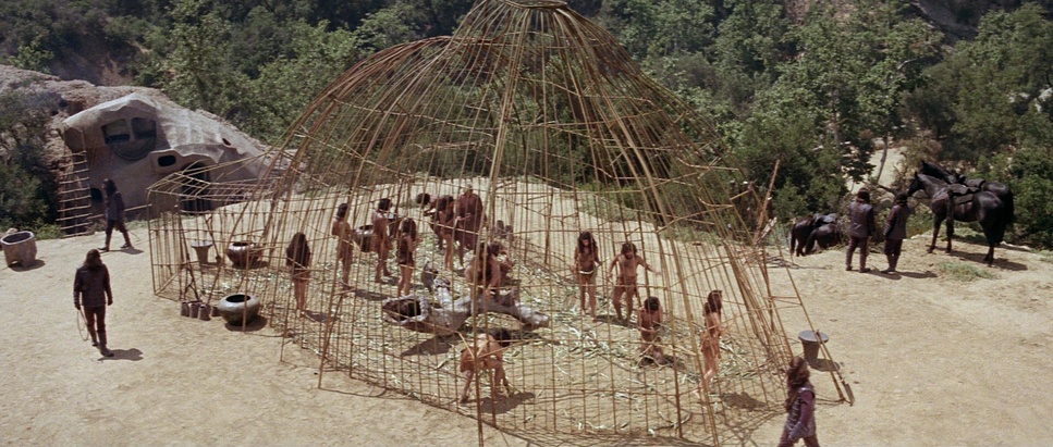
This is where the movie really earns its keep. Using the 2.35:1 Panavision format, Shamroy created frames that practically swallow the actors. Early on, the astronauts are tiny specks against massive rock formations. It’s a visual way of saying “you don’t matter here.”
Once the apes take over, the geometry changes. Shamroy starts framing the apes from low angles, making them look like statues imposing and dominant. Taylor, meanwhile, is usually framed low or through the literal bars of a cage. It’s dehumanization through composition. And that final shot of the Statue of Liberty? It’s a masterstroke of depth cues. You have the characters in the foreground and the massive, broken crown on the horizon. It doesn’t need a line of dialogue to explain the tragedy; the composition does all the talking.
Lighting Style
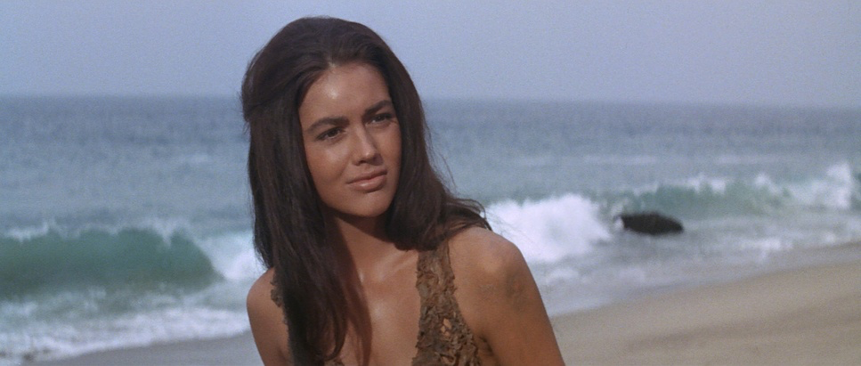
Most of the film relies on harsh, naturalistic light. In the desert, Shamroy leaned into the “brutality” of the sun. He used high-contrast lighting to pull out every wrinkle in the landscape and every pore in the ape prosthetics.
In the interiors, like Dr. Zaius’s chambers, it gets much more dramatic. You see cool, almost clinical tones in the labs and warmer, primitive light in the council areas. It’s a subtle way of showing the apes’ limited tech. I’ve heard people complain about the “strange luminosity” of the night shots, but to me, that eerie glow adds to the “wrongness” of the planet. It’s not about realistic exposure; it’s about mood.
Lensing and Blocking
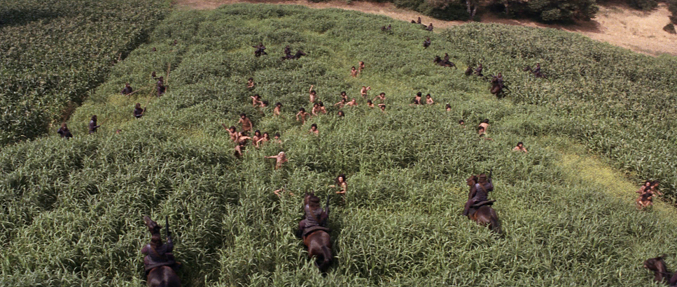
Shamroy clearly loved his wide glass for the exteriors. It captures the sheer scale of the Arizona and Utah locations, making the world feel infinite and the humans feel disposable.
But when we get to the Ape City, the lensing gets tighter. Those close-ups on the apes are legendary they allow actors like Roddy McDowall to actually act through layers of latex. The blocking is equally cruel. Think about the scene where the apes are “posing for photos” with their human trophies. The way they’re crowded together while Taylor is isolated in the frame tells you everything you need to know about the new social order. The camera is just a silent witness to the power dynamic.
Color Grading Approach
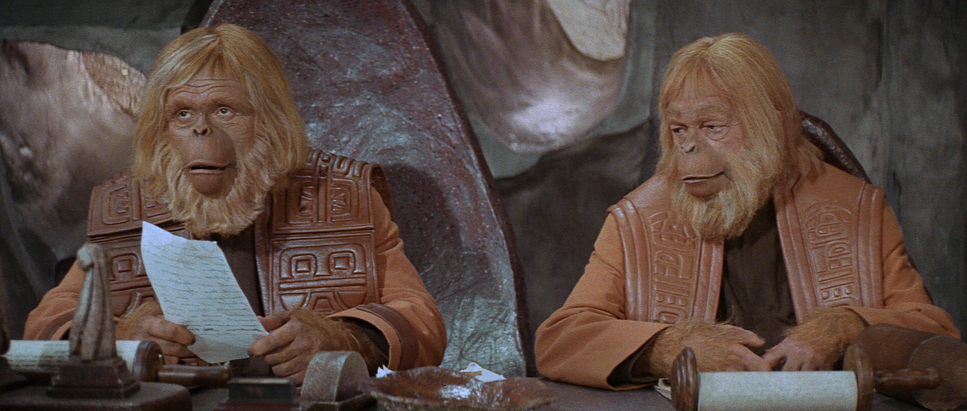
Time to put the colorist hat on. When we talk “grading” for 1968, we aren’t talking about DaVinci Resolve or clicking buttons. This was photochemical timing manipulating chemicals and light in a lab.
The palette is beautifully desaturated: tans, dusty browns, and muted greens. As a colorist, I’m looking at the contrast. The highlights on this original film stock (Kodak 5251) are incredible. They have a smooth, natural “roll-off” that digital sensors still struggle to replicate today. You don’t see that brittle clipping in the skies. Even with a limited palette, Shamroy kept the hues separated the orangey-brown of the ape fur pops just enough against the muted blue of the sky so things don’t get “muddy.” If I were grading this today, I’d fight to keep those rich, slightly lifted blacks. It gives the shadows an organic depth you just can’t get with a “pure digital zero.”
Technical Aspects & Tools
Planet of the Apes (1968) Technical Specifications
| Genre | Adventure, Mystery, Science-Fiction |
| Director | Franklin J. Schaffner |
| Cinematographer | Leon Shamroy |
| Production Designer | William J. Creber, Jack Martin Smith |
| Costume Designer | Morton Haack |
| Editor | Hugh S. Fowler |
| Time Period | Future |
| Aspect Ratio | 2.35 – Anamorphic |
| Format | Film – 35mm |
| Lighting | Hard light |
| Lighting Type | Daylight, Sunny |
| Story Location | Earth |
| Filming Location | Calabasas > Malibu Creek State Park |
| Camera | Panavision Cameras |
| Lens | Panavision Lenses |
| Film Stock / Resolution | 5251 Neg 50T |
The film was shot on 35mm using Panavision anamorphic lenses. That’s where those subtle horizontal flares and the oval bokeh come from. It’s a texture that feels “cinematic” in our DNA now.
But the real MVP is John Chambers’ makeup. One of the biggest technical hurdles for Shamroy was lighting those prosthetics so they looked like skin, not rubber. The fact that the actors could deliver nuanced expressions under all that foam is a miracle of both makeup and lighting. They didn’t have the budget for a high-tech civilization, so they poured their creativity into the practical stuff. The result is a film that feels tangible and real in a way that modern CGI often misses.
- Also read: SCENT OF A WOMAN (1992) – CINEMATOGRAPHY ANALYSIS
- Also read: THE INVISIBLE GUEST (2016) – CINEMATOGRAPHY ANALYSIS
Browse Our Cinematography Analysis Glossary
Explore directors, cinematographers, cameras, lenses, lighting styles, genres, and the visual techniques that shape iconic films.
Explore Glossary →