Philadelphia, I find this film to be an incredible case study. In 1993, it was a massive gamble for Hollywood taking the AIDS epidemic and homophobia head-on at a time when most studios were looking the other way. While people still debate some of the narrative choices, the visual language Jonathan Demme and his team built still hits hard today.
Running Color Culture, I’m usually the guy dissecting the image rather than the script. But with Philadelphia, you can’t separate the two. It isn’t just a legal drama; it’s a story about the fight for dignity. The cinematography isn’t there to look “pretty” it’s there to force us to look, to feel, and to confront a reality many in the ’90s wanted to ignore.
About the Cinematographer

The man behind the glass was Tak Fujimoto. If you know Demme’s filmography, you know Fujimoto was his visual right hand. They had already developed a shorthand on The Silence of the Lambs, creating a style that’s both observant and incredibly intense.
Fujimoto is a master of the mundane. He doesn’t rely on “look-at-me” camerawork. Instead, he acts as a silent observer with a surgical eye for human emotion. For Philadelphia, his challenge was massive: show the brutal physical toll of AIDS without being exploitative. He had to ground the legal battles in a sense of realism that felt lived-in, not staged. It’s a performance-first style of cinematography, and in a film this sensitive, that authenticity was the only way to go.
Inspiration Behind the Cinematography

The “why” behind the look of Philadelphia wasn’t just about aesthetics it was social. You have to remember the context of 1993. Fear and misinformation about AIDS were everywhere. There’s a line in the reviews from back then about how people “didn’t want to look at them.” Demme and Fujimoto clearly took that as a challenge.
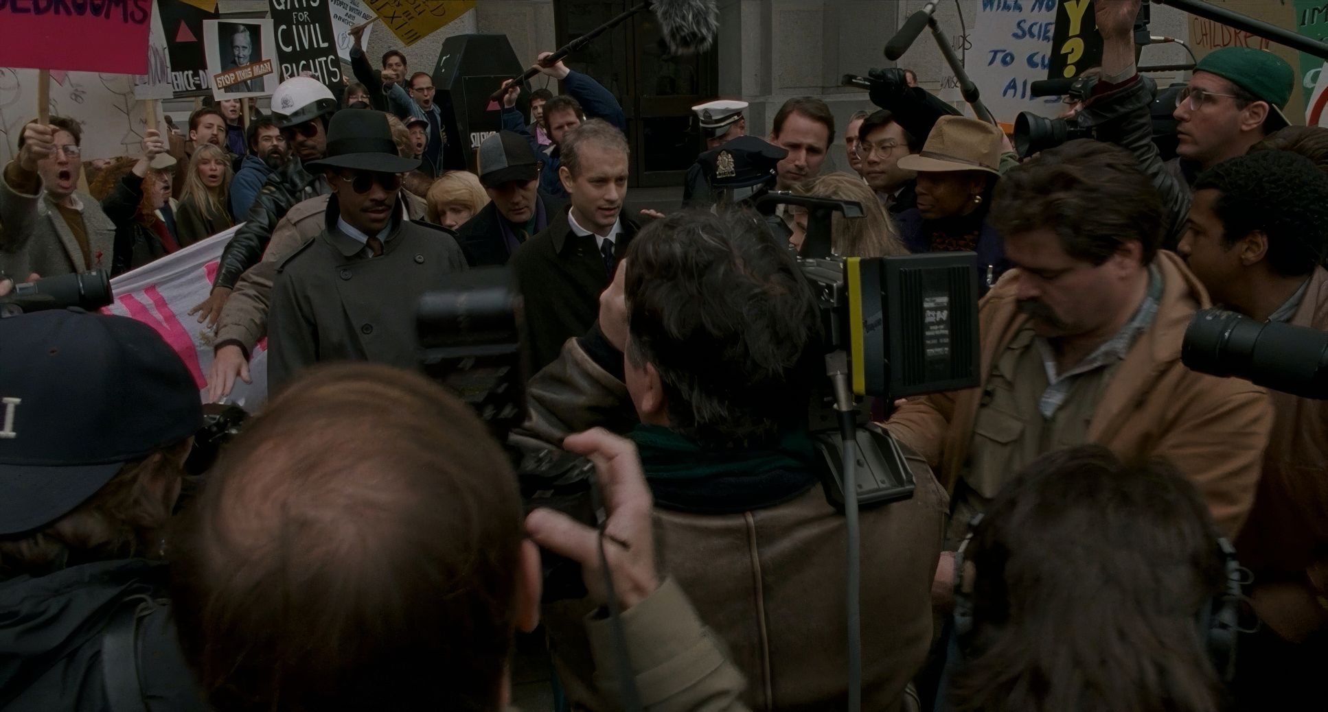
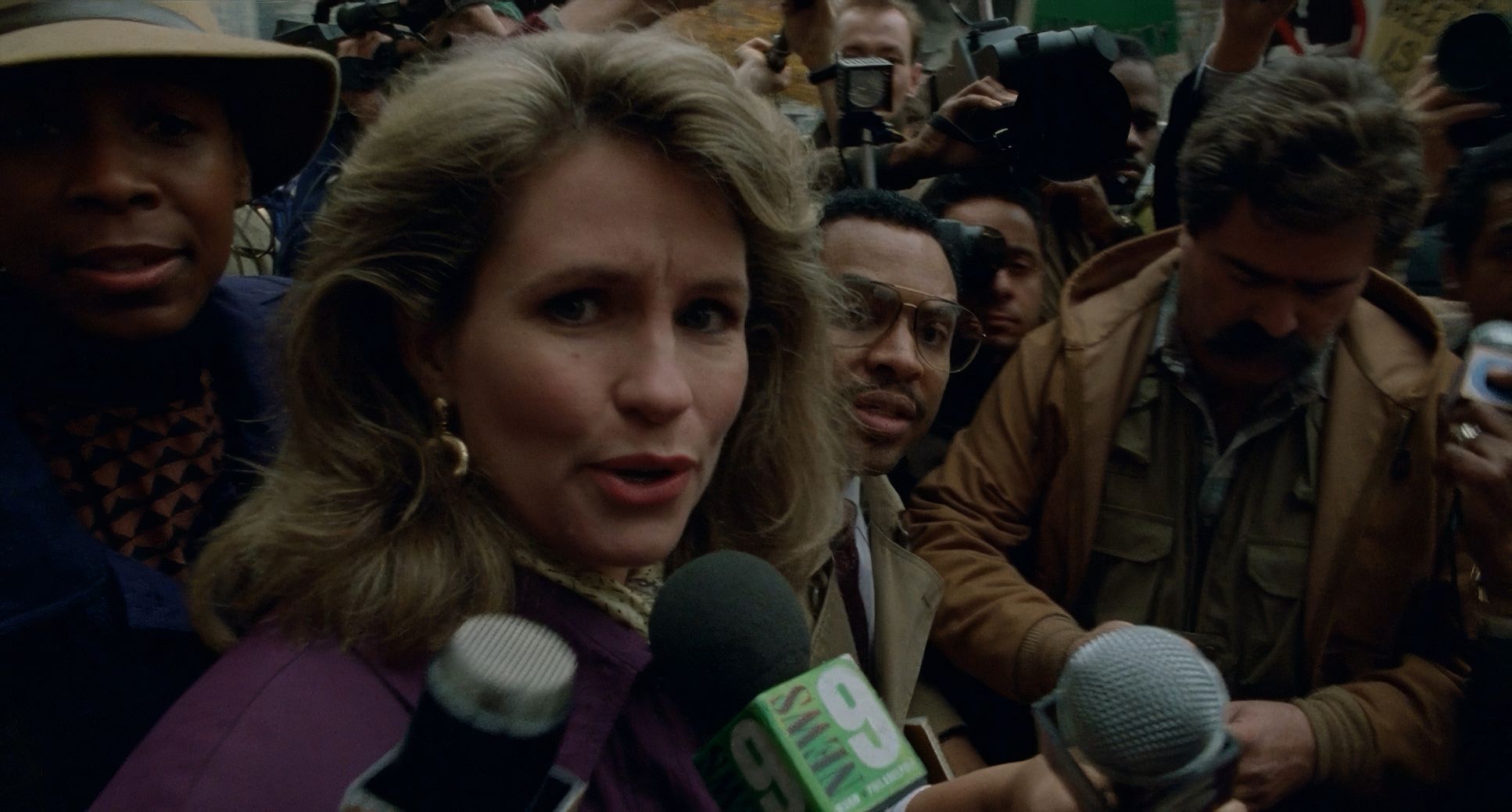
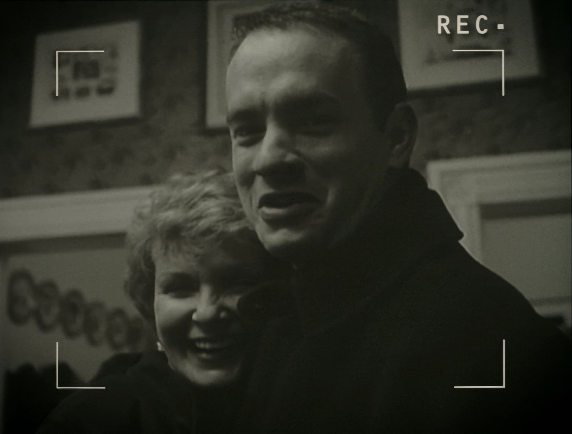
Their mandate was simple: force intimacy. The camera isn’t a wall; it’s a bridge. It leans in, insisting that we acknowledge Andrew Beckett’s (Tom Hanks) humanity. Setting the film in Philadelphia the “City of Brotherly Love” created a visual irony they leaned into. The cinematography acts as a cinematic stethoscope, connecting us directly to Andy’s heartbeat. They weren’t trying to beautify a tragedy. They were trying to humanize it so thoroughly that looking away became impossible.
Camera Movements

Fujimoto’s camera is remarkably disciplined. You won’t find aggressive crane shots or hyperactive Steadicam work that pulls you out of the moment. Every movement is weighted with emotional intent.
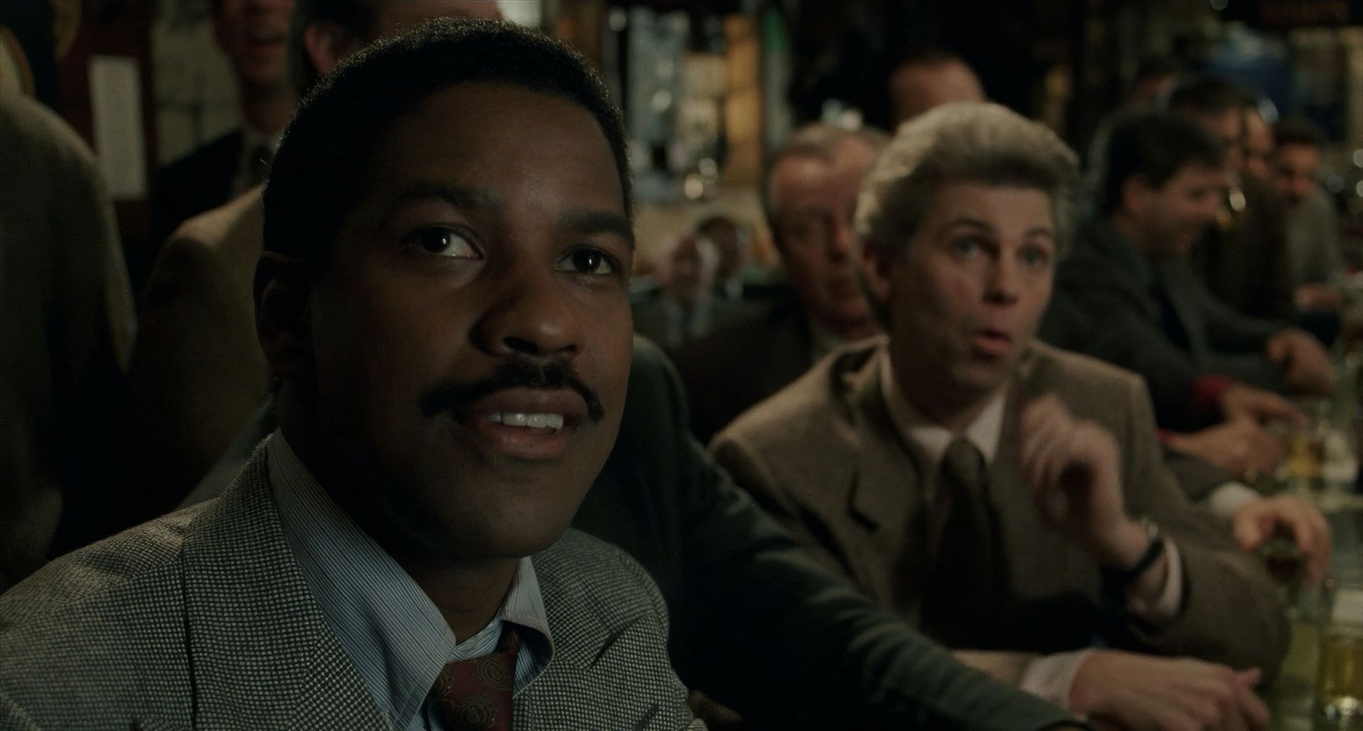
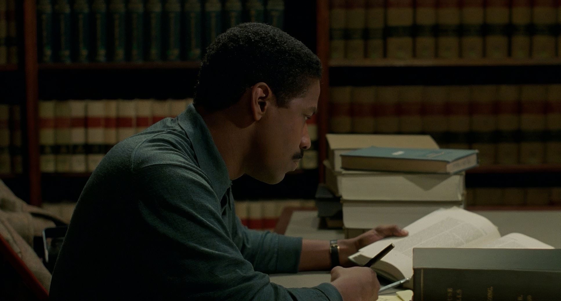
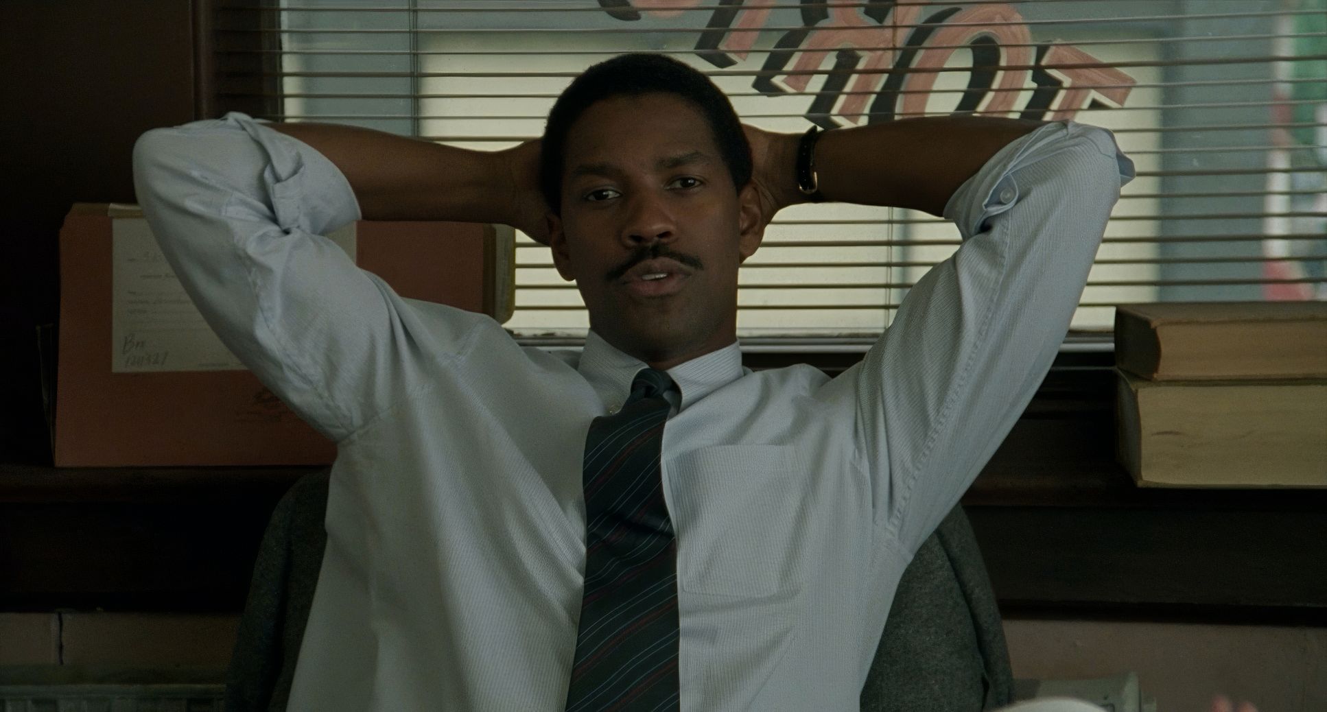
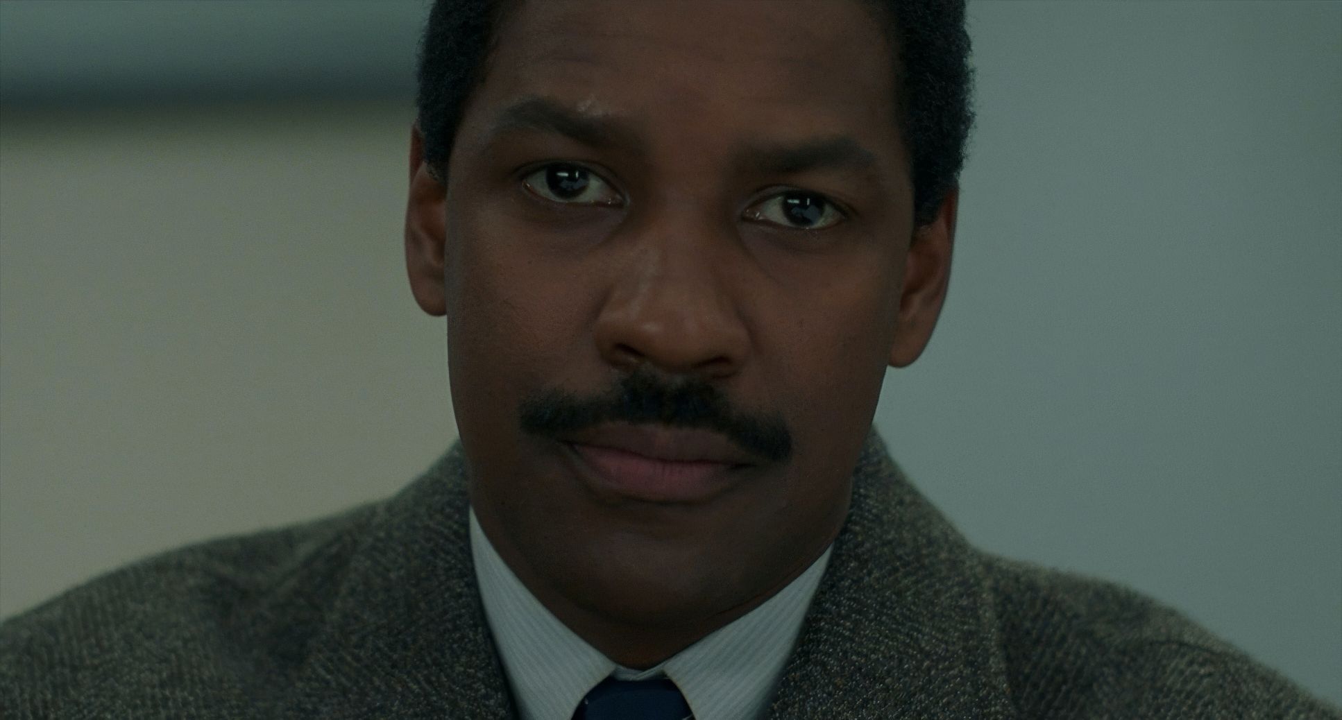
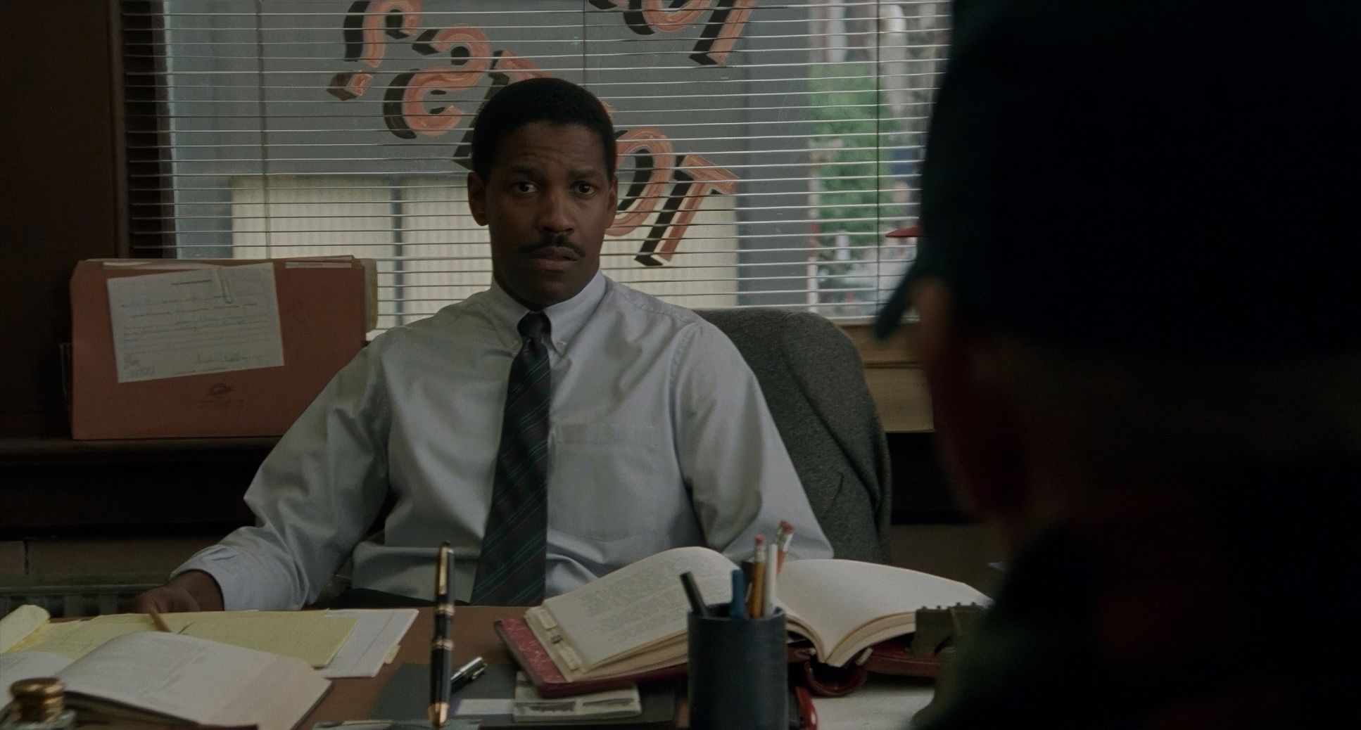
Instead of flashy choreography, we get these slow, deliberate pushes. They usually happen when a character is at their most vulnerable. Watch Joe Miller (Denzel Washington) as his internal walls start to crumble the camera draws closer, letting us read the micro-shifts in his face. It’s observational, not voyeuristic. Even the pans have a purpose. As Roger Ebert once noted, Demme uses the camera to “pan down the face, pan down the body” not to gawk, but to say, “Look. Here is the reality.”
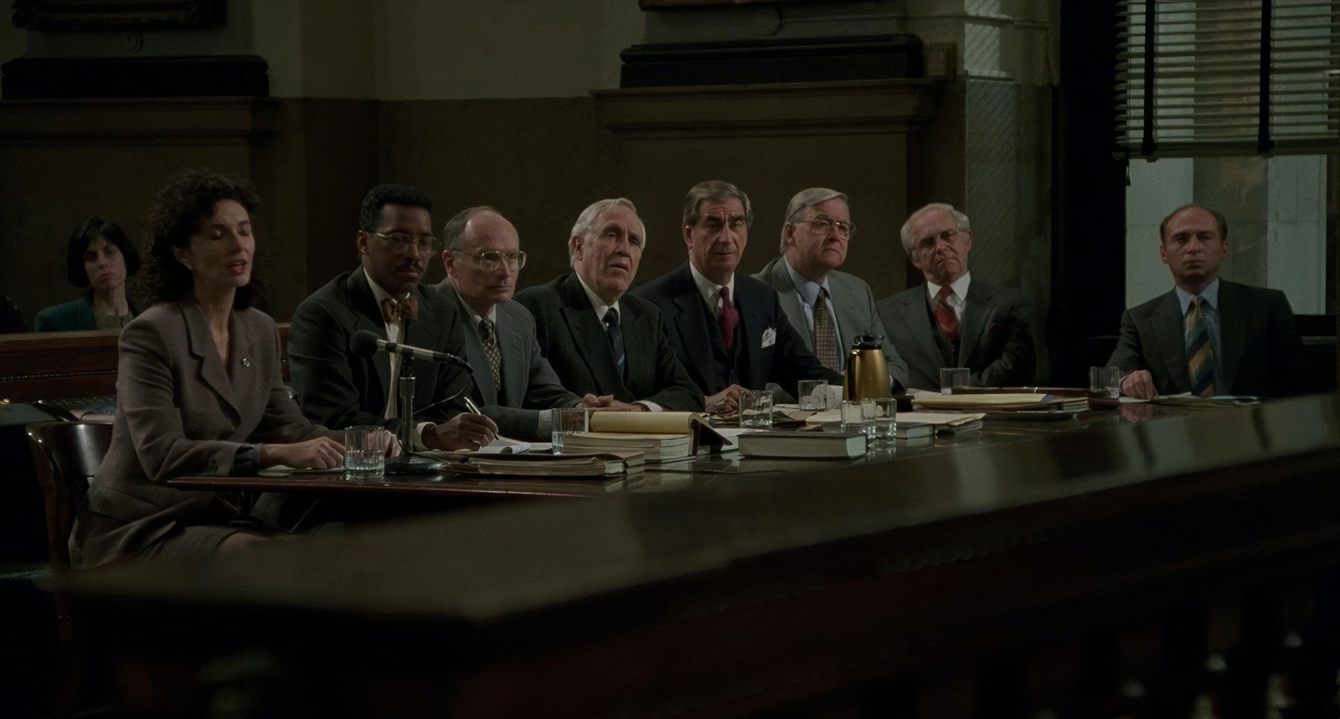
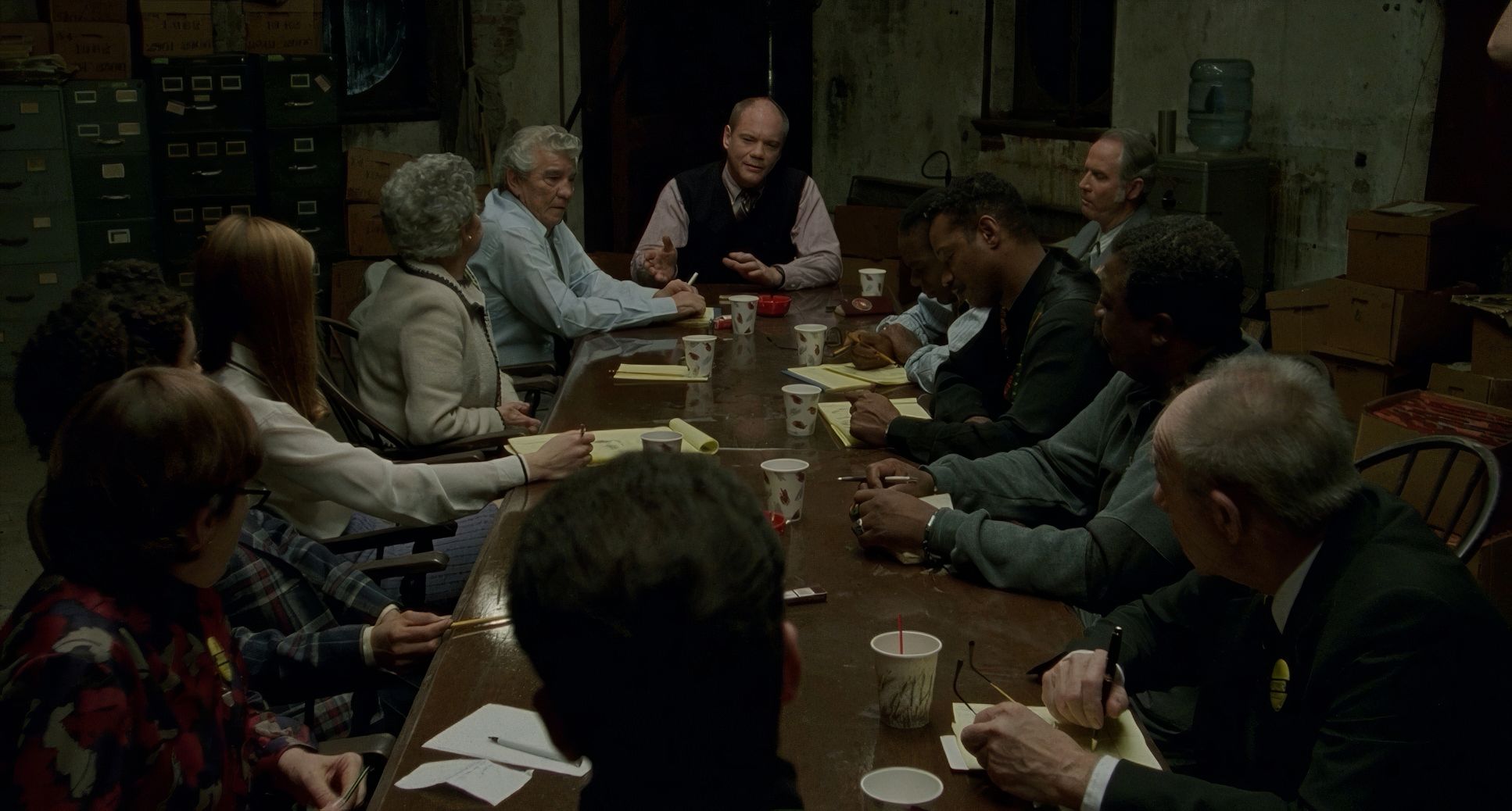
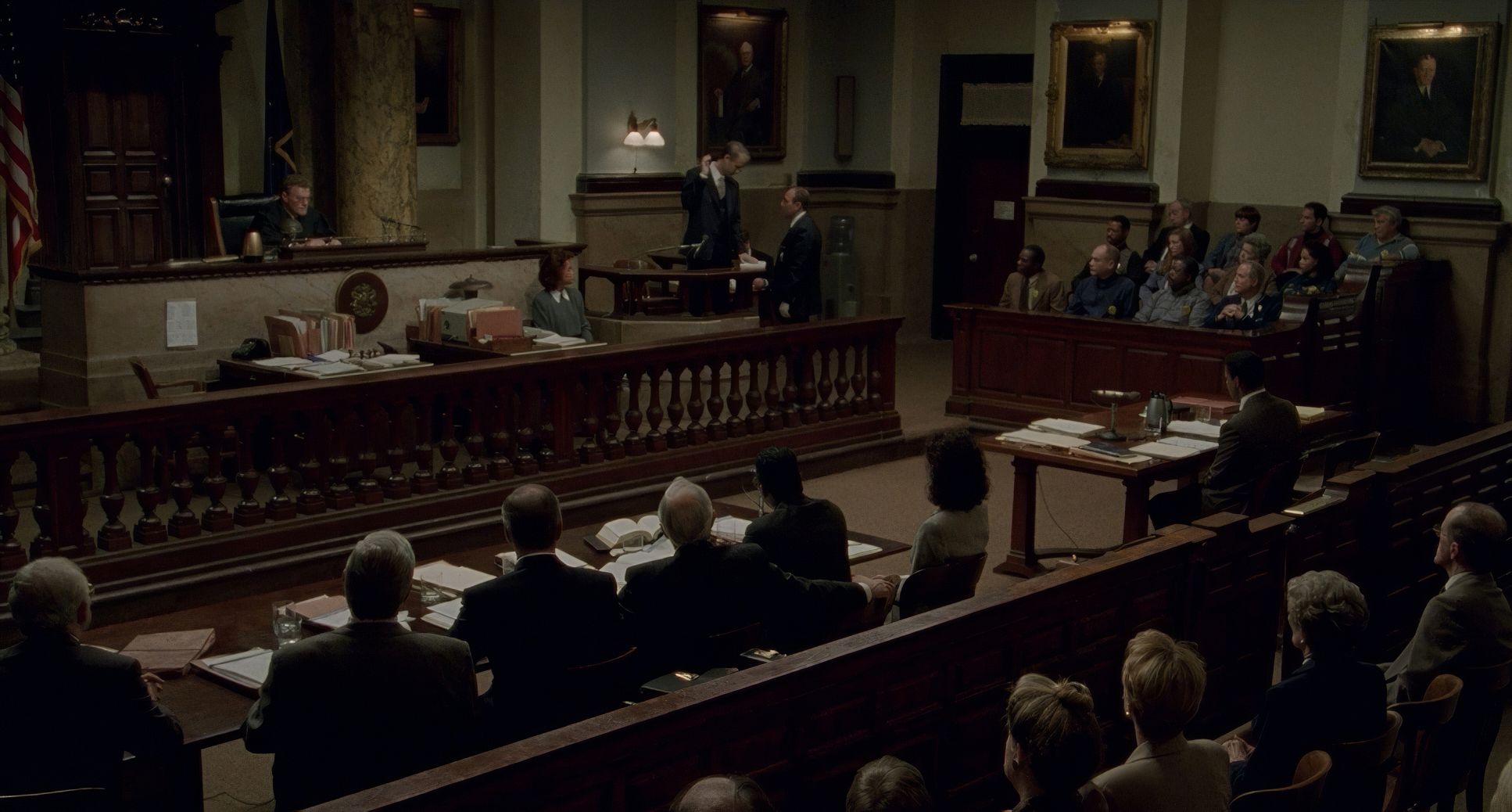
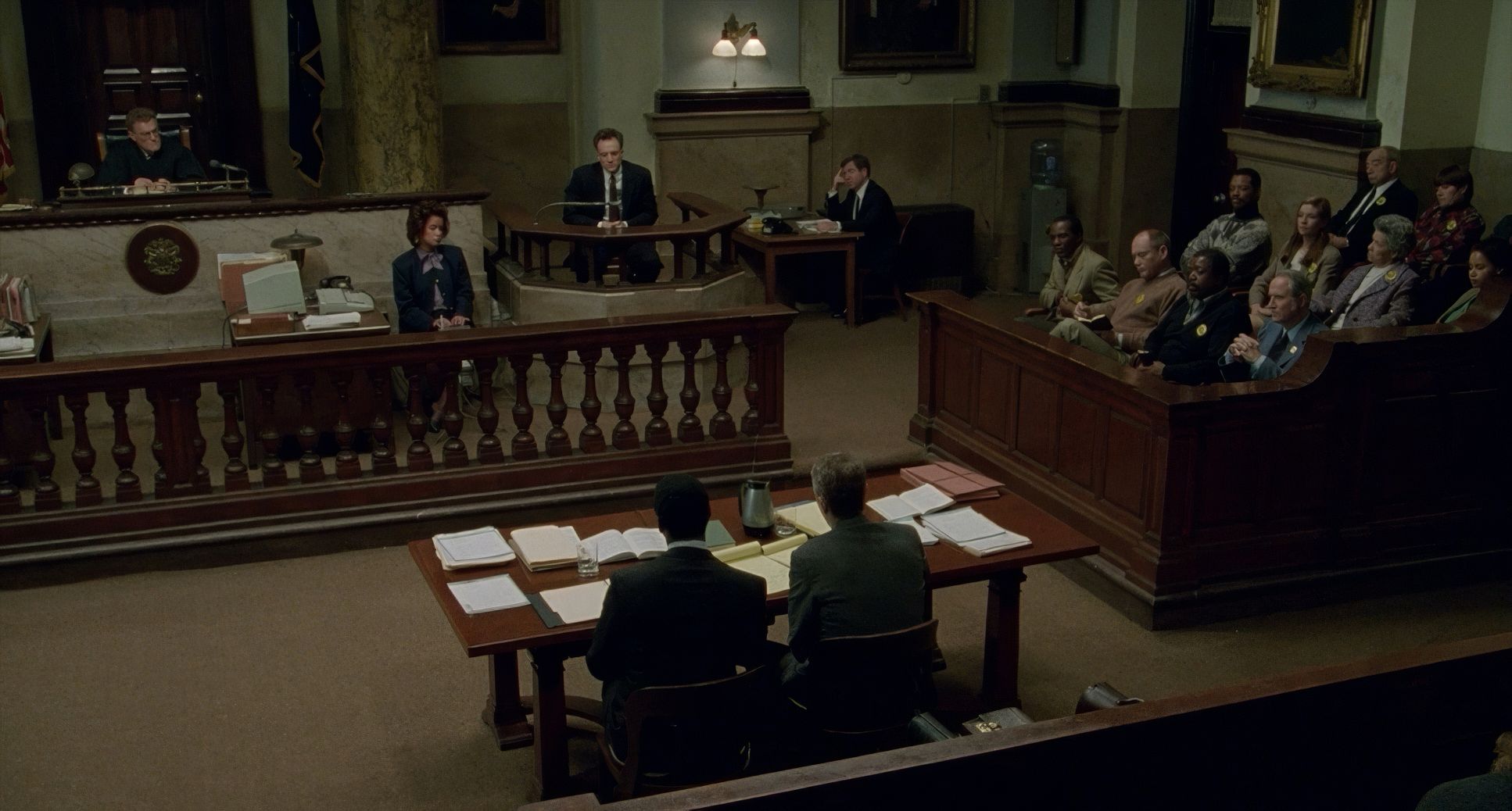
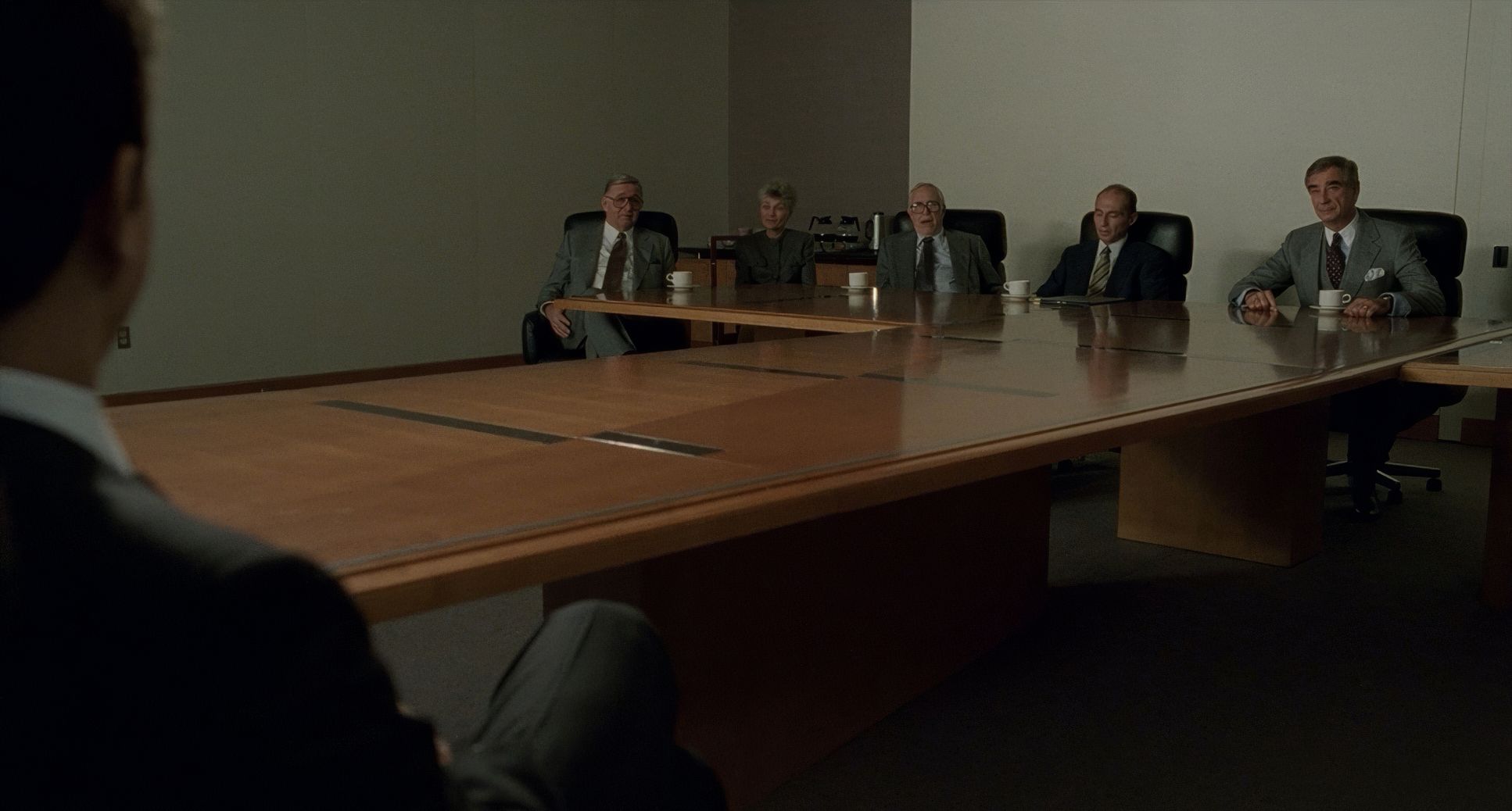
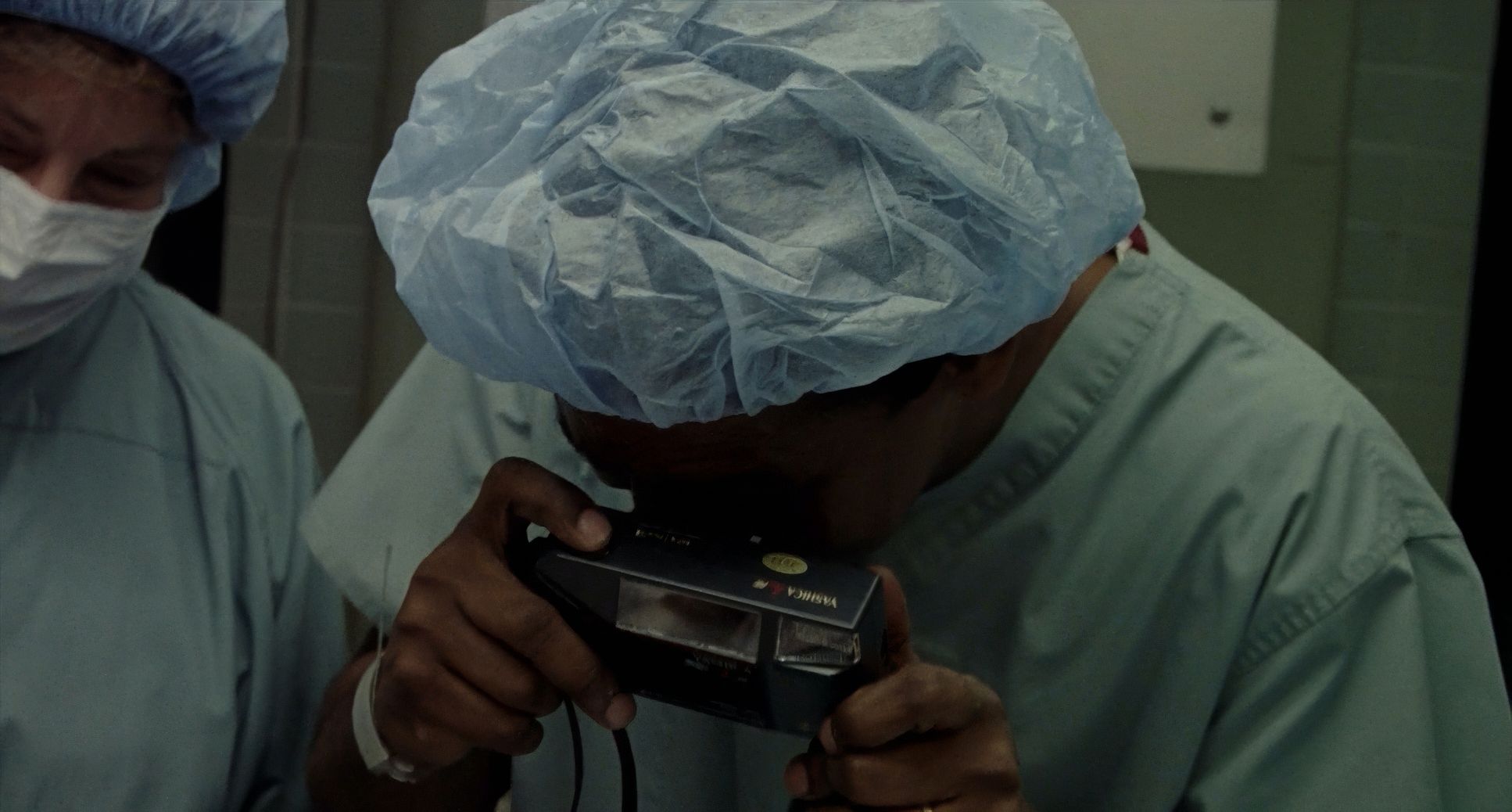
Then there are the static shots. They’re heavy. In the courtroom, the camera often just sits there, planting the audience in the room. It trusts the actors to do the heavy lifting. It’s confident filmmaking that doesn’t feel the need to move just for the sake of moving.
Compositional Choices

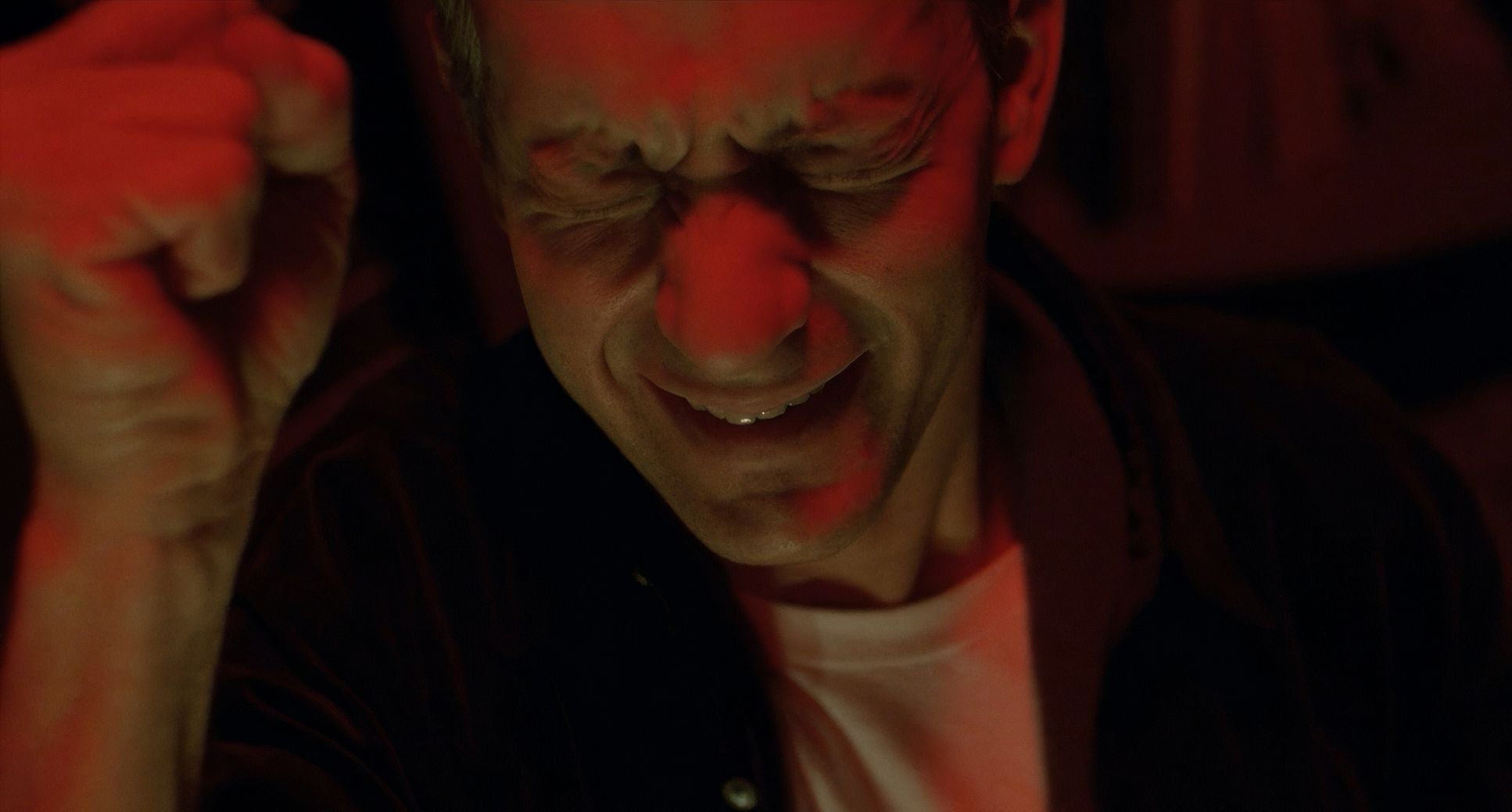
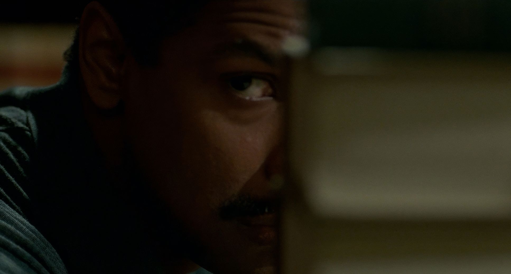
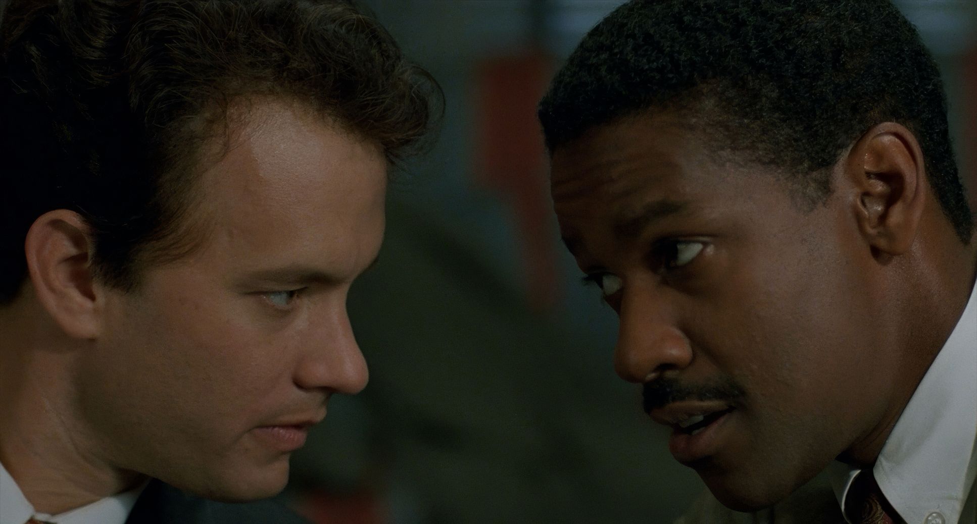
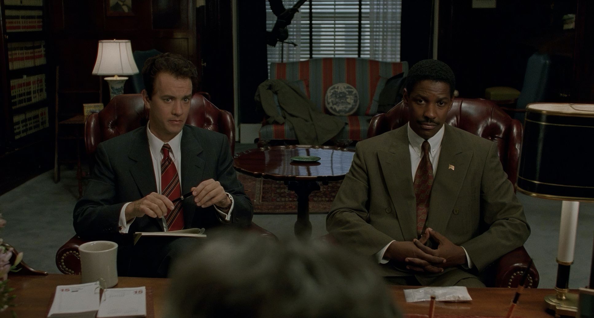
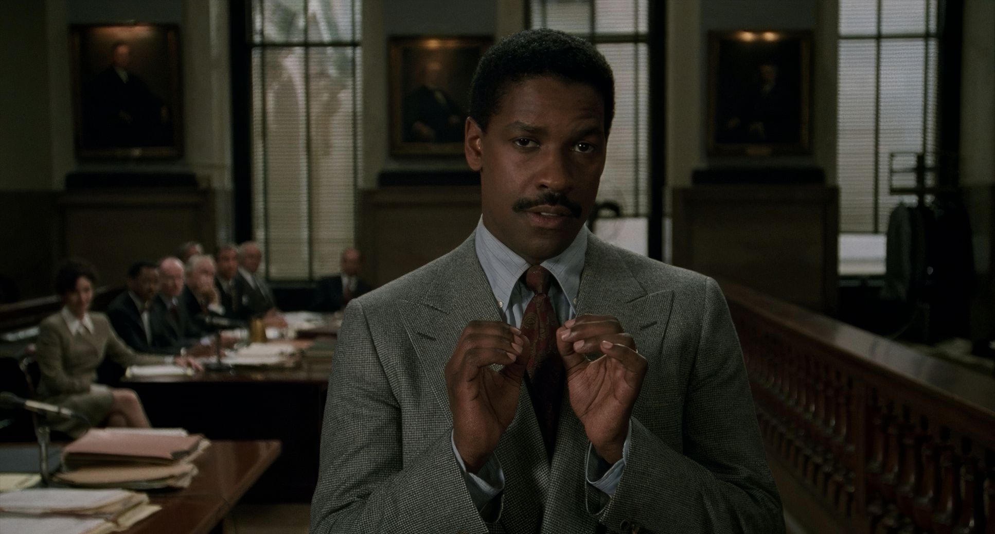
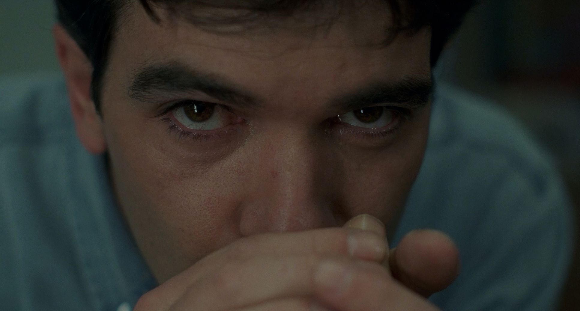
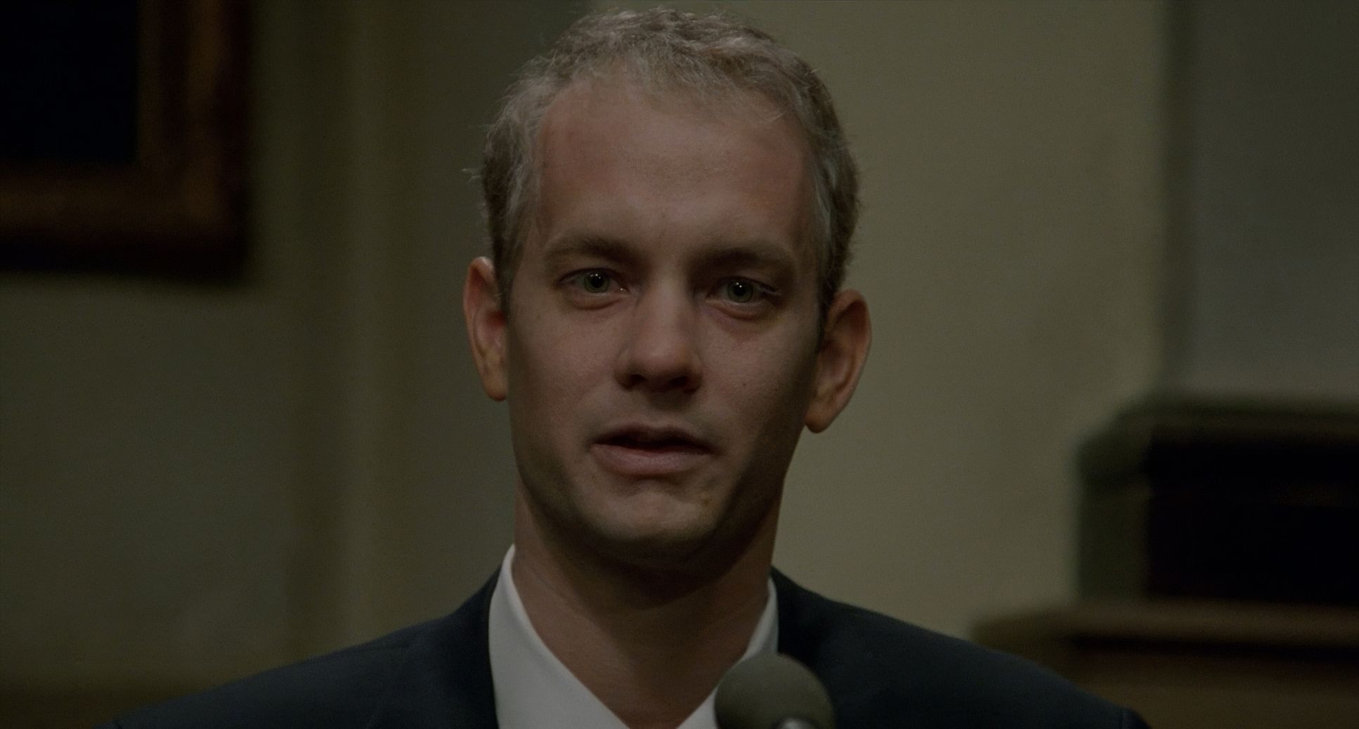
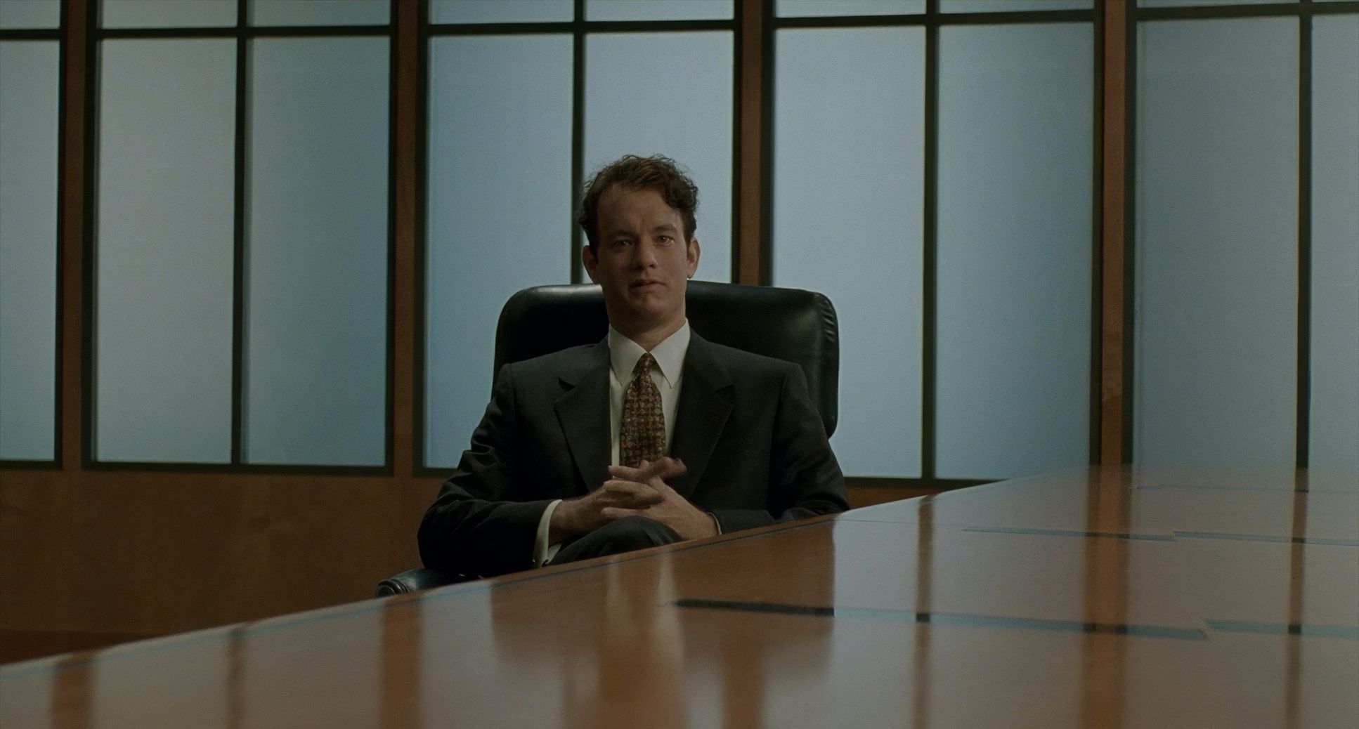
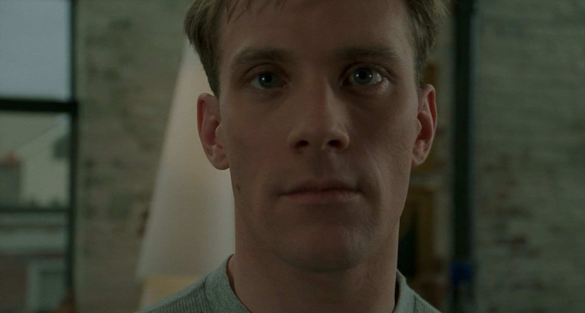
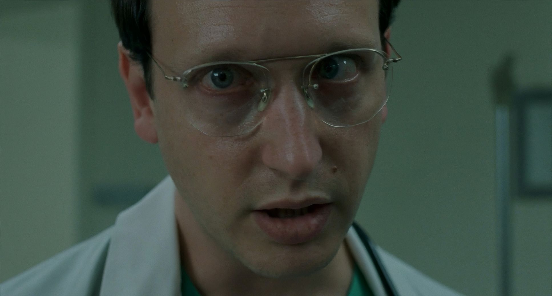
This is where Demme’s DNA is most visible. Philadelphia is famous for the Direct Address close-up. This isn’t just a tight shot; it’s a confrontation.
When Andy or Joe speaks directly into the lens, the psychological distance vanishes. It’s just us and them. It makes the issues of prejudice and illness deeply personal. We see the sores on Andy’s face not as a “special effect,” but as an undeniable truth.
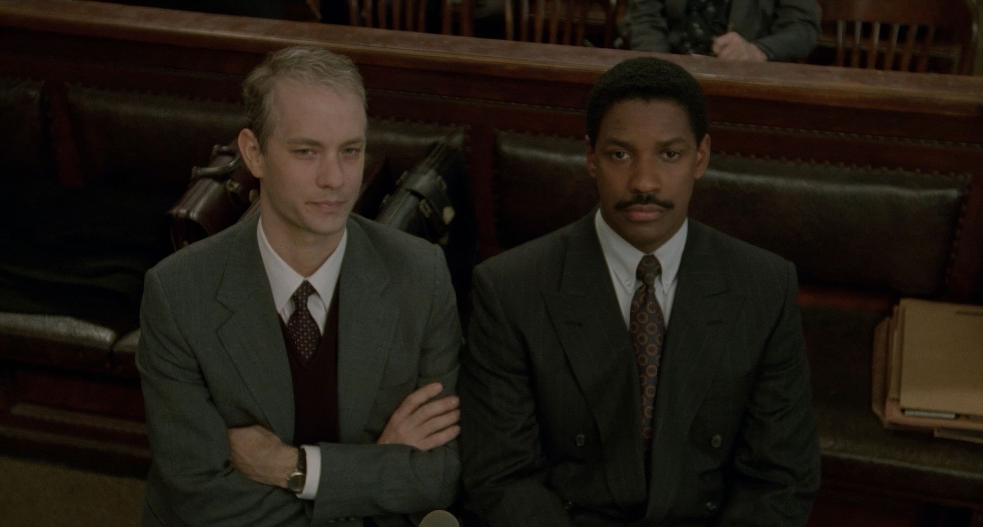
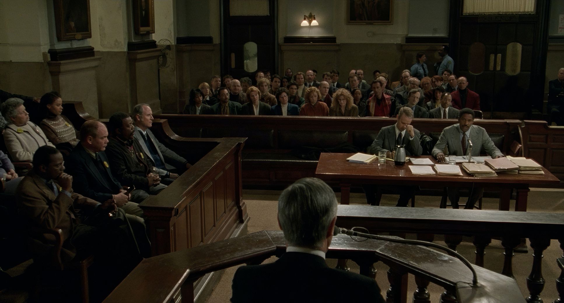
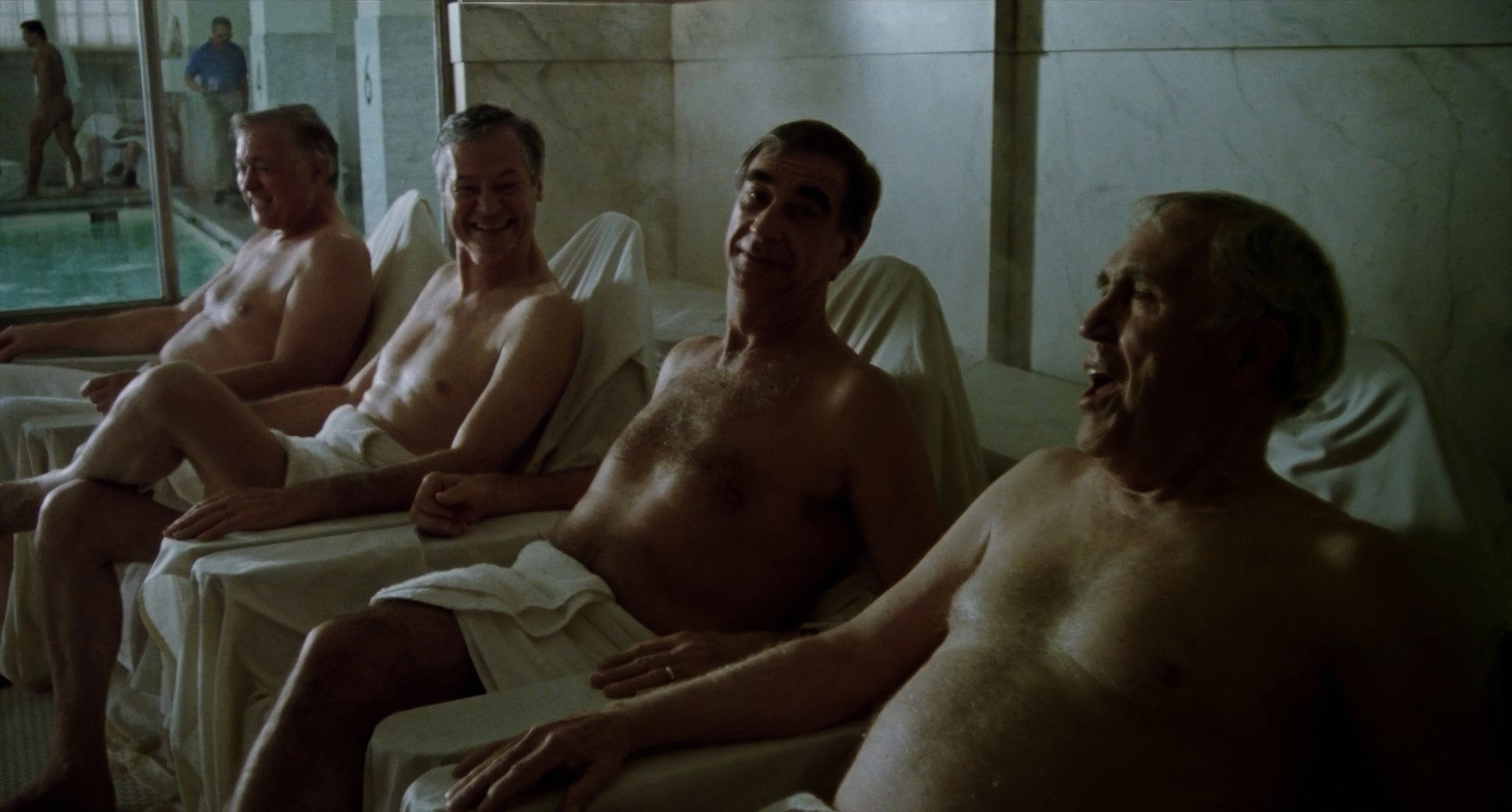
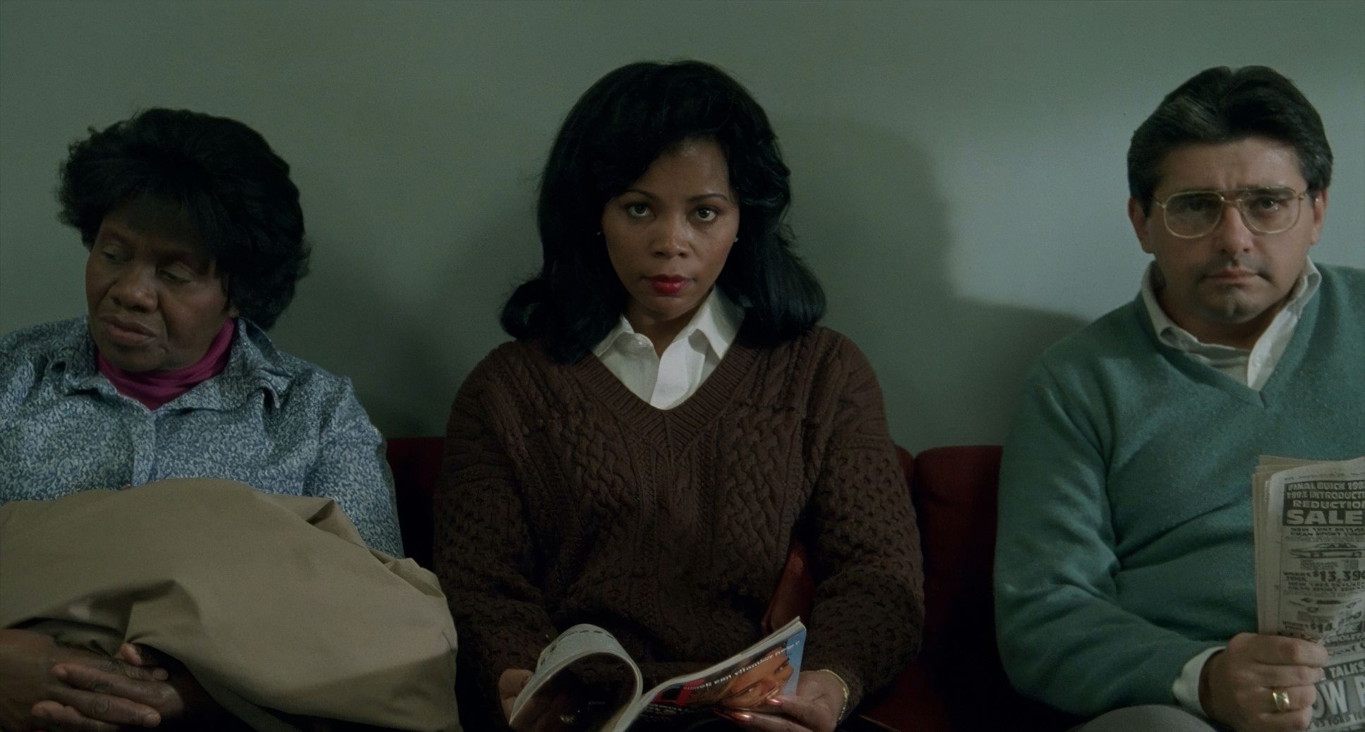
Beyond the close-ups, the framing tells the story of isolation. Early on, Andy and Joe are separated by massive amounts of negative space. They’re in two different worlds. As the bond forms especially during the opera scene the framing tightens, eventually bringing them into the same two-shot. It’s a visual bridge for their relationship. Even the background depth in the courtroom is managed perfectly, keeping the jury and the public eye present without distracting from the central conflict.
Lighting Style

Lighting a story this heavy requires a delicate touch. Fujimoto leans into a naturalistic, soft-light style that feels very “early 90s drama,” but with more intention.
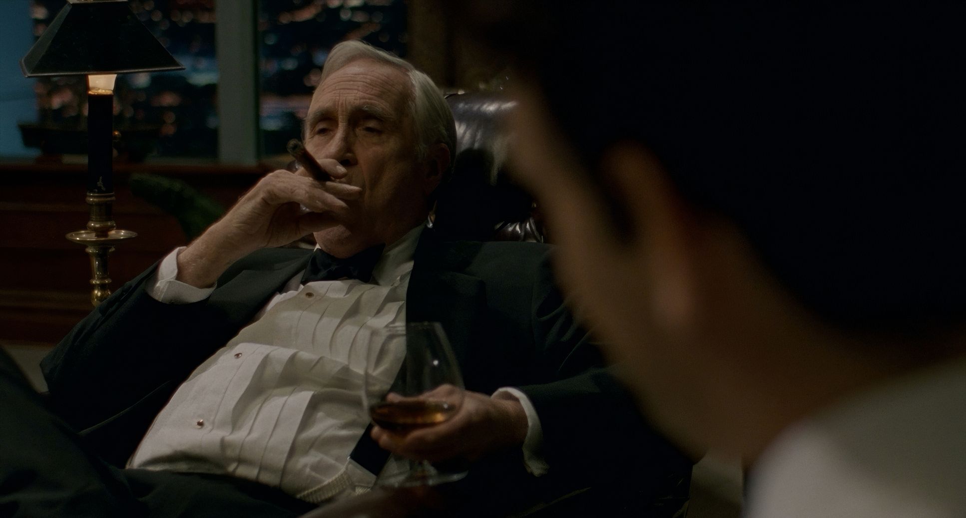
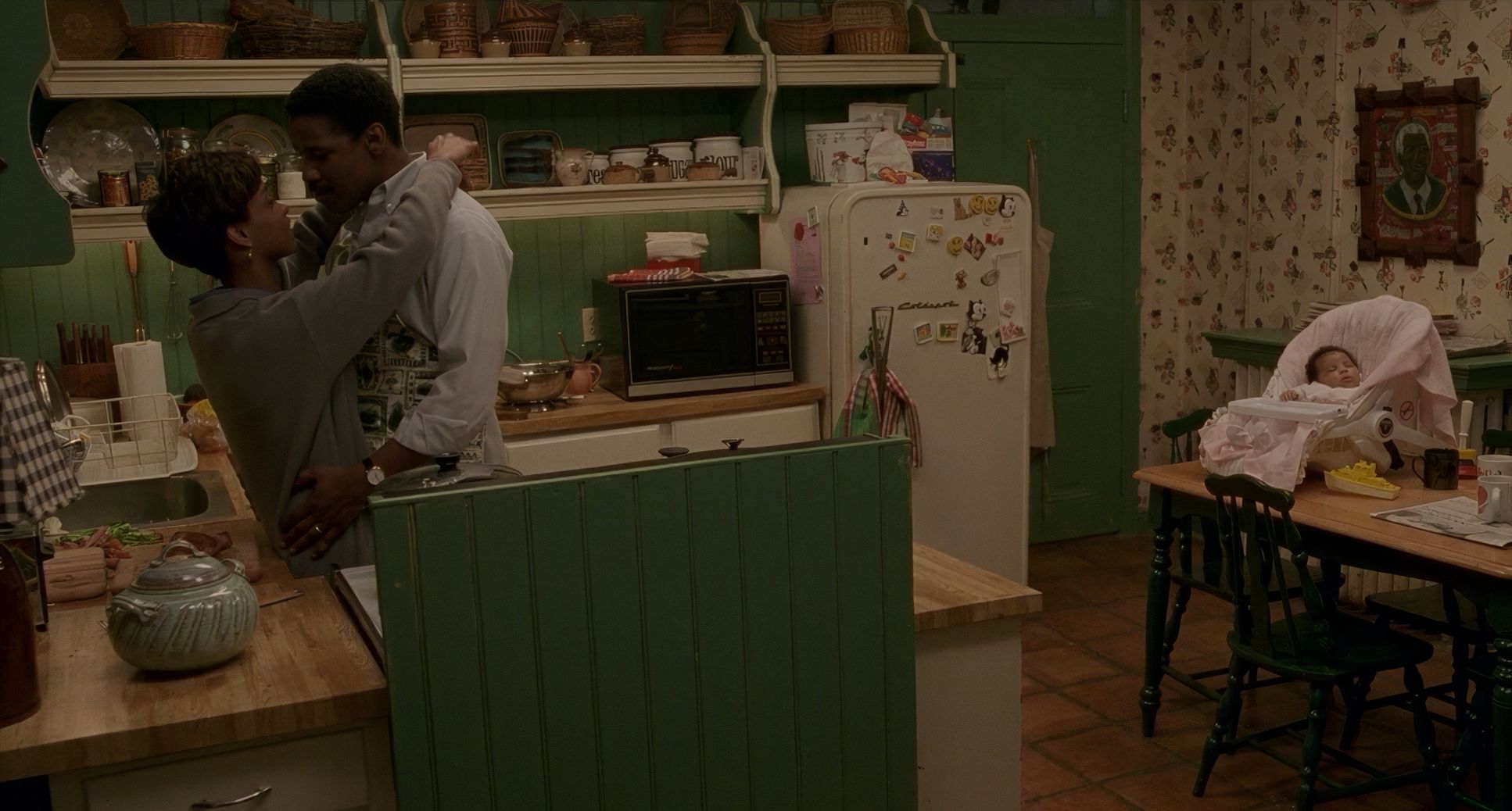
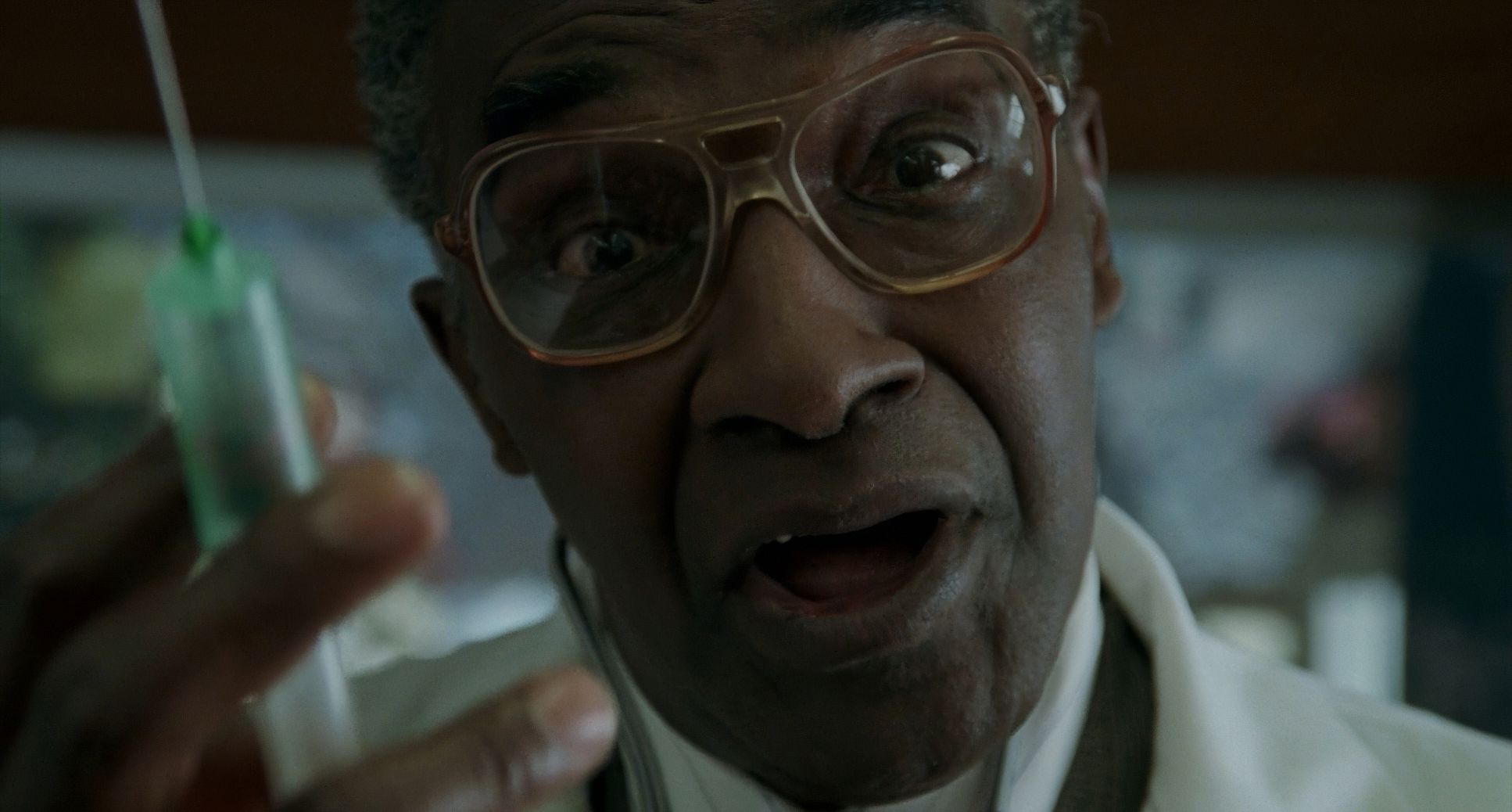
Early on, Andy’s world is lit with a professional, high-contrast crispness. He’s a winner, and the light reflects that. As the illness takes hold, the lighting softens. It becomes warmer, more diffused, especially in the home and hospital scenes. This isn’t just to make him look sick; it’s to make him look vulnerable.
Everything is motivated. Light spills from windows in a way that feels accidental but perfectly shapes the shadows under Andy’s eyes. As a colorist, I love the highlight roll-off here. The windows don’t blow out into a digital white void; they stay textured. The contrast is kept in a medium-low range, which gives the film a melancholic, mournful air. It lets the shadows “breathe” rather than crushing them into an oppressive black.
Lensing and Blocking

For those signature close-ups, I’d wager Fujimoto lived on the 50mm to 85mm primes, maybe even a 100mm for the tightest beats. These focal lengths give you that natural perspective no wide-angle distortion, just a clean, humane look at the face. It fits Demme’s directive to look AIDS in the eye.
The blocking is where the power dynamics really play out. The courtroom is all about tension sides are clearly drawn. But look at the “odd” blocking in the opera scene. Joe is physically and emotionally out of place, while Andy is lost in the music. Some critics called the angles weird, but to me, that disconnect is the point. It’s supposed to be unsettling for Joe before the music finally breaks through his prejudice. It’s not about perfect symmetry; it’s about the emotional truth of the moment. I remember watching it and thinking it was a gutsy way to block a scene, but it works because it feels raw.
Color Grading Approach

When we talk about the “grade” here, we’re talking about photochemical timing. There were no digital sliders in 1993. No Power Windows to cheat the light. This is the beauty of the print-film sensibility it’s organic, textured, and baked into the chemistry of the celluloid.
The palette is subdued. You don’t want “pop” in a movie like this. The focus is on hue separation in the skin tones. Even as Andy gets paler, the color timer (David Bryden) kept those tones feeling human. He never looks “sickly green” in a way that feels like a horror movie trope. It’s a delicate balance of maintaining dignity through color.
The tonal sculpting is pure craftsmanship. The shadows have that gentle “film lift” they aren’t bottomless blacks. It creates a visual continuity that supports the somber tone. In the more intimate scenes, there’s a subtle shift toward amber and golden hues in the mids. It’s never loud, but it whispers a sense of home and love amidst the tragedy.
Technical Aspects & Tools
Philadelphia: Technical Specifications
| Genre | Courtroom Drama, Drama, Legal, Mafia, Social Justice, Political, History, Melodrama |
| Director | Jonathan Demme |
| Cinematographer | Tak Fujimoto |
| Production Designer | Kristi Zea |
| Costume Designer | Colleen Atwood, Lisa R. Frucht |
| Editor | Craig McKay |
| Colorist | David Bryden |
| Time Period | 1980s |
| Aspect Ratio | 1.85 – Spherical |
| Format | Film – 35mm |
| Lighting | Soft light, Low contrast |
| Lighting Type | Daylight, Sunny |
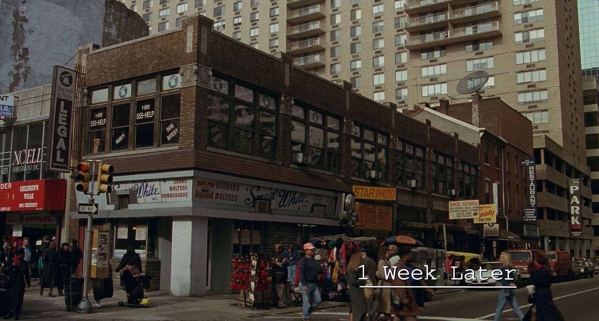
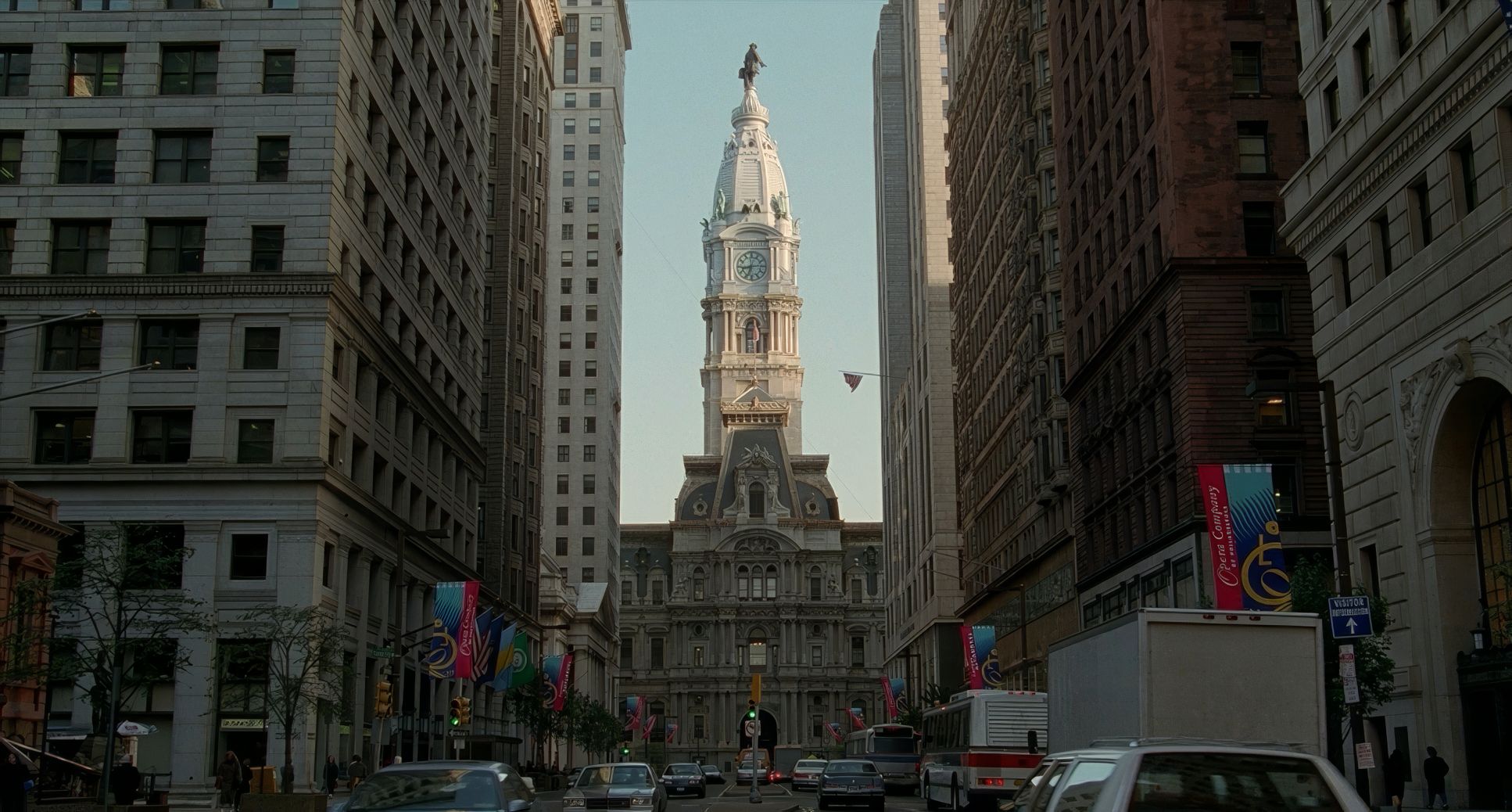
| Story Location | Pennsylvania > Philadelphia |
| Filming Location | Pennsylvania > Philadelphia |
| Camera | Panavision Panaflex |
| Lens | Panavision Lenses |
| Film Stock / Resolution | 5248/7248 EXR 100T, 5293/7293 EXR 200T, 5296/7296 EXR 500T |
Philadelphia was a 35mm production, likely shot on Arriflex or Panavision systems the reliable workhorses of that era.
Fujimoto used the Kodak EXR series (5248, 5293, 5296). For the interiors and night stuff, the EXR 500T would have been the go-to. It has a beautiful grain structure that adds a layer of “truth” to the image. This was years before the Vision stocks, so the look is very much defined by that EXR contrast and color rendition.
The lighting was all traditional tungsten and HMI fixtures. No LEDs. No instant feedback on a monitor. They used dollies for those slow pushes and relied on the lab to develop the “look.” It’s a reminder of how much of this was a physical art form. The “grade” happened in a lab with light gates and filters, giving it that unique, analog soul that digital can only try to emulate.
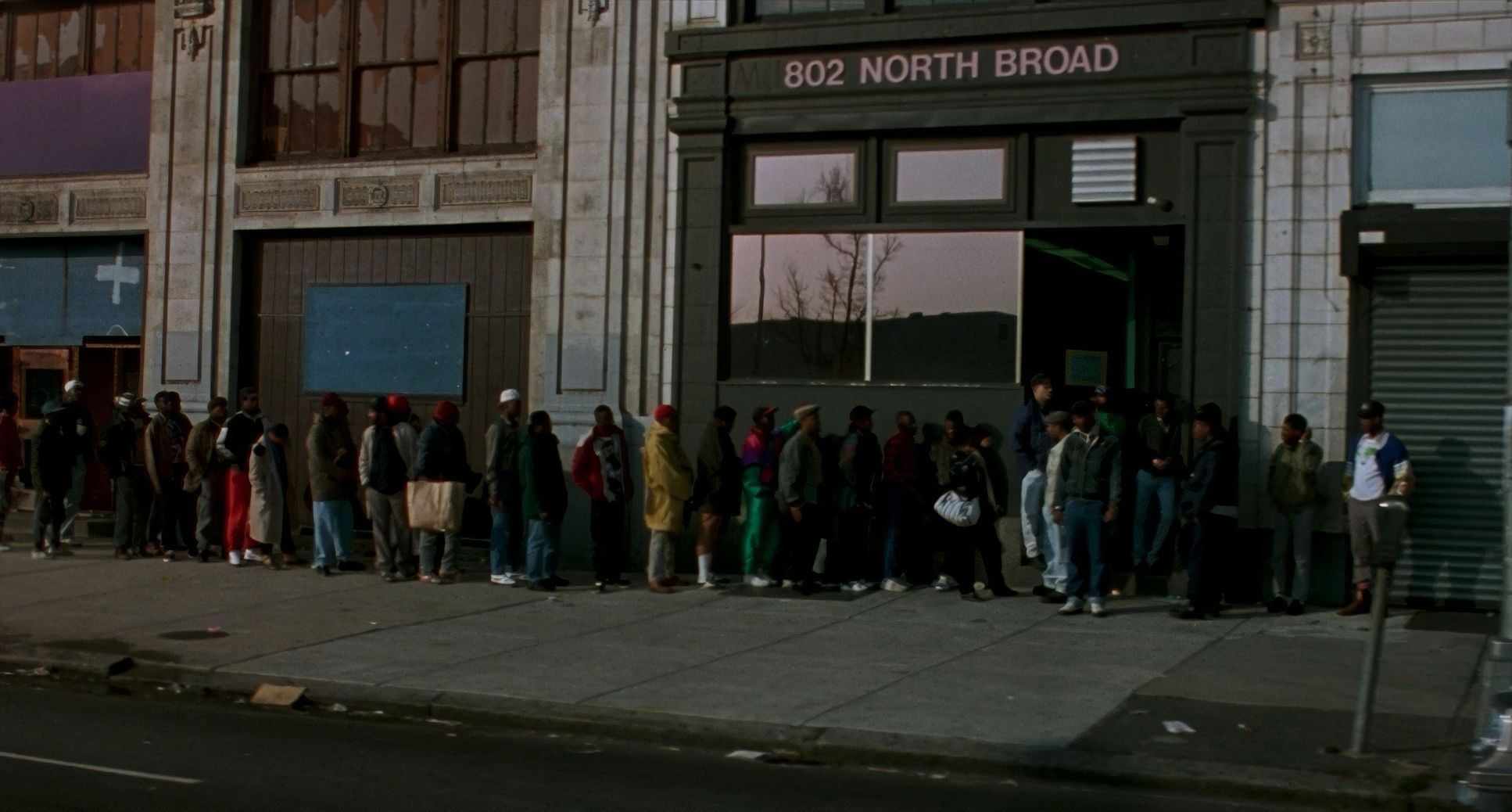
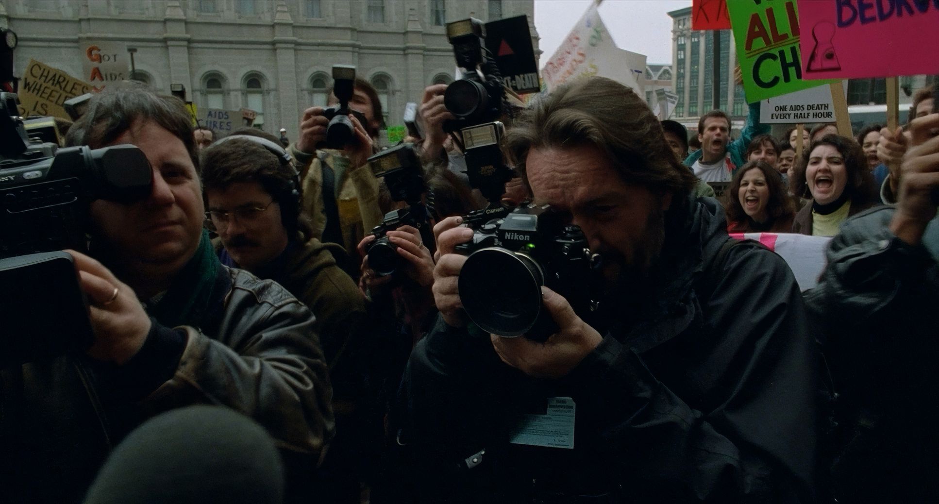
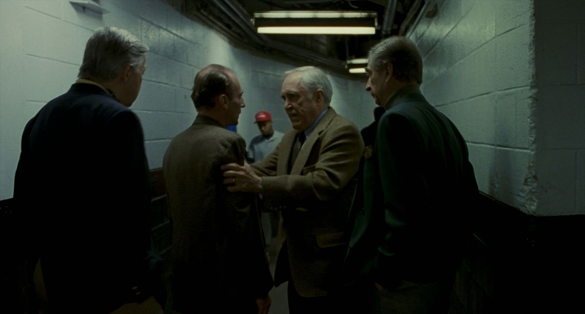
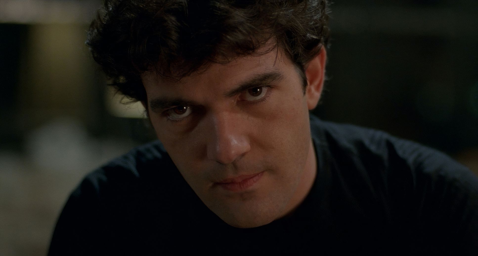
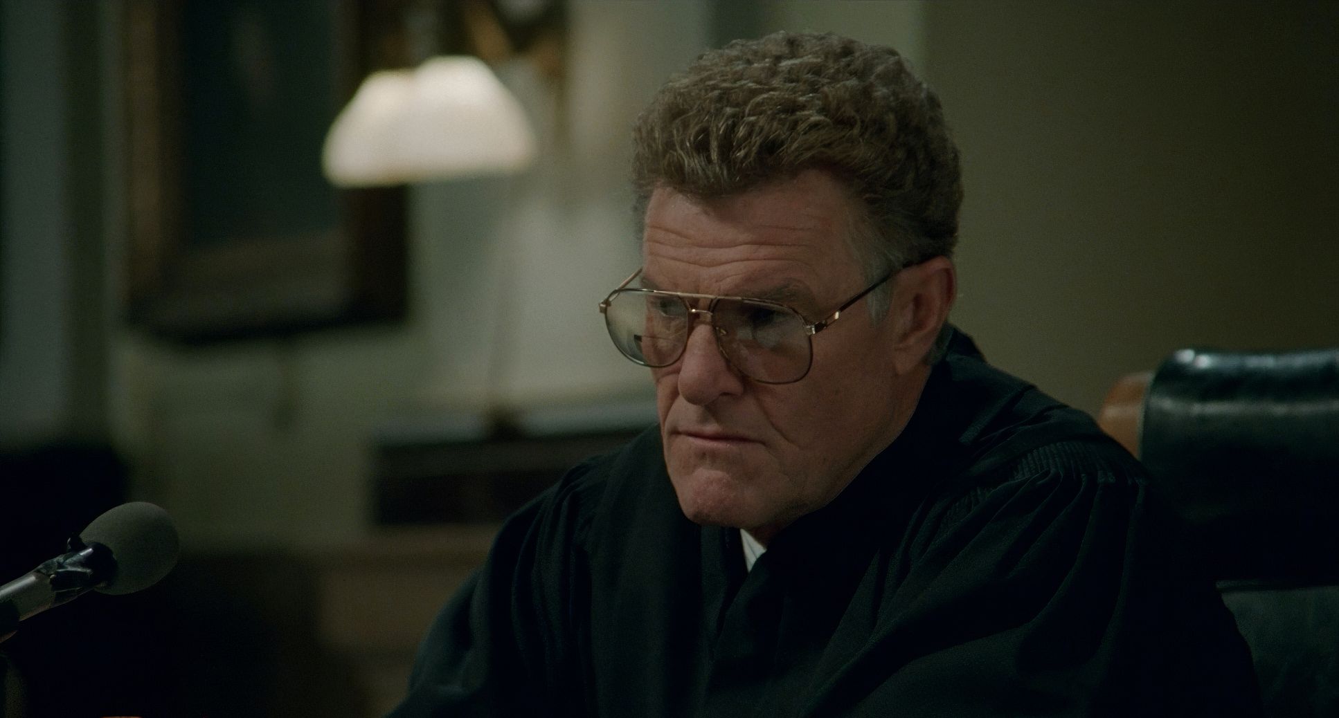
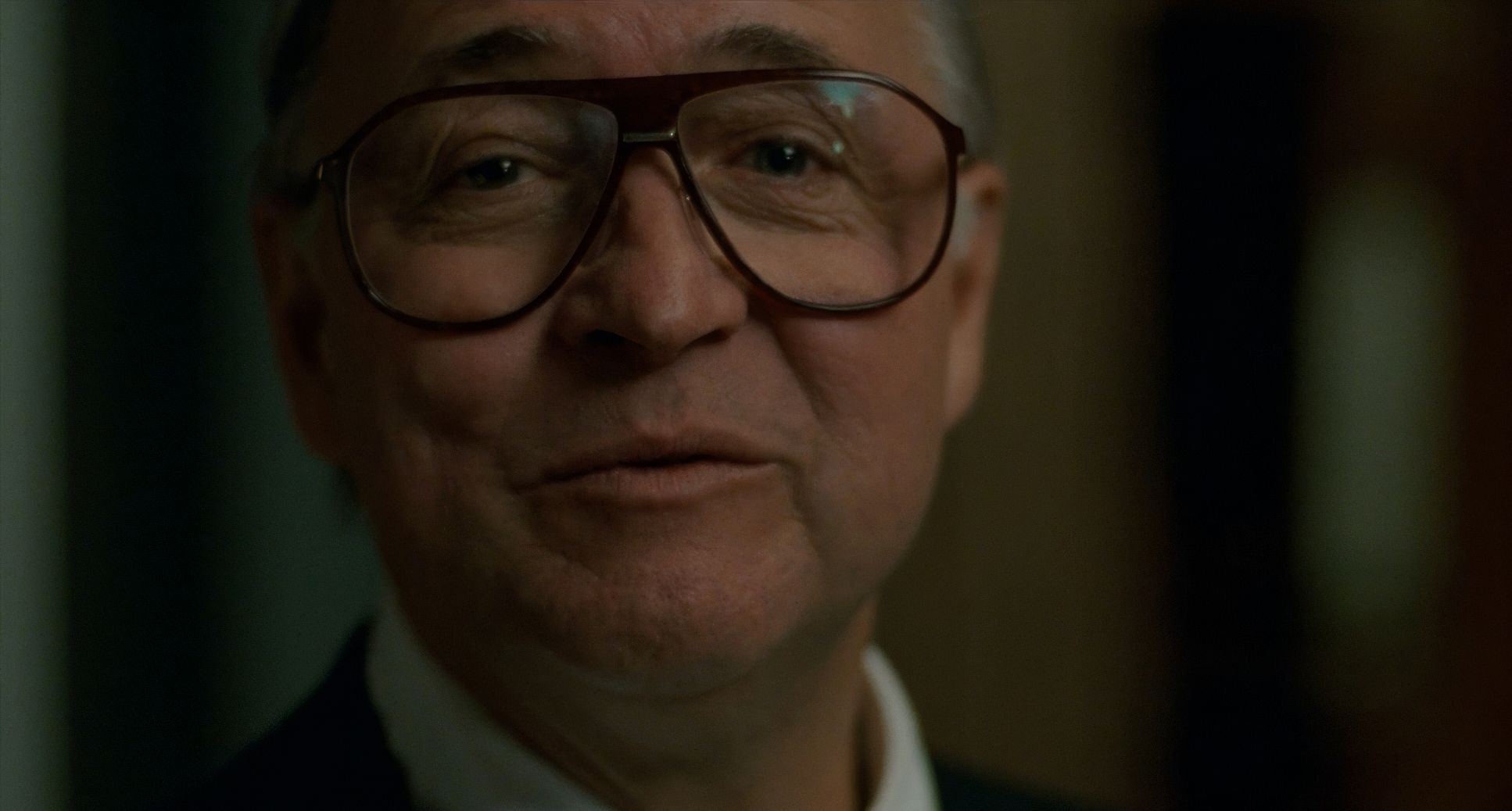
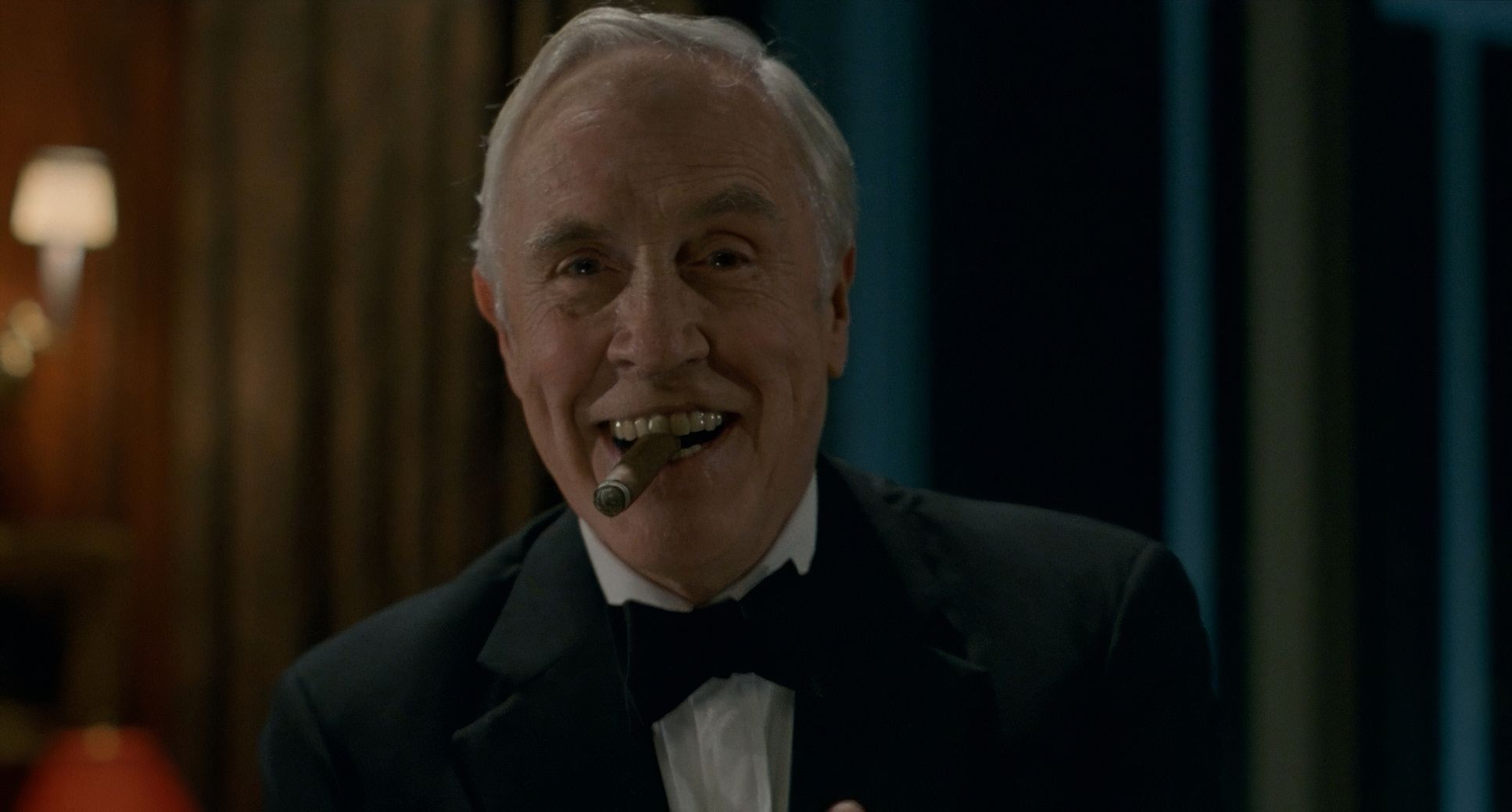
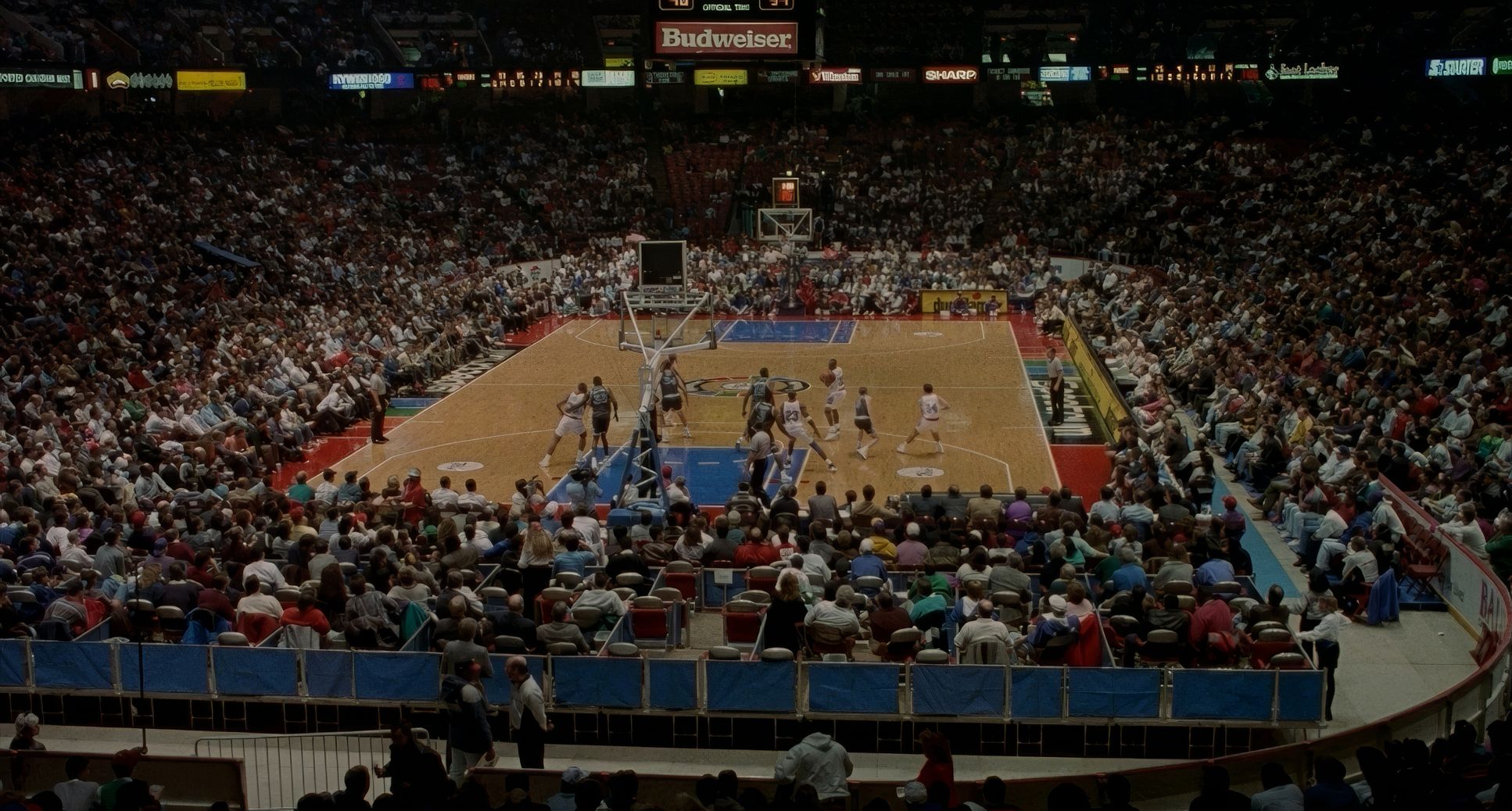
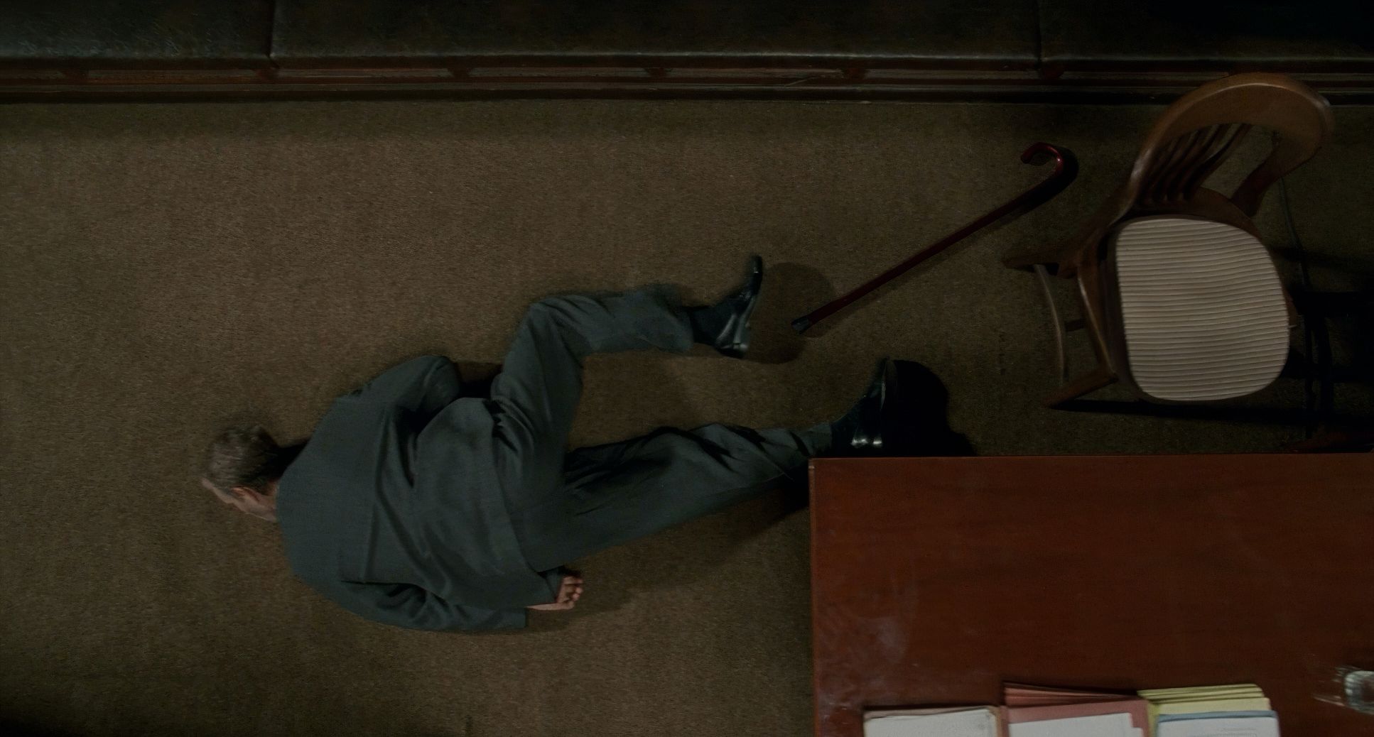
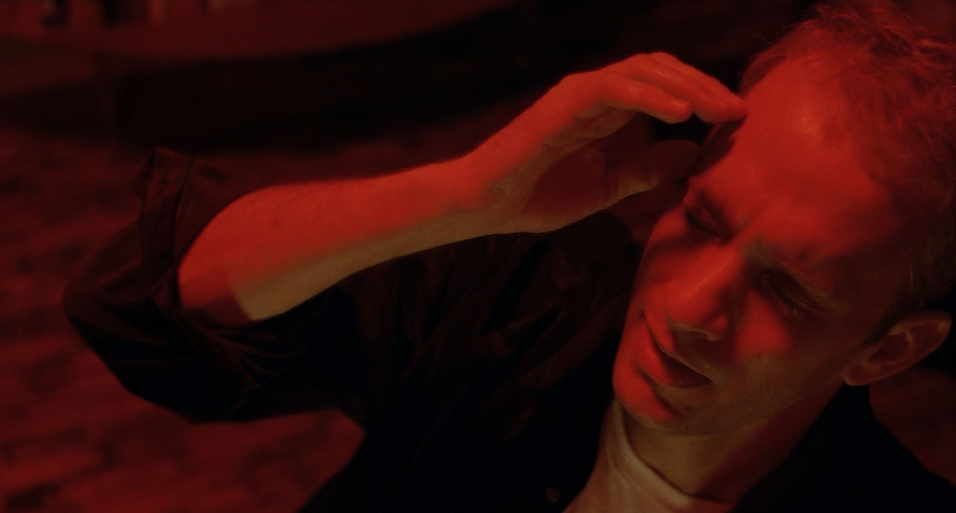
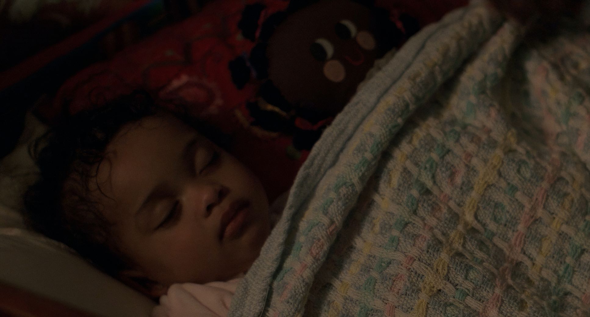
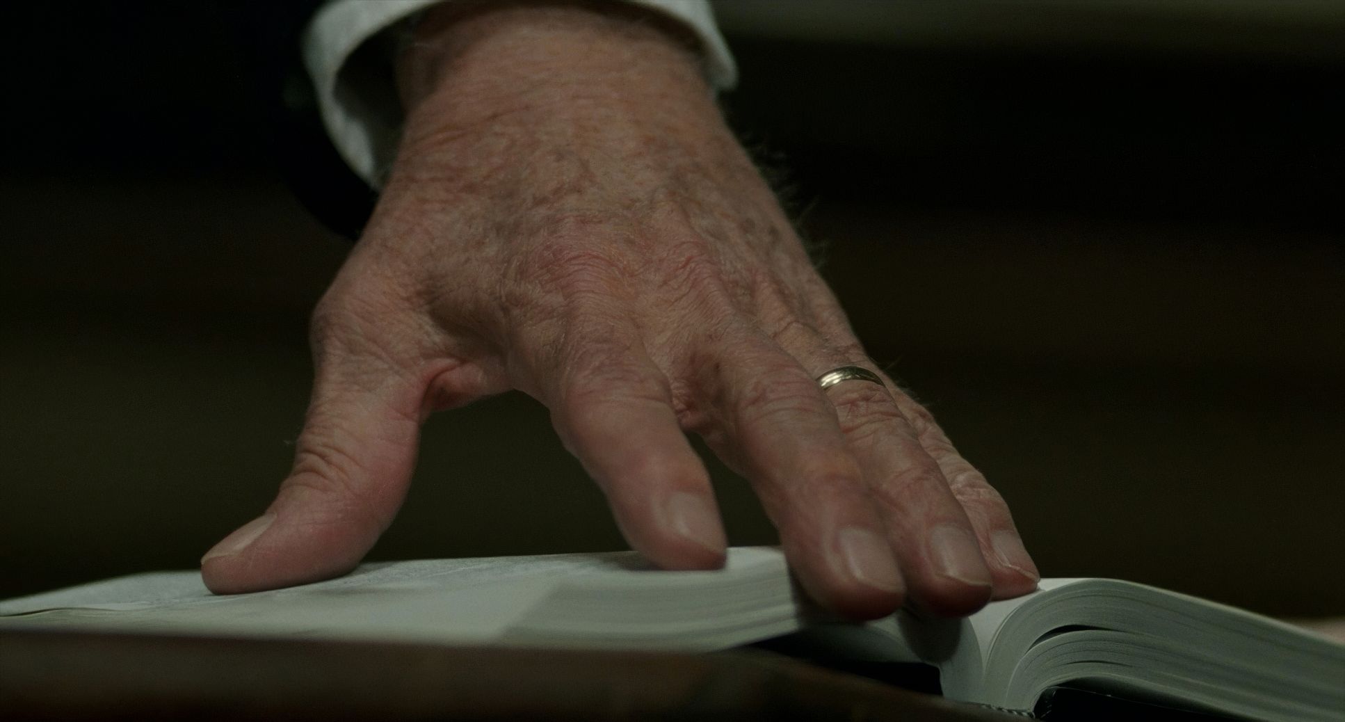
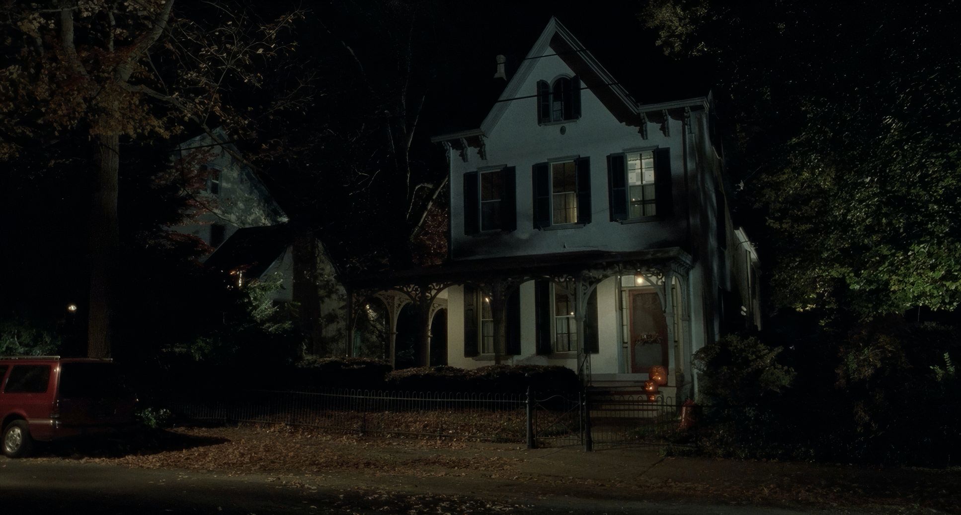
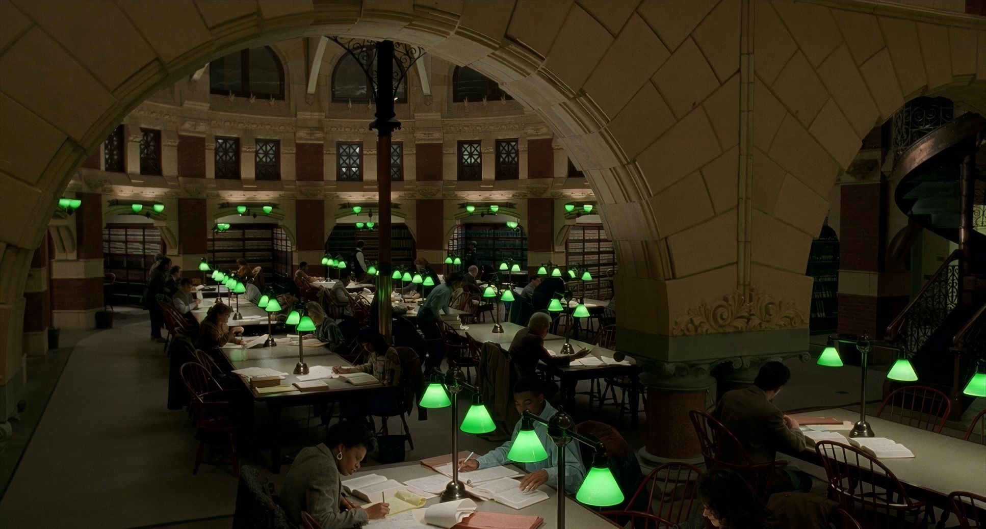
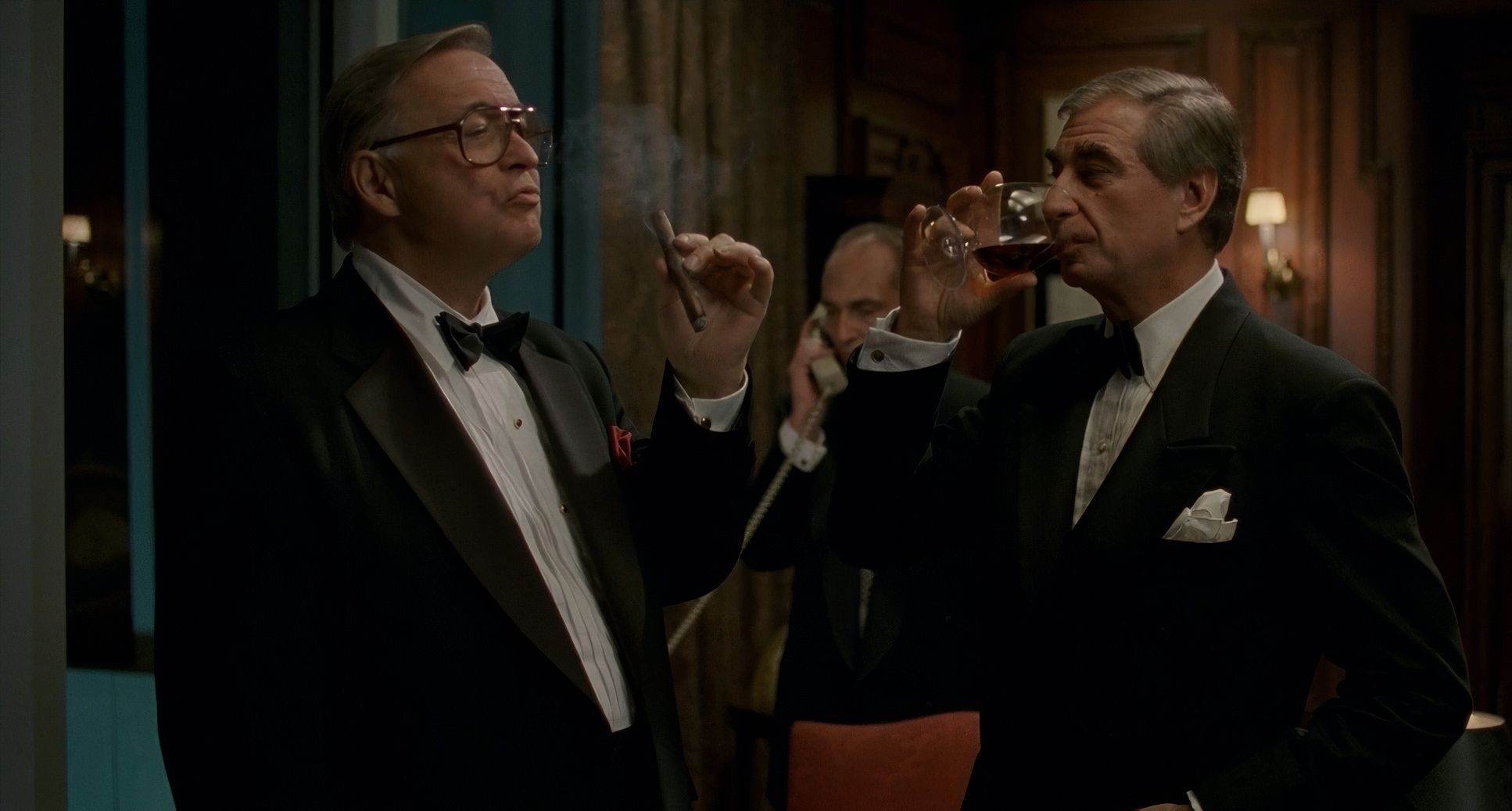
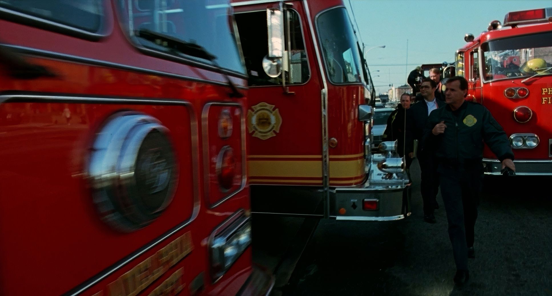
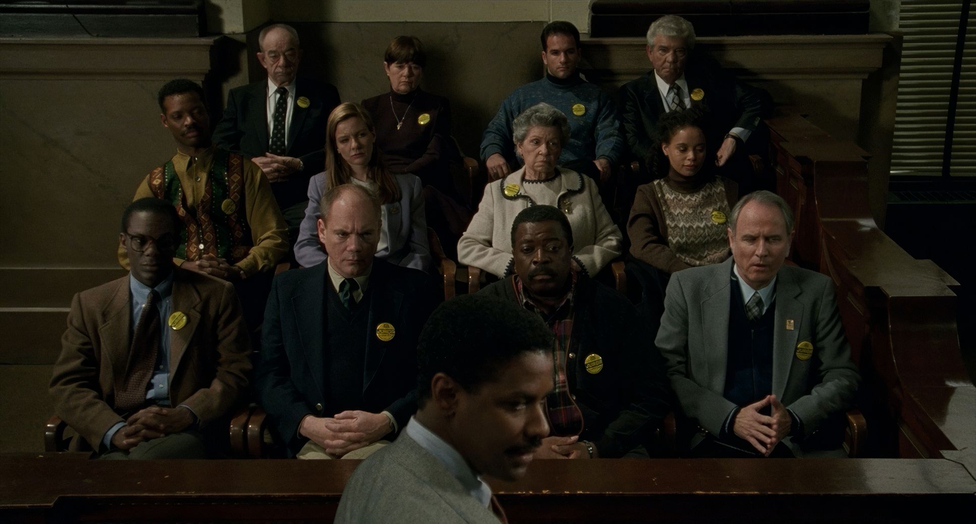
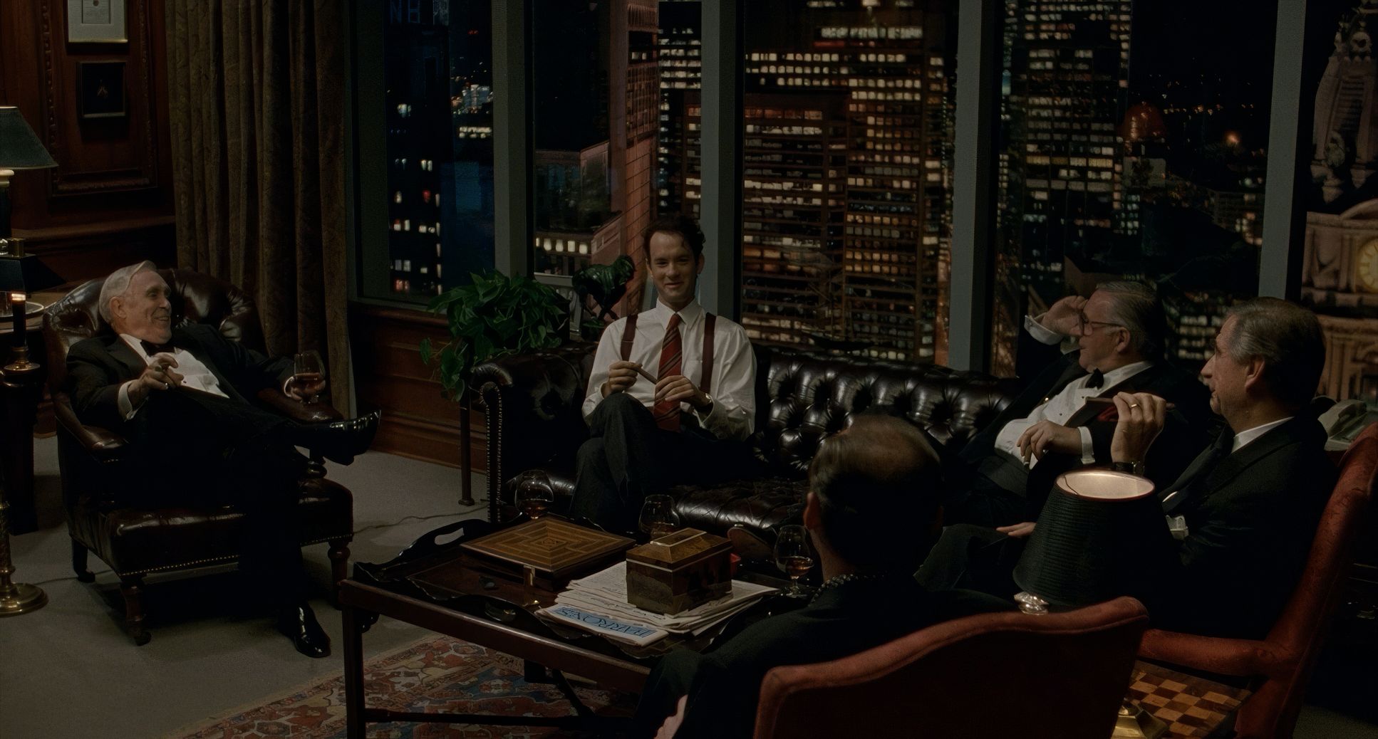
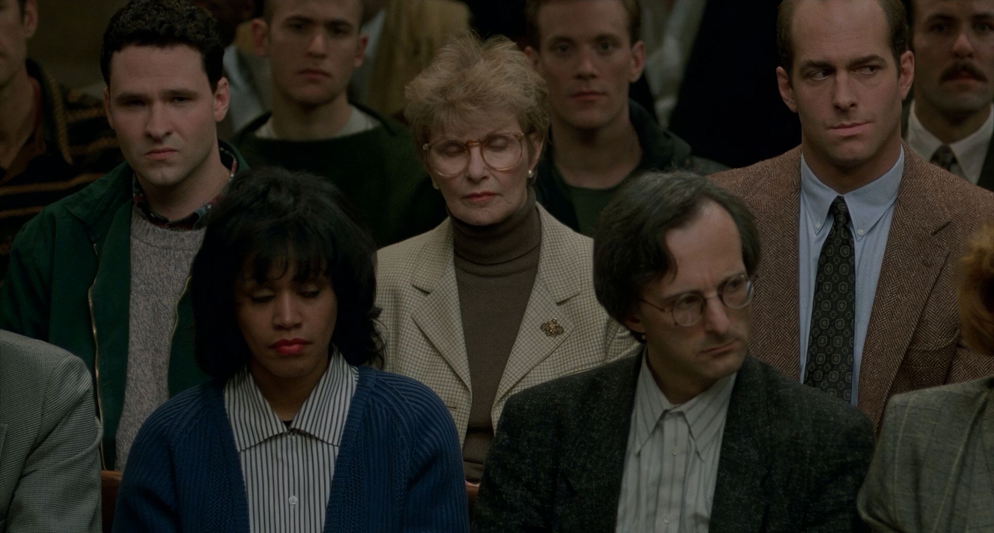
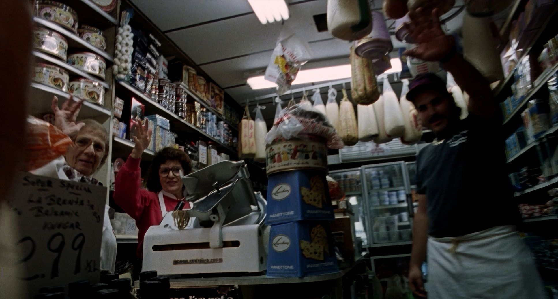
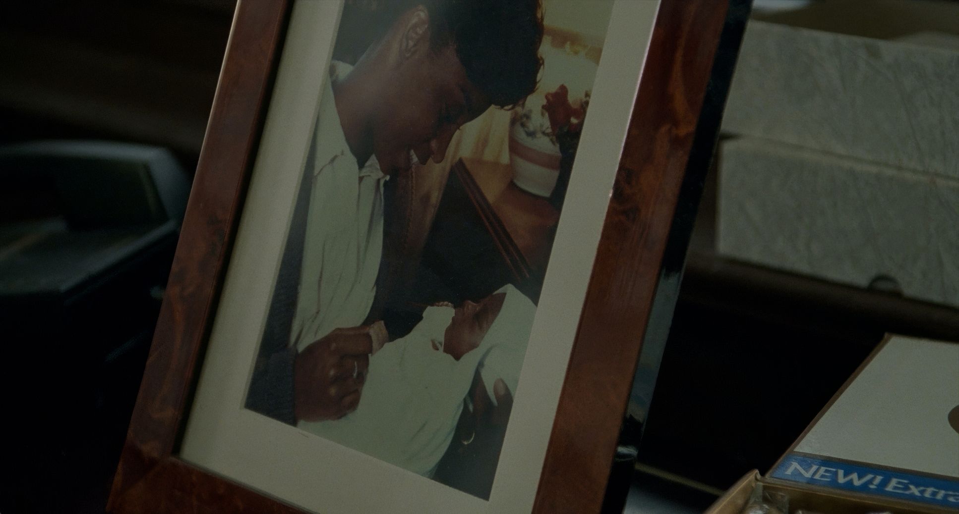
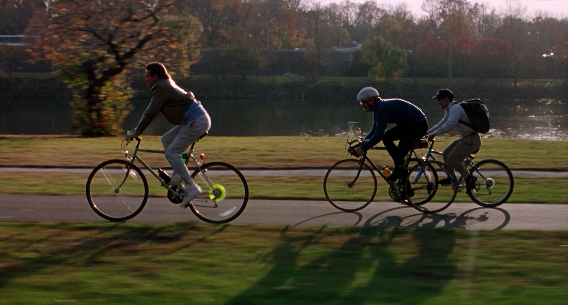
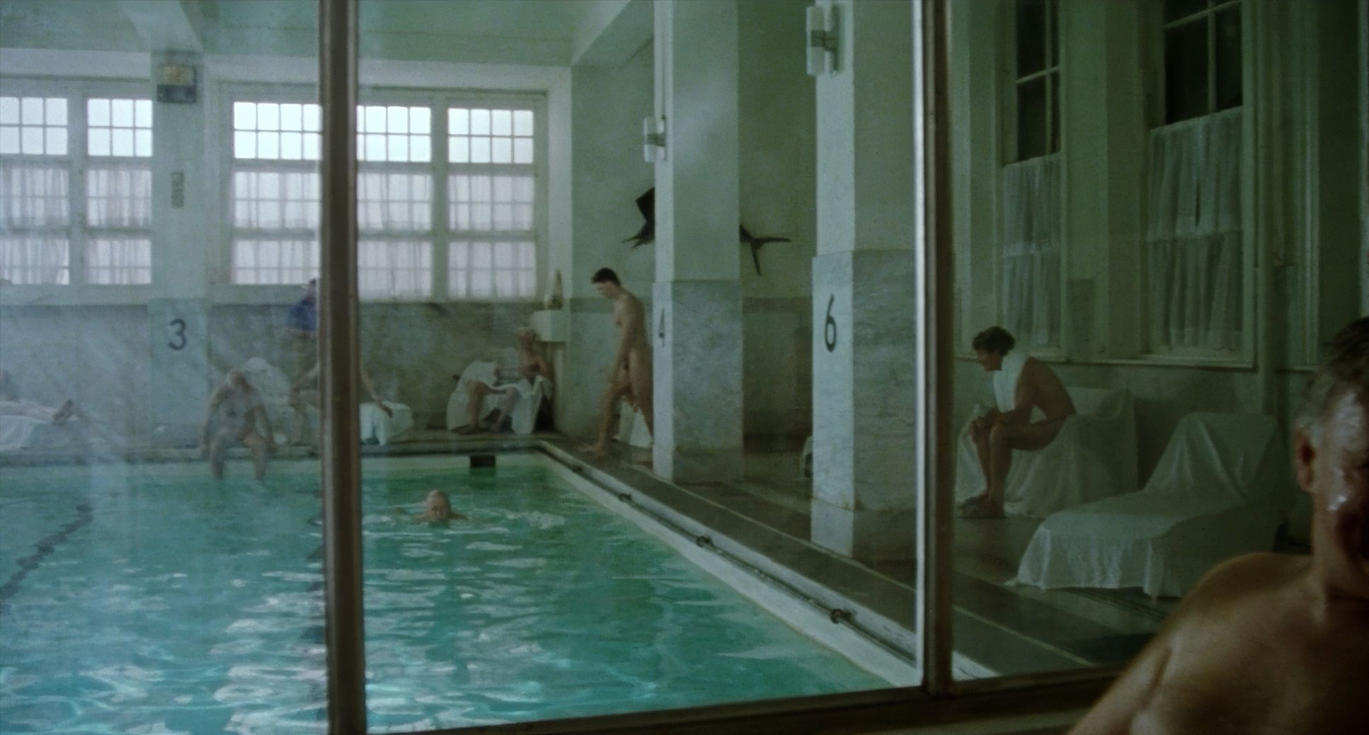
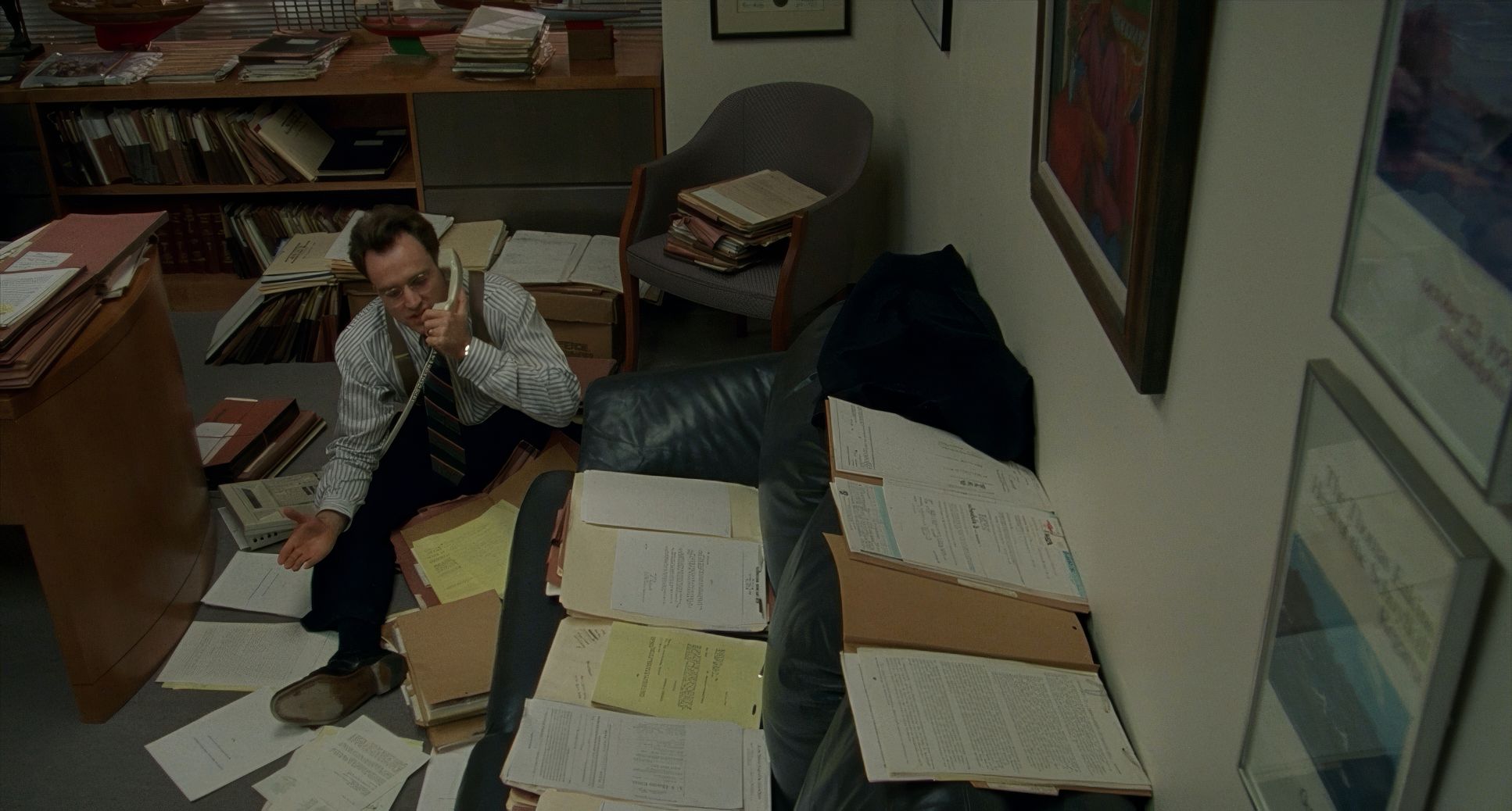
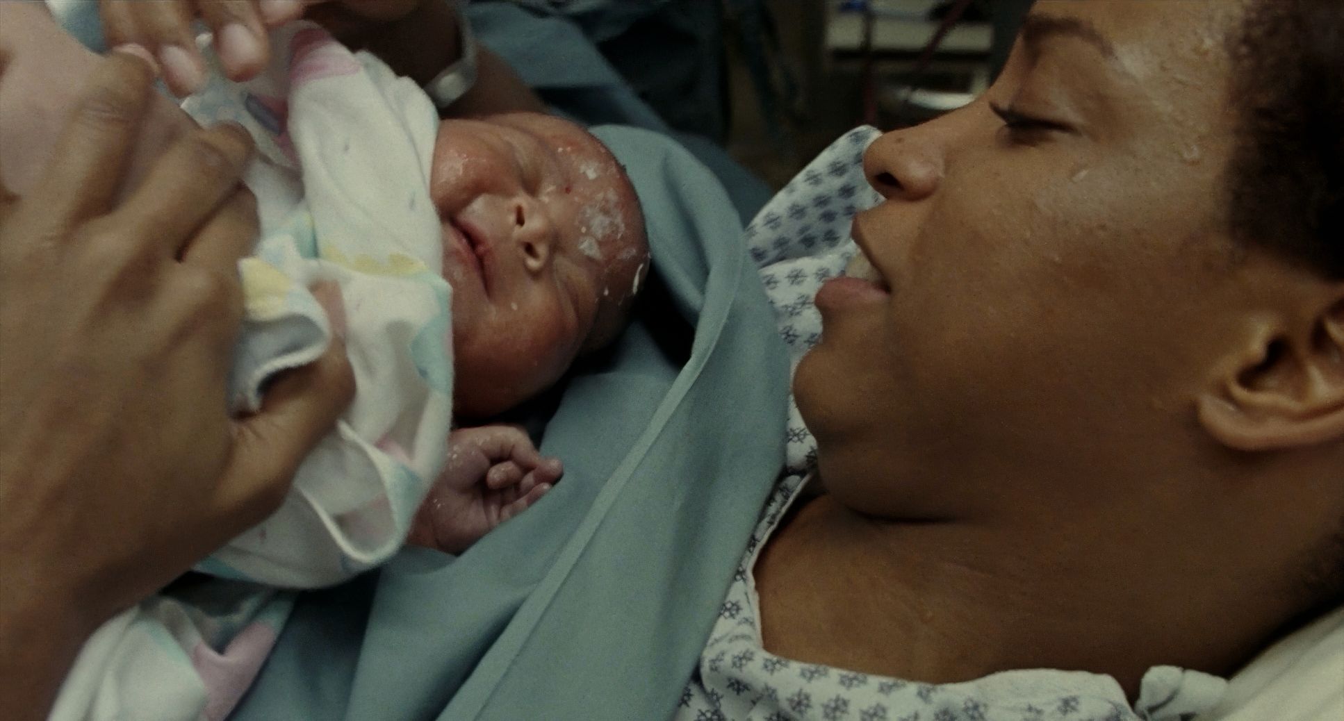
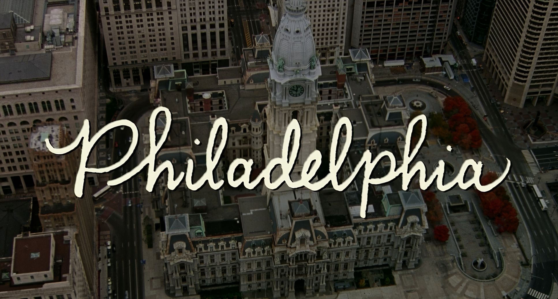
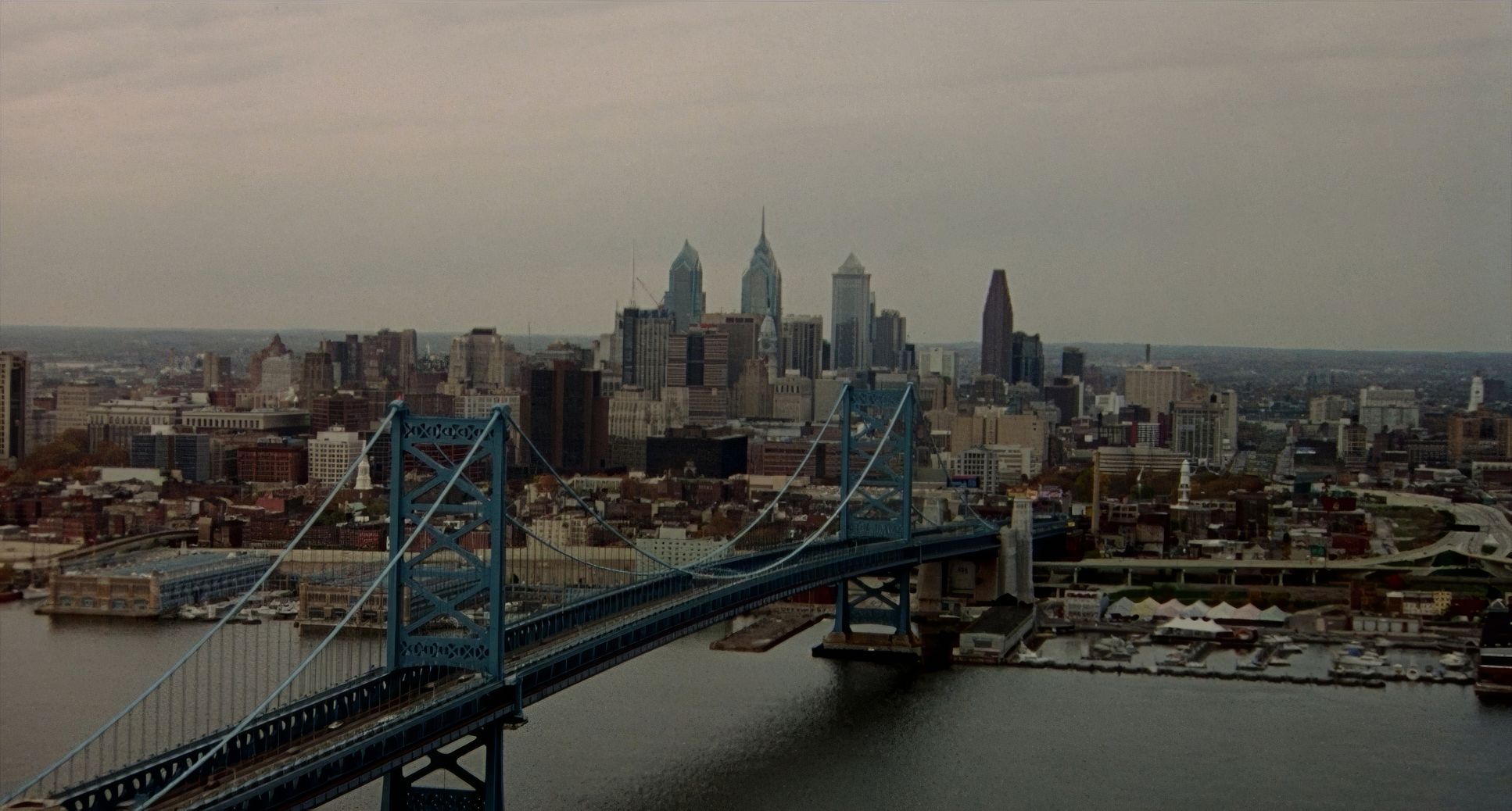
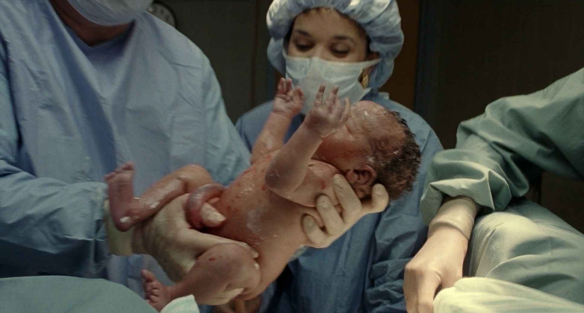
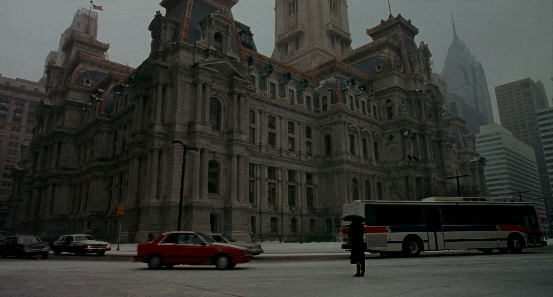
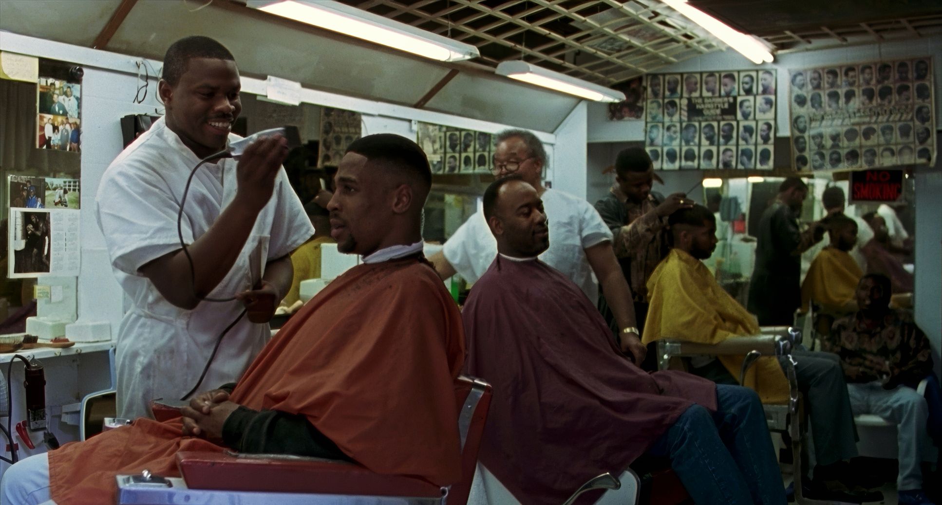
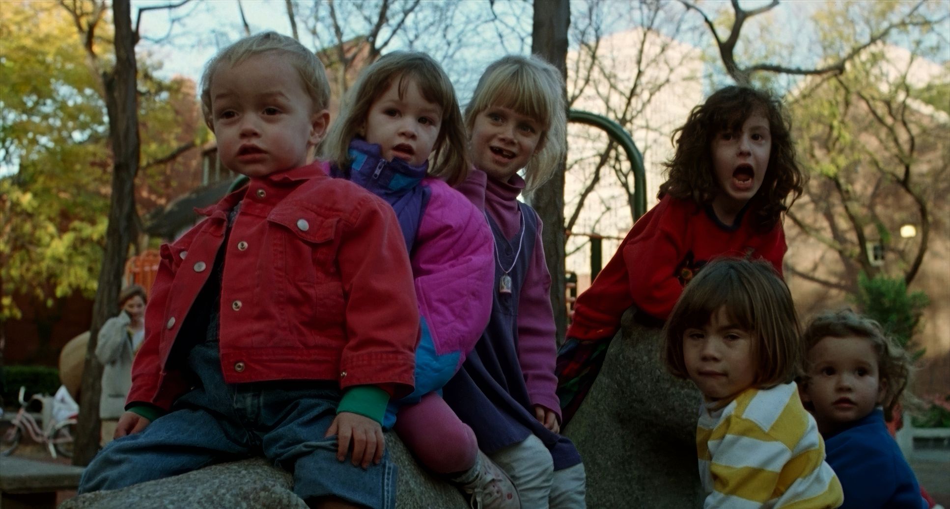
Philadelphia (1993) Film Stills
A curated reference archive of cinematography stills from Philadelphia (1993). Study the lighting, color grading, and composition.

- Also read: CHANGELING (2008) – CINEMATOGRAPHY ANALYSIS
- Also read: PRIMAL FEAR (1996) – CINEMATOGRAPHY ANALYSIS
Browse Our Cinematography Analysis Glossary
Explore directors, cinematographers, cameras, lenses, lighting styles, genres, and the visual techniques that shape iconic films.
Explore Glossary →