Ingmar Bergman’s 1966 masterpiece Persona isn’t just a movie to me; it’s a seismic event. It’s been called the “Mount Everest of Cinema,” and for good reason. For anyone who lives and breathes the language of light and shadow, this film is the ultimate visual manifesto.
It’s a psychological drama, sure, but it’s also a violent deconstruction of film itself. It strips away the fluff, forces you to stare at the artifice of the medium, and hits you with a raw truth about human connection or the total lack of it. For a visual artist, digging into this film is like striking gold.
About the Cinematographer
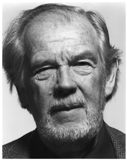
You can’t talk about the look of Persona without talking about Sven Nykvist. He wasn’t just a DP; he was Bergman’s visual alter-ego. Their collaboration was almost telepathic, rooted in a philosophy of “honest” light. Nykvist had this incredible, almost spiritual gift for capturing light in its most unadulterated form. He famously said, “The light must be honest,” and in Persona, that honesty actually hurts.
Nykvist didn’t go for flashy setups. He was a master of using available light or subtly cheating it to sculpt a face until he found the “essential” version of it. His work feels like a direct window into a character’s soul, unembellished and sometimes brutal in its clarity. When you watch his work here, it’s unsettling it feels like the film is peering back at you, judging you while you’re trying to analyze it.
Inspiration Behind the Cinematography
At its core, Persona is about masks. It’s about the performative way we live our lives and the terrifying thought that there might be nothing underneath the surface. This existential dread is the engine behind every visual choice. Bergman wanted to “start over” with this film, deconstructing his own career and the medium of film entirely. That’s why the movie starts with a projector flickering to life, showing jarring, disconnected clips cartoons, newsreels, violence. It’s a direct challenge to the audience.
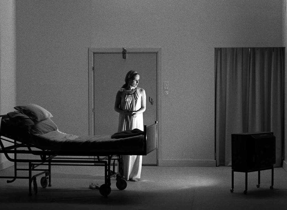
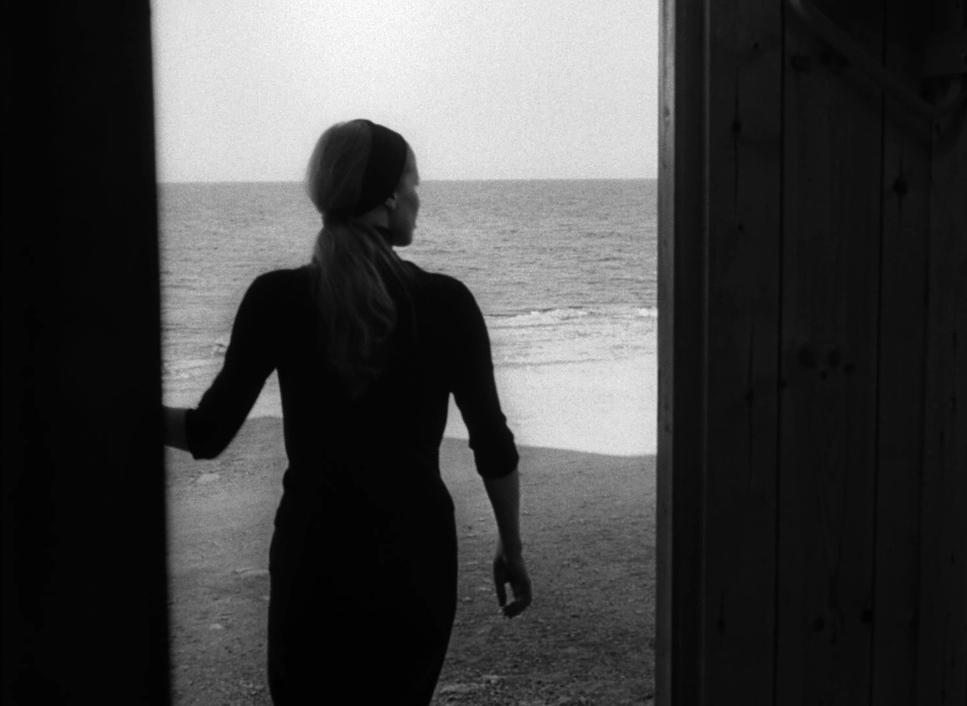
There’s a famous observation about the young boy touching the screen in the opening, suggesting a “male view of females” basically Bergman acknowledging his own gaze as he tries to scratch the surface of these two women. This translates into the relentless, probing close-ups. Even the locations the clinical hospital and the isolated cottage by the sea act as crucibles. They aren’t just pretty backdrops; they’re visual pressure cookers designed to force these two “aspects of the same woman” into a collision.
Camera Movements

When I look at the camera work in Persona, I’m struck by the restraint. We live in an era of sweeping drones and frantic handheld shots, but Nykvist operates with surgical precision.
The camera is remarkably still. It holds its gaze, forcing you to stay in the room with these faces. When it does move, it’s never for show. A slow, almost imperceptible pan might shift focus from Alma’s frantic talking to Elizabeth’s silence, and the power dynamic shifts without a single word being spoken. Or a subtle push-in will draw you into an emotional revelation without breaking the spell. It doesn’t feel like a crew is standing there; it feels like the camera is a third character, silently participating in the psychological merging of these two women.
Compositional Choices
This is where Persona really flexes. The compositions are legendary, and they are almost entirely built around the human face. As a colorist, I’m always thinking about how light and shadow sculpt a profile, but Bergman and Nykvist turn faces into entire emotional landscapes.
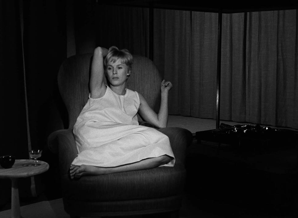
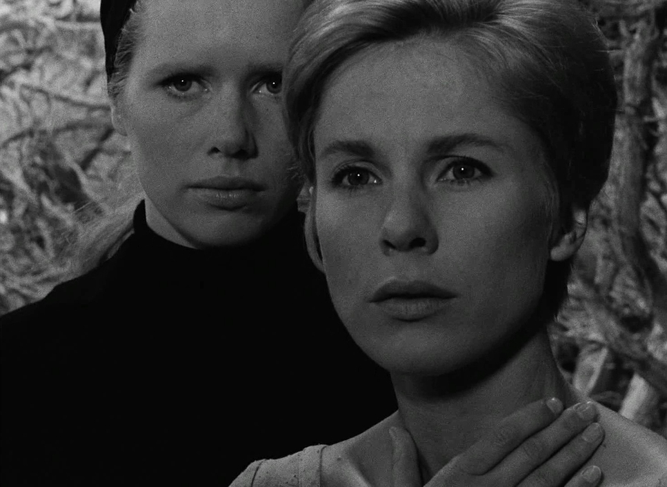
- Extreme Close-ups: This is the film’s DNA. We are constantly “up in their faces,” but it’s a paradox. Even though we’re excruciatingly close, the face remains a mask. The framing is so tight there’s no room for escape, creating a suffocating intimacy that mirrors Alma’s own breakdown.
- Two-shots and Overlapping: The way they frame duality is genius. Long before we had digital compositing tools, they were using depth cues to suggest identity theft. You’ll see one character in sharp focus in the foreground while the other is a soft-focus ghost behind them. Then, of course, there’s the iconic composite shot where their faces literally merge. It’s simple, powerful, and deeply unsettling.
Lighting Style
Nykvist’s lighting is a masterclass in “less is more.” He was a devotee of natural light, and the “motivated” lighting here meaning light that feels like it’s coming from a window or a lamp is incredibly authentic.
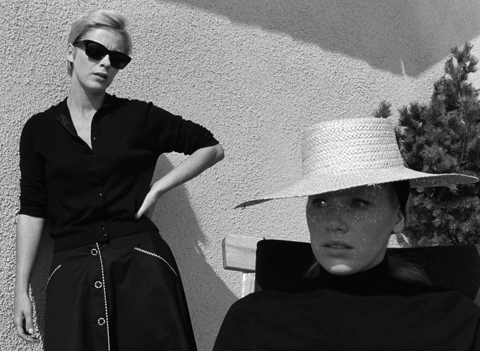
You have these broad, gentle spills of daylight in the cottage, but they’re always contrasted with deep, meaningful shadows. In my world, we say shadows aren’t just an absence of light; they’re a narrative tool. Here, they represent the hidden fears and unspoken thoughts of the characters. There’s no “hollywood” glow here. It’s visceral realism. The way the light catches the texture of a sweater or the sheen on a forehead makes the whole experience feel tactile. It’s a whisper that hits with the force of a shout.
Lensing and Blocking
The technical choices for lenses were all about fidelity. Nykvist mostly stuck to normal or short telephoto lenses. These are the “portrait” lenses they don’t distort the features. They let the subtle tremors in Bibi Andersson’s or Liv Ullmann’s expressions breathe. By flattening the background slightly, the focus stays squarely on the psychological drama.
The blocking is just as meticulous. Alma is the talker, so she’s often moving, pacing, and filling the space. Elizabeth is the silent observer, statuesque and still. Their spatial relationship is constantly shifting sometimes side-by-side, sometimes one receding into the background symbolizing how their identities are blurring. Those famous merging shots weren’t just “tricks”; they were perfectly planned positions where the actors were aligned to create that illusion of overlap.
Color Grading Approach
Now, talking about “grading” a black-and-white film might sound weird to some, but to a colorist, it’s everything. In black and white, you don’t have hue to lean on; you only have luminance. You’re sculpting with shades of grey.
In Persona, the “grade” (achieved through lab timing back then) is all about tonal sculpting. We’re looking at rich, ink-black shadows that still hold texture they aren’t “crushed” or dead. Then you have the highlights. The roll-off is gorgeous. When a highlight hits a forehead or a white wall, it doesn’t just clip and disappear; it transitions into the mid-tones with a smooth, organic grace that digital sensors still struggle to replicate.
I’m also looking at luminance separation. How do you make Alma’s eyes pop against her skin without color? It’s all in the contrast and the density of the print. Plus, you have that beautiful film grain. It’s not a “flaw” it’s the texture of the film’s soul. When I’m asked to emulate this look today, it’s not just about removing the saturation; it’s about matching that specific response to light and that sense of depth.
Technical Aspects & Tools
Persona (1966) — 35mm / 1.37:1 / B&W
| Genre | Drama, Melodrama, Horror, Psychological Horror, Thriller, Mental Health |
| Director | Ingmar Bergman |
| Cinematographer | Sven Nykvist |
| Production Designer | Bibi Lindström |
| Costume Designer | Mago |
| Editor | Ulla Ryghe |
| Time Period | 1960s |
| Color | Desaturated, Black and White |
| Aspect Ratio | 1.37 |
| Format | Film – 35mm |
| Lighting | Hard light, High contrast, Side light |
| Lighting Type | Mixed light |
| Story Location | Europe > Sweden |
| Filming Location | Sweden > Stockholm |
| Camera | Mitchell BNC |
In 1966, this was a pure analog craft. They likely used Kodak Double-X 5222 35mm stock, which is known for that fine grain and great latitude. Shooting in black and white wasn’t just an aesthetic choice; it was a way to strip away the “distraction” of color so the audience had no choice but to confront form and light.
While the Mitchell BNC was a studio staple of the era, you can really feel the flexibility of the Arriflex 35 IIC in some of those more intimate, invasive close-ups. It allowed them to get close without the camera feeling like a massive machine in the room.
The lighting kit was likely minimal. Classic Fresnels for the hard stuff, and probably some “Blondes” or “Redheads” for bigger bounces, but always heavily diffused with silks and flags. Nykvist preferred using large bounces to fill shadows, which is how he got that signature soft-but-directional look. The final “look” was a chemical dance in the lab what we’d call “timing” or “grading” where they’d adjust the exposure of the print to ensure those deep tones and crisp whites remained consistent.
- Also read: PAPILLON (1973) – CINEMATOGRAPHY ANALYSIS
- Also read: STALKER (1979) – CINEMATOGRAPHY ANALYSIS
Browse Our Cinematography Analysis Glossary
Explore directors, cinematographers, cameras, lenses, lighting styles, genres, and the visual techniques that shape iconic films.
Explore Glossary →