When I sat down to re-watch Persepolis, Marjane Satrapi’s animated masterpiece, I didn’t see a “simple” cartoon. I saw a masterclass in cinematographic restraint. It’s a monochrome world, sure, but it’s exactly that lack of color that forces you to look at the bones of the filmmaking the composition, the lighting, and the raw intent. Persepolis eludes the “photographic realism” trap that many live-action features fall into, proving that sometimes, the most moving experiences come from the most deliberate design choices.
About the Cinematographer
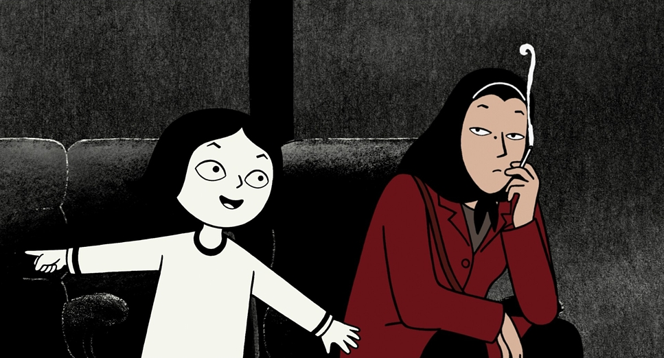
In animation, the title of “Cinematographer” is a bit of a moving target. You aren’t hauling a physical camera through the mud; instead, you’re crafting a collective vision of how the world is seen. For Persepolis, that vision is the brainchild of co-directors Marjane Satrapi and Vincent Paronnaud. Satrapi isn’t just the director here; she’s the chief architect. Since the film is based on her own life, every frame feels incredibly subjective. She’s been vocal about the film not being a literal “documentary,” but a “subjective point of view.” To me, that’s the secret sauce. Because they weren’t trying to record reality, they were free to interpret it. Through meticulous storyboarding and layout, Satrapi and Paronnaud effectively acted as their own DP, translating 2D comic art into a dynamic, living world where the “camera” is liberated from the laws of physics.
Inspiration Behind the Cinematography
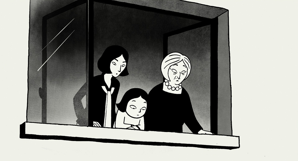
The visual soul of Persepolis comes from a very personal place: Satrapi’s need to show “another point of view” of her Iran. She wanted to strip away the politics and show that humans are, well, humans everywhere. This ambition is the engine behind the film’s stark, graphic aesthetic. There’s this idea from Scott McCloud that readers see simplified characters as “themselves,” and you really feel that here. By stripping away the distractions of hyper-realism, the film becomes a blank slate for our own empathy. I remember watching it and thinking that it didn’t feel like I was watching Marjane’s memory it felt like a shared one. It was a bold move to adapt a graphic novel into a “cinematographic language” rather than just copying and pasting the panels, but it paid off.
Camera Movements
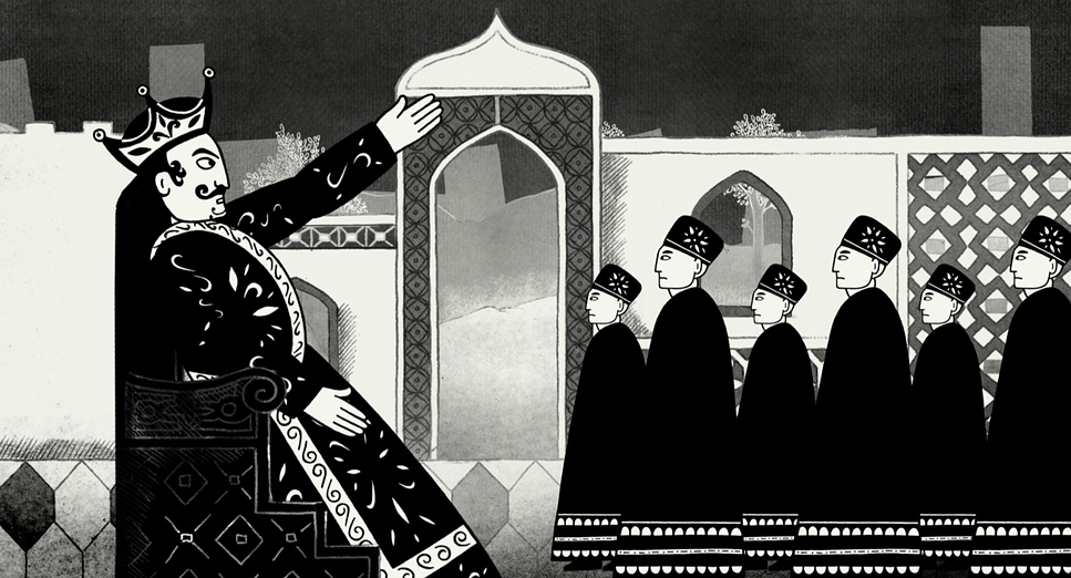
Even without a physical rig, the “camera” in Persepolis moves with a purpose that puts many live-action films to shame. The precision here is incredible. You have these static, almost photographic frames that force you to sit with a moment of sorrow, and then boom the camera becomes kinetic. During the scenes of political unrest, the movements get aggressive. You see quick pans and tilts that mimic a handheld feel, throwing you right into the middle of a protest or a bombing. It’s never movement for the sake of movement, though. Whether it’s a slow, agonizing push-in on a face or a wide tracking shot of a changing city, the camera always follows the internal logic of Marjane’s emotional state. It’s the kind of “invisible” camera work that I find most impressive.
Compositional Choices
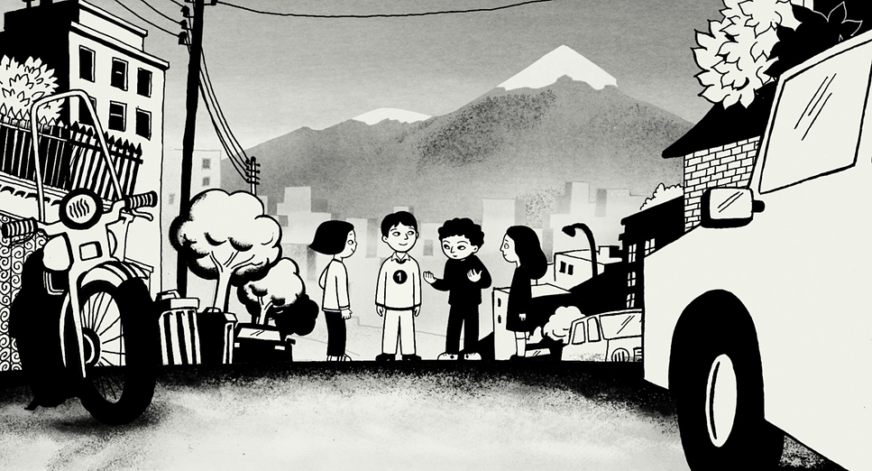
This is where the graphic novel’s DNA is most obvious, but the cinematic adaptation is brilliant. Satrapi and Paronnaud use high-contrast black and white to create frames that are essentially visual poetry. Silhouettes are used constantly depicting the faceless, oppressive crowds or the lonely individual. I love the use of negative space here; it boils a complex scene down to its emotional core without any clutter. You see a lot of strong architectural lines verticals and horizontals that physically “hem” Marjane in when the regime feels most suffocating. They also use depth cues in a way that’s very clever for 2D animation. Instead of optical blur, they use layered graphical elements (foreground, mid-ground, background) to create a sense of scale. It’s all very deliberate, very crisp, and very powerful.
Lighting Style
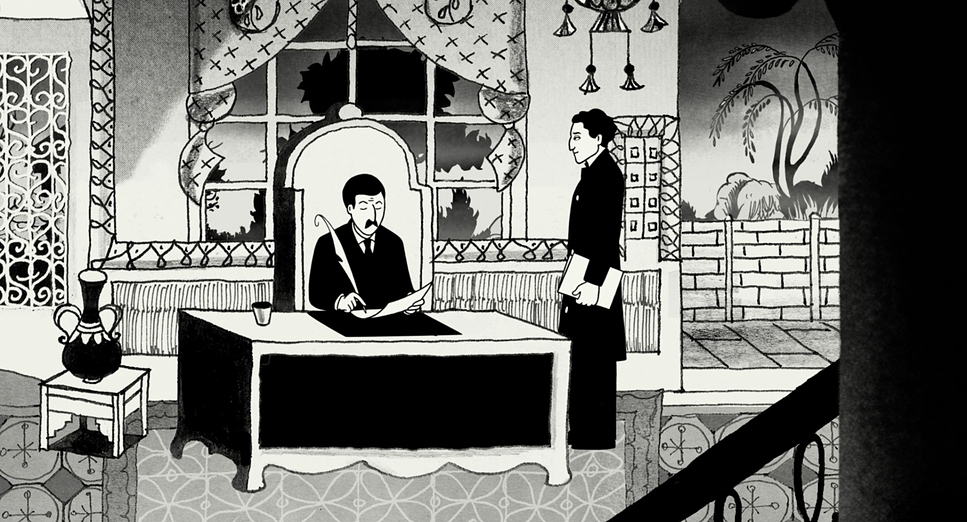
For a colorist, this film is a dream. In a black-and-white world, lighting is the color. Persepolis is a masterclass in chiaroscuro that sharp, moody contrast between light and dark. The “lighting” isn’t just there to show us the characters; it’s there to sculpt them. You have these expressionistic shadows falling across faces during moments of terror, contrasted with soft, diffused light during the quiet family scenes in the house. The lighting always feels “motivated,” even if we don’t see the lamp or the sun. Shadows aren’t just empty spaces; they are a presence. When Marjane is stifled, the blacks feel heavy and suffocating. When there’s hope, the frame opens up. It’s a reminder that you don’t need a million hues to paint a vibrant emotional landscape.
Lensing and Blocking
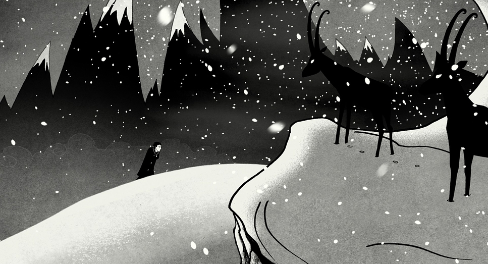
In the digital space, “lensing” is all about implied perspective. Persepolis uses wide “lenses” to make Marjane look tiny against the backdrop of history or a massive crowd. It’s a great way to show the individual being swallowed by the state. Then, when things get personal, they “long lens” into a tight close-up. These shifts bring us right into her vulnerability. The blocking is just as sophisticated. Look at how characters are positioned: Marjane is often physically separated from her family to show her growing independence, or she’s dwarfed by authoritarian figures looming in the background. These “living compositions” evolve with the narrative, creating a visual rhythm that keeps the story moving without a single wasted frame.
Color Grading Approach
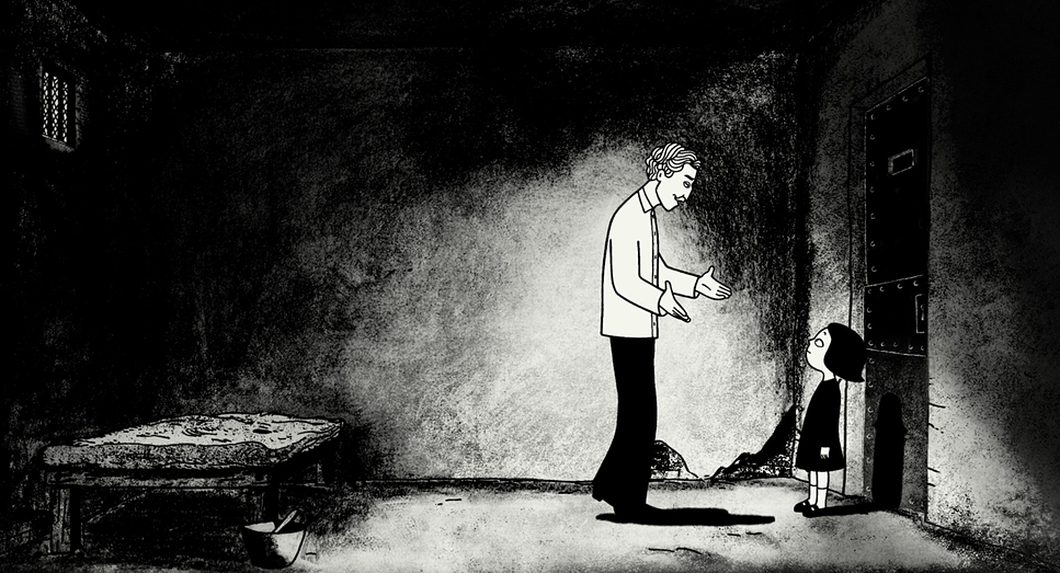
Now, let’s talk about the tonal grading. Even though we’re looking at black and white, the decisions made about contrast and density are exactly what I do in a grading suite. The work of colorist Christian Dutac here is subtle but vital. The blacks are deep and “inky” a look that’s actually quite hard to maintain without losing detail in the shadows (we call it “crushing the blacks,” and here it’s used as a stylistic tool for oppression). The whites are clean but never “blown out.”
The most interesting choice, though, is the rare use of color. The opening scene at the airport is rendered in muted, sepia-toned shades. It’s such a smart way to separate the “now” from the “then.” It tells the audience that memory is different sharper, perhaps, or more stripped down. And when color does pop up, like a splash of red in a dream or a symbolic sequence, it feels like a physical jolt to the system. It’s a print-film sensibility that gives the whole thing a timeless, grounded feel.
Technical Aspects & Tools
Persepolis
Technical Specifications
| Genre | Animation, Drama, Political, Traditional Animation, History, Biopic |
| Director | Vincent Paronnaud, Marjane Satrapi |
| Production Designer | Marisa Musy |
| Editor | Stéphane Roche |
| Colorist | Christian Dutac |
| Time Period | 2000s |
| Aspect Ratio | 1.85 |
| Format | Animation |
| Lighting Type | Artificial light |
| Story Location | Paris > Paris Orly Airport |
While the film looks “hand-drawn,” the technical heavy lifting behind the scenes was massive. Moving from a static page to a 1.85 aspect ratio film requires a rigorous pipeline storyboarding, animatics, and a lot of frame-by-frame sweat. I’d bet they used digital painting tools like Toon Boom or TVPaint to keep those lines as crisp as Satrapi’s original art. They likely used multiplane camera effects to get those complex background movements without the limitations of old-school cel animation. It’s a perfect example of a “hybrid” workflow using modern digital efficiency to protect a traditional artistic vision. Technology didn’t dictate the look; it served it.
- Also read: THE KILLING (1956) – CINEMATOGRAPHY ANALYSIS
- Also read: THE NIGHT OF THE HUNTER (1955) – CINEMATOGRAPHY ANALYSIS
Browse Our Cinematography Analysis Glossary
Explore directors, cinematographers, cameras, lenses, lighting styles, genres, and the visual techniques that shape iconic films.
Explore Glossary →