Perfect Blue (1997) hit me like a revelation years ago, long before I formally dedicated myself to the craft of color. It’s a rare blend of Hitchcockian suspense and Kubrickian surrealism, wrapped in an animated package that defies every genre expectation. This isn’t your average 90s anime. It is a slow-motion car crash involving the psyche of Mima Kirigoe, a pop idol trying to shed her manufactured persona for a career in acting, only to find her reality fraying at the edges. You can see its fingerprints all over modern cinema most famously in Darren Aronofsky’s work, from the bathtub shots in Requiem for a Dream to the thematic bones of Black Swan. But what fascinates me most is how the visual team used every tool available to pull us into Mima’s spiral, making the audience feel every disorienting step of her descent.
About the Cinematographer

In animation, “cinematography” is a collaborative labor, but it requires a specific eye to translate a director’s mania onto the screen. While Satoshi Kon was the visionary behind Millennium Actress and Paprika, the actual heavy lifting of the lighting and “lens” work in Perfect Blue fell to cinematographer Hisao Shirai. Together, they created a mind obsessed with duality. They loved the blurred lines between dreamscapes and waking life, the self and its various avatars. This thematic core is exactly why the cinematography is so potent; it isn’t just about “pretty pictures.” Shirai and Kon didn’t just tell a story; they crafted a subjective, often terrifying headspace. They had a way of looking at mundane objects that made it feel as though they could rip through the dimensions of the frame.
Inspiration Behind the Cinematography
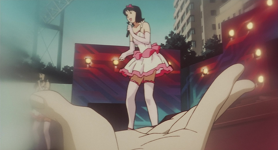
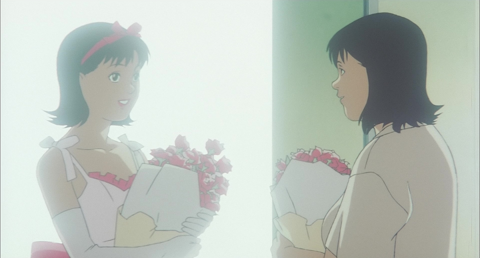
What struck me immediately about Perfect Blue was its deliberate rejection of the hyper-stylized, neon-soaked aesthetic typical of 90s anime. Instead, Shirai and Kon opted for a pulled-back, grounded realism. This wasn’t a superficial choice it was the foundation of the horror. By rendering the environments with an unromantic, almost boring quality, the film makes the eventual eruption of violence infinitely more unsettling. When things go wrong, it isn’t a stylized struggle between heroes; it’s a stark, brutal conflict. This grounded aesthetic makes it harder to distance yourself from the screen; the nightmare feels like it could bleed into your own living room. By making most characters look like “regular people” and reserving stylized beauty only for the pop-idol masks, the film highlights the fabricated nature of Mima’s public life versus her vulnerable, human self.
Camera Movements
The camera in Perfect Blue is rarely static, but its movements are never random. They mimic Mima’s fractured mental state, creating the sensation of a lucid dream where you’re never quite sure if you’ve woken up. This sense of being trapped in a loop is achieved through fluid, often jarring transitions. We see her on stage, bathed in blinding lights, and then suddenly, she’s in the quiet, mundane aisles of a grocery store.
This isn’t just a simple edit. Shirai employs clever visual sleights of hand, using matching frames to bridge disparate realities. Take the scene where Mima walks into the street with headlights rushing toward her. Is it a truck, or are those the flashbulbs of the paparazzi? The camera’s rapid dollies and pans contribute to this disorientation, blurring the narrative lines until the viewer is just as lost as Mima is. It’s a masterful use of cinematic rhythm to express a total break from reality.
Compositional Choices
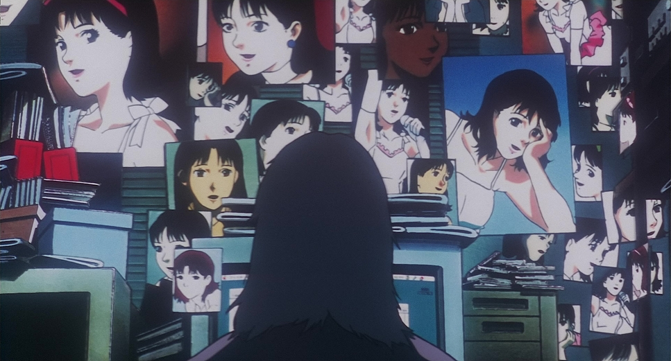
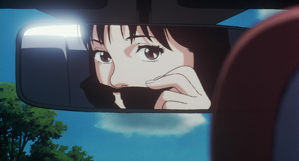
The compositional prowess here is breathtaking. Every frame is meticulously built to convey Mima’s isolation and the pervasive sense of being watched. Shirai frequently uses reflections and mirrors as depth cues to literally fracture Mima’s image, symbolizing her fragmented identity. The floating image of Mima’s pop-persona reflected in a train window against the city landscape is iconic for a reason: it’s a visual metaphor for the inescapable ghost of her past.
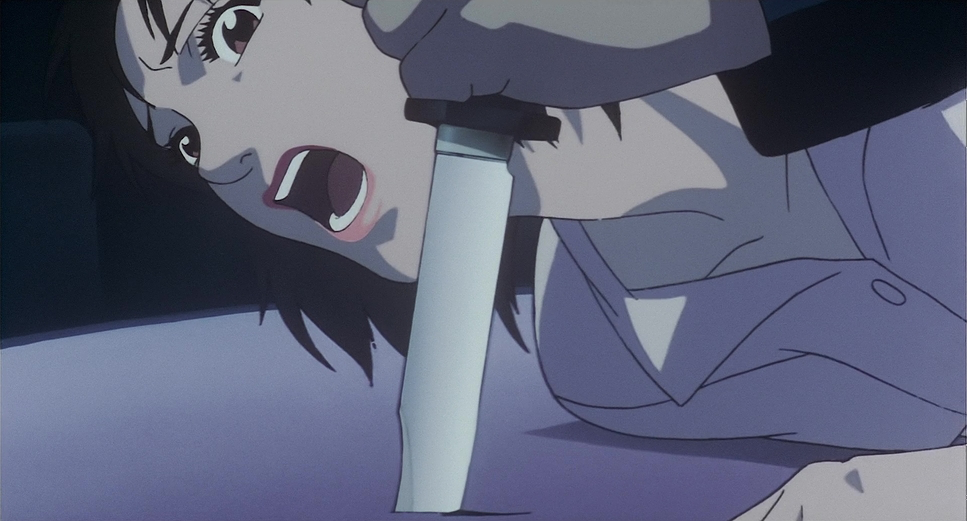
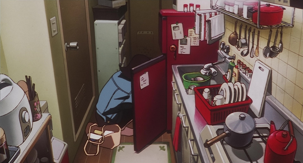
I also love the domestic details in Mima’s apartment the fish tank, the posters, the old PlayStation under the TV. These elements create a profound sense of intimacy. When this personal space is later invaded by her stalker or her doppelganger, the violation feels acutely personal because we’ve been “living” in that clutter with her. The film often pins Mima in tight, oppressive frames when she’s distressed, then pivots to wide, chaotic shots of her on stage where she looks utterly lonely despite the crowd. The scene where she stabs the photographer his nude “projections” flickering across her face is a tour-de-force. It’s a chaotic ballet of light and shadow that exposes the raw nerve of her rage.
Lighting Style
As a colorist, I see the lighting in Perfect Blue as its own character. It morphs and intensifies alongside Mima’s breakdown. Initially, her world has a washed-out, plain look. The tones are restrained and comforting, establishing a baseline of boring reality. But as the story darkens, the lighting follows. The environments become harsher and more saturated until they feel overpowering.
The best example is the strikingly lit strip club scene. Here, the lighting bathes Mima in deeply intense reds, purples, and blues, creating a lurid, artificial atmosphere. This isn’t just for style; it’s a visual metaphor for her transformation. She’s stepping into a darker existence, and the color temperature screams that shift. Even in subtle moments, the use of hard, directional light creates shadows that cast her doppelganger in a haunting, chiaroscuro effect. These aren’t just “animated” choices they are sophisticated lighting decisions that guide our emotional response.
Lensing and Blocking
When we talk about lensing in animation, we’re talking about the illusion of lens behavior and Perfect Blue uses that illusion brilliantly. Early on, the film uses wider perspectives to establish the “lived-in” feel of Mima’s world. But as her reality fractures, the “lenses” tighten. Close-ups become frequent and jarring, forcing us into her suffocated perspective.
The film plays with depth of field to isolate Mima, detaching her from her surroundings. There’s a crucial difference in how the camera treats her when she’s alone versus when she’s being exploited. When she’s in her apartment, the camera feels like an empathetic observer. But during the more sexualized or professional scenes, the perspective shifts to a voyeuristic “long lens” feel, aligning the viewer’s eye with the stalkers and the fans. The blocking of Mima and her doppelganger creates unsettling spatial relationships that emphasize her feeling of being hunted by her own image.
Color Grading Approach
Looking at this through the lens of a modern grading suite, the palette of Perfect Blue is an emotional blueprint. In those early “normal” scenes, I’d be aiming for a subtle lift in the shadows and muted saturation to create a sense of fragile normalcy. I’d keep the highlight roll-off gentle and natural.
But once Mima’s world unravels, that’s where you lean into the psychological impact. I’d push the reds and purples, letting them bloom and even clip slightly in the highlights to create a sense of overwhelming heat and danger. The blues would become colder and more alien. I’d push the contrast aggressively, deepening the shadows to hide threats and making the highlights unforgiving. The goal wouldn’t be to make it “pretty” it would be to make the audience feel the visceral discomfort of her reality. I might even explore a subtle print-film emulation to give the colors some analog grit, adding a grimy realism that enhances the unsettling quality. It’s about making the picture breathe her anxiety.
Technical Aspects & Tools
| Genre | Animation, Thriller |
| Director | Satoshi Kon |
| Cinematographer | Hisao Shirai |
| Production Designer | Nobutaka Ike |
| Editor | Harutoshi Ogata |
| Time Period | 1990s |
| Color | Mixed, Saturated, Blue |
| Aspect Ratio | 1.85 |
| Format | Animation |
| Lighting Type | Artificial light |
| Story Location | Japan |
Even though Perfect Blue is hand-drawn, the technical planning mirrors live-action. Kon and Shirai were essentially filming with pencils, using their understanding of optics to create the illusion of a physical camera. This involved incredible layout art and character designs like the stalker, Mr. Mimane. His gaunt, disturbing features are a huge part of why he’s so menacing; it’s a character design I love for how effectively it triggers a “fight or flight” response.
The detail in the backgrounds the cluttered shelves, the city streets isn’t just window dressing. It builds the realistic quality necessary for the horror to land. The seamless “bleeding” of scenes, where a pop concert morphs into a grocery store, requires planning akin to complex digital transitions today. They were effectively using “digital intermediate” concepts before DIs were standard, controlling every luminance value to simulate depth and perspective within a two-dimensional medium.
- Also read: THREE COLORS: RED (1994) – CINEMATOGRAPHY ANALYSIS
- Also read: ELITE SQUAD (2007) – CINEMATOGRAPHY ANALYSIS
Browse Our Cinematography Analysis Glossary
Explore directors, cinematographers, cameras, lenses, lighting styles, genres, and the visual techniques that shape iconic films.
Explore Glossary →