Hello, my name is Salik Waquas. I’m a film colorist and the owner of a post-production color grading studio called Color Culture, where I’ve had the pleasure of working on projects that push creative boundaries. As someone deeply passionate about visual storytelling, I’m fascinated by how cinematography, lensing, blocking, and color grading all work together to enhance a film’s narrative. Today, I want to share my personal analysis of the cinematography in Bong Joon-ho’s masterpiece, “Parasite.” This film is a powerful example of how careful visual decisions can drive home a story’s themes of social inequality, and I find the craft behind it simply mesmerizing.
About the Cinematographer

“Parasite” was shot by Hong Kyung-pyo, a cinematographer whose career is marked by visually stunning and thematically complex films like “Snowpiercer” and “Burning.” His expertise shines through in “Parasite,” a film that demanded an intricate balance of styles to reflect both social satire and the growing tension of the story.
Hong Kyung-pyo’s work stands out because of his incredible ability to adapt his visual language to the narrative needs of each story, as we have been seeing over the past years. This approach is fully realized in “Parasite,” where the cinematography subtly shifts as the power dynamics change between the Park and Kim families. I find it fascinating how Hong chose to use a 65mm lens—not for the sake of luxury or sharpness, but for the emotional resonance it brought to the story. Such thoughtful consideration is exactly what makes his work extraordinary.
Inspiration for the Cinematography of “Parasite”
The inspiration behind the cinematography of “Parasite” lies in creating visual metaphors for social disparity and the struggle for power. One of the key aspects of the film’s visual language is the division between two worlds: the world of the wealthy Park family and the struggling Kim family. Hong used distinct visual elements to separate these spaces while also connecting them through shared motifs.
I recall how Hong mentioned the importance of testing different lenses to achieve the desired look. The ARRI Rental Prime DNA lenses he tested provided an almost anamorphic feel, with a depth of field that brought realism to the characters and their surroundings. He appreciated how these lenses rendered close-ups, highlighting the characters’ eyes and skin textures, bringing an intimacy to their emotions. The choice of these lenses underscores his dedication to finding the right visual tools to tell the story.
Hong and director Bong Joon-ho drew inspiration from European cinema, focusing on realism and careful framing. I feel their intention was never to make the cinematography flashy or overly noticeable, but rather to serve the story and immerse the viewer in the complex relationships between the characters.
Camera Movements Used in Parasite
Camera movement in “Parasite” is one of the film’s most critical storytelling tools, evolving seamlessly throughout the story. In the first half, as the Kim family infiltrates the Park household, the camera has a subtle, almost unnoticeable forward motion. This consistent movement symbolizes the Kims’ calculated ascent and growing influence over the Park family. I love how Hong’s choice of a slow push forward creates a sense of inevitability—it’s like foreboding, even during seemingly lighthearted scenes. It perfectly represents the creeping sense of events that are about to unfold.
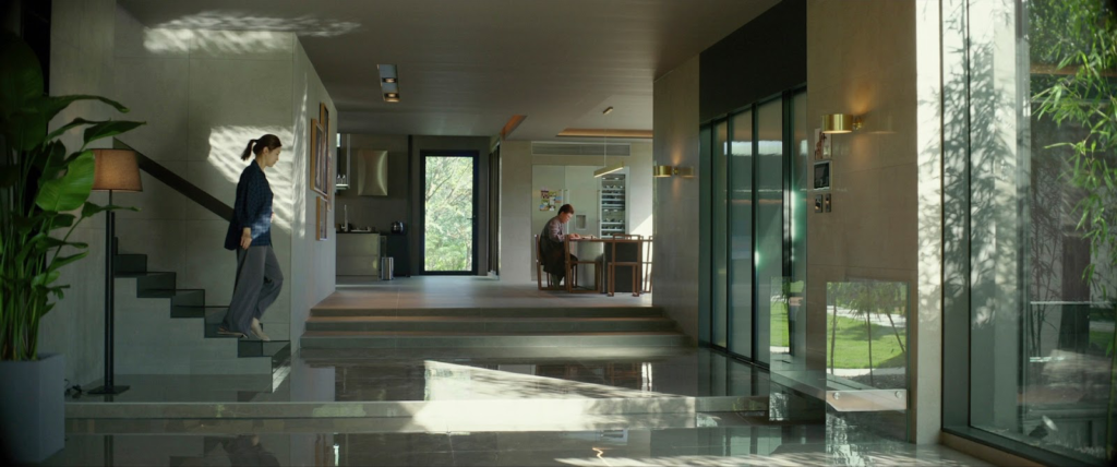
Once the Kims reach their goal, however, the camera’s movement changes significantly. The forward momentum stops, symbolizing that they’ve reached a standstill in terms of their power and influence. Instead, the camera becomes more static, reflecting a false sense of stability. Movement forward or backward is used sparingly, highlighting specific turning points. For instance, when the ousted housekeeper returns, the camera suddenly becomes erratic, handheld, and much less controlled, matching the chaos and tension of that moment, isn’t that terrific.
I also admire Bong and Hong’s use of Steadicam shots to depict the lavish Park household. The smooth, flowing camera work emphasizes the vastness and freedom of their space, contrasting sharply with the locked-down shots of the Kim’s semi-basement home. The difference in how these two spaces are filmed visually illustrates the disparity between the two families as we have seen in his film.
Compositions in Parasite
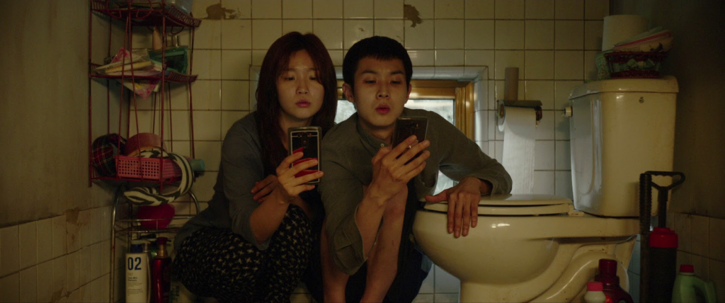
Composition in “Parasite” is one of the film’s most essential elements. The set design, blocking, and framing all underline themes of inequality, confinement, and the fine line between the two families is one of the most striking aspects is how often the two families are separated by physical boundaries within the frame whether be it a window, a wall, or even just a difference in height that comes into our sight.
Stairs play a significant role in emphasizing social hierarchy which left me mesmerized. The stairs leading up to the Park’s grand home and those leading down to the Kim’s semi-basement are visual markers of the vertical nature of social status, with the rich literally living above the poor. This motif is used throughout the film to reinforce the divisions between classes.
Hong Kyung-pyo’s use of a wide lens was also key. Wide lenses tend to exaggerate the distance between objects, adding to the sense of separation. However, what I noticed is how the DNA lenses used in the film softened this effect, making the distance feel more natural and bringing the characters closer together, which added to the realism. This subtle shift in composition makes the spaces feel tangible—almost as if we’re standing right there with the characters.
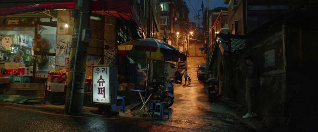
The cinematography in “Parasite” often employs long takes that combine wide, medium, and close-up compositions without a cut. Hong and Bong meticulously choreographed these movements, allowing scenes to develop naturally, revealing new elements at just the right moment. You can clearly see how this method not only kept the pacing dynamic but also made us as the audience feel like we were navigating the space along with the characters.
Lighting Style of Parasite
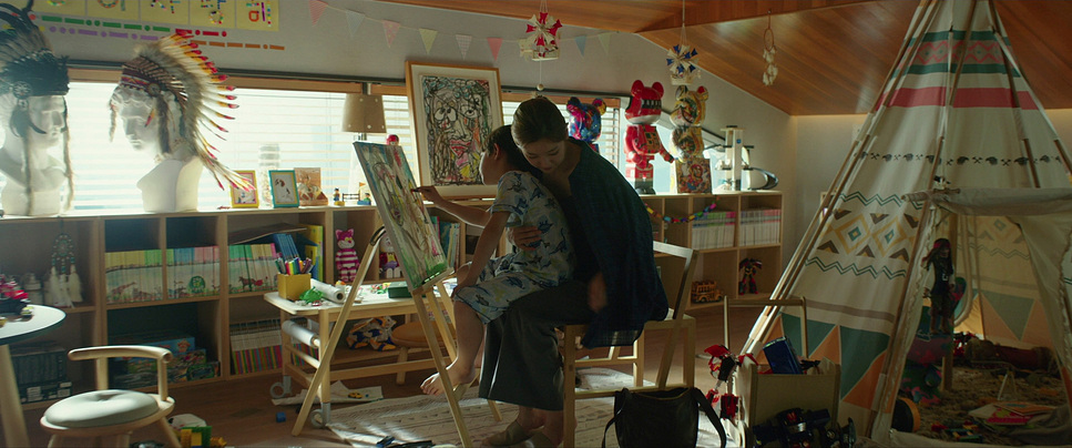
The lighting in “Parasite” effectively defines the two contrasting worlds. As we can see, the Park family’s house is bathed in natural, abundant light pouring through large windows, suggesting freedom, openness, and luxury. In contrast, the Kim family’s semi-basement is lit by dim, often fluorescent lights, with the only natural light coming from a small window at street level, frequently shadowed by passing pedestrians.

The contrast in lighting helps to reflect the psychological state of the characters. The Parks, basked in soft, natural light, seem at ease and oblivious to the struggles happening around them. Meanwhile, the Kims are often portrayed in shadows, their environment feeling claustrophobic and oppressive.
One particularly memorable sequence that I recall is when heavy rain floods the Kim family’s home. The lighting in this scene is almost surreal, as the murky, greenish water rises and the lights flicker. This visual metaphor perfectly captures the feeling of being overwhelmed, emphasizing the fragility of the Kim family’s situation.
Hong also spoke about testing the limits of exposure. When he tested the 65mm lens in very low light, he found that it gave a luxurious quality even in darkness. I strongly think, this exploration of lighting extremes adds depth to the scenes and heightens the tension, particularly in the film’s darker moments.
Lensing and Blocking of Parasite
The choice of lenses in “Parasite” plays a crucial role in the storytelling. The ARRI ALEXA 65 camera paired with ARRI Rental Prime DNA lenses and Hasselblad lenses gave the film a cinematic feel, while also ensuring that close-ups were intimate without being intrusive. In one of his interviews, Hong mentioned how this lens captured the texture of the characters’ skin and brought their eyes to life, which was particularly important for a film that relied heavily on subtle facial expressions and character nuances.
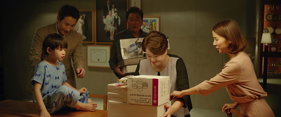
Blocking in “Parasite” also deserves significant attention. Characters are often blocked in ways that reinforce their social positions. For instance, when you see the Kims are in the Park house, they are frequently seen in the background, almost blending into the environment, while the Parks occupy the foreground, confidently taking up space.
If you notice, a particularly powerful moment towards the film’s end shows Mr. Kim crouched behind a bush, watching the Park family. He is literally and figuratively in the shadows, marginalized and hidden from view, while the Parks bask in the sun. This careful attention to blocking not only supports the narrative but also makes a strong visual statement about social invisibility and power dynamics.
Color Grading of Parasite
| Genre | Comedy, Drama, Thriller |
| Director | Bong Joon-ho |
| Cinematographer | Hong Kyung-pyo |
| Production Designer | Lee Ha-jun |
| Costume Designer | Choi Se-yeon |
| Editor | Yang Jin-mo |
| Colorist | Kevin Kang |
| Time Period | 2010s |
| Color | Saturated, Green |
| Aspect Ratio | 2.39 – Spherical |
| Format | Digital |
| Lighting | Top light |
| Lighting Type | Artificial light |
| Story Location | Seoul Capital Area > Seoul |
| Filming Location | Asia > South Korea |
| Camera | ARRI ALEXA 65 |
| Lens | Arri Prime DNA Lenses |
| Film Stock / Resolution | ARRIRAW (6.5K) |
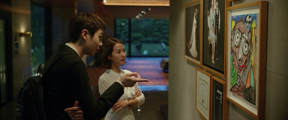
As a colorist, I particularly appreciate the deliberate choices made in the color grading of “Parasite.” The color palette shifts between the two families, further emphasizing their contrasting lives. The Park family’s scenes are full of warm, golden hues, suggesting comfort and affluence. In contrast, the Kim family’s world is dominated by cooler, muted tones, which add to the feeling of confinement and struggle. Definitely, a thumbs up on the color palette.

One of the most interesting aspects of the color grading is how it changes when the two families’ worlds collide. As you would have seen, during the infamous flood scene, the colors become almost monochromatic, drained of warmth, reflecting the hopelessness of the Kims’ situation. The colorist worked to ensure that the emotional tone of each scene was amplified through the color palette quite wisely.
The grading also emphasizes the green hues of the Park’s garden and the natural elements surrounding their home, contrasting sharply with the gray concrete of the Kim’s neighborhood. This contrast reinforces the idea that the Parks live in an idyllic bubble, disconnected from the harsh realities faced by the Kims.
The final scenes, where Mr. Kim disappears into the bunker beneath the Park’s house, are graded with an almost sickly green hue. This choice adds to the feeling of entrapment and symbolizes decay and the descent into darkness—an unsettling but powerful visual that enhances the narrative and indulges us into the same.
- Also Read: FILM DENSITY DCTL DAVINCI RESOLVE (FREE DOWNLOAD)
- Also Read: THE CINEMATOGRAPHY OF “SEVEN SAMURAI” EXPLAINED
Browse Our Cinematography Analysis Glossary
Explore directors, cinematographers, cameras, lenses, lighting styles, genres, and the visual techniques that shape iconic films.
Explore Glossary →