Every frame is a choice that guides the viewer’s eye and manipulates their pulse. So, when I sat down to rewatch Peter Bogdanovich’s Paper Moon (1973) recently, it wasn’t just a casual viewing. It felt like a masterclass in how deliberate cinematography especially in black and white can transcend its era.
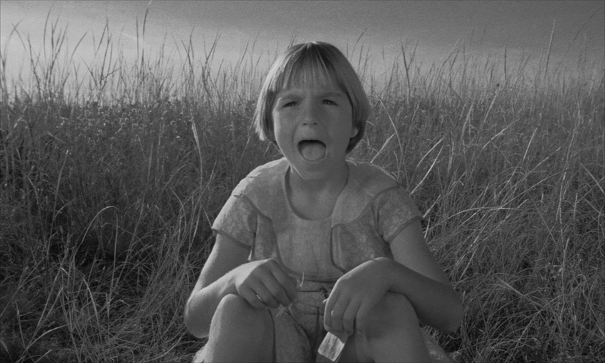
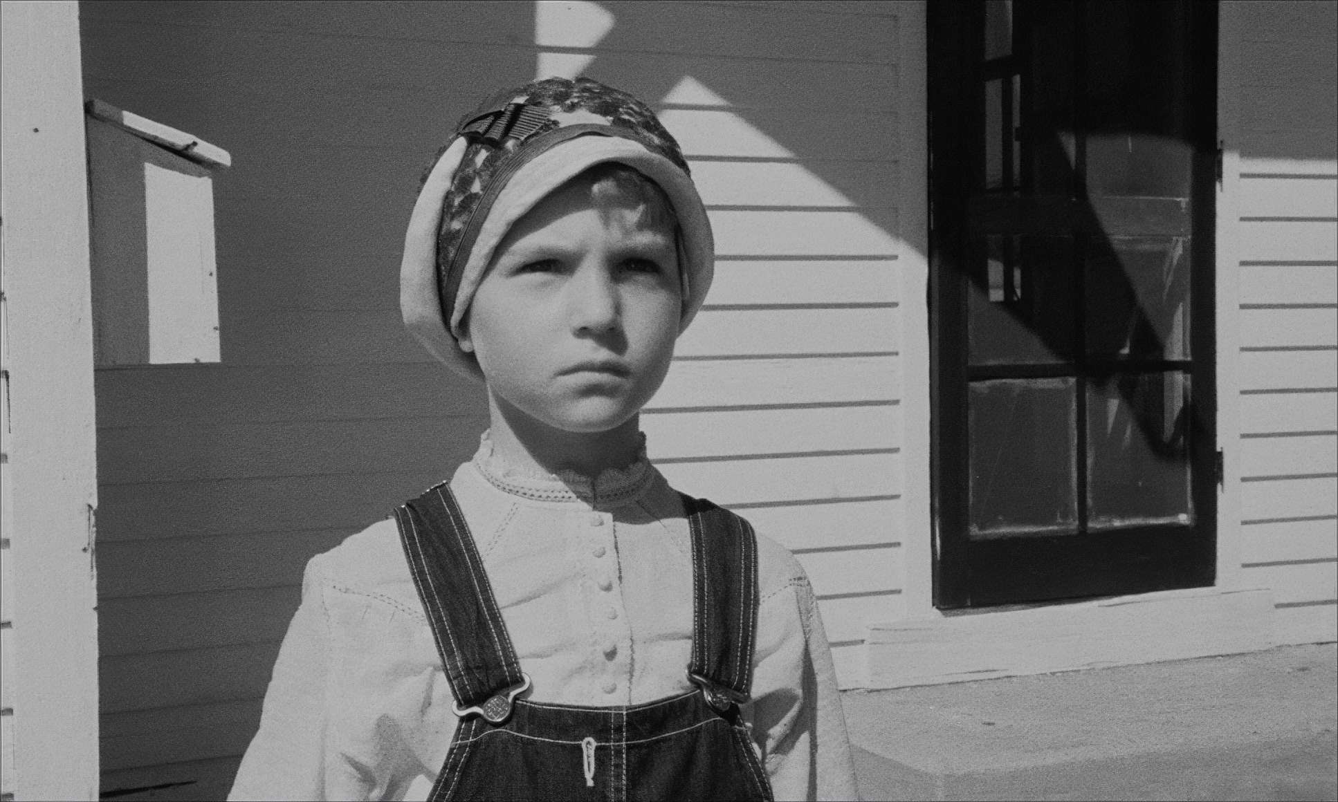
This film, a Depression-era road movie, feels like it was literally plucked out of the 1930s. It follows the charmingly cynical con artist Moses Pray and the precocious nine-year-old Addie through the dust-caked landscapes of Kansas. For a colorist, analyzing a black-and-white film is like peeling back skin to see the skeleton. Without the “distraction” of hue, you’re forced to focus purely on light, shadow, and texture. It’s a challenging, yet incredibly rewarding exercise for anyone in the trade.
The Kovács Connection

You can’t talk about Paper Moon without talking about the man behind the lens: László Kovács. If you’re a fan of the New Hollywood era, Kovács is basically royalty. He’s the guy who gave Easy Rider and Five Easy Pieces their visual DNA. He was an artist who wasn’t afraid to get his hands dirty, but his work on Paper Moon shows a different side of his genius restraint.
Kovács, alongside directors like Bogdanovich, defined a look that was gritty and real, yet somehow poetic. For a working professional like me, his career is a constant reminder that technical mastery is just the floor; the ceiling is how you use that tech to evoke an entire epoch. In Paper Moon, he captures sun-drenched, dust-bowl landscapes with the same surgical precision he uses for the intimate, often hilarious exchanges between the O’Neals. He doesn’t just show you the 1930s; he makes you breathe the dust.
Inspiration Behind the Cinematography
Paper Moon doesn’t just take place in the 30s; it feels like a 30s film. That wasn’t an accident. Bogdanovich was obsessed with classic American cinema, and he consciously aimed for that “Old Hollywood aesthetic.” Shooting in black and white was the most overt and brilliant choice they made. It instantly transports you.
I see immediate parallels here to films like The Grapes of Wrath. There’s a starkness to the monochromatic palette that cuts right through any potential sentimentality. It strips away the fluff and forces you to look at the human struggle against a desolate backdrop. It’s a nostalgic nod, sure, but it isn’t superficial. It’s a stylistic anchor that grounds the film. Bogdanovich took the essence of the old masters their framing, their pacing and reinterpreted it through a 1970s lens. The result is something that feels authentically antique but possesses a narrative drive that still feels modern today.
Compositional Choices: The “Flex” of Deep Focus

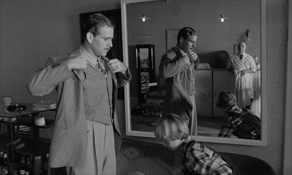
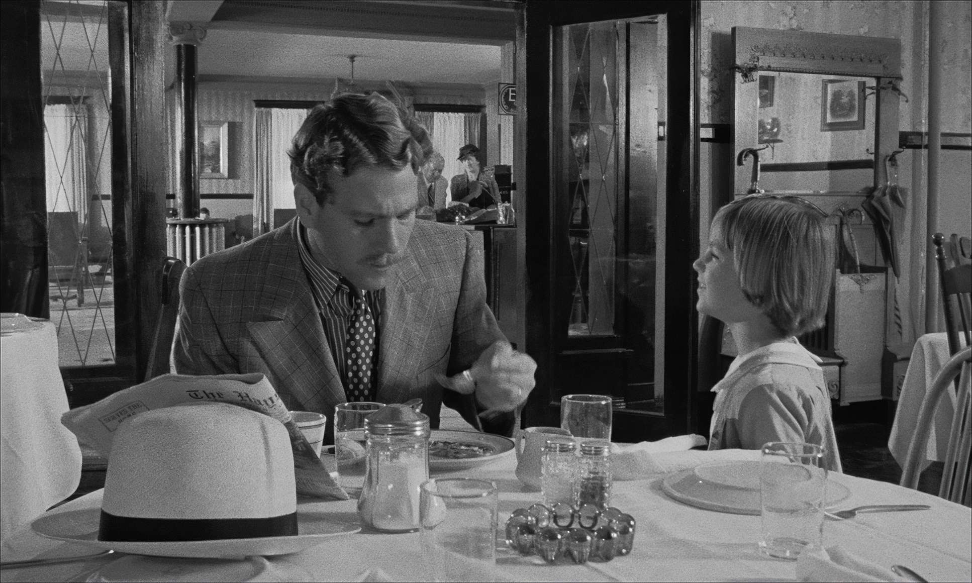
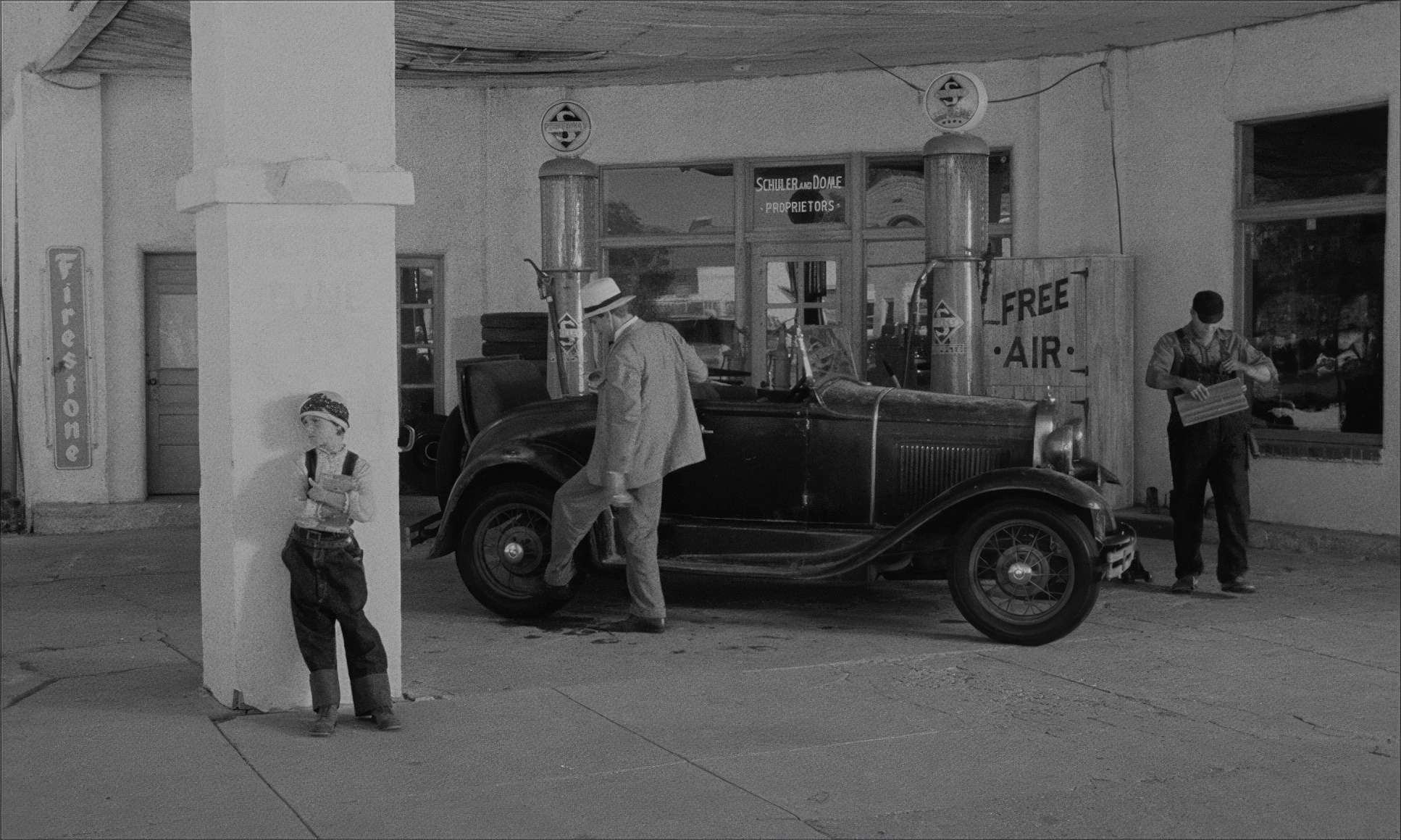
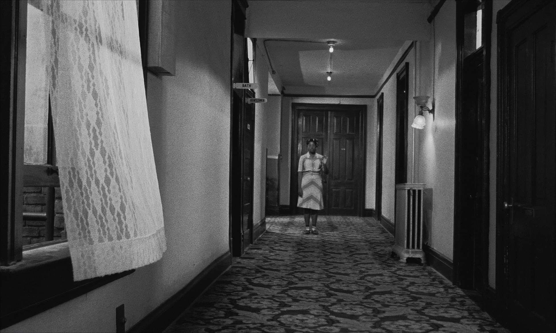
This is where the cinematography truly sings for me. Kovács’s compositional choices are both classically elegant and quietly aggressive. The film is famous for its masterful use of deep focus, which basically gives the viewer something to observe in the distance while the story progresses in the foreground. It’s a total “flex” of technical skill.
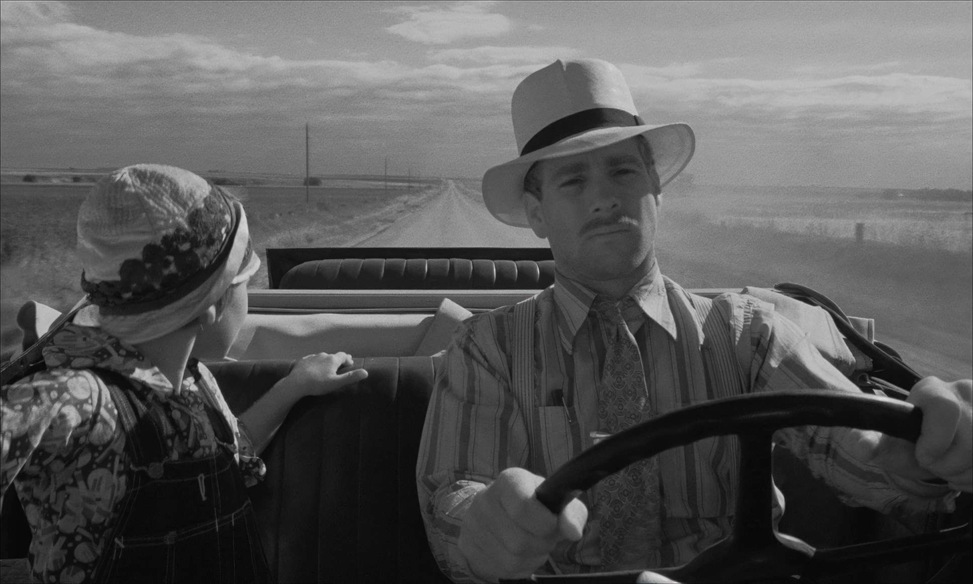
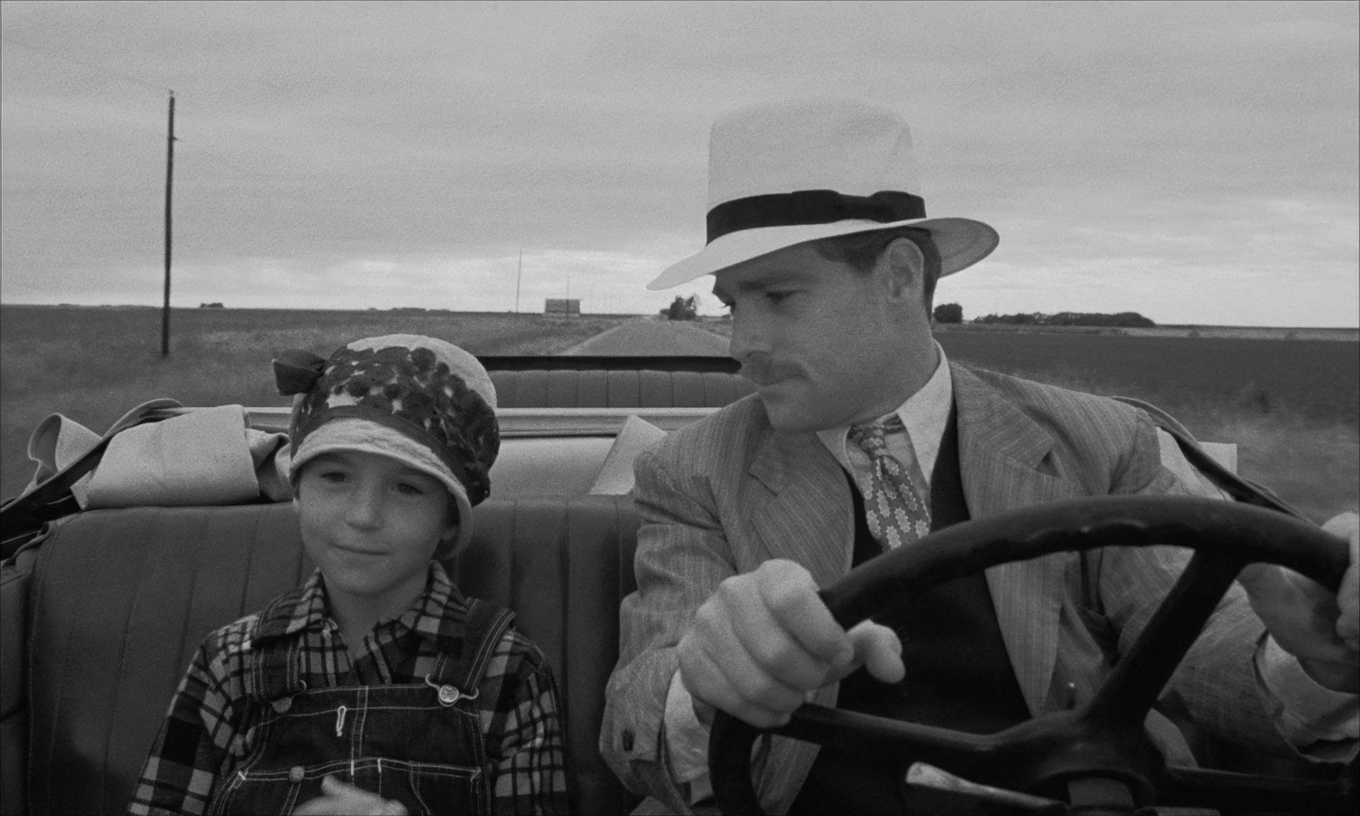
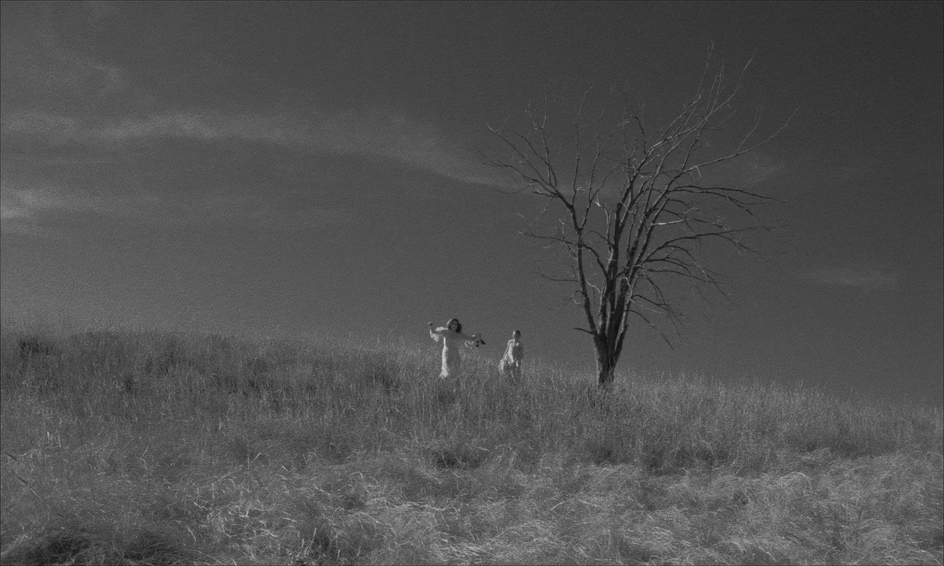
Think of the scene at the train station. In the foreground, we have Moses getting a ticket. In the mid-ground, we see Addie, isolated and forced into an adult world she didn’t ask for. And in the far background, through a window, you see actual children playing. This layered composition does more work than five pages of dialogue. It creates a “real sense of depth” that makes the Great Depression feel tangible, not just like a movie set.
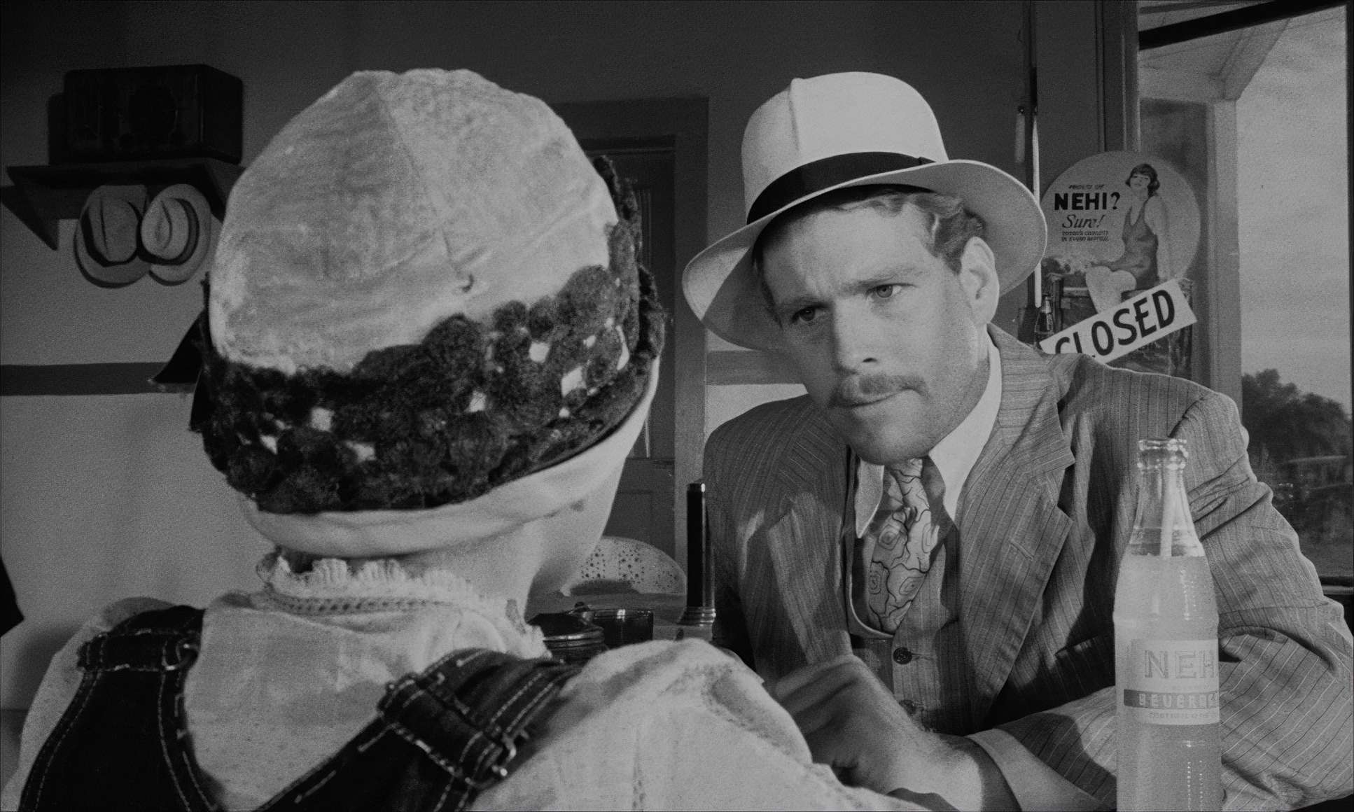
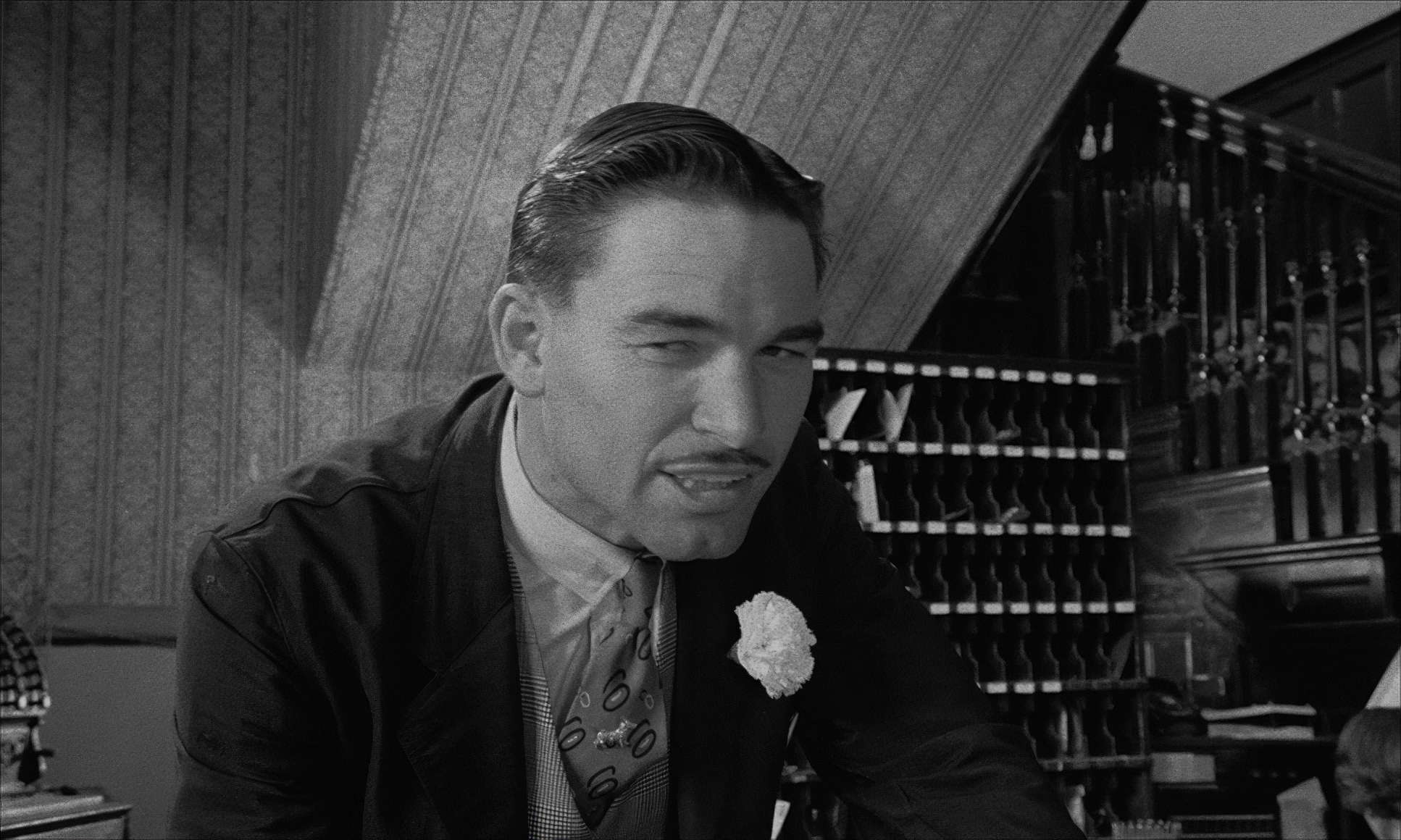
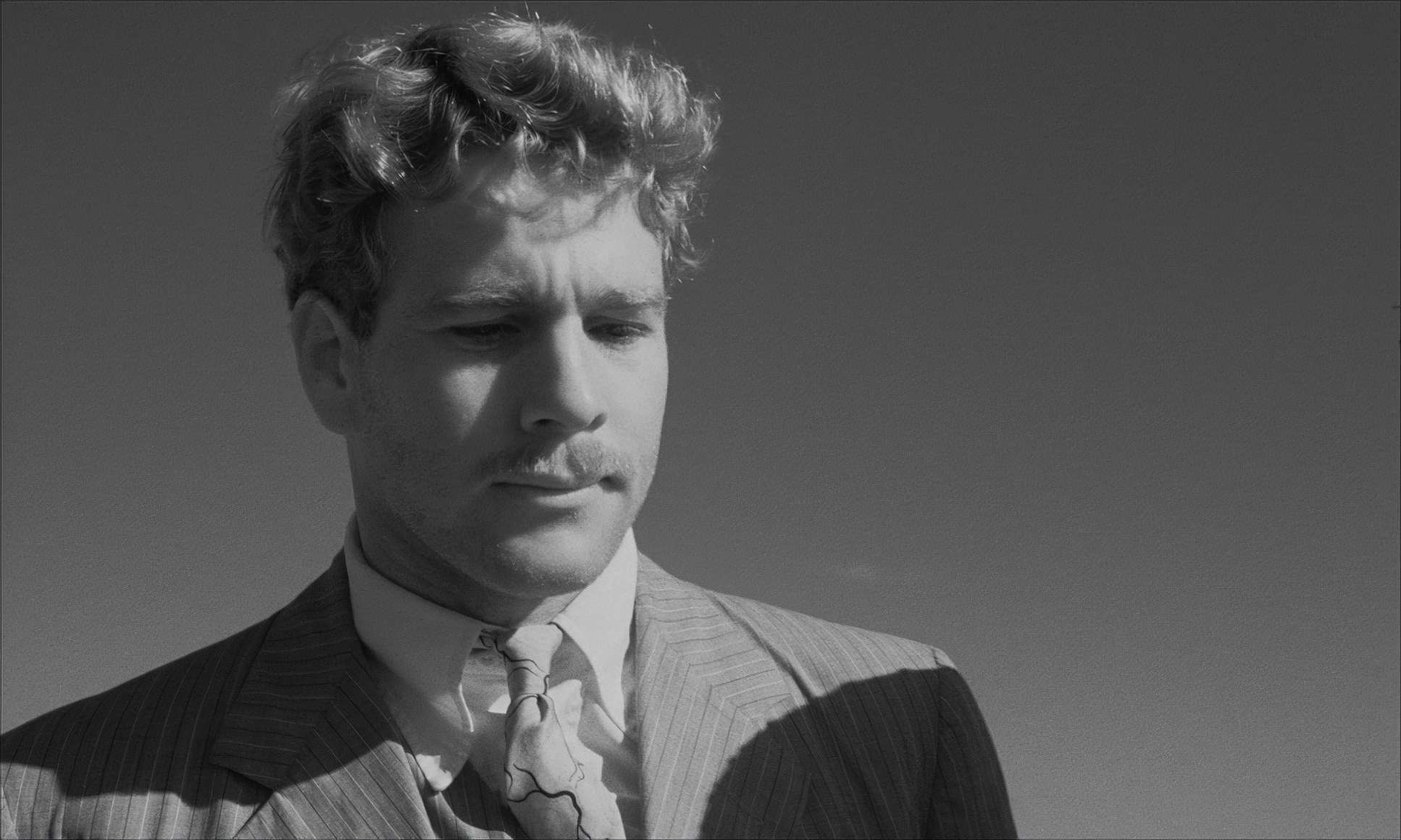
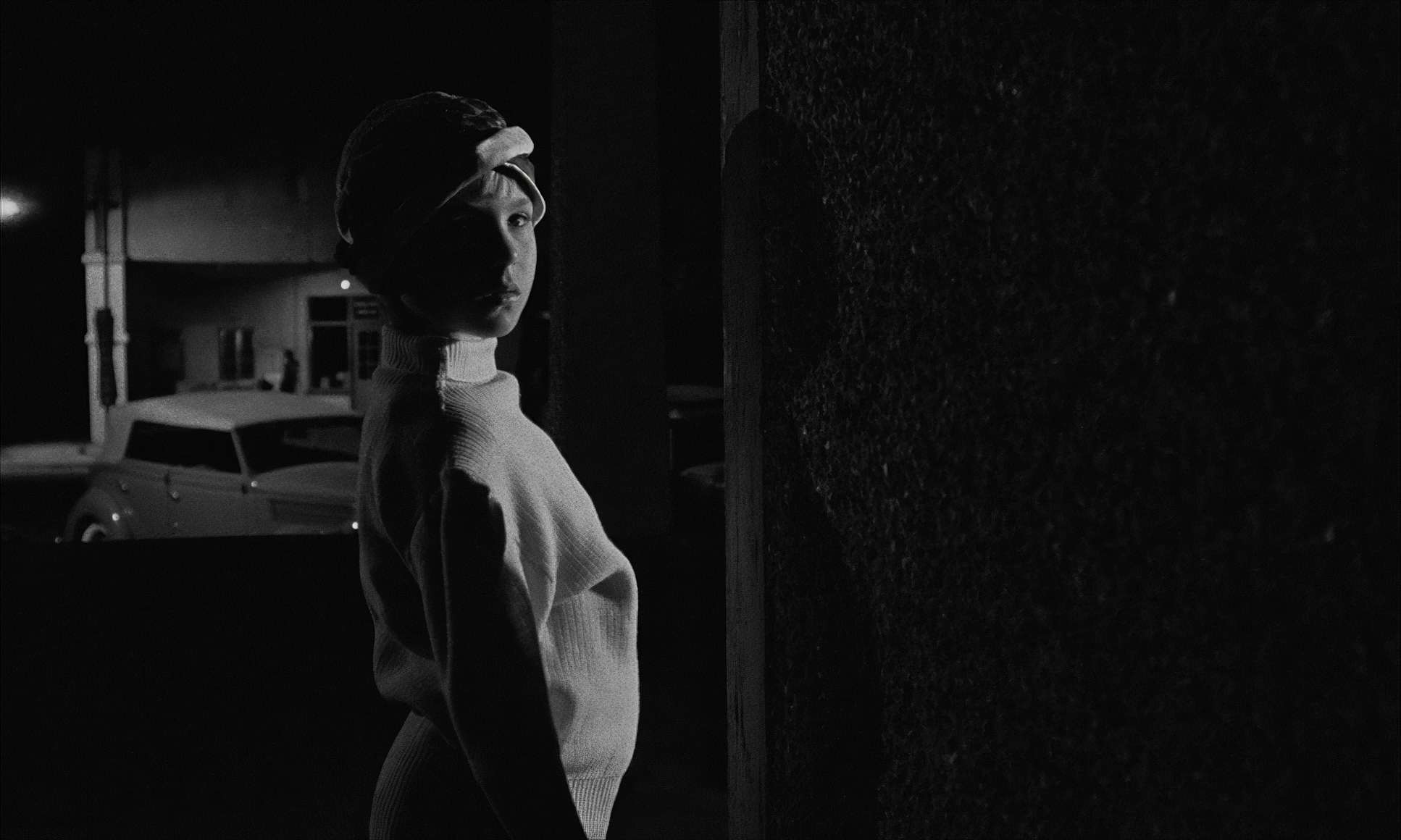
Equally bold is Bogdanovich’s habit of starting scenes with extreme close-ups. It’s a bit subversive it plants an immediate question in your mind: Why am I looking at this? Instead of a boring wide shot to “establish” the scene, he thrusts you into a detail that becomes the scene’s pivot point. It keeps you leaning in, constantly asking questions.
Lighting Style: Sculpting in the Dust

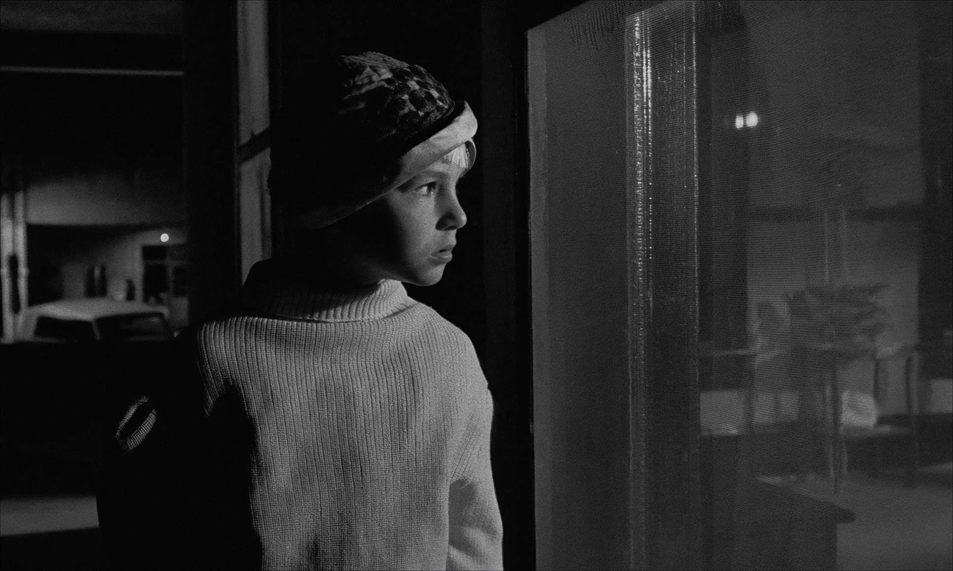
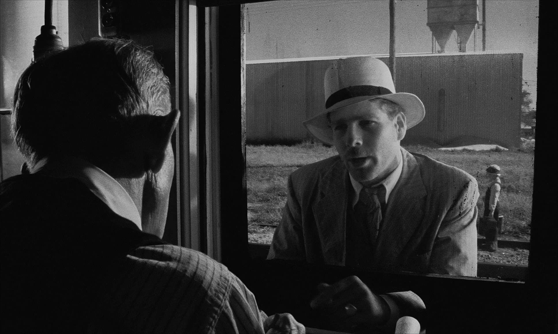
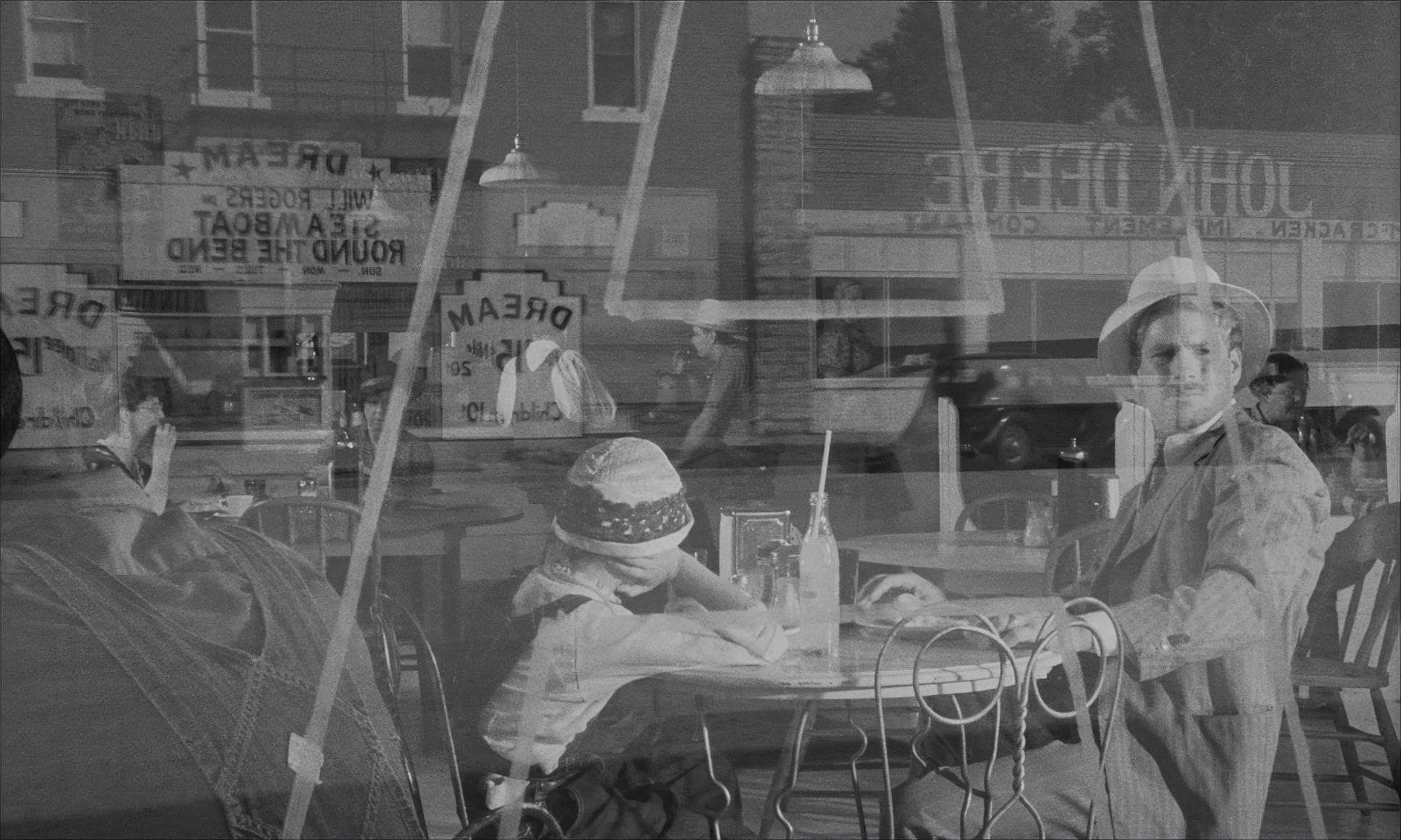
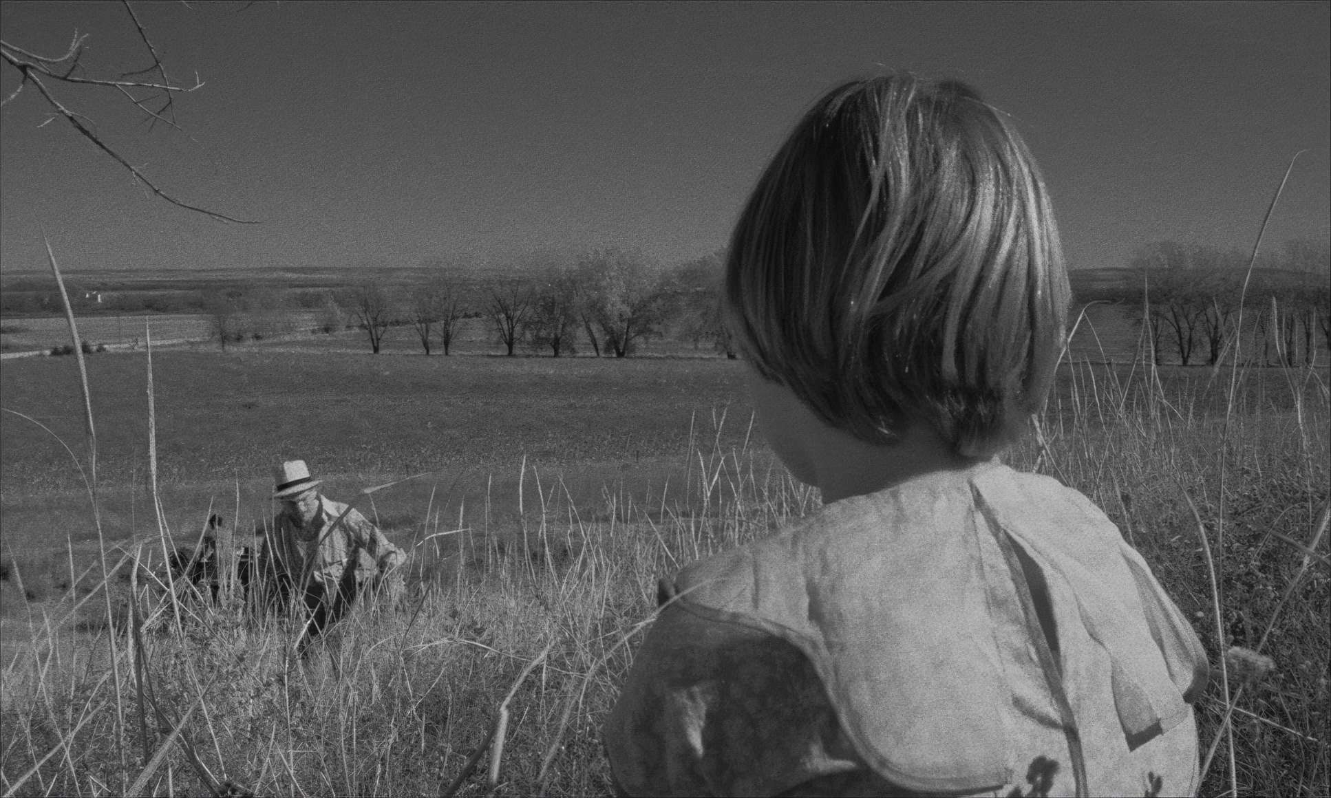
In the world of black and white, lighting isn’t just about visibility; it is the image. It dictates the mood and the “separation” of elements. For Paper Moon, the lighting is tied to that “destitute” setting it’s dusty, dirty, and poor.
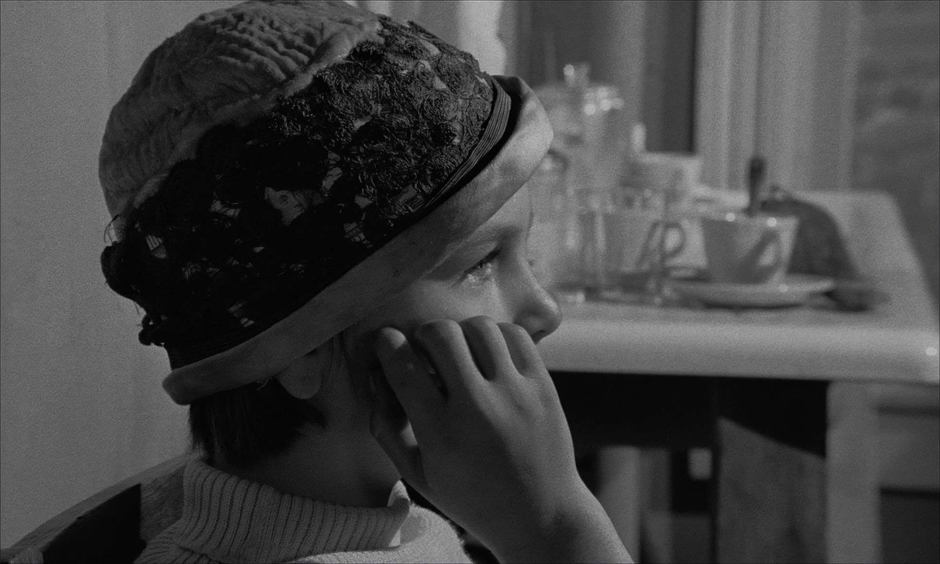
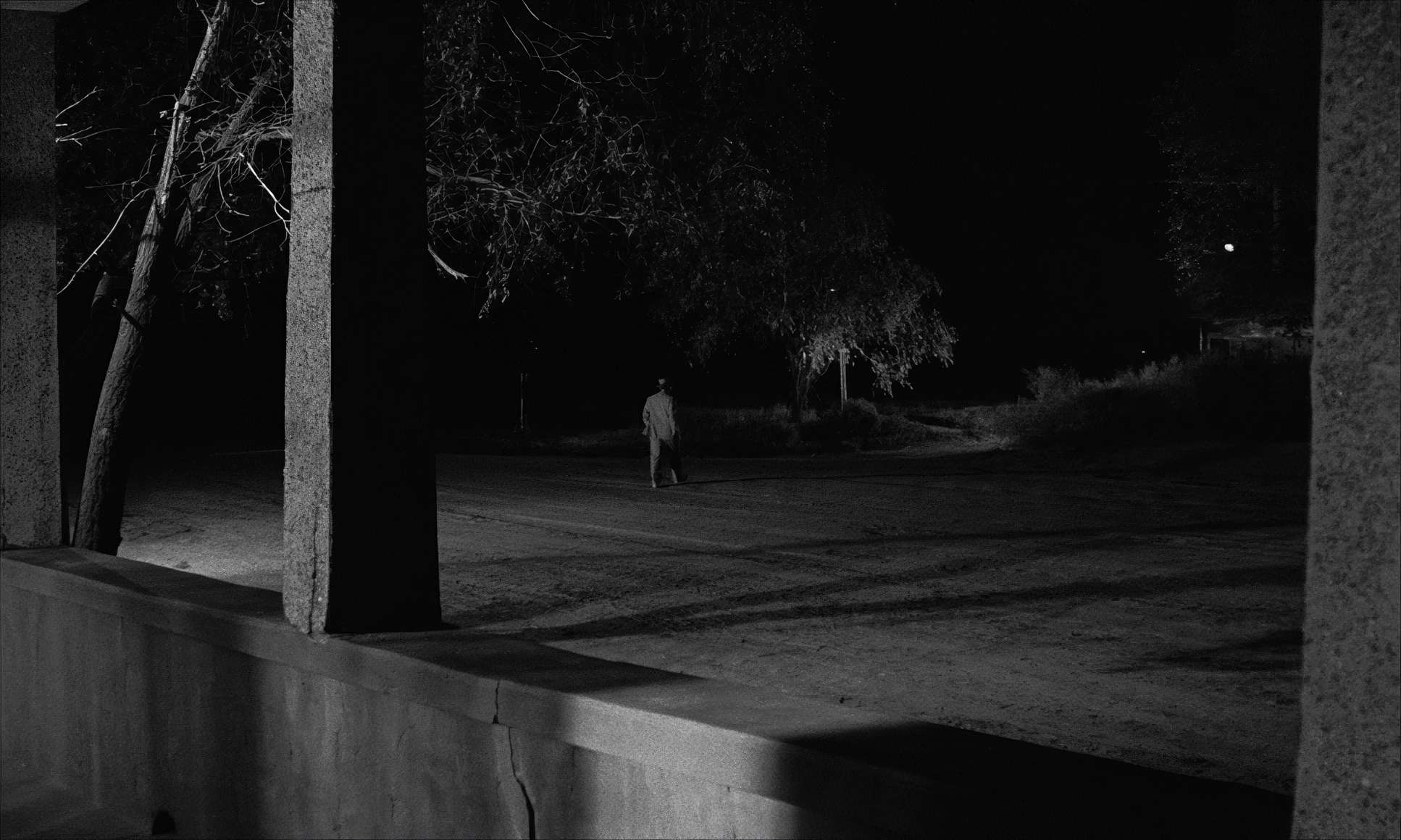
I don’t see a lot of “pretty” Hollywood lighting here. Instead, Kovács embraced the harsh, high-contrast sunlight of the American Midwest. He uses that hard light to carve out details in the worn landscapes and catch the texture of the dust in the air. Shadows are deep, but and this is the colorist in me talking they aren’t “crushed.” There’s just enough detail in the blacks to keep the world feeling real rather than theatrical. For interiors, the light feels “motivated,” usually coming from a single window or a lamp. It’s a masterclass in restraint, proving that sometimes the most effective lighting is the kind that looks like you didn’t do anything at all.
Camera Movements: The Quiet Observer

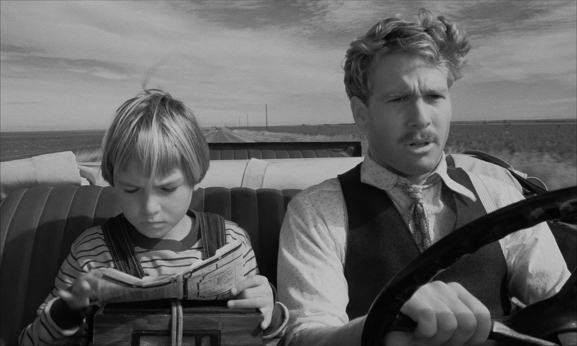
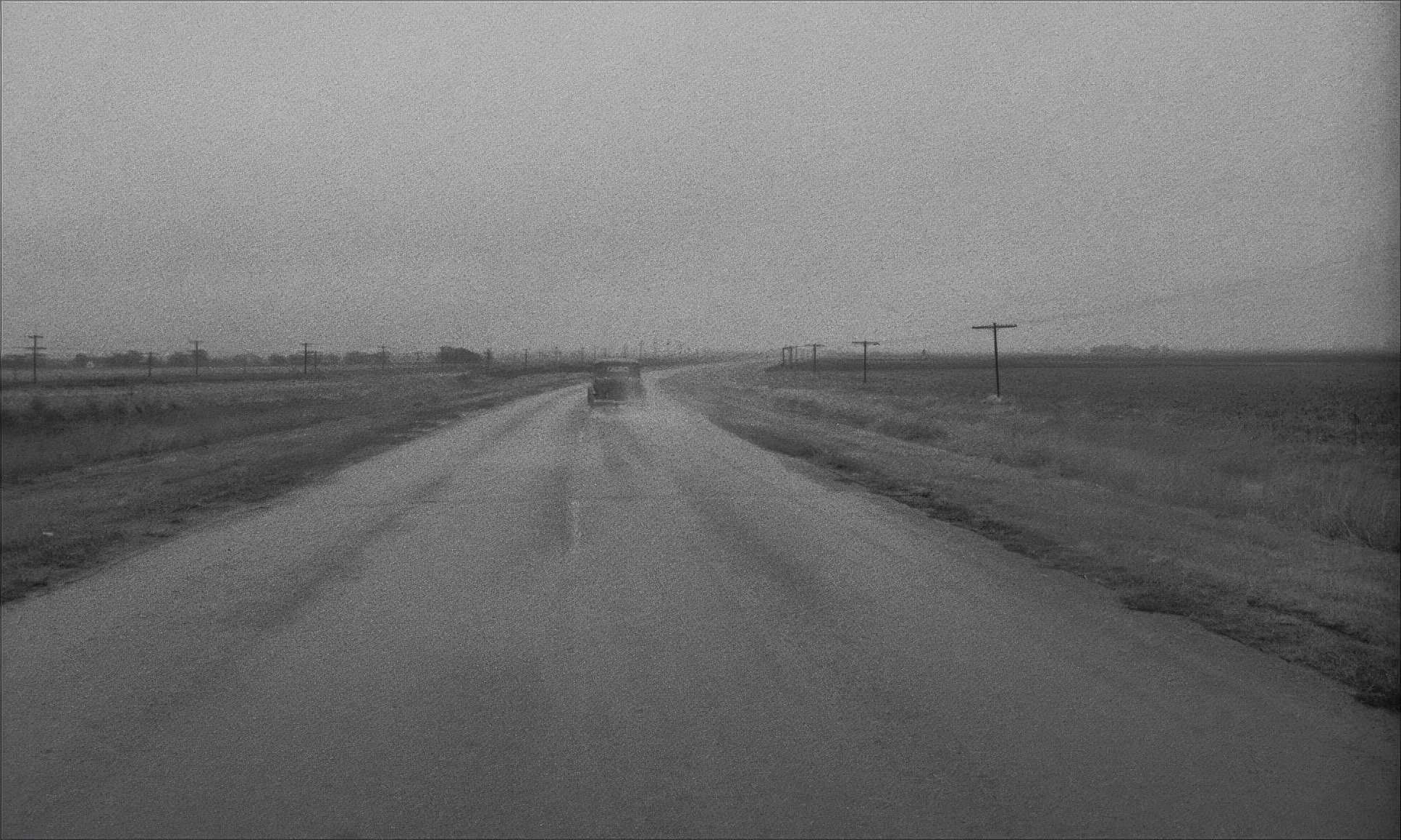
You won’t find a lot of flashy, “look at me” camera moves in this film. The camera is a quiet observer. I’ve heard it described as “everything seemed pretty tight,” and I agree the pacing just rolls.
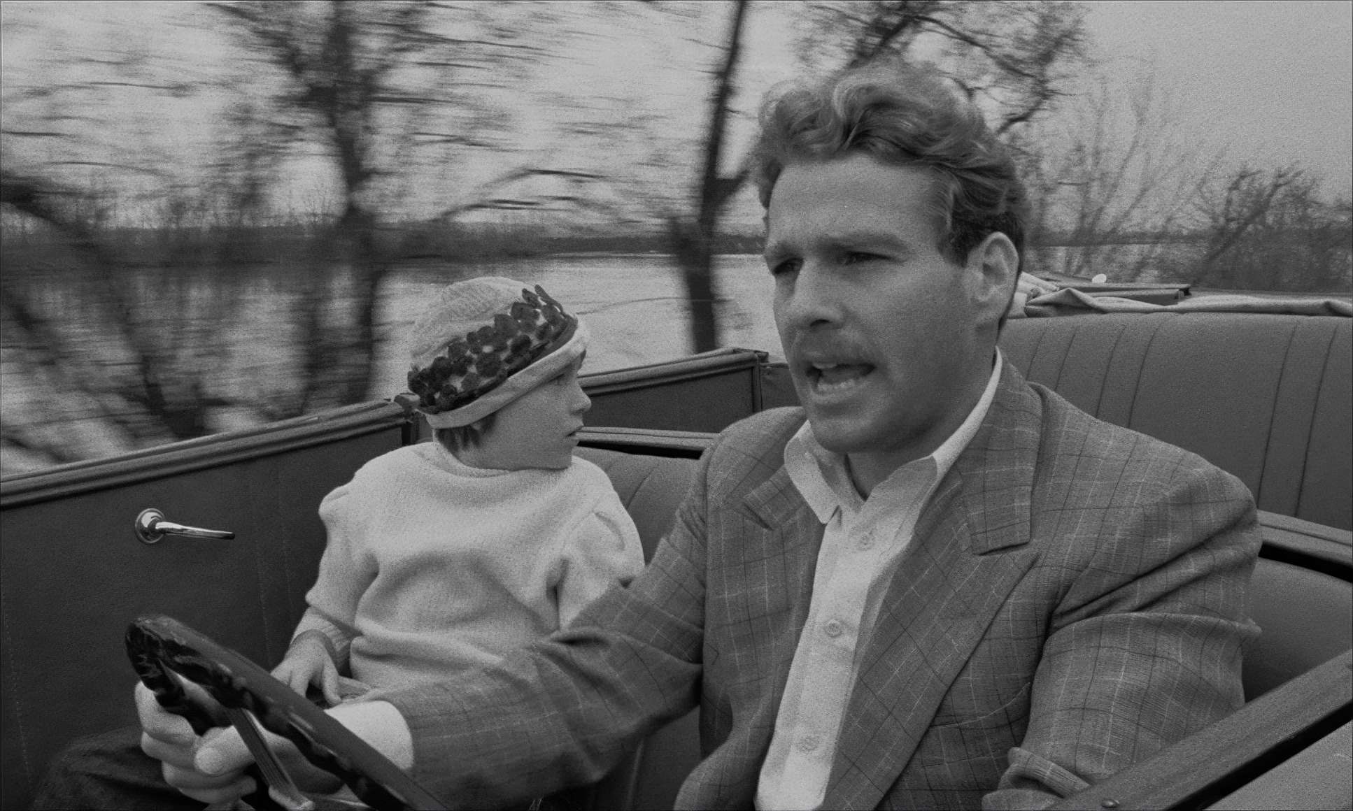
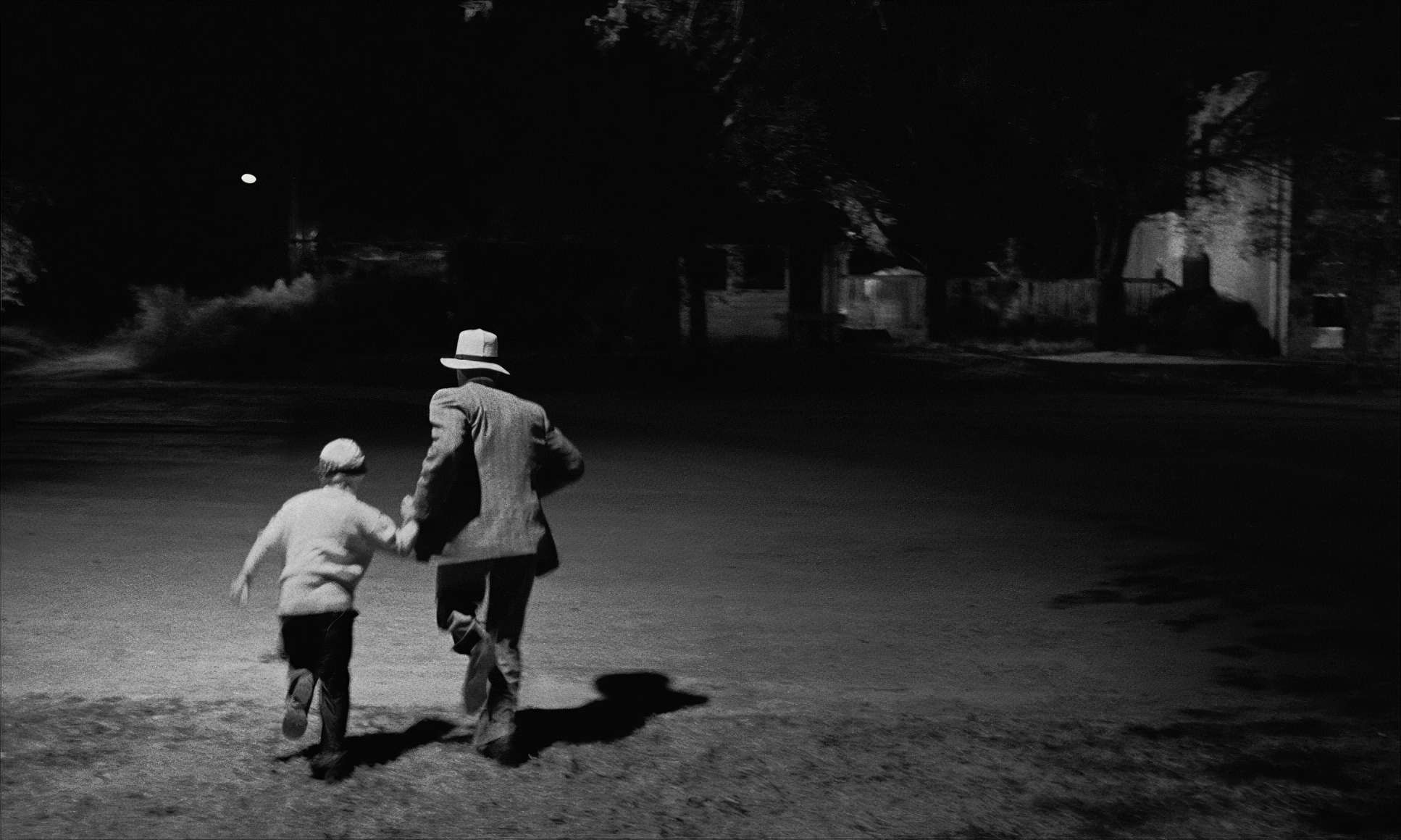
That’s not to say the film is static. The road trip demands momentum. We get that visually through frequent shots of the car driving into the distance, marking the end of one “act” and the start of the next. These moves are economical and effective. The camera’s restraint allows the performances especially the chemistry between Ryan and Tatum O’Neal to take the lead. When the camera does move, it’s usually a smooth, almost imperceptible dolly or pan. It mimics the natural flow of a human eye looking around a room, which makes you feel like you’re riding in the backseat with them.
Lensing and Blocking
The lensing in Paper Moon works hand-in-glove with that deep focus look. To get that much clarity from front to back, Kovács likely used wide-angle lenses and small apertures (high f-stops). This technical choice changed everything about how they staged the actors.
Because everything is in focus, they didn’t need to constanty cut back and forth between faces. They could place Moses and Addie at different distances from the camera and let the scene play out in real-time. This kind of “blocking” requires way more planning, but it pays off because the film feels incredibly immersive. It gives the movie the “freedom” a road trip needs the world feels vast and explorable, even when the characters are stuck in a tight spot.
Color Grading Approach: The Tonal Sculptor

Now, let’s talk about “grading” a black-and-white film. For me, this is where the craft shifts from capturing light to sculpting it. We aren’t dealing with hues, but we are absolutely managing dynamic range and tonal separation.
If I were grading Paper Moon today, I’d be obsessing over the contrast. You want enough “punch” to make the image pop, but if you go too far, you lose that “dusty and dirty” texture that makes the film work. Paper Moon hits the sweet spot. The highlights roll off gently, avoiding that clipped, digital harshness we see too often now.
I’d also be thinking about “tonal separation.” In a color film, a blue shirt stands out against a brown wall. In black and white, you have to ensure those two things translate into different shades of gray so the image doesn’t look like mush. It’s a dance between density and luminosity, ensuring every frame has the right “weight.”
Technical Aspects & Tools
Paper Moon | Technical Specifications: 35mm B&W (1.66:1)
| Genre | Comedy, Crime, Drama, Road Trip, Survival, Thriller, Heist, Science-Fiction |
| Director | Peter Bogdanovich |
| Cinematographer | László Kovács |
| Production Designer | Polly Platt |
| Costume Designer | Polly Platt |
| Editor | Verna Fields |
| Time Period | 1970s |
| Color | Desaturated, Black and White |
| Aspect Ratio | 1.66 – Spherical |
| Format | Film – 35mm |
| Lighting | Hard light, Low contrast, Top light |
| Lighting Type | Daylight, Sunny |
| Story Location | United States of America > Kansas |
| Filming Location | United States of America > Kansas |
Shot in 1973, Paper Moon was 35mm through and through. In an era where color was becoming the standard, choosing black and white was a massive statement. It gave the film a “timeless” quality that digital often struggles to replicate.
They likely used classic panchromatic film stock, which is known for a beautiful grain structure that adds a layer of “grit” to the image. To achieve that deep focus, they needed a lot of light either from the sun or big, powerful units on set to compensate for the small apertures. This blend of old-school technical mastery and artistic vision is what makes the film look so iconic. It’s a reminder that great cinematography is a science as much as it is an art.
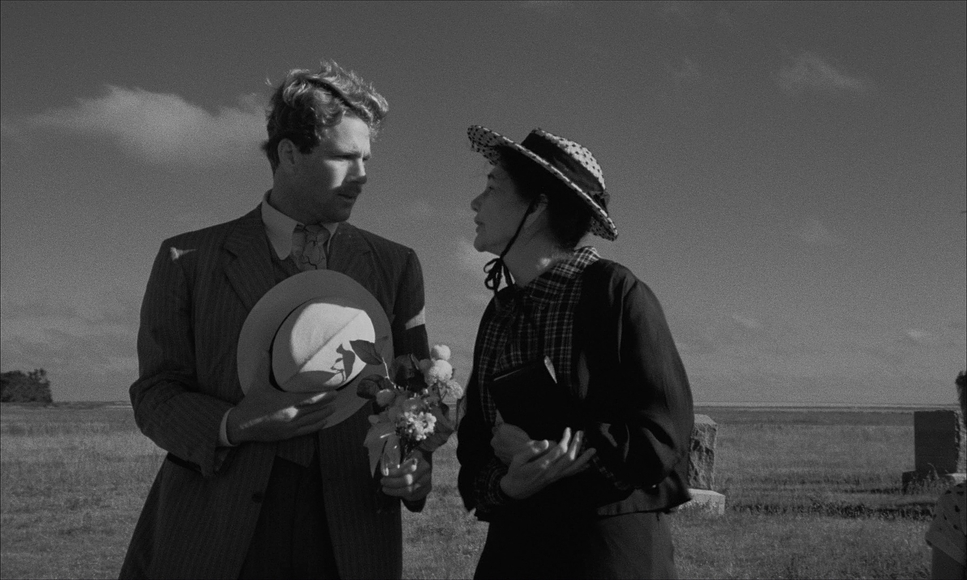
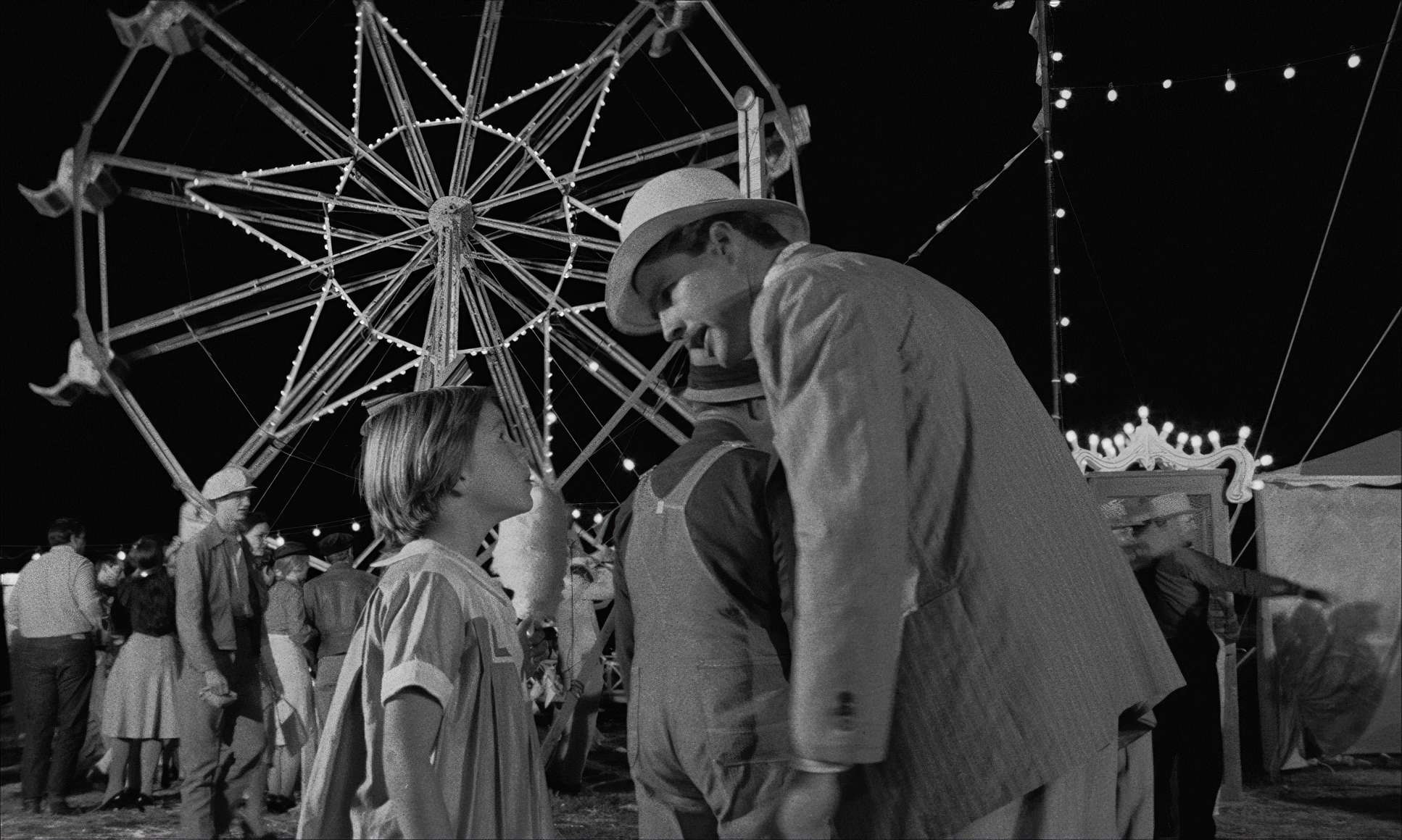
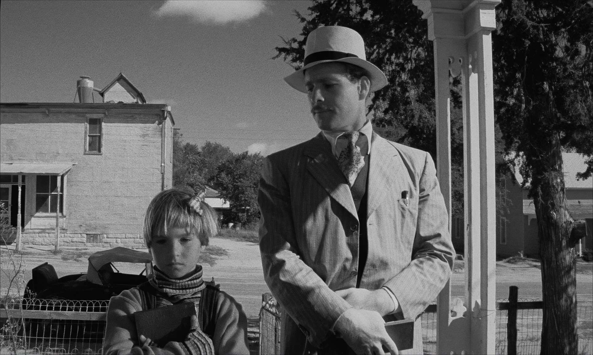
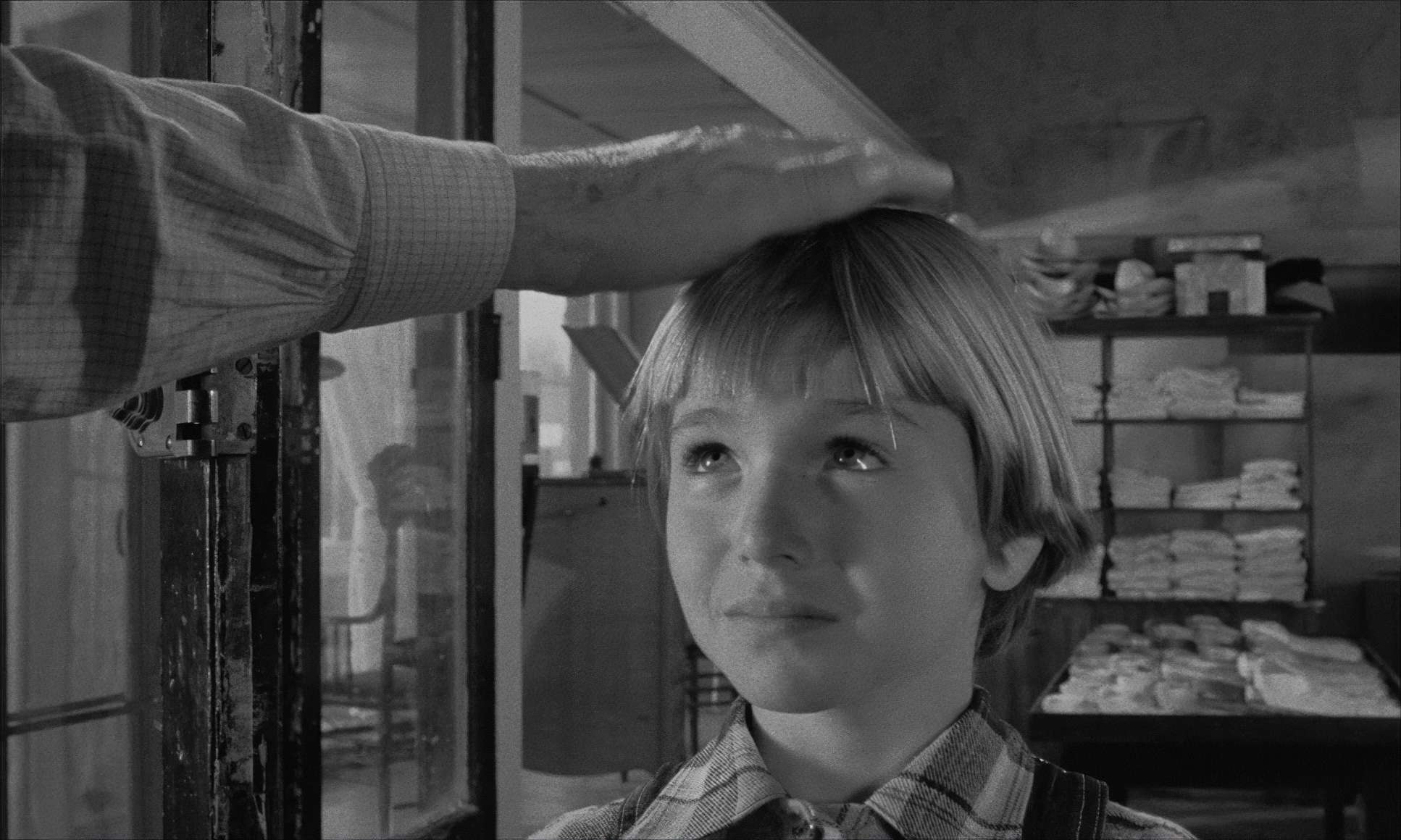
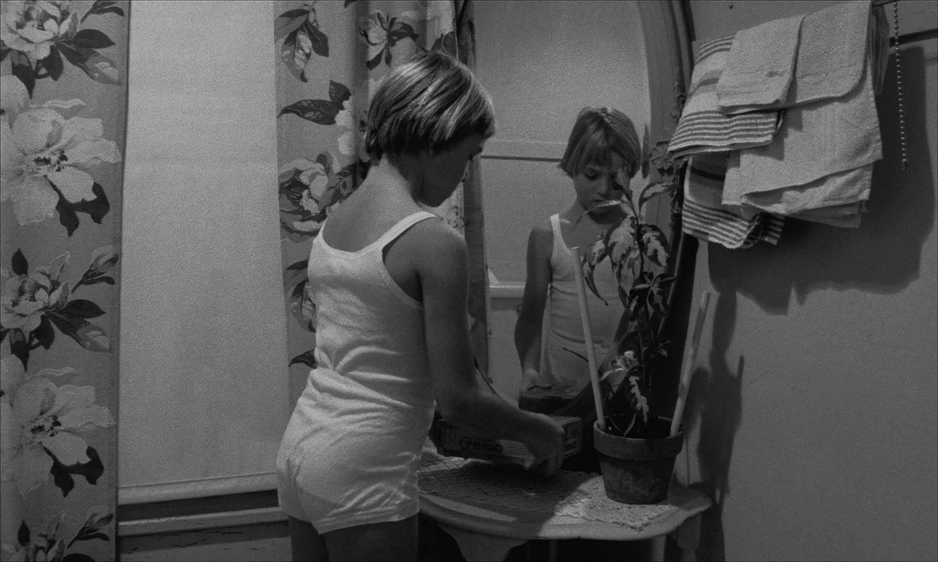
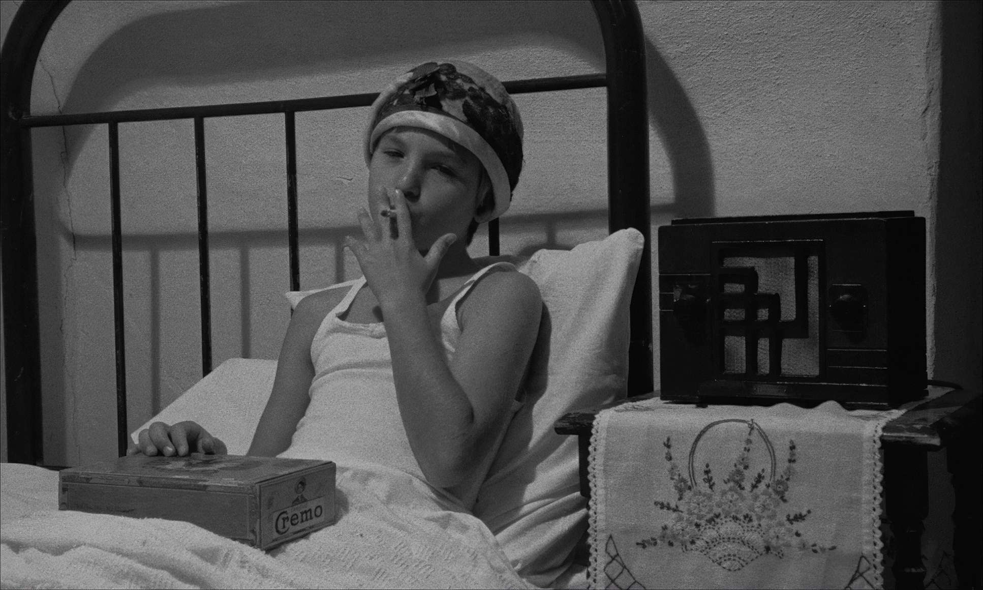
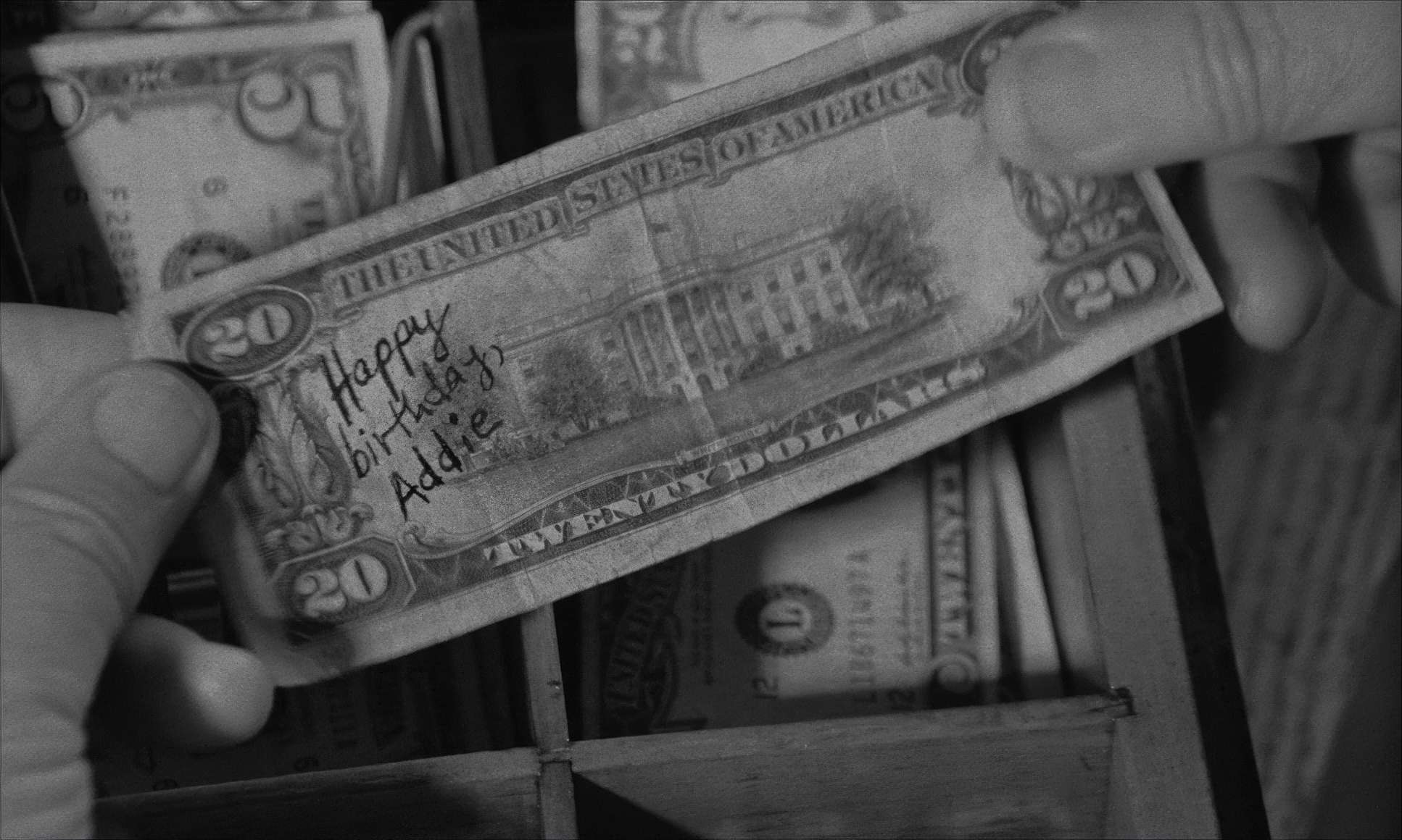
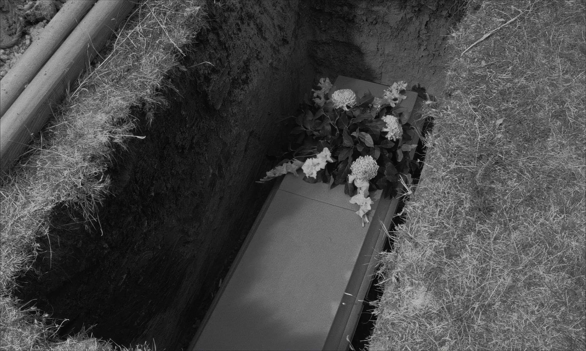
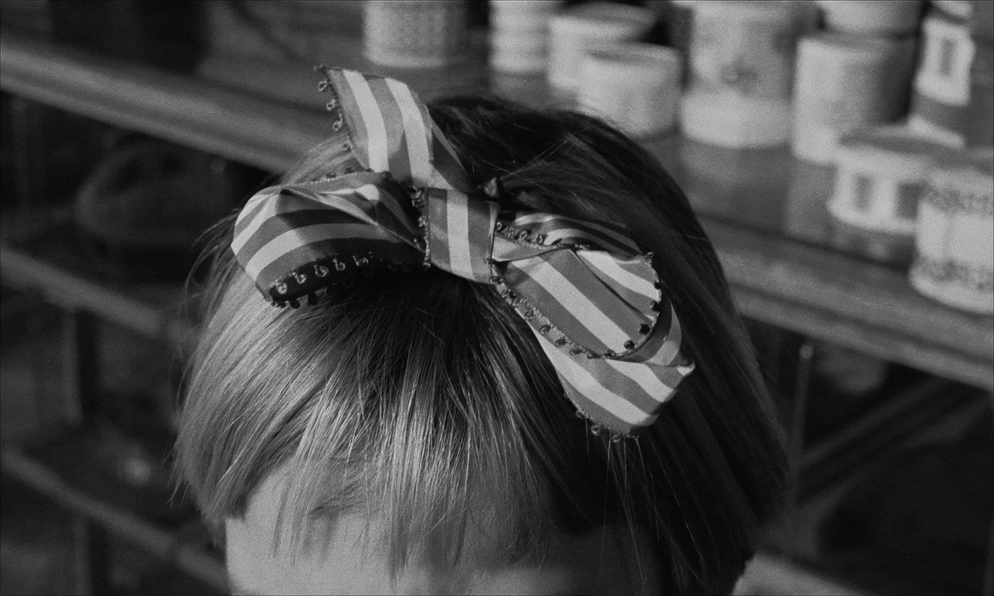
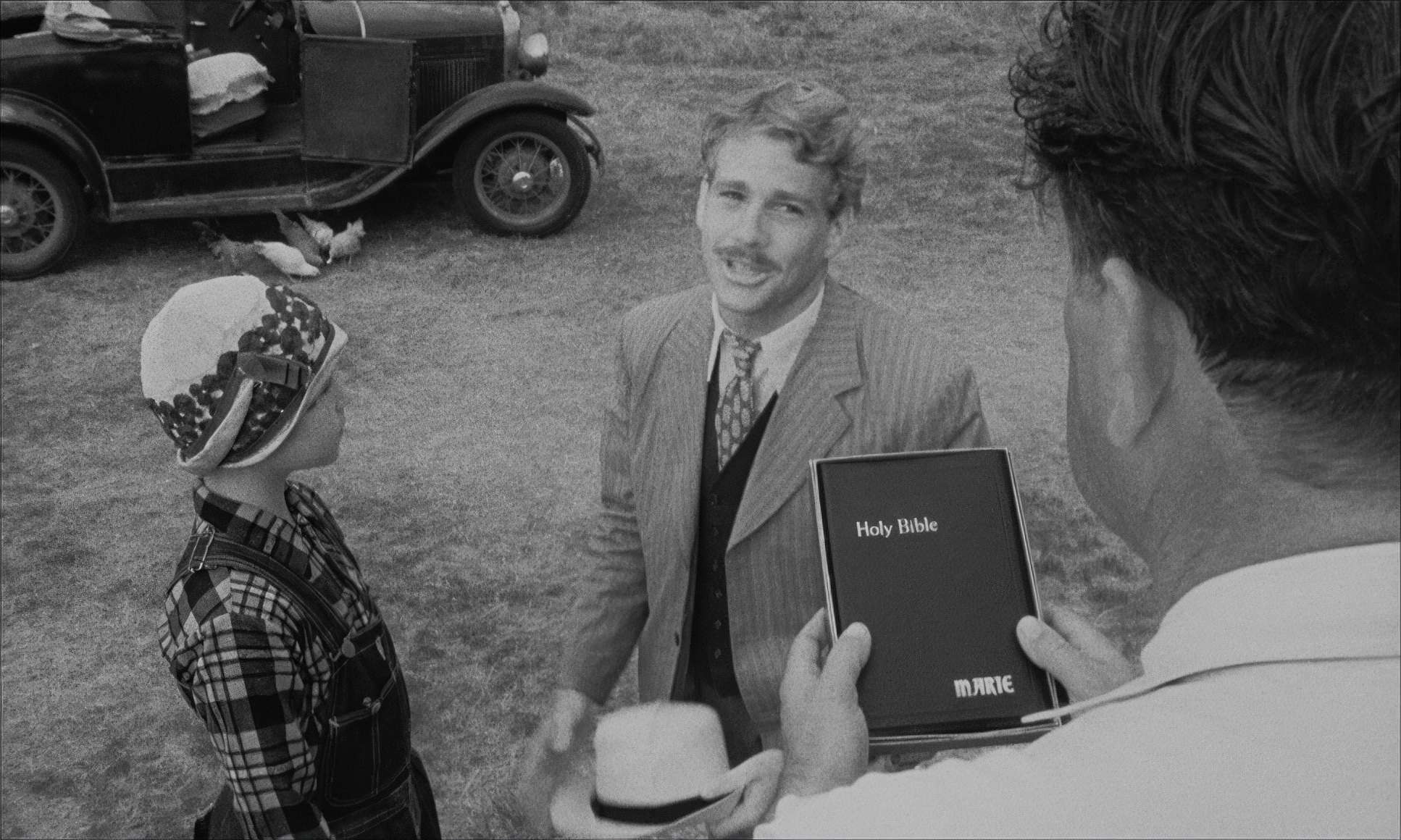
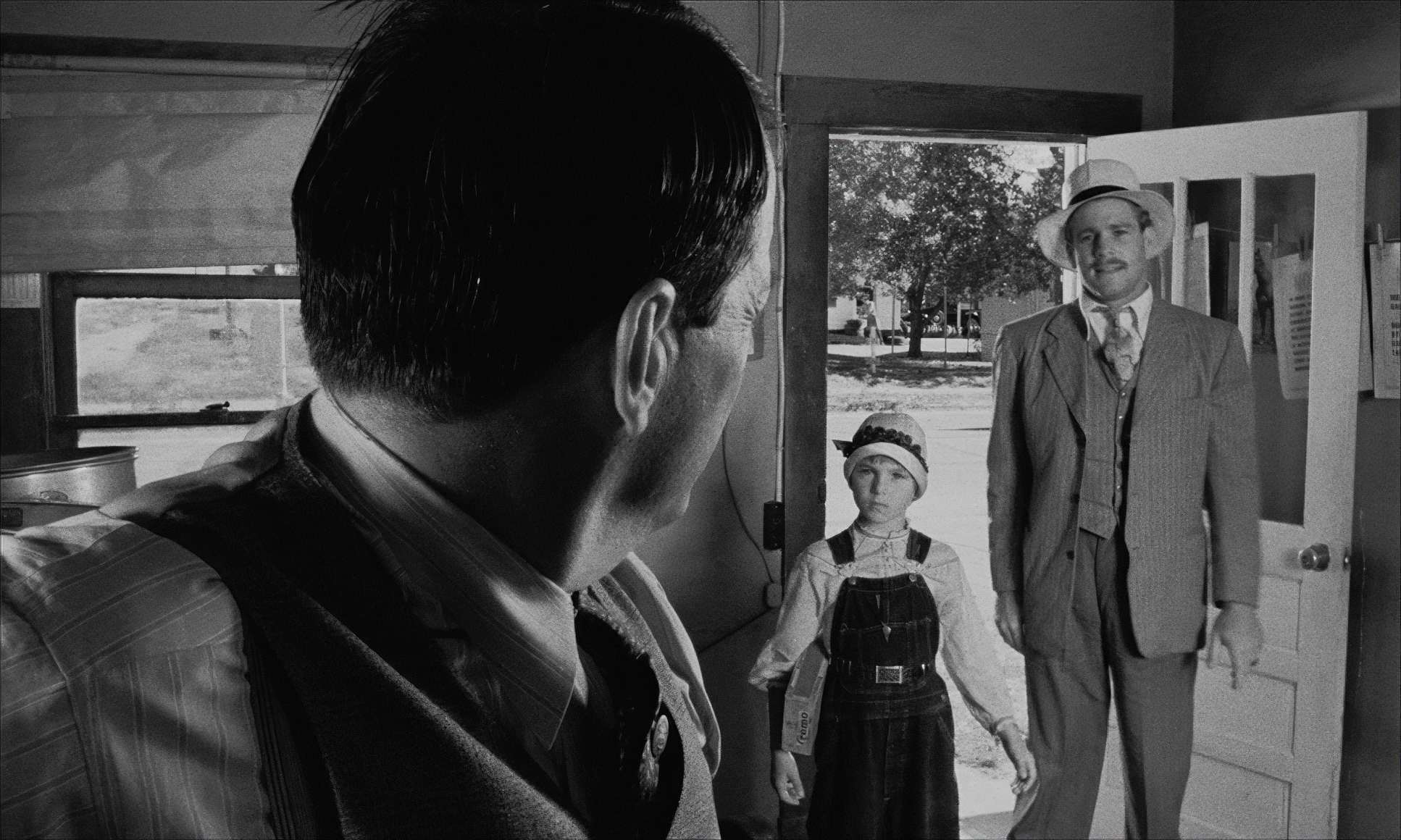
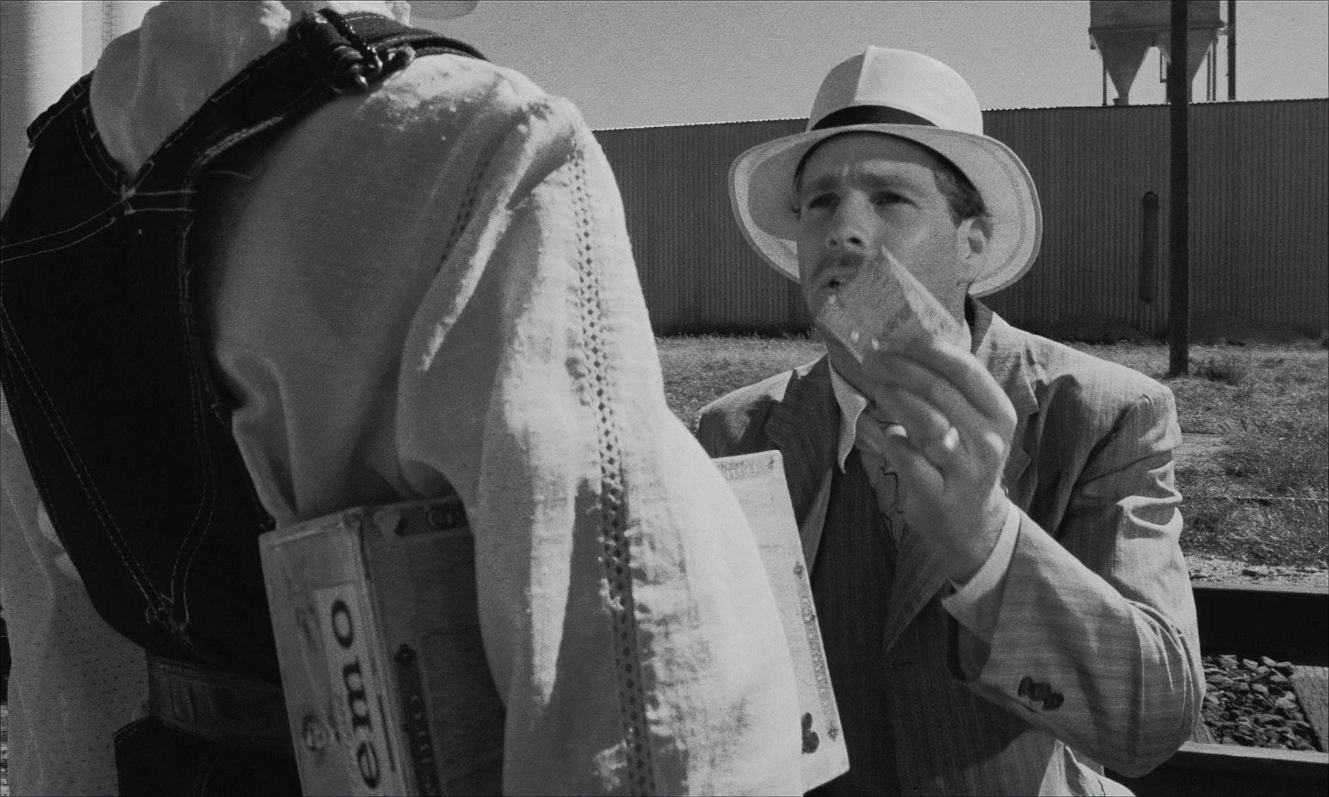
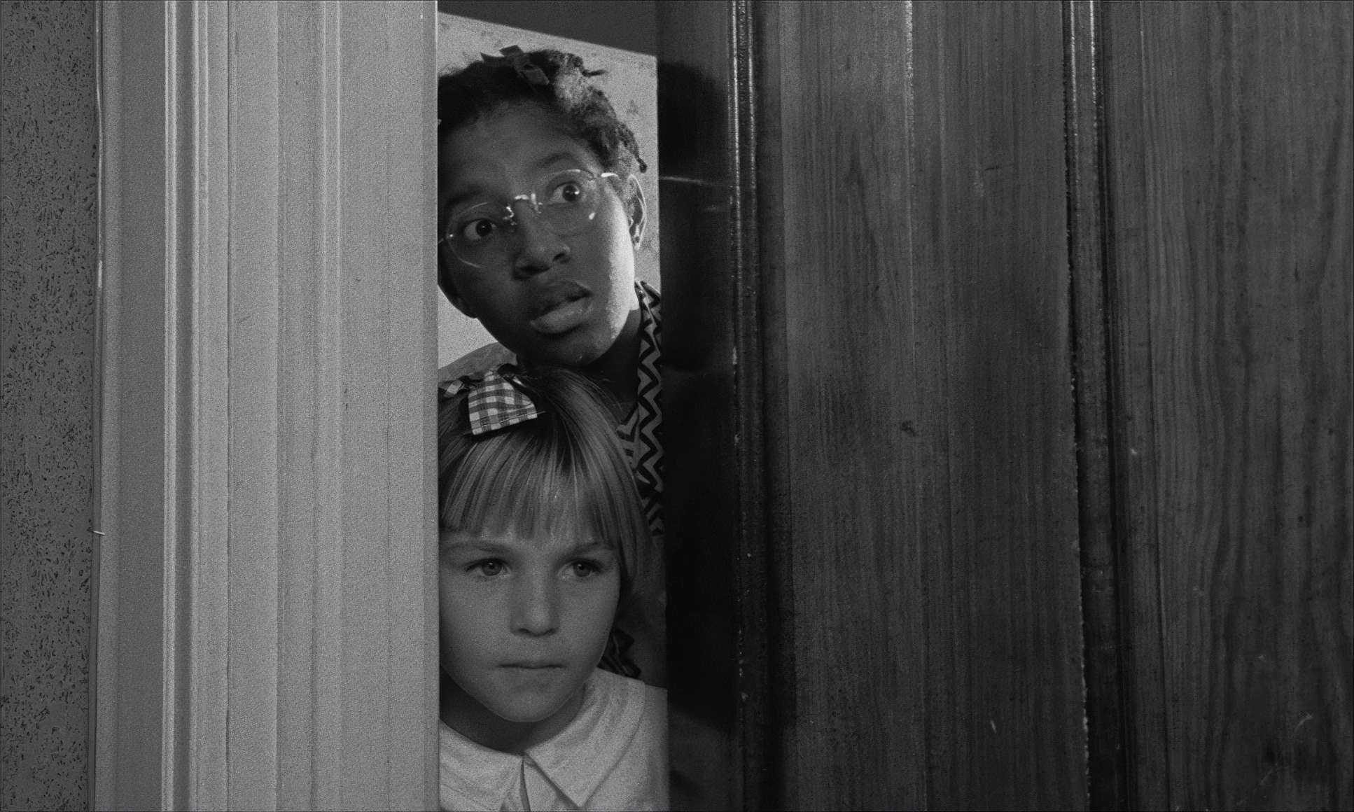
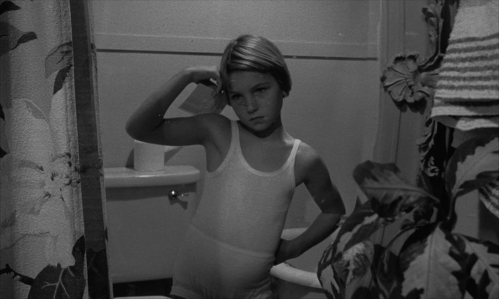
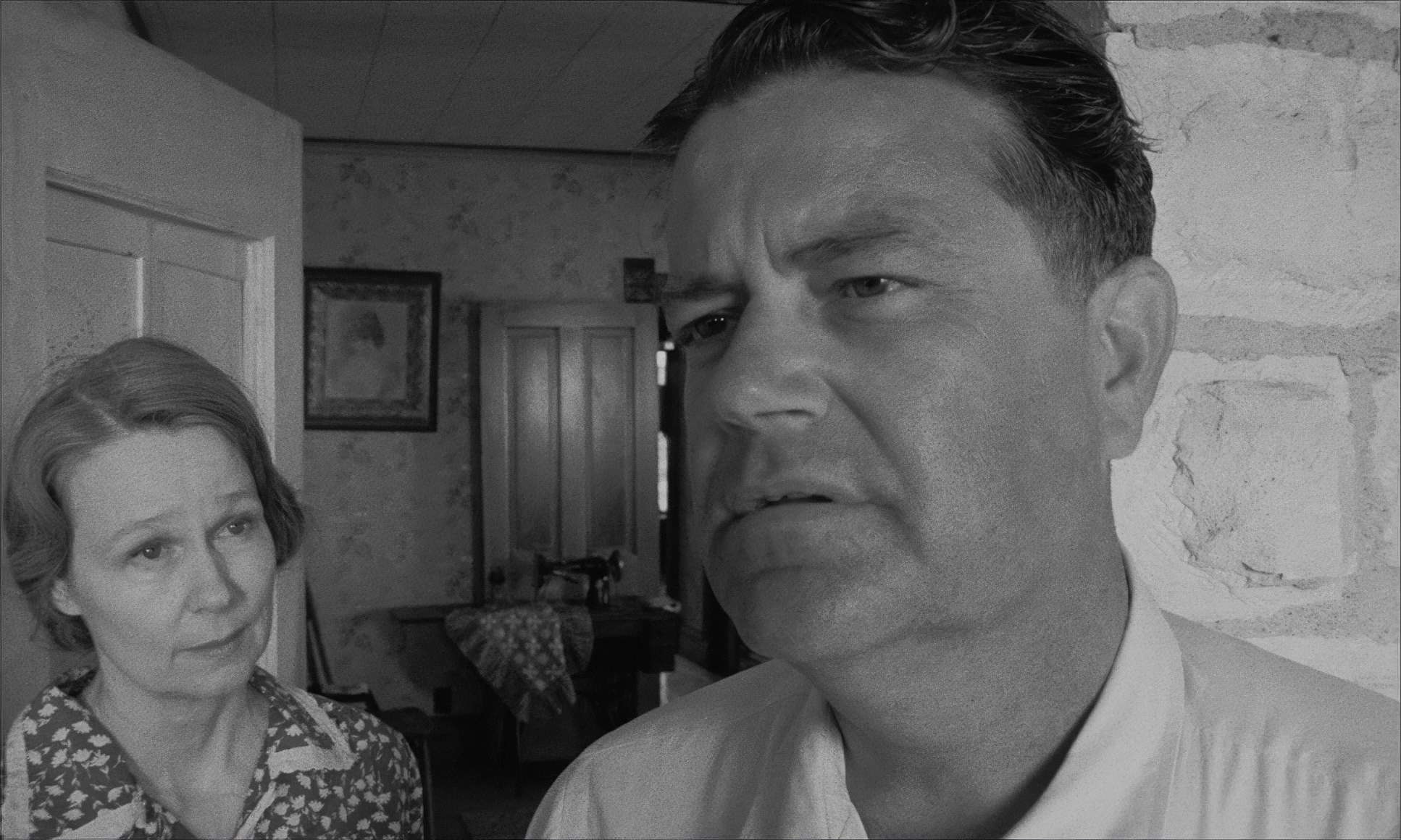
Paper Moon (1973) Film Stills
A curated reference archive of cinematography stills from Paper Moon (1973). Study the lighting, color grading, and composition.


- Also read: DEPARTURES (2008) – CINEMATOGRAPHY ANALYSIS
- Also read: BLACK CAT, WHITE CAT (1998) – CINEMATOGRAPHY ANALYSIS
Browse Our Cinematography Analysis Glossary
Explore directors, cinematographers, cameras, lenses, lighting styles, genres, and the visual techniques that shape iconic films.
Explore Glossary →