Watching Network today feels less like watching a “classic” and more like reading a news feed from next week. It’s a darkly comedic satire, sure, but its commentary on news-as-entertainment and the monetization of outrage is chilling. Every time I cue it up, I’m struck by how well it anticipated our current hellscape of engagement farming and false prophets. But my job is to look past the script and see how the visual storytelling sells these ideas. In Network, the cinematography isn’t just wallpaper; it is an active participant in creating that uncomfortable, almost prophetic reality.
About the Cinematographer
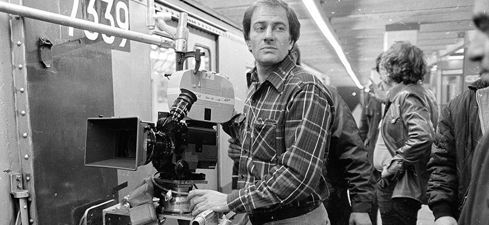
The man behind the lens was Owen Roizman, a genuine heavy hitter in 70s cinema. This wasn’t his first run with director Sidney Lumet they had already done Serpico and Dog Day Afternoon together. That relationship is key. Lumet was famous for a theatrical, rehearsal-heavy process, which meant Roizman knew exactly where the actors would be and could light for the performance, not just the set. Roizman’s style was gritty and realistic; he wasn’t afraid to let a frame look ugly if the moment was ugly. He didn’t rely on flashy camera tricks to distract you. Instead, he had this self-effacing mastery serving the story with precise, sometimes harsh imagery that felt lived-in. That discipline is something I try to emulate in my own work.
Inspiration Behind the Cinematography
The visual anchor here is duality: the glossy, manufactured look of the television broadcast versus the messy, gritty reality of the people making it. The film constantly reminds us that characters like Diana Christensen process reality through “constructed narratives.” Roizman had to visualize that. The newsroom scenes have this frantic, authentic 1970s energy fluorescent and chaotic while the broadcast segments feel sterile and alienating. It’s a constant push and pull between what is “real” and what is just a ratings grab.
Then there’s the descent into madness. Howard Beale’s breakdown isn’t just a plot point; it’s a visual journey. The cinematography had to amplify the sense that the world was tilting off its axis. It’s about making the audience feel trapped inside this media vortex, blurring the lines until you can’t tell if you’re watching a movie or a news report about the end of the world.
Camera Movements
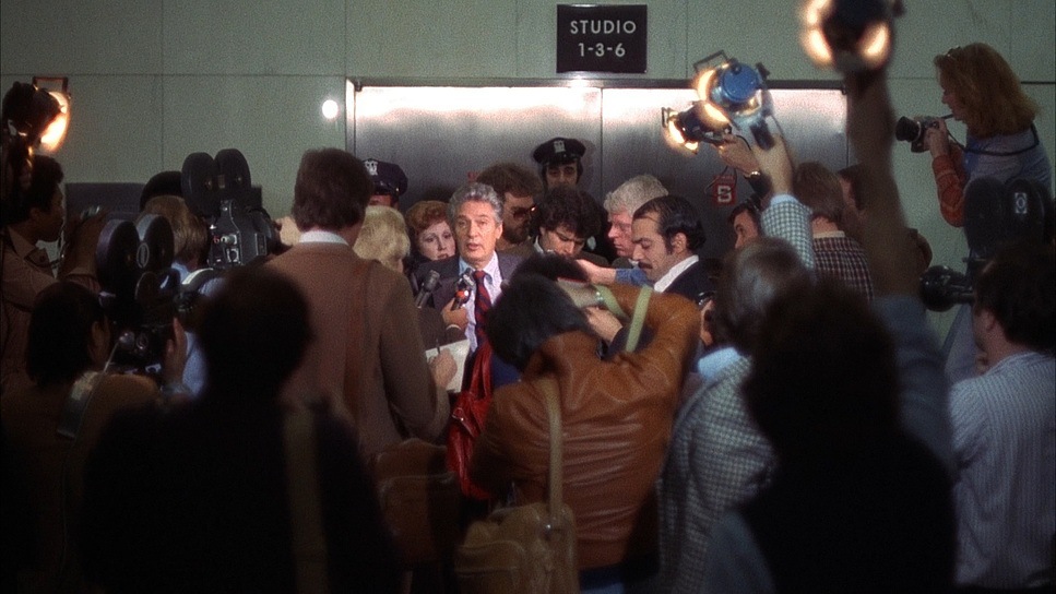
Lumet and Roizman didn’t move the camera just because they could. Every push and track feels psychologically motivated. In the corporate scenes, the framing is claustrophobic. We get these tracking shots weaving through the labyrinthine corridors of the network, creating this paranoid sense that you are constantly being watched, evaluated, and monetized.
But when Howard Beale starts spiraling into his “mad prophet” phase, the camera changes. It becomes aggressive. The slow push-ins on his face during the rants aren’t just for emphasis; they force you to confront his unraveling. It makes you want to lean back, but the lens pulls you in. Conversely, in the control room scenes, the movement shifts to something more restless and clinical. It’s rarely handheld in a “shaky cam” sense Lumet was too disciplined for that but there is a contained energy that feels incredibly unsettling. The camera acts like a voyeur, letting the rapid-fire dialogue take center stage while quietly guiding your eye to the rot at the center of the frame.
Compositional Choices

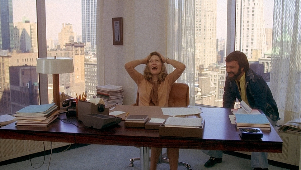
Lumet was a stage director at heart, and his blocking in Network is textbook. He understood how to place actors in a frame to scream “power” or “isolation” without a word being spoken. You’ll notice characters are often isolated in the corners of the frame, even in crowded rooms, emphasizing their emotional detachment.
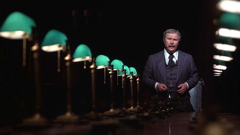
Take Arthur Jensen’s famous “college of corporations” speech. He is framed like an Old Testament God, his office a cathedral of shadow and mahogany. The depth cues suggest he is untouchable. Compare that to Howard Beale on his tiny monitor he’s framed tight, trapped in the box. It emphasizes the paradox: Beale is the voice of the people, but he is visually imprisoned by the system he’s critiquing.
Roizman also loves using multi-plane compositions in the studio scenes. You have the foreground characters, and then layers of monitors behind them, flashing different images. It visually blurs the line between the character’s reality and the broadcast reality. It effectively tells us these people are trapped in the ecosystem they built.
Lighting Style

I was watching a breakdown of this film recently apparently, it’s a favorite of Jim Carrey’s and it pointed out something about the lighting that I can’t unsee. Specifically, the use of blue light. In most films, blue is just moonlight. In Network, blue is “divine truth.” It’s the color of Howard’s insanity.
Roizman uses motivated lighting, but he pushes it into the symbolic. That cool, ethereal blue during Howard’s nocturnal revelations isn’t just ambient city light; it functions like a halo of mania. It gives his rants a weird, prophetic weight.
Aside from the blue, the lighting is stark. The newsroom is bathed in hard, top-down fluorescent light that creates unflattering shadows. Roizman didn’t try to make the actors look pretty; he made them look tired. Diana, in particular, is often lit in a way that emphasizes her “humanoid” lack of empathy. The high contrast in the dramatic scenes strips away the glamour, leaving us with just the raw, ugly truth of the business.
Lensing and Blocking
The lensing here is effective because it’s invisible. Roizman was likely on Panavision primes, sticking to wider focal lengths for the establishing shots to capture the visual noise of the studio, and longer lenses for those uncomfortable close-ups.
What I love about this era is the glass. These lenses had texture. They didn’t have the clinical, sterile sharpness of modern digital glass. That slight optical fall-off helps sell the grit of 1970s New York.
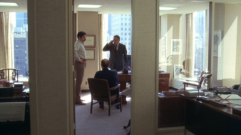
Blocking, however, is where the movie really wins. Lumet orchestrates these complex, multi-person scenes in tight offices where every inch of the frame is used. It’s choreographed chaos. He blocks for tension one person towering over another, or a group converging on a single victim. It provides depth cues that tell you exactly who holds the power in the room before anyone opens their mouth.
Color Grading Approach
This is where my brain truly lights up. We have to remember that in 1976, there was no “grading” in the modern sense no DaVinci Resolve, no power windows. The “look” was baked into the chemical timing at the lab. While modern restorations (like the one colored by Don Dittmar) do an amazing job cleaning it up, the original soul of the film comes from the film stock itself likely Kodak 5247.
That stock gave the film a specific density. You get those deep, inky blacks and a highlight roll-off that is creamy, not harsh. The palette is muted and desaturated, reflecting the cynicism of the story. You don’t see poppy, vibrant colors unless they are coming from the artificial glow of a TV screen.
If I were building a node tree for Network today, I wouldn’t just slap a film emulation LUT on it. I’d be looking at the printer lights. I’d want to preserve that “sodium vapor” dirty look of the city and the greenish spike of the office fluorescents. I’d focus on hue separation in the skin tones to keep them looking organic, not digital. And crucially, I’d leave the shadows rich with color information rather than crushing them to pure black. You need that grain structure; you need that texture. The goal would be to honor the film’s choice not to beautify its subject.
Technical Aspects & Tools
Network (1976)
35mm Film • 1.78 Aspect Ratio • Panavision Anamorphic| Genre | Comedy, Satire, Drama, History, Political, Business, Conspiracy, Biopic, Workplace |
|---|---|
| Director | Sidney Lumet |
| Cinematographer | Owen Roizman |
| Production Designer | Philip Rosenberg |
| Costume Designer | Theoni V. Aldredge |
| Editor | Alan Heim |
| Colorist | Don Dittmar |
| Time Period | 1970s |
| Aspect Ratio | 1.78 – Spherical |
| Format | Film – 35mm |
| Lighting | Backlight |
| Lighting Type | Daylight |
| Story Location | New York > New York City |
| Filming Location | New York > New York City |
| Lens | Panavision Lenses |
| Film Stock / Resolution | 5247/7247 Vision 125T |
Technically, this is a 35mm show, shot on the workhorse cameras of the era probably Arriflex or Panavision. That 5247 stock I mentioned earlier was famous for its fine grain and latitude, but it was tungsten balanced. Shooting that in daylight or under mixed office lighting without heavy filtration contributes to that specific, cool, mixed-color temperature look Roizman achieved.
From a workflow perspective, the difference between then and now is night and day. Back then, “color timing” was a chemical process involving printer points adding or subtracting red, green, or blue light when making the print. It was a broad stroke process. Today, we have infinite control. We can qualify a specific skin tone or track a person’s eyes. But looking at Network, you realize that limitations breed creativity. They didn’t have the tools to “fix it in post,” so they got it right on the day.
- Also read: THE HANDMAIDEN (2016) – CINEMATOGRAPHY ANALYSIS
- Also read: MARY AND MAX (2009) – CINEMATOGRAPHY ANALYSIS
Browse Our Cinematography Analysis Glossary
Explore directors, cinematographers, cameras, lenses, lighting styles, genres, and the visual techniques that shape iconic films.
Explore Glossary →