My Father and My Son (2005) actually stumbled onto the power of this film in the YouTube comments section. I kept seeing reviews in Tamil, a language completely removed from the film’s Turkish roots, praising the story. People were commenting things like “Family,” “Pure sadness,” and dropping specific ratings like “8.75/10.” When a visual language is strong enough to cross that kind of linguistic barrier, I pay attention. It’s not just a sad story; it’s a masterclass in how cinematography works when you stop showing off and start serving the narrative.
About the Cinematographer
The DP behind this, Uğur İçbak, isn’t trying to make a reel here. He understands that for a story this heavy, the camera needs to disappear. His work relies on a profound understanding of natural light and “invisible” technique. Working with director Çağan Irmak, İçbak crafted a style that feels incredibly intimate. You don’t look at a shot and think, “Wow, cool lighting setup.” You look at it and feel the weight of the room. He makes decisions lens choice, diffusion, framing that force you to lean in rather than sit back. It’s a quiet confidence that many modern productions lack.
Inspiration Behind the Cinematography
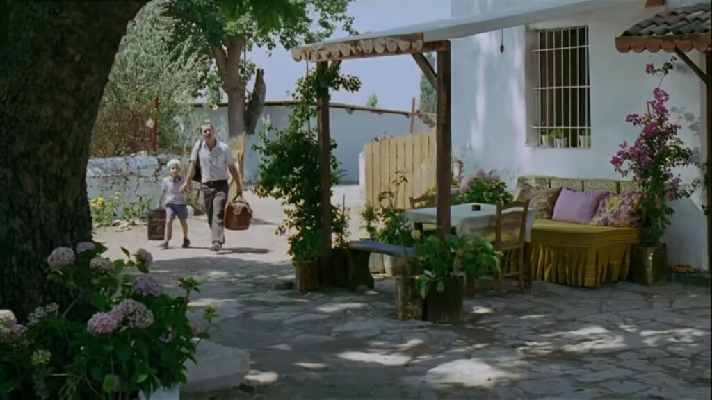
The look of My Father and My Son feels rooted in the dirt and the air of the Aegean region. The cinematography treats the location like a character it’s dusty, warm, and steeped in history. The inspiration here clearly comes from the tension between the past and present. The pastoral landscapes aren’t just pretty backdrops; they represent the tradition and “rootedness” the characters are fighting against or running toward.
The “sadness” those YouTube commenters felt comes from how İçbak captures this environment. He uses a muted, earthy palette to evoke memory. It’s not a flashback haze, but a tactile feeling of nostalgia. The visuals confront the political history and the family trauma by refusing to glamorize them. It feels raw and lived-in, grounding the melodrama in a physical reality.
Camera Movements
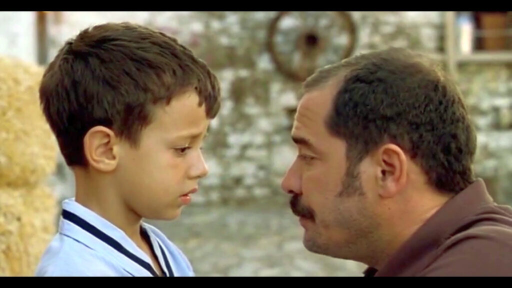
In an emotional tear-jerker, the temptation is always to go handheld and shaky to force the energy. İçbak resists that. There is a strict discipline to the camera movement. When we do see handheld work, it’s usually tracking Deniz, the grandson. It creates a lower, slightly unstable POV that mimics a child’s discovery of a new, confusing world. It puts us in his shoes immediately.
Then, the film stops. Dead still. İçbak uses locked-off wide shots to let the rural landscape swallow the characters. These static frames emphasize how small the family drama is against the backdrop of nature and time. When the camera moves on a dolly or Steadicam, it’s silky smooth and motivated by blocking. It’s not moving for the sake of movement; it’s guiding your eye to a specific reaction or following a character through a threshold. It’s invisible, functional, and deeply effective.
Compositional Choices
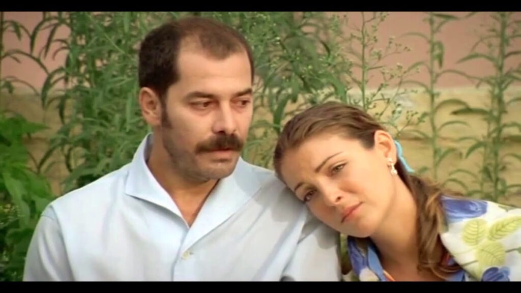
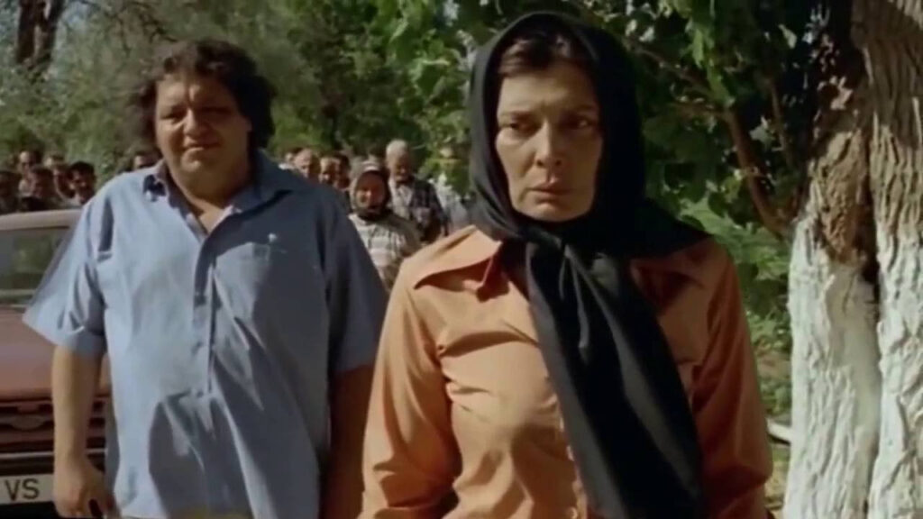
The framing here is doing a lot of the heavy lifting. İçbak uses negative space brilliantly often short-siding characters or leaving huge pockets of empty air in the frame to make them feel isolated. You see this with the grandfather, Hüseyin; he’s often framed alone against big fields or empty walls, visually screaming about his stubbornness and loneliness.
I also love the use of depth cues. The camera is constantly shooting through doorways, fences, and windows (“dirtying the frame”). It adds layers, sure, but it also creates this voyeuristic feeling, like we’re peeking into private family moments we shouldn’t be seeing. The composition creates a physical distance between Sadık and his father even when they are standing three feet apart. The lens separates them before they even speak a word.
Lighting Style
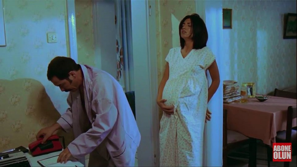
This is where the film really shines for me. The lighting is motivated and naturalistic, but highly controlled. In the village interiors, İçbak uses soft, diffused sources, likely bouncing light or pushing it through thick muslin to mimic the glow of a late afternoon sun. It wraps around the faces gently, softening the hardship without erasing the texture of the actors’ skin.
He leans into golden hour for the flashbacks and childhood scenes low sun angle, long shadows, warm flares. It’s the visual shorthand for “memory.” But in the tougher scenes, the light gets harder. He’s not afraid of shadow. As a colorist, I look at the highlight rolloff in these scenes it’s organic. The windows blow out gently, not clipping into harsh digital white. It retains texture in the brightest parts of the image, keeping the world feeling cohesive and analog.
Lensing and Blocking
Looking at the optical characteristics, this was almost certainly shot on prime lenses. The focus fall-off is too creamy for zoom lenses of that era. It looks like he favored the wider end maybe 28mm or 35mm to establish the environment, which tends to stretch the space slightly and make the characters feel part of their surroundings.
For the intimate dialogue, he jumps to the 50mm or 85mm range. It’s a standard portrait length, but it works because it creates just enough separation from the background to focus on the performance without feeling artificial. The blockingworks in tandem with these focal lengths. Sadık and his father are often staged on different planes of depth. One is sharp in the foreground, the other soft in the background. It forces the audience to shift focus, literally and metaphorically, between the two generations.
Color Grading Approach
This is the part I geek out on. The color grading is a perfect example of “density” over “saturation.” A lot of films try to create emotion by pumping the colors, but here, they pulled them back. It has a desaturated, bleach-bypass vibe, but without the harsh contrast usually associated with that look.
The tonal sculpting is precise. The blacks are heavy rich and deep but they aren’t crushed to zero. They sit just above the floor, mimicking a high-quality print film projection. The skin tones are kept warm and separated from the cooler, greenish-blue bias of the shadows. That color separation is key; it keeps the actors alive and blood-filled even when the world around them looks bleak and cold. It’s a subtractive color approach: taking away the “digital” pop to leave something that feels like an old photograph.
Technical Aspects & Tools
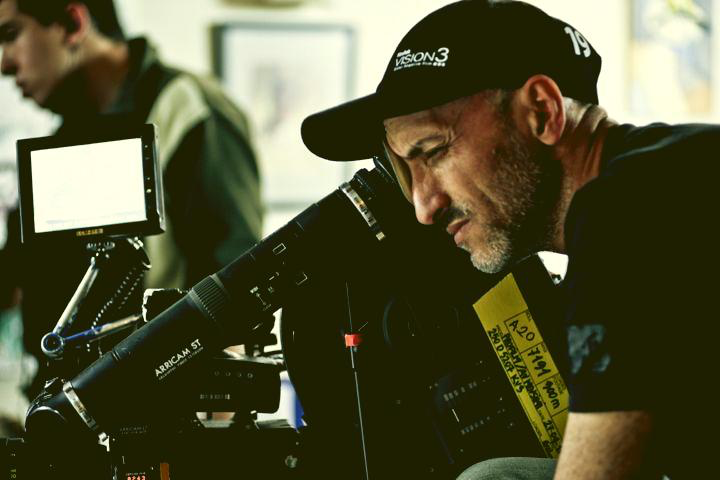
Considering the 2005 release, this screams 35mm film. The grain structure in the shadows is tight but organic it lacks the fixed-pattern noise of early digital sensors. I’d bet on a stock like Kodak Vision2 500T (5218), which was the workhorse of that era for low light and interiors. It had that specific way of handling mixed lighting that we see in the dinner scenes.
Camera-wise, this was likely an Arriflex 435 or 535. They were the industry standard for a reason. For glass, the bokeh and flare characteristics remind me of Zeiss Super Speeds sharp, but with a bit of character when opened up wide. Post-production would have likely involved a Digital Intermediate (DI) scan. Even though photochemical finishes were still common, the control over the color palette suggests a digital grade, probably on an early DaVinci 2K or Baselight system. The tech doesn’t matter as much as the intent, but the choice to shoot film gave the grade a head start with unmatched dynamic range and color depth.
- Also read: THE MOUNTAIN II (2016) – CINEMATOGRAPHY ANALYSIS
- Also read: I’M STILL HERE (2024) – CINEMATOGRAPHY ANALYSIS
Browse Our Cinematography Analysis Glossary
Explore directors, cinematographers, cameras, lenses, lighting styles, genres, and the visual techniques that shape iconic films.
Explore Glossary →