It takes a lot for a film’s look to genuinely break my brain. But David Lynch’s Mulholland Drive is one of those rare films. It isn’t just a “movie”; it’s a masterclass in using the image to lie to the audience.
Most cinematographers try to make things look “real.” Lynch and his team did the opposite: they crafted a glossy, plastic reality to hide a nightmare in plain sight. Today, I want to bypass the plot theories and look strictly at the signal the lighting, the glass, and the color decisions that make this film feel so viscerally uncomfortable.
About the Cinematographer
To understand the look, you have to look at the operator. Mulholland Drive was shot by Peter Deming, a DP who had already survived the chaos of Lost Highway and Twin Peaks. That relationship is key because Deming isn’t just lighting a scene; he’s translating Lynch’s “dream logic” into exposure.
Deming’s job here was incredibly difficult: he had to shoot a “fake” Hollywood that looked alluring enough to be believable, but slightly “off” enough to feel threatening. He nails that specific, uncanny valley look where the image is almost too clean. It’s a style that borrows heavily from the 1950s glossy and high-contrast but Deming subverts it. He lures you in with beauty, then traps you in the dark.
Inspiration Behind the Cinematography
The visual DNA here is a collision of styles. You can see the obvious nods to Hitchcock’s Vertigo and Bergman’s Persona in the way identity is treated, but visually, it’s all about the “Golden Age” of Hollywood.
Lynch and Deming built a world that feels like a memory of a movie rather than reality. We get these sweeping shots of the Hollywood Hills and interiors that feel like sets. There is a “magical smoke screen” effect at play a soft, ethereal glow that hits the L.A. sun. It’s deceptive. It’s designed to make you lower your guard so that when the “unmasking” happens when the industry reveals its dark, male-dominated underbelly it hits harder. The cinematography weaponizes that Americana imagery. It takes the saccharine sweetness of a naive actress coming to LA and slowly rots it from the inside out.
Camera Movements
The camera in Mulholland Drive is a participant, not an observer. In the early “dream” sequences, the movement is fluid almost floating. We get these smooth tracking shots following Betty and Rita that imply momentum and romance.
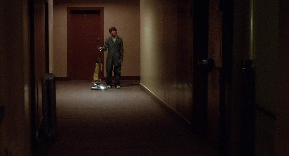
But watch closely how that changes when the tension spikes. The “Winky’s Diner” scene is the perfect example. The camera executes this slow, suffocating push-in on the man recounting his nightmare. It’s not shaky handheld; it’s a deliberate, mechanical glide that feels like an invisible force closing in. It makes you feel the dread physically.
Later, on Adam Kesher’s film set, the camera backtracks to reveal the edges of the set, literally stripping away the artifice. Lynch uses the camera to dictate our heart rate. Sometimes it floats; other times, it holds an uncomfortably static lock-off, forcing us to stare at a character’s terrified face for seconds longer than we want to.
Compositional Choices
Lynch and Deming use framing to mess with your head. One of the most aggressive tactics is the use of extreme close-ups.
In the meeting scene with Adam Kesher and the Castiliani brothers, the tight framing creates immediate hostility. But the genius is in the focus pulls. When the espresso arrives, the camera shifts focus from the adversary to the coffee Adam’s attention drifts to “that which is surprising and new.” It’s a subtle visual cue that dictates the character’s headspace.
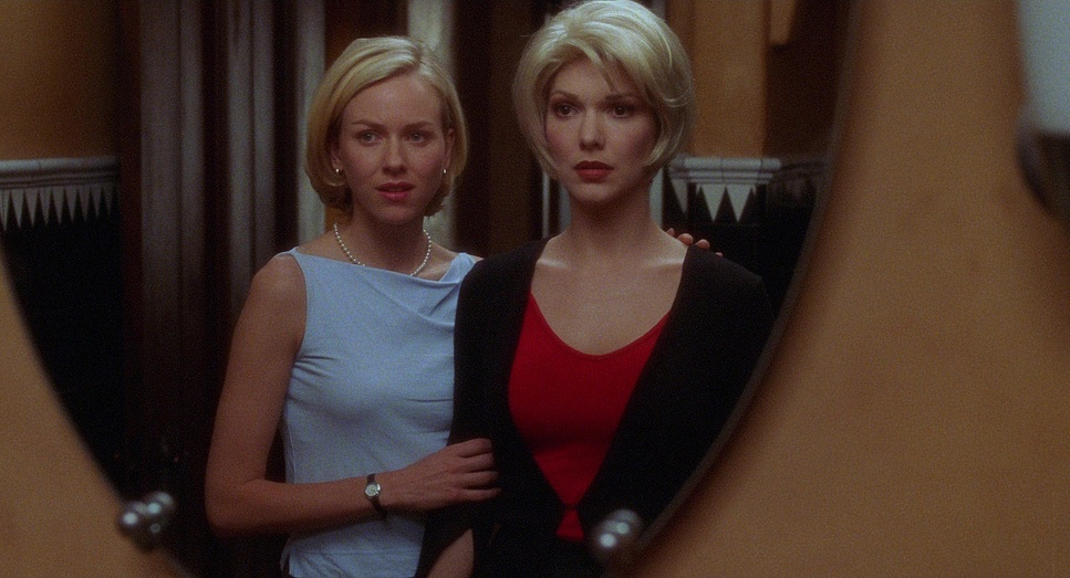
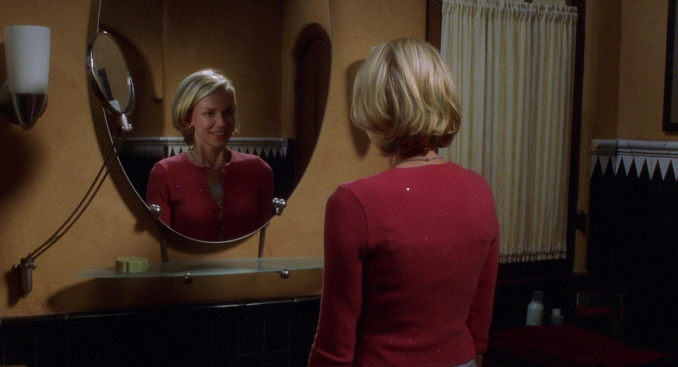
Then there’s the purse scene. We get these intimate close-ups of Betty and Rita, their eyelines perfectly synchronized, showing a “melding” of identities. But the moment the Blue Key is revealed, that visual geometry breaks. Their eyelines fall into misalignment. It’s a technical choice that signals a fracture in their connection.
Perhaps the most haunting composition is the composite shot after they sleep together features of two faces merging into one weird, singular entity. It’s a visual metaphor for their blurring identities that pays off devastatingly at the end, where we are left with Diane’s isolated eye staring into a void. The composition goes from connection to total, bleak isolation.
Lighting Style
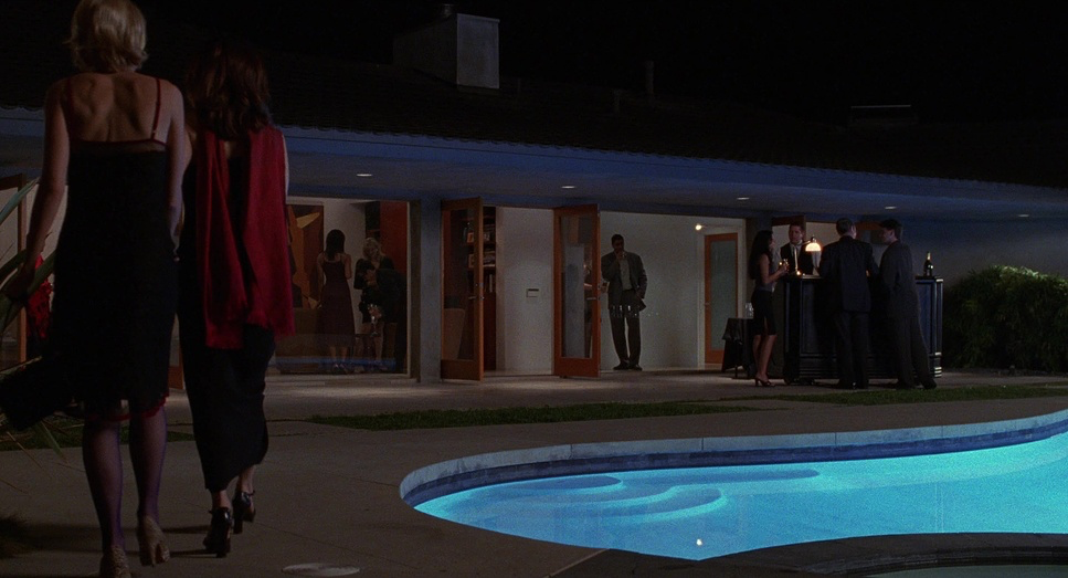
Lighting is where the “lie” of the film is constructed. In the first half (the dream), Deming lights for a “1950s Hollywood” aesthetic. It’s high-key, with soft fill and a distinct lack of deep shadows. Betty’s arrival in LA is bathed in warm, optimistic sunlight. It’s the visual equivalent of a major key melody inviting and safe.
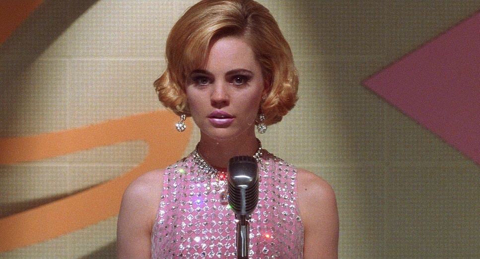
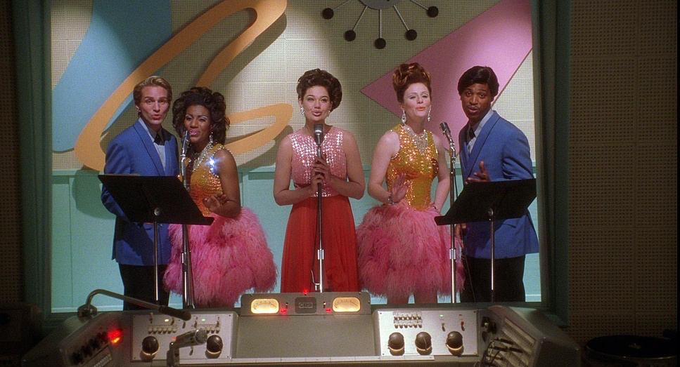
But as the dream rots, the lighting ratio shifts aggressively. We move into high-contrast territory. In the Winky’s Diner scene (which is arguably a daytime nightmare), the sunlight feels harsh. In the Club Silencio scene, the lighting becomes theatrical and artificial.
By the time we hit the reality of Diane’s apartment, the light is unmotivated and sickly. When the “unnatural blue lights” flash, signaling the trauma of Camilla’s murder, the lighting disconnects from physics entirely. It becomes purely psychological. Deming stops lighting the room and starts lighting the guilt.
Lensing and Blocking
While the exact focal lengths aren’t printed on the screen, you can feel the glass choices. For the wide, hopeful shots of Hollywood, Deming leans on wider focal lengths to capture the scale and the “dream.” It keeps the world in focus.
But for the tension, he switches to telephoto/long lenses. This compresses the background, bringing the out-of-focus elements closer to the subject and isolating them in the frame. It creates a claustrophobic feeling, like the world is closing in on Diane.
The blocking reinforces this. Early on, Betty and Rita are constantly blocked together, sharing the frame, physically overlapping. They are a unit. In the final act, Diane is blocked in isolation small in the frame, cornered in her apartment, or lost against the indifferent sprawl of Los Angeles.
Color Grading Approach
As a colorist, this is the part I obsess over. The grade was handled by Chris Jacobson, and the work here is about duality.
The “Dream” timeline is graded to emulate a pristine film print. The highlights roll off gently creamy whites, rich but not crushed blacks. The skin tones are luminous, almost glowing. It’s that “Technicolor” look where the primaries (Reds, Greens, Blues) feel slightly more saturated than reality, feeding into Diane’s naive fantasy.
Then, the shift happens. The “Reality” timeline is colder, grittier. The skin tones lose that healthy luster and become pale or sallow. The “Blue Key” and the blue box act as a massive hue shift a spike of cool tones that cuts through the warmth of the film.
From a technical standpoint, Jacobson likely pushed the contrast in the darker scenes to retain detail in the shadows without lifting the blacks too much, maintaining a “thick” negative density feel. It’s a texture you can’t quite get with digital emulation; the grain structure in those blue/black areas feels alive.
Technical Aspects & Tools
| Genre | Psychedelic, Thriller, Drama, Magical Realism, Mystery |
|---|---|
| Director | David Lynch |
| Cinematographer | Peter Deming |
| Production Designer | Jack Fisk |
| Costume Designer | Amy Stofsky |
| Editor | Mary Sweeney |
| Colorist | Chris Jacobson |
| Time Period | 2000s |
| Color | Cool, White |
| Aspect Ratio | 1.85 – Spherical, Super 35 |
| Format | Film – 35mm |
| Lighting | Hard light, High contrast |
| Lighting Type | Artificial light |
| Story Location | … California > Los Angeles |
| Filming Location | … Los Angeles > Mulholland Drive |
| Camera | Panavision Platinum |
| Lens | Panavision Lenses, Panavision Primo Primes |
We are in the year 2001, so this is pure photochemical film. Deming shot this on 35mm (likely Kodak Vision stocks) using Panavision Platinum cameras.
The glass is crucial here. He used Panavision Primo Primes, which are known for being incredibly sharp and color-matched, but they still have that organic Panavision characteristics slight warmth and pleasing flares. This choice of sharp, high-end glass contrasts with the surreal narrative; the image is crisp, which makes the hallucinations feel more disturbing because they look so “real.”
Shooting on film gave them the latitude to handle those harsh LA sun exteriors without clipping the highlights, while still digging into the shadows during the night exteriors on Mulholland Drive itself.
- Also read: GUARDIANS OF THE GALAXY VOL. 3 (2023) – CINEMATOGRAPHY ANALYSIS
- Also read: E.T. THE EXTRA-TERRESTRIAL (1982) – CINEMATOGRAPHY ANALYSIS
Browse Our Cinematography Analysis Glossary
Explore directors, cinematographers, cameras, lenses, lighting styles, genres, and the visual techniques that shape iconic films.
Explore Glossary →