Mr. Smith Goes to Washington (1939) is one of those films I return to constantly. Frank Capra’s classic isn’t just a political drama or a vehicle for Jimmy Stewart; it’s a blueprint for visual manipulation. It shows us exactly how cinematography shapes our perception of innocence and corruption without us even realizing it.
This isn’t an academic exercise for me. I’m looking at this through the lens of a modern colorist and director, trying to reverse-engineer the choices that make this film work nearly a century later.
About the Cinematographer
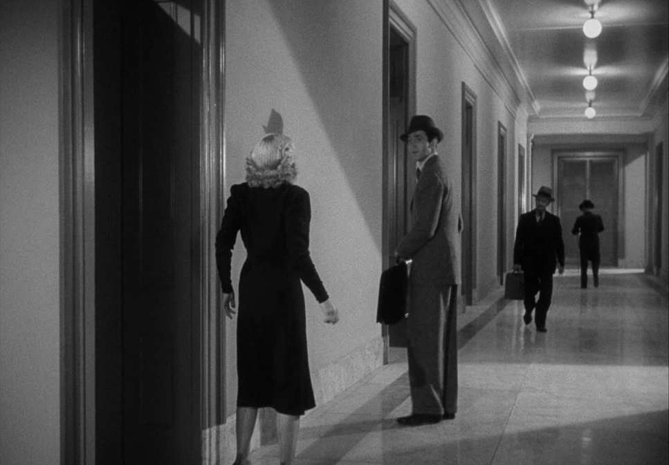
Joseph Walker, ASC was at the helm of the visual storytelling here. Walker was Capra’s go-to cinematographer, and their partnership created a kind of visual shorthand. He wasn’t just capturing action; he was crafting a specific texture. Walker was known for rich, expressive black and white work that felt functional but looked expensive. He knew exactly how to use dynamic range to serve the story giving us stark, dramatic contrasts when the tension spiked, and softer, more nuanced tones for the human moments.
Walker understood that his job was to translate Capra’s humanist vision into a frame. He didn’t need dialogue to tell you a character was overwhelmed; he used light and shadow to do the heavy lifting.
Inspiration Behind the Cinematography
The look of Mr. Smith Goes to Washington was born out of the tension of its time. Released in 1939, right as the world was tipping into war, the film was controversial. Washington insiders hated it, calling it “anti-American” for showing corruption. But audiences loved it because it felt real.
That duality the harsh reality of the system vs. the idealism of one man is the core of the visual approach. The cinematography had to make Washington D.C. feel massive and imposing, almost crushing the protagonist, Jefferson Smith. There is a constant tug-of-war between realism and idealism in the frame.
A huge driver of the visual style was the set itself. The U.S. Senate was a studio-built replica, and the goal was authentic grandeur. It needed to feel like a crucible. The aesthetic choices the lighting, the angles were all designed to sell the weight of that room.
Camera Movements
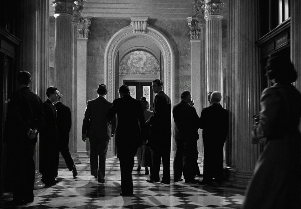
In this era, camera movement wasn’t about showing off; it was about revealing information. Walker’s work here is restrained and deliberate.
We see elegant pans and tilts that follow characters, letting us absorb the environment with them. When Jefferson Smith arrives in D.C., the camera tracks him like a silent companion, mirroring his wide-eyed wonder. It emphasizes his perspective: he is a small, honest man walking into a complex machine.
Inside the Senate, the camera language shifts. We get grand, sweeping moves to establish the scale of the room, contrasting sharply with the tight, intimate close-ups on Smith. During the famous filibuster, the movements become agitated. The camera locks onto Smith, pushing in, mirroring his physical exhaustion. These aren’t just movements; they are emotional cues. They tell us exactly where to look and how to feel, acting as a witness to Smith’s struggle.
Compositional Choices
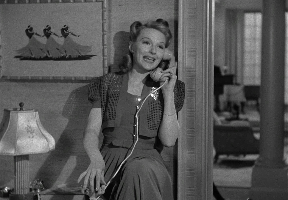
Walker’s composition is where the storytelling really tightens up. He uses the frame to articulate power dynamics perfectly. The Senate set provided a massive playground for deep-focus shots, and Walker used every inch of it.
Look at how Jefferson Smith is framed during the filibuster. He is often a lone figure, physically dwarfed by the towering columns and rows of empty seats. It’s a textbook use of negative space to show isolation. The visual weight of the room is literally pressing down on him.
There’s also a brilliant, subtle choice in the framing of the children during the reaction shots. Capra and Walker keep the boys closest to their father soft and out of focus, while the children further back are sharp. It’s a clever use of depth cues to guide our eye and hierarchize the characters within a single shot. By controlling what’s sharp and what falls into a blur, they tell us who is an active participant and who is just observing.
Lighting Style
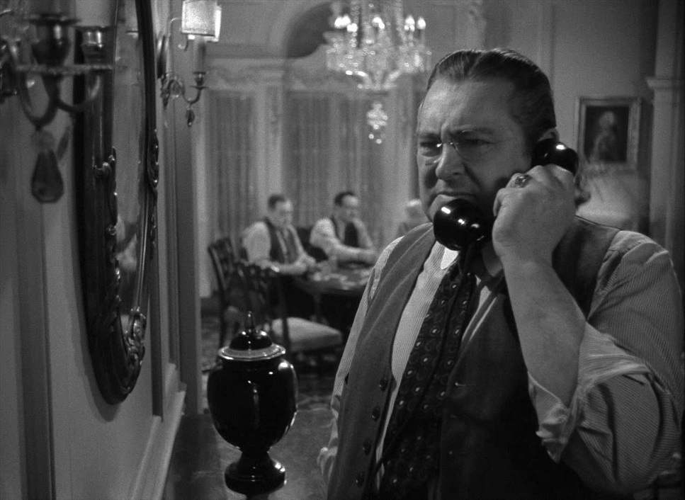
Since this is black and white, the lighting is the color grading. Walker’s lighting is realistic but dramatically expressive, often using motivated sources like windows or practical lamps to ground the scene.
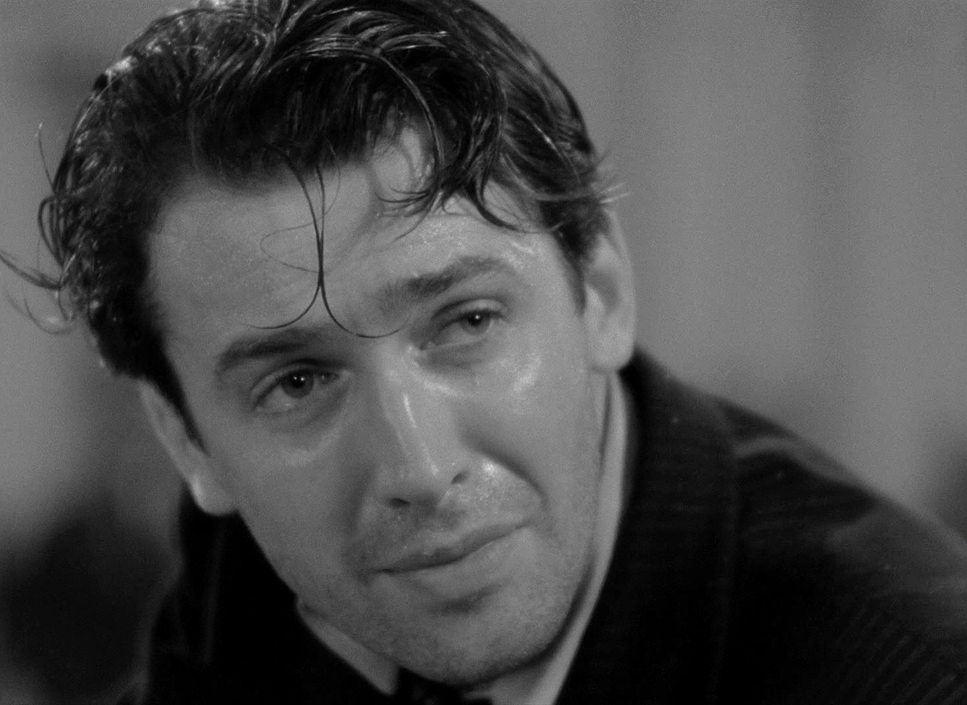
In the beginning, Smith is lit with high-key lighting bright, clear, reflecting his pure intentions. But as he gets dragged into the political mud, the lighting shifts. The shadows get deeper. The contrast ratio increases. We start seeing more visual ambiguity.
Walker sculpts the faces beautifully. He uses backlighting to separate actors from the busy backgrounds and soft, directional key lights to model Jimmy Stewart’s face. In the filibuster scenes, the lighting turns grueling. It highlights the sweat, the fatigue, the bags under the eyes. It’s not just about visibility; it’s about texture. The light accentuates the physical toll of the story.
Lensing and Blocking
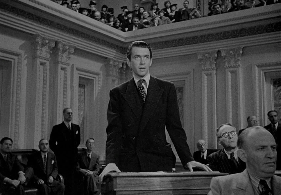
They didn’t have zooms back then, so prime lenses dictated the look. The choice of focal length here was critical for emotional impact.
Walker likely used wide lenses to capture the Senate floor, exaggerating the distance between characters and making the individual look small. This helped sell the “reality” of the studio set. Conversely, longer lenses were used for the close-ups, compressing the background and forcing us into the characters’ headspace. This is vital for connecting with Stewart’s “childlike” energy and Jean Arthur’s intensity.
The blocking works hand-in-hand with the glass. Capra and Walker orchestrated complex movements within that deep space. If a character is high in the frame or central, they have power. If they are pushed to the corner, they are vulnerable. Initially, Smith’s blocking is open and free. Once he hits the political machine, he is visually boxed in, blocked by other actors or set pieces. The lens and the blocking work together to interpret the action, not just record it.
Color Grading Approach
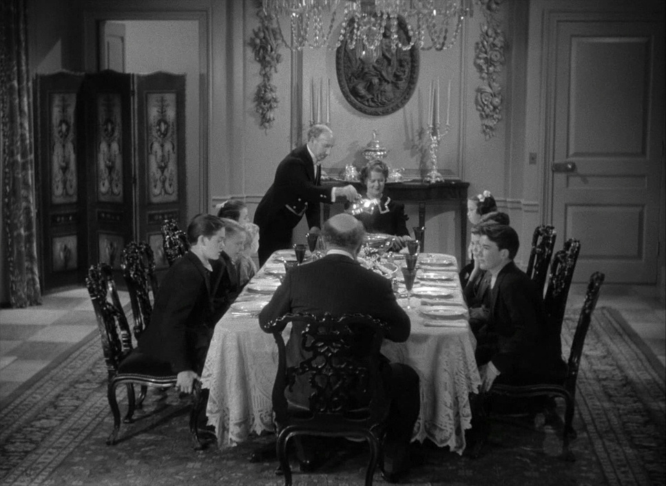
Even though this is black and white, the principles of color grading are all over it. As a colorist, I see “tonal separation” everywhere.
In 1939, the “grade” happened on set. They selected film stock (likely Panchromatic) and used colored glass filters yellow, green, or red to control how colors translated to gray. A red filter would turn a blue sky dark, for example. Walker used these tools to ensure separation between skin tones and the background.
The aesthetic leans into a rich, robust contrast. There is density in the image. We see deep, inky blacks that anchor the frame, but the highlights don’t clip they have that beautiful, creamy roll-off you only get with celluloid. The mid-tones are where the texture lives, giving the Senate set its gritty realism.
If I were grading a digital remake of this today, I wouldn’t try to “fix” it. I’d try to emulate it. I’d focus on that mid-tone micro-contrast to draw focus, and I’d be very careful with the bottom end of the curve. I’d want to crush the blacks just enough to get that “print film” weight, but lift the shadows slightly to keep the detail in the dark suits. The goal would be to preserve that organic grain structure and the velvety texture of the shadows.
Technical Aspects & Tools
Mr. Smith Goes to Washington — Technical Specs
| Genre | Comedy, Drama, History, Political |
|---|---|
| Director | Frank Capra |
| Cinematographer | Joseph Walker |
| Production Designer | Lionel Banks |
| Costume Designer | Robert Kalloch |
| Editor | Gene Havlick, Al Clark |
| Time Period | 1930s |
| Color | Desaturated, Black and White |
| Aspect Ratio | 1.43 – Spherical |
| Format | Film – 35mm |
| Lighting | Soft light, Top light |
| Story Location | Washington > District of Columbia |
| Filming Location | United States > Washington, D.C. |
This production ran on the Mitchell BNC, the workhorse of Hollywood. It was quiet enough for sound recording and rock-solid steady. Paired with glass like Cookes or Bausch & Lombs, it gave the film its sharp, classic look.
Walker almost certainly shot on Eastman Kodak Panchromatic Negative. This stock was sensitive to the full color spectrum, which allowed for that nuanced translation of color into gray values.
- Also read: A SILENT VOICE: THE MOVIE (2016) – CINEMATOGRAPHY ANALYSIS
- Also read: PARIS, TEXAS (1984) – CINEMATOGRAPHY ANALYSIS
Browse Our Cinematography Analysis Glossary
Explore directors, cinematographers, cameras, lenses, lighting styles, genres, and the visual techniques that shape iconic films.
Explore Glossary →