Mr. Nobody. I’ve always been drawn to films that treat the image as more than just a container for the plot. While the internet loves to argue over whether this movie “makes sense” or offers a traditional puzzle-box payoff, I’m usually too busy staring at the screen to care. What grabs me and keeps me coming back is its audacious visual ambition. It’s a film that lives and breathes through its cinematography, regardless of how you interpret the ending.
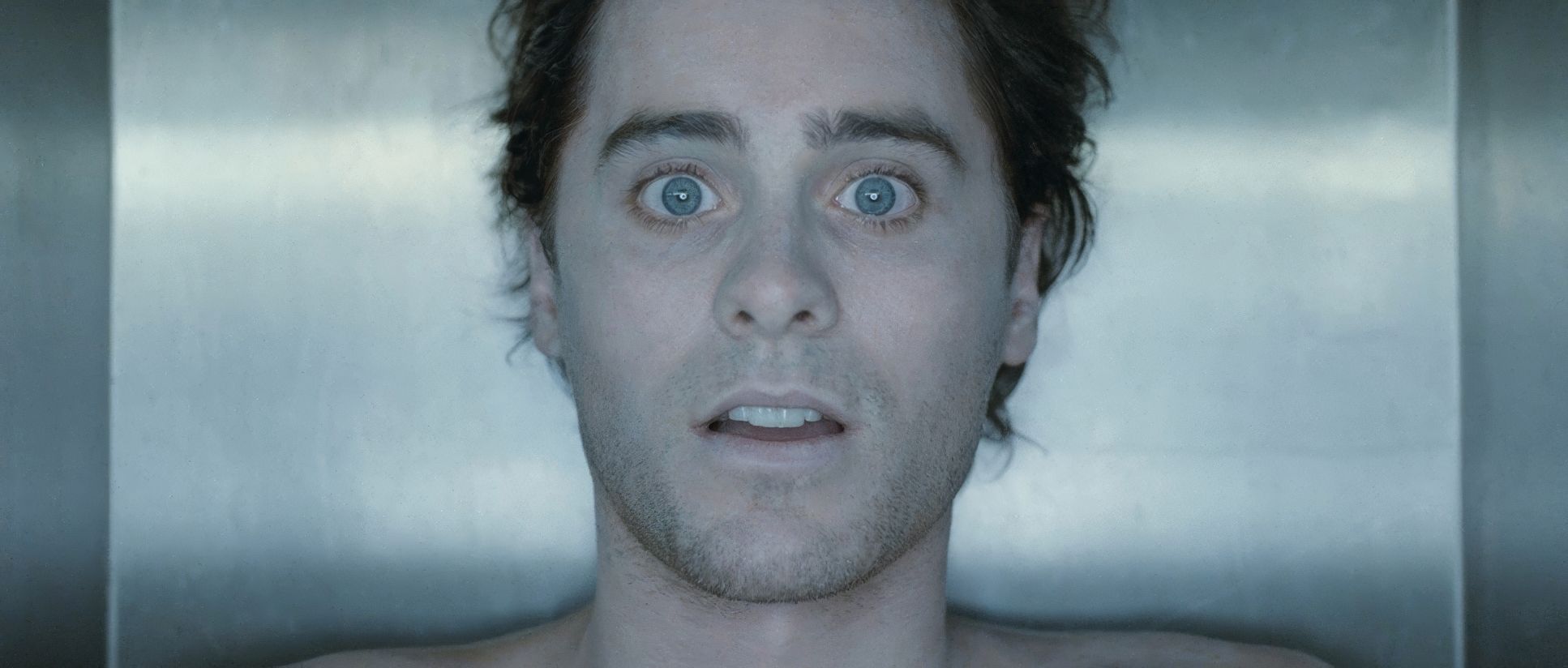
Mr. Nobody isn’t just a movie you watch; it’s an experience you wade into. It’s a kaleidoscope of potential lives, regrets, and what-ifs. Directed by Jaco Van Dormael and starring Jared Leto, this 2009 sci-fi drama throws you headfirst into a non-linear narrative, fragmenting the story across myriad parallel timelines. One viewer called it “total randomness of the visuals,” but to my eye, it’s the exact opposite of random. It’s incredibly disciplined. As a colorist, I’m obsessed with how these divergent realities are visually separated yet feel like they belong to the same soul. As a filmmaker, I’m looking past the dazzling surface at the intentional craft beneath. This isn’t a film content with a single visual style; it’s a canvas for exploring the emotional weight of every path Nemo Nobody might have taken.
About the Cinematographer

The visual architect here is Christophe Beaucarne. If you aren’t familiar with the Belgian DP, his work is typically poetic and deeply embedded in the “soul” of the story rather than just being flashy for the sake of it. His collaboration with Van Dormael on this project feels like a perfect match it gave him the freedom to experiment with a massive spectrum of visual languages. You can see that European sensibility in his light; he favors a painterly quality that feels organic even when it’s meticulously controlled. He understands how to make a frame feel naturalistic while imbuing it with heavy subtext. This wasn’t just about making pretty pictures; it was about creating distinct visual ecosystems for each iteration of Nemo’s life.
Technical Aspects & Tools
Mr. Nobody: 35mm Film • Zeiss Master Primes • 2.35:1
| Genre | Drama, Fantasy, Romance, Science Fiction, Soft Sci-Fi, Lo-Fi Sci-Fi, Science-Fiction |
| Director | Jaco Van Dormael |
| Cinematographer | Christophe Beaucarne |
| Production Designer | Sylvie Olivé |
| Costume Designer | Nathalie Leborgne, Ulla Gothe |
| Editor | Susan Shipton, Matyas Veress |
| Colorist | Fred J. Julito, Fabien Pascal |
| Time Period | 2000s |
| Color | Cool, Desaturated, Cyan |
| Aspect Ratio | 2.35 – Spherical |
| Format | Film – 35mm |
| Lighting | Soft light, Top light |
| Lighting Type | Artificial light, Fluorescent |
| Camera | Arricam LT |
| Lens | Zeiss Master Primes |
| Film Stock / Resolution | 8573/8673 Eterna 500T, 8583/8683 Eterna 400T |
To understand why this film looks the way it does, you have to look at the chemistry of the image. It was shot on 35mm film using the Arricam LT, and that choice is everything. There’s a texture here a natural grain structure and a specific highlight roll-off that you just couldn’t get with 2009-era digital sensors. They used Fuji Eterna (500T and 400T) stock, which is a detail I love. Fuji Eterna has this beautiful, slightly softer rendering of skin tones and shadows compared to the punchier Kodak Vision stocks of that time. When you pair that “thick” film look with the clinical sharpness of Zeiss Master Primes, you get a fascinating contrast: a world that is hyper-clear but still feels like a memory. Shooting in a 2.35:1 aspect ratio was also the right call. It gives the “Big Bang” sequences an epic scale while allowing for enough horizontal space to physically separate characters in the intimate domestic scenes.
Inspiration Behind the Cinematography

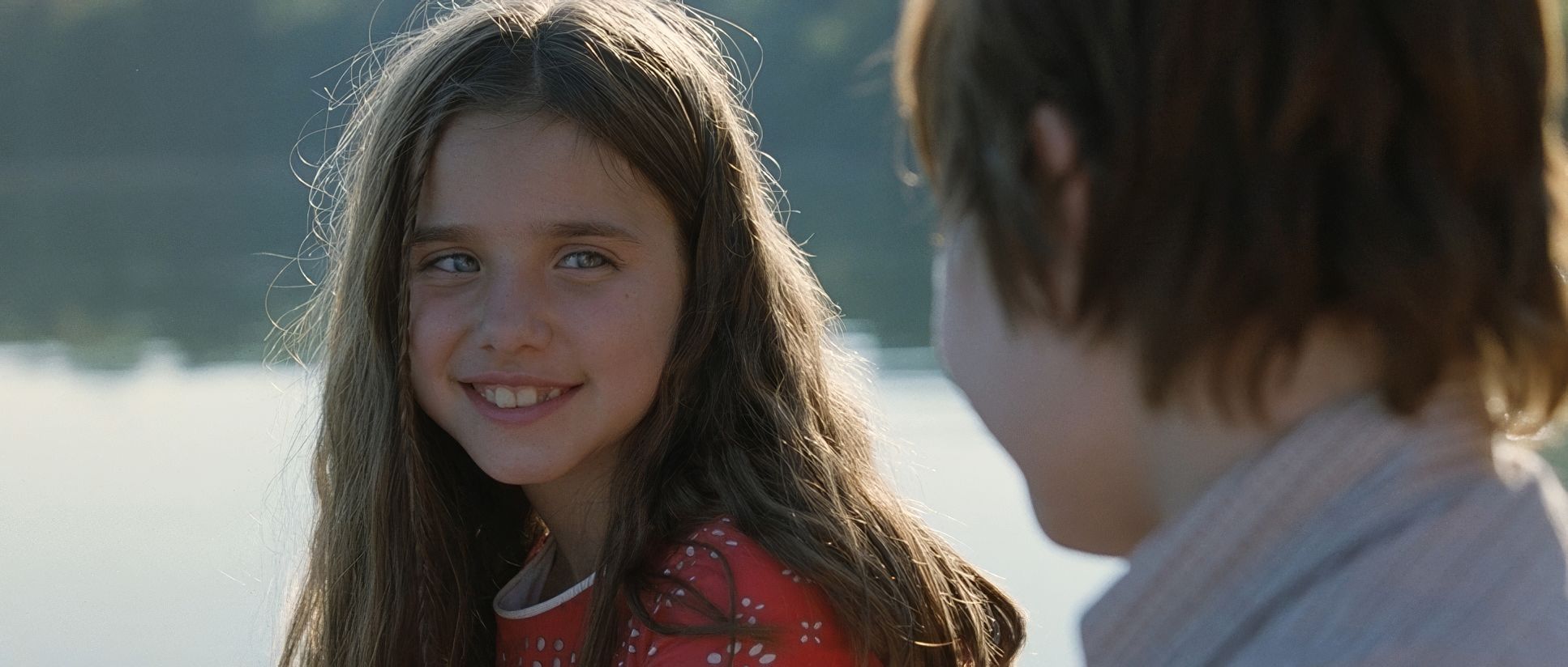
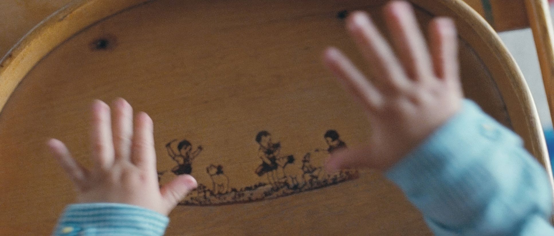
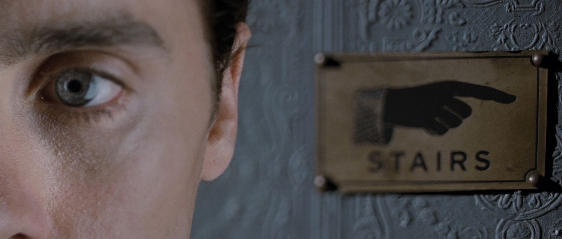
“How do we make meaningful choices?” That’s the core question Beaucarne had to answer visually. The script is a meditation on the butterfly effect and chaos theory, themes Nemo literally spells out in his narration. For the cinematography, this meant crafting a language that could articulate the fluidity of memory. The inspiration clearly came from the script’s inherent multiplicity. How do you show a choice not made? The “symbolism of diverging train tracks” isn’t just a plot point; it’s a profound visual motif. Each decision point choosing a parent, approaching a girl, deciding a career needed a distinct identity. It’s an exercise in world-building where you aren’t just building one reality, but a dozen, each subtly influencing how we feel about Nemo’s fragmented self.
Compositional Choices

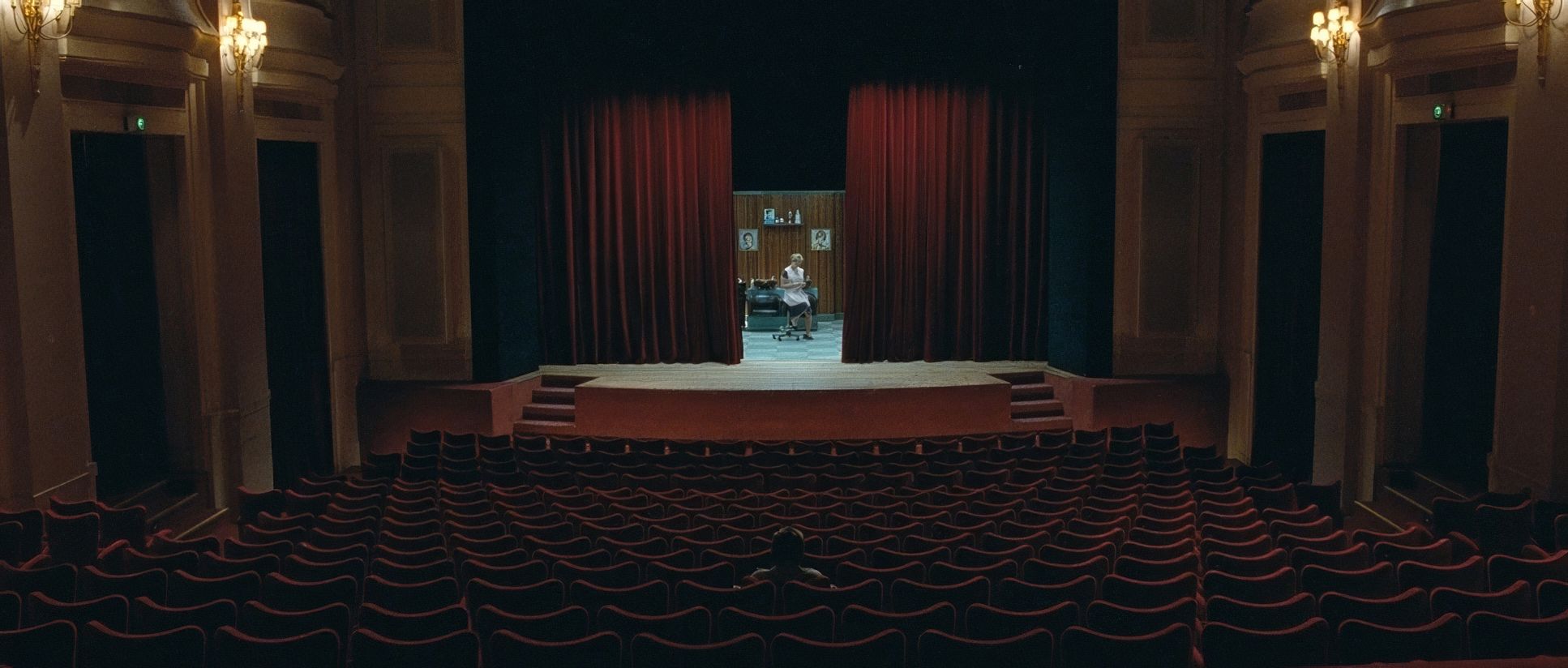
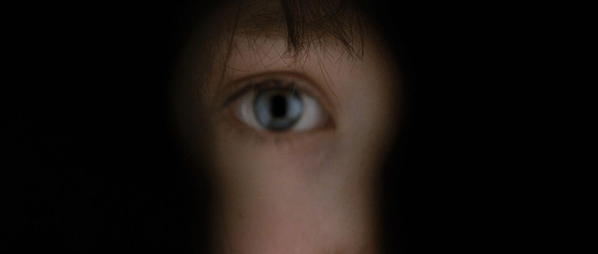
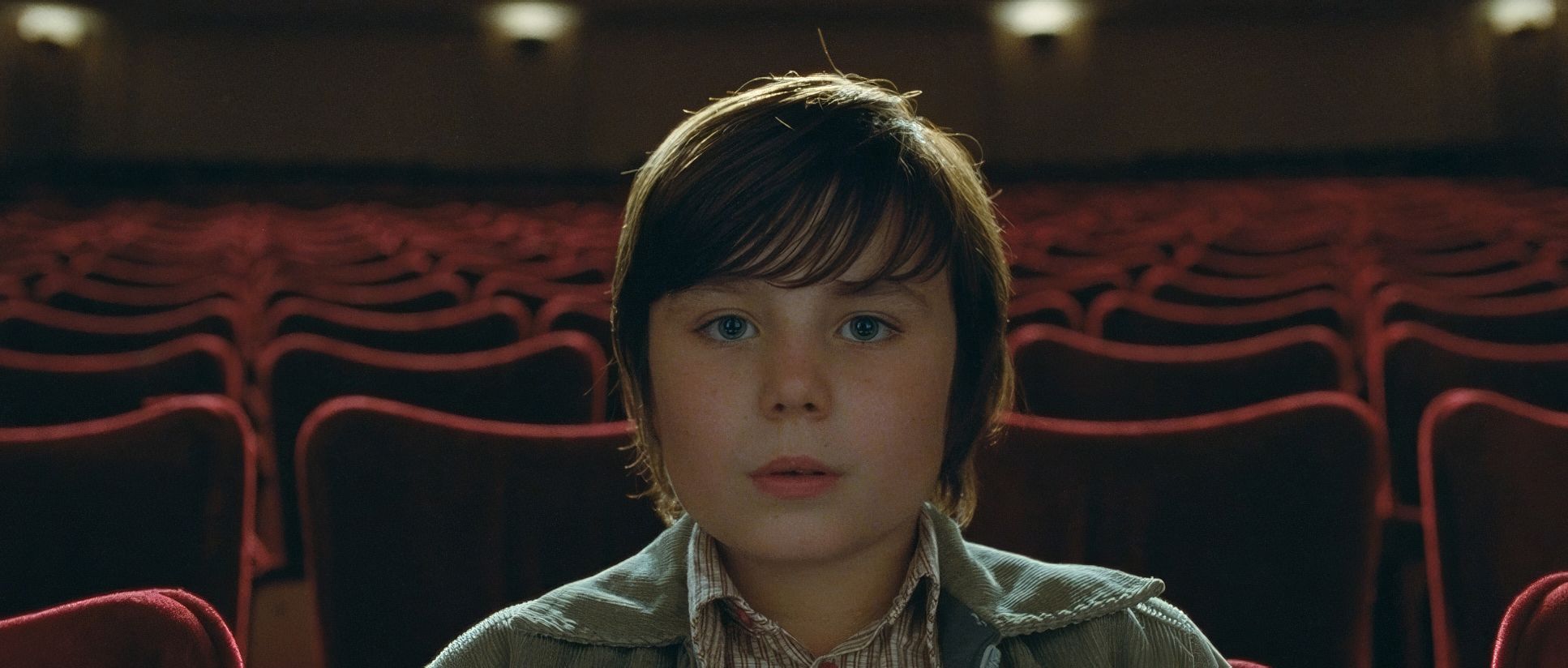
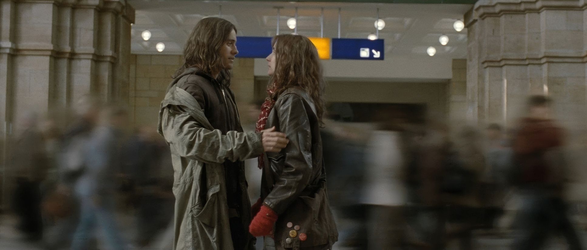
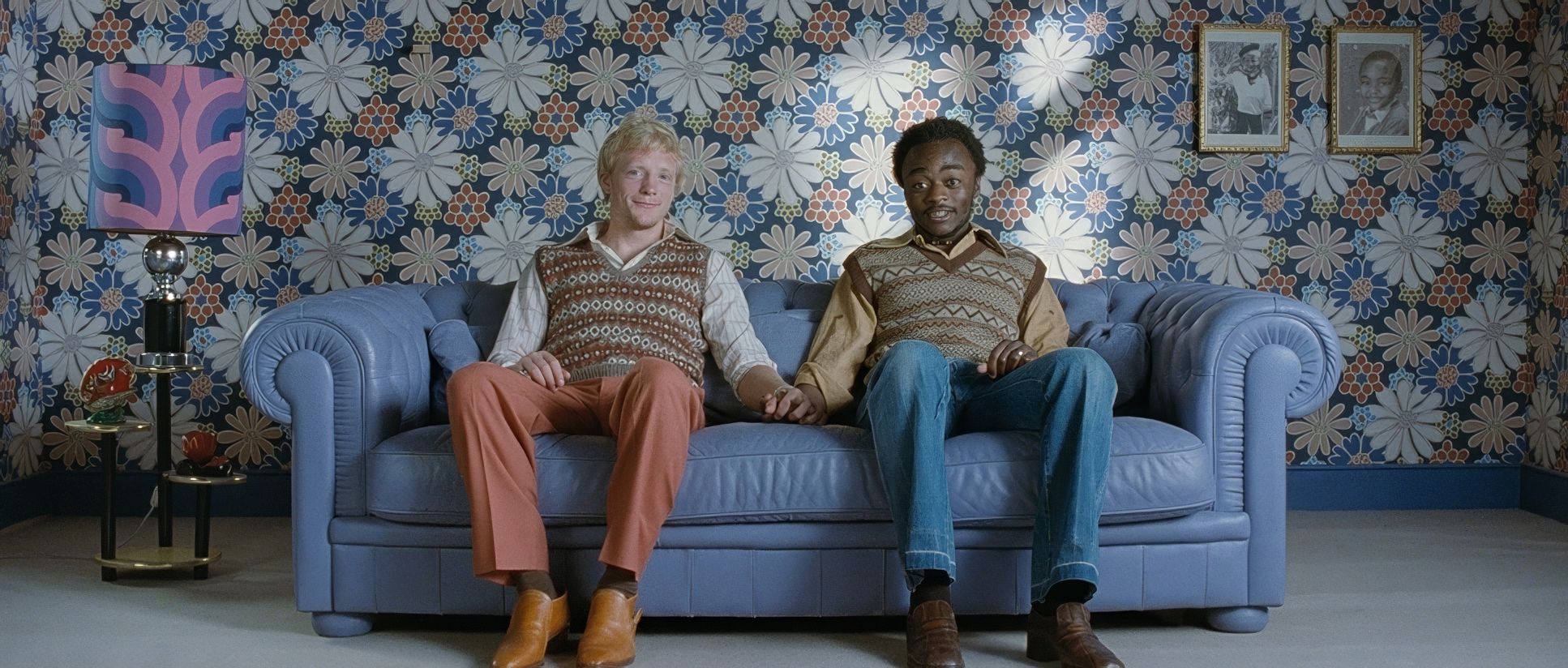
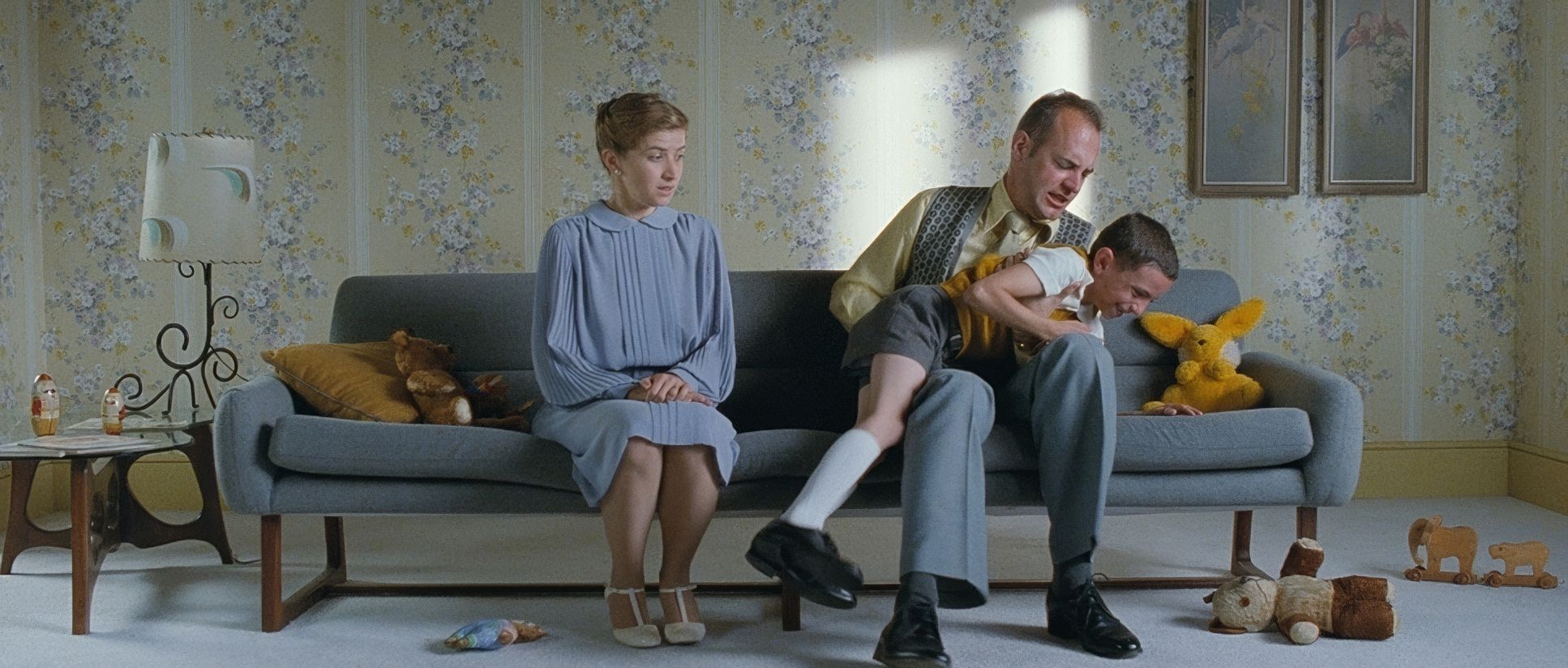
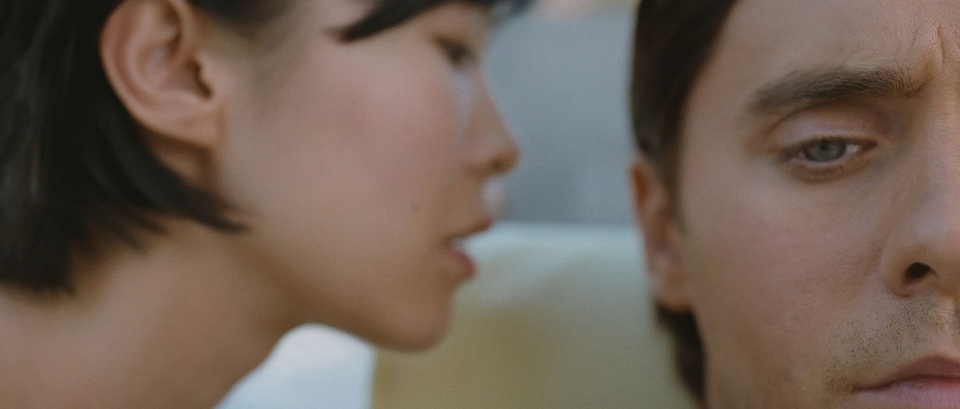
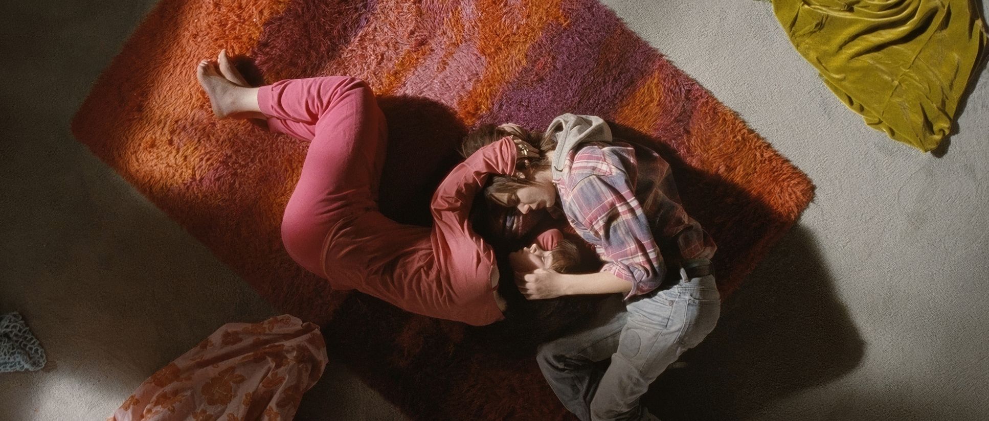
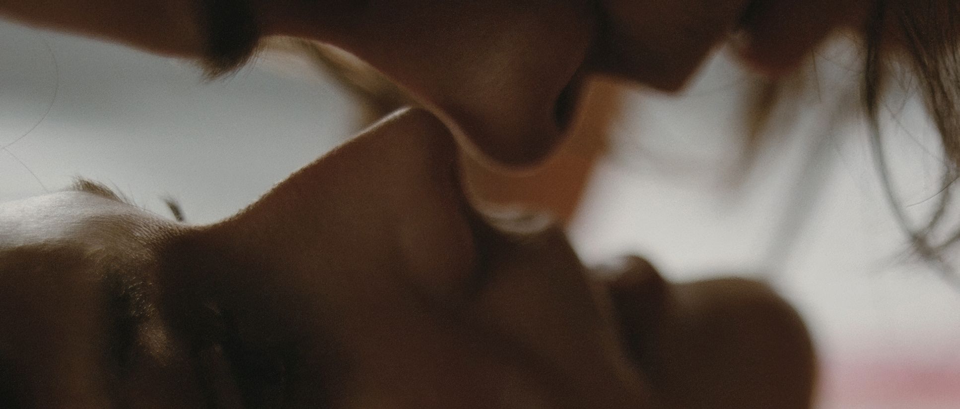
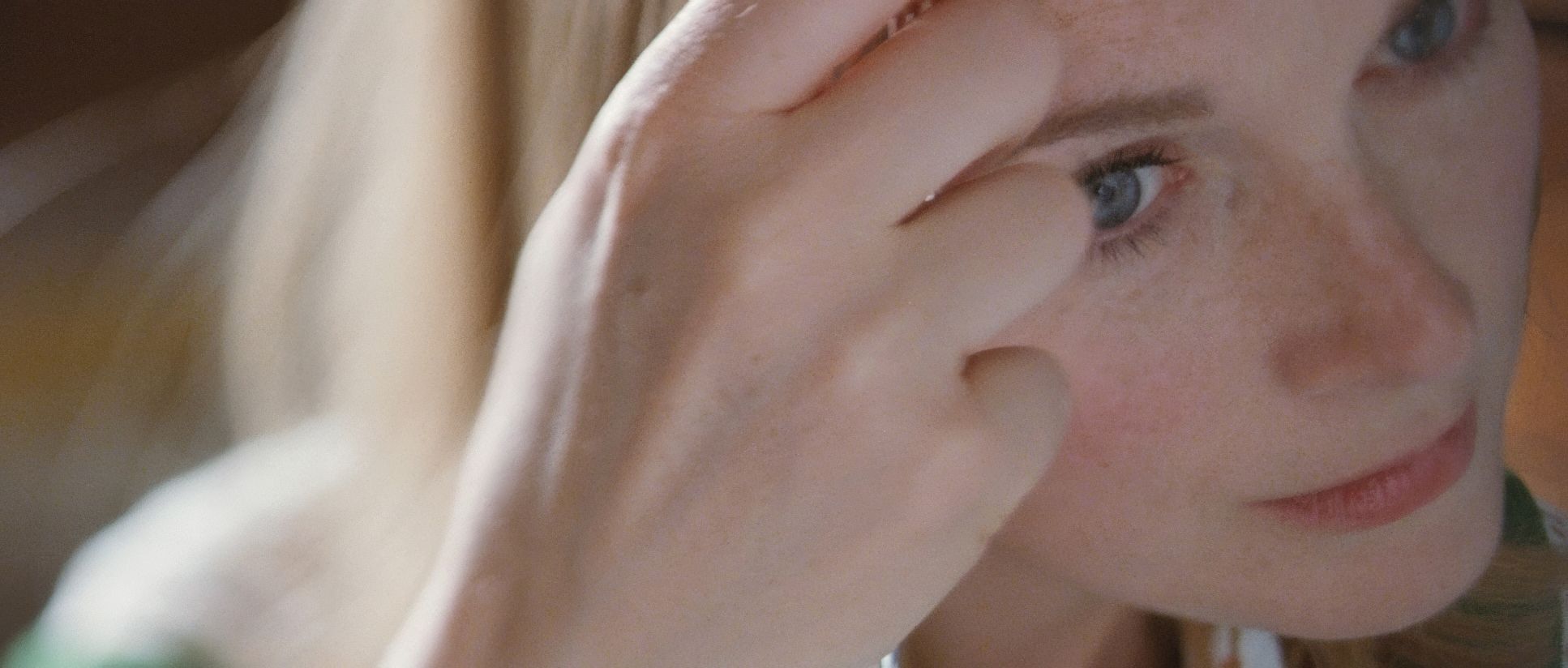
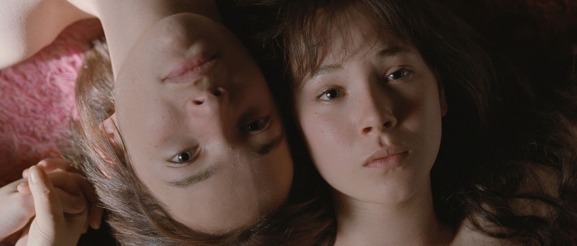
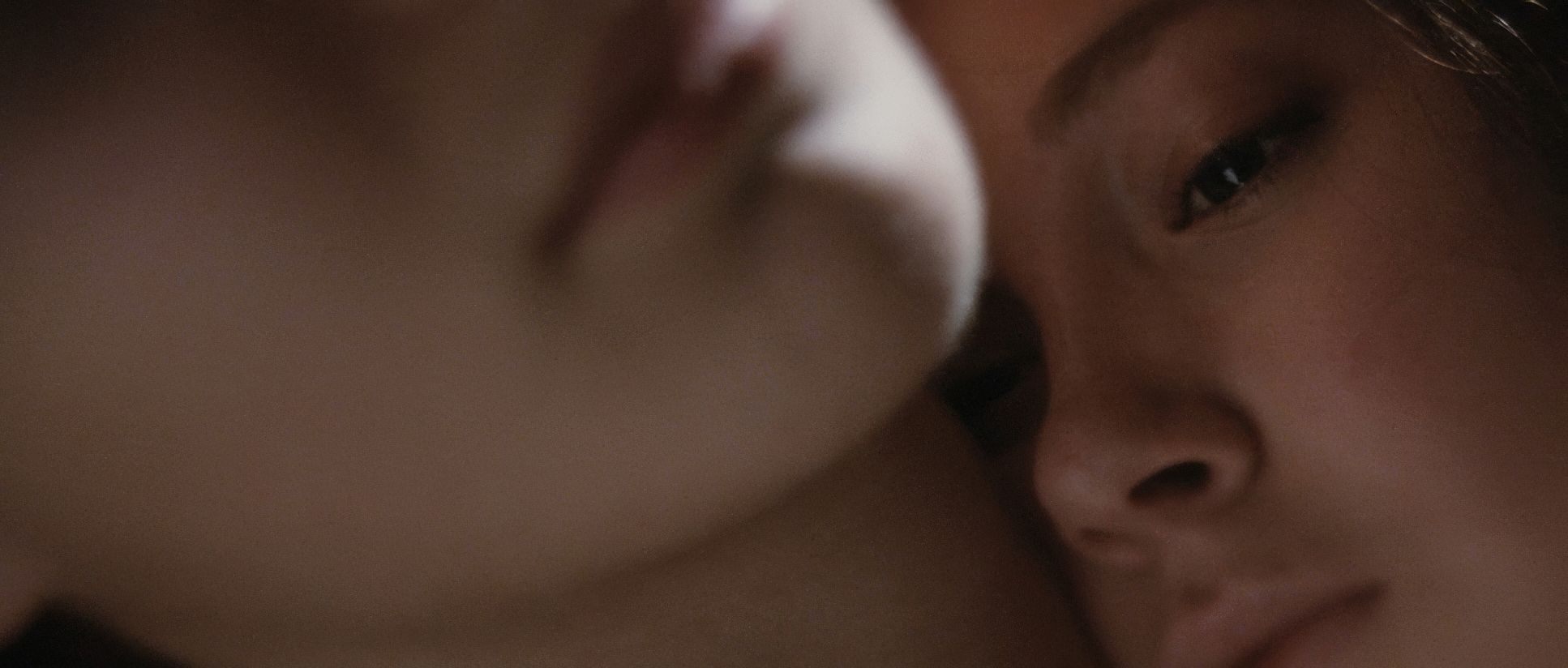
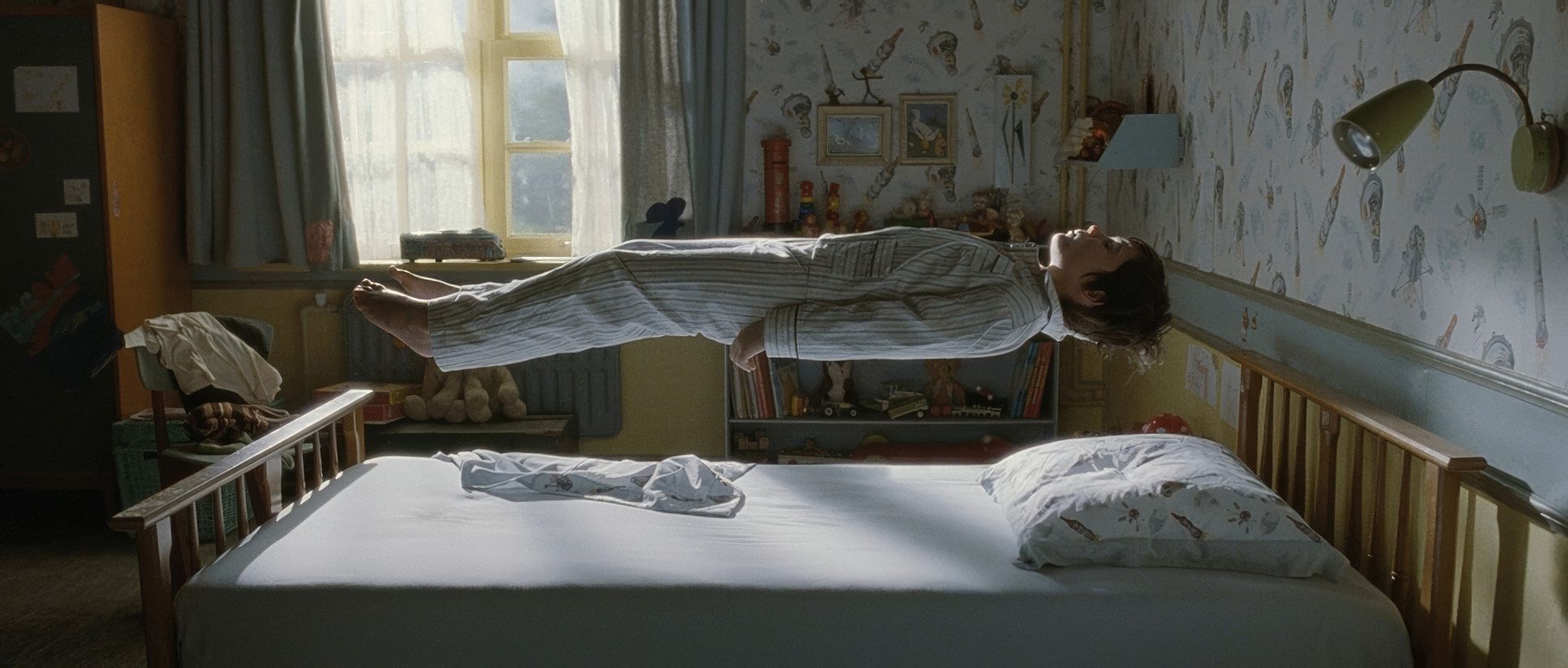
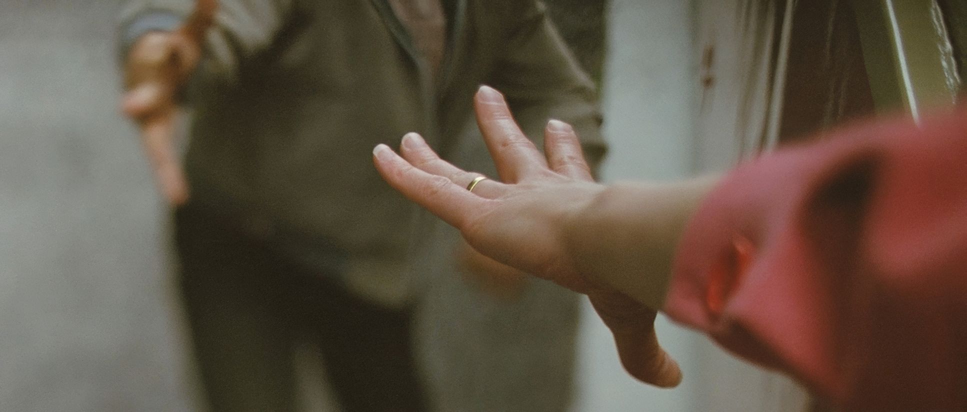
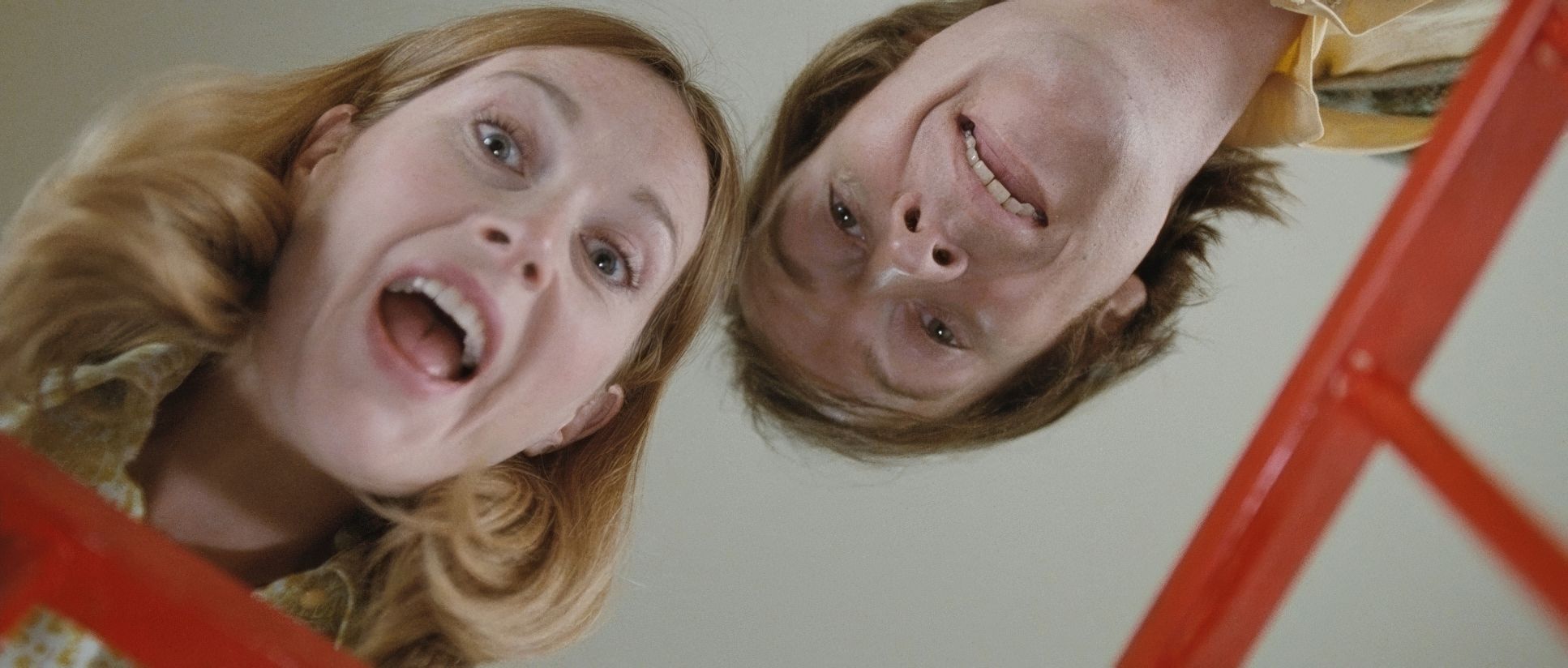
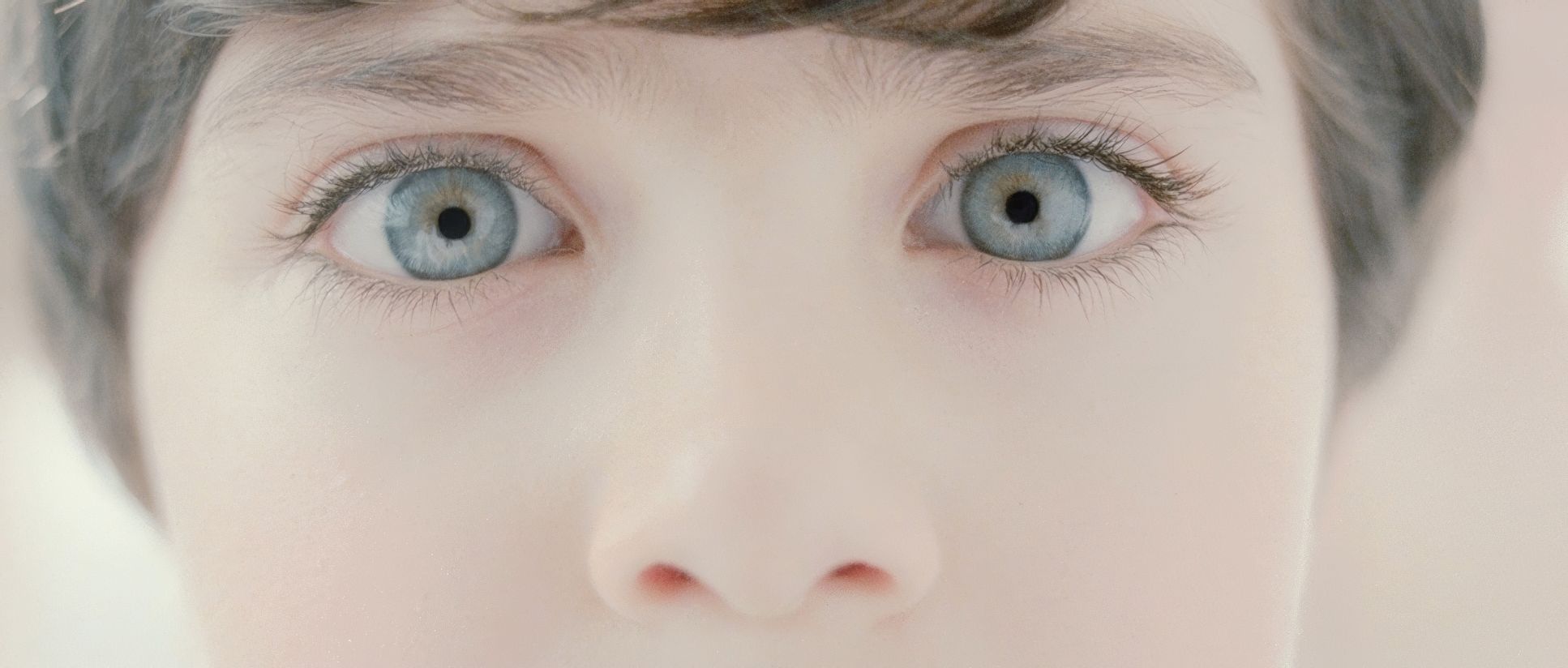
There’s a specific shot of Nemo standing between his divorcing parents on that train platform that perfectly encapsulates the film’s geometry. It’s not just a choice; it’s a visual bifurcation. Beaucarne masterfully uses depth cues and frame division to show us Nemo’s fractured existence. We often see him positioned at literal and metaphorical crossroads. There’s a beautiful interplay between expansive wide shots that feel lonely and possibility-drenched, and tight close-ups that drill into the emotional core of a moment. In one life, the frames are symmetrical and settled; in another, they’re off-kilter and asymmetrical, conveying an unpredictable future. I’ve even noticed moments where the composition feels almost like a stage play a nod, perhaps, to the constructed nature of memory itself.
Camera Movements

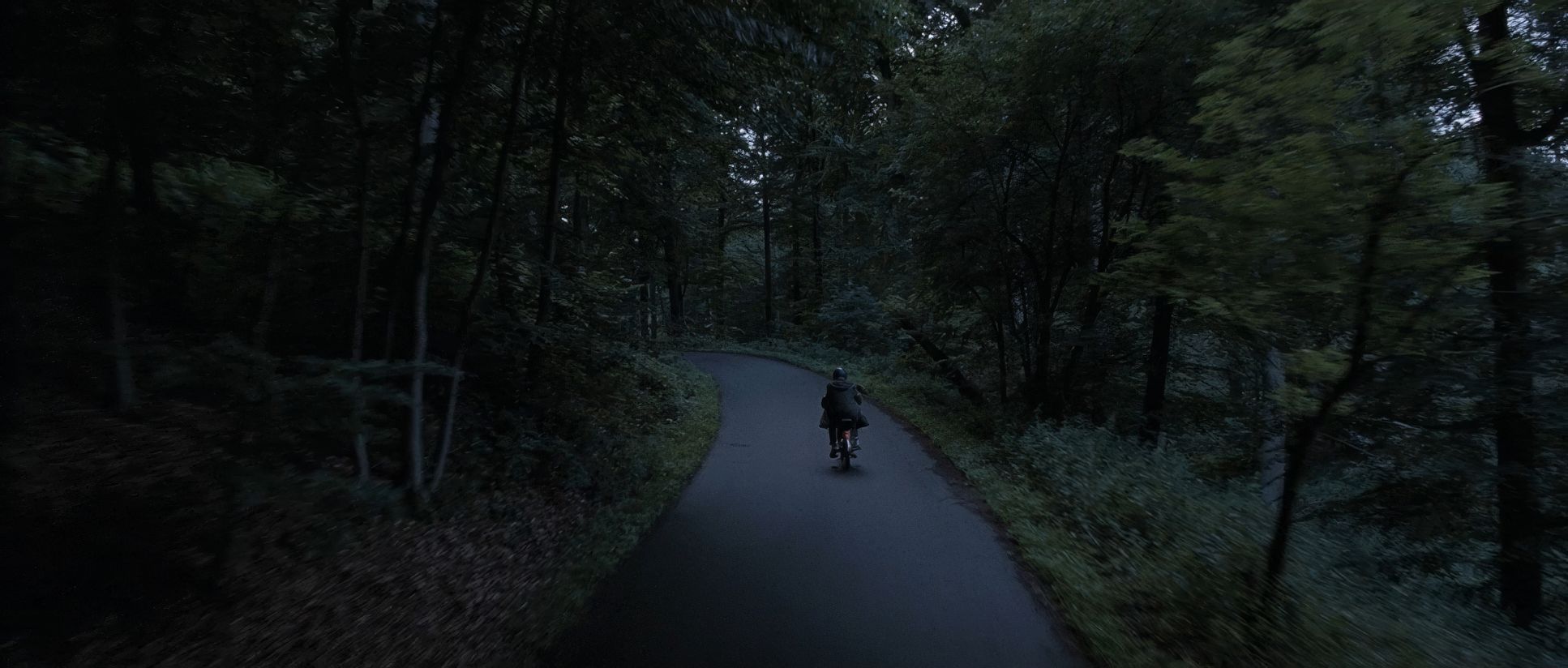
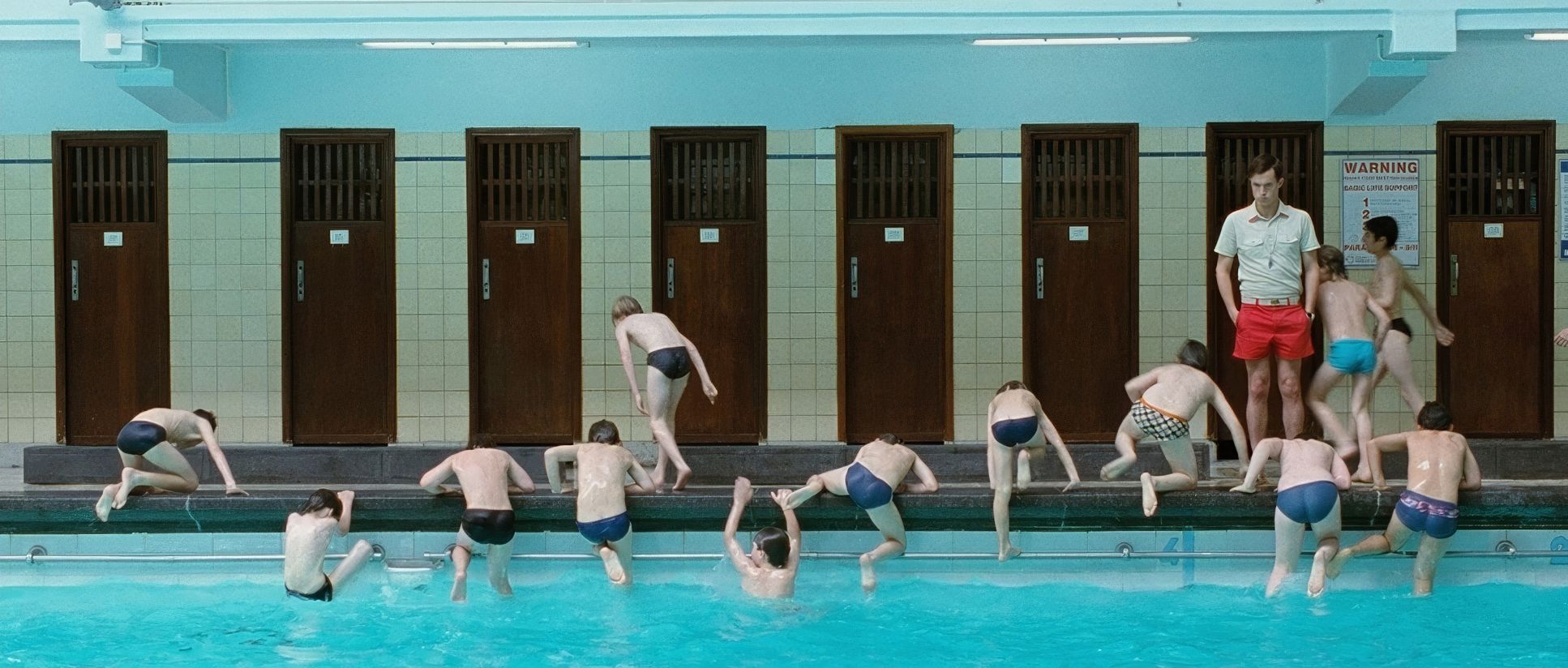
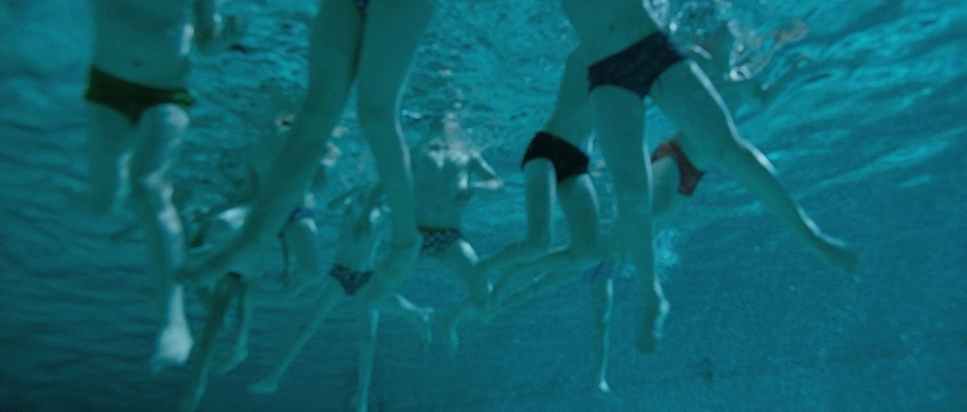
The camera in Mr. Nobody is rarely static. It mirrors the constant flux of Nemo’s consciousness. It’s an active participant. We see these sweeping crane shots that emphasize grand philosophical ideas about the universe, placing Nemo’s individual choices within a cosmic context. Then, the camera shifts. It becomes intimate, handheld, and grounding especially during moments of confusion. Think of that disoriented feeling when he awakens by the swimming pool; the camera’s slight wobbles and uncertain framing perfectly convey his headspace. And that quirky reverse motion of the mailman early on? That’s a delightful visual breadcrumb for the film’s eventually “reversal of time.” The rhythm isn’t uniform; it ebbs and flows.
Lighting Style

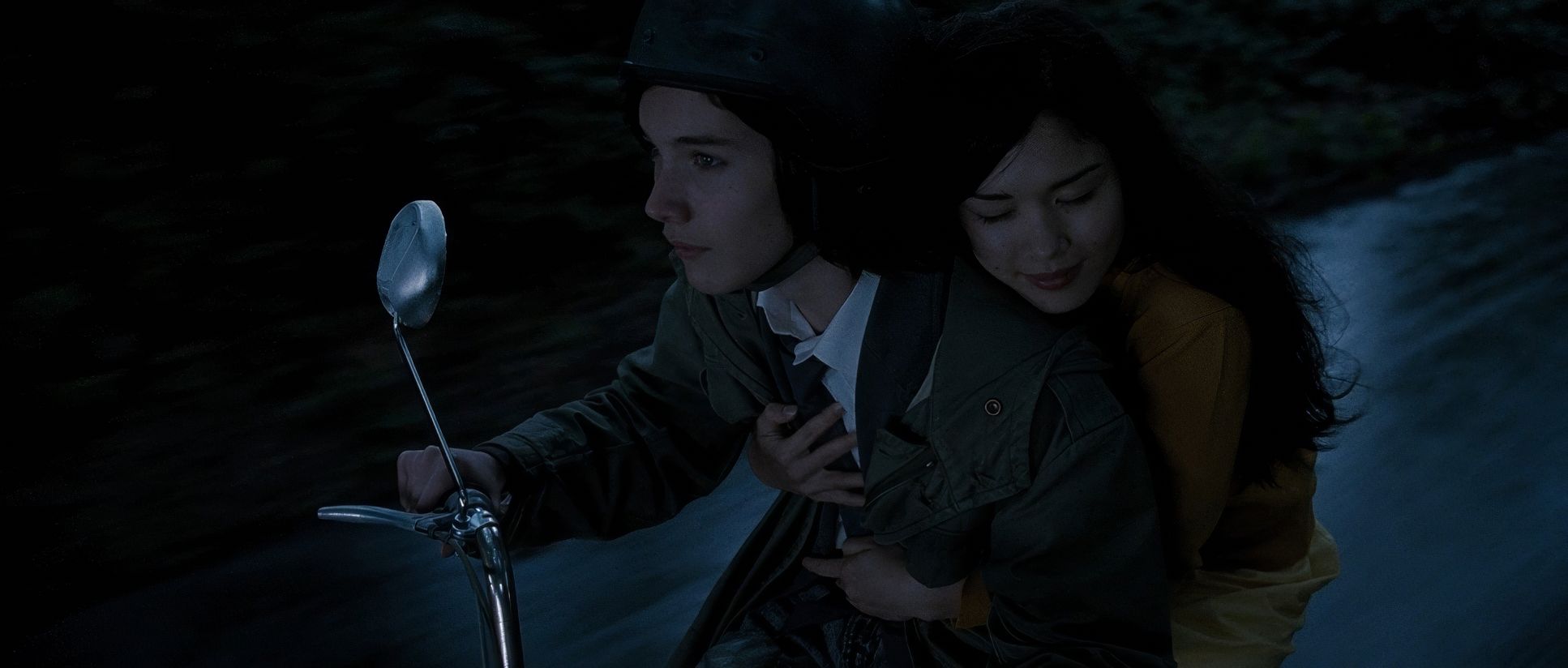
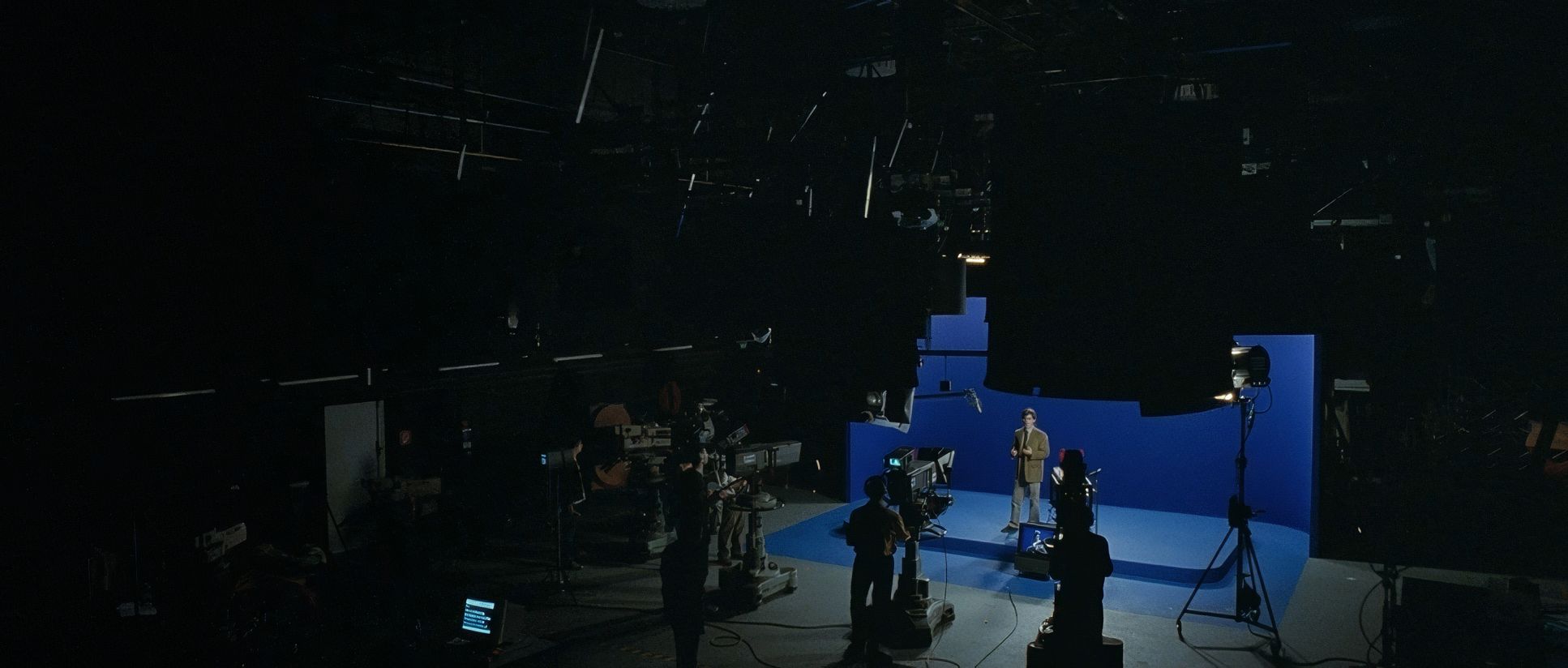
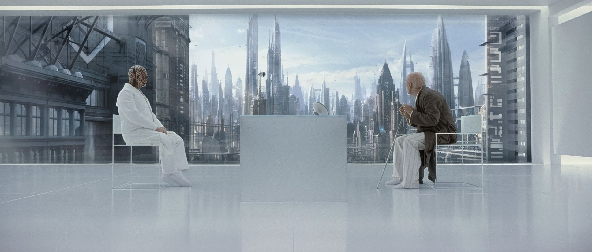
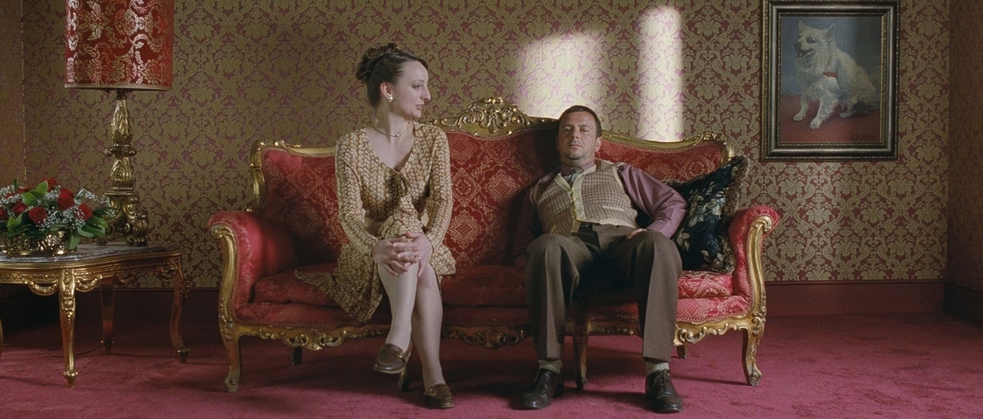
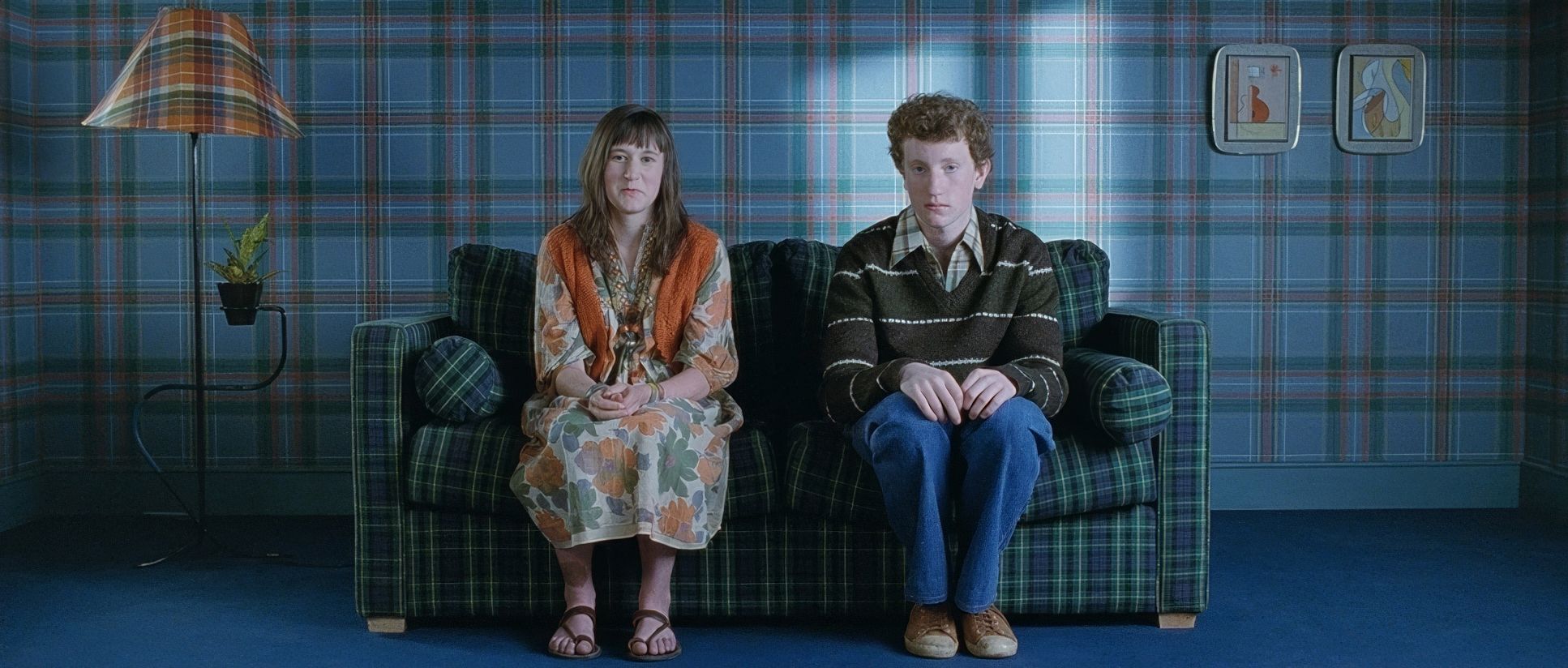
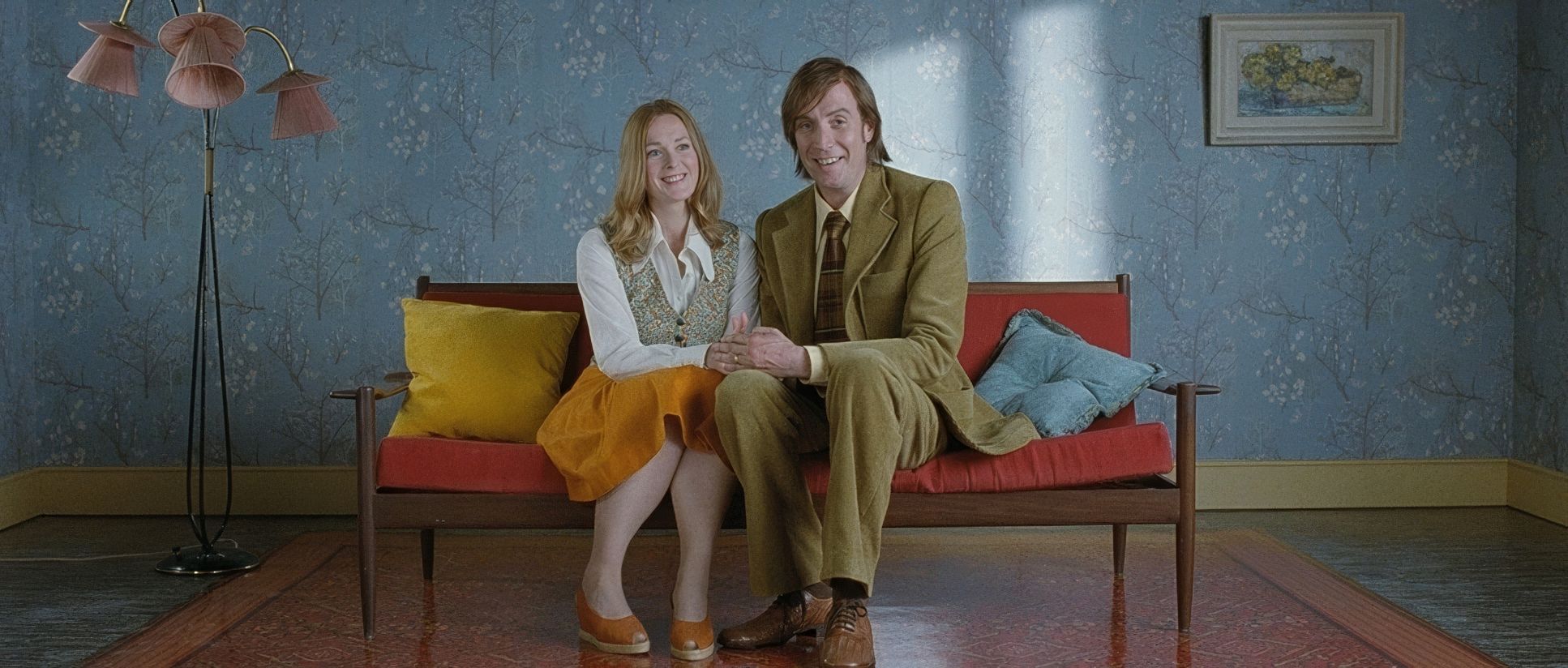
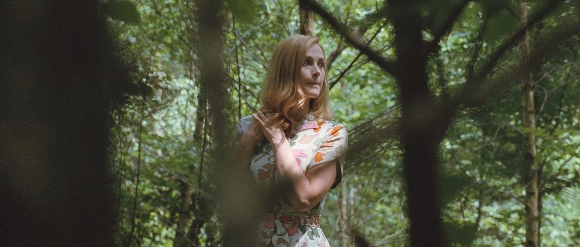
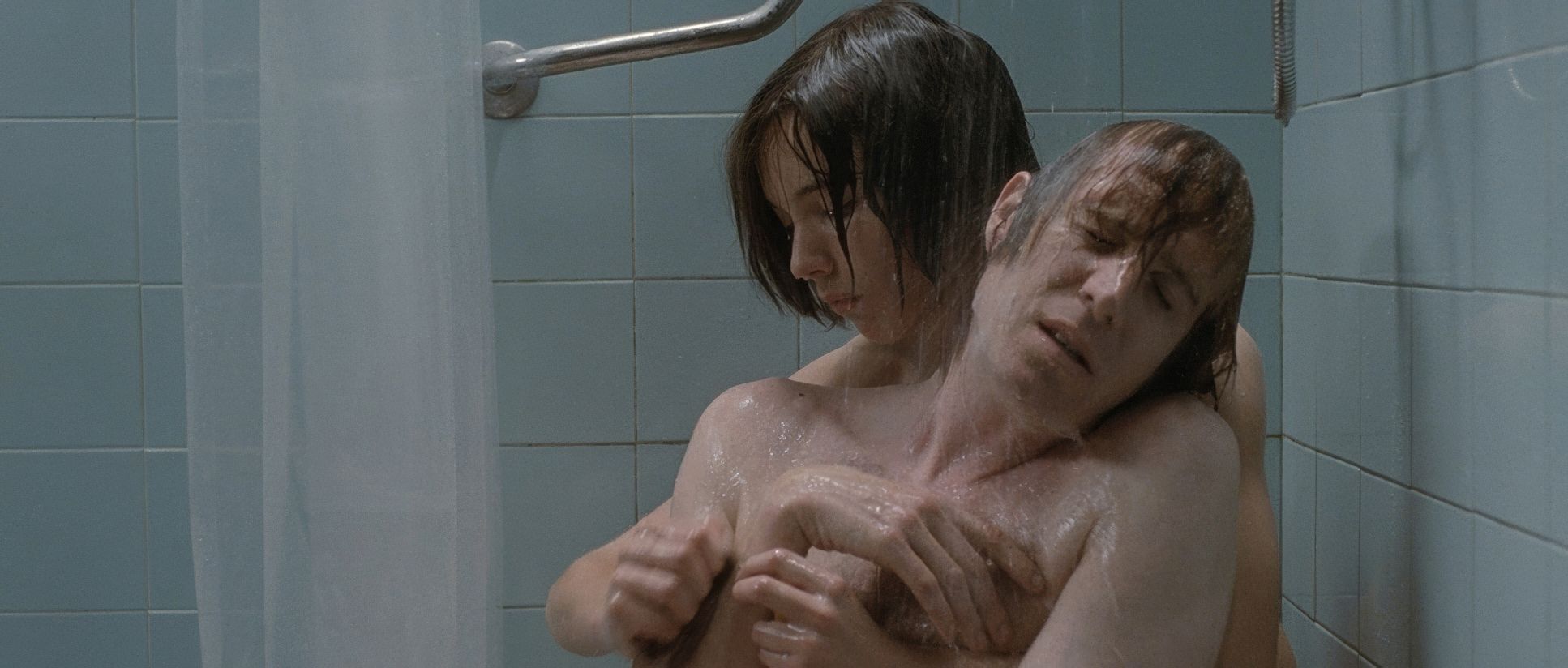
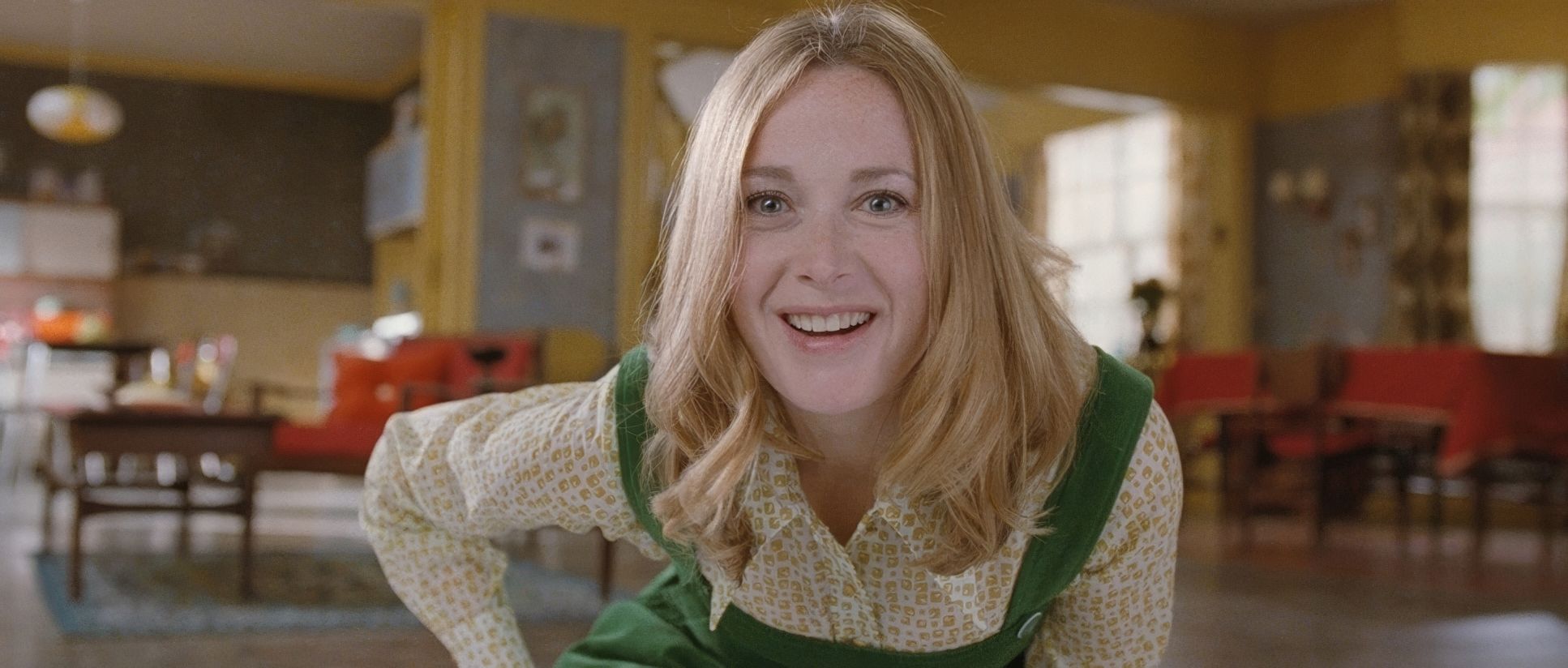
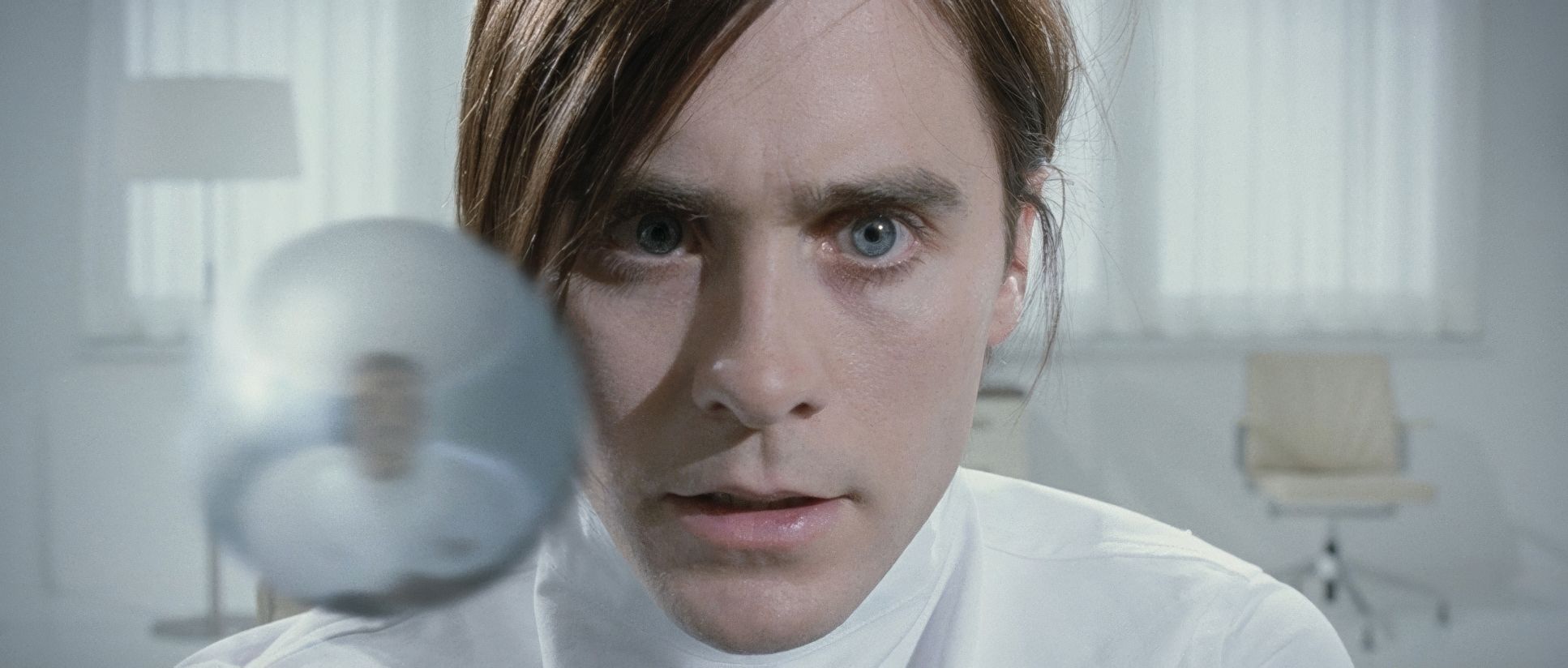
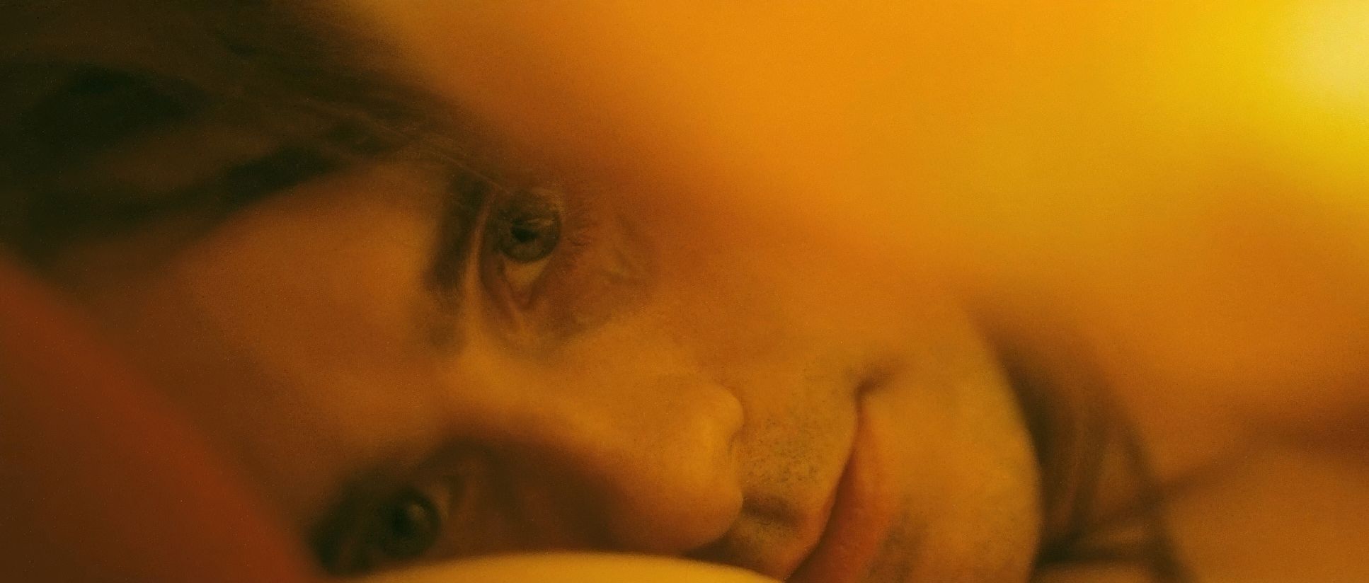
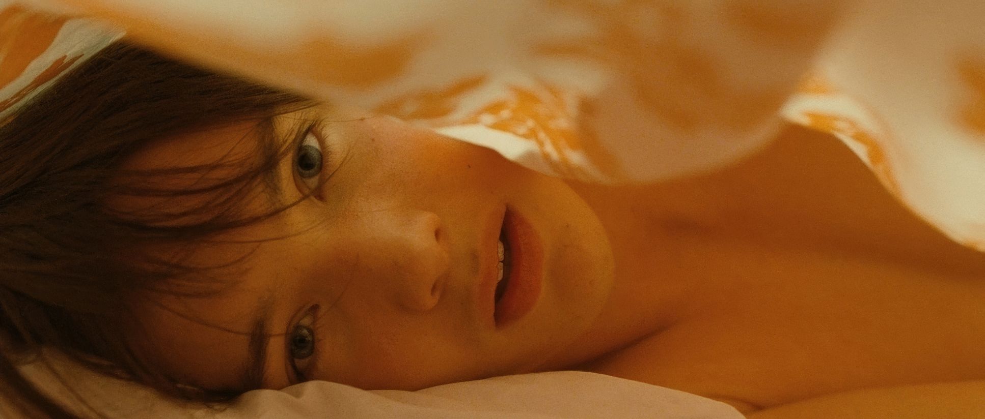
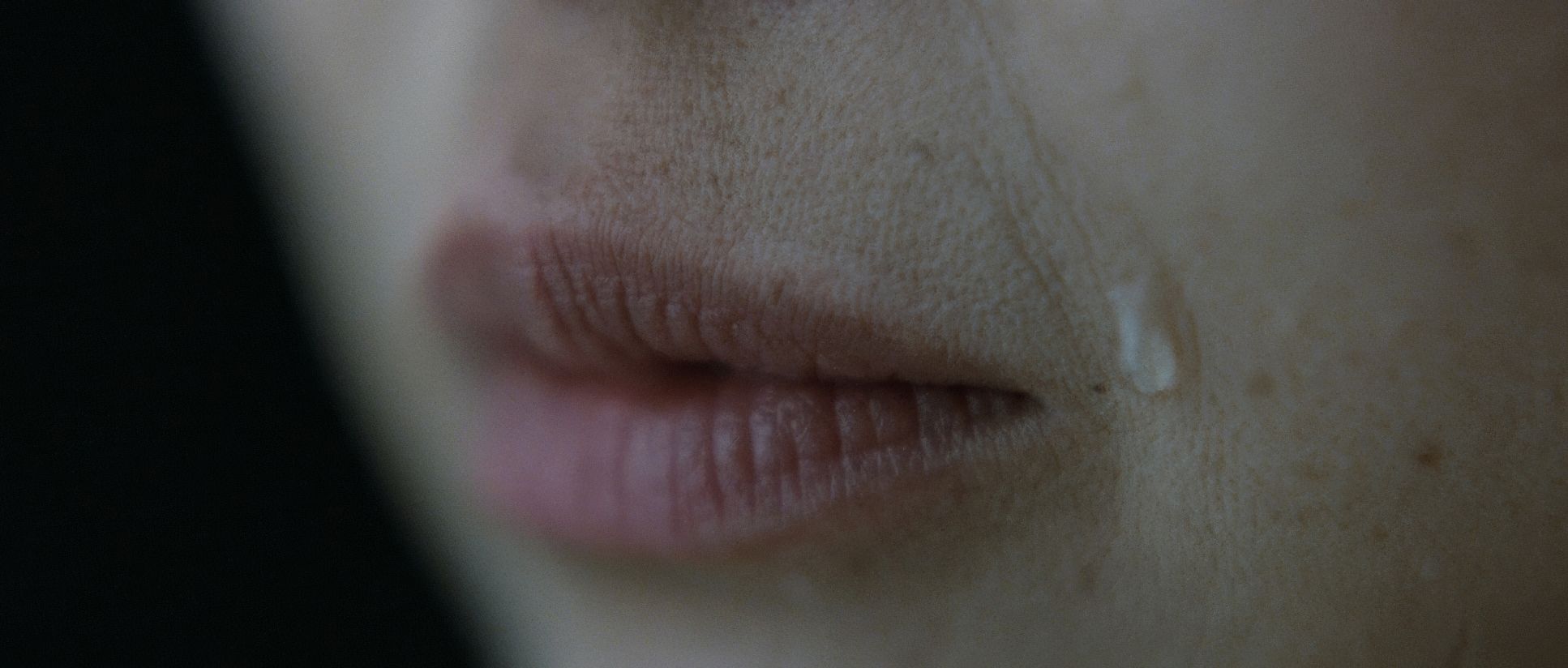
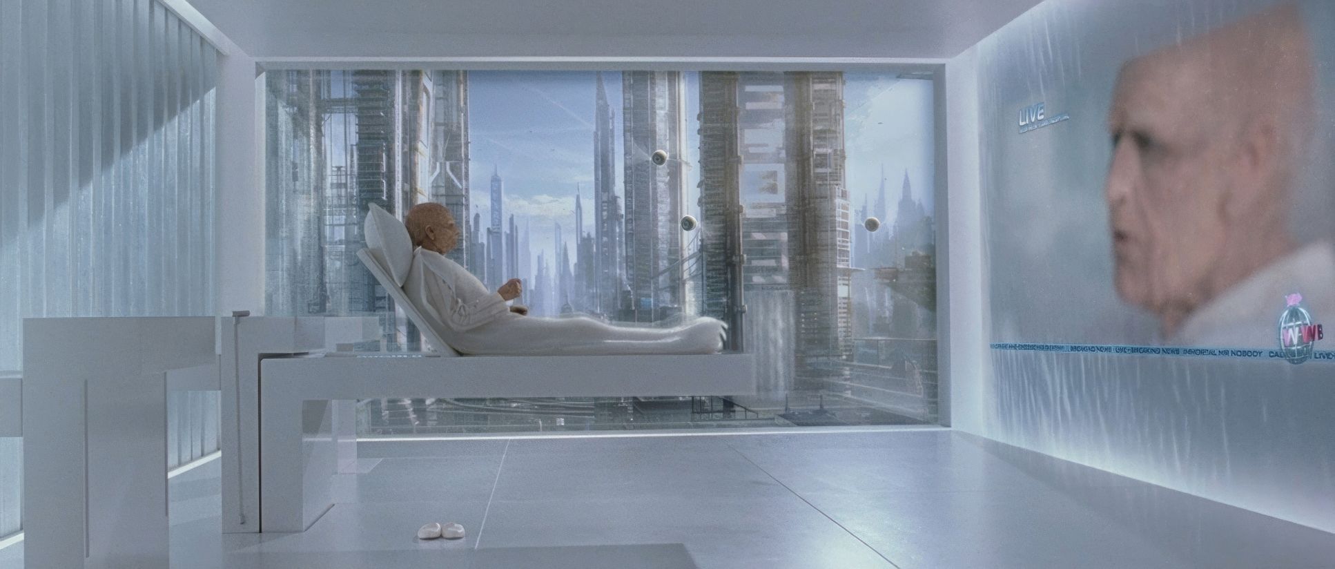
Lighting here is less about an “aesthetic” and more about atmosphere. It’s a masterclass in motivated lighting. The childhood memories are often bathed in warm, soft, diffused light. It’s nostalgic and idyllic. This contrasts sharply with the colder, almost clinical blue cast of his “successful” but unhappy life with Jean. It looks expensive, but it feels sterile. Then you have his life with Elise. As her depression deepens, the lighting leans into desaturated tones and dimmer, isolated practicals that cast long, somber shadows. By the time we reach 2092, the world is lit with a high-tech, sterile glow blue-white sources that feel like a world that conquered death but lost its pulse. Beaucarne isn’t afraid of stark contrast to highlight intensity, or flatter, hazier light to reflect “muddled memories.”
Lensing and Blocking

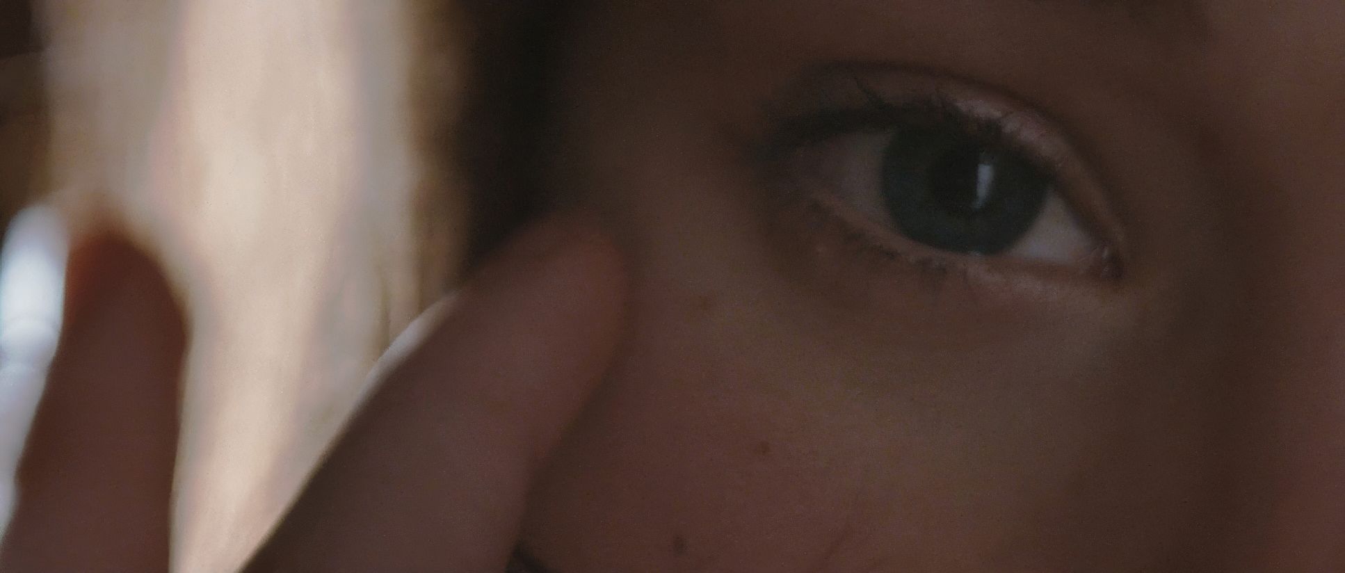
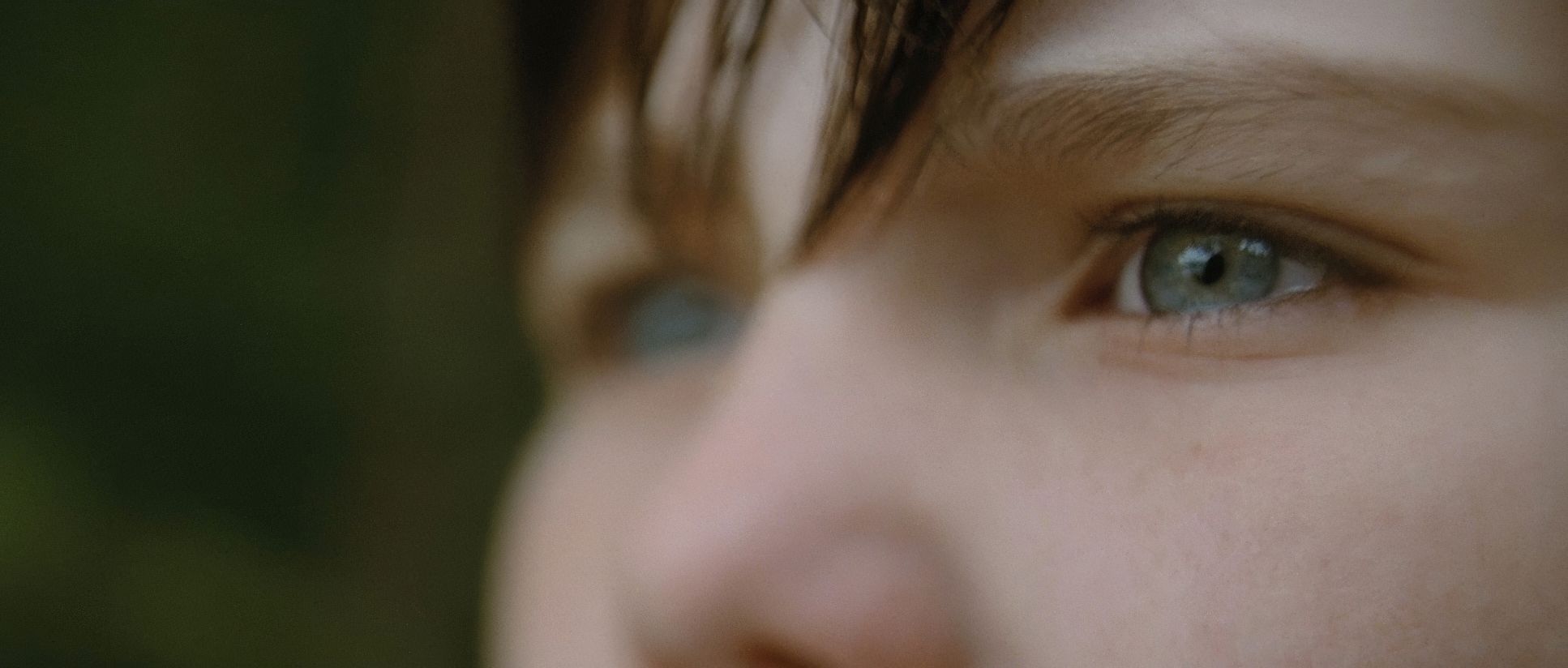
The way Beaucarne uses glass to shape our perspective is brilliant. We see wide-angle lenses in childhood scenes, providing a slight distortion at the edges that reflects a child’s subjective, exaggerated perception. These wider lenses give a sense of infinite space and possibility. On the flip side, telephoto lenses are used to compress depth and isolate characters. This compression can make a room feel claustrophobic, reinforcing the idea that some paths lead to inescapable, paralyzed outcomes. Blocking is just as vital. When Nemo is caught between his parents on the platform, his physical positioning is a powerful visual metaphor. It’s not just actors moving in a space; it’s the physical manifestation of a life-altering dilemma.
Color Grading Approach

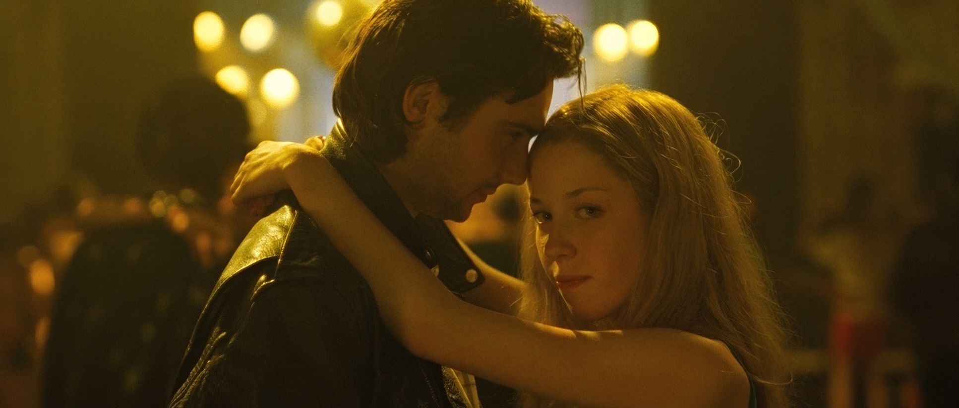
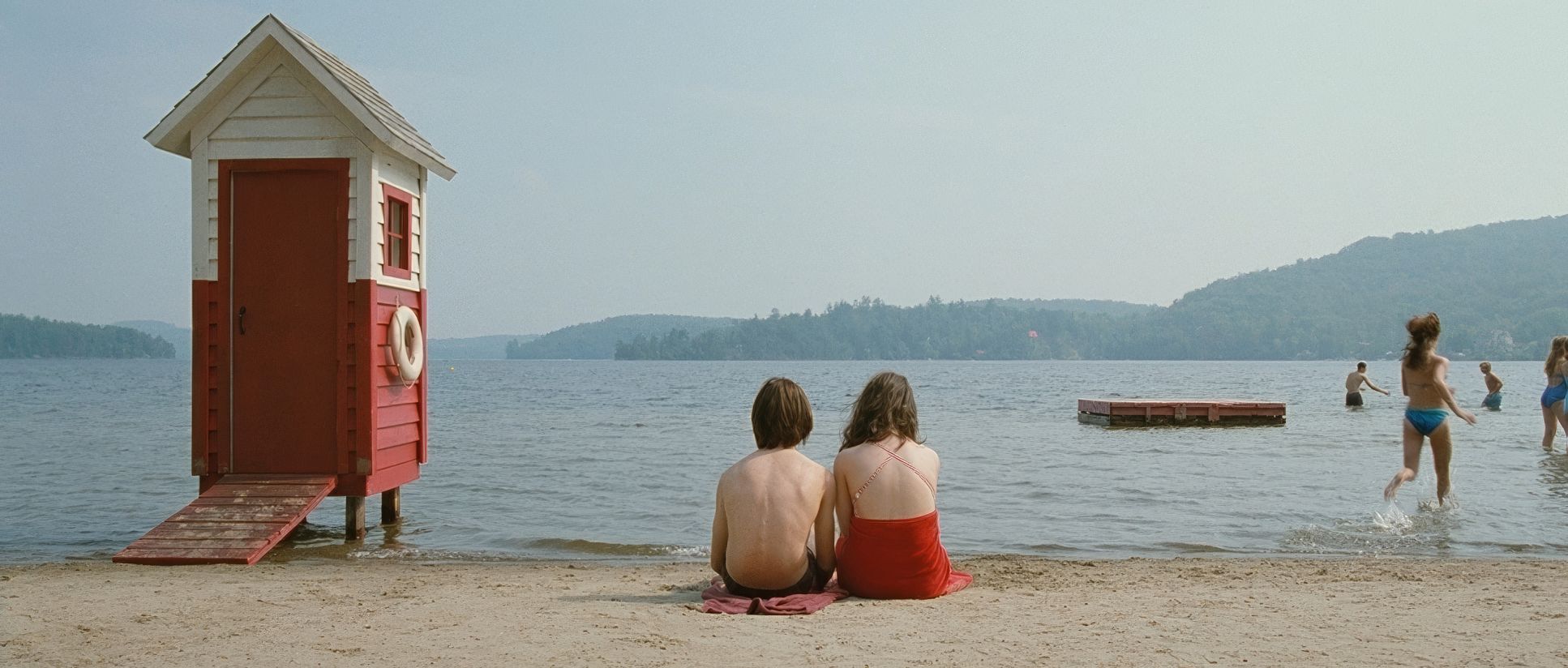
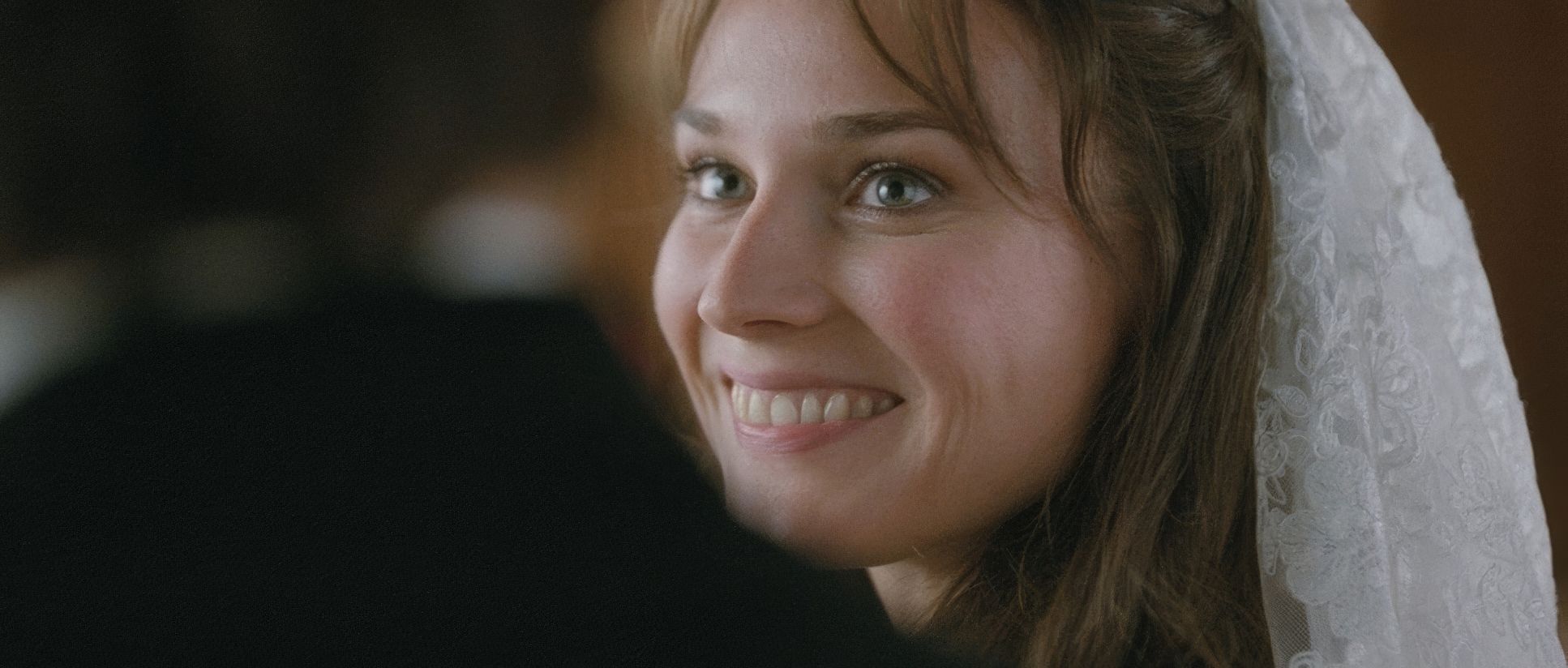
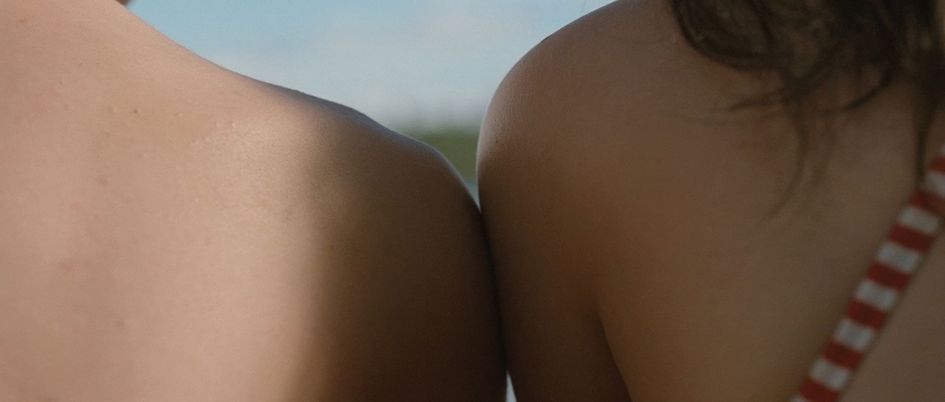
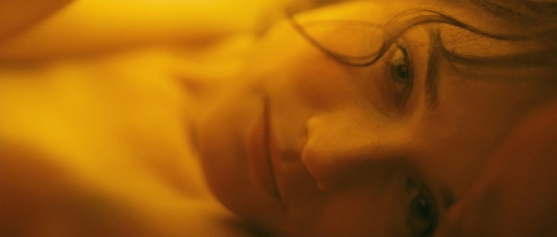
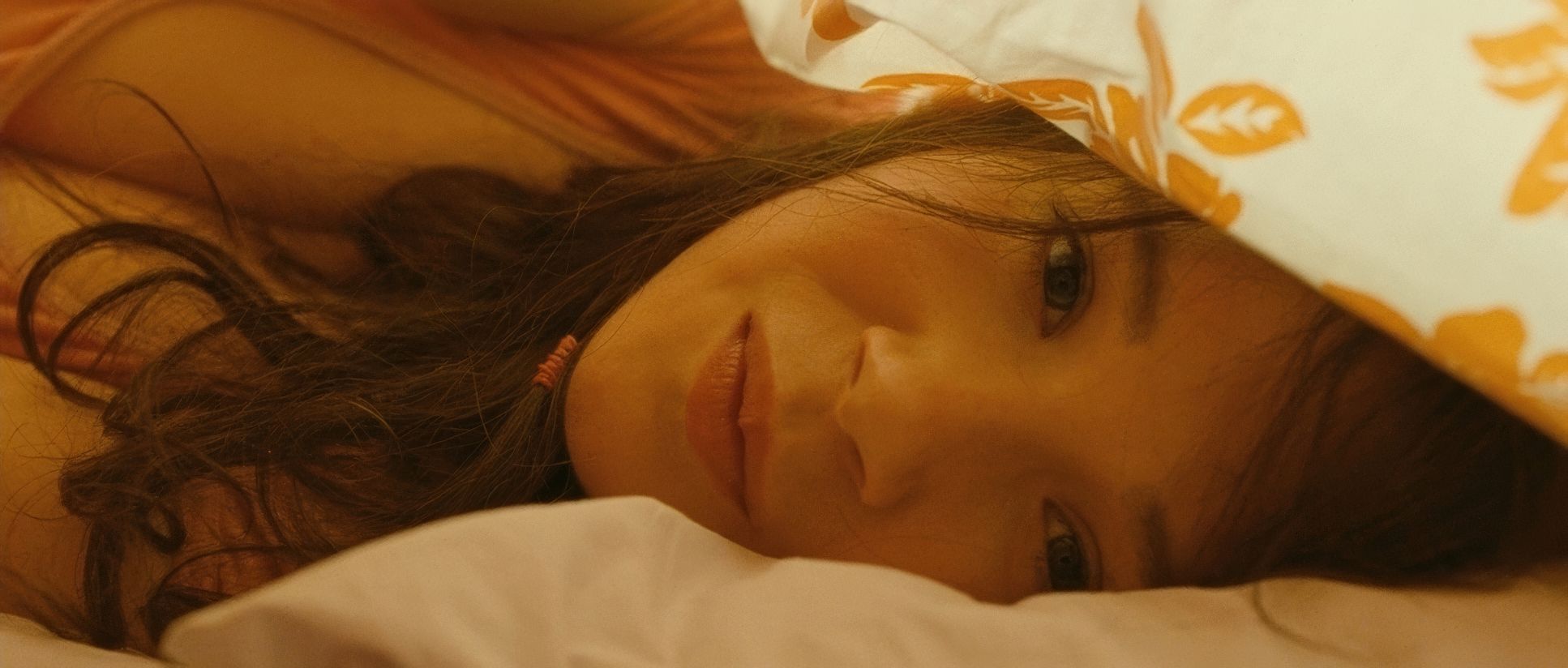
As a colorist, this is where I get really excited. The color in Mr. Nobody is arguably its most powerful narrative tool. It isn’t just about “look” it’s about orientation. The film uses a sophisticated hue separation strategy. The love story with Anna is drenched in warmer, richer tones amber interiors and golden hour light that push into vibrant reds. Contrast that with the cooler, muted blues and greens of his life with Elise. This isn’t just “random stuff on the screen.” It’s a carefully curated visual map.
I also look at the contrast shaping. High-contrast scenes emphasize moments of stark choice, while lower-contrast, softer images evoke the dreamlike haze of the past. The tonal sculpting is exquisite. Shadows are rarely crushed to absolute black; they retain detail, suggesting lingering possibilities. And the highlight roll-off is just beautiful it has that organic, thick film-stock feel I mentioned earlier. It prevents the image from looking digital or harsh. It’s not about clinical accuracy; it’s about emotional resonance. Even the “movie set” world has its own artificial shift, making it feel distinct from the “lived” realities.
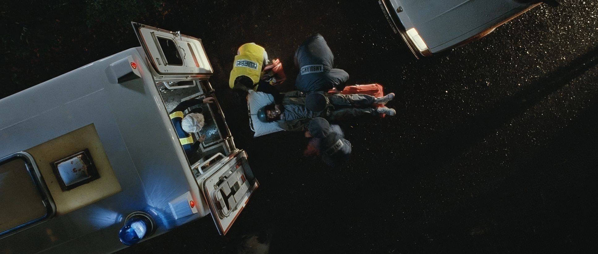
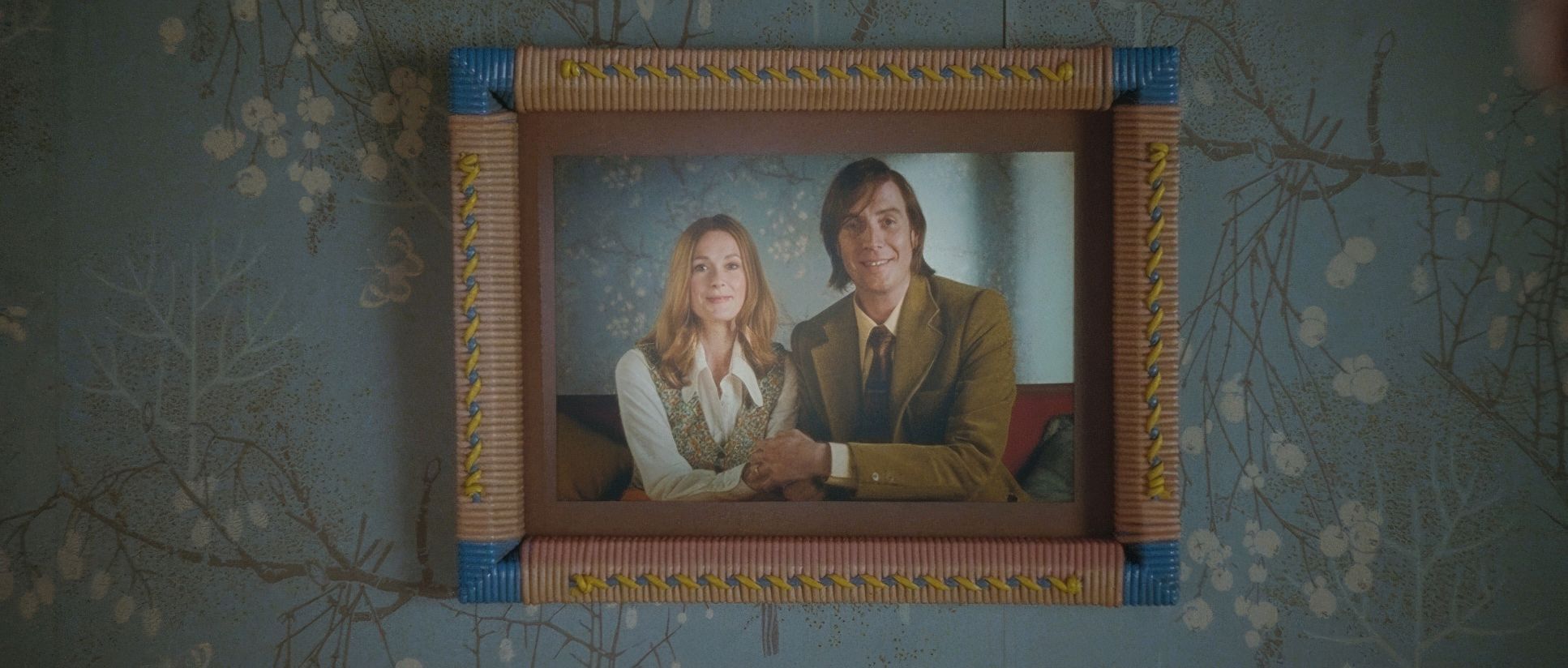
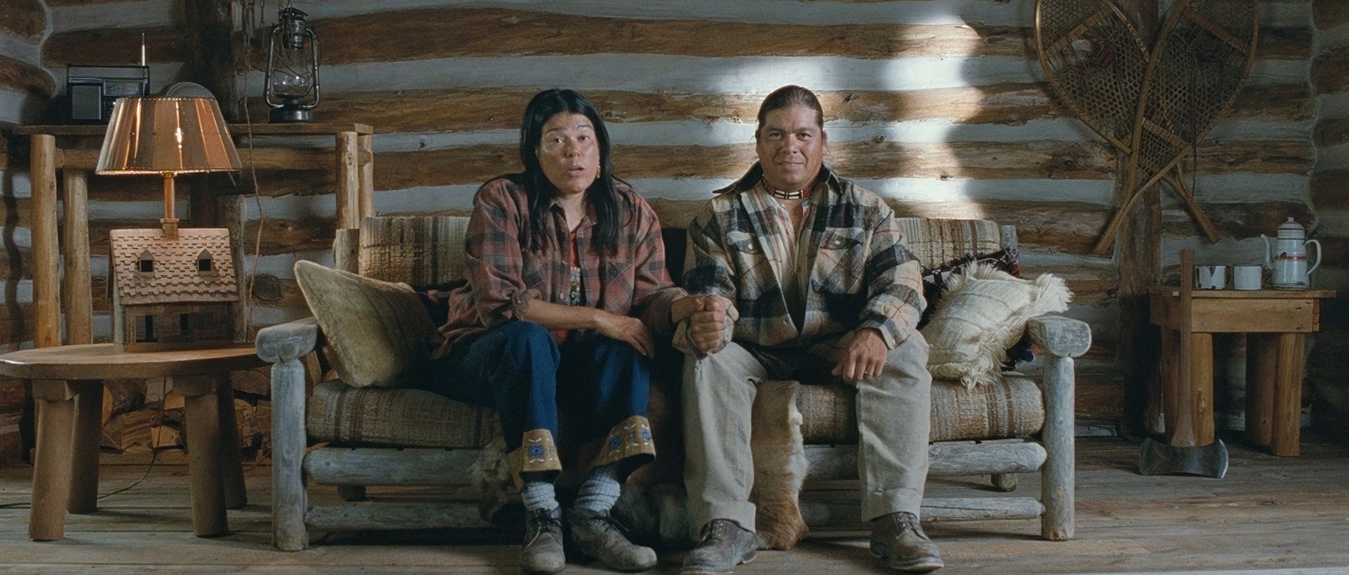
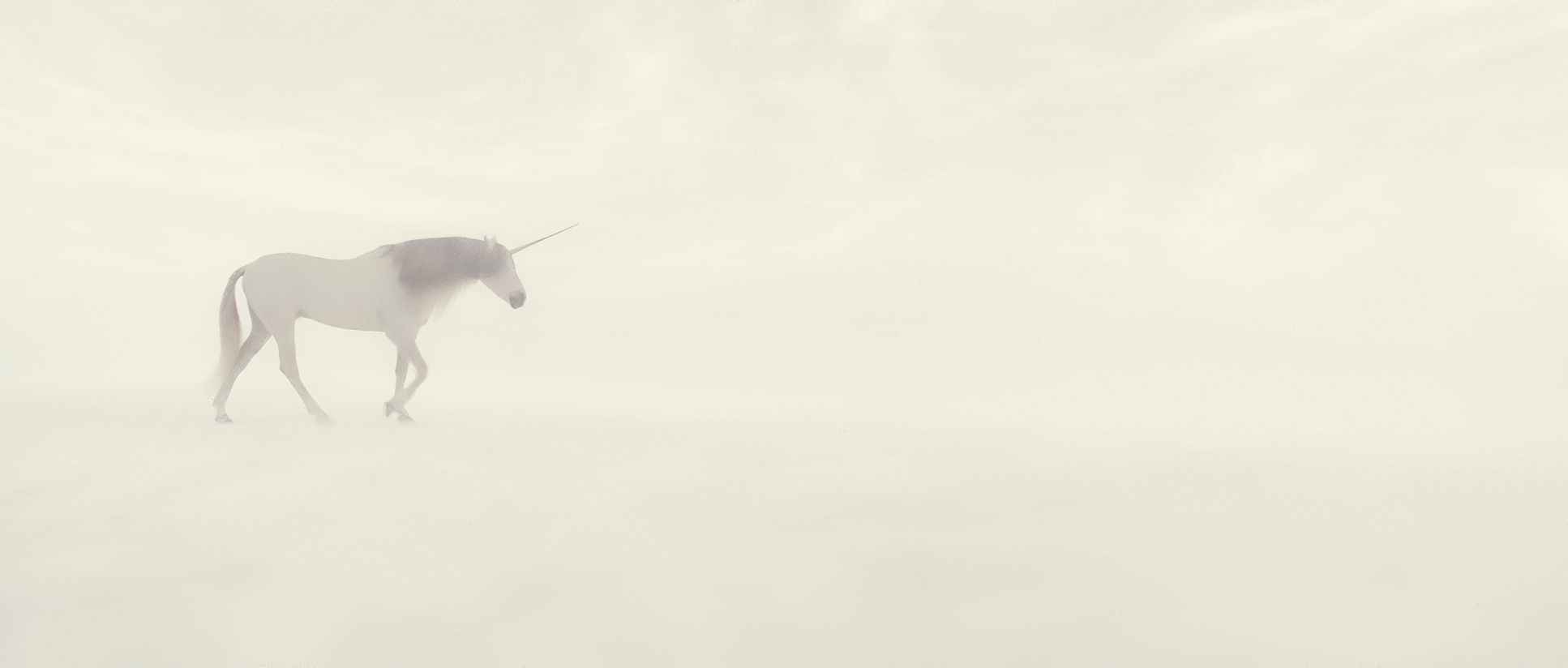
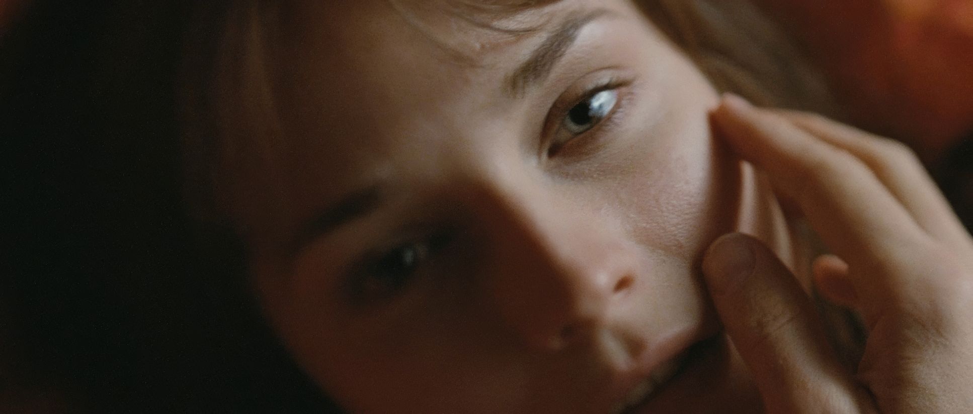
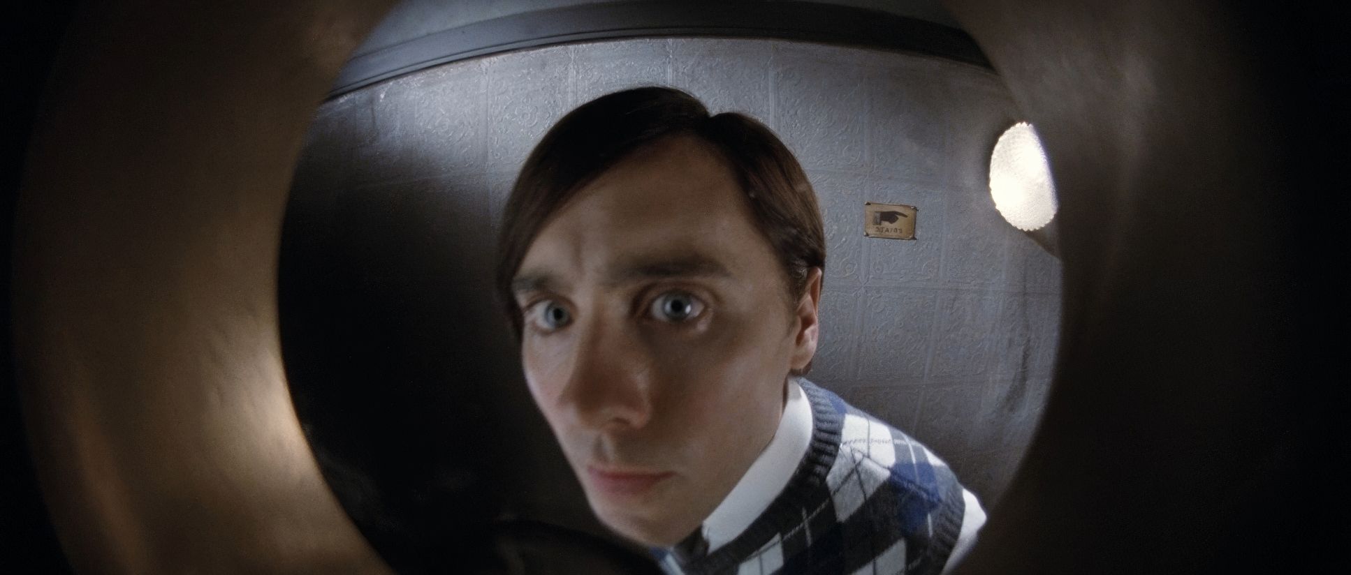
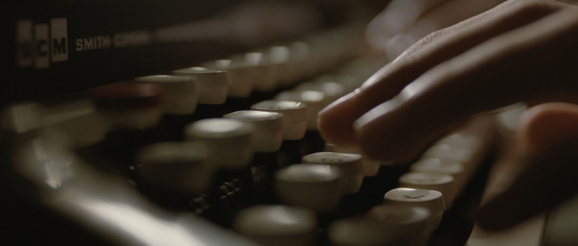
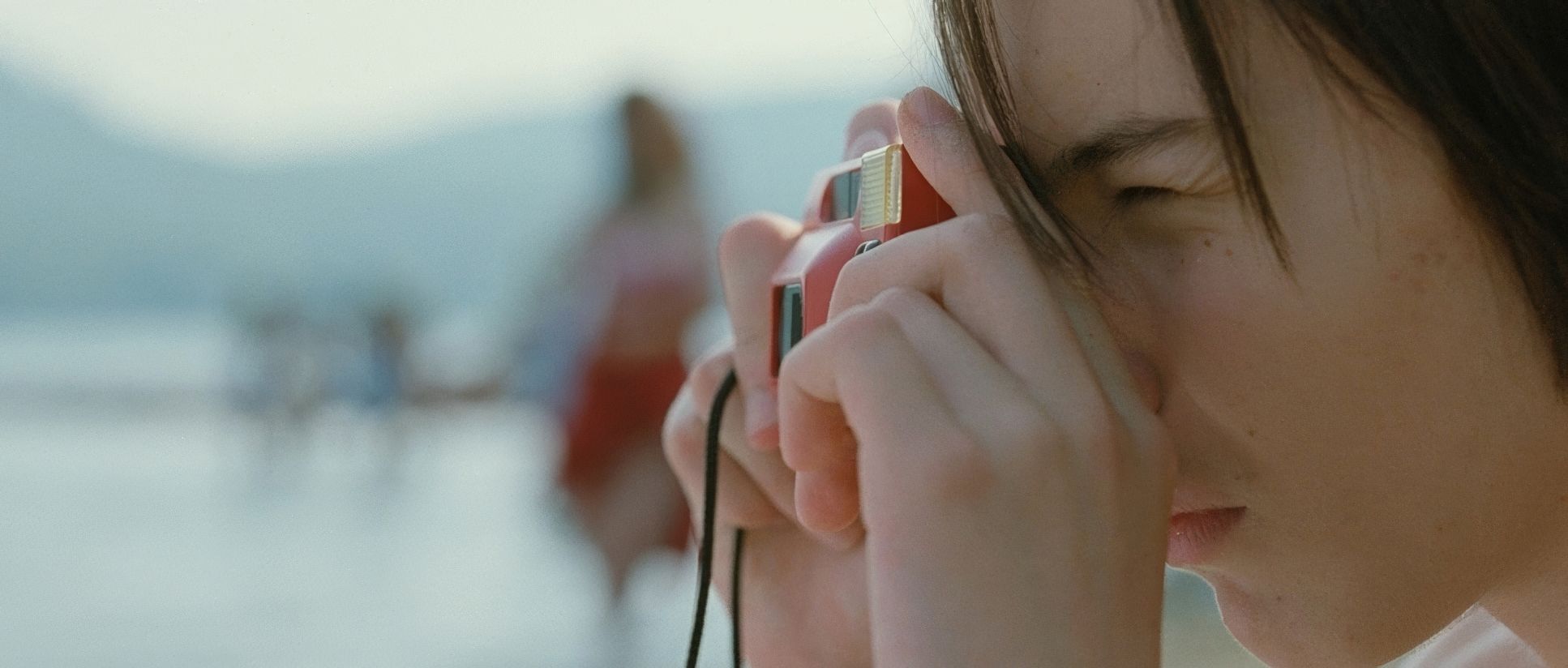
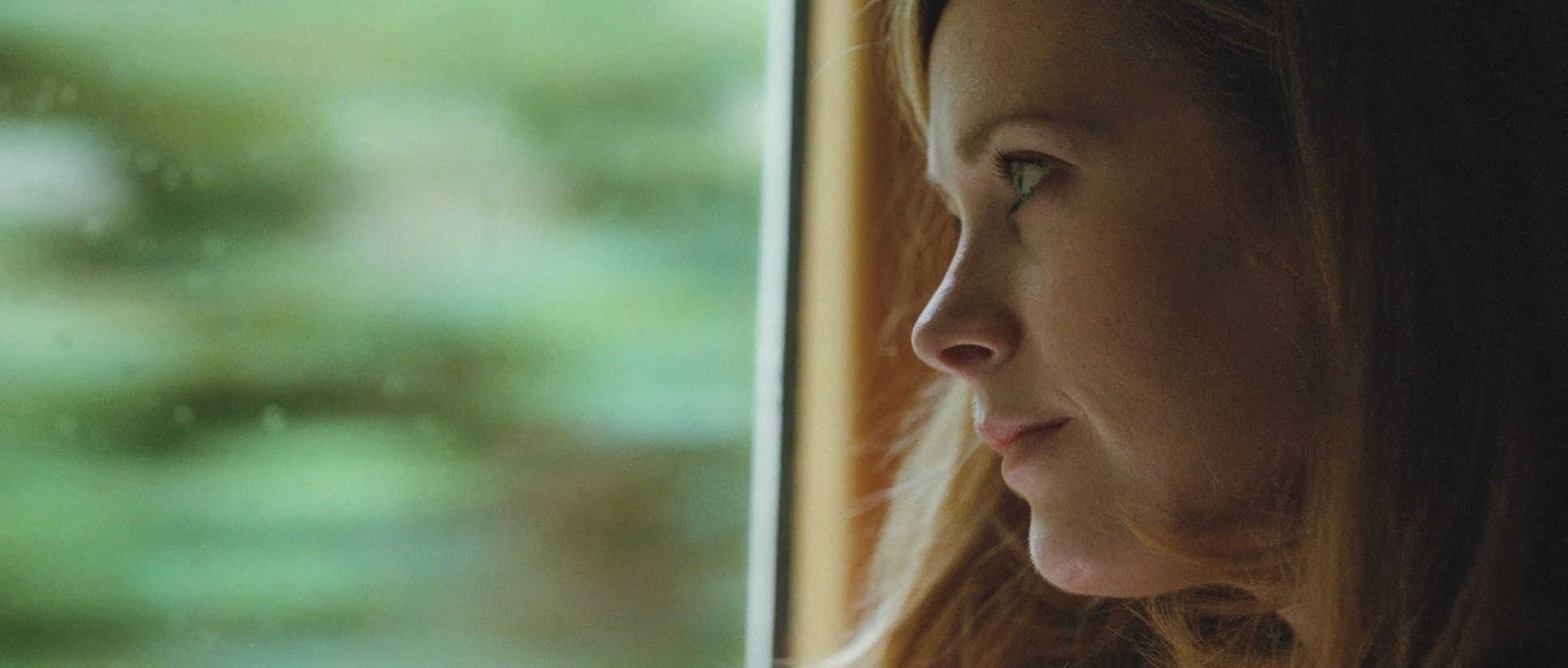
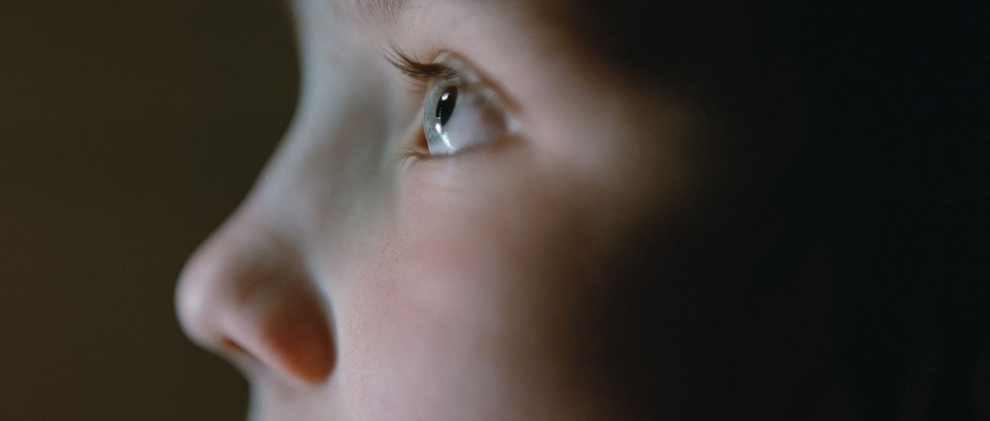
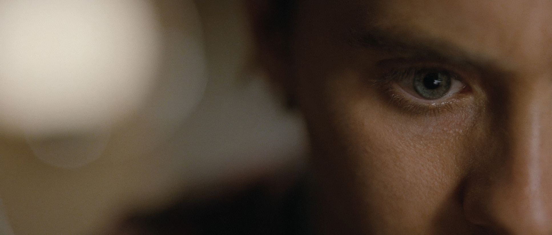
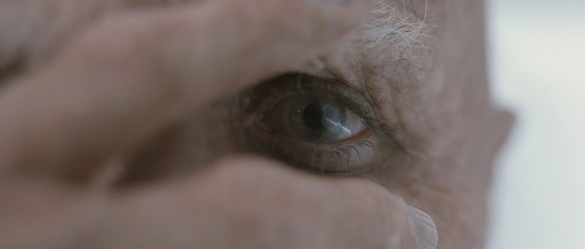
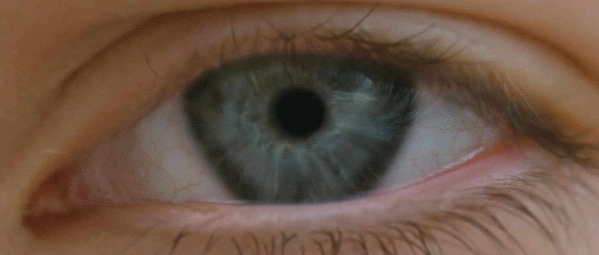
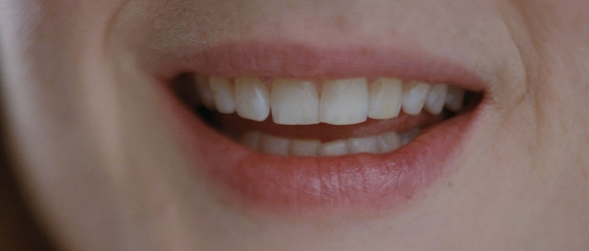
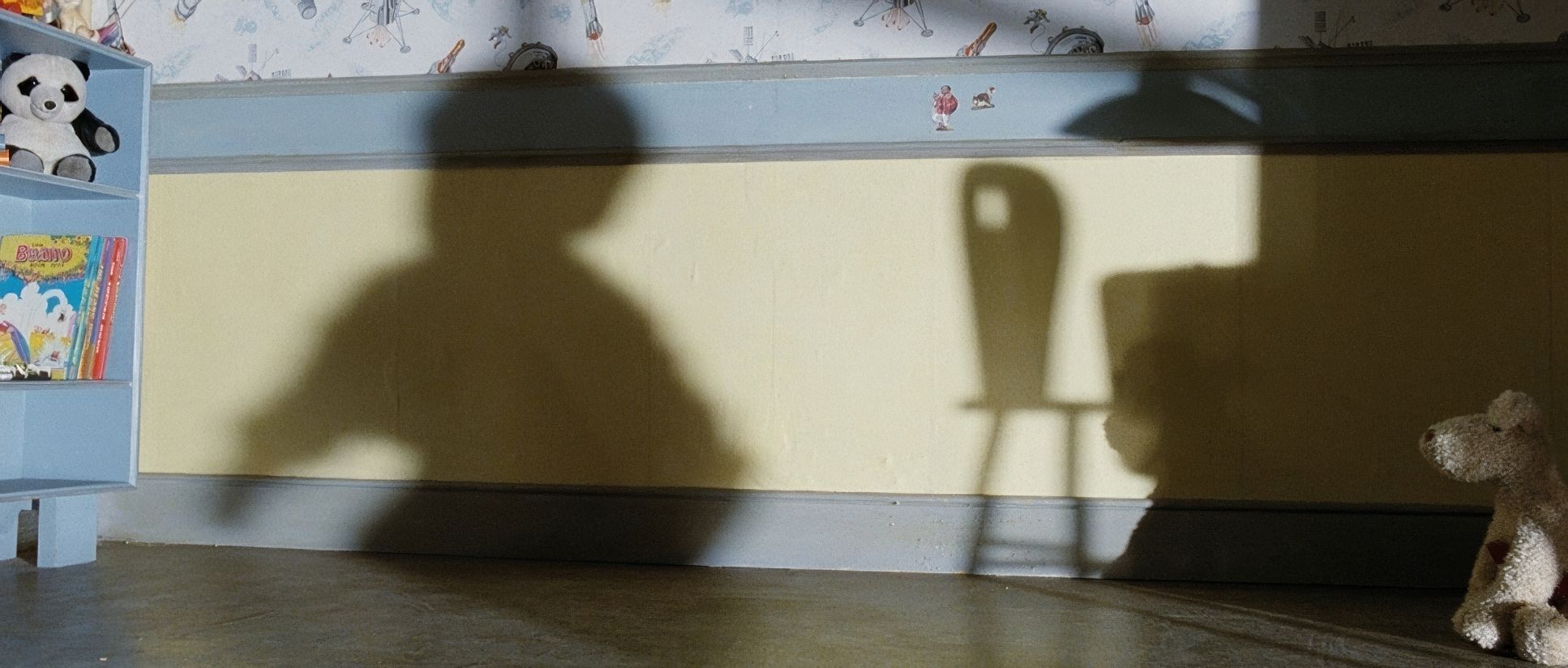
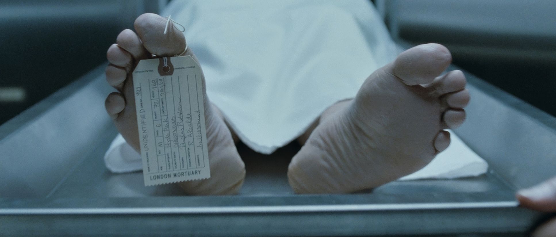
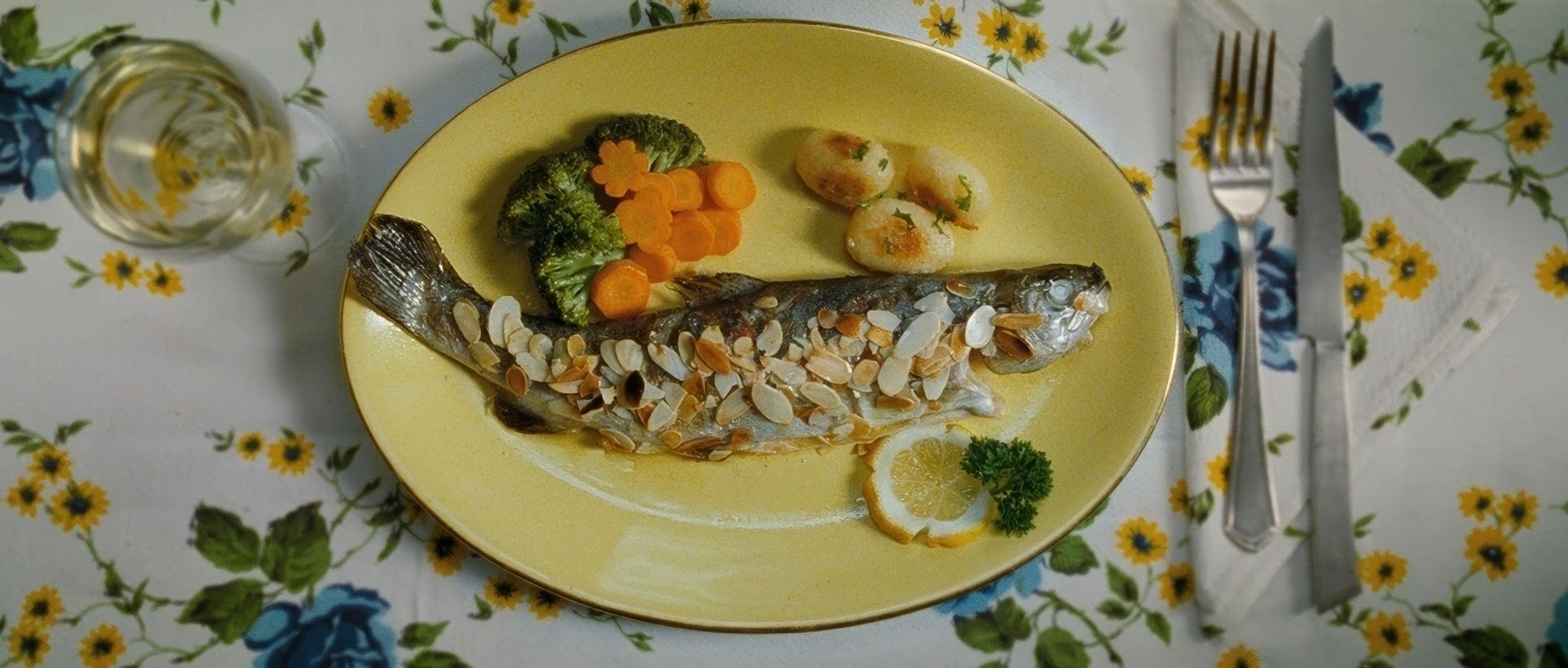
Mr. Nobody (2009) Film Stills
A curated reference archive of cinematography stills from MR. NOBODY (2009). Study the lighting, color grading, and composition.


- Also read: MISERY (1990) – CINEMATOGRAPHY ANALYSIS
- Also read: WHEN HARRY MET SALLY… (1989) – CINEMATOGRAPHY ANALYSIS
Browse Our Cinematography Analysis Glossary
Explore directors, cinematographers, cameras, lenses, lighting styles, genres, and the visual techniques that shape iconic films.
Explore Glossary →