The interesting thing is that Moon (2009) hits all the classic “big corporate” sci-fi notes we saw in Alien or Blade Runner, but it does it on a catering budget. The cinematography isn’t trying to show off. It’s surgical. It’s about making a tiny set feel like a massive, lonely world, reminding me that the gear doesn’t matter nearly as much as the eye behind the viewfinder.
About the Cinematographer
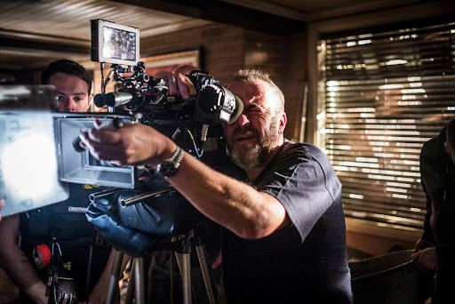
The guy responsible for the look is Gary Shaw. He’s not a “superstar” DP like Deakins, but honestly, what he did here is more impressive in some ways. For a directorial debut, you need a DP who can problem-solve on the fly, and Shaw clearly did that. His approach feels disciplined. He isn’t chasing spectacle; he’s chasing atmosphere. He’s the kind of shooter who understands that a static, quiet shot can sometimes hit way harder than a hundred million dollars of CGI. He laid down a visual language here that still holds up fifteen years later.
Lensing and Blocking
This is where the technical choices get really interesting. Even with a $5 million budget, they chose to shoot on 35mm (Arricam LT and Panavision Millenniums). That’s a bold move. Most low-budget films today would jump straight to digital to save money, but the texture of film is what makes this clinical base feel “real.”
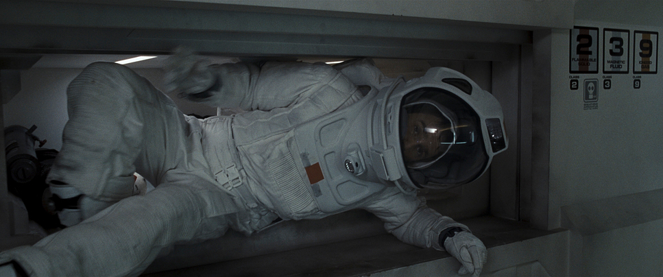
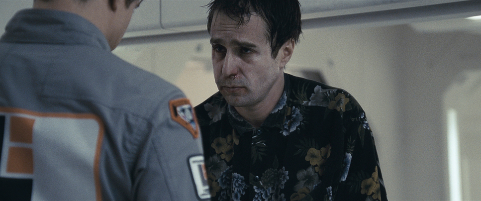
I also noticed a bit of a mix-up in some earlier discussions regarding the glass they actually used Panavision Primo Anamorphics. You can see it in the way the highlights bloom and the subtle distortion at the edges of the frame. Using anamorphics in tight, cramped corridors is a nightmare for focus pullers, but it’s why the movie feels so cinematic. It gives that wide 2.39:1 aspect ratio that makes Sam look even smaller in his environment.
Blocking was the real puzzle here, given Rockwell is playing against himself. They used motion control rigs for some of it, but they were smart about it. Instead of doing complex, sweeping moves when both Sams are on screen, they often kept the camera static or used simple pans. This let them hide the “seams” along the walls or computer consoles. It’s a great reminder that if the acting is as good as Rockwell’s, you don’t need fancy camera tricks to make the audience believe there are two people in the room.
Lighting Style

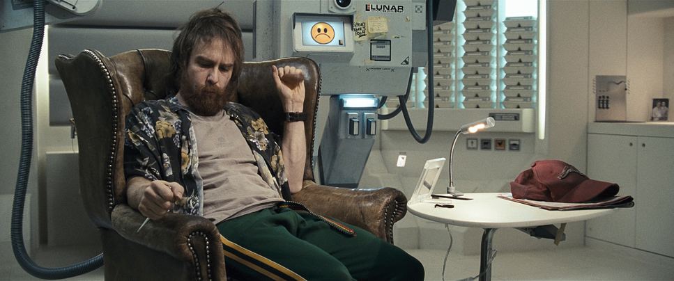
The lighting in Moon is a study in motivated, practical realism. Most of the light in the base comes from the set itself fluorescent banks and glowing screens. It’s cold, clinical, and frankly, a bit depressing, which is exactly the point.
As a colorist, I love the interplay between the Tungsten sources and the overall cool grade. You have these harsh, hard shadows inside the base that make the whole place feel unforgiving. On the lunar surface, it’s even more extreme. Since there’s no atmosphere, the light is incredibly “stiff” deep blacks and searing highlights. Shaw handled the dynamic range beautifully here; the highlights roll off naturally without that ugly digital clipping, which is why shooting on 35mm was the right call. It keeps the “bleak future” feeling grounded rather than looking like a video game.
Compositional Choices
Composition-wise, Jones and Shaw are obsessed with trapping Sam. We see him framed by doorways, through glass, or tucked into the corner of a wide shot. There’s a lot of “negative space” here big, empty areas of the frame that emphasize that there is nobody else coming to help him.
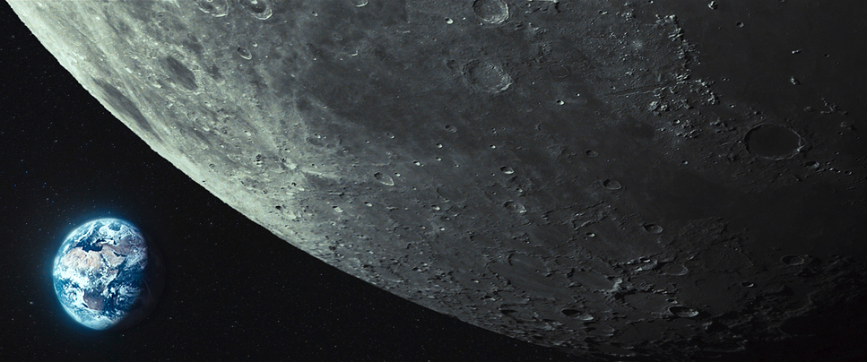
They use a lot of symmetry, which usually feels peaceful, but here it feels oppressive. It’s too perfect, too corporate. As Sam’s mental state starts to crack, the compositions get a bit more claustrophobic. My favorite recurring shot is Sam looking out the window at Earth. The framing makes the Earth look like a tiny, unreachable marble. It’s a simple visual metaphor, but it works every single time.
Color Grading Approach
This is my favorite part to dissect. The palette is intentionally suppressed lots of cyans, grays, and sterile whites. It’s a “dishonest” environment, so the colors feel muted.
When I look at the grade, I see a very specific approach to contrast. The mid-tones are compressed to keep that moody, melancholic feel, but the whites are kept clean. It would have been easy to just “wash” the whole thing in blue, but they didn’t. They kept the skin tones legible, even in that cold light.
The use of “hue separation” is minimal but effective. The only time we really see warmth is when Sam is watching video messages from home or looking at GERTY’s little yellow emoticons. Those small splashes of color act as emotional anchors. To me, it feels like a very “honest” grade it isn’t trying to hide anything with a heavy stylized LUT; it’s just enhancing the loneliness that’s already there in the RAW footage.
Inspiration Behind the Cinematography
You can clearly feel the “Old Guard” of sci-fi in Moon’s DNA. It’s a direct descendant of 2001: A Space Odyssey in its pacing and those sterile, monastic interiors. But there’s also a grittiness that reminds me of Alien. It’s that “lived-in” tech look the machines look greasy and used, not shiny and new.
The “solo conglomerate” theme is visually reinforced by the brutalist design of the base. It feels like a place built by accountants, not architects. The inspiration here isn’t just about “looking cool”; it’s about using an established visual language to tell the audience, “This corporation doesn’t care about this man.” It grounds the sci-fi in a reality that feels almost like a documentary.
Camera Movements
Finally, the movement. Or rather, the lack of it. The camera in Moon is incredibly disciplined. It doesn’t move unless it has to. We get these slow, rhythmic pans and dollies that mirror Sam’s boring, repetitive daily routine.
When things start to go wrong, the camera doesn’t suddenly go into a “shaky-cam” frenzy. Instead, the movements just feel a bit more detached, like an unseen observer watching Sam unravel. There are a few moments of handheld work during his hallucinations, but they’re used sparingly. This restraint is what makes the movie feel so heavy. It forces you to sit in the room with him and feel the silence.
Technical Aspects & Tools
Moon (2009) | Technical Specifications
| Genre | Drama, Lo-Fi Sci-Fi |
| Director | Duncan Jones |
| Cinematographer | Gary Shaw |
| Production Designer | Tony Noble |
| Costume Designer | Jane Petrie |
| Editor | Nicolas Gaster |
| Colorist | Tim Waller |
| Time Period | Future |
| Color | Cool, Cyan, Blue |
| Aspect Ratio | 2.39 – Spherical |
| Format | Film – 35mm |
| Lighting | Top light, Side light |
| Lighting Type | Artificial light, Tungsten |
| Story Location | … Space |
| Filming Location | … Surrey > Shepperton Studios |
| Camera | Arricam LT, Panavision Millennium / Millenium XL / XL2 |
| Lens | Panavision Primo Anamorphics |
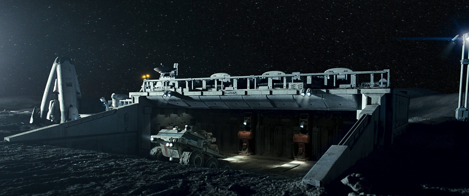
What’s wild is that about 80% of this was practical. They built the Moon Station set at Shepperton Studios, and you can tell. There’s a tangibility to it that CGI just can’t replicate. When Sam touches a wall, it doesn’t feel like a green screen; it feels like cold metal.
The use of miniatures for the exterior lunar rovers was a stroke of genius. Miniatures have a specific weight and way of reflecting light that sells the scale much better than cheap 2009-era CGI would have. By blending these physical models with 35mm film grain, they created a world that feels completely seamless. It’s proof that creative solutions and smart “old-school” tricks will always beat a massive budget.
- Also read: HOW TO TRAIN YOUR DRAGON 2 (2014) – CINEMATOGRAPHY ANALYSIS & STILLS
- Also read: THE FIGHTER (2010) – CINEMATOGRAPHY ANALYSIS
Browse Our Cinematography Analysis Glossary
Explore directors, cinematographers, cameras, lenses, lighting styles, genres, and the visual techniques that shape iconic films.
Explore Glossary →