Every so often, a film comes along that completely rewires your expectations of how a narrative can be told visually. For me, Xavier Dolan’s Mommy (2014) is the benchmark for that kind of “visceral” filmmaking.
It’s an undeniable masterpiece, but more importantly, it’s a raw explosion of emotion. When I first saw it, I was struck by how André Turpin’s cinematography felt both jarring and incredibly intimate. It’s the kind of movie that leaves an indelible mark. Dolan who somehow churned out five features by his mid-twenties isn’t just a prolific director; he’s a visual poet who understands the tectonic connection between frame, light, and feeling.
About the Cinematographer

While Xavier Dolan is the visionary behind this semi-autobiographical story, the lens through which we experience this world belongs to André Turpin. Turpin is a seasoned Canadian cinematographer, and his collaboration with Dolan is clearly built on a deep artistic trust.
It’s fascinating to look back at Dolan’s early work, like I Killed My Mother, and see his innate love for the close-up. That preference was always geared toward portraying characters who are unable to share the same physical or emotional space. When you have a director with such a defined visual voice, the DP’s role becomes one of exquisite interpretation. Turpin nails this, translating Dolan’s ambitious ideas into a tangible reality that feels like an organic extension of the characters’ inner lives rather than just “pretty pictures.”
Technical Aspects & Tools
Mommy (2014)
35mm Negative • 1:1 Aspect Ratio • Zeiss Master Primes
I have to correct a common assumption here: Mommy wasn’t a digital production. To get that specific texture, Turpin and Dolan opted for 35mm film, shooting on the Arricam LT and the Arriflex 235. Using the 235 was a smart move it’s a small, lightweight “MOS” camera that’s perfect for the kind of handheld, erratic energy this film demands.
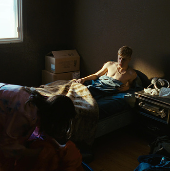
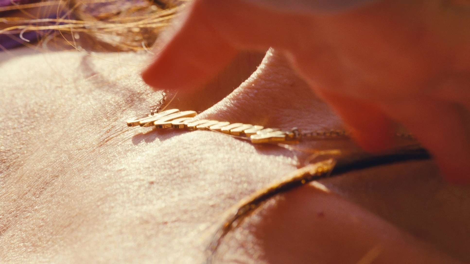
They ran Kodak Vision3 500T (5219/7219), which is essentially the gold standard for high-speed film stock. As a colorist, I can see why. The 500T has this incredible latitude and a specific grain structure that handles the “kitsch” interior shadows of Die’s apartment beautifully. They weren’t just cropping a digital sensor to get that 1:1 aspect ratio; they were framing for it on a chemical negative. This required planning every shot immaculately. You can’t just “fix” a 1:1 composition in post if you didn’t see it on the day; the headroom and lead room would be a mess.
Inspiration Behind the Cinematography
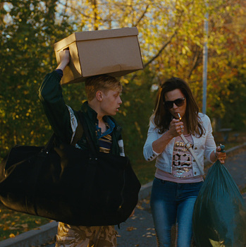
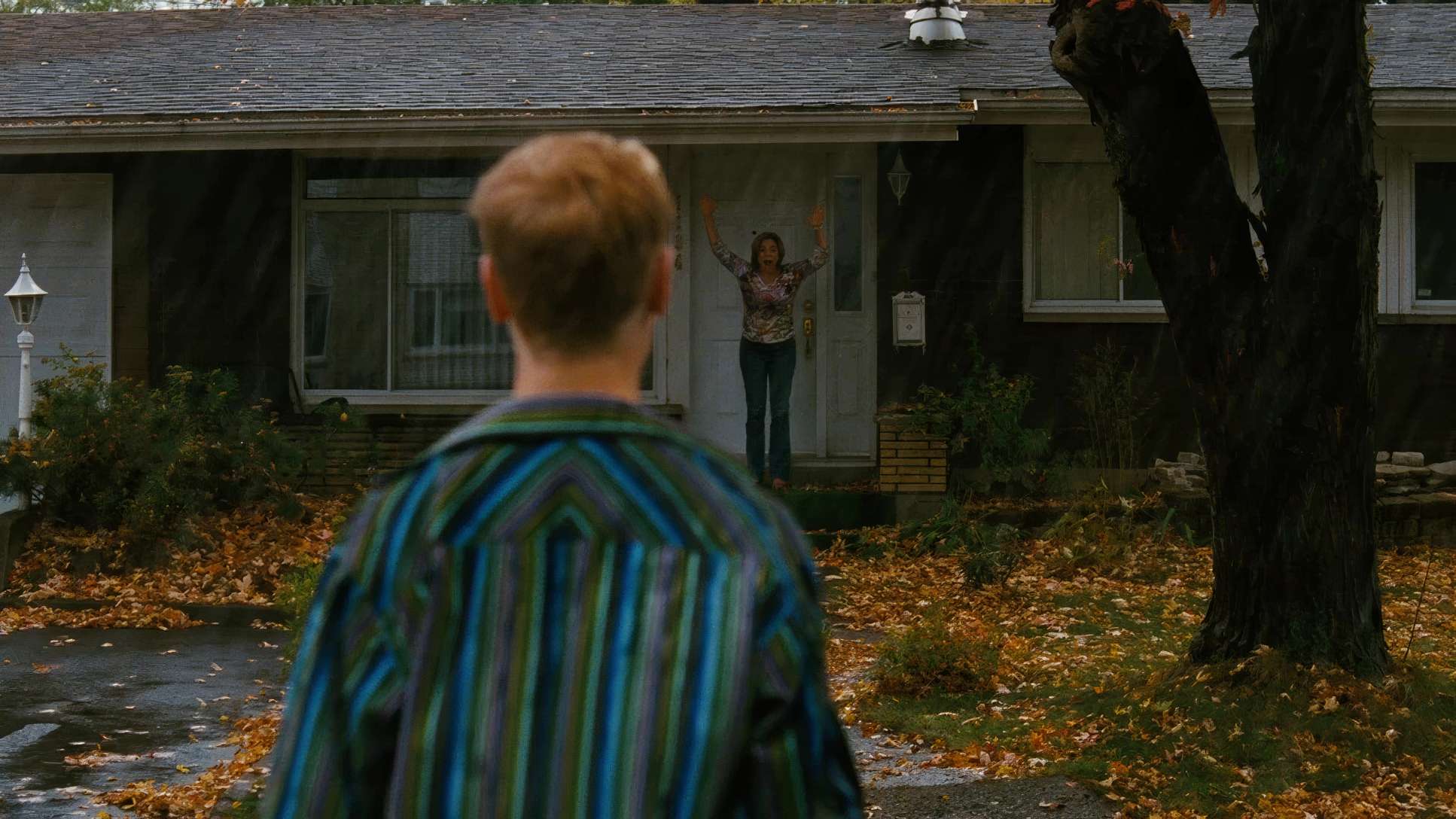
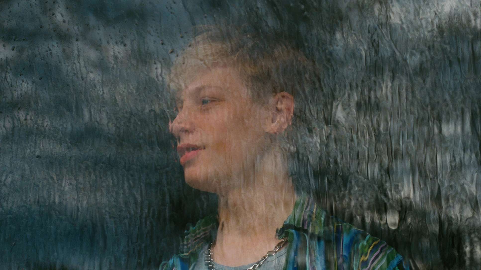
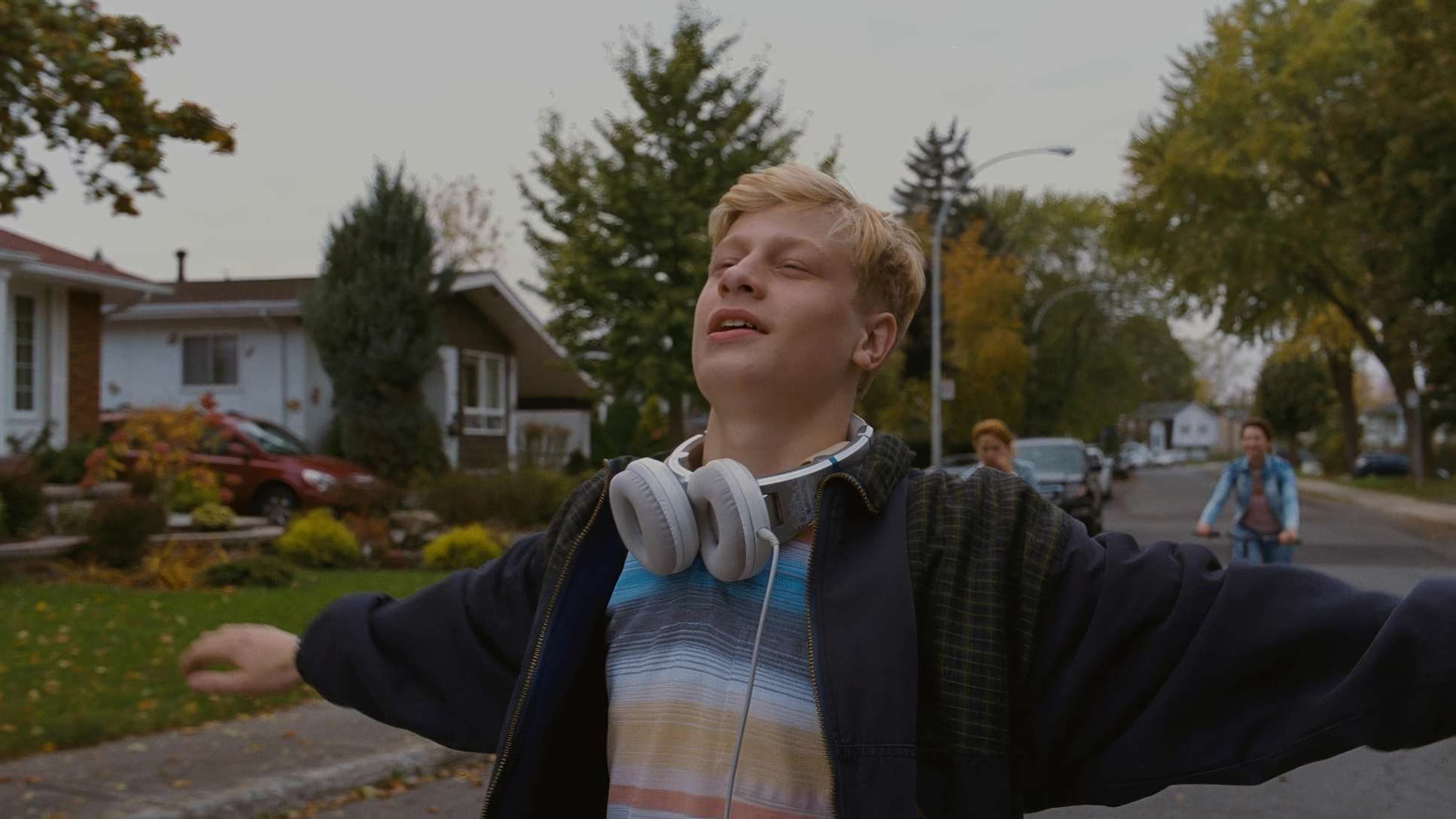
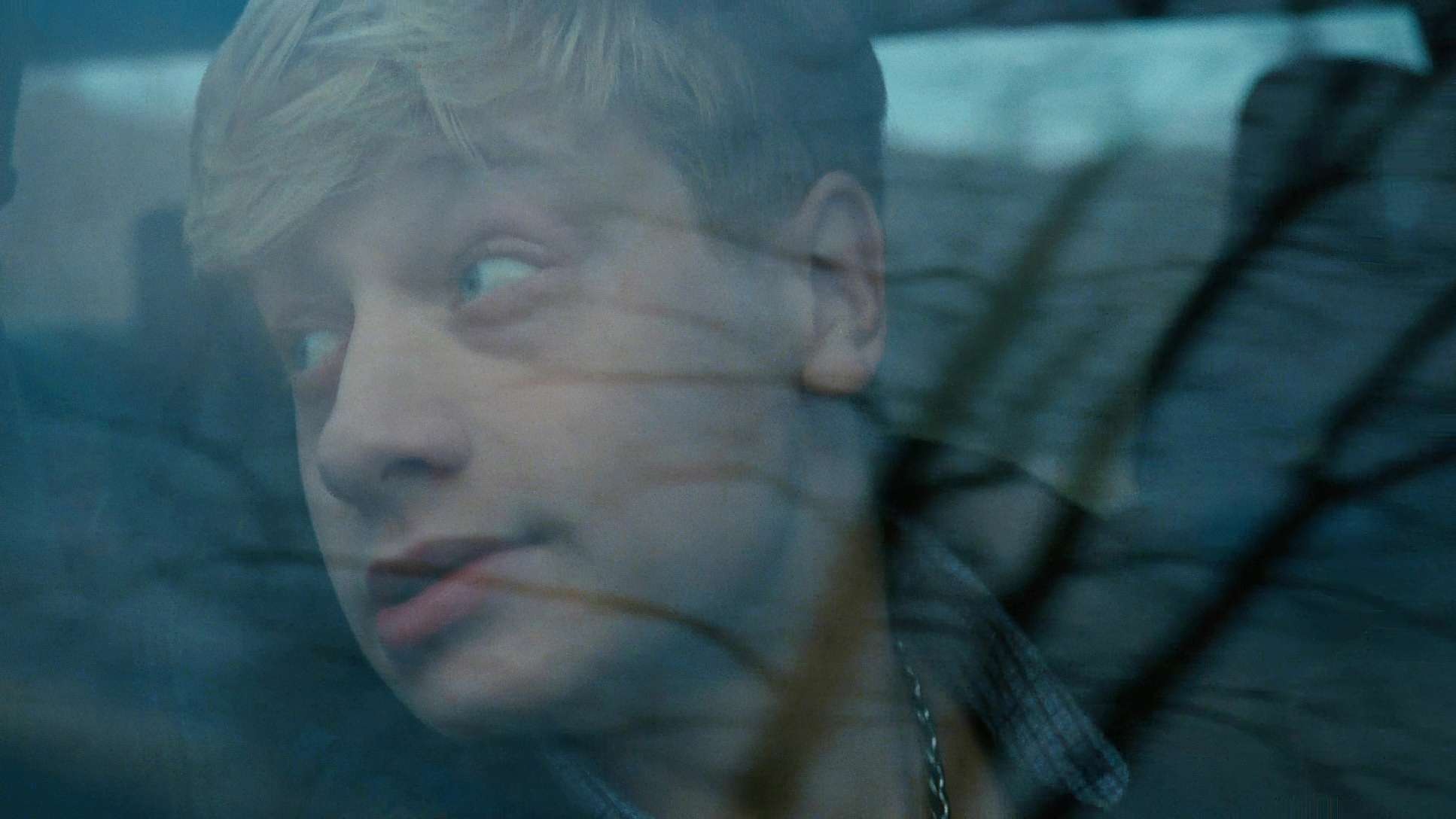
You can’t talk about Mommy without addressing the square on the screen. The 1:1 aspect ratio is the defining “gimmick” that isn’t a gimmick at all. It’s a perfect square, reminiscent of a Polaroid or an old camera phone photo, and it’s used to make every shot feel like a portrait.
For me, it immediately invokes a sense of claustrophobia. You feel the walls of the frame physically pushing in on Die and Steve, mirroring the financial and emotional pressures suffocating them. Their lives are happening in a box.
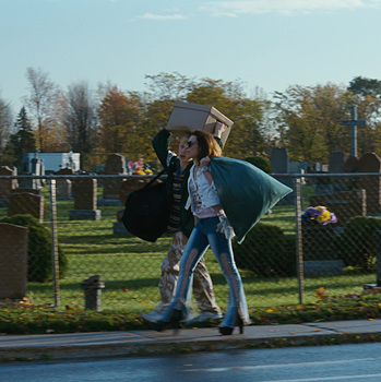
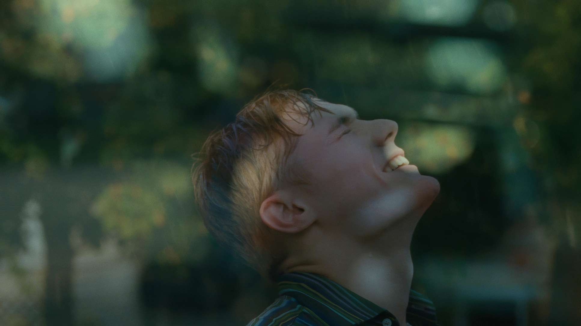
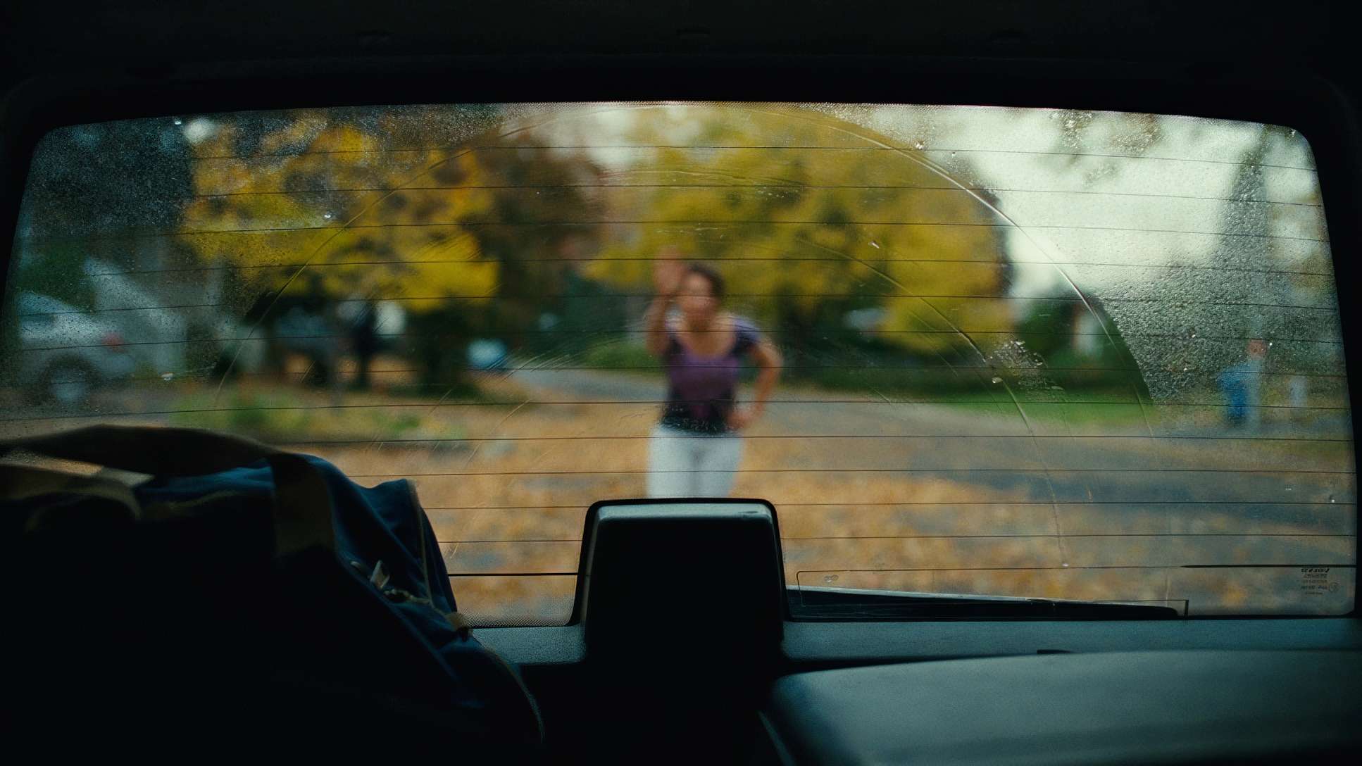
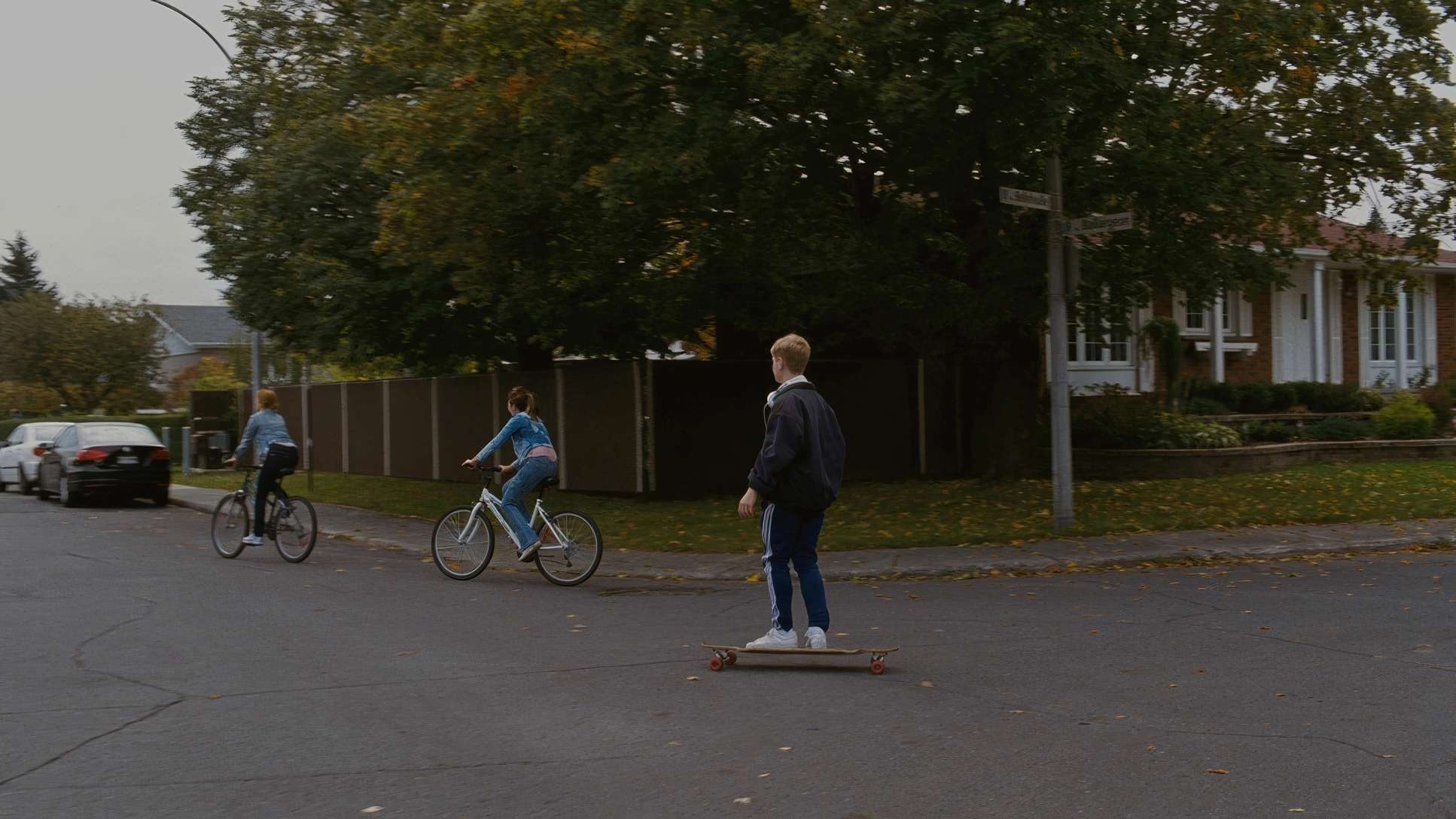
But then, we get that stroke of genius: the frame breathes. When Steve is skateboarding and literally pushes the frame open into a widescreen panorama, it’s not just a visual trick it’s a profound release of tension. The screen opening up is a literal visual metaphor for the “expansive possibilities of life.” It’s one of those rare moments of pure cinematic magic where a technical constraint transforms into an essential emotional beat.
Lensing and Blocking
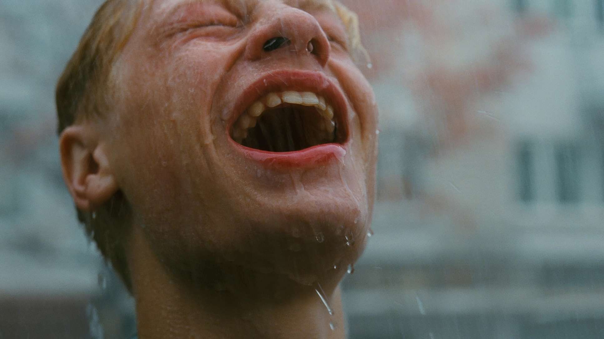
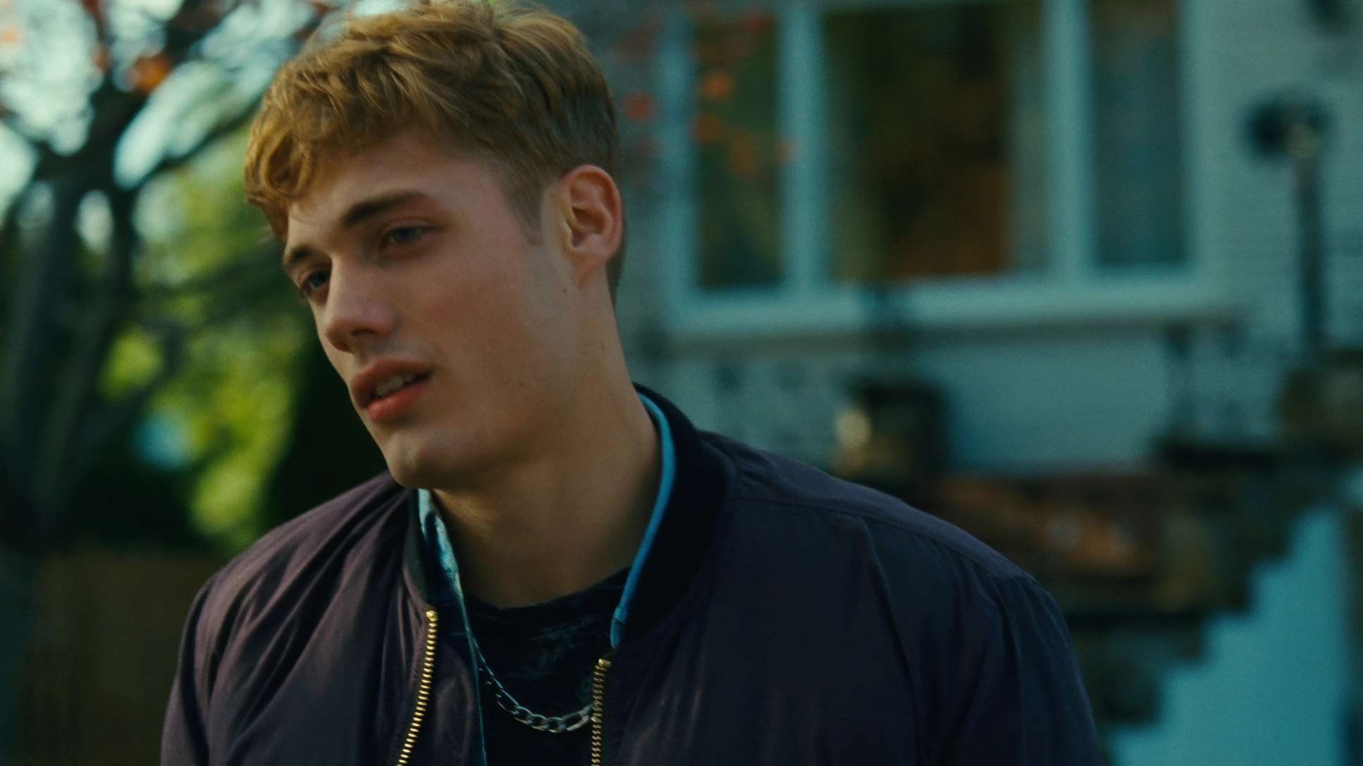
Despite the tight frame, they didn’t shy away from Long Lenses. Using a longer focal length within a 1:1 ratio is a bold move because it compresses the space even further, isolating the characters from their backgrounds.
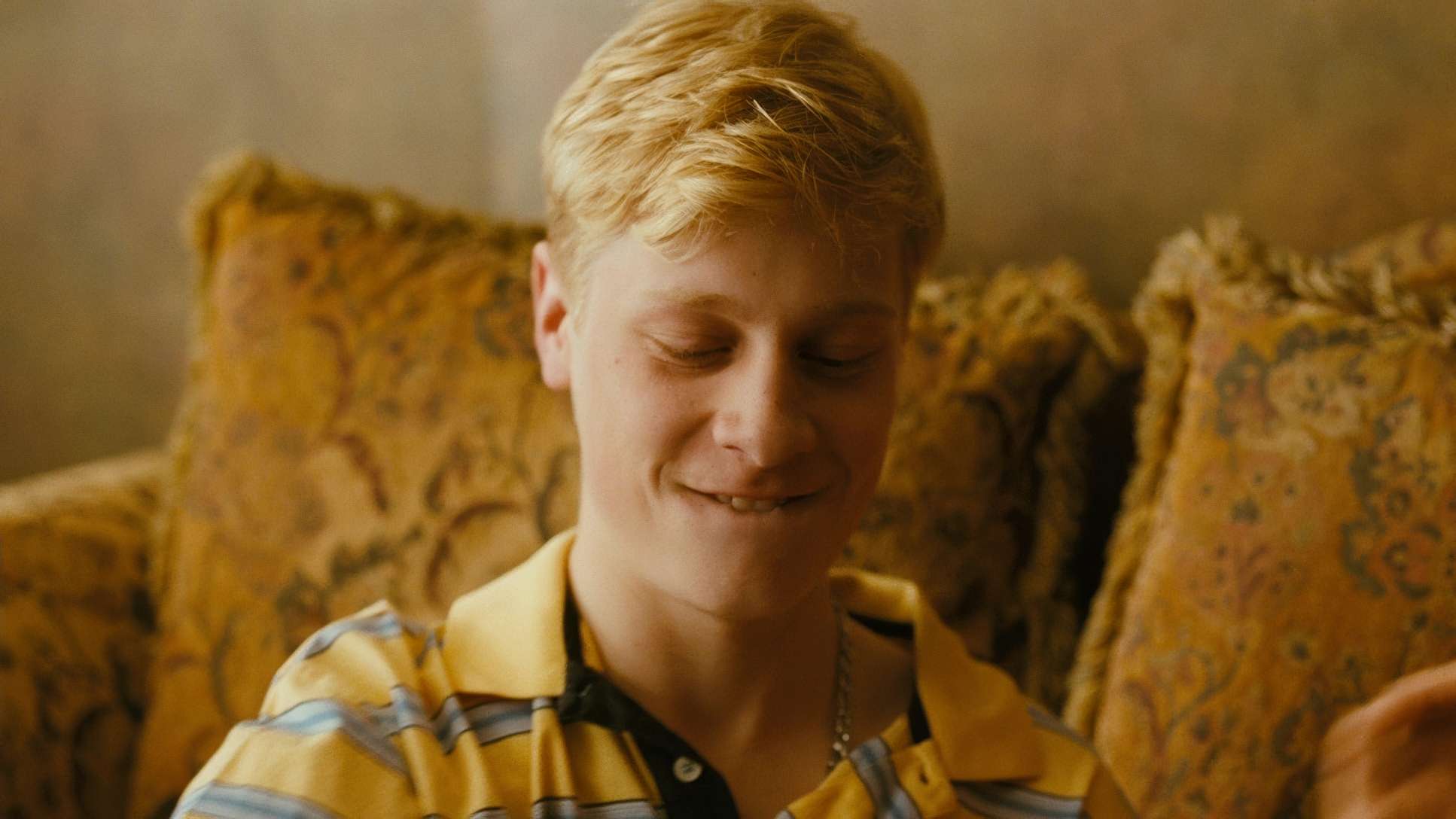
They shot on Zeiss Master Primes, which are known for being incredibly sharp with almost no breathing. This choice kept the image looking modern and “clinical” in its clarity, which balances out the messy, emotional performances. The blocking is often left-heavy, pushing characters into the corners of that square frame to emphasize their instability. There’s a constant dance of foreground and background, ensuring the primary emotional beat is clear even when the characters are literally on top of each other.
Color Grading Approach
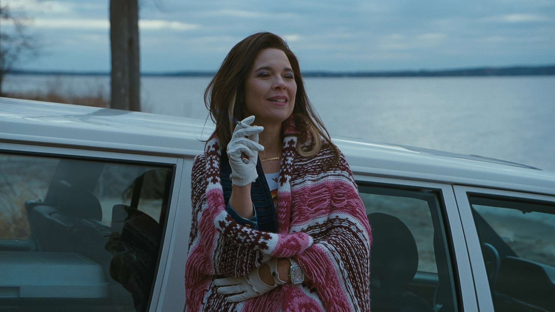
This is where I really lean in. The final look was crafted by colorist Jérôme Cloutier, and it has this “warm, intimate feel” that defines the movie’s aesthetic.
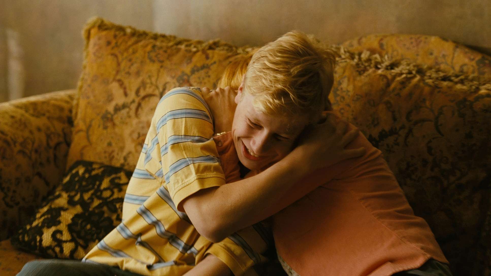
As a colorist, I look at the density of those 500T shadows. Cloutier didn’t just “throw a warm filter” over the movie. It feels like a nuanced tonal sculpture where the mid-tones and highlights lean toward amber and ochre, but the skin tones remain grounded and authentic. The contrast is robust it has weight but the highlight roll-off is soft, which is that classic film-print sensibility where highlights gently compress rather than clipping like digital.
Hue separation was vital here. Even within a dominant warm palette, you can see the distinct blues of Steve’s clothing or the greens of the Montreal locations. It prevents the image from becoming a monochromatic muddy mess and maintains the “brutally realistic” feel of the drama.
Lighting Style
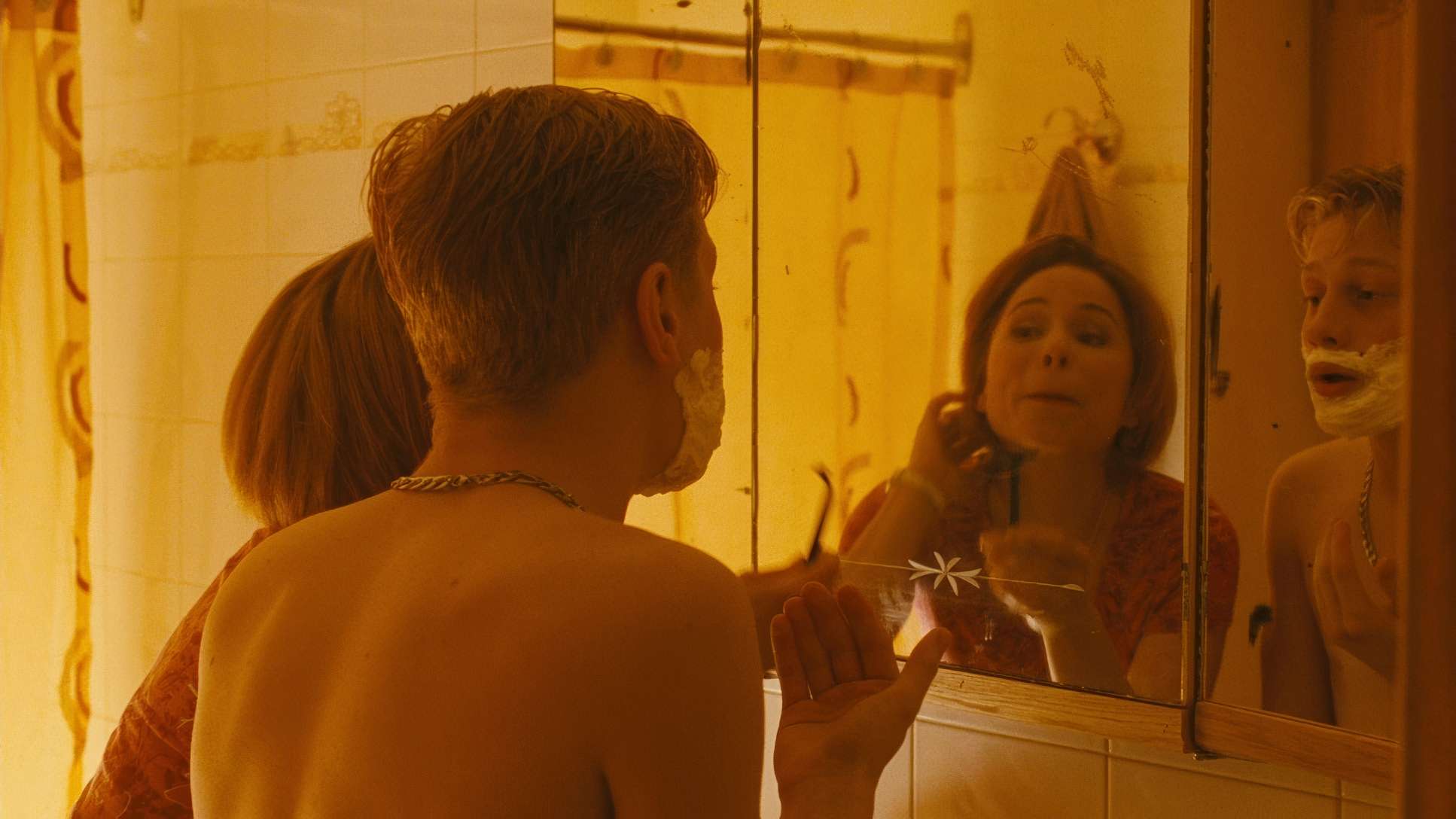
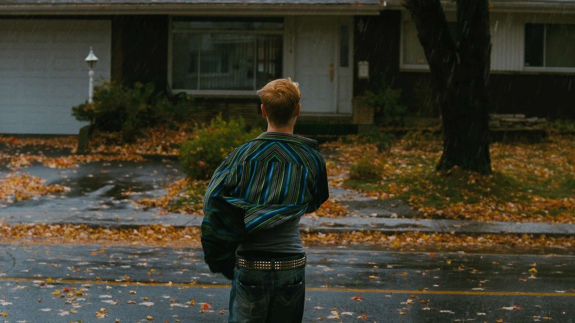
The lighting carries a heavy emotional charge, utilizing a lot of side light and backlight to create depth within the square. Much of the film is set in Die’s home, which has a “dark, kitschy” vibe.
We see a lot of motivated daylight shafts of warm sun cutting through windows to create strong practical highlights. This creates pockets of intimacy in an otherwise moody environment. The lighting feels like a character itself; when things are tense, the contrast sharpens, accentuating every furrowed brow. When moments of vulnerability happen, the light softens into a golden hue, wrapping the characters in a visual embrace. It’s about enhancing the rawness making every tear and defiant glare feel earned.
Camera Movements
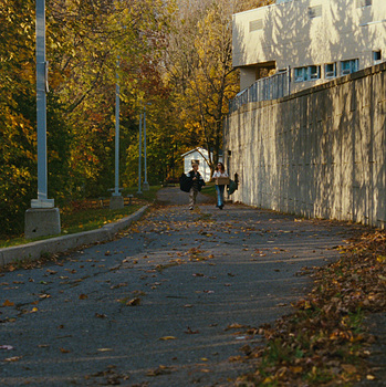
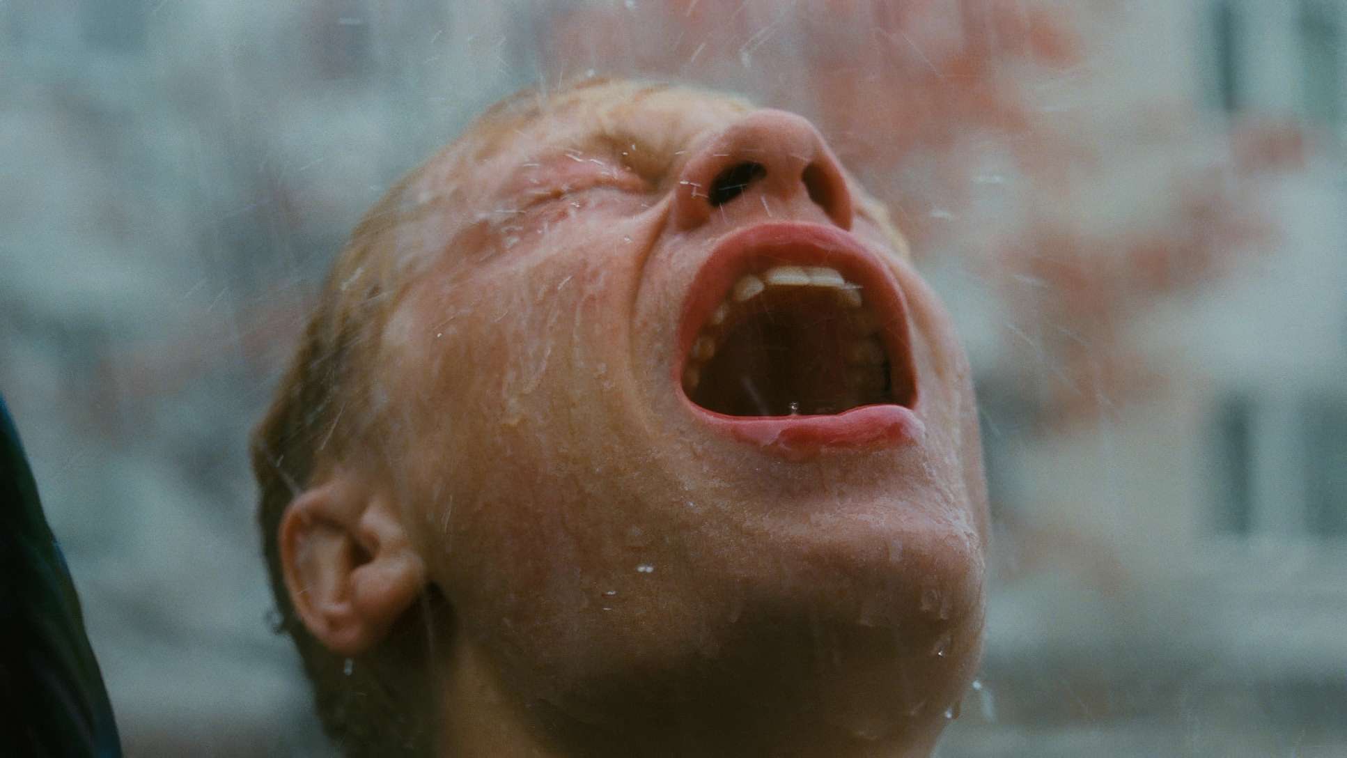
With a 1:1 ratio, camera movement has to be surgical. There’s no room for sweeping, pointless pans. Instead, Turpin uses a raw, handheld verité style that adds to the unpredictable energy of the scenes.
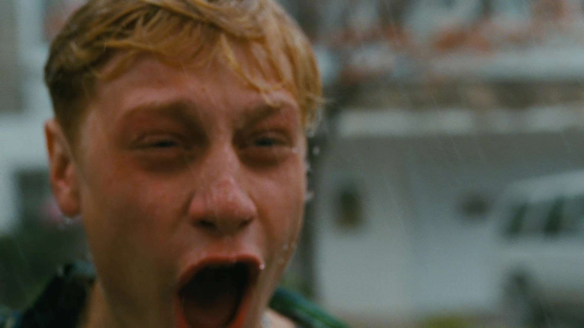
When Steve has an outburst, the Arriflex 235 follows his erratic movements, drawing us into his volatile state. It’s gritty and immediate. In contrast, the static shots lock the characters into their square prison, forcing us to confront their immobility. The camera isn’t just observing; it’s participating in the journey, feeling the constriction of the box before finally breaking free in those iconic widescreen moments.
Compositional Choices
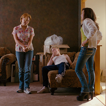
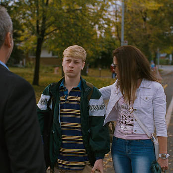
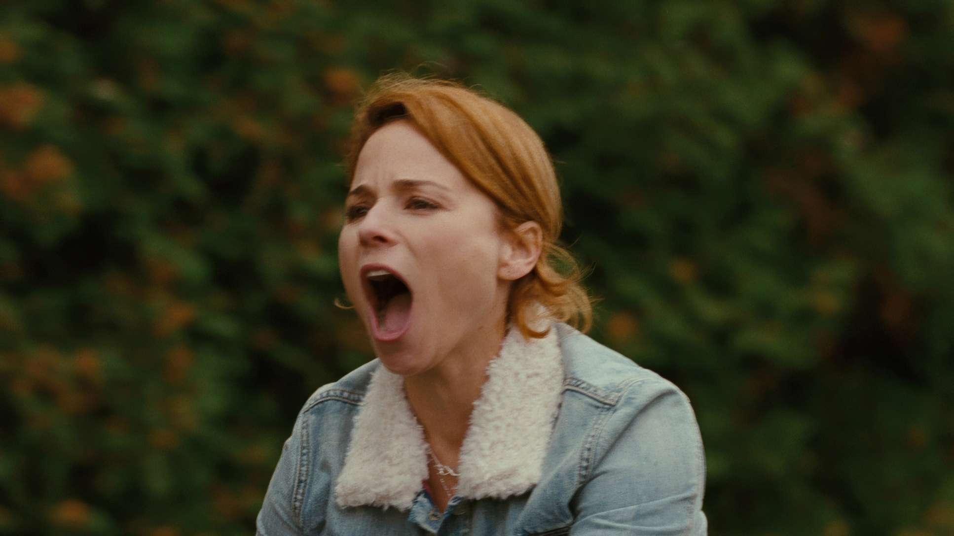
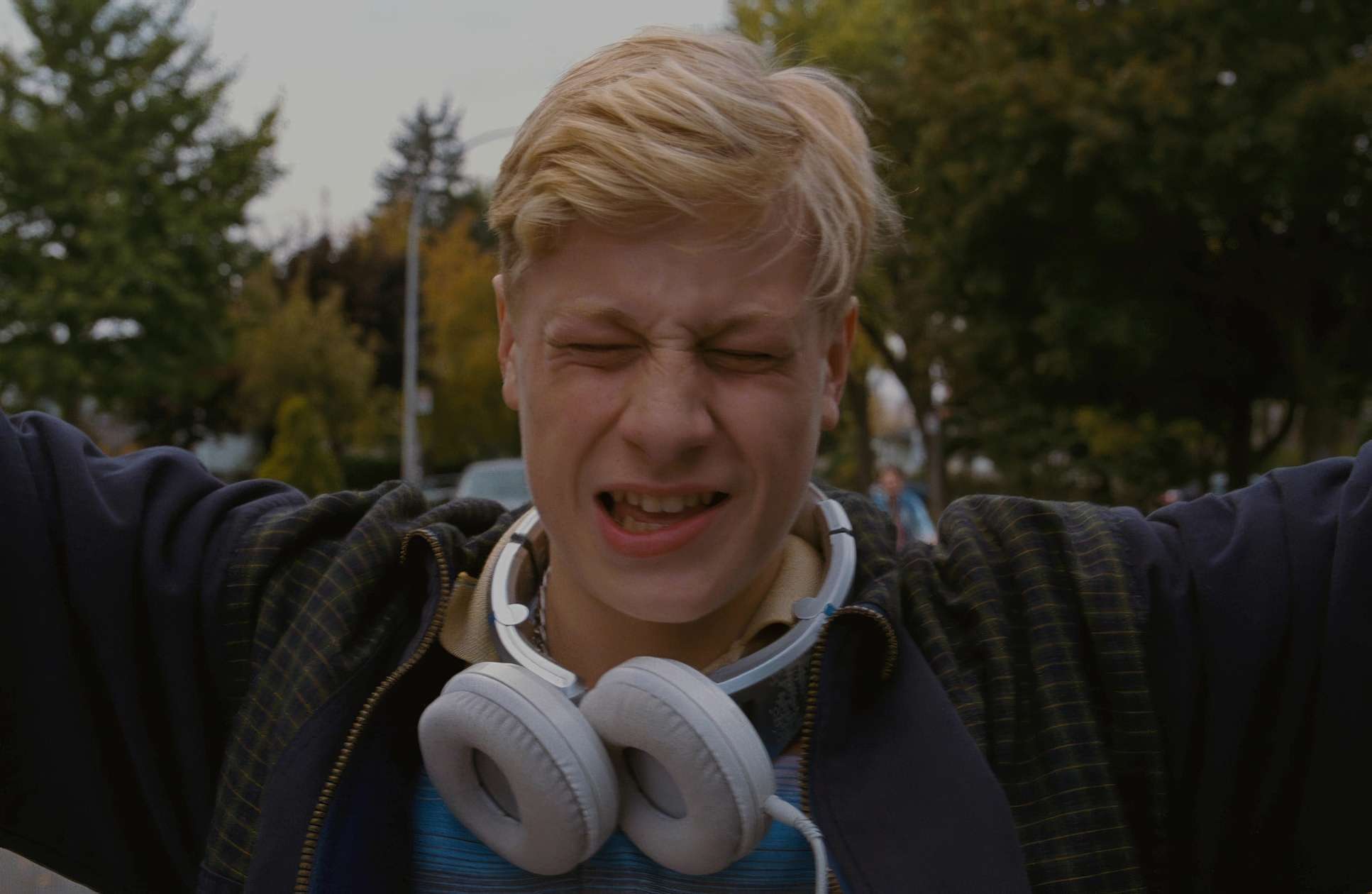
In a square frame, the traditional “rule of thirds” is basically thrown out the window. Everything becomes about verticality and depth. Close-ups are the heart of this film a signature of Dolan’s style.
The tight compositions make eye contact incredibly powerful. As we see in the scene in the juvenile hall hallway, the Medium Close Up and Over the Shoulder shots are used to reveal the unspoken. It’s the facial expressions and body language that tell the truth, while the dialogue is often just noise. By framing characters way off-center, Turpin fosters a sense of loneliness and emotional chasm even when people are physically close. Every inch of that square frame is meticulously considered; there’s zero “dead air.”
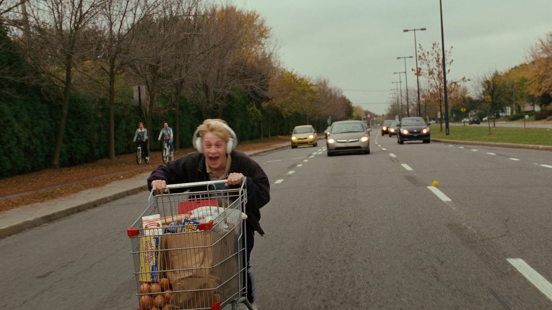
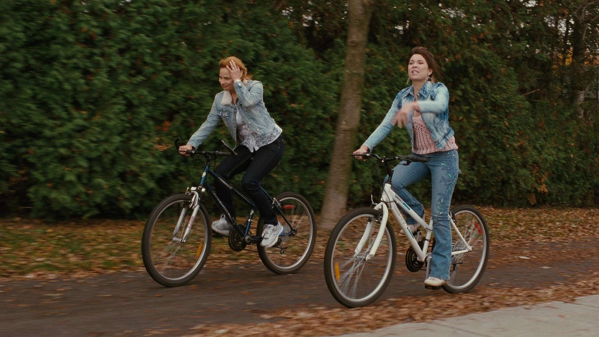
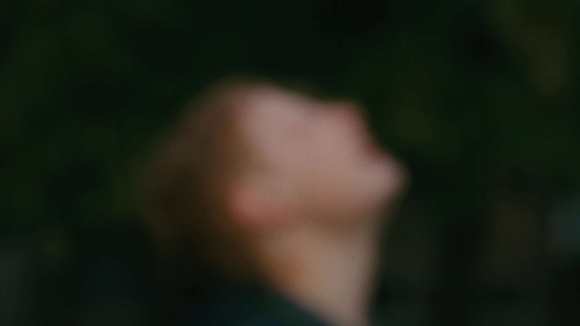
Mommy (2014) Film Stills
A curated reference archive of cinematography stills from Mommy (2014). Study the lighting, color grading, and composition.


- Also read: WHAT EVER HAPPENED TO BABY JANE? (1962) – CINEMATOGRAPHY ANALYSIS
- Also read: SONG OF THE SEA (2014) – CINEMATOGRAPHY ANALYSIS
Browse Our Cinematography Analysis Glossary
Explore directors, cinematographers, cameras, lenses, lighting styles, genres, and the visual techniques that shape iconic films.
Explore Glossary →