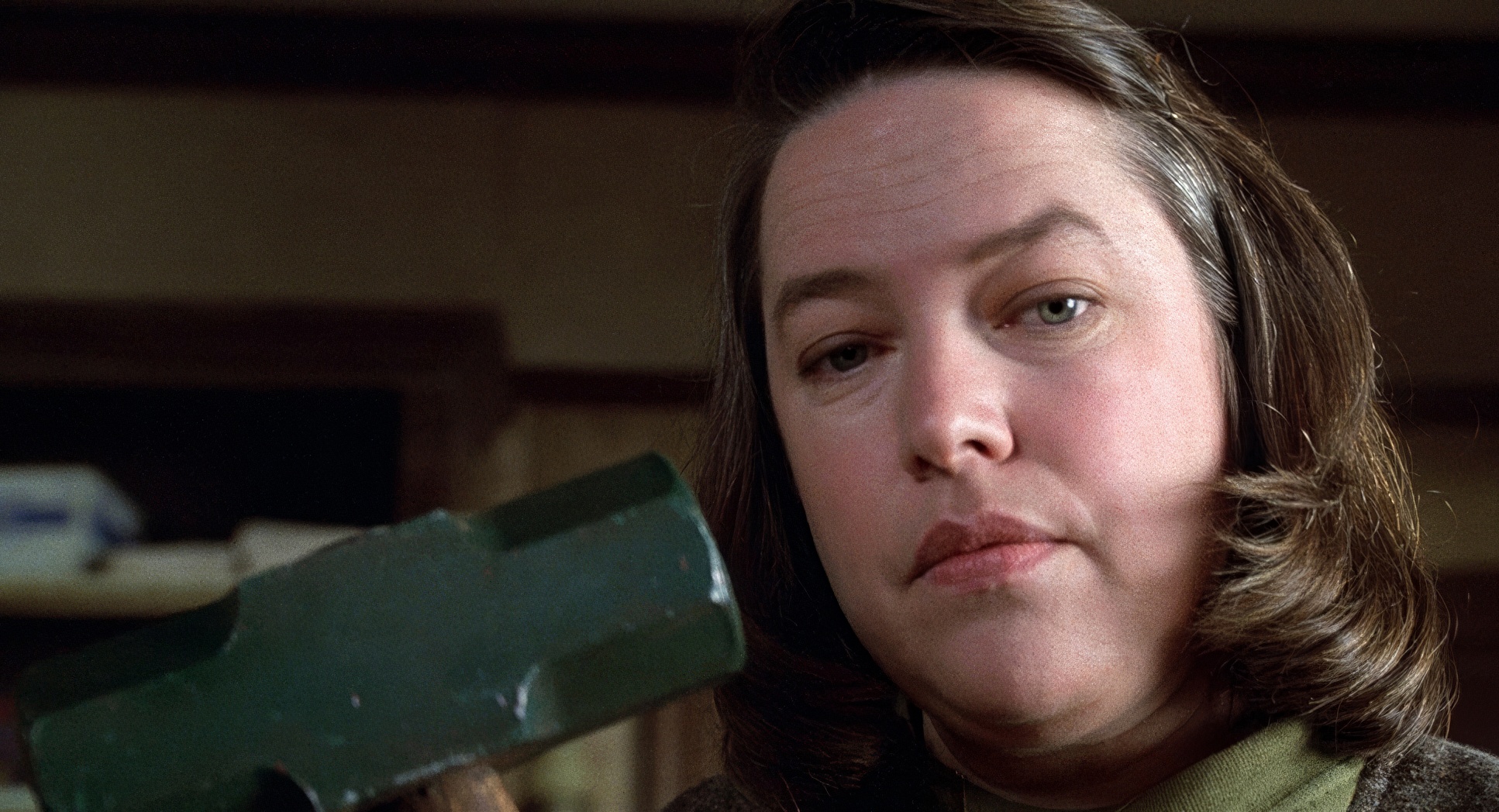
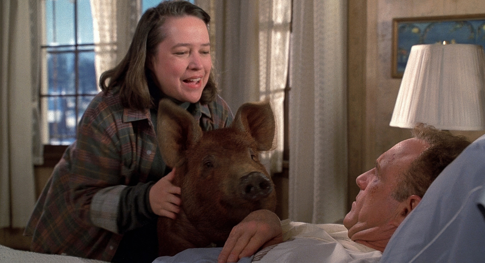
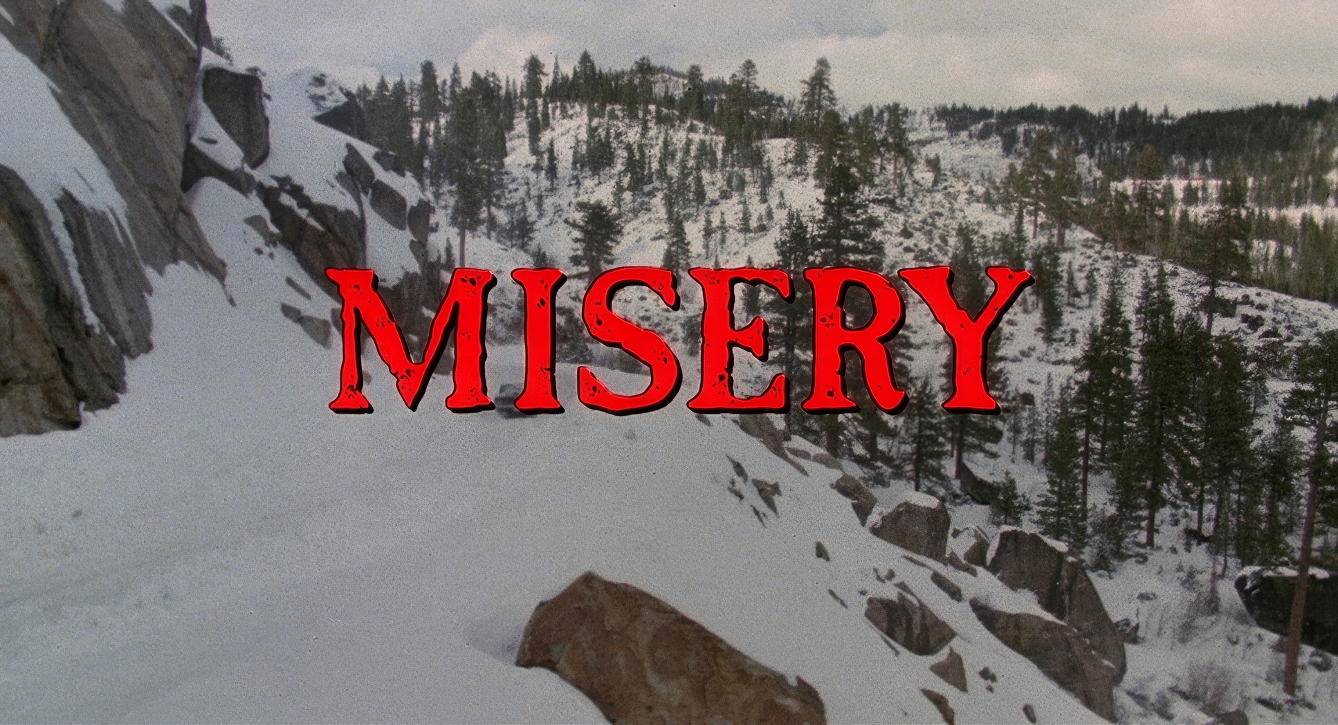
Misery (1990) is the one that actually gets under my skin. It’s not supernatural. It’s just two people in a house, and honestly, the way it’s shot is a masterclass in making a standard bedroom feel like a coffin.
We’ve all seen the memes about Annie Wilkes being a “crazy bitch,” but that’s a lazy way to look at it. The real magic here is how Rob Reiner and Barry Sonnenfeld used the camera to trap us. It’s not just about Paul Sheldon being stuck in a bed; it’s about the way the image itself starts to feel smaller and smaller as his hope fades.
About the Cinematographer

Before he was directing massive hits like Men in Black, Barry Sonnenfeld was the guy giving the Coen Brothers their early, signature look (Blood Simple, Raising Arizona). He has this specific way of using wide lenses and weirdly symmetrical framing that feels… off. It’s a bit detached, almost clinical. In Misery, that style is perfect. He doesn’t use the camera to pity Paul; he uses it to observe his suffering with a cold, Hitchcockian eye. He knows exactly how to make a mundane living room look like a crime scene before any blood is even spilled.
Inspiration Behind the Cinematography

You can feel the ghost of Alfred Hitchcock in every frame of this film. It’s basically Rear Window but with broken legs instead of a broken leg. Reiner and Sonnenfeld took the psychological core of Stephen King’s book the idea of a creator being held hostage by his own “number one fan” and turned it into a visual trap.
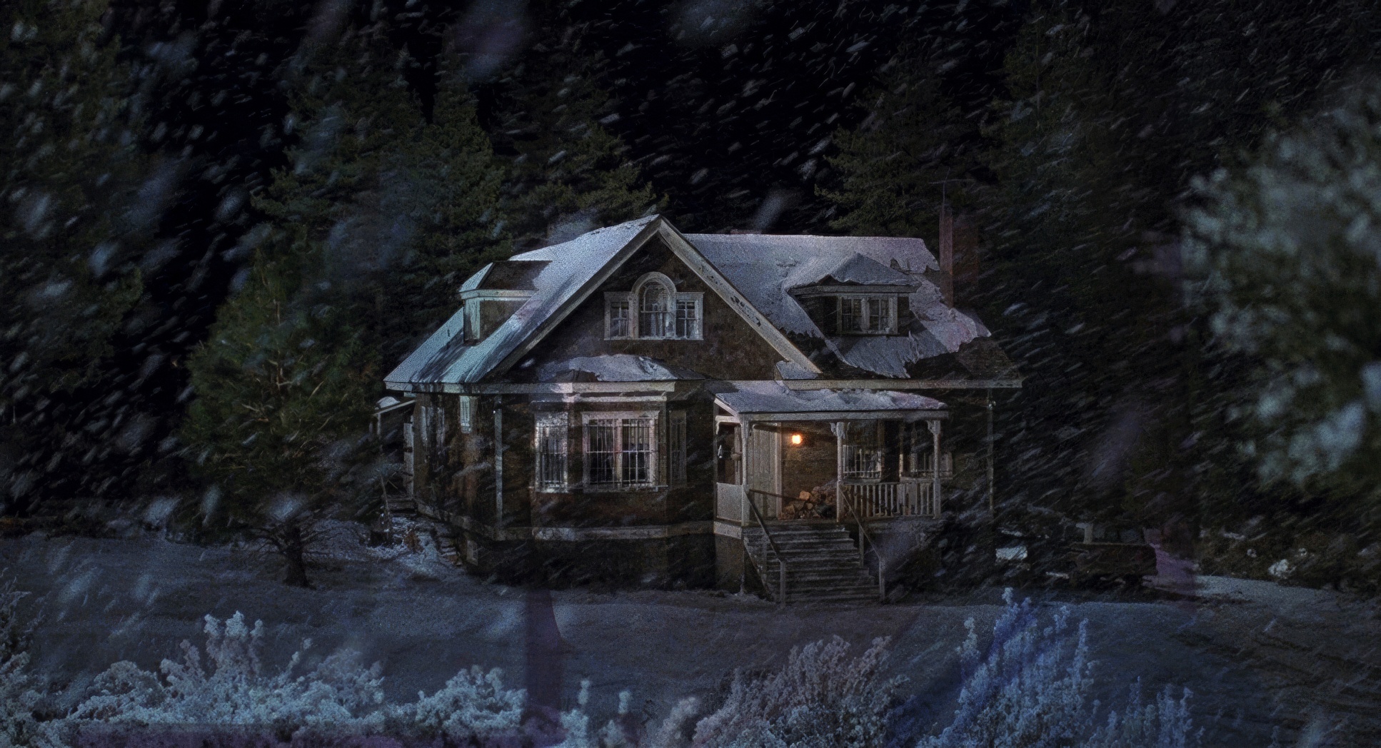
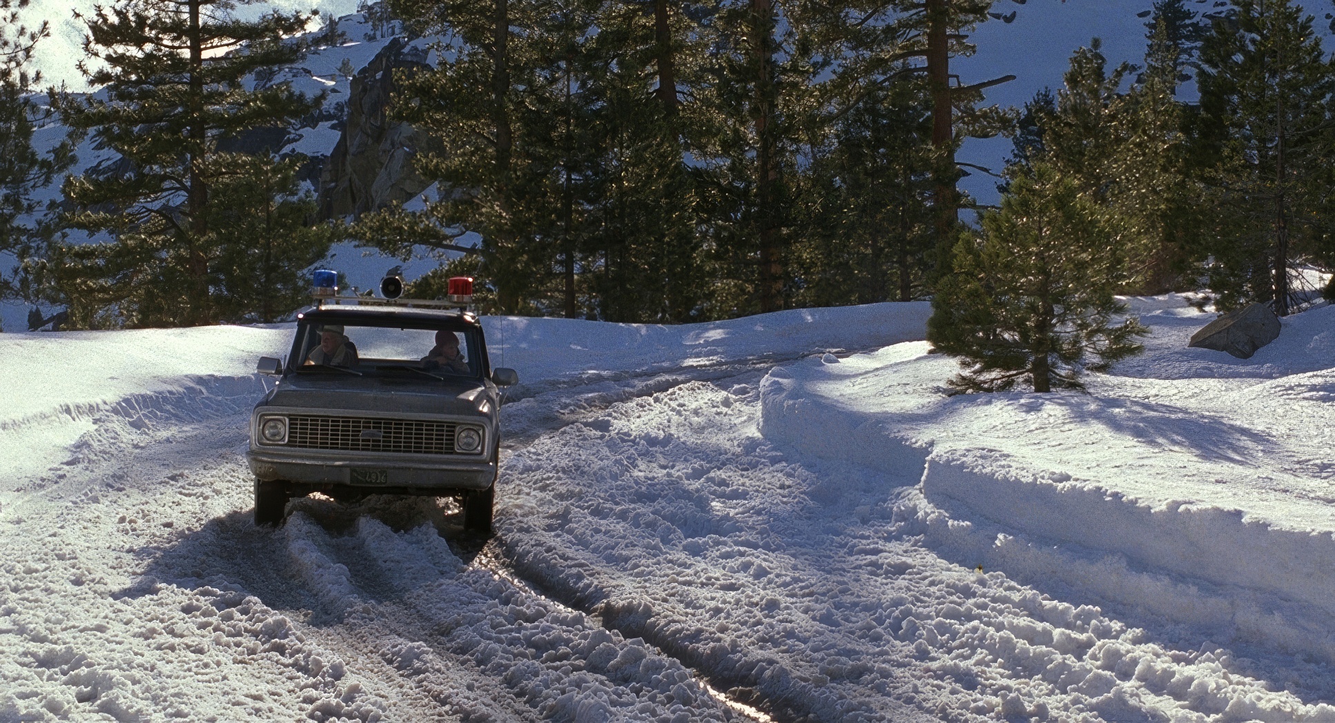
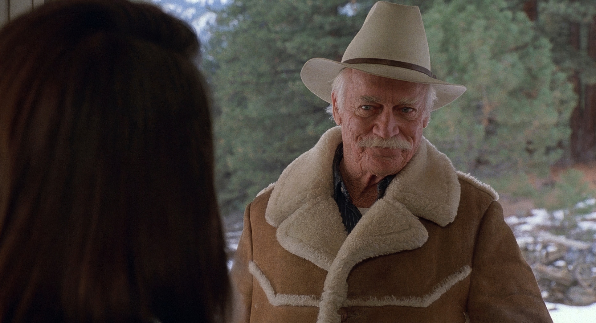
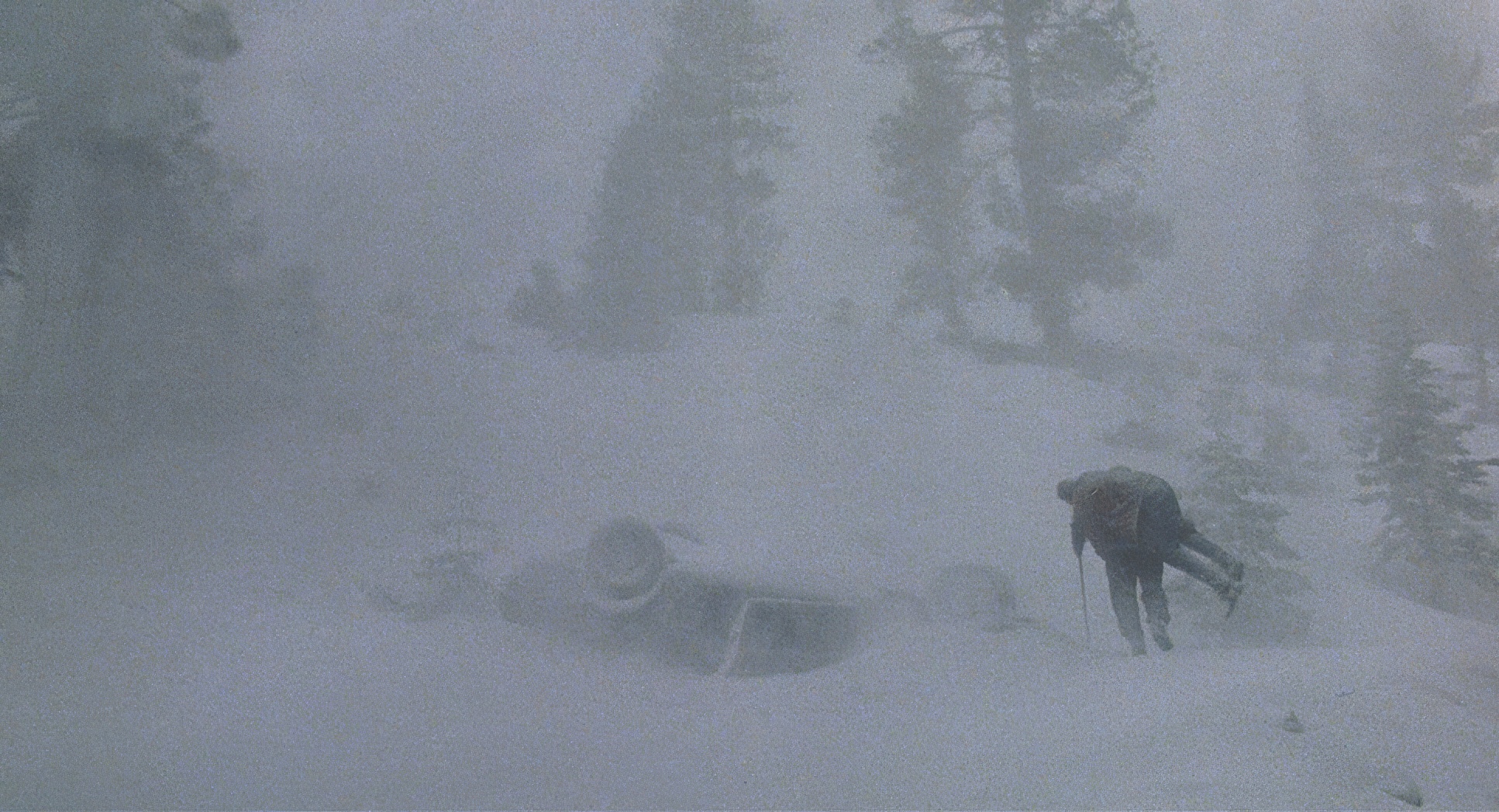
The house is the antagonist. We start with these wide, freezing shots of the Colorado mountains total freedom, if a bit cold. Then, we’re suddenly shoved into Annie’s guest room. The shift is jarring. The cinematography stops being about the landscape and starts being about the “headspace.” We are stuck in Paul’s skull, and the walls are closing in.
Camera Movements

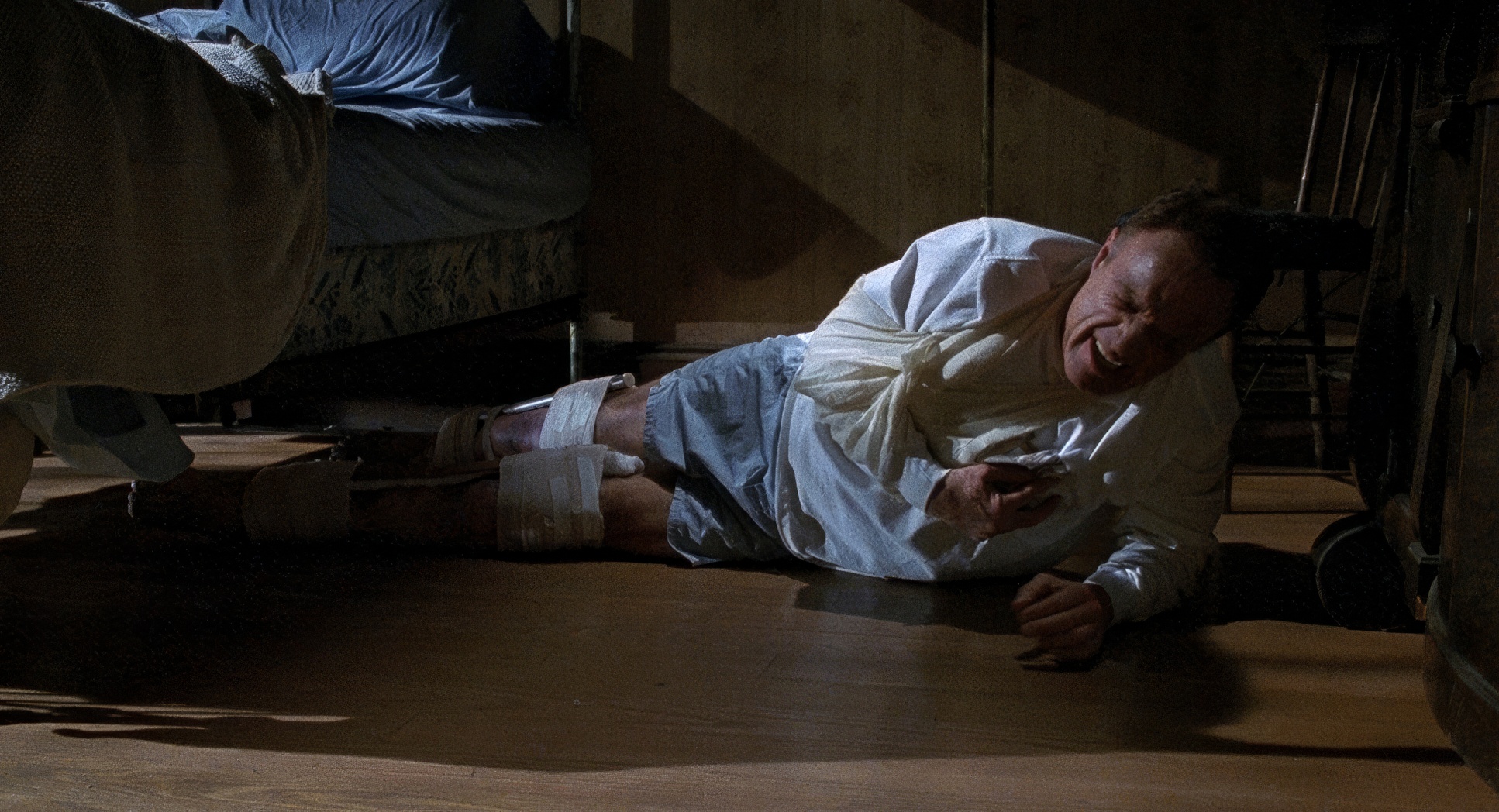
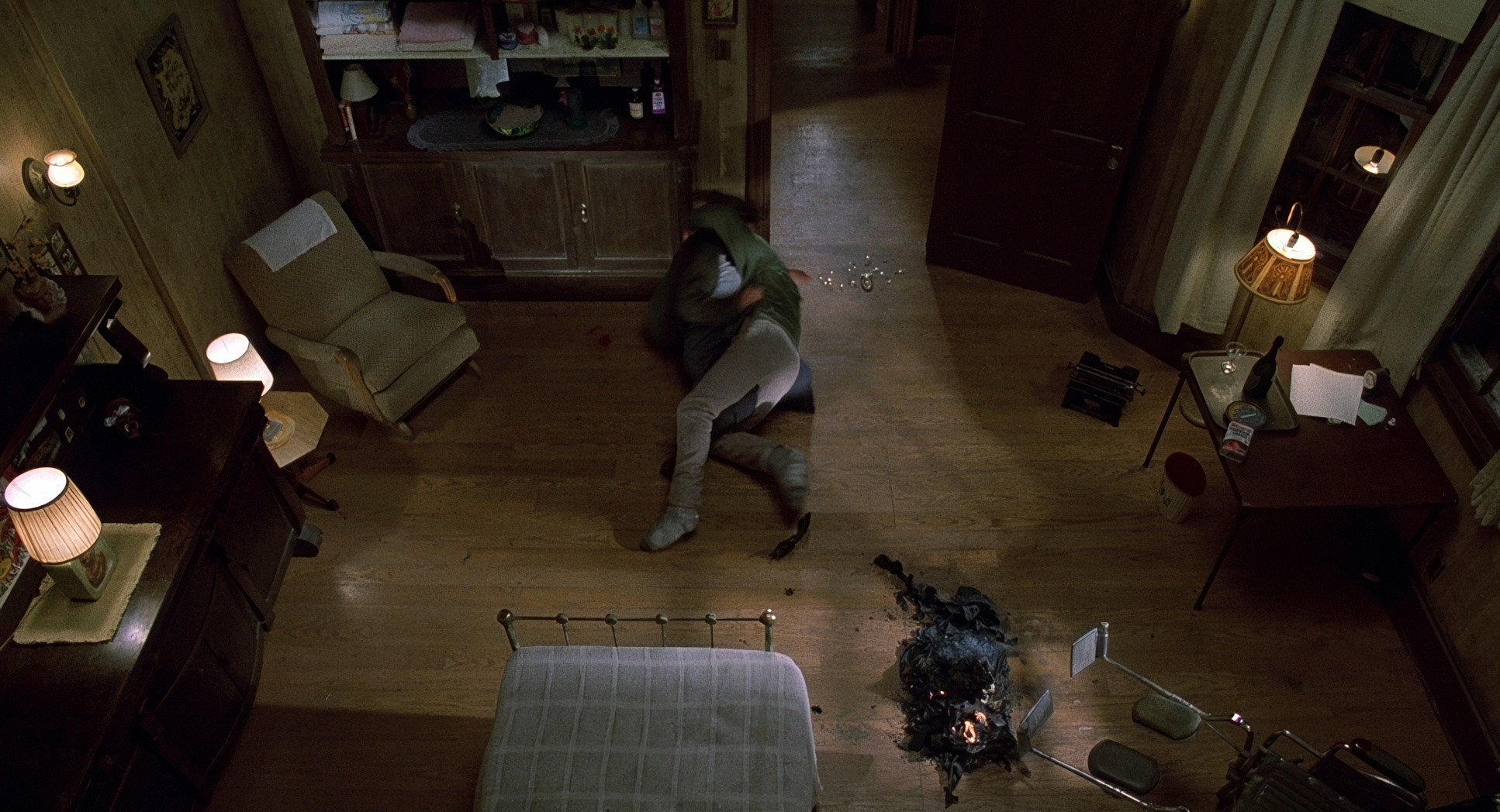
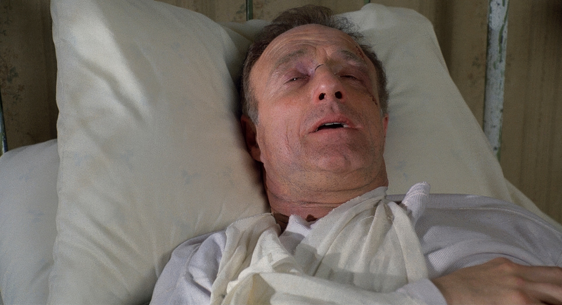
The camera in Misery doesn’t move just for the sake of moving. It’s deliberate. It’s heavy. When Paul is trying to crawl out of that room, the camera stays low and moves with a slow, agonizing creep. It’s painful to watch because the camera is mimicking his physical struggle.
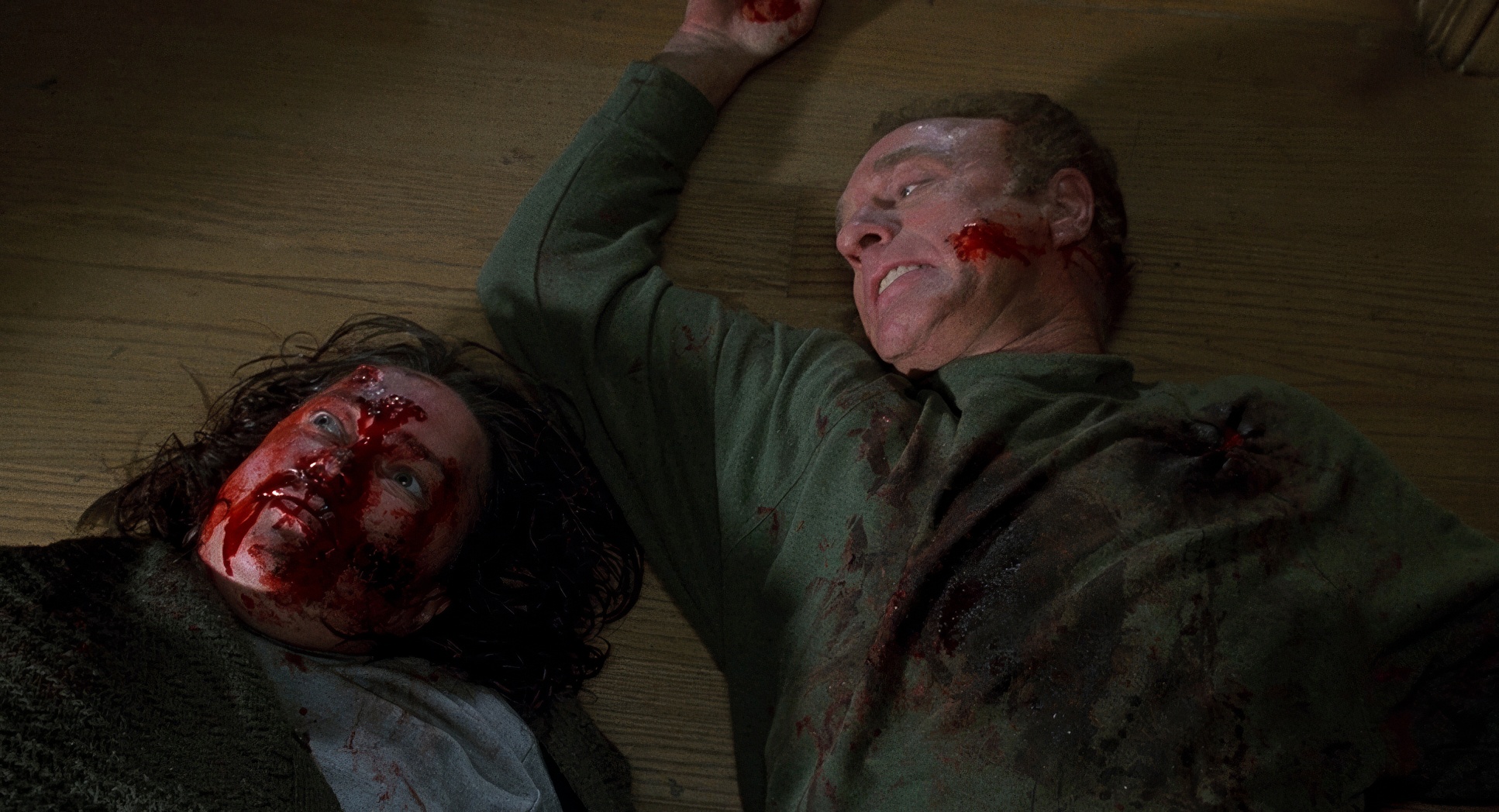
Then there are those “horrific wides.” They aren’t pretty vistas. They’re static, low-angle shots that make Paul look tiny and Annie look like a giant. My favorite bit of movement is the slow dolly toward Paul during the climax it’s the first time the camera feels like it’s on his side, capturing a moment of genuine defiance. It gives you that hit of adrenaline right when you need it.
Compositional Choices

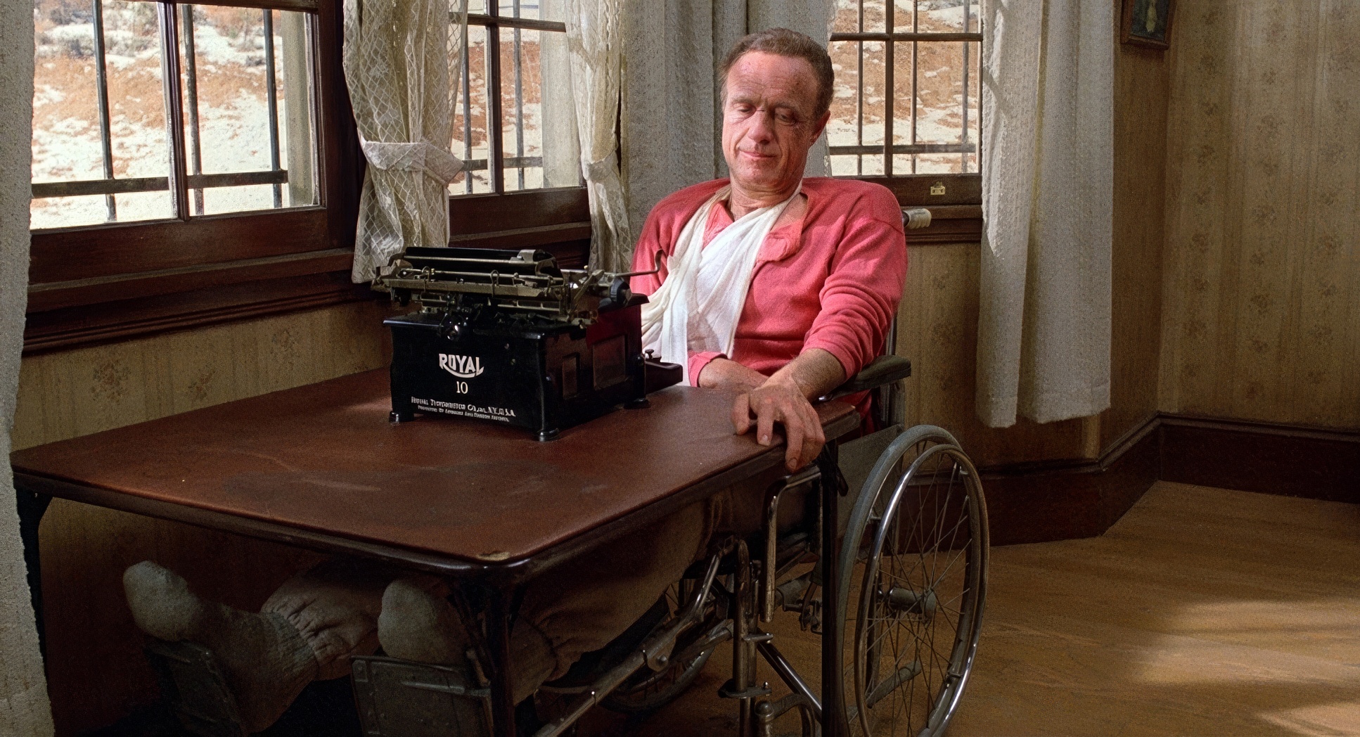
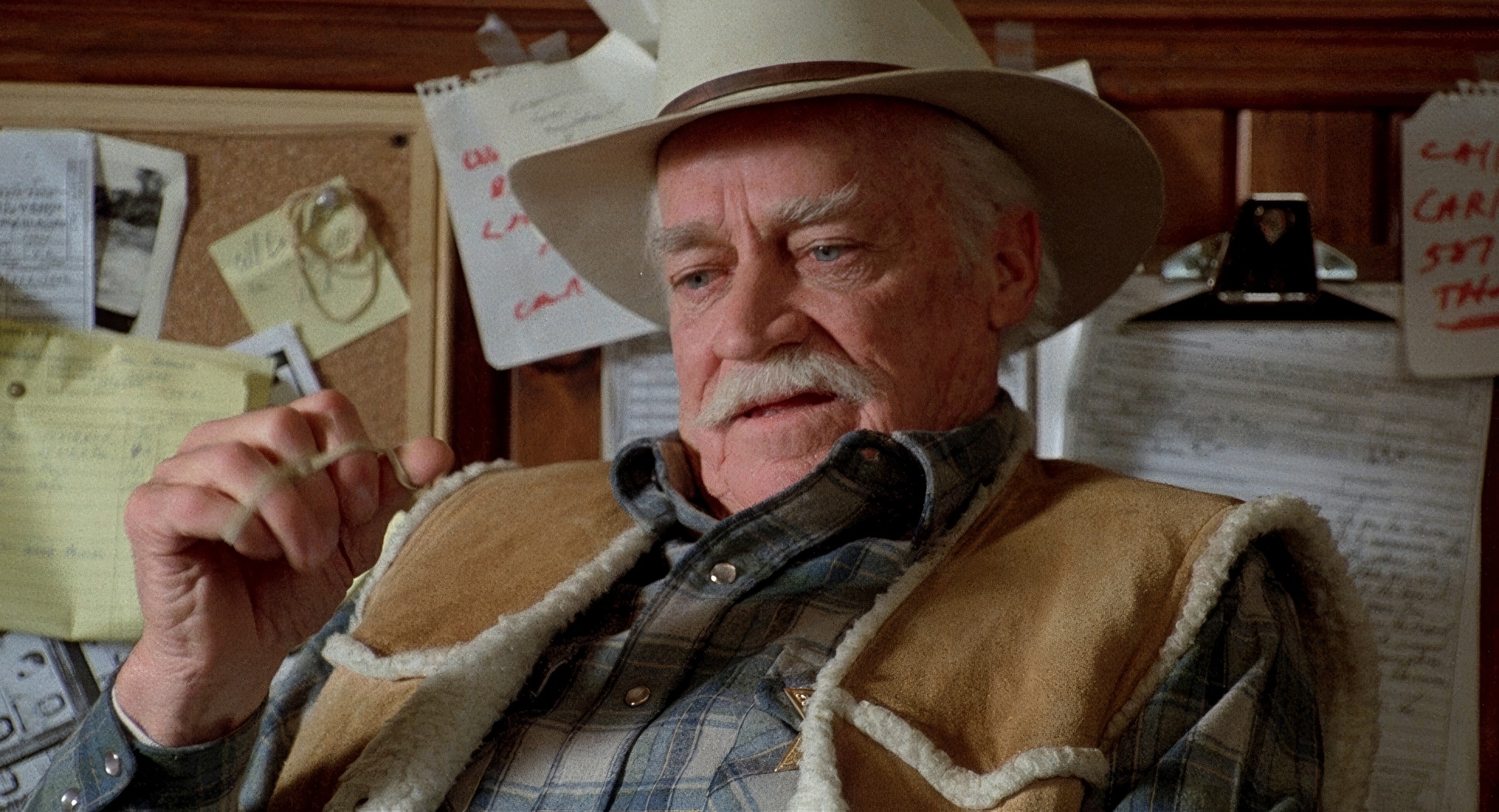
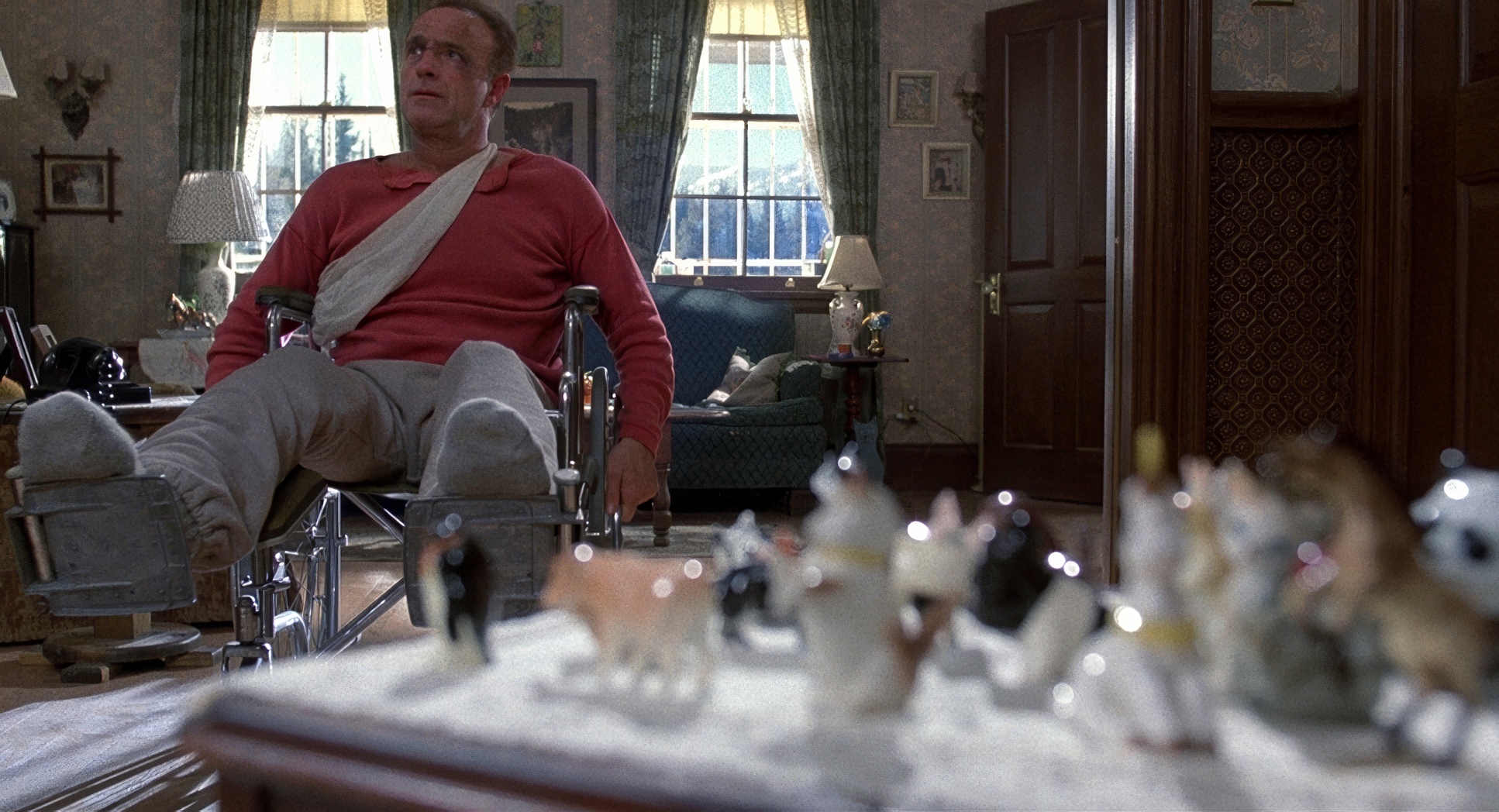
Sonnenfeld loves to use framing to bully the audience. Paul is constantly “boxed in” framed by bedposts, doorways, or the back of a wheelchair. He’s always being dwarfed by furniture or by Annie herself. It’s claustrophobia 101.
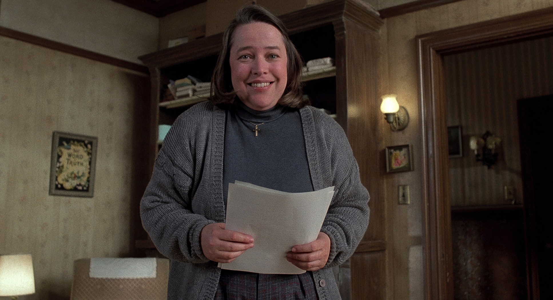
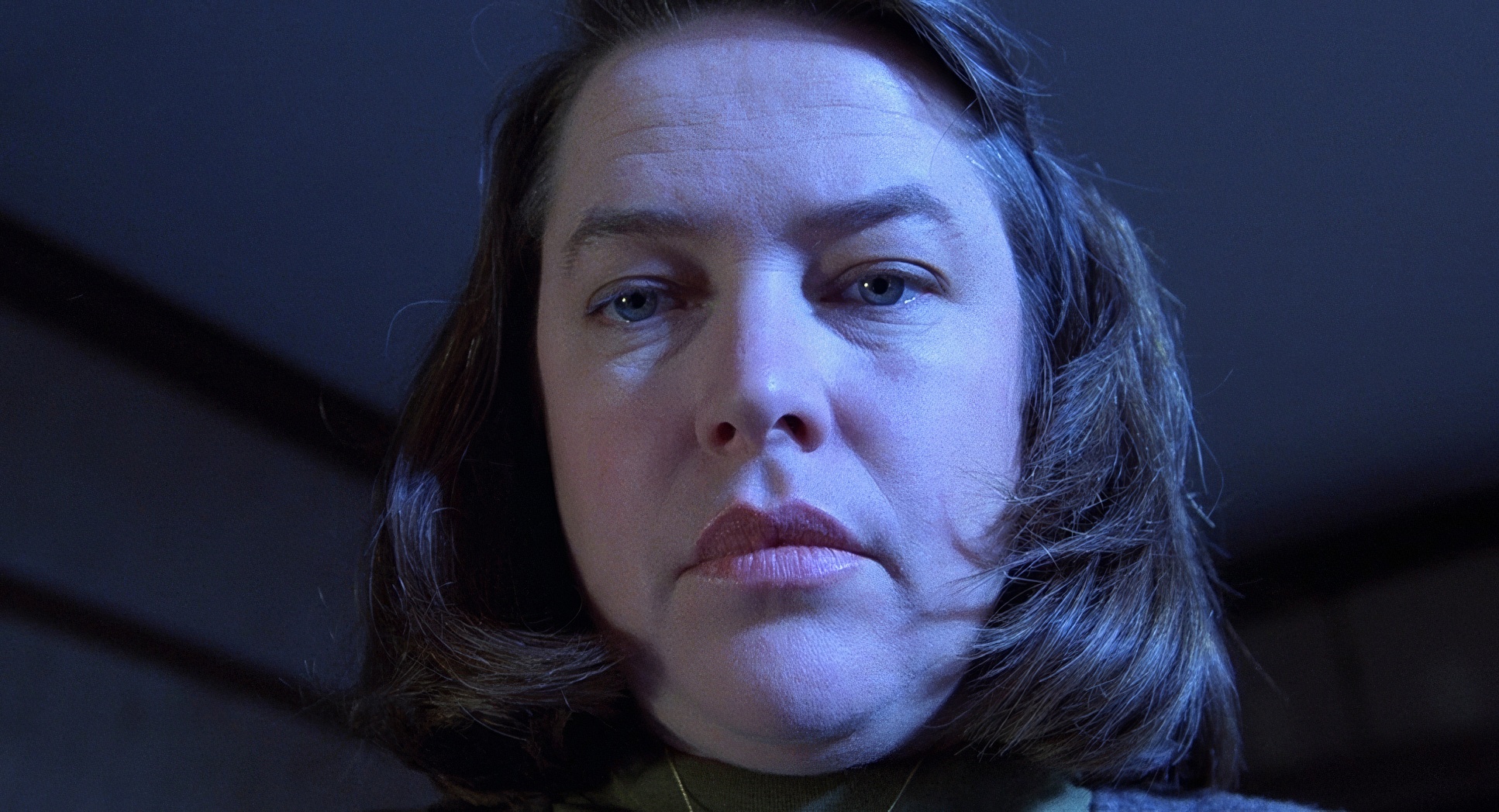
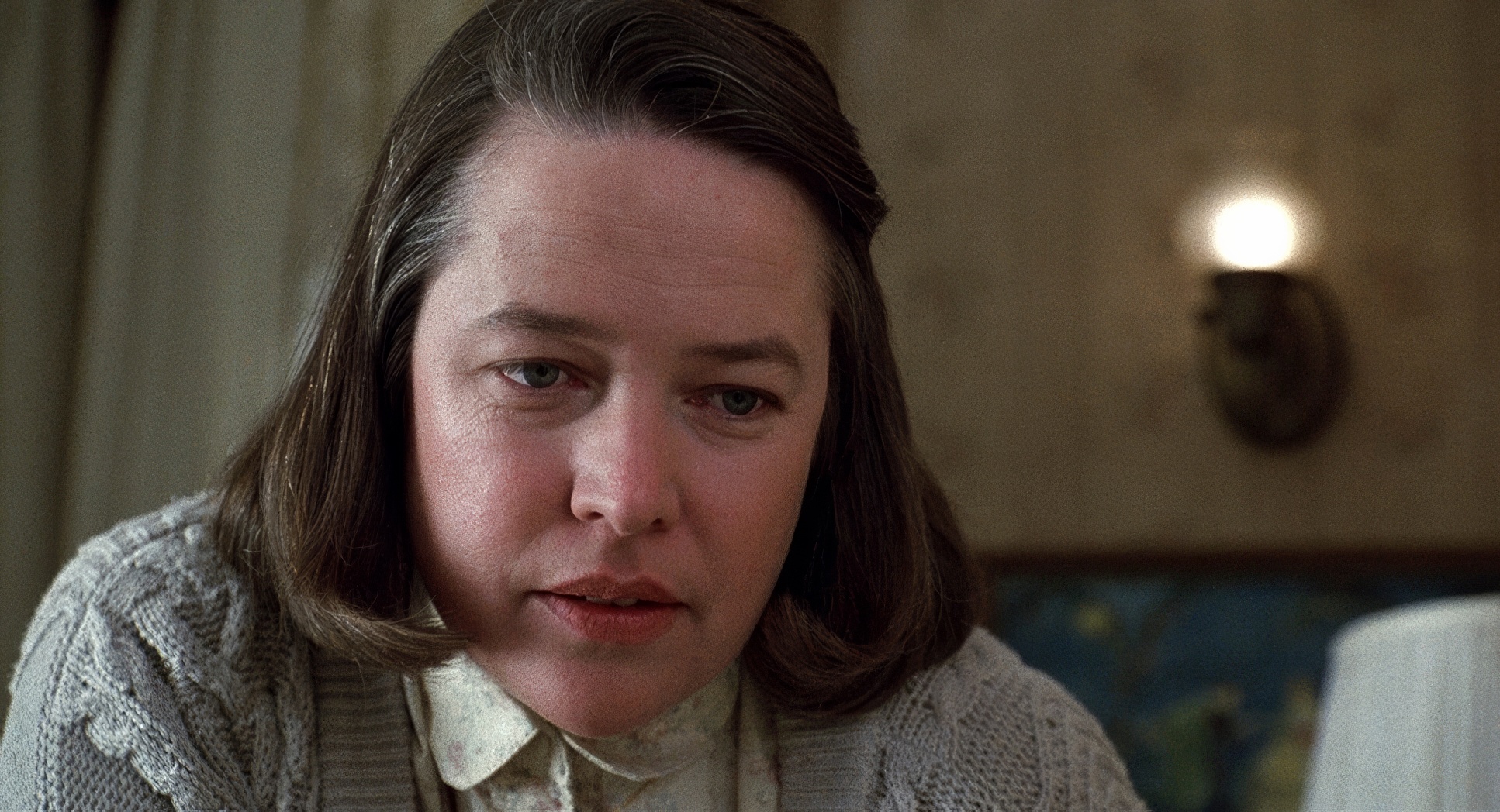
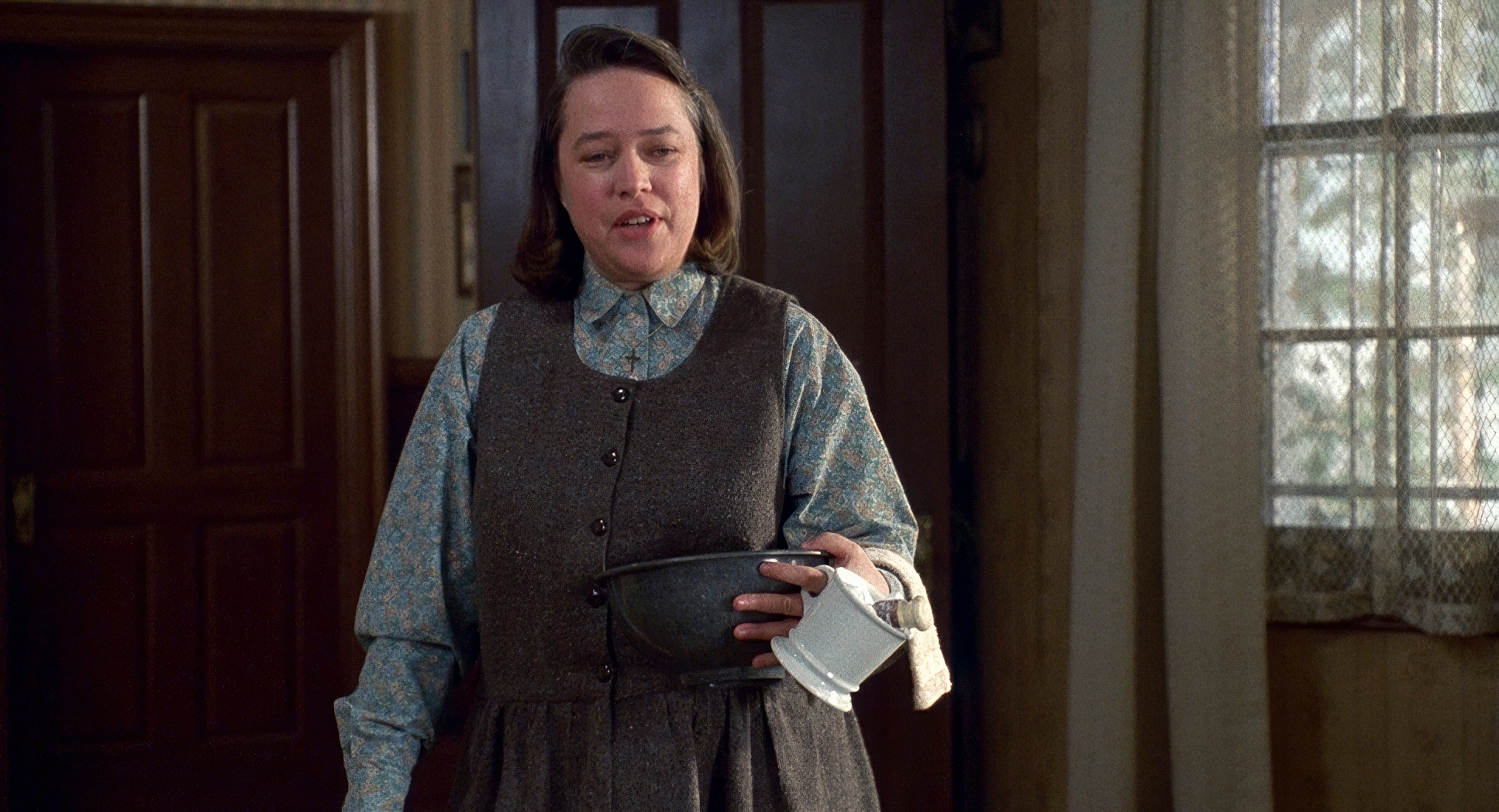
Annie, though? She owns the frame. She fills the space. There’s this one scene where she’s reading the manuscript and realizes Paul killed off her favorite character. The cuts between her face and his are so sharp they practically draw blood. It’s not about jump scares; it’s about the dread of seeing a person realize they’ve been betrayed, all through the lens of a tight, suffocating close-up.
Lighting Style

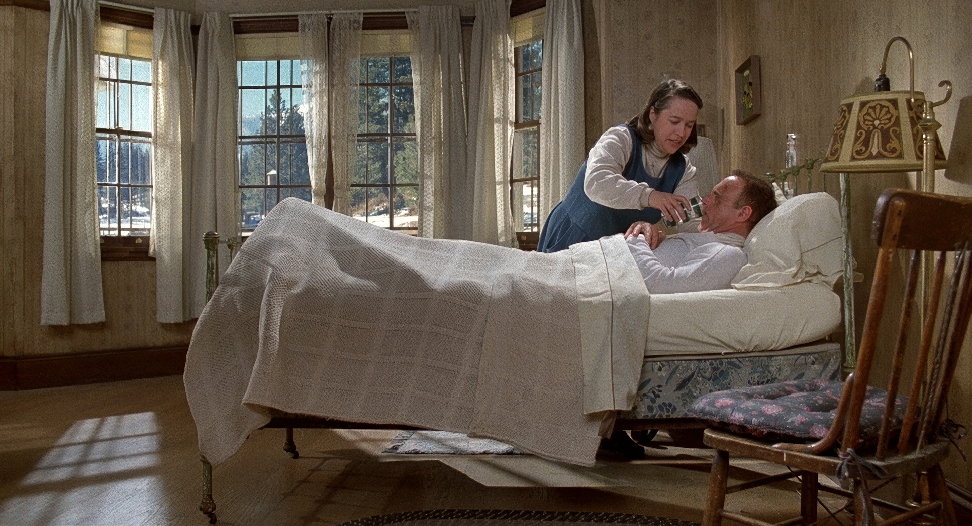
The lighting in Misery is terrifying because it’s so… normal. It’s not a “spooky” house. It’s a bright, snowy Colorado day outside, and inside, it’s all practical lamps and window light. That’s what makes it worse. The horror is happening in broad daylight in a cozy-looking house.
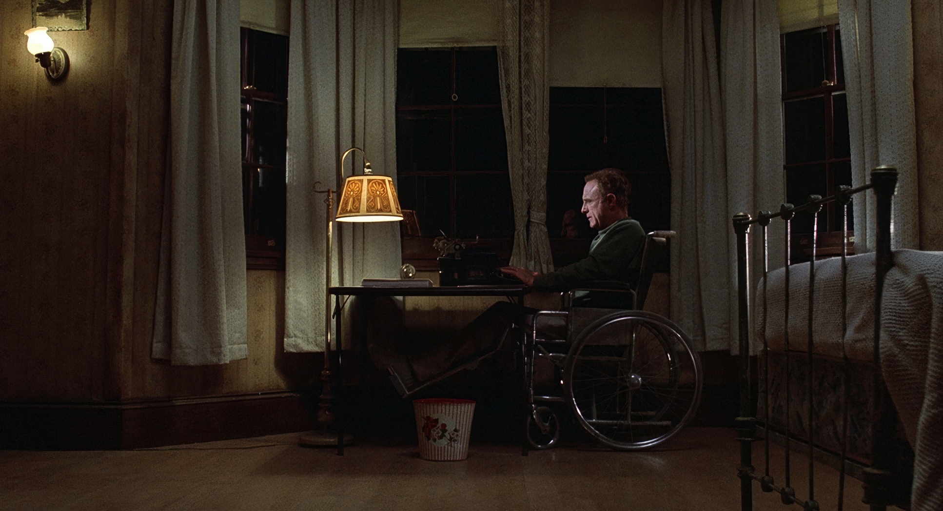
In the beginning, the lighting is almost soft, masking Annie’s psychosis. But as things go south, the shadows get harsher. When I’m grading, I’m always thinking about “contrast shaping” how much do we see in the shadows? Here, the shadows start to swallow the corners of the room. That tiny match light in the opening isn’t just a cool shot; it’s a reminder of how small Paul’s “light” is compared to the darkness Annie is bringing.
Lensing and Blocking

Sonnenfeld used wide lenses for the interiors, which is a bold move. Usually, wides make things feel big, but here, they distort the space just enough to make the rooms feel “wrong.” It keeps everything in focus, meaning Paul and the audience can never look away from the danger. There’s nowhere to hide.
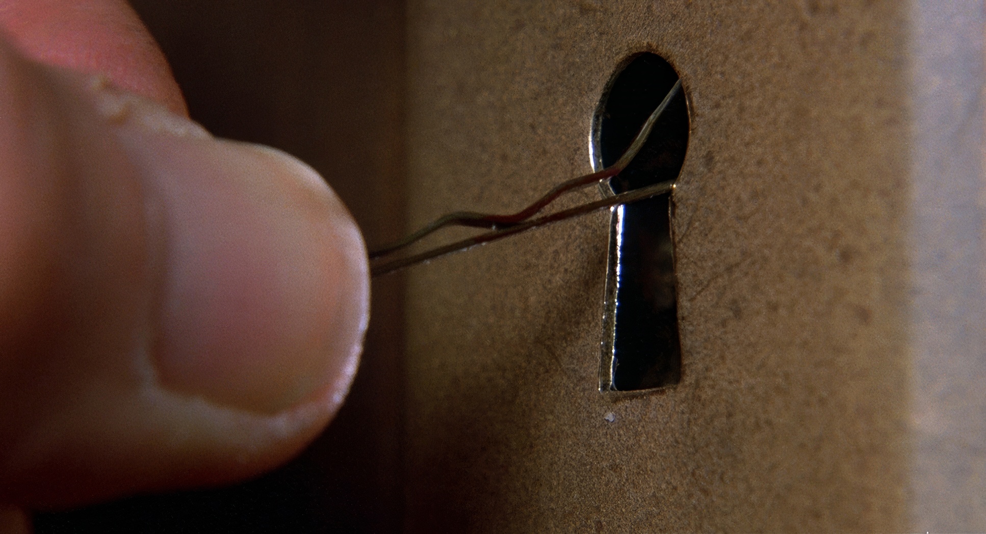
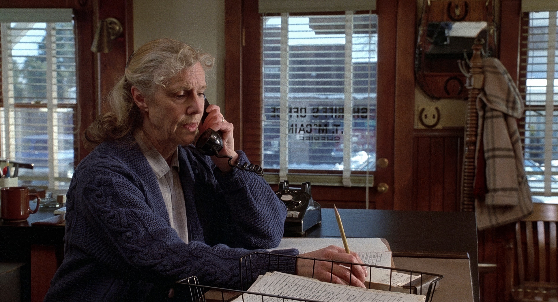
The blocking is where the power dynamic really lives. Paul is a fixed point literally nailed to a bed or a chair. Annie moves around him like a predator. She controls the geography of the house, and the camera follows her lead. There’s a shot through a keyhole that is just brilliant it’s voyeuristic and creepy, and it makes you feel like an intruder in Annie’s twisted world.
Color Grading Approach

This is where I get really nerdy. As a colorist, I look at Misery and see a beautiful balance of “Warm vs. Cold.” The exterior is all Kodak blues and desaturated whites it feels like death. Inside, you have the warm woods and “homey” fabrics of Annie’s house.
But here’s the trick: the warmth isn’t inviting. It’s a muddy, dated warmth. It feels stagnant. If I were in the suite grading this, I’d be obsessing over the “tonal sculpting” to make sure the highlights on Paul’s skin feel sickly and pale against that oppressive wood-grain background. The “print-film” look of the 90s really helps here there’s a texture to the mid-tones that digital just can’t touch. It feels “lived-in” and, ultimately, inescapable.
Technical Aspects & Tools
Misery (1990) | Technical Specifications
| Genre | Horror, Thriller |
| Director | Rob Reiner |
| Cinematographer | Barry Sonnenfeld |
| Production Designer | Norman Garwood |
| Costume Designer | Gloria Gresham |
| Editor | Robert Leighton |
| Time Period | 1980s |
| Color | Red |
| Aspect Ratio | 1.85 – Spherical |
| Format | Film – 35mm |
| Lighting | Soft light |
| Lighting Type | Daylight |
| Story Location | United States > Colorado |
| Camera | Panavision Cameras |
| Lens | Panavision Lenses |
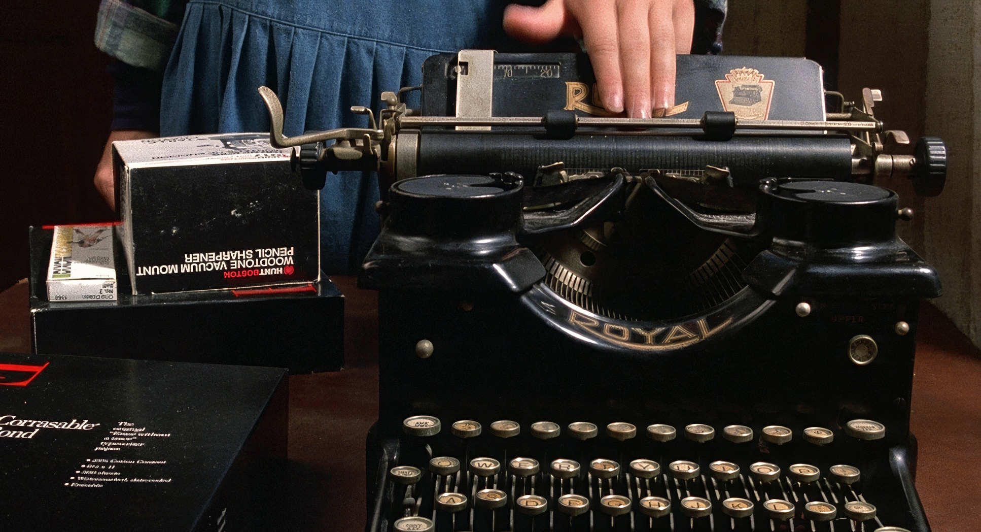
They shot this on 35mm using Panavision systems, and you can feel that organic grain. It adds a layer of grit to the “pristine” editing. The pace of the cuts is perfect it knows exactly when to hold a shot to make you squirm and when to cut away to Annie’s reaction. It’s the kind of synergy between the DP and the Editor that makes a film feel like a single, cohesive nightmare. For me, that’s the goal: making the capture and the finish feel like they were born together.
At the end of the day, Misery isn’t just a thriller. It’s a study in how to use a camera to dismantle a human being’s spirit. It’s a reminder that the scariest prisons aren’t made of iron bars; they’re made of four walls, a “number one fan,” and a camera that won’t let you look away.
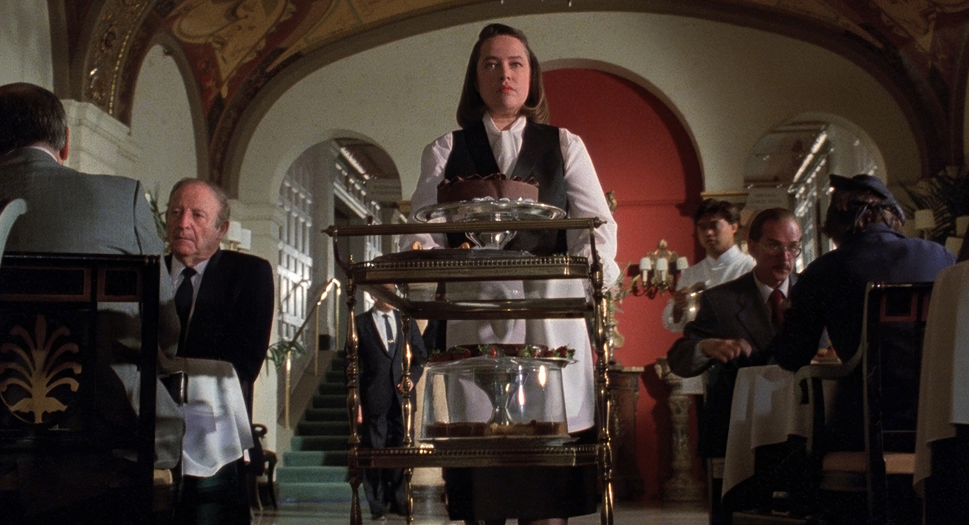
Misery (1990) Film Stills
A curated reference archive of cinematography stills from MISERY (1990). Study the lighting, color grading, and composition.
- Also read: WHEN HARRY MET SALLY… (1989) – CINEMATOGRAPHY ANALYSIS
- Also read: PHILADELPHIA (1993) – CINEMATOGRAPHY ANALYSIS
Browse Our Cinematography Analysis Glossary
Explore directors, cinematographers, cameras, lenses, lighting styles, genres, and the visual techniques that shape iconic films.
Explore Glossary →