As a filmmaker and full-time colorist, I spend most of my waking hours staring at screens, tweaking curves, and obsessing over how an image feels rather than just how it looks. Usually, I’m focused on making things look polished. But every so often, a film comes along that challenges that instinct—a film where the “ugliness” is the point. Bong Joon-ho’s Memories of Murder (2003) is exactly that kind of film. Long before the global acclaim of Parasite, this was the movie that carved out a permanent space in my brain. It blends dark humor with the grim reality of the Hwaseong serial murders, and for me, it’s a benchmark because the visual language doesn’t just support the story—it is the story. Today, I want to look at the specific cinematography choices that make this film work so well.
About the Cinematographer
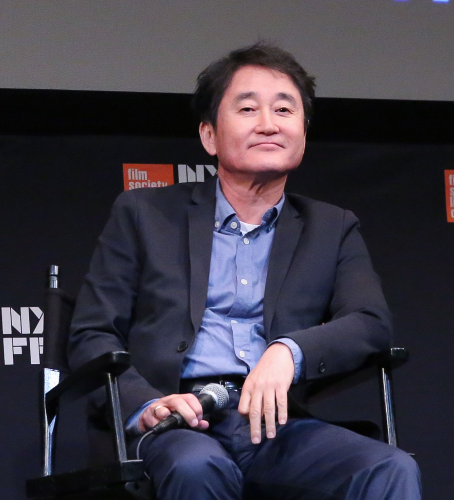
The DP behind the lens is Kim Hyung-ku, a frequent collaborator with Bong (they also did The Host together). What strikes me about Kim’s work here isn’t flashiness; it’s his patience. He isn’t trying to impress you with “cool” shots. Instead, he builds a visual environment that feels grounded in a wet, miserable realism. His style here is almost journalistic—he frames the world as it is, even when that world is confusing and unjust. There’s a restraint in his lighting and composition that actually makes the movie scarier. He understands that what you don’t see is often worse than what you do, letting the audience’s imagination fill in the gaps. It’s a principle of “less is more” that I constantly try to remind myself of when I’m grading.
Inspiration Behind the Cinematography
You can’t talk about Memories of Murder without acknowledging the Seven and Zodiac comparisons. There’s definitely a shared DNA with Fincher’s work—specifically the rain, the grime, and the psychological toll of an investigation that goes nowhere. But while Fincher’s grime feels stylized, the mud and rain in Memories of Murder feel uncomfortably real. This comes from the film’s true-crime origins. Since the real Hwaseong cases were unsolved at the time of filming, that sense of futility had to be baked into the visuals. The camera doesn’t give us heroic angles or easy answers because there weren’t any. It mirrors the chaos of the investigation. Kim Hyung-ku manages a tricky balance here: blending the moody atmosphere of a thriller with moments of slapstick comedy, without it ever feeling disjointed.
Camera Movements
The camera work is incredibly deliberate. Kim Hyung-ku largely sticks to an observational distance, using slow dollys or static wide shots (likely 1.85:1 aspect ratio) that let the characters look small and helpless against the landscape. It emphasizes just how out of their depth these detectives are. But then, he flips the script. When things get chaotic—like in the interrogation room or at a crime scene—the camera goes handheld. It creates a jarring, intimate shift that pulls us right into their frustration.
There’s a specific shot often mentioned in breakdowns of the film—the “animalistic crawl” where a head just peers out of the tall grass. What makes it creepy isn’t a whip-pan or a crash zoom; it’s the stillness. The camera sits there like another predator, observing. The most effective shots in this film are often the ones where the camera simply refuses to cut, forcing us to sit in the tension of a dark field way longer than we want to.
Compositional Choices
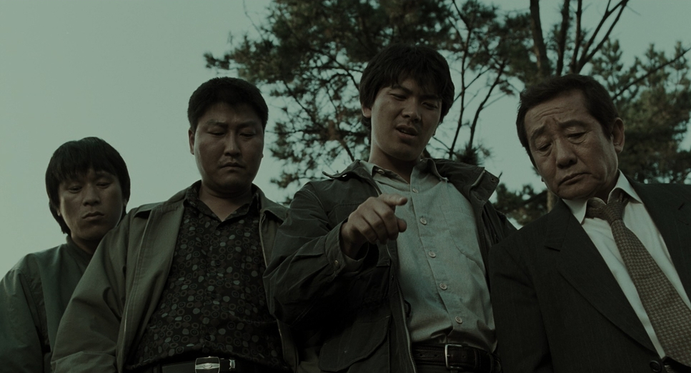
Compositionally, the film is doing a lot of heavy lifting regarding character dynamics. The standout example is the tunnel scene with Dooman, Tae-Yoon, and the suspect, Heng-gyu. The framing uses the tunnel mouth to physically split the image: light vs. dark, wet vs. dry. The detectives are stuck in the rain-soaked light, while the suspect sits in the darkness of the tunnel, paradoxically backlit by daylight. It’s a brilliant visual cue that tells us the “truth” isn’t where we think it is.
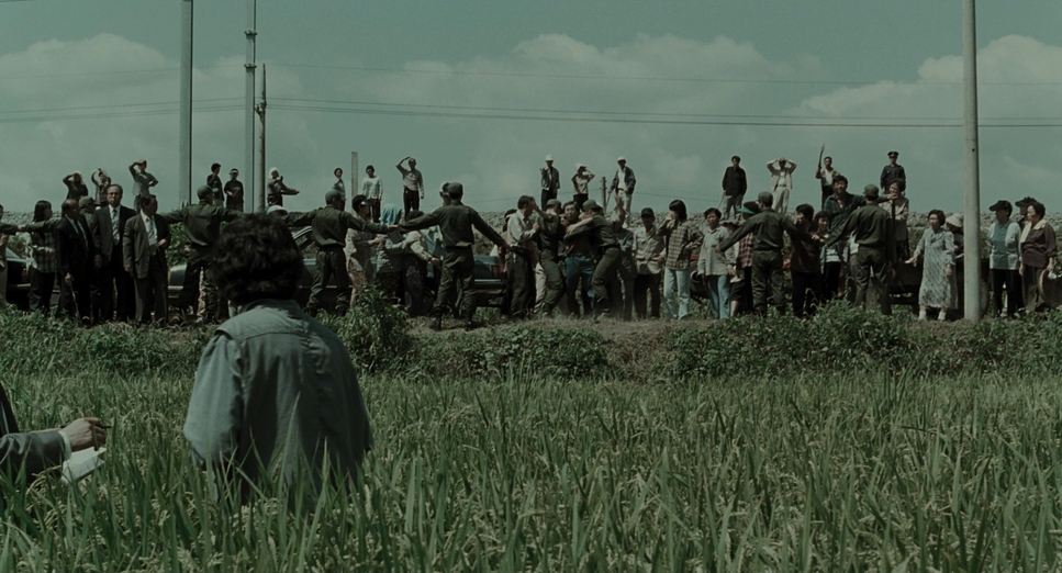
The film also uses depth to isolate the characters. Those wide shots of the rural fields swallow the detectives whole, emphasizing how few resources they actually have. I also love the way they block the “primitive detective,” Yong-gu. He’s always entering or exiting the frame in a disorderly, messy way, which visualizes his erratic nature without a single line of dialogue. And of course, there’s the final shot: Dooman staring right down the lens. Breaking the fourth wall is a risky move, but here, it implicates us. It’s an uncomfortable reminder that the killer is likely just an ordinary face in the crowd, watching the movie right along with us.
Lighting Style
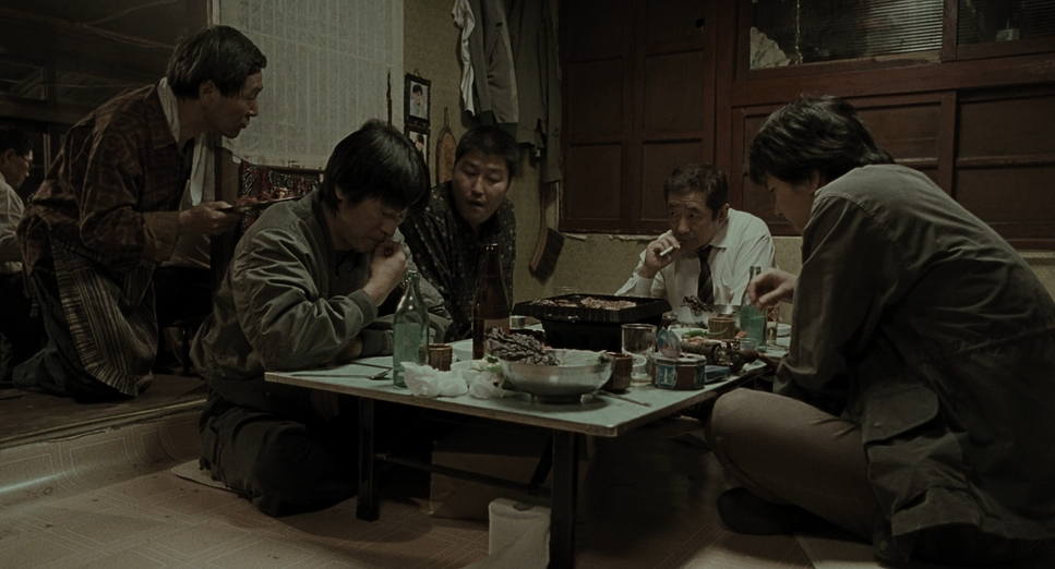
If I had to describe the lighting in one word, it would be “flat”—but in a good way. The YouTube analysis calls it “gray,” and that’s accurate. It’s a low-contrast, source-driven look. Kim Hyung-ku avoids the glossy, high-contrast “movie look” in favor of something that feels like a documentary. He relies on motivated sources: harsh overhead fluorescents in the station, dim bulbs in basements, or the flat, diffused light of an overcast day.
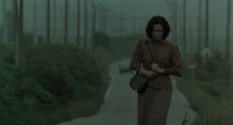
He keeps the dynamic range constrained. The highlights aren’t blown out, and the shadows aren’t crushed to total black; there’s detail everywhere, which makes the grime feel tangible. It avoids visual fatigue, which is crucial for a story this heavy. The only time the film breaks this rule is in the opening and closing sequences, which are saturated and golden. That warm yellow tint in the opening paddy field scene gives you a false sense of security—a “happy” look that makes the discovery of the body feel even more violating.
Lensing and Blocking
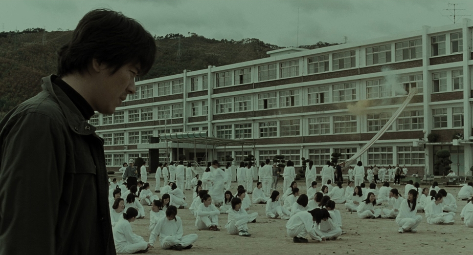
The lens choices are all about context. Kim tends to favor wider focal lengths to keep characters embedded in their environment. Whether it’s the vast, indifferent fields or the cramped police station, we always see the detectives in relation to their surroundings. Tighter, longer lenses are saved for specific emotional beats, like the fear in the schoolgirl’s eyes, which makes those moments pop.
The blocking is just as precise. Dooman, the “instinct” cop, is often shot close-up and center-frame—direct but flawed. Tae-Yoon, the Seoul detective relying on data, starts out positioned further back or out of focus, visually reinforcing that he’s an outsider. Going back to that tunnel scene, the spacing between the detectives and the suspect is physical storytelling. When the train tears through the frame, cutting them off from each other, it’s not just a cool transition; it represents the investigation completely derailing. It’s a great example of using physical space to dictate the narrative.
Color Grading Approach
As a colorist, this is the part that I really geek out on. The grade on this film, executed by colorist Yong-gi Lee, is deceptively simple. On the surface, it looks desaturated and bleak. If I delivered a commercial looking this “muddy” today, the client would probably send it back. But for this narrative, it’s perfect. The muted palette makes the world feel oppressive and exhausted, mirroring the detectives’ dwindling hope.
But if you look closely at the scopes (or just squint at the screen), there is a hidden pattern. Beneath the gray wash, there are very specific red, green, and blue accents tucked into the scenes. It’s a “hidden in plain sight” technique that influences the viewer subconsciously. I used to wonder why colorists bothered with subtle separation like that, but I’ve realized it bypasses the brain and hits the gut. The film also flips standard color tropes—the “color of the victims” is often white, standing out starkly against the muddy environment, while the police are obsessed with red. The highlight roll-off is also worth noting; because it was 2003 and likely finished photochemically, the highlights have that gentle, organic taper that digital still struggles to replicate perfectly.
Technical Aspects & Tools
Memories of Murder — Technical Specifications
| Genre | Crime, Detective, Drama, Murder Mystery, Police, Thriller |
|---|---|
| Director | Bong Joon-ho |
| Cinematographer | Kim Hyung-ku |
| Production Designer | Seong-hie Ryu |
| Costume Designer | Yu-sun Kim |
| Editor | Sun-min Kim |
| Colorist | Yong-gi Lee |
| Time Period | 1980s |
| Color | Cool, Desaturated |
| Aspect Ratio | 1.85 – Spherical |
| Format | Film – 35mm |
| Lighting | Soft light, High contrast, Silhouette, Backlight |
| Lighting Type | Daylight, Overcast |
| Story Location | Gyeonggi Province > Hwaseong |
| Filming Location | Jinju > Jukbong tunnel |
Since Memories of Murder dropped in 2003, we’re talking about the tail end of the analog era, just before Digital Intermediates (DI) became the standard. It was shot on 35mm film—likely Kodak Vision stock given the era—which dictates the texture of the whole movie. You get that natural grain structure and latitude that you just don’t get with digital sensors. They likely used Arriflex bodies (like the 535 or 435) with standard primes.
The “desaturated” look was also a bit of a counter-culture move for the time. Early digital video was starting to appear and looked sterile; by leaning into the filmic texture and stripping the color, Memories of Murder felt tactile and dirty. The post-production workflow would have been a traditional telecine transfer, likely graded on an older DaVinci system, but printed back to film for theaters. That entire analog chain—film neg to print—adds a richness to the mid-tones that helps the “flat” lighting style actually work, rather than just looking boring.
- Also Read: BEN-HUR (1959) – CINEMATOGRAPHY ANALYSIS
- Also Read: THE SOUND OF MUSIC (1965) – CINEMATOGRAPHY ANALYSIS
Browse Our Cinematography Analysis Glossary
Explore directors, cinematographers, cameras, lenses, lighting styles, genres, and the visual techniques that shape iconic films.
Explore Glossary →