We spend hours dissecting intention, craft, and the emotional logic that stitches a sequence together. Few films demand this kind of engagement like Adam Elliott’s Mary and Max (2009). On the surface, it’s a whimsical stop-motion piece about an unlikely pen-pal friendship. But beneath the clay veneer lies a brutal exploration of mental health, loneliness, and the elusive nature of “normal.” It hits you hard not just because of the script, but because the visual language is a masterclass in amplifying the human condition, even when the actors are made of plasticine.
About the Cinematographer
In stop-motion, the line between “director” and “cinematographer” blurs significantly. Adam Elliott isn’t just the storyteller here; he is the architect of the visual language alongside DP Gerald Thompson. Elliott’s signature style wobbly, imperfect, tactile is the bedrock of the film’s identity. Unlike the polished sheen of a Pixar production, Elliott embraces the thumbprints. His previous work, like Harvey Crumpet, established this aesthetic, but Mary and Maxrefines it. He leverages the inherent jitter of stop-motion not as a technical limitation, but as a narrative tool. The camera doesn’t just record the puppets; it inhabits their nervous, disjointed world.
Inspiration Behind the Cinematography

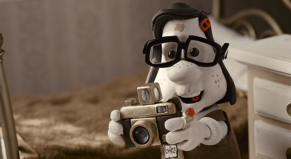
The film’s genesis is rooted in Elliott’s own 20-year correspondence with a pen pal who had Asperger’s. That authenticity dictates the cinematography. It’s less about spectacle and more about a grounded, almost documentary-like resonance. The choice to sever the two worlds visually Mary in Australia and Max in New York wasn’t just an artistic flourish; it was a narrative necessity. Max’s New York is a stark, high-contrast noir, a visual metaphor for his binary worldview and struggle with Asperger’s. In contrast, Mary’s Australia is rendered in a “muddy” palette desaturated sepia and rot. It’s not vibrant; it’s oppressive. This deliberate clash of palettes establishes the core conflict immediately: two isolated souls trapped in vastly different, yet equally suffocating, emotional landscapes.
Camera Movements

Elliott and his team approach the camera with the sensibilities of live-action filmmaking. The movement (or lack thereof) mirrors the internal state of the characters. Max’s world is often shot with a locked-down, static camera. It emphasizes his rigid routine, his anxiety, and the boxes he mentally constructs to feel safe. We feel the confinement of his existence through these composed, unmoving frames. But when Max spirals into a panic attack, the language shifts. The camera introduces subtle, unsettling jitters almost like a variable shutter angle effect to visually represent his internal chaos.
For Mary, the camera is more fluid, especially in her childhood. We get sweeping pans across her meticulous clay collections, inviting us into her imagination. But as life hardens her, the camera gets heavier. The moves become slower, dragging through the scene like a physical burden. Since the narrative relies heavily on letters, the camera often drifts across objects and environments to bridge time, creating a deliberate rhythm that guides the eye without feeling like a generic montage.
Compositional Choices
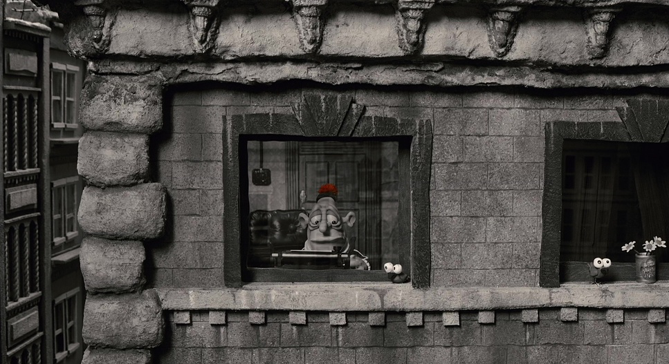
The framing in Mary and Max relies heavily on isolation. Max is frequently shot on wider focal lengths within his New York apartment. He is a small figure dwarfed by towering filing cabinets and city skylines, reinforcing his insignificance in the bustling city. Conversely, Mary is often framed tightly. As a child, this closeness feels intimate, but as she grows older, it starts to feel claustrophobic, emphasizing the pressure of her neglectful home life.
The film also nails the use of Z-space (depth). Even though these are miniature sets, the layering of foreground, midground, and background elements creates a genuine sense of scale. The negative space in Max’s black-and-white world is particularly effective; it feels heavy, not just empty. When the color breaks like the red pom-pom arriving in the mail the composition treats it as a sacred object. That single splash of saturation becomes the undisputed focal point, drawing the eye and signaling an emotional shift without a word of dialogue.
Lighting Style
The lighting here is sophisticated, clearly borrowing from classic noir and naturalism. in Max’s New York, the lighting is hard and directional. It’s motivated by practicals naked bulbs, streetlamps, subway neon. This creates deep, crushing shadows and hot highlights, emphasizing the bleakness of his environment. As a professional, you can see the care taken to ensure the “black and white” isn’t flat; it’s sculpted with light to maintain texture in the shadows.
Mary’s sepia-toned Australia uses a completely different setup. The light is softer, more diffused, likely using larger sources to wrap around the clay figures. But it’s not “beauty” lighting; it’s dim and dusty. It evokes the feeling of a hot, stagnant afternoon. Even when moments of hope appear, the lighting never fully breaks into “bright and sunny.” It stays somewhat muted, maintaining visual consistency with the film’s melancholic undertones.
Lensing and Blocking
Every focal length choice here feels calculated. Wide lenses (simulating perhaps an 18mm or 24mm equivalent) establish the vastness of the environments, introducing a slight distortion that enhances the caricature style while isolating the subject. Telephoto equivalents are used sparingly, usually to compress the background and force intimacy during moments of vulnerability.
Blocking where the characters stand is executed with the precision of a stage play. Characters often occupy the edges of the frame, leaving the center empty to represent the distance between them. The movement of the puppets themselves includes that signature “jerky-ness.” It’s a brave stylistic choice. In an industry that usually strives for fluid perfection (think Laika or Aardman), Elliott leaves the rough edges. It subconsciously reminds the viewer that these characters, like the medium itself, are flawed and imperfect.
Color Grading Approach
For me, the grade is where the film truly comes alive. Max’s world isn’t just a simple desaturation node. It looks like a carefully emulated B&W print stock. The blacks have real density they are thick and heavy while the mid-tones carry a silvery contrast. It’s about “tonal sculpting,” ensuring the clay has weight. We aren’t clipping the whites; there’s a soft roll-off that keeps it looking cinematic rather than digital.
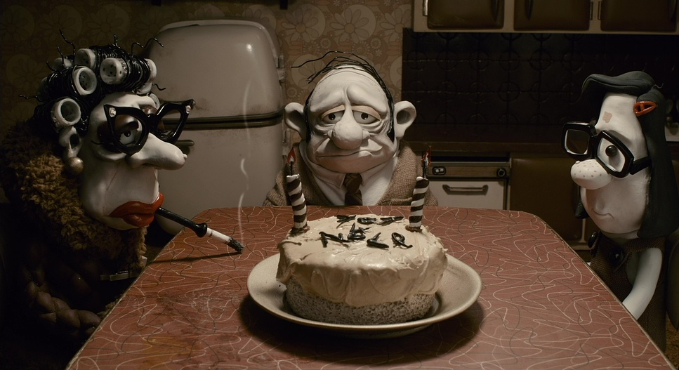
Mary’s world is a masterclass in “ugly” color done right. It’s a palette of muddy browns, tans, and dried-blood reds. As a colorist, I know how hard it is to make this look appealing. The key is in the separation. The reds are pushed warm and earthy, while the blues are sucked dry into a dirty grey. The overall luminance is kept lower to reflect the depressive subject matter. When Mary spirals, the grade seems to dip even further, desaturating the environment until she is almost part of the grey walls. It’s a delicate dance of density and hue, using color or the lack of it to dictate the emotional temperature of the scene.
Technical Aspects & Tools
Mary and Max (2009) — Technical Specifications
| Genre | Animation, Comedy, Drama, Stop-Motion Animation, Mental Health, Puppetry, Claymation |
|---|---|
| Director | Adam Elliot |
| Cinematographer | Gerald Thompson |
| Production Designer | Adam Elliot |
| Editor | Bill Murphy |
| Colorist | Dee McClelland |
| Time Period | 1970s |
| Color | Warm, Desaturated |
| Aspect Ratio | 1.85 |
| Format | Animation |
| Lighting | Side light |
| Story Location | … Earth > Australia |
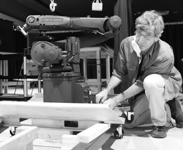
The technical execution of Mary and Max is a marathon of patience. Every prop and set piece is a physical object, crafted from clay, silicone, and wire. The “cutaway gags” alone some lasting only two seconds required entirely new builds and lighting setups. The shoot likely utilized high-resolution DSLRs (standard for the time) to capture the raw frames, allowing for massive latitude in post.
Lighting miniature sets requires specialized, small-scale fixtures to control the spill, often using LEDs or fiber optics to place pools of light exactly where needed. Post-production would have involved extensive rig removal and compositing, but crucially, they didn’t “fix” the wobble. That choice to leave the human error in the animation is what makes the film feel tangible. It aligns perfectly with the film’s thesis: perfection is a myth.
- Also read: BARRY LYNDON (1975) – CINEMATOGRAPHY ANALYSIS
- Also read: IN THE NAME OF THE FATHER (1993) – CINEMATOGRAPHY ANALYSIS
Browse Our Cinematography Analysis Glossary
Explore directors, cinematographers, cameras, lenses, lighting styles, genres, and the visual techniques that shape iconic films.
Explore Glossary →