Manchester by the Sea is that film. It’s a masterclass in understated devastation. Jody Lee Lipes and Kenneth Lonergan didn’t just make a movie; they built a window into a specific kind of Massachusetts grief the kind that’s cold, quiet, and refuses to leave.
This isn’t a film that begs for your attention with “cinematic” flourishes. In fact, it’s almost defiant in its plainness. My goal here is to pull back the curtain on how Lipes and Lonergan used visual craft to elevate the human condition, making us feel like uninvited witnesses to a tragedy that hasn’t quite ended.
About the Cinematographer
When Lonergan looked for a DP, he didn’t need a stylist; he needed an observer. He found that in Jody Lee Lipes. If you look at Lipes’s work on Martha Marcy May Marlene, you see a guy who is comfortable with silence. He isn’t interested in bombastic statements. His strength is in making a frame feel lived-in.
Lipes has this rare restraint. In Manchester, he never lets the cinematography overshadow the performance. He serves the script, which is excruciatingly realistic. It’s a delicate balance: how do you keep a film from looking “produced” while still maintaining high-level craft? This collaboration is where the magic is. It’s a shared understanding that sometimes, the most powerful visual statement is the one you choose not to make.
Inspiration Behind the Cinematography
The heart of this film is an unwavering commitment to realism. Lonergan explicitly rejected the “art-house” or “Hollywood” approach. He didn’t want a stylized version of loss; he wanted it to feel like life. The New England landscape isn’t just a pretty backdrop here it’s a character. It’s bleak. It’s unforgiving.
The mandate was simple: make the audience feel like they are eavesdropping. Grief doesn’t follow a three-act structure. It’s “sporadic and irrational.” It doesn’t stop and start when the screenplay demands a beat change. Lipes had to find a way to make the camera reflect this disorienting, uncinematic reality. The result feels less like a movie and more like a memory you wish you could forget.
Camera Movements
If you’re looking for sweeping crane shots or frenetic handheld energy, you won’t find them here. And that is exactly why it works. The camera work is characterized by a profound, almost uncomfortable stillness. Lonergan and Lipes purposefully “pull back” during the big emotional moments. In any other film, the camera would rush in for a teary close-up. Here? It stays back.
It’s patient filmmaking. It’s rare.
The camera often holds wide, static shots, letting the scene breathe. When it does move, it’s a slow, deliberate push or a subtle Steadicam shot that feels invisible. It preserves “life’s duller moments.” Even during the most intense dialogue, we’re often kept at a medium distance. It forces you to lean in. You have to work to see what the characters are feeling, much like Lee Chandler himself keeps the world at arm’s length.
Compositional Choices
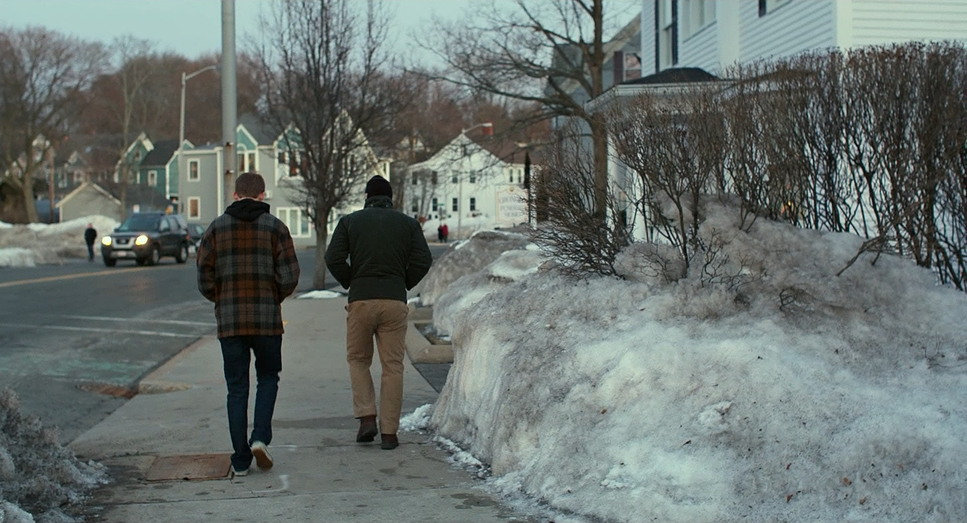
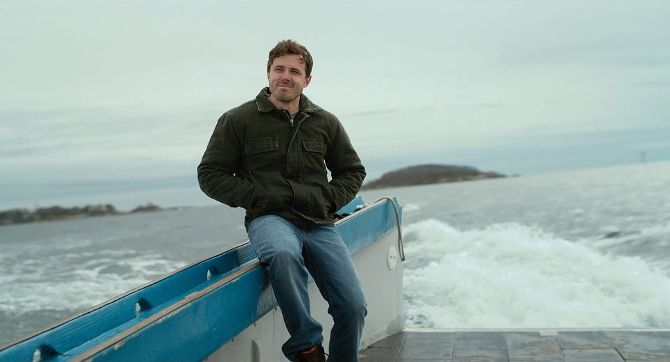
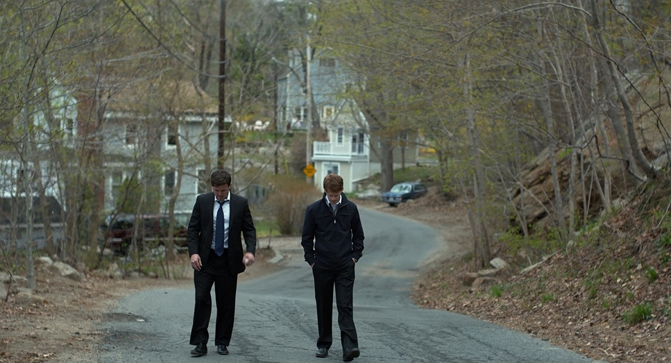
The composition here is all about environment. Wide shots dominate because they emphasize Lee’s isolation. He is frequently framed as a solitary figure, looking small against the Massachusetts coast. We see a lot of “Left Heavy” compositions and negative space not to create horror-style tension, but to show the literal emptiness in his life.
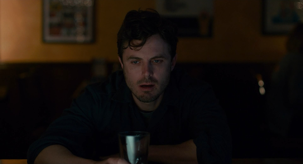
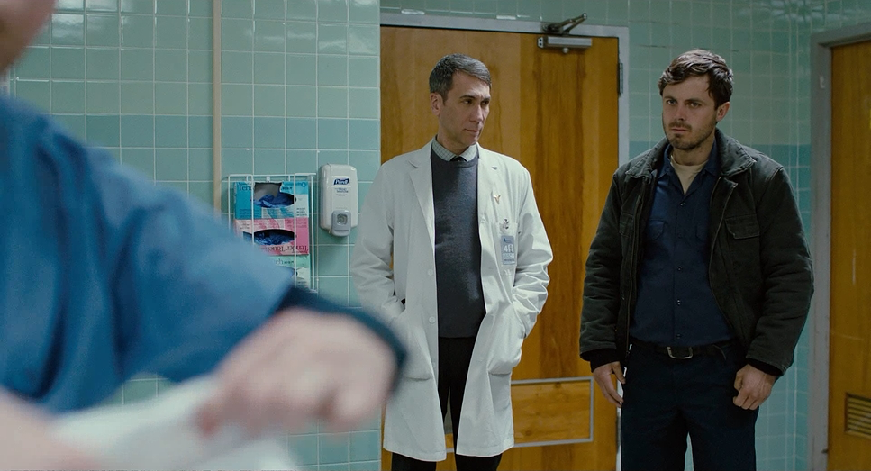
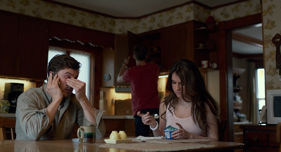
I noticed a specific use of high-angle shots in scenes like the hospital or the police station. It makes the characters look vulnerable, almost pinned down by their circumstances. Interestingly, the close-ups are reserved for mundane things a phone call, a grocery bag rather than the “big” cries. It subverts your expectations. It tells us that the real pain isn’t in the outburst; it’s in the quiet, persistent hum of daily existence.
Lighting Style
The lighting in this film is honest. As a colorist, I love that Lipes didn’t try to “beautify” the tragedy. He relied heavily on natural, motivated light the kind of raw, unforgiving light you only get during a New England winter. Think muted daylight filtering through a window or the cool, desaturated glow reflecting off snow.
But it’s not all “pretty” naturalism. Lipes embraces the “ugly” light too. The interiors often feature hard, side-lit setups and the sickly green-yellow of fluorescent fixtures. Look at the scenes in the basement or the office; they feel sterile and cold. He allows the shadows to deepen and the highlights to roll off naturally. It’s a commitment to truth. The lighting underscores the emotional landscape: the persistent gloom of Lee’s world and the harsh reality of an environment that has trapped him.
Lensing and Blocking
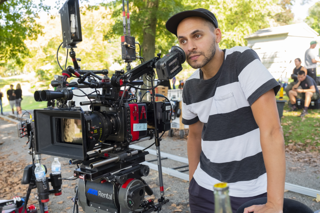
Lipes went with the ARRI ALEXA XT paired with Angenieux Optimo Zooms. Choosing zooms over primes is a gutsy move for a “realist” drama. Usually, we associate zooms with 70s grit or news-gathering, but here, they use that flexibility to find the frame organically. It removes the “preciousness” of a prime lens setup and makes the film feel more like an observation.
The blocking is a masterclass in psychological distance. Characters are rarely in the same physical plane. Lee is often positioned in doorways, looking out windows, or standing a few feet further back than everyone else. This visual isolation is his self-imposed exile. The 1.85:1 aspect ratio helps here it’s intimate. It’s less “epic” than widescreen, which keeps the focus squarely on the personal domestic tragedy.
Color Grading Approach
This is where I really lean in. The grade, handled by Jack Lewars, is intrinsically tied to the theme of “eternal winter.” The palette is cool, muted, and often desaturated. But as a colorist, I see the “tonal sculpting” happening under the surface.
It’s easy to just “dump blue” into a scene to make it look cold. This is much more sophisticated. They kept the neutrals muddy and grey which is actually very difficult to balance without it looking like a mistake. Skin tones are rendered with zero idealization. If a character looks tired or cold, the grade reflects that. There’s a beautiful highlight roll-off that feels like a film print, likely achieved through a custom LUT that mimics film emulsion. The grade doesn’t just sit on top of the footage; it pulls the audience into the temperature of the room. You can practically feel the damp cold in your bones.
Technical Aspects & Tools
Manchester by the Sea (2016) | Technical Specs
| Genre | Drama |
| Director | Kenneth Lonergan |
| Cinematographer | Jody Lee Lipes |
| Production Designer | Ruth de Jong |
| Costume Designer | Melissa Toth |
| Editor | Jennifer Lame |
| Colorist | Jack Lewars |
| Time Period | 2010s |
| Color Palette | Blue |
| Aspect Ratio | 1.85:1 |
| Format | Digital |
| Lighting | Hard light, Side light |
| Lighting Type | Artificial light, Fluorescent |
| Story Location | Massachusetts, USA |
| Filming Location | Massachusetts, USA |
| Camera | ARRI ALEXA XT / XTplus |
| Lens | Angenieux Optimo Zooms |
To get this look, the Alexa XT was the perfect choice. Its dynamic range and natural skin tone rendering provide a robust foundation for the kind of subtle grading Lewars applied. It captures an image that feels less “digital” and more “organic.”
The use of the Angenieux Optimos provided a slightly softer, more textured look than modern, clinical primes. These technical decisions weren’t about chasing specs; they were about selecting tools that wouldn’t get in the way of the story. Everything from the 1.85:1 ratio to the Alexa’s sensor worked in concert to create a window into an unfiltered reality.
- Also read: THE UNTOUCHABLES (1987) – CINEMATOGRAPHY ANALYSIS
- Also rrad: APOCALYPTO (2006) – CINEMATOGRAPHY ANALYSIS
Browse Our Cinematography Analysis Glossary
Explore directors, cinematographers, cameras, lenses, lighting styles, genres, and the visual techniques that shape iconic films.
Explore Glossary →