I look at Life of Pi (2012) and see a benchmark. Ang Lee’s adaptation of Yann Martel’s novel was famously labeled “unfilmable” a tag usually slapped on stories that rely too much on internal monologue or abstract concepts. But Lee, alongside cinematographer Claudio Miranda, ASC, didn’t just adapt it; they engineered a visual language for it. They pushed CGI and 3D to their absolute limits without turning the film into a soulless tech demo. Instead, the technology actually serves the story, making the impossible look not just filmable, but necessary.
About the Cinematographer

The visual architect here was Claudio Miranda, ASC. If you look at his resume prior to Pi specifically The Curious Case of Benjamin Button and TRON: Legacy you see a DP who is incredibly comfortable with heavy VFX workflows and digital acquisition. Miranda understands how to blend live-action with digital environments better than almost anyone. He was the perfect choice for Life of Pi because he doesn’t treat digital as a compromise; he treats it as a specific aesthetic. His collaboration with Ang Lee wasn’t just about capturing a performance; it was about building a world from scratch that still felt organic.
Inspiration Behind the Cinematography
The cinematography anchors itself in the novel’s central theme: the blur between reality and storytelling. Ang Lee needed visuals that felt grounded enough to be dangerous, but heightened enough to be mythological.
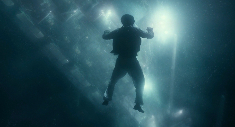
The “unfilmable” challenge was solved by philosophy, not just pixel count. They didn’t create spectacle just to show off the budget. They used the tech to mirror Pi’s internal state. Nature here isn’t a Disney backdrop; it’s indifferent and primal. The visuals had to balance that brutality with divine beauty. Take the ship sinking sequence: it’s terrifying, but the shot of Pi underwater, watching the lights of the tanker fade into the abyss, is strangely beautiful. It manages to hold dread and wonder in the same frame.
Camera Movements
The camera in Life of Pi behaves like the ocean fluid, constant, and indifferent. In the early India sequences, the camera is stable, observational, almost gentle. It establishes safety.
Once Pi hits the water, the language shifts. The camera starts to float. In the underwater sequences, it glides with a dreamlike grace that contrasts the violent, chaotic handheld feel of the storm scenes. Even in moments of calm, the frame is rarely locked off; there’s a subtle, almost imperceptible drift. This is crucial technical storytelling: on a small boat, visual stagnation is the enemy. That constant, subtle motion keeps the visual narrative alive and reminds the audience that the ground beneath Pi is never solid.
Compositional Choices
Compositionally, this film is a textbook example of using negative space to dictate emotion. Miranda uses the 1.85:1 aspect ratio to isolate Pi, often letting the ocean and sky consume 80% of the frame. It crushes him visually. The iconic wide shot of the boat tiny against a star-strewn sky tells you everything you need to know about the odds he’s facing.
Miranda also plays fast and loose with the rule of thirds. He often centers Pi or the tiger to create a sense of confrontation, or pushes them to the extreme edges to suggest an uneasy truce. Then you have the symmetry of the “mirror ocean” scenes. These shots are composed with almost mathematical precision, eliminating the horizon line to disorient the viewer. It breaks the depth cues we rely on, pulling us into Pi’s confused, hallucinated reality.
Lighting Style
The lighting is motivated by natural sources sun, moon, bioluminescence but it is pushed to a hyper-real degree. This is where the dynamic range of the Arri Alexa really shines. The daylight scenes are often harsh, simulating the unforgiving midday sun, but the highlight roll-off is gentle. Nothing feels distinctively “clipped” or digital.
Then there are the night scenes. A strict realist would argue the moon doesn’t cast that much light, or that the ocean doesn’t glow neon green. But Miranda isn’t going for realism; he’s going for “emotional truth.” The bioluminescent sequence is lit with an unmotivated, otherworldly glow that separates the boat from the reality of the ocean. It allows for those painterly reflections where the water becomes a canvas. It’s a deliberate break from naturalism that sells the spiritual undertone of the film.
Lensing and Blocking
Miranda’s lens choices shape the psychological space of the boat. He leans on wide-angle lenses to exaggerate the distance between Pi and the horizon, distorting the perspective just enough to make the ocean feel infinite and Pi feel small.
But when the focus shifts to the relationship with Richard Parker, the focal length tightens. Longer lenses compress the background, bringing the tiger and the boy into the same claustrophobic plane. The blocking has to be meticulous here because the space is so limited. The tarp isn’t just a prop; it’s a border wall. The camera creates tension by framing shots where the tiger is just out of sight, or obscured by the tarp, forcing the audience to scan the frame just like Pi does. The 3D acquisition meant this blocking had to work volumetrically, not just on a 2D plane giving the viewer a sense of physical presence in that lifeboat.
Color Grading Approach
As a colorist, this is the part of the film that I obsess over. The grade moves beyond correction and into full-blown look development. The palette is distinct: the warm, dusty golds of India transition into the cool, relentless cyans and teals of the Pacific.
The hue separation is masterful. Often in digital films, the ocean becomes a muddy wash of blue. Here, the separation between the deep navy of the water, the turquoise of the shallows, and the fiery orange of Richard Parker is incredibly clean. That orange/teal contrast is a classic trope, but here it serves a purpose keeping the tiger visually separated from his environment.
There is also a sensibility that feels like print-film emulation. The highlights have a creamy texture that avoids the sterile look of early 2010s digital cinema. The grade breathes with the story desaturating during moments of hopelessness and exploding with saturation during the “magical realism” sequences. It’s a great example of how color grading dictates the emotional tempo of a scene.
Technical Aspects & Tools
Life of Pi
Technical Specifications| Genre | Action, Adventure, Drama, Fantasy, Nature, Survival, Magical Realism, Low Fantasy, Science-Fiction |
|---|---|
| Director | Ang Lee |
| Cinematographer | Claudio Miranda |
| Production Designer | David Gropman, Marcelo Pont Verg |
| Costume Designer | Arjun Bhasin |
| Editor | Tim Squyres |
| Colorist | Anthony Harris |
| Time Period | 2010s |
| Color | Warm, Green |
| Aspect Ratio | 1.85 – Spherical, 3D |
| Format | Digital |
| Lighting | Hard light |
| Lighting Type | Daylight |
| Story Location | … Ontario > Toronto |
| Filming Location | … Montreal > Old Port of Montreal |
| Camera | ARRI ALEXA, ARRI ALEXA 4:3 / plus |
| Lens | Angenieux Optimo Zooms, Zeiss Master Primes |
| Film Stock / Resolution | 2.8K / 2.8K ArriRaw |
Considering this came out in 2012, the technical achievement is massive. The blend of live-action water work with CGI is seamless. Richard Parker is still one of the best CGI animals ever put on screen not just because of the fur rendering, but because of the interaction with light. The bounce light from the ocean hitting the white underbelly of the tiger grounds him in the physical space.
And I have to mention the 3D. I’m usually skeptical of 3D it often feels like a gimmick to jack up ticket prices. But Lee and Miranda treated 3D as a narrative tool, not a theme park ride. They used the Z-axis to emphasize the depth of the water and the isolation of the boat. It creates a “volume” that draws you in rather than poking things out at you. It makes you feel the distance between the boy and the whale. It’s one of the few times the format actually justified its existence.
- Also read: DISTRICT 9 (2009) – CINEMATOGRAPHY ANALYSIS
- Also read: HARRY POTTER AND THE PRISONER OF AZKABAN (2004) – CINEMATOGRAPHY ANALYSIS
Browse Our Cinematography Analysis Glossary
Explore directors, cinematographers, cameras, lenses, lighting styles, genres, and the visual techniques that shape iconic films.
Explore Glossary →